
Cartographers have long been concerned with how map-readers perceive map symbols. How small can a map symbol be and still be noticed? What size do symbols have to be for a viewer to differentiate and clearly distinguish different shapes or forms? Such questions can be answered by using psychological methods of evaluation, as discussed in my previous post on the Perceptual Scaling of Map Symbols, or based on the experience of skilled map makers.
Examples of some thresholds of map symbol perception are illustrated by Prof. E. Spiess in a chapter entitled “Map Compilation” in the out-of-print book Basic Cartography, Vol. 2 (International Cartographic Association, 1984). At the time Spiess was the Director of the Department of Cartography at the Swiss Federal Institute of Technology.
Note: the illustrations below are guidelines for printed maps. Typically, increase sizes for computer displays. The illustrations have been slightly expanded in size from the originals to make them readable on a computer screen. Click on the image for a larger version. Illustrations are for educational purposes only.
“Three thresholds can be distinguished in a series of increasing symbol sizes: at a certain level the presence of a symbol can be clearly discerned – this is the threshold of perception (column 2 in Fig. 2.40); a clear difference of form or shape can be recognized at a later stage – this is the threshold of differentiation (column 3 in Fig. 2.40).
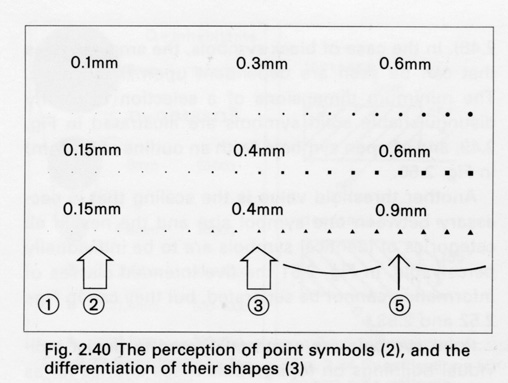
Further steps of increase in symbol size are necessary to ensure the absolutely certain identification of a symbol larger than that appearing in column 3, and column 5 corresponds with the threshold of separation.
Besides the size of the symbols, the spacing between them is another element which must be chosen in relation to their visual perception (Fig. 2.41).
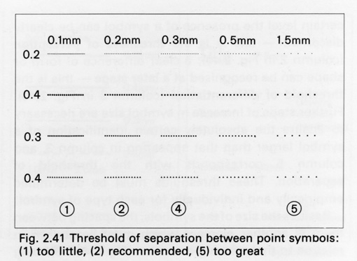
Spacing is too small in column 1, but just sufficient in column 2. Their separation in column 4 is equal to the dimension of the symbol – a proportion that causes irritation and should therefore be avoided. In column 5 the symbols are isolated to such an extent that they no longer seem to form a row, but start to have individual functions.”
The narrowest line that can be perceived with certainty when printed in black is 0.08 mm wide, and significant increases in width are necessary to produce lines that can easily be distinguished one from another (Fig. 2.42).

Such a series of well differentiated line-widths is shown on the right of figure 2.44.

The threshold of perception for fine and coarse double-lines is shown above 2 in Fig. 2.43.
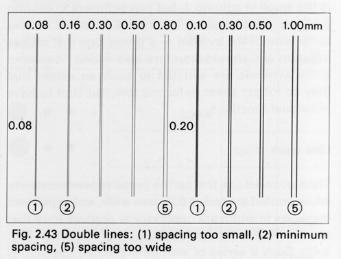
The broad double lines above 5 are too widely spaced to remain easily recognizable as double lines.
A few other line textures are illustrated in Fig. 2.45. Apart from width thresholds, in the case of a pecked line the selection of the correct proportions for the length of a dash and the interval of its separation from the next one can provide further problems.
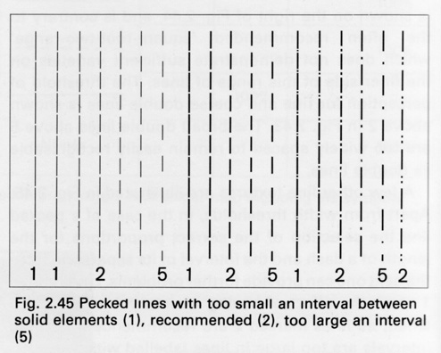
Lines above 1 show the effect of having an interval which is too small; all lines marked 2 are recommended; and the intervals are too large in lines labeled with a 5.
Figures 2.46 and 2.47 contrast poor and good applications of the separation of line-work and pecked lines with respect to the conditions explained above.”


some more on this has been published in:
Topographic Maps – Map Graphic and Generalization, Publ. Vol. 17 by the Swiss Society of Cartography
(link for orders: http://www.kartographie.ch/publikationen/publications.html )
in the book/cdrom they also added something on presentations of maps on screen. Unfortunately the book does not cite any sources for those thresholds (i.e. psychology, medical pubs) in comparison to for instance the book by Robinson which cites – I believe – at least one source.