

What if there was a gap between mapped data and our perception of it?
Buried in the ArcGIS symbolization options for proportional symbol maps is a puzzling check box labeled Appearance Compensation (Flannery) that addresses one gap between perception and data symbolized on maps.
This check box is a vestige of academic cartography’s extensive engagement with psychophysics beginning in the 1950s. Psychophysics relates “matter to the mind, by describing the relationship between the world and the way it is perceived.” Psychophysical studies select specific sensory stimuli and evaluate human perception of the stimuli. Cartographers studied thresholds (what is the smallest type size the average viewer can read?), discrimination (what is the minimum difference between two gray tones required for the average viewer to perceive a difference?), and scaling (how to scale a map symbol so the average user correctly judges the symbol’s value?).
The most studied map symbol was the proportionally scaled circle.
The scaling of proportional map symbols was the primary research focus of James Flannery, a student of Arthur Robinson, one of the founders of American academic cartography. Flannery’s research on map symbols was based on 1920s research on the human perception of circles and other symbols on statistical graphics. Flannery’s dissertation, completed in 1956, was among the first in Geography using psychophysical methodology.
A typical proportional circle map (below, right) scales circle area to the value (usually a total) for a geographic area on a map. Such a map is an alternative to the more common choropleth map (below, left) that shades geographic areas to their value (usually derived data, such as a density).

While not as common as the choropleth map, proportional symbol maps can be found in the public eye, as on the map accompanying a recent New York Times article on poppy cultivation in Afghanistan.
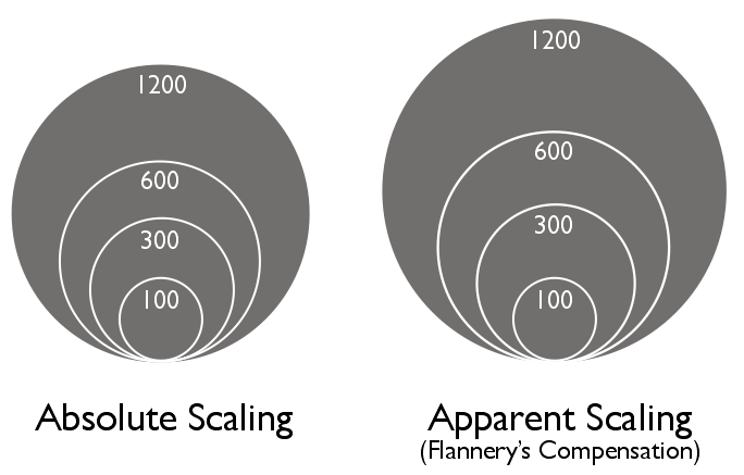
The absolute scaling of circles is common on proportional circle maps: a county with a value of 100 has a circle with an area of 2 square cm, a county with a value of 200 has a circle with an area of 4 square cm, etc. (In 1801 William Playfair first scaled circle areas to represent quantities; the use of area rather than diameter persists to this day).
But psychophysical research revealed that while people tend to correctly estimate lengths, they tend to underestimate areas and volumes. In other words, when asked to pick a circle that is two times the size of another in a range of different circle sizes, most people would pick a circle that was about 1.8 times the size. This tendency gets worse with larger areas, and is worse in general for estimations of volumes.
The graph below shows three apparent-magnitude curves for estimations of symbol length, area, and volume.
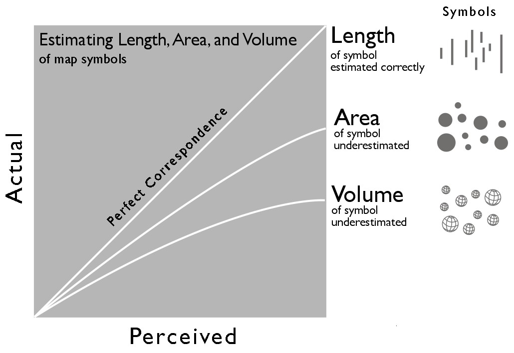
The implication of this perceptual underestimation was that absolute scaling on proportional symbol maps led to inaccurate perception of the values: while the circles were scaled accurately, the perception of the areas, and thus the values the user got from the map, were wrong.
The solution was to devise a method of perceptual (or apparent) scaling of graduated symbols, or appearance compensation in ArcGIS-ese.
Thousands of perceptual tests led Flannery to develop a method for scaling circles that compensated for the underestimation. When you check the Appearance Compensation check box in ArcGIS the method scales up proportional circles, the larger the circle, the more the scaling.
There are problems with perceptual scaling that suggest avoiding its use on map symbols.
Edward Tufte, in The Visual Display of Quantitative Information (1998, 2nd ed. 2001) stands opposed to anything but absolute scaling: “The representation of numbers, as physically measured on the surface of the graphic itself, should be directly proportional to the numerical quantities represented” (see my previous post on Tufte here). If one actually measures a perceptually scaled circle on a map (or graph) one would get the wrong actual value. Tufte’s demand to “tell the truth about data” excludes compensation for human perceptual failings. In one fell swoop Tufte wiped out a broad swath of psychophysical research in cartography.
The fact that perceptual (or apparent) scaling was based on an average subject ignored the fact that a broad range of user reactions varied greatly from the average. Perceptual adjustments for the average subject didn’t solve the perceptual problem for a considerable number of potential map users, and led to problems for those who were able to correctly judge areas.
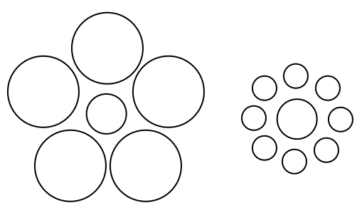
Finally, once added to the complexity of a map, the value of apparent scaling diminished. Research revealed the perceptual problem was not as evident on maps with a smaller range of circle sizes; that good legend design could eliminate the perceptual problem; and that circles on complex maps may have other problems, including optical illusions, which are impossible to correct and lead to even worse perceptual problems. For example, the middle circle in the two groups below is the same size (showing how the perceived area of a circle is shaped by the circles that surround it):
Some vestiges of psychophysical studies are embedded in map design guidelines like those illustrated in the Making Maps book. However, psychophysical map studies assumed map-readers, maps, and map symbols were quite a bit simpler than they are in reality. This limited the utility of such research, much of which was seen by practicing cartographers as not useful for making maps or, at best, merely confirming common sense rules of map design.
A great overview of the history of psychological research on maps including psychophysical research is Daniel Montello’s “Cognitive Map-Design Research in the Twentieth Century: Theoretical and Empirical Approaches” (Cartography and Geographic Information Science, Vol. 29, No. 3, 2002, pp. 283-304). Borden Dent’s text Cartography: Thematic Map Design (4th ed., WC Brown, 1996) has a good discussion of absolute and perceptual scaling of map symbols, including equations for absolute and perceptual scaling, in chapter 8 (this chapter was the source for some of the redrawn illustrations above).
Postscript: The implementation of Flannery’s perceptual scaling in ArcGIS has a software-specific problem: perceptual scaling should only be applied to circles. If the symbol is changed in ArcGIS, to a square or some other shape, the perceptual scaling can still be applied. Research has shown that square symbols, on a proportional symbol map, don’t have the same perceptual problem that circles do (we can correctly estimate the areas of squares). Little research on map symbols besides circles and squares exists. Bottom line: if you use the Appearance Compensation in ArcGIS, only apply it to proportionally scaled circles.

[…] Perceptual scaling for proportional symbols using Flannery’s exponent […]
[…] humans to accurately estimate its relative size. John Krygier of Making Maps: DIY Cartography has a great post about the entire […]
[…] of academic cartography have established. The graph below (from John Krygier’s excellent blog post on perceptual scaling) sums up the average response to 1, 2, and 3D proportional […]
[…] common mistake whenever circles are involved in data visualization. It's been described several times (also by myself), and while there is still some discussion about the best way to map numbers to […]
[…] Using circles to represent scaled data is problematic. There is solid research indicating that humans have trouble estimating the area of circles in relation to each other… So I used the ratio suggested by James Flannery to counter this […]
[…] unique feature of this library is that it allows for perceptual scaling of proportional symbol features. Back in they heyday of psychophysical research in academic […]
[…] of the US budget breakdown is an egregious example, particularly when you consider that most people under-estimate differences in area – which is also one of the reasons why McCandless deserves a special place in hell, in my […]
[…] https://makingmaps.net/2007/08/28/per…f-map-symbols/ […]
[…] should have consulted Colorbrewer for some advice first as well as this fine read on the art of scaling symbology. Now don’t get me wrong, the colors are “pretty” but they really don’t help […]
[…] In the 1950s various people studied biases in perception. One of these scholars was James Flannery. Based on earlier research that has shown that people often judge relative sizes of circles wrongly, he introduced a so-called appearance compensation for circular diagrams. This algorithm would adjust relative sizes of circles in a manner that, on average, would compensate for the biased perception. However, nowadays most people argue that these methods should not be used anymore, but instead other means that support accurate perception o…. […]
“If one actually measures a perceptually scaled circle on a map (or graph) one would get the wrong actual value. Tufte’s demand to “tell the truth about data” excludes compensation for human perceptual failings. ”
i think this is a pedantic view of data visualisation. i don’t remember breaking out my ruler and compass to verify a graphic on usa today or wherever. if a pie chart has a segment that looks like it’s about two thirds and it’s labelled 67%, I take it as such and don’t actually verify whether it’s 240 degrees.
visualisation is about conveying the information, especially to a lay audience, in a manner which is quickly absorbed, as close to the results as possible. if it’s just about fidelity to the quantitative truth (even if the perception can scientifically or anecdotally shown to be problematic), then just give them the numbers.
even without a background in data, it’s easy to acknowledge that most people people would have trouble telling how much larger a ball or cone was than another, in stark contrast to the length of a ruler.
This comment captures the view critical of perceptual scaling. Much of the perceptual research on maps was remarkably pedantic, which is one of the reasons for its limited acceptance (and marginal usefulness) beyond the narrow confines of academic cartography.
Thanks for the primer on perceptual scaling of maps. I now know more than I did five minutes ago!
[…] have areas that are proportional to the values in the data. Additionally, there are arguments [8] that most viewers struggle with properly perceiving area comparisons, which these graphs require. […]
[…] the circles is the result of a compromise relationship between magnitude scale number, circle area, perceived circle size difference and total energy release. I chose a scale that (a) was intermediate between the extremes of size […]
[…] circles is the result of a compromise relationship between magnitude scale number, circle area, perceived circle size difference and total energy release. I chose a scale that (a) was intermediate between the extremes of size […]
[…] is the result of a compromise relationship between magnitude scale number, circle area, perceived circle size difference and total energy release. I chose a scale that (a) was intermediate between the extremes of […]
[…] Color and Perception https://makingmaps.net/2007/08/28/perceptual-scaling-of-map-symbols/ […]