Feeds:
Posts
Comments

Archive for the ‘Maps Made’ Category

everything_cover

The revised and expanded second edition of Denis Wood’s Everything Sings: Maps for a Narrative Atlas, is due May 30, 2013 from Siglio Press.

The second edition of the atlas comes with ten new maps, including Numbers and Roof Lines (below).

The second edition also includes an interview with Blake Butler, as well as essays by Albert Mobilio and Ander Monson. This edition comes swathed in a violet dust jacket and the book itself is daffodil yellow, but it’s the new maps and accompanying essays that are the main attraction.

everything_numbers_text

everything_numbers_map•••••••

everything_roof_text
everything_roof_map

Read Full Post »

To understand map design, and how maps work, it is useful to see how map design concepts play out on a real map.

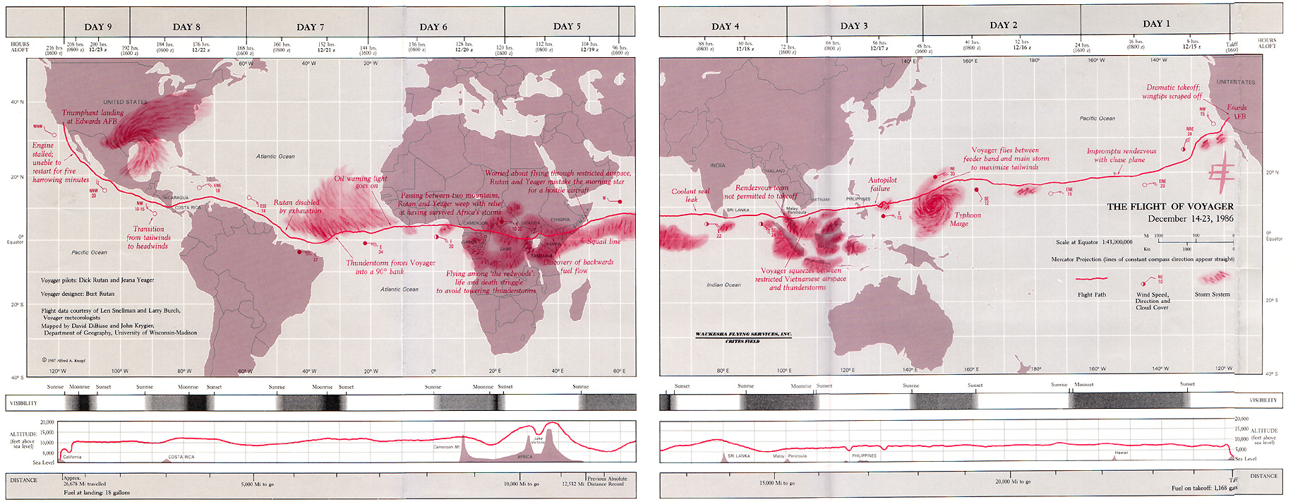
One of the significant updates to the 2nd edition of Making Maps was the inclusion of a map of the 1986 trans-global flight of the experimental aircraft called Voyager. This map, originally designed and created by David DiBiase and I back in 1987 for David Woodward’s map design course (and in the University of Wisconsin Cartographic Lab), is repeated thirteen times in seven of the chapters, annotated to show how the concepts and ideas in these chapters play out on the map.

The repeatedly annotated Voyager map serves as an example of map design in practice, but also a guide to “reading” a map from the perspective of map design.

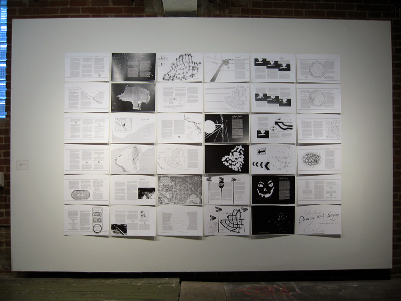
Martin Dodge suggested the annotated maps be available together, for instructional purposes. A good idea! So here they are. Each individual map on this page is a 800k PNG file (click for full size).

A PDF file (8.8mb) with all thirteen higher resolution TIFF images is available here.

The Voyager map project was quite a bit of fun to create back in the day. It won a map design award, was published in the book about the Voyager flight, and printed on paper as part of a promotion for the Waukesha County, Wisconsin Airport. I cannot imagine anything much more exciting than that.

••••••••••

The second map in the series prefaces the initial chapter in Making Maps 2nd edition, and poses a series of questions that will be addressed in future chapters (and annotated Voyager maps):

Chapter 2, What’s Your Map For?, sets the context of the map (and of its re-creation for the book) and how such context shapes the design of the map:

Chapter 6, The Big Picture of Map Design, repeats the Voyager map five times, focusing on the key map design concepts covered in the chapter. This is where the map flips orientation south up (a controversial design choice, according to some reviewers: good! Think about why such a choice is controversial, and if it should be [or ask your students to do so]):

South is now up (so the story reads from left to right):


Annotations about map pieces including title, scale, explanatory text, legend, directional indicator, border, sources, credits, and insets & locator maps:

Annotations about visual arrangement including path, visual center, balance, symmetry, sight-lines, and grids:

Annotations about graphical excellence, based on Edward Tufte’s ideas, including complexity, detail, design variation & data variation, context, revision, non-data ink, data-ink ratio, explanatory text, editing, chartjunk & map crap, redundancy, and multivariate data:

Chapter 7, The Inner Workings of Map Design, reveals the Voyager map with no visual differences (a confusing mess of lines and type):

The map with visual differences is then annotated, with regard to key methods for establishing visual differences, including detail, edges, texture, layering, shape, size, closure, proximity, simplicity, direction, familiarity, and color:

Chapter 8, Map Generalization and Classification, annotates the Voyager map in terms of the generalization concepts of selection, dimension change, simplification, smoothing, displacement, and enhancement:

Chapter 9, Map Symbolization, annotates the map in terms of the visual variables: shape, size, color hue, color value, color intensity, and texture:

Chapter 10, Words on Maps, annotates the Voyager map with regards to typographic variables including typeface, type form, type weight, and type size:

I have a few ideas for additional annotated Voyager maps (such as a full color map) which I hope to cobble together in the future. If you have any other ideas for variations that might be useful or interesting, let me know.

Read Full Post »

Cover, Making Maps, 2nd edition (AmazonGuilford)

Krygier and Wood’s book should be used by anyone interested in the way the world looks, the way the world works, or the way the world should be. It remains the most accessible yet comprehensive guide of its kind. The second edition meets the needs and expectations of the “Google generation” of map users while remaining true to the guiding principles that govern how maps look, work, and function. The very accessible, extensively illustrated format makes the book easily usable by students at all levels, as well as those taking steps to develop expertise in cartographic design. Paul Longley, Department of Geography, University College London, United Kingdom.

Building on their solid first edition, Krygier and Wood have created a new and much richer follow-up. The second edition represents a serious reworking of subject matter and graphics. The book uses extraordinary map exemplars to address the full range of basic cartographic concepts and to demonstrate many subtle and advanced design techniques as well. Making Maps is appropriate for beginning to intermediate college cartography students and others who want to tap into the power of map creation. Addressing current social issues including map agendas, ethics, and democracy, it is the kind of book that will inspire readers and cultivate admiration for the field. James E. Meacham, Senior Research Associate and InfoGraphics Lab Director, Department of Geography, University of Oregon.

More than two years in the making, the second edition of the book Making Maps is set for printing. Copies should be available in February or March of 2011. A Korean translation (?!) is planned for 2012.

This is no weenie update: Denis and I ruthlessly reorganized and rethought every bit of content in the book. I then redesigned the entire book and spent the better part of eight months producing it. We both think it’s a much better book.

Denis and I were careful to keep the spirit of the first edition of Making Maps intact while sharpening the overall look, content, and usability of the book. The goal from the beginning was to create a map design text that was different from other map design texts – more visual, creative, critical, engaging, and focused on making maps as well as really understanding how they work. It is a synthesis of what we like most about the academic study of maps and the actual design and production of maps. It is difficult to express how complex and challenging achieving this goal has been. When I look at this new edition, it feels so easy. Why couldn’t we have just done this 8 years ago when I started on the initial edition of the book?

The 2nd edition is larger in size (now 7″ x 10″) allowing more content on each page. In a Tuftean fit of non-data-ink removal, gone are a bunch of pages that didn’t have much content (such as the overview pages near the beginning of each chapter). We did retain ample white space, since absence makes the heart fonder.

We also added new material, including many real mapped examples, yet we are dozens of pages shorter than the first edition. Our goal was a lean book – “the greatest number of ideas in the shortest time with the least ink in the smallest space” – as Tufte put it.

The cover initiates an expanded version of the “road connector controversy” which sets up the point of the book – you make things happen by making maps.

There is a completely new first chapter setting the context for the entire book. It introduces The Flight of Voyager map, which is annotated a dozen times over throughout the book showing how map design concepts in the text play out on an actual map:

The chapters in the book are about the same, with a new first chapter and some recast chapter names:

Introduction

1: How to Make a Map
2: What’s Your Map For?
3: Mappable Data
4: Map Making Tools
5: Geographic Framework
6: The Big Picture of Map Design
7: The Inner Workings of Map Design
8: Map Generalization and Classification
9: Map Symbolization
10: Words on Maps
11: Color on Maps

While some chapters retain a significant amount of the original edition’s material, chapters 6 and 7 were extensively revised.

A makingmaps.net blog posting “How Useful is Tufte for Making Maps?” led me to incorporate Tufte’s ideas in the book in a much more explicit manner than in the 1st edition. See, for example, the Tufte-influenced annotated Flight of Voyager map (2 page spread, chapter 6) below:

Chapter 7 was revised as “The Inner Workings of Map Design” including figure ground:

Chapter 9 on map symbols also underwent significant renovations:

•••••••••••••••

Making Making Maps … Second Edition

I am but slightly embarrassed to admit that, once again, I produced the entire book in a 6-year-old version of the now defunct Freehand MX software. My original plan was to shift to InDesign since I was redesigning the entire book, but in the end I just wanted to make the damn book rather than futzing with transferring the maps and graphics from Freehand to InDesign and learning the ins and outs of InDesign. So my plan is to eventually shift the entire book to InDesign assuming a 3rd edition sometime in the future.

The book was produced on my 4-year-old MacBook Pro, which allowed me to work on it at home on the dining room table, at home on the table on our front porch (where Denis and I had earlier sat and pounded through the plan for the 2nd edition), at CupOJoe coffee at the end of the block, at Panera while waiting to pick up Annabelle after her morning pre-school, at soccer practice at some god-forsaken indoor soccer warehouse in the hellish outer suburbs of Columbus, in Raleigh NC whilst visiting Denis to work on the book, at the OSU recreation center with the climbing wall, at the OSU recreation center with the pool (both while waiting for kids to finish various climbey or splashy activities), at my parents house in Waukesha (Wisconsin), the Caribou Coffee in Waukesha, my in-laws in River Hills Wisconsin, and in my office at Ohio Wesleyan.

•••••••••••••••

This is really a labor of love – given the time and brain power expended on the text – and we both hope this new edition lives up to the expectations of the kind and usually enthusiastic readers of the first edition.

Read Full Post »

Denis Wood’s Everything Sings: Maps for a Narrative Atlas

Now shipping from Siglio Press

Use discount code PUMPKIN for 20% off until November 12, 2010

Three maps from Everything Sings are below

Sidewalk Graffiti | Wind Chimes | Radio Waves

•••••

Sidewalk Graffiti (detail)

Scratched, scrawled, or stamped into drying concrete—mostly from the 60s into the 80s—is a fragmentary and tragically conventional body of folklore.

Sidewalk Graffiti (click to enlarge)

•••••

Wind Chimes (detail)

When we did the house types survey, we also paid attention to the presence of wind chimes. They were all over—bamboo, glass, shell, metal tubes. Depending on where you stood, the force of the wind, and the time of day, you could hear several chiming, turning the neighborhood into a carillon.

Wind Chimes (click to enlarge)

•••••

Radio Waves (detail)

Unlike the wave fronts of wind chimes which—requiring a lot of energy to move the air molecules—never get very large, radio waves don’t propagate in air. They propagate in space and travel undisturbed through non-metallic objects like house walls and bodies. Depending on the location of the transmitter, their wave fronts can be enormous, yet they pass through the neighborhood silently, unfelt, and unnoticed, unless tuned into. In the mid-1980s, Boylan Heights listened mostly to a mix of Top 40, Oldies, Country, R&B, and talk radio on six radio stations: WDGC transmitting from Pittsboro, WFXC from Durham, WQDR from Apex, WRDU in Middlesex, WRAL and WPTF from Auburn. As the neighborhood has changed, so have the radio stations it listens to. Today, it’s mostly NPR broadcast by WUNC in Chapel Hill.


In the key, Boylan Heights is the point of tangency of these six fronts of radio waves. On the map, you can see which waves belong to which stations by their shape and direction. Because radio waves are concave to their point of origin, a wave concave to the lower right (southeast) is coming from Auburn, and one concave to the upper left (northwest) is from Durham. The degree of curvature depends on the size of the wave front and its distance from the source: the straighter the line, the farther away the transmitter. (Sensible curvature decreases with size which is why the earth seems flat.) These wave fronts, ever expanding, make different patterns in other places.

Radio waves also come from the stars. Their wave fronts are effectively flat and they come from every direction, silently, unfelt, and unnoticed.

Radio Waves (click to enlarge)

•••••

Read Full Post »

owjl-finalmap_low

Guide Psychogéographique de OWU (2009, med res jpg)

(larger version jpg)

•••••

During the week of June 15-19 (2009) five intrepid Ohio students and myself engaged in improvisational psychogeography, culminating in the map opening this post. A printable 11″ x 17″ (300dpi 1.4mb) PDF of the map is here.

•••

Picture 1

Map detail: The path taken through campus followed the outline of a wolfie hand-shadow cast on a campus map.

•••

Picture 2

Map detail: Stuff smelt, heard, and felt with its allure or disallure indicated with faces.

•••

The map was the product of a course – Mapping Weird Stuff – I offered at the OWjL (Ohio Wesleyan University Junior League of Columbus) summer camp for gifted and talented middle school students.

Based on the kid’s ideas and work collecting diverse data, I designed a layout and look for the map. The map itself was created in FreehandMX, now dead-tech thanks to Adobe (I still prefer Freehand even though I started with Illustrator back at version 1).

Making the map once again reminded me that it’s fun to make maps, if you have interesting stuff to map. The design and layout are certainly nothing one could generate with typical mapping software – thus the use of graphic illustration software. Diverse and interesting maps are not really the domain of web and pc-based map generation software. Maybe sometimes. Not usually.

•••

Picture 3

Map detail: An abstracted linear “map” sequencing smells, textures, and sounds from one end to the other of the path investigated.

•••

My vague intent was to do some kind of weird mapping project on campus – sensory mapping, psychogeography, etc. My search for resources for this age student (grades 6-8) resulted in a few finds, but not much. The materials I compiled on the course blog (here) served as the basis of our work, which developed as the students engaged the ideas. We met for 1.5 hours a day, for 5 days.

•••

kids

Special glasses indicate how serious we were about this project.
The
Hulk hand inspired confidence in our powers.

•••

The students, Django, Mallory, McKenna, Erica, and Ben, were great. They jumped into the project, came up with ideas that shaped our direction, and collected all of the data on the map. I had some ideas about what kind of psychogeography we would do, and what kind of map we would create, then it all transmogrified into something else which turned out great.

We did a dérive (“a technique of transient passage through varied ambiances”) to get a feel for the campus and its “resonances,” some blind-folded, ear-plugged tours through the campus (with me or one of the students leading the others along) collecting smells and sounds, as well as a few texture collection expeditions (inspired, in part, by Denis Wood’s Narrative Atlas of Boylan Heights project).

•••

Guiding much of our work was a single, inspiring Hulk hand.

•••

A bit of background on Psychogeography:

Psychogeography, according to its founder Guy Debord, is “the study of the precise laws and specific effects of the geographical environment, consciously organized or not, on the emotions and behavior of individuals.”

In practice, psychogeography inherently resists any narrow definitions. It encompasses diverse activities that raise awareness of the natural and cultural environment, is attentive to senses and emotions as they relate to place and environment, is often political and critical of the status quo, and must be both very serious and fun.

Psychogeography overlaps with Kevin Lynch’s work on mental maps, as nicely reviewed in Denis Wood’s article “Lynch Debord” as well as work on non-visual sensory-scapes (smellscape, soundscape, touchscape, tastescape, etc.).

The most famous psychogeography map is Debord’s Guide Pychogéographique de Paris:

debord-guide

Guy Debord, Guide Pychogéographique de Paris

•••

grassyfoot

•••

bomb

Read Full Post »

publico-boylan-atlas.jpg

Denis Wood, co-author of Making Maps, has been working on an atlas of the Boylan Heights neighborhood in Raleigh, North Carolina since the mid 1970s. The atlas, which has never been published in its entirety, is called Dancing and Singing: A Narrative Atlas of Boylan Heights.

Inspired by Bill Bunge’s radical cartography in the 1960s and 1970s, the atlas contains diverse examples of creative, place-inspired maps, including maps of night, crime, fences, graffiti, textures, autumn leaves, routes, the underground, lines overhead, stars, and jack-o-lanterns. The atlas is of particular interest to those engaged in planning, urban history, urban geography, landscape architecture, participatory mapping and GIS, subversive cartography, counter-mapping, and psychogeography. Or anyone who enjoys creative mapping.

wood_boylanatlas_signs.png

Sign Map (736kb PDF here)

The Atlas has been featured on NPR’s This American Life and in Katharine Harmon’s book You Are Here. All or or parts of the atlas have been shown at The Brattleboro Museum and Art Center, Brattleboro, Vermont (1989), the Tang Teaching Museum at Skidmore College in Saratoga Springs, New York (2001), at SCI-Arc in Los Angeles (2002), at Colby-Sawyer College in New London, New Hampshire (2002), at designbox in Raleigh, North Carolina (2004), and Publico Galleries in Cincinnatti, Ohio (2007). The image which opens this entry was taken at the Publico Gallery.

A description of the atlas by Denis and more of it’s maps follow.

(more…)

Read Full Post »

flat-earth1.jpg

What if the world was spherical, but it didn’t matter?

Most of you have been unable to avoid the flat-earth kerfuffle on the day-time talk show The View.

On a recent episode one of the hosts, Sherri Shepherd, said she doesn’t believe the theory of evolution. Whoopi Goldberg, also a host, asked Shepherd “Is the world flat?”

Shepherd’s response was “…I Don’t know. I… I never thought about it, Whoopi. Is the world flat? I never thought about it.”

Most maps show the earth as flat. Map projection is the process whereby the surface of the 3D earth is transformed into 2 dimensions. A flat earth is usually more useful than a spherical one.

Awhile back I made a flat-earth globe for folks like Ms. Shepherd. It is a globe designed for niche cosmologies.

More images and basic instructions for making your own flat-earth globe below.

(more…)

Read Full Post »

Q: How were all the example maps in Making Maps created?

A: The primary software I used to create Making Maps was Freehand on a Mac. I learned Illustrator and Freehand in versions 1.0 back in the day while working at the Cartographic Lab at UW Madison. I have always liked Freehand better than Illustrator, despite extensive work with both software packages. Many of the map projections in the book were created in GeoCart, and I used ArcGIS to create a few dozen maps. All were imported into Freehand and redesigned.

The entire book layout and design was done with Freehand – somewhat unconventional. Because the book design and layout I wanted was unusual, I decided to “mock it up” in Freehand, assuming the whole book would be reworked by a professional book designer, sorta following my ideas. In the end, this never happened, my “mock up” is what became the final book layout and design. I think I need to take a book design course, and learn more about typography (I think the typeface and text in the book is one of its weaker points) for the 2nd edition. William Meyer (at Guilford Publications) took the Freehand files, chopped them up into single pages (I did two-page layouts, as facing pages almost always were designed to relate to each other) and converted them to PDF (with surprisingly few problems) and sent them off to the printer.

Read Full Post »

Making Real Maps

Q: Did you ever make real maps?

A: Denis makes maps, and had some – from his work in progress on the Boylan Heights neighborhood in Raleigh NC – featured on NPR’s This American Life. A few of his maps are linked there but they ain’t great scans. I will get some better ones and post them here sometime soon. As for me, Making Maps has over 300 maps in it and I made most of them; they sorta count. Below find a few maps I made in the olden days – with scribers, stick-up type, pens and ink, all finished off with photomechanical processes in the dark room. I was the last generation to learn and work with traditional (non digital) map production (late 1980s) and the first to learn and work with computer graphic design software that could make maps as well as the old traditional techniques (Illustrator and Freehand on a Mac).

Da Bomb

Chippewa Moraine Ice Age National Scenic Reserve (1987) was created in David Woodward’s Map Design course at the University of Wisconsin Madison:

Chippewa Moraine Ice Age National Scenic Reserve (1987) David knew how to do shaded relief by hand, with graphite, and showed me how. The glacial terrain on the map was easier than “normal” terrain and the result was not bad (for a beginner). The rest of the map was scribed & used stick-up type. My mom’s family (the Wolf’s) live near the area shown on the map. The map won an Honorable Mention in the 1987 R.R. Donnelly and Sons Map Design Competition (see below for the map that won the competition that year).

Da Bomb

David DiBiase and I created The Flight of Voyager (1987) when we were students at Madison (we both worked in the Cartographic Lab):

The Flight of Voyager (1987) David DiBiase started this project when he acquired detailed flight information about the Voyager flight – the first airplane to fly around the world without refueling. When the publisher of the book about the flight heard we had the data, they asked us to create the map for the book endpapers (thus the gap in the middle of the map: the left half was the front endpaper, the right half the back endpaper). The map was published in the hard cover version of J. Yeager and D. Rutan Voyager (New York: Knopf). The map won the 1987 R.R. Donnelly and Sons Map Design Competition. I had to scan the map in several pieces and there is some distortion where I photoshopped the pieces together.

Da Bomb

I created the University of Colorado at Boulder Campus Map (detail) (1988) mostly by myself as a UW Madison Cartographic Lab project:

University of Colorado at Boulder Campus Map (detail) (1988) The map was – amazingly I think – done with technical pens and ink. I traveled to Boulder to sketch and photograph each building on campus. Back in the lab, I had to develop a generalized sketch of each building – not too detailed but detailed enough to distinguish the building. Each sketch was then inked on mylar and cleaned up with an x-acto knife. I created the building windows by scanning the inked buildings into Adobe Illustrator (probably version 1.0!), creating the windows (not the buildings) then printed the windows really big, then reduced the printout in the darkroom, burned it on the same film we used for type stickup, and stuck them up. I also drew all the trees by hand (pen & ink again). This map was a tremendous amount of work. I doubt the map is used anymore, and here is a clickable WWW version that, at least in part, replaced it. Looking at the WWW map suggests to me that technology is providing us with more diverse media for mapping, but that the design of maps in these new media is often mediocre at best.

Read Full Post »