
Archive for the ‘08 Generalization & Classification’ Category
Making Maps now at makingmaps.substack.com
Posted in 01 What's A Map?, 02 Why Are You Making Your Map?, 03 Mappable Data, 04 Map-Making Tools, 05 Geographic Framework, 06 Map Layout, 07 Hierarchies, 08 Generalization & Classification, 09 Map Symbolization, 10 Type on Maps, 11 Color on Maps, 12 Finishing Your Map, tagged Cartography, data analytics, Denis Wood, Geographic Information Systems, geospatial, information design, John Krygier, Making Maps, maps on January 17, 2025| Leave a Comment »
Map Design Annotated: 13 Voyager Maps from Making Maps 2nd Edition
Posted in 01 What's A Map?, 02 Why Are You Making Your Map?, 06 Map Layout, 07 Hierarchies, 08 Generalization & Classification, 09 Map Symbolization, 10 Type on Maps, Making Maps Book News, Maps Made, tagged Annotated Maps, Map Design, Maps - Annotated, Maps - Design on October 17, 2011| 1 Comment »

To understand map design, and how maps work, it is useful to see how map design concepts play out on a real map.
One of the significant updates to the 2nd edition of Making Maps was the inclusion of a map of the 1986 trans-global flight of the experimental aircraft called Voyager. This map, originally designed and created by David DiBiase and I back in 1987 for David Woodward’s map design course (and in the University of Wisconsin Cartographic Lab), is repeated thirteen times in seven of the chapters, annotated to show how the concepts and ideas in these chapters play out on the map.
The repeatedly annotated Voyager map serves as an example of map design in practice, but also a guide to “reading” a map from the perspective of map design.
Martin Dodge suggested the annotated maps be available together, for instructional purposes. A good idea! So here they are. Each individual map on this page is a 800k PNG file (click for full size).
A PDF file (8.8mb) with all thirteen higher resolution TIFF images is available here.
The Voyager map project was quite a bit of fun to create back in the day. It won a map design award, was published in the book about the Voyager flight, and printed on paper as part of a promotion for the Waukesha County, Wisconsin Airport. I cannot imagine anything much more exciting than that.
••••••••••
The second map in the series prefaces the initial chapter in Making Maps 2nd edition, and poses a series of questions that will be addressed in future chapters (and annotated Voyager maps):

Chapter 2, What’s Your Map For?, sets the context of the map (and of its re-creation for the book) and how such context shapes the design of the map:

Chapter 6, The Big Picture of Map Design, repeats the Voyager map five times, focusing on the key map design concepts covered in the chapter. This is where the map flips orientation south up (a controversial design choice, according to some reviewers: good! Think about why such a choice is controversial, and if it should be [or ask your students to do so]):

South is now up (so the story reads from left to right):

Annotations about map pieces including title, scale, explanatory text, legend, directional indicator, border, sources, credits, and insets & locator maps:

Annotations about visual arrangement including path, visual center, balance, symmetry, sight-lines, and grids:

Annotations about graphical excellence, based on Edward Tufte’s ideas, including complexity, detail, design variation & data variation, context, revision, non-data ink, data-ink ratio, explanatory text, editing, chartjunk & map crap, redundancy, and multivariate data:

Chapter 7, The Inner Workings of Map Design, reveals the Voyager map with no visual differences (a confusing mess of lines and type):

The map with visual differences is then annotated, with regard to key methods for establishing visual differences, including detail, edges, texture, layering, shape, size, closure, proximity, simplicity, direction, familiarity, and color:

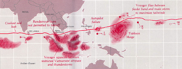
Chapter 8, Map Generalization and Classification, annotates the Voyager map in terms of the generalization concepts of selection, dimension change, simplification, smoothing, displacement, and enhancement:

Chapter 9, Map Symbolization, annotates the map in terms of the visual variables: shape, size, color hue, color value, color intensity, and texture:

Chapter 10, Words on Maps, annotates the Voyager map with regards to typographic variables including typeface, type form, type weight, and type size:

I have a few ideas for additional annotated Voyager maps (such as a full color map) which I hope to cobble together in the future. If you have any other ideas for variations that might be useful or interesting, let me know.
More Principles of Map Design
Posted in 02 Why Are You Making Your Map?, 06 Map Layout, 07 Hierarchies, 08 Generalization & Classification, 09 Map Symbolization, Deep Map Thoughts, tagged Cartographic Design, Cartography, Design, Design Principles, Hate Group Maps, Map Design, maps, Run Over Children Maps, Terror Maps on February 5, 2008| 17 Comments »

Making maps is rife with rules. But following rules does not necessarily produce a great (or even good) map. It may be the implementation of broader design principles that leads to a successful map.
Principles are an intellectual generalization of a broad field of knowledge: a kind of map, in the broadest sense of the word.
They are useful for guiding map makers and helping map users understand how maps work.
There are numerous sets of cartographic design principles. My previous post on Edward Tufte distilled six map design principles (or commandments as I called them) from Tufte’s first book, The Visual Display of Quantitative Information.
In 1999 the British Cartographic Society’s Design Group proposed “Five Principles of Cartographic Design.” When I first came across this set of principles I thought them interesting – even a bit passionate – a rare state of affairs in the often stoic world of cartography. I added a few maps and my own comments (in italics).
More on these map design principles below: Concept before Compilation, Hierarchy with Harmony, Simplicity from Sacrifice, Maximum Information at Minimum Cost, and Engage the Emotion to Engage the Mind.
Cool maps below include: Geo-Smiley Terror Spree Map, The Continents and Islands of Mankind, Hate Groups and Hate Crimes Map, and Where Commuters Run Over Black Children, Detroit 1968.
(more…)
How Useful is Tufte for Making Maps?
Posted in 06 Map Layout, 07 Hierarchies, 08 Generalization & Classification, 09 Map Symbolization, 10 Type on Maps, 12 Finishing Your Map, Map Books on August 16, 2007| 21 Comments »
Edward Tufte’s The Visual Display of Quantitative Information (1998, 2nd edition 2001) is a classic book, arguably his best, and certainly a key text in the field of information graphics (which encompasses cartography). I know some cartography courses use the book as a text.
I recall being inspired by the book as a neophyte cartographer back in the late 1990s.
The book looked great: its design communicated the importance of design (when most other cartography and information graphics books were clunky and poorly designed). The tone was serious and high-minded: I was designing information graphics. And I think I absorbed Tufte’s minimalist design philosophy, although cartographic design, at least the way I learned it, was largely minimalist, with no allowance for flourish, fake 3D embellishment, or other chartjunk (or “map-crap” as I call it in the Making Maps book).
While I won’t impugn the importance of lofty inspiration, I did wonder what kind of practical guidelines I could derive from Tufte’s book. You know, specific stuff that would help me to design and make better maps. I sat down one day and made a list of Tufteisms from the book: that list is below.
These Maps Tell Lies!
Posted in 05 Geographic Framework, 08 Generalization & Classification, Map History on July 12, 2007| 1 Comment »
I was catching up on back issues of the magazine The Independent (the May 22, 1920 issue) and came across this historical tidbit entitled “These Maps Tell Lies.”
“An absolutely accurate and truthful map can be used in skillful hands to mislead the unwary. Only the crudest propagandists will distort his facts; it is far better to take the facts as nature gives them and present them in such a way to convey a false impression.”
Map Police Review: the MLA Language Map of the US
Posted in 03 Mappable Data, 04 Map-Making Tools, 08 Generalization & Classification, 12 Finishing Your Map, Map Police on July 9, 2007| 1 Comment »
The proliferation of mapping sites on the web provides ample fodder for critique by the map police (cartographic insiders). I usually feel a bit bad whining about the cartographic limitations of such sites. Cartographers have a history of obsessing with rules and such obsession has, arguably, limited creativity and undermined innovations. Bad cop. However, not following the rules does not necessarily produce creative and innovative mapping. I, for one, don’t entirely enjoy being the map police, but will try to at least be a good cop.
Lets look at a site that has been around awhile: The Modern Language Association’s Language Map. The site allows you map language data collected in the 2000 U.S. Census. A nice focused site with interesting data (I use it in my classes and the students enjoy pondering the patterns): here is the default map of the total number of language speakers in each county:
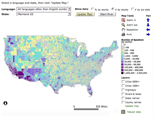
The basic language map allows you to view 33 different languages, mapped by county in the U.S. The total number of people who speak a particular language (above) can be mapped, but mapping totals can be deceptive, as the sizes of the counties vary. Thus a county may have more speakers of a particular language just because it covers more area than a smaller county. To account for these variations in county size, map the data as a percentage (the percent of people in a county that speak a particular language, see below). But you can map totals and there are sometimes good reasons to do so. Just realize the potential limitations of what you are seeing.
