Feeds:
Posts
Comments

Archive for the ‘13 Multimedia Mapping’ Category

rethinking_cover

Lukewarm off the presses, a tome chock full of lofty thoughts on maps and mapping. The blurb about Rethinking Maps, edited by Martin Dodge, Rob Kitchin, and Chris Perkins (Routledge 2009), sez:

Maps are changing. They have become important and fashionable once more. Rethinking Maps brings together leading researchers to explore how maps are being rethought, made and used, and what these changes mean for working cartographers, applied mapping research, and cartographic scholarship. It offers a contemporary assessment of the diverse forms that mapping now takes and, drawing upon a number of theoretic perspectives and disciplines, provides an insightful commentary on new ontological and epistemological thinking with respect to cartography.

A useful overview of what typically gets called “critical cartography,” with a few other voices of reason mixed in.

Denis Wood and I contributed a chapter, a comic with plentiful notes (for those who can’t figure out the pictures). I linked our chapter below, but it works much better as a printed comic.  I have about 10 paper copies, and can mail them to the first 10 people that email me (jbkrygier@owu.edu). Include a mailing address!

Debates rage, and tussles erupt, over the question…

kupperman2

Serious enough, I guess, to be included in a tome of high academic scribblings.

The editors have made the introductory and concluding chapters available as PDFs. Those too are linked below.

The book is expensive ($129.95!) and sales will mostly be to libraries. Check a copy out of your favorite library (or ask for it via inter-library loan) or email the author of a chapter you are interested in and ask if they are willing to share a copy.

Chapters in Rethinking Maps include:

1. Thinking about Maps (360k PDF) (Rob Kitchin, Chris Perkins and Martin Dodge)

2. Rethinking Maps and Identity: Choropleths, Clines and Biopolitics (Jeremy W. Crampton)

3. Rethinking Maps from a more-than-human Perspective: Nature-society, Mapping, and Conservation Territories (Leila Harris and Helen Hazen)

4. Web mapping 2.0 (Georg Gartner)

5. Modelling the Earth: A Short History (Michael F. Goodchild)

6. Theirwork: the Development of Sustainable Mapping (Dominica Williamson and Emmet Connolly)

7. Cartographic Representation and the Construction of Lived Worlds: Understanding Cartographic Practice as Embodied Knowledge (Amy Propen)

8. The 39 Steps and the Mental Map of Classical Cinema (Tom Conley)

9. The Emotional Life of Maps and Other Visual Geographies (Jim Craine and Stuart Aitken)

10. Playing with Maps (Chris Perkins)

11. Ce n’est pas le Monde [This is not the world] (2mb PDF) (John Krygier and Denis Wood)

Here is an easier to read PDF version of Ce N’est Pas le Monde.

12. Mapping Modes, Methods and Moments: A Manifesto for Map Studies (556k PDF) (Martin Dodge, Chris Perkins and Rob Kitchin)

Read Full Post »

soundvars-crop.jpg

Quite a few years ago I wrote an overview article on the use of sound for representing geographic data, including a series of sound variables for mapping I developed. The article was titled “Sound and Geographic Visualization” and was published as a chapter in the now out-of-print book Visualization in Modern Cartography (MacEachren & Taylor eds., 1994).

Sound is used to convey information all the time, but less so in the realm of mapping where the visual dominates. The article explores the possibilities of making maps with sound, or using sound in tandem with a visual display to add additional layers of information.

Some work on tactile mapping had had occurred at the time the article was published, as well as a few dozen articles on sound for representing data in general (not geographic data). Subsequently, research on multi-sensory mapping has expanded but not as much as I expected. We still can’t hear data with Google Earth.

For an updated bibliography of related work, see the articles and books that cite “Sound and Geographic Visualization” at Google Scholar.

The article is below as originally published. It holds up ok, although technology has changed quite a bit.

••••••

Denis Elder emailed me (Feb 6, 2012) and asked about the “manuscript videotape” cited in the paper below. The video was made to accompany my 1993 Association of American Geographers (AAG) conference presentation on using sound with maps. Back then, showing the examples (which were created with the software Director on a Mac) live at the conference would not have been easy, so I made a video of the maps being used (and making sounds). This presentation was an early form of the work that would be published as “Sound and Geographic Visualization.”

I managed to find the video and had our media center create a digital version (in Quicktime / .mov format).

The video and the notes for the presentation (“Mapping with Sound”) are below. This is old stuff, so don’t laugh!

“Mapping with Sound.” (PDF) Presented at the 1993 Association of American Geographers Conference, Atlanta, Georgia.

“Mapping with Sound.” (Quicktime Movie, 9 minutes, 84mb) to accompany paper. Explanation of this video is in the above PDF of the paper presented at the conference. If sound does not work try the .m4v version (below).

“Mapping with Sound.” (.m4v Movie, 131.6mb). Same as above, different movie file format.

And, least and last, the 1991 seminar paper (For Mark Detweiler in Psychology 597a) that served as the basis of the Sound and Geographic Visualization book chapter: “An Elemental Approach to Animation and Sound in Information Graphics” (PDF, 1mb)

••••••

Sound and Geographic Visualization

“Who the hell wants to hear actors talk?”

Harry Warner on being confronted with the prospect of the sound movie.

Introduction

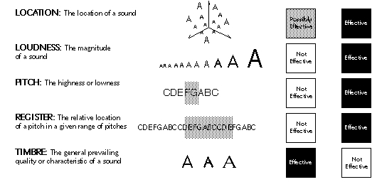
The issue of sound in the context of visualization may at first seem incongruous. There is, however, evidence to support the claim that sound is a viable means of representing and communicating information and can serve as a valuable addition to visual displays. Abstracted two-dimensional space and the visual variables – the traditional purview of cartography – may not always be adequate for meeting the visualization needs of geographers and other researchers interested in complex dynamic and multivariate phenomena. The current generation of computer hardware and software gives cartographers access to a broadened range of design options: three-dimensionality, time (animation), interactivity, and sound. Sound – used alone or in tandem with two-or three-dimensional abstract space, the visual variables, time, and interactivity – provides a means of expanding the representational repertoire of cartography and visualization.

This chapter discusses the use of realistic and abstract sound for geographic visualization applications. Examples of how and why sound may be useful are developed and discussed. Uses of sound in geographic visualization include sound as vocal narration, as a mimetic symbol, as a redundant variable, as a means of detecting anomalies, as a means of reducing visual distraction, as a cue to reordered data, as an alternative to visual patterns, as an alarm or monitor, as a means of adding non-visual data dimensions to interactive visual displays, and for representing locations in a sound space. The chapter concludes with research issues concerning sound and its use in geographic visualization.

Experiencing and Using Sound to Represent Data

Our sense of vision often seems much more dominant than our sense of hearing. Yet one only has to think about the everyday environment of sound surrounding us to realize that the sonic aspects of space have been undervalued in comparison to the visual (Ackerman 1990, Tuan 1993). Consider the experience of the visually impaired to appreciate the importance of sound and how it aids in understanding our environment. Also consider that human communication is primarily carried out via speech and that we commonly use audio cues in our day to day lives – from the honk of a car horn to the beep of a computer to the snarl of a angry dog as we approach it in the dark (Baecker and Buxton 1987).

There are several perspectives which can contribute to understanding the use of sound for representing data. Acoustic and psychological perspectives provide insights into the physiological and perceptual possibilities of hearing (Truax 1984, Handel 1989). An environmental or geographical perspective on sound can be used to examine our day to day experience with sound and to explore how such experiential sound can be applied to geographic visualization (Ohlson 1976, Schafer 1977, Schafer 1985, Porteous and Mastin 1985, Gaver 1988, Pocock 1989). Understanding how sound and music is used in non-western cultures may inform our understanding of communication with sound (Herzog 1945, Cowan 1948). Knowledge about music composition and perception provides a valuable perspective on the design and implementation of complicated, multivariate sound displays (Deutsch 1982). Many of these different perspectives have coalesced in the cross-disciplinary study of sound as a means of data representation, referred to as sonification, acoustic visualization, auditory display, and auditory data representation (Frysinger 1990). Within this context both realistic and abstract uses of sound are considered.

(more…)

Read Full Post »

lat_long_globe.jpg

Maps and cartography are not particularly popular as song themes.

But there is the Longitude and Latitude Song (MP3 file here). Careful or you’ll be singing this one out loud in your cubicle.

Performed by Tom Glazer and Dottie Evans, and written by Hy Zaret, the song is one of a series of sciency tunes, aimed to inspire Sputnik-era kiddies, on the Space Songs album, recorded in 1959.

Jeff Poskanzer’s terrific Singing Science web page has all the tracks from Space Songs, as well as the tracks from subsequent albums Energy and Motion Songs (“Ultraviolet and Infrared”), Experiment Songs (“We Know the Air is There”), Weather Songs (“The Water Cycle Song”), Nature Songs (“Song of the Rocks”), and More Nature Songs (“What is an Animal”).

Absent from the albums are other potential map songs: “Which Datum Do You Use?” “Project Me,” “The Large Scale/Small Scale Polka,” “Your Love is like a Decorative Font,” “She’s Natural Breaks, I’m Quantiles,” and “The Symbols of my Love are Abstract Shapes in a Selection of Different Hues Corresponding to Qualitative Data Variation.” I’ll stop now.

A quick search of a few open-source music databases (FreeDB and MusicBrainz) results in hundreds of songs with map in the title. Not many latitude/longitude songs, though. There are also quite a few mappy band names: The Maps, Swell Maps, Maps and Diagrams, Maps of the Heart (blah!), Maps and Atlases, Relief Maps, The Plat Maps, Map, Map of Wyoming, Map of the World, Town Map, The Map, Map of Africa, Map of Hell, Penguin Map Mijinko, The Search Map, Book of Maps, Minus a Map, Map the Growth, Map of July, Days without Maps, Mind Maps, Maps of Norway, and Not on the Map.

The potentially evil, formerly-open-source music database Gracenote has a moderately interesting Music Maps page, which uses recent CD lookup data to map the geography of popular music.

And, of course, the excellent World Beat Music map of the world over at Strange Maps.

Latitude/longitude graphic from David Greenhood’s classic book Mapping.

Read Full Post »

bomb-multiple.jpg

Google’s My Maps allows the easy creation of pseudo map mash-ups, where you can map your own data as points, lines, and area symbols with Google Maps as the background.

I wrote about My Maps – basic how-to and some of its limits – in another blog post, Allelopathic Maps & Google’s “My Maps.” One of the My Maps limits, the inadequate and corny set of available map symbols, has been removed: you can now create and use your own map symbols in My Maps.

To work with My Maps you need a Google account, and to use custom symbols (icons, as Google calls them) you need some server space to upload your symbols: you must provide a URL to the symbols. You should be able to find a free web hosting service that allows hot-linking (the placement of an image hosted on the free site in a My Maps map in this case). You can also embed images in the pop-up balloon associated with points, lines, and areas on My Maps, and you need server space to host those files.

In Custom Icons for Your Maps, a posting on the official Google Earth/Maps blog, PNG files with transparent backgrounds are recommended, although JPG and GIF should also work. PNGs and GIFs can have transparent backgrounds, essential if you don’t want a white box surrounding your symbol. As Google says PNG, lets PNG.

(more…)

Read Full Post »

animatedchoro.gif

Google Earth can display geographic data with a time component, and thus show animated maps. Animated mapping has garnered much attention among cartographers in the last decade.

I created a few Google Earth animated choropleth (literally, area-filling) maps of population change in Ohio. One map shows total population by county from 1900 to 2006. The other shows percent population change from decade to decade. Details on how I created these animated maps along with links to the downloadable KMZ files are below.

(more…)

Read Full Post »