Feeds:
Posts
Comments

Archive for the ‘Deep Map Thoughts’ Category

Matthew H. Edney. Cartography. The Ideal and Its History. xiii + 309 pp., figs., bibl., index. Chicago: The University of Chicago Press, 2019. $30.00 (paper), ISBN 9780226605685.


Matthew Edney @ USM

Matthew Edney @ Mapping As Process


Google Books Book Information

University of Chicago Press Book Information

Amazon Book Information


Book Review by John Krygier published in Isis: A Journal of the History of Science Society—Volume 111, Number 1, March 2020 (pp. 207-208)


There is no such thing as cartography, and this is a book about it. (p. 1)

Matthew Edney’s Cartography: The Ideal and its History provides a necessary corrective to the normative ideal of maps, mapping and the field of cartography. While of interest to scholars in the history of cartography, Edney’s book is just as important to the growing number of scholars whose research engages maps and mapping as part of diverse studies of culture, society and human history. Cartography: The Ideal and its History details problematic assumptions about maps, mapping and cartography, but it’s the creative potential of Edney’s book that’s most notable. As untenable assumptions are discarded, new insights emerge, insights which have the potential to greatly expand our understanding of maps and mapping across many different studies and disciplines.

Edney’s Cartography is situated in the intermingled fields of the history of cartography and critical cartography with touchstones including The History of Cartography, Book 1, edited by J.B. Harley and David Woodward (1987), Harley’s “Deconstructing the Map” (1989) and Denis Wood’s The Power of Maps (1992). These works, and many that followed, undermined narrow definitions of the map and broadened our understanding of the cultural, social and political context of mapping. Edney’s work as editor of later volumes of the History of Cartography, extensive publications on maps from Europe, North America and India as well as critical cartography make him an ideal scholar to take on the ideal of cartography. He does so by characterizing the traditional study of maps and mapping as “a profound act of cultural misdirection.” Maps and mapping are more complex, nuanced and disjunct than the universalizing, idealized conceptions offered by modern cartography, a thesis strongly supported by Edney’s immersion in diverse historical maps and mapping practices.

The most appealing parts of Cartography: The Ideal and its History are the delineation of fourteen modes of Western mapping and an intellectual assault on cartography’s idealized preconceptions. These issues are addressed in the first third of the book, prefaced by a discussion of the ideal and its limitations. Mapping modes include place, urban, property, engineering, chorographical, cosmographical, geographical, marine, celestial, boundary, geodetic, analytic, and overhead imaging. The concept of modes shifts focus away from a singular, idealized map (and map making process) to distinct (but evolving and interrelated) map types and processes that are better understood free of the narrow, idealized context within which they are typically situated. Cartography’s idealized preconceptions include ontology, pictorialness, individuality, materiality, observation, efficacy, discipline, publicity, morality and singularity & universality. In each case, Edney describes, critiques, and offers alternatives to these preconceptions. With the concept of mapping modes and critique of preconceptions in place, an intellectually sophisticated, nuanced and creative understanding of maps and mapping processes can play out.

Chapter 4, The Ideal of Cartography, details the construction of cartography as “a modern myth.” The chapter weaves in references to mapping modes and idealized preconceptions. One is left, upon finishing this chapter, with a history of the construction of modern cartography as well as an understanding of its limitations. Chapter 5 critiques the idealized geometry at the heart of modern cartography, specifically map scale. Much like maps and cartography in general, it is easy to naturalize map scale. This chapter, like the rest of the book, brings a sense of unease: many seemingly natural aspects of our common understanding of cartography are carefully constructed myths.

Cartography: The Ideal and its History is scholarly, well-written and a significant contribution to the history of science. It covers some ground explored by other recent scholars (including Matthew Wilson’s 2017 New Lines) but with a stronger footing in historical scholarship. Edney’s mapping modes and idealized preconceptions provide actionable ideas which are often lacking in critical cartography literature. It’s not clear, however, if Edney’s work will have much of an impact on modern mapping practitioners (cartography, geographic information systems, Geospatial technology) or academics in these technical fields. The myth of cartography is, if anything, functional and serves the needs of particular people and groups (property ownership, the military, government bureaucracy, business, etc.). Online mapping and navigational tools, such as Google Maps, are rife with problems (such as the inclusion of fake businesses that generate income for Google and for companies who pay to have these businesses on the map). Alas, people find such services useful and don’t really think the maps and information they engage with are anything other than an image of the real world. At the very least, scholars should not fall into the same trap: Matthew Edney’s Cartography: The Ideal and its History provides a corrective, a reimagined intellectual framework for maps and mapping that will, when engaged and operationalized, greatly broaden our understanding of the wondrous array of inscriptions and practices we call maps and mapping.

John Krygier

Professor of Geography
Ohio Wesleyan University

Delaware, OH. 43015

jbkrygier@owu.edu

Read Full Post »

mm_trumpcover

Read Full Post »

tumblr_nbwxfcQ9jZ1tga8o1o1_1280


Review by Denis Wood of
Katherine Marsh. Nowhere Boy (Roaring Brook, New York, 2018)
Glenda Garelli, Federica Sossi & Martina Tazzioli. Spaces in Migration: Postcards of a Revolution (Pavement Books, London, 2013).
James Cheshire and Oliver Uberti. Where the Animals Go: Tracking Wildlife with Technology in 50 Maps and Graphics (Norton, New York, 2017)


Where? Nowhere

One of them doesn’t exist.

What could that mean, doesn’t exist? Clearly he exists. He has flesh. He has bones. What he doesn’t have are … papers. Which is another way of saying … any rights. No rights. This is to say that spatially he has no right to exist where he does. Where he does? What could that possibly mean? Where else except where he is could he exist?

Well, nowhere, obviously. So this must mean something else. But it’s hard to say what. The boy we’re talking about is Syrian, which is to say that he was born in Syria and until recently lived there. Now he’s in Brussels, in the corner of a basement in a house whose other inhabitants don’t know he’s there. He comes out at night to filch a little food but is very quiet because if they knew he was there they’d turn him over to the authorities who would lock him up. Or send him back to Syria which he’d fled because of the war there. He had the right to be in Syria, but no way to be in Syria. He has a way to be in Brussels, but no right to be there.

Rights don’t seem to be very strongly connected to the way things are, to the actual state of things.

Rights are permissions granted to people by others. To say that the boy – his name is Ahmed – had no right to exist in Brussels is to say that those around him hadn’t given him permission to exist there. Well, this isn’t quite right either. Max had. Max was another boy living in the house, one who did exist, who did have a right to be there. A partial right. His family had moved there from Washington when his father was posted to Brussels. Max finds, he ferrets out Ahmed in the basement. The two become friends and Max abets Ahmed’s secret life in the house.

Fig 1 Nowhere Boy cover

The boys are characters in Katherine Marsh’s Nowhere Boy (Roaring Brook, New York, 2018), a young adult novel about the refugees coming to Europe, these days through the desert and across the seas. Those fleeing to Europe are fleeing war and destitution and tend to be Muslim, which is pretty stigmatized in Europe. These people are not wanted, even in countries that desperately need their labor, like Hungary. Ironically Ahmed and Max end up in Hungary, in Kiskunhalas, near its border with Serbia, where Ahmed’s father is in detention. It’s a young adult novel, so it ends well. But until it does, Ahmed “didn’t want to go anywhere anymore. He felt safer being nowhere.”

Which is what not existing means: it means being nowhere.

Being nowhere means you can’t be plotted to a map. Not existing, being nowhere, and being unmappable are all vaguely synonymous. Of course they’re abstractions. One flesh and blood body can annihilate them all. Which is what Ahmed’s body did, violated the abstractions, rendering him existent, there, and mappable. This is also what the Tunisians from Lampedusa in Paris did when they occupied 51 Avenue Simon Bolivar, hanging out a banner that read, “Ni police, ni charité. Un lieu pour s’organiser.” Which is to say, “No police, no charity. A place where we can organize.” A place. They wanted a place which, nowhere, nonexistent and unmappable, they didn’t, they couldn’t have. What they had, two days later, were police, plenty of them, who forced them back onto the streets and so rendered them, once more, nonexistent, nowhere, and unmappable.

Fig 2 Spaces in Migration cover

These were the harraga, “those who burn.” Meaning both “young people who ‘burn’ frontiers as they migrate across the Mediterranean sea and those who are ready to burn their documents (but also their pasts and eventually their lives).” The words are those of Paola Gandolfi from her “Spaces in Migration” in Glenda Garelli, Federica Sossi and Martina Tazzioli’s Spaces in Migration: Postcards of a Revolution (Pavement Books, London, 2013). “Spaces in migration” is an ambiguous phrase, implying both spaces moving in the process of migration (for example, the spaces moving with the migrants’ bodies) but also the spaces emerging in the process of migration (like 51 Avenue Simon Bolivar, like the detention facilities on Lampedusa). Either, or both of these taken along with the burning of frontiers and the burning of documents can melt the solidities, the certainties, of the contemporary system of nation-states.

Which are, after all, bounded places (states) with a population that is more or less culturally coherent (nations). There may be no true nation-states these days, given the bewildering range of peoples that live in even the smallest of them (Abkhazia, for example), but there are states galore, with ever more jealously guarded borders.

When these are “burned” by harraga it’s as though a body were being wounded, anything might get in, there would be no integrity, the body could come apart. So when the Tunisians started crossing the Mediterranean for France and reached Lampedusa, a minute island midway between Sfax, in Tunisia, and Malta, from which, thanks to a permit granted by the Italians, they were able to travel freely through the Schengen Area, you’d think the whole African continent was attempting to pour into Europe. The few thousand who initially reached Lampedusa, well, Lampedusa is small. It’s not eight square miles. But still, the first few thousands that arrived immediately aroused a language of Biblical proportions, of natural disasters: plagues, floods, tsunamis, simply overwhelming numbers which, in fact, didn’t amount to single thousandth of a single percent of the even the Italian population. Even in August when the number did reach fifty thousand it was still inconceivably small.

You’d think a dagger was being driven into the Italian, into the French heart.

The French closed its border with Italy. There was no way they were letting all these Tunisians into la patrie, despite their own earlier colonization of Tunisia. The French into Tunisia? Certainly. (And they didn’t give it up until 1956). But Tunisians into France? Unthinkable! To say nothing of the Libyans, who with their numbers soon revealed how few the Tunisians had been, the Eritreans, the Senegalese, the Syrians … All barely existent nowhere people on the move …

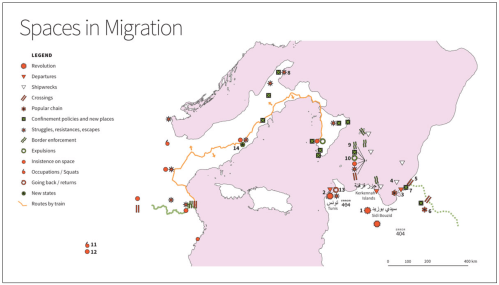
Fig 3 Spaces in Migration MAP

The map here may confuse some people. For one thing, north is to the left of the map. For another we’re not used to seeing this piece of the Mediterranean, turned this way, at this scale. Tunisia is in the lower right. That’s Libya above it. Lampedusa is the dot from which the items labeled 9 and 10, among others, are emanating. Paris is indicated by 12. Be that as it may, it’s astonishing how tight everything is, how close, how these two continents so firmly separated by Mohammed and Charlemagne almost kiss, even here in the middle of the sea. Lampedusa has kin, Linosa and Lampione. You can even see Tunisia from Pantelleria (it’s only 37 miles away). Despite this the rhetorical distance separating Europe and Africa remains all but uncrossable.

For the undocumented burning their way across it is crossable, but only as long as they remain nonexistent, nowhere, and unmappable. The problem is, “You start to get hungry, you smell and you only have one pair of jeans to wear. You never take your shoes off and your feet hurt. You call home, not too often, to let them know you are still alive but you do not speak of your insistence on space, and sometimes you start to think about returning. You even go as far as to insist on consulate offices to try to work out how to get home. But you burnt a border when you left on a boat, one that won’t allow you to burn it again on the return journey.” This comes from Garelli, Sossi, and Tazzioli’s “Postcards of a Revolution,” the conclusion to their book (it’s also online here). This is as close as you can get to despairing without actually giving up.

Fig 4 where the animals go cover

Placeless: often this is to say on the move, and since in motion, unmappable, wherever they may happen to be. It’s hard to map things in motion. All the ways we’ve developed are workarounds. Some of the best of these are captured in the recent book, Where the Animals Go: Tracking Wildlife with Technology in 50 Maps and Graphics (Norton, New York, 2017) by James Cheshire and Oliver Uberti. Like Ahmed in Brussels, like the Tunisians in Paris, animals too are undocumented, and like Ahmed and the Tunisians they too burn borders without hesitation. If they’re even aware of them.

Select maps from our new book, Where The Animals Go

Take Slavc, a young wolf from the mountains on the Croatian-Slovenian border. He left his maternal pack and struck out on his own, crossing motorways and major rivers, navigating the Dolomites in the middle of winter and the suburbs of Verona; moving from the Dinaric Alps, across the Drava into the Alps, and so from Slovenia into Austria, and into and through the Dolomites, which is to say into Italy, before settling in the upper plateau of Monte Lessini. Slavc leaves Croatia, crosses Slovenia and Austria, and slips into Italy, all without so much as a by-your-leave from a single border agent. Of course he’s not a human so … who cares?

That he’s visible at all is because he’d been radio collared by a University of Ljubljana conservationist who tracked his GPS transmissions. The collar sent about seven locations a day, allowing Hubert Potočnik to interpolate the rest of Slavc’s movements. Mostly he moved at night, more like Ahmed than the Tunisians. He didn’t kill a domestic animal until he reached the outskirts of Verona, so if he hadn’t been radio collared he would have been completely invisible.

The carnivore at the top of the food chain is less easily hidden and, when seen, needs to be able to exhibit papers. The simmering European refugee “crisis” has led to an armoring of border and after border, including the one in the Dinarics that Slavc crossed between Croatia and Slovenia. The Dinarics are home to many animals that now move freely across the Slovenian and Croatian border, wolves, obviously, but also, among the collared, lynx and bears. The borders that impede the movement of Syrians and Eritreans also impede and usually preclude the movement of all the larger mammals. Impenetrable barriers are horrifying intrusions into their lives and genetically disastrous.

But what is this terror of the mobile? Only that it implies the fragility of the police states into which most modern states have evolved. Is there any that lacks its apparatus of control, its mechanisms for identifying, tracking, apprehending and expelling any it stigmatizes as unwelcome? It has less success with wolves, with storks, with whales but only because, inhuman, they’re less subject to scrutiny. As we have seen this has its downside: unintended control by barriers meant for humans. How many animals moving back and forth across the US-Mexico border will be trapped on one side or the other by Trump’s wall? How many will have their ranges severed? How many will be separated from their families?

I think it’s easy enough to answer, “Enough, enough will be separated from their families,” just as Ahmed was separated from his, as the Tunisians were separated from theirs, as animals around the world are separated from theirs.

Why do we even care where any of these are?

Isn’t it enough to know where we are? And when you stop to think about it, isn’t that hard enough?

Read Full Post »

tumblr_mscvwcjGpm1qz6f9yo1_1280

Mapping Deeply by Denis Wood

This is a description of an avant la lettre deep mapping project carried out by a geographer and a number of landscape architecture students in the early 1980s. Although humanists seem to take the “mapping” in deep mapping more metaphorically than cartographically, in this neighborhood mapping project, the mapmaking was taken literally, with the goal of producing an atlas of the neighborhood. In this, the neighborhood was construed as a transformer, turning the stuff of the world (gas, water, electricity) into the stuff of individual lives (sidewalk graffiti, wind chimes, barking dogs), and vice versa. Maps in the central transformer section of the atlas were to have charted this process in action, as in one showing the route of an individual newspaper into the neighborhood, then through the neighborhood to a home, and finally, as trash, out of the neighborhood in a garbage truck; though few of these had been completed when the project concluded in 1986. Resurrected in 1998 in an episode on Ira Glass’ This American Life, the atlas was finally published, as Everything Sings: Maps for a Narrative Atlas, in 2010 (and an expanded edition in 2013).

Deep maps, deep mapping…

Yes, yes, but such a strange name for the practice. A practice that so often delivers far, far less than it promises. Especially maps. So many instances of deep mapping lack any at all.

Why mapping? Why not…thick description? Oh. Maybe because deep mapping is about place, while thick description is about…behavior? But aren’t the two all mixed up together? Isn’t that what deep mapping is supposed to be about—at least one of the things it’s supposed to be about—the unfolding of human life here, the mutual relations of people and soil and plants and animals and…go on, you name it…here in this…place?

Well, obviously I’m just trying to figure out why they call it deep mapping, when mapping isn’t what they are about, at all. They’re storytellers mostly, which is great, but mostly they’re not mappers. I’m talking about almost all of them, from William Least Heat-Moon to the most recent anthology of work on spatial narratives.

Not that you can’t tell stories with maps. You can. In fact, every map tells a story, stories actually, many of them. Even maps that people who don’t know much about maps call thin maps tell stories, ordinary, taken-for-granted maps, like highway maps, like the state highway map of North Carolina that John Fels and I spent fifty pages writing about back in 1986, and whose surface we barely scratched [1,2]. Thin maps…

Maps are models of concision, especially the ordinary taken-for-granted ones, cramming so many layers—so much history—into each line, into this line, for instance, this county border, the border of Wake County, first drawn in 1771 when the county was laid out of from parts of previously existing counties, but redrawn in 1787, 1881 and 1911, and named after Margaret Wake in 1771, the wife of William Tryon, then the colonial governor of North Carolina. All of this and so much more are caught up in that line that looks so simple but is anything but. And there’re a hundred counties on this highway map of North Carolina, which also sports state borders, coasts, highways, roads, cities, towns, parks, reservations, military bases, forests and other things. This map is not simple, this map. It’s not thin. It’s deep and thick. Most maps are like this.

A lot of them wield power too, great power. We think about maps as being representations of the world, but they’re not. They’re arguments about the world, and many of these arguments are serious. “High court to hear map challenge in August” reads the headline to an article on the second page of yesterday’s News and Observer [3]. A couple of days earlier, the lead editorial had been headed: “Rule on maps: the N.C. Supreme Court must quickly resolve a challenge to redistricting maps.” [4]. These maps are about who gets to vote in which districts, that is, are about whether Democrats or Republicans will reign in state government. This has huge consequences for the distribution of wealth, education, health, you name it.

Let’s not even think about the problems with immigration caused by the lines called national borders; or about the lines that bound school districts.

Some have more power than others, but all maps have it.

1. My Fight with Maps

My fight with maps, actually with cartography, was ignited by their rejection of modernism. As modernism was noisily turning its back on the failed rationalities, on the empty harmonies, on the make-believe coherences of Enlightenment, of Victorian thinking, cartography was clutching them ever more tightly to its breast. Painters may have been deconstructing pictorial space, composers shredding inherited tonalities, architects stripping walls of pilasters, cornices, and dentil moldings, poets following Pound’s cry to “Make it new”, and novelists indulging a self-consciousness that was all but the hallmark of the age, but cartographers, they were content to hone, to polish, to extend inherited forms.

Cartography exalted its unreflective empiricism as its raison d’être. It cherished the graphic conventions it had laid down in the 19th century. Even today, few maps acknowledge the 19th century’s over. This, despite the fact maps were never what they were claimed to be, never what the map themselves claimed to be: veridical and value-free pictures of reality. They were always arguments about the way the maps’ makers—or about the way those who paid the maps’ makers—thought the world should be.

With modernism came a predisposition for resistance and smashing traditional forms, for going someplace stripped down, someplace essential, someplace real, for asking, Why not? I long felt around for a new map that wasn’t of the same old subjects, that didn’t have the same old forms, that looked and felt modern. Schoenberg wanted to emancipate the dissonance. Arp wanted to destroy existing modes of making art. Fifty years later, I wanted to destroy the existing ways of making maps through which millions were subjugated, herded, and all too often killed. I wanted to emancipate dream and desire as subjects of the map.

Hard to do in geography: it was nearly as hidebound as cartography.

But when I found myself teaching landscape architecture studios in the School of Design at North Carolina State University, I found my opportunity. I knew nothing about landscape architecture. I knew less about studios, about how they worked, about what they were supposed to do. However, I figured landscape architects needed to know something about the environment in which they were working, and I figured that making maps might be a good way to learn—to discover—what it was they needed to know. So I set the first studio I taught—well, I set the students—the task of mapping a nearby neighborhood. The thing was, these were design students. They were undergraduate design students.

They had had little professional training (they weren’t hidebound). They were wildly creative (which is why they had entered the School of Design). They knew nothing about the conventions of making maps (they were blank slates). So when I set them tasks like mapping sounds, or making maps from the perspective of bees, or constructing maps out of food they leaped at them like, like frolicking gazelles! They were all over these projects. They made the most amazing things.

I kept none of the maps. I mean, there were always more studios, more students, more maps. However, in a studio I co-taught with Robin Moore in the spring of 1982, we decided to make an atlas, a neighborhood atlas, an atlas we could reproduce on a copy machine, that we could distribute to the neighbors when we had finished. This meant the work had to make sense in black and white (in the early 1980s, color copy machines barely existed, and landscape architecture students loved to use colored markers), and it had to make sense to the neighbors (and so not be completely off-the-wall). This did not mean it had to be mapmaking the way these grad students had come to know it (and they were much more hidebound than the undergrads). That I was adamant about. But it didn’t matter what they were mapping: I couldn’t get them to leave the streets off their maps.

I was trying to get them to map the way the land smelled, the way it felt in their legs when they walked it, the way twilight made all the difference. I wasn’t sure what the streets had to do with any of these, but the streets were an irreducible subject in the eyes of these students, the whatever-it-was that made the neighborhood a neighborhood. If you’re going to be laying out subdivisions, which a lot of these students would be doing professionally, streets are really all you have to play with. I got that, but at the same time, the streets did seem to inhibit the other qualities I was trying to draw the students’ attentions to. No matter how far into the background they intended the streets to recede, somehow they always stood out front.

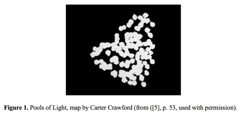
Then, once when we were working on a map of streetlights, we just kept paring away the non-streetlights. We dumped the map crap (the neat line, the scale, the north arrow), the neighborhood boundaries, and the topography. Finally, we dumped the streets: first the scaled streets, then a schematic grid of the streets, finally even a hint of a grid of the streets. Daylight went too—that default daylight that most maps take for granted—so that we were fooling around with circles of white on a black background. That’s when it became clear that the map wasn’t about lamp posts, but about lamp light, and light was something we weren’t sure how to deal with. Certainly, the uniform white circles we’d been drawing caught nothing of the way the light was fringed by the trees; and one night, armed with a camera, we scaled a fence and climbed a radio tower on the edge of the neighborhood hoping to catch the night lights on film. What a disappointment. The view from above was nothing like walking in and out of the pools of dappled light on the streets below. But I had a pochoir brush at home and when Carter Crawford—who had put himself in charge of atlas graphics—used it to draw the circles, it was magical (Figure 1). Nothing but blotches of white: that was the way it felt to be walking the streets at night.

Screen Shot 2015-08-11 at 10.35.14 AM

The usual “efficient” map would have located everything on the street onto a single sheet—that is, different marks for lamp posts, fire hydrants, street signs, trees. Our inefficient map concentrated on a single subject and rather than lamp posts, it brought the pools of light into view. No legend, no north arrow, no neat line, none of the usual apparatus. At last: a modernist feel! Maybe even a sense of poetry, something imagistic, a little like Pound’s “The apparition of these faces in the crowd;/Petals on a wet, black bough” [6] or Williams’s red wheel barrow, but as it might manifest on a map, a map attentive to the experience of place [7].

That’s when I knew we could write poems in maps. That’s when I began thinking seriously about a poetics of cartography.

2. Making Maps

Once we got to this point, we started wanting to map everything. …

…Continue reading & footnotes & sources: PDF of article (here) and at Humanities — Open Access Journal (here – full text link on upper left)

Read Full Post »

Cover of dissertation

André Luiz Mesquita’s dissertation (in Portuguese), Mapas Dissidentes: Proposições Sobre um Mundo em Crise (1960-2010), (Dissenting Maps: Propositions on a World in Crisis, 1960-2010), looks at the maps and diagrams of artists and activists from 1960 to 2010, all working in social, political, and economic contexts of crisis and change, conflict and various forms of resistance. He approaches the work of three generations of artists through an analysis of endless documents, catalogs, manifestos, articles, photographs, documentaries, art works, reproductions of maps, and interviews.

Mesquita begins by examining the games and maps created in the 1960s and ’70s by the Swedish-Brazilian artist, Öyvind Fahlström (1928-1976), made under the geopolitical tensions of the Cold War (1947-1991) and the structural and organizational changes in global capitalism of the 1970s.

Öyvind Fahlström's World Map

Öyvind Fahlström’s World Map

He then turns to the work of the American artist, Mark Lombardi (1951-2000), who, in the 1990s, mapped international power networks and obscure financial transactions involving banks, governments, and neoliberal elites.

Mark Lombard's World Finance

Mark Lombard’s World Finance

Finally Mesquita addresses the counter-cartography practices developed between the 1990s and 2010’s by three activist art collectives: Bureau d’Études (France), the Counter-Cartographies Collective (United States), and Iconoclasistas (Argentina). Based on the interrelations between contemporary art, political activism, and critical cartography, Mesquita holds that the work of these activists-artists has created a significant opposition to the “neutral and objective” maps made in the interests of corporate, governmental, and military bodies.

Bureau de'Etudes's Refuse the Biopolice

Bureau de’Etudes’s Refuse the Biopolice

•••••

Counter-Cartographies Collective's DisOrientation Guide

Counter-Cartographies Collective’s DisOrientation Guide

•••••

Iconoclasistas' Radiografía del Corazón del modelo sojero

Iconoclasistas’ Radiografía del Corazón del Modelo Sojero

What’s really exciting is the mining Mesquita has done, coming up with a range of map work that will surprise the causal observer of, say, Fahlström (in particular); but also the way he attaches all this work to that of antecedents (like the Surrealists and the Situationists) and parallels (as in the work of Trevor Paglen).

Structure of the dissertation's argument

Map of the Dissertation’s Argument

This is an important piece of work. Mesquita is currently working on a translation to English.

The full dissertation can be downloaded here or here (55.4 mb)

Contact André Luiz Mesquita

Read Full Post »

propaganda_press_evthss_1__shop1_185403

Denis Wood’s Everything Sings atlas in Korean via Your Mind.

propaganda_press_evthss_003_shop1_162248 propaganda_press_evthss_004_shop1_162248 propaganda_press_evthss_005_shop1_162249 propaganda_press_evthss_006_shop1_162249


What follows is the Google translation of the book description (from the Korean on this page). It captures, I am sure you will agree, some of what is special about the Atlas:

Everything Song: The Story of a map

Dennis Wood

Maverick academics and innovators of the American Geographical Dennis Wood is the North Carolina depicting a small town seem to run Heights creative guidance of various forms book.

How to create a map that Dennis Wood is unique unprecedented. He move, coming to North Carolina, he lived in a small town look run Heights overturns the traditional concept of cartography, and explore new perspective on the nature of this particular place and place itself. Each map is unseen, no one will pay attention not do, Turn your eyes to seem trivial. From radio waves to penetrate into the air until released by Hal reowin pumpkin on the porch, he made maps, nor have never let the fact that we did not know at things simply can not make such a map will find insights.

He most important thing is a map of the place of experience. In pursuit of poetry and ‘useless’ knowledge, this noble jimyeo year, aims to reproduce the sound of the world. We must appreciate and admire the beauty of the city map (詩) wrote to me at a map and start a new neighborhood, undergoes a change in the perception of how to read the map and the map in the process. So this book is about a neighborhood, and we piled the story of his gyeopgyeop about going out there trying to calm the place called ‘my neighborhood’ la.

We are looking to buy a new area, and in the effort to find a variety of means is happening in Korea. By exploring new geographic area to another time trying to cache the truth is hidden in the epidermis and the realities of the region. “Everything Song: Map of talking” is the one piece of creative map showing the iconic Atlas do not change the perception of the place.


Read Full Post »

LovelyLesserCover_150

Cover of Estelle H. Ries’ opuscule on a miscellany of “lesser arts.”

Estelle H. Ries. The Lovely Lesser Arts: Leather Making, Screens, Map Making, Silhouettes, and What To Do About Nudes (1948). Girard KS: Haldeman-Julius Publications (B-686).

••••••••••

Ms. Ries here situates makers of maps among other lesser artists – leather toolers, silhouette cutters, screen decorators, and carvers of ivory. Ries concludes her work with a few comments on the dreaded nude:

What to do about nudes, if anything, is always more or less of a ticklish problem. No matter how 20th-century we are or wish to be, some of us have inherited enough from the Mauve Decade, or have been surrounded by the traditions of Victorianism to such an extent, that the very word, Nude, is often veiled in whispers even if the object itself is veiled in nothing more than the atmosphere.

As for maps and their makers, Ries has many thoughts:

The first matters to be charted were direction and distance and these are still essential to every map. If you hear of that better place you can keep going until you get there if you but travel in the right direction. (p. 12)

Having north at the top of the map, we are used to the shapes of countries in this position. It would be the same world if we turned it upside down and had the south at the top, but try it once and you will see how unfamiliar and confusing it looks so. Yet the world is so upside down in most particulars right now, that perhaps it would be more true to print the maps that way after all. (p. 12)

In the jungles of Bengal they have a custom of breaking a branch from the wayside, and when it wilts it is considered that a krosh has been traveled. They do not realize that this varies with the season the type of tree from which the branch is taken, the speed of the walker or his idea of wilting! (p. 13)

One long-established concern publishing maps is in touch with all foreign governments through a branch office in Washington which contacts all the embassies. They consider a man in their cartography department an apprentice for the first three or four years of service which will give you a clue to the difficulty and importance of this type of work. (p. 15).

••••••••••

The full text of section III, “The Human Side of Map Making,” from The Lovely Lesser Arts is below. A PDF (13.3 mb) of the entire 30 page booklet is here.

••••••••••

III. THE HUMAN SIDE OF MAP MAKING

Once upon a time the nations of the world knew little or nothing of one another: The hazards of travel in an uncharted world prevented people from going far afield. What lay beyond the horizon? Who dwelt there? These questions were answered by silence or by mythical imaginings. But necessity and curiosity joined hands and impelled discovery of these unknown places. Which way to a better land? How far to more fertile ground? These questions were answered by a map.

The first matters to be charted were direction and distance and these are still essential to every map. If you hear of that better place you can keep going until you get there if you but travel in the right direction.

To get this sense of direction you must start from somewhere. Today maps have the true north at the top. This was not always so. The religious movements of the Middle Ages developed special reverence for the East. Paradise itself was represented on the maps and was supposed to be in the Garden of Eden, in the East. But Paradise was Heaven, and Heaven was above, so the East was at the top of the map and there it remained until the compass came along and displaced Paradise by pointing north itself.

Having north at the top of the map, we are used to the shapes of countries in this position. It would be the same world if we turned it upside down and had the south at the top, but try it once and you will see how unfamiliar and confusing it looks so. Yet the world is so upside down in most particulars right now, that perhaps it would be more true to print the maps that way after all.

A map is not earth size, of course, so that distances must be represented to a scale. Otherwise your map is too vague to have much use. It is harder to do this than to get direction because a knowledge of mathematics is needed both to measure distance on the ground and still more to show it on a map. In some parts of India a unit of measurement, the krosh, is given as “two statutory miles, more or less.” In the jungles of Bengal they have a custom of breaking a branch from the wayside, and when it wilts it is considered that a krosh has been traveled. They do not realize that this varies with the season the type of tree from which the branch is taken, the speed of the walker or his idea of wilting! Obviously mapmaking could not advance far until some facts of mathematics and astronomy could be applied. The best early maps came from Egypt, Babylon, China and Greece where these abilities first flourished.

The absence of such knowledge in most of Europe during the middle ages led the monks who made the maps never to leave any blank space on a map. To do so was an open confession of ignorance. They filled up all vacant areas with elaborate decorations-sometimes of fantastic creatures, or of legendary tales. Through the 18th century maps were decorative rather than practical, truly works of art, and are even now collectors’ items of rich beauty. Perhaps as an alibi to conceal their lack of accurate data, the idea was allowed to get around that accurate observations would be of value to trade rivals or enemies.

Of course, there were always some serious geographers who tried to promote accuracy in maps. Ptolemy, a famous Egyptian astronomer of the 2nd century, was first to draw the equator upon a globe and measure off the lines of latitude and longitude. Such lines, he explained, would locate any place on the map better than any amount of description. He also pointed out that a flat sheet of papyrus or paper would not fit around a sphere and that flat maps would involve too much distortion to be accurate. For a long time he pondered, “How can I show a map of the globe on a flat surface without too much distortion?” And then he had an idea. He took a cone and fitted a piece of papyrus around it tightly. It went on without any bulges, and when he took it off, it could be flattened out. He placed the cone, which was hollow, over the globe as far as the equator and drew his lines upon it. Then he took another cone going from the South Pole to the equator, and so invented the conical projection for flat maps. Ptolemy’s contributions to map-making were of great importance, but during the centuries new discoveries were made which were not on his maps. Moreover they had some inaccuracies of their own due to the unreliability of his sources, although his scientific methods were correct.

Mercator, a Flemish mathematician in the 16th century recognized the troubles with the earlier maps and decided to make something that would combine their advantages and remove their faults. Where Ptolemy used a conical projection, Mercator devised one based on a cylinder, and this solved the problems he had set himself.

The difficulties of making a map increase when we try to show on a flat surface the variations in height such as hills or mountains, yet their importance is too great to overlook. Mountains are not only a distinguishing physical characteristic of a region, but they affect rainfall and climate; they are the sources of rivers; they influence the amount of timber or the agricultural conditions; they serve as political boundaries and in many other ways. At first glance it would seem that the best way to show these would be on an actual model. However, models are costly to produce and cumbersome to handle, as they cannot be rolled, bound, folded or otherwise carried around conveniently. Most important, however, there has to be a different scale used for horizontal and vertical distances, else a relief model of the globe without such a difference would show little more in the way of relief inequalities than the skin of an orange. For example, Mount Everest is only 1/2000 of the earth’s diameter. On an 18-inch globe, it is estimated, it would be represented by less than 1/100 of an inch. Thus the highest mountain in the world wouldn’t even show!

A map combines the qualities of a picture and a book. Elevations of mountains or depths in water are depicted by forms of shading. A town is indicated by a dot, a road or river by a line. Codes of color can be employed, and other conventions are customary. The mapmaker must exercise some choice in the matter of naming places. He has to decide whether to use an American form of a foreign town or its native name, or one recently changed as an expression of national self-determination. Koln or Cologne; Dublin or Baile Atha Cliath? Praha or Prague; Munchen or Munich? This grows even more complex if the alphabet used by the natives is not related to a European one. There seems to be quite an assortment of spellings for the names of places in Persia (itself called Iran), China, India and other oriental lands. Maps should, of course, be clear and uncrowded, and the mapmaker should decide at the outset which kinds of things he must emphasize.

Of course, since Mercator’s Atlas appeared in 1585, mapmaking has grown continuously more scientific and accurate. The modern era of discovery and exploration does not consist in the vague adventuring by land and by sea which in a large measure constituted discovery up to the time of Captain Cook-and in some parts of the world long after that time. Today’s cartographers have precision instruments and theoretical knowledge far beyond any then in use. Mapping by airplane, for instance, is one of the newest and most popular methods giving access to hitherto inaccessible places. Telegraph, cable, radio, weather bureau and countless similar services have simplified the work of mapmakers and at the same time have given them far greater responsibilities. There is so much less excuse for them to be other than strictly reliable.

The modern mapmaker is an expert and his results go to experts whereas the early seafarer was more of a rough and ready adventurer who took a long chance hoping for gain, and did not care too much if he lost. By the old methods and equipment much of the world was discovered by accident. Desire for trade and wealth, missionary zeal, piracy, or sheer adventurousness were the usual reasons for exploration. In those times an explorer would ask for a little money to find a land that one could see and profit by. Today explorers like Roy Chapman Andrews require a quarter of a million dollars to explore a portion of the Gobi desert for knowledge of a world buried millions of years ago; not for financial profit in any way but for study of rocks and skeletons to reveal the beginnings of life on earth. It has been pointed out that while Columbus spent only about $2,000 to discover America, Byrd needed over $1,000,000 to enter the Antarctic. He spent nearly $200,000 merely to make a 17-hour trip over the North Polar Sea by air. Few modern explorers are able to take a large scientific staff into the field under a cost of $100,000.

When explorers have mapped the surface of the earth, will the job of mapmaker be finished? By no means. The whole idea has expanded and will continue to do so, for map making means many things to many people. Alexander von Humboldt, for instance, was puzzled by the fact that London was farther north than New York and yet was warmer in winter, while other places in the same latitudes varied in temperature. He began to plot new lines on the map running through places having the same temperatures, just as each line of latitude runs through all places of like distance from the equator. The temperature lines ran zigzag all over the map. He called them isotherms, and today no student of geography can do without his isothermic map. He followed this up with many other queries about the climate, and from his extended travels in South America and elsewhere he remembered certain facts. The height above sea level counts in climate, he knew from some of his own exciting mountain climbs. Mountains affect the rainfall too, he recalled. In his marvelous book, “Cosmos,” the science of physical geography was born, and Humboldt showed us a new way to look at ourselves and our earth.

Following the work of Humboldt and others, Joseph Henry gave us the daily weather map with its high and low-pressure regions and other data. Again, four-fifths of the earth is under water and this is a great field for investigators. Years ago, Lieutenant Maury of the U.S. Navy devoted his life to describing and mapping the sea – its currents, winds, temperatures, depths and many other qualities. Through him, the father of oceanography, navigators can take advantage of the most favorable winds and currents and many other benefits. Other types of explorers, like William Beebe, map the land of the fish, the actual depth and bottom of the sea, while Auguste Piccard did the opposite and soared 10 miles into the stratosphere. John Milne investigated the inside of the earth-the causes of earthquakes, and improved the seismograph which gives warning of impending disasters of this kind. And so today we still live in an age of discovery, and the vague notions of far-off countries give way to the most precise records. Accurate measurements of distances, heights, weather conditions, geological conditions; productive regions of the earth-its oil, minerals, wheat and other economic resources; plant life, animal life, human distribution, wealth maps, health maps-all these open fields of interest, work and achievement.

A basic necessity for compiling up-to-date maps is the collection and analysis of geographic and economic data. Several hundred thousand maps, charts, geographical reports, statistical records, post office guides, survey and exploration reports, historical notes and handbooks from all parts of the world are available for intensive study and research carried on by cartographers. All this research, traveling, surveying, compiling and drawing are essential to the production of the modern map. And today changing conditions make other maps of vital importance. One long-established concern publishing maps is in touch with all foreign governments through a branch office in Washington which contacts all the embassies. They consider a man in their cartography department an apprentice for the first three or four years of service which will give you a clue to the difficulty and importance of this type of work. New or old, maps and mapmaking are powerfully fascinating, bringing the world of war and work, peace and plenty, romance and reality, before our very eyes in a glowing panorama of adventure.

Read Full Post »

wood_documentary_flyer

More information on Unmappable can be found on the Book of Face.

Read Full Post »

couverture

Céline Boyer: Empreintes (from Céline Boyer)

•••••••

Denis Wood’s 2010 book Rethinking the Power of Maps includes a discussion of exhibits devoted to maps created by artists prior to 2010. A significant number of exhibits have opened since the book was published. Map Art Exhibitions, 2010-11 was posted in late 2012, and an update for 2012-13 is below.

Map Art Exhibitions, 2012-13

While we know there were more exhibitions than we cover here – so please note any we’ve overlooked in the comments – the last two years have marked a slackening of interest in map art as the genre is increasingly taken for granted. Map art is gradually seeping into art the way landscape painting did into the Western tradition in the fifteenth and sixteenth centuries, solidifying its position in the world of art as it loses its novelty.

zarina_dividing-line_fb

Zarina: Dividing Line (Paper Like Skin, Guggenheim)

One thing this means is that map art is beginning to show up in broader bodies of work – as in Zarina Hasmi’s (above) or Erik Parker’s (below) – and in exhibitions on other themes – as in three of shows we’ve included here.

Parker-2

Eric Parker: Preoccupied (Too Mad to be Scared: Aldrich Contemporary Art Museum)

 •••••••


julia-wilson-4

Julia Penrose: from Mapping the Future: Where Are You Now?

Mapping The Future: Where Are You Now? Textile Forum South West, Gallery at The Brewhouse Theatre & Arts Centre, Taunton, England, 2012. Following a successful Textiles Forum South West (TFSW) conference, Maps define the future: where are you now? held at Somerset College in 2011, our exhibition here included the work of 35 textile artists reflecting on a variety of map themes. The artists utilized a range of experimental techniques, including delicate hand stitch, felt making, quilting, collage knitting, sculpture as well as digital media. Reviews of the show are posted at the exhibition site, along with descriptions of all the projects. There’s a catalogue too, as well as a DVD of the show.

•••••••

127516-4f8050ff1263c-large

Joyce Kozloff: JEEZ (Joyce Kozloff)

Joyce Kozloff: JEEZThe Armory Show Modern, New York, 2012. About JEEZ, which hung at the main entrance of the 2012 Armory Show Modern in New York, Kozloff has said, “JEEZ is my election year piece, a 12’ x 12’ painting based on the Ebstorf map, a 13th century mappa mundi, which depicted Biblical stories and pagan myths within the world as it was then known, with Christ’s body as a symbolic and literal frame. I have inserted and rendered 125 images of Jesus from the history of art and worldwide popular culture – black, Latino, female, Asian; adults and babies; gay and straight; images from the movies and New Age hippies off the Internet – each true to its artistic ideal. As the archetypes and stereotypes accumulate, holy portraits are transformed into a rogue’s gallery of mismatched characters. Seen altogether, this proliferation wryly erodes their power.” Kozloff’s work was also included in a number of the other exhibitions noted here, in exhibitions at D. C. Moore in New York, and elsewhere.

•••••••

atlascritique

from Atlas Critique

Atlas critique, Parc Saint Léger, Contemporary Art Centre, Pougues-les-Eaux, France, 2012. The curators of this very interesting show wrote: “Although we are aware of the extent to which cartography as a discipline has been profoundly imbricated in the performative production of the narratives of modernity, in objective and positivist rationality, but also the history of colonialism and nationalistic constructions, for artists today, it has become a privileged site for the invention of counter-practices that open up new perspectives and participate in a deconstruction of hegemonies and post-colonial epistemologies as alternative tools for the production of knowledges, narratives and realities.” In demonstration of this they showed the work of, Francis Alÿs, Erick Beltrán, Berger & Berger, Border Art Workshop [a San Diego-based collaborative], Mark Boulos, Lewis Carroll / Henry Holiday, Chto delat? [a Russian art collective], Fernand Deligny, Michael Druks, Claire Fontaine, Internacional Errorista [an international art movement], Pedro Lasch, Vincent Meessen, Nástio Mosquito, Estefanía Peñafiel Loaiza, Lia Perjovschi, Radek Community+Dmitri Gutov [Moscow-based group], Philippe Rekacewicz, R.E.P. Group [a Ukrainian art collective], Allan Sekula & Noël Burch, Société Réaliste [a Parisian cooperative], Stalker [a walking group based in Rome], Endre Tót, David Wojnarowicz / James Wentzy / AIDS Community Television. This was an amazing exhibition, accompanied by conferences, performances, and films.

•••••••

richard-long-i-una-linea-trazada-caminando-i-1967-collection-dorothee-and-konrad-fischer-copy-vegap-barcelona-2012

Richard Long: A Line Made by Walking (from Contemporary Cartographies: Drawing Thought)

Contemporary Cartographies: Drawing Thought, CaixaForum, Barcelona, Spain, 2012. Curated by Helena Tatay, this important exhibition included more than 140 works by 77 artists, from the classics (Dalí, Debord, Duchamp) to the contemporary (Alÿs, Kentridge, Kuitca), with the goal of “inviting the visitor to question both the systems of representation that we use and the ideas that underpin them.” As the press release put it, “The central aim of this exhibition is, therefore, to explore the ways in which contemporary artists have used cartographic language to subvert traditional systems of representation, propose new formulas or suggest the very impossibility of representing a globalised, ever more chaotic world.”

•••••••

dsc027621

Joyce Kozloff: Targets (from The Map as Art, Kemper Museum)

The Map as Art, Kemper Museum. St. Louis, Missouri, 2013. Inspired by Katharine Harmon’s best-selling book, The Map as Art, this exhibition presented work that explored the issue of mapping – whether conceptually or quite literally – while examining systems of personal gesture involved in large-scale works. The exhibition featured more than 30 works by seven artists: Ingrid Calame, Nathan Carter, Tiffany Chung, Joyce Kozloff, Lordy Rodriguez, Robert Walden, and Heidi Whitman, several of whom made presentations in the extensive programming that accompanied the show. It was co-curated by Kemper Museum curator Barbara O’Brien and Katharine Harmon. There was an illustrated gallery card. Sept 14, 2012-April 21, 2013.

•••••••

riemondo

David Reimondo: Patch World Inverso (from MAPPAMUNDI, art et cartography

MAPPAMUNDI, art et cartographie, Hôtel des Arts, Centre d’art du Conseil général du Var, Toulon, 2013. Less pretentious than some shows, but more exciting, MAPPAMUNDI brought together 58 works by 26 artists, a number of them represented in Atlas critique (for example, Stalker) and/or Contemporary Cartographies: Drawing Thought (for example, Kuitca) in a show organized by Guillaume Monsaingeon around three themes: the body, combat, and the tale. Monsaingeon also wrote the fully-illustrated, 190-page catalogue, MAPPAMUNDI, art et cartographie, which opens with a long history of maps and map art. The exhibition included Céline Boyer’s project Empreintes, a collection of photographs of hands, against black backgrounds, on which maps of their places of origin (Senegal, Iran, Spain, and so on) have been superimposed. A 100-page book – all of which fold out – documents Empreintes. Boyer’s project is connected to those in the exhibition of Qin Ga and Kuitca, though indeed this show was rich in resonances.

•••••••

expandedmap

Expanded Map (from Expanded Map)

Expanded Map, RM Gallery, Auckland, New Zealand, 2013. Curated by Ruth Watson and James Wylie, who both co-authored the catalogue and have pieces in the show, Expanded Map is an artists show in an artists space. With the exception of Gigi Scaria, Lize Mogel, and Clare Noonan all the artists are locals: Auckland has a rich map art scene! The show was divided into two parts, both of them covered in the color catalogue.

 •••••••

Mark-Schatz-Universe-Hive-620x413

 Mark Schatz: Universe Hive (From ArtHopper.com)

Universe, The Sculpture Center, Cleveland, Ohio, 2013. Mark Schatz mapped the world in this sprawling, double-sided landscape model built with ideas from architects, planners, hobbyists, and self-taught artists,. The faceted map could be folded up to make a Buckminster Fuller-inspired cuboctohedron; and it drew attention to individual perceptions of ones place, ones residence or “home,” and how it’s all a multifaceted, living, growing experience.

•••••••

LandscapePainterWadingRiver-620x448

Samuel Rowlett, Still From “Landscape Painting in the Expanded Field” (from Artfcity.com)

Artists’ Walks: The Persistence of Peripateticism, Dorsky Gallery, New York, 2013. Curated by Earl Miller, this is an example of a show tangential to the world of map art, but in an essential way, for walking, after all was for most of human history how we came to know the world. A lot of peripatetic art still uses maps to document the walks. Here this was the case for the work of Danica Phelps, Gwen MacGregor, and Sandra Rechico. The latter two also organized a piece, “Map It Out (New York),” in which they invited people to map the travels they’d made during the day, and then they assembled the collected drawings into a psychogeographic portrait of New York that hung alongside works by Richard Long, Hamish Fulton, and others. Neat show.

•••••••

o-KU-900

Joseph Kosuth: From Memory, Draw a Map of the United States (from Huffington Post)

From Memory: Draw a Map of the United States, Sean Kelly Gallery, New York, 2013. This show is the first presentation of a project conceived and produced in 1971-1972 by Hisachika Takahashi. Takahashi, a Japanese artist living in New York, asked twenty-two fellow artists to each draw or paint a map of the United States entirely from memory on the handmade Japanese paper he provided: Arakawa, Jed Bark, Mel Bochner, Juan Downey, Alex Hay, Jasper Johns, Joseph Kosuth, Jeffrey Lew, Jane Logemann, Brice Marden, Gordon Matta-Clark, Richard Nonas, Robert Petersen, Robert Rauschenberg, Dorothea Rockburne, James Rosenquist, Keith Sonnier, Hisachika Takahashi, Cy Twombly, Susan Weil, Lawrence Weiner, Robert Whitman and Don Wyman. It’s a valuable document of the scene and of the map ferment beginning to grip the art world.

•••••••
WEB-lines-of-Control-1651

Detail from Nalini Malani and Iftikhar Dadi: Bloodlines (from IndiWeek)

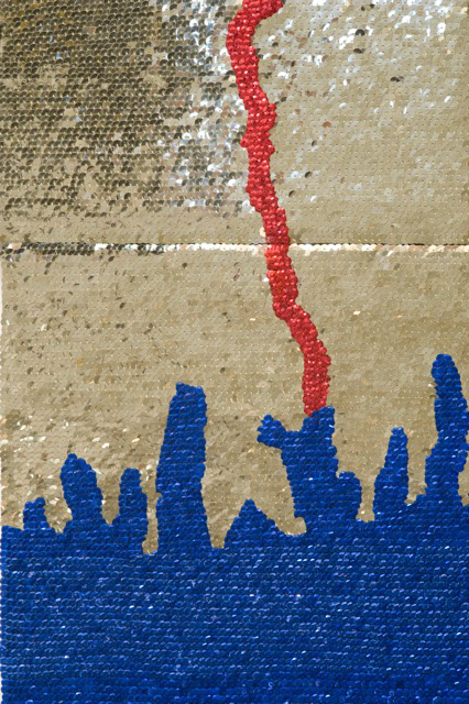
Lines of Control: Partition as a Productive Space, Nasher Museum of Art, Duke University, Durham, North Carolina, 2013-14. This is another show at once tangential to map art and yet concerned with an essential map element: lines of control. The lines of control in this case are mostly borders through contested areas (India/Pakistan, Israel/Palestine, Mexico/US, and so on). Green Cardamom brought together more than thirty contemporary artists (from Francis Alÿs to Muhammad Zeeshan) and a host of other contributors (including Iftikhar Dadi and Irit Rogoff) to mount a ceaselessly stimulating exhibition, first in 2012 at Cornell and then in 2013-14 at Duke. It spawned a 240-page full-color catalogue. A great stimulating show and a terrific catalogue!

•••••••

_PIR0242

Maya Lin: Blue Lake Pass (from IndiWeek)

Surveying the Terrain, Contemporary Art Museum, Raleigh, 2013-14. While Lines of Control was up at Duke in Durham, across the Triangle in Raleigh, CAM was showing Surveying the Terrain, another show tangential to map art, yet equally concerned with an essential subject; or, as the gallery brochure put it, “Surveying the Terrain explores contemporary artworks that map our terrain.” Curated by Dan Solomon, it featured ten artists including Alfredo Jaar, Laura Kurgan, Maya Lin, and Trevor Paglen. Beautiful work!

•••••••

MAPnificent image

(from Bronx River Art)

MAPnificent! Artists Use Maps, Bronx River Art Center, New York, 2013-14. Curated by Yulia Tikhonova, this show’s 18 artists – among whom were Paula Scher and Mannahatta – approached the map from every direction. This may have been the year’s most classic map art show, a fading form.

•••••••

Roosmarijn Pallandt

Roosmarijn Pallandt (from Roosmarijnpallandt.com)

Unmapping the World, EXD’13 / Instituto de Investigação Científica Tropical, Palácio dos Condes da Calheta, Lisbon, Portugal, 2013. Part of Experimental International Design Biennial 2013, and curated by Annelids de Vet (of the Subjective Atlas of … fame) and Nuno Coelho, the exhibit was “an exploration into the field of reactive map making practices. It aims to counterpoise the apparent neutrality of professional cartography through contemporary engaged mapping projects. In this exhibition, ways of mapping are used to resist the authority of state, to question ruling power structures and to expose the propensity of maps to simplify our world. The act of uncapping is presented as a poetic form of resistance.” And so much more!

•••••••

bus-map-b-12-07-16

Across the Wall: Israeli Settlement Bus Routes: Ahmad Barclay & Polypod (from Visualizing Palestine)

The Cartography of the Unseen, The Research Gallery, Holon Institute of Technology, Holon, Israel, 2013. This exhibition dealt with “the political reading of the overt and covert mechanisms embedded in the act of cartography, by exposing the ideological aspects, as well as the solicitation to action performed through mapping. The exhibition analyses the ways in which the design of maps conditions the very interpretation of them, and examines how the act of mapping affects the reorganization of the mapped territory.” Thirteen projects from as many territories were presented, including work from both Israel and Palestine. Radical presentation!

•••••••


Read Full Post »

I Don’t Want To But I Will: Title Page of Denis Wood’s Dissertation

Throughout graduate school I heard tales of the Denis Wood’s outrageous dissertation, curiously titled I Don’t Want To But I Will. Of particular interest are the scathing Acknowledgments, where Denis took his advisors to task. A worn copy of the Acknowledgments was passed among grad students as a bit of intellectual contraband.

But the content was what was most important. It’s a crazy dissertation. It’s about maps, mental maps, getting kicked off a bus, psychogeography, single element veridicality analysis, Europe, cartography, Kevin Lynch, passed-out subjects, Peter Gould, psychogeomorphology, the Shirelles, and the invention of “Environmental a” – a language for mapping. Among other things. It is driving the wrong way down the one-way-street of academia.

The dissertation was printed in a very limited number by the Clark University Cartographic Laboratory. Denis has recently made available a PDF of this never-really-in-print gem. I have reproduced Denis’ comments on the different chapters in the dissertation, along with links to the entire document and each chapter, from his web pages (here).

••••••••••

I DON’T WANT TO, BUT I WILL

By Denis Wood

1973

Download it by chapters (below) or as a single 685-page document.

The front matter, including the dedication (by the Shirelles), the notorious acknowledgements (my unhelpful faculty and the rare humans), credits (as in a movie), and Introduction (opening with Ed’s story, a night watchman on the edge of Castle Hill park, and going on to talk about psychogeography and various kinds of mental maps).

PART I: Psyching Up for the Trip (a sort of philosophy section).

Chapter 1: The Beginning of All This (“How would you like to go to Europe this summer?” Bob Beck asked me; and the design of the study).

Chapter 2: Some Relevant Ancestors (individual, consensual, and standard mental maps, Peter Gould, and Kevin Lynch; or, what passes in the trade for the “review of the literature”).

Chapter 3: The Study Tools (Bob and I invent Environmental a, a mapping language).

Chapter 4: The Study Starts Before the Trip (long-distance training in Environmental a and the “predictive morphologies” of London, Rome, and Paris).

PART II: The Trip or Denis’ Inferno (the novelesque part).

Chapter 5: What Others Have Thought of Travel (a bouquet of quotations about travel).

Chapter 6: A Terminal Wet Towel (Bob and I meet the Group L kids at Kennedy and what happens after that).

Chapter 7: A Day on a Tour (the first day: I will show you blood in a handful of data).

Chapter 8: Down and Out in London (the week in London).

Chapter 9: Parnassus in Innsbruck (and one of the kids ODs or, well, just passes out).

Chapter 10: When in Rome, Don’t Do as I Did (in which I get drunk and kicked off the bus).

Chapter 11: Kid’s Lib, or Aristocracy in Exile (in which the kids take control of the research and collect all the Paris data).

Chapter 12: Old Tours Never Die, They Just Fade Away (in which, months later, a bunch of us get together again for a weekend in New York).

PART III: After the Trip; or What’s in Klein’s Bottle (the “science” part of the dissertation).

Chapter 13: Tripping and Tracing through the Data (trace events; or the crumbs of the cookies left for Santa).

Chapter 14: The Content of the Tour (applying Lynchian content analysis to the traces left by the Group L kids).

Chapter 15: Travel Connections (or trying to wrap graph theory around the kids sketch maps).

Chapter 16: Hanging Out the Rivers to Dry (trying to read the maps through something I called single element veridicality analysis).

Chapter 17: Pagan Curves, Lincoln Variations, and Eber Aberrations (or the quest for the warped space of human experience and psychogeomorphology).

Chapter 18: Bigger is Better – Or Worse (you draw what you feel; or, the analysis of the areal and feelin overlays).

Chapter 19: You Are Where You Sit (the analysis of the bus seating charts and their relation to the maps; or, Fixers, Mixers, and Rangers).

Chapter 20: That’s the End of the Movie! ! ? ? ! ? ? (which is a whole long list of “conclusionettes” that concludes, “That the subject can have the first, last and most comprehensive word on the subject of the investigation itself, specifically that: I DIDN’T WANT TO, BUT I DID.”

BIBLIOGRAPHY

Read Full Post »

Older Posts »