Archive for the ‘Advocacy Maps’ Category
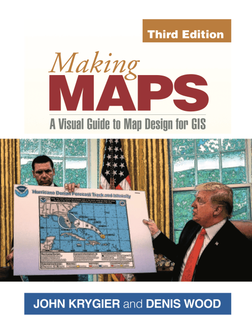
Making Maps is Great!
Posted in Advocacy Maps, Bad Maps, Deep Map Thoughts, Map History on September 6, 2019| Leave a Comment »
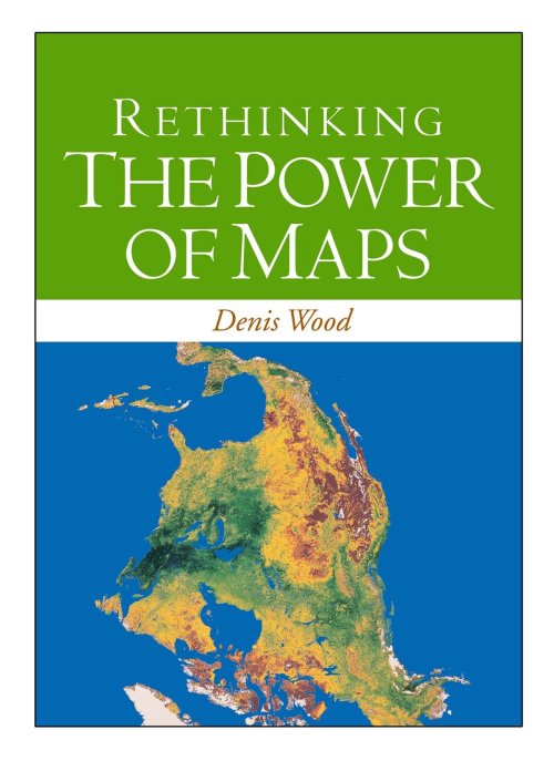
Book Review: Denis Wood reviews “The Power of Maps” – But not his “The Power of Maps”
Posted in 02 Why Are You Making Your Map?, Advocacy Maps, Map Books, tagged CTA Publishing, Participatory GIS, Participatory Mapping, The Power of Maps on October 17, 2016| 2 Comments »
Denis Wood’s delightfully snarky review of a new book, The Power of Maps, but not The Power of Maps he wrote in 1992. The review provides a critique of participatory mapping and GIS from the perspective of critical cartography that has developed over the past several decades.

Review: The Power of Maps: Bringing the Third Dimension to the Negotiation Table
C. Pedrick (editor)
Technical Centre for Agricultural and Rural Cooperation (CTA)
Order book or free PDF here.
by Denis Wood
Interesting title, The Power of Maps. Once I wrote a book called The Power of Maps (Guilford, New York, 1992), but that was then and this book was just published. My book was about how maps, instead of being objective and neutral, were interested, and about how hard maps labored to mask this interest. In the end it was about maps as malign instruments that hid their commitment to advancing the interests of those who commissioned them.
CTA’s The Power of Maps is one of these masks.
Or maybe I shouldn’t put it that way. That may be too harsh, too sweeping. But, my god, just take a look at the cover! In the upper right is the boxed phrase, “Success Stories,” letting us know right off that we’re in for some kind of fluff. Below, bracketing the title, are photos of a landscape and of a bunch of kids clustered excitedly around a three-dimensional model of it, or at least we assume the model’s of the pictured landscape (we hope it is): it’s never stated. The kids, a diversity of ages, are proud, and as we later learn, they should be, since presumably these are the kids who made the model. “Bringing the third dimension to the negotiation table,” says the subtitle, though these kids don’t look like they’re negotiating anything and, as it turns out, they’re not.
All sorts of prefatory fluff precede twelve stories with titles like “Mapping in Madagascar – from skepticism to ownership” and “Scaling up P3DM: A powerful community engagement tool.” The exciting titles are unfolded in exciting texts. Wonderful things happen when participatory 3D models are constructed. Generations come together (since the youth build the model which “the elders” interpret), people who have trouble with maps move over the model with ease (as we can see in the photos), government officials are impressed (evidently), and soon … everybody’s negotiating, they’re taking their future into their own hands, they’re triggering green lights for environmental restoration.
In these stories it’s almost magical the ways these things happen. The kids just build the model; the elders cluster around it annotating it with colors, yarn, pushpins; the officials just show up. In better than three dozen full-color photos, kids happily work, elders eagerly collaborate, attentive outsiders look and listen. P3DM really is magical! It really works!
That this a profound illusion The Power of Maps reveals only in its list of further readings on page 67 (the whole document runs only 74 pages). The first item, Giacomo Rambaldi’s Participatory Three-dimensional Modeling: Guiding Principles and Applications: 2010 edition runs 98 pages, each crammed with facts, figures, diagrams and tasks, tasks, tasks. There’s a lot to do before the locals can start making their model, and lots of outsiders are going to work to get it done. To begin with:
Organizing and facilitating a P3DM exercise requires a multidisciplinary team with at least three facilitators covering – as an example – the following disciplines: geography/cartography/GIS; natural resource management/environment; and social sciences. (p. 52)
and:
Logistical aspects vary from project to project. The more complex the initiative the more demanding are the logistical arrangements. All projects, whether they involve single or multiple communities and ethnic groups scattered over a large area, must handle logistical details for field activities, workshop venues, travel, accommodation and catering for community members and technical staff. Other matters to be arranged include contracts for a venue sufficiently large and possibly with electric power to allow the manufacture of the model, board and lodging, equipment rental or purchase and procurement and safe storage of supplies including the base maps. Additional staff may be hired and vehicles made available – in short, a variety of logistical arrangements are required for the project to run smoothly. All of these arrangements must be made in a timely fashion, and many must be in place during the earliest stages of the project and before project activities get underway. (p. 31)
That’s my emphasis, but there are lots of people from the outside who are going to be involved, and it all has to be paid for (materials for the model alone will run about a thousand bucks), there are salaries, and so there are sponsoring agencies and so on (and so on). While there’s a philosophical inclination to insist that these projects are “demand driven” – by the locals – it’s plain enough that they’re instigated by the agencies funding the work and so they’re in pursuit of agency goals.
Further along in the further-readings is CTA’s “Training kit on participatory spatial information management and communication” (2010). This consists of fifteen modules, most of which contains four units, none of which takes less than an hour, which is to say we’re talking about a commitment of more than 60 hours, and that’s without all the stuff they ask you to download and read or watch. Working through this training kit demands a serious chunk of time and energy. But, then, the whole thing does. The least of it is the construction and interpretation of the model, since once that’s done the whole thing has to be turned into a GIS, and maps have to be made. Maps, as my Power of Maps made plain, will be the tools used to implement any action, which since these are more or less all government projects, pretty much goes without saying. The 3D models are really about securing buy in, consensus, on the part of the locals.
I’ve critiqued participatory mapping before, in the keynote, “Public? Participation? Geographic? Information? Systems?” that I gave to the 2005 URISA Conference on PPGIS in Cleveland. The title should make the nature of my complaint clear enough. At the time I was unaware of Bill Cooke and Uma Kotiiari’s Participation: the New Tyranny? (Zed Books, London 2001) which examines many of my complaints in piercing detail; and I certainly didn’t know of Cooke’s “Rules of thumb for participatory change agents” (from Samuel Hickey and Giles Mohan’s Participation – From Tyranny to Transformation?, Zed Books, London, 2004), the first of which is, “Don’t work for the World Bank,” which naturally enough turns out to have funded “Mapping in Madagascar – from skepticism to ownership.” In fact, most of the projects laid out in The Power of Maps violate most of Cooke’s rules. One of these, “Data belong to those from whom they were taken,” includes “The use of photographs of participants in presentations and publications without their consent, informed or otherwise.” Again, nearly every one of the better than four dozen photos in The Power of Maps consists of photos of the people, the kids, the adults, the “elders” and, far more rarely, the government and NGO folk involved. Can you imagine the photographer of the image on the cover scurrying around to solicit the permission of each of the 23 caught? (Why bother? They’re mostly kids.) Under the same rubric Cooke mentions the use of material gathered in one capacity, as a participatory change agent, in another, for example as an academic in a journal, again without permission. Further he notes the public disclosure of information, in conferences or faculty staff rooms, again without permission, and contrasts this with the censure that would clobber people working with First World clients (therapists, for example).
There are others – the skewed rates of pay offered locals, government employees, and consultant academics – but to work through the list would be too disheartening. Worst of all is the way this – all this! – and more is obscured in The Power of Maps behind a curtain that could conceal an Oz. It’s this above all else that raises my ire, who tried to expose precisely this kind of deceit in a book whose title probably should have been The Real Power of Maps. Worst did I say? No, that’s actually not the worst of it. The worst of it is the startling lack of evidence that all this cardboard and plaster and paint and yarn has paid off in significant benefits for the locals, who end up no more than exposing their local knowledge to outsiders whose ultimate goal is buy in from the locals.
Okay, I’m carping from way outside, and by no means want to castigate all the work accomplished with P3DM which is often a huge improvement, if nothing else, over the options. And maybe it’s just their use of my title, over which of course I have no title. But there’s something about this self-congratulatory volume that sticks in my craw. Why couldn’t they have called it, The Power of 3D Models or The Use of 3D Models? Or better yet Preparing the Ground for Capitalism?
Denis Wood’s Dissertation – I Don’t Want To But I Will (PDF)
Posted in 01 What's A Map?, 02 Why Are You Making Your Map?, 03 Mappable Data, 04 Map-Making Tools, Advocacy Maps, Deep Map Thoughts, tagged Cartography, Denis Wood, maps, Mental Mapping, psychogeography on March 27, 2012| 8 Comments »
I Don’t Want To But I Will: Title Page of Denis Wood’s Dissertation
Throughout graduate school I heard tales of the Denis Wood’s outrageous dissertation, curiously titled I Don’t Want To But I Will. Of particular interest are the scathing Acknowledgments, where Denis took his advisors to task. A worn copy of the Acknowledgments was passed among grad students as a bit of intellectual contraband.
But the content was what was most important. It’s a crazy dissertation. It’s about maps, mental maps, getting kicked off a bus, psychogeography, single element veridicality analysis, Europe, cartography, Kevin Lynch, passed-out subjects, Peter Gould, psychogeomorphology, the Shirelles, and the invention of “Environmental a” – a language for mapping. Among other things. It is driving the wrong way down the one-way-street of academia.
The dissertation was printed in a very limited number by the Clark University Cartographic Laboratory. Denis has recently made available a PDF of this never-really-in-print gem. I have reproduced Denis’ comments on the different chapters in the dissertation, along with links to the entire document and each chapter, from his web pages (here).
••••••••••
I DON’T WANT TO, BUT I WILL
By Denis Wood
1973
Download it by chapters (below) or as a single 685-page document.
The front matter, including the dedication (by the Shirelles), the notorious acknowledgements (my unhelpful faculty and the rare humans), credits (as in a movie), and Introduction (opening with Ed’s story, a night watchman on the edge of Castle Hill park, and going on to talk about psychogeography and various kinds of mental maps).
PART I: Psyching Up for the Trip (a sort of philosophy section).
Chapter 1: The Beginning of All This (“How would you like to go to Europe this summer?” Bob Beck asked me; and the design of the study).
Chapter 2: Some Relevant Ancestors (individual, consensual, and standard mental maps, Peter Gould, and Kevin Lynch; or, what passes in the trade for the “review of the literature”).
Chapter 3: The Study Tools (Bob and I invent Environmental a, a mapping language).
Chapter 4: The Study Starts Before the Trip (long-distance training in Environmental a and the “predictive morphologies” of London, Rome, and Paris).
PART II: The Trip or Denis’ Inferno (the novelesque part).
Chapter 5: What Others Have Thought of Travel (a bouquet of quotations about travel).
Chapter 6: A Terminal Wet Towel (Bob and I meet the Group L kids at Kennedy and what happens after that).
Chapter 7: A Day on a Tour (the first day: I will show you blood in a handful of data).
Chapter 8: Down and Out in London (the week in London).
Chapter 9: Parnassus in Innsbruck (and one of the kids ODs or, well, just passes out).
Chapter 10: When in Rome, Don’t Do as I Did (in which I get drunk and kicked off the bus).
Chapter 11: Kid’s Lib, or Aristocracy in Exile (in which the kids take control of the research and collect all the Paris data).
Chapter 12: Old Tours Never Die, They Just Fade Away (in which, months later, a bunch of us get together again for a weekend in New York).
PART III: After the Trip; or What’s in Klein’s Bottle (the “science” part of the dissertation).
Chapter 13: Tripping and Tracing through the Data (trace events; or the crumbs of the cookies left for Santa).
Chapter 14: The Content of the Tour (applying Lynchian content analysis to the traces left by the Group L kids).
Chapter 15: Travel Connections (or trying to wrap graph theory around the kids sketch maps).
Chapter 16: Hanging Out the Rivers to Dry (trying to read the maps through something I called single element veridicality analysis).
Chapter 17: Pagan Curves, Lincoln Variations, and Eber Aberrations (or the quest for the warped space of human experience and psychogeomorphology).
Chapter 18: Bigger is Better – Or Worse (you draw what you feel; or, the analysis of the areal and feelin overlays).
Chapter 19: You Are Where You Sit (the analysis of the bus seating charts and their relation to the maps; or, Fixers, Mixers, and Rangers).
Chapter 20: That’s the End of the Movie! ! ? ? ! ? ? (which is a whole long list of “conclusionettes” that concludes, “That the subject can have the first, last and most comprehensive word on the subject of the investigation itself, specifically that: I DIDN’T WANT TO, BUT I DID.”
Mapping Radioactive Fallout in the United States
Posted in 01 What's A Map?, 02 Why Are You Making Your Map?, 09 Map Symbolization, Advocacy Maps, tagged Japan - Nuclear Fallout, Maps - Nuclear Fallout - United States, Maps - Radioactive Fallout, Nuclear Fallout, Radioactive Fallout on March 18, 2011| 4 Comments »
Concerns about the failing nuclear reactors in Japan and the fear of spreading radiation inspired me to share one of my favorite maps. The map shows areas in the United States crossed by two or more radioactive clouds during the era of nuclear testing (1951-1962) in the American Southwest. Click on the map for a larger version.
Richard Miller painstakingly created his map showing where humans, animals, and the environment were contaminated by radioactive fallout, broadly dispersed by weather patterns.
A sublime map, both beautiful and terrifying.
The map is also reproduced in my forthcoming book, Making Maps, 2nd Edition (due any day now).
Source: Richard Miller, “Areas crossed by two or more radioactive clouds during the era of nuclear testing in the American Southwest, 1951-62” in Under the Cloud: The Decades of Nuclear Testing (Two-Sixty Press, 1999), between chapters 4 and 5.
“There were no maps before 1500” | Denis Wood | New Book | Rethinking the Power of Maps
Posted in 01 What's A Map?, 02 Why Are You Making Your Map?, Advocacy Maps, Deep Map Thoughts, Map Books, Map History, tagged Cartography, Critical Cartography, Denis Wood, maps, maps - theory, The Power of Maps on August 30, 2010| 1 Comment »
Denis Wood’s followup to his classic The Power of Maps (1992) is almost entirely new in content. I have included the book’s table of contents below. A PDF copy of chapter 1 is included. This chapter argues, provocatively, “there were no maps before 1500” – a serious challenge to our assumptions about the map as a human and historical universal.
I. Mapping
1. Maps Blossom in the Springtime of the State (PDF)
2. Unleashing the Power of the Map
3. Signs in the Service of the State
4. Making Signs Talk to Each Other
II. Counter-Mapping
5. Counter-Mapping and the Death of Cartography
6. Talking Back to the Map
7. Map Art: Stripping the Mask from the Map
8. Mapmaking, Counter-Mapping, and Map Art in the Mapping of Palestine
From the publisher: “Denis Wood shows how maps are not impartial reference objects, but rather instruments of communication, persuasion, and power. By connecting us to a reality that could not exist in the absence of maps – a world of property lines and voting rights, taxation districts and enterprise zones – they embody and project the interests of their creators.”
Making Advocacy & Humanitarian Maps [updated]
Posted in 01 What's A Map?, 02 Why Are You Making Your Map?, 04 Map-Making Tools, Advocacy Maps, Deep Map Thoughts, Map Books, tagged Activism maps, Advocacy Maps, Cartographic Design, Counter Cartography, Counter Mapping, Humanitarian Maps, Map Design, maps as arguments on June 6, 2009| 8 Comments »
When Bill Bunge mapped out the locations of car/pedestrian collisions in Detroit (Detroit Geographical Expedition, 1968) he and the map were advocating a way of thinking about what was happening to the black community in Detroit – and advocating for change.
All maps advocate.
To advocate means to “to speak or write in favor of; support or urge by argument; recommend publicly.” The word derives from the Latin advocate: “to call to one’s aid.”
What map does not advocate, or argue for something? We are always calling maps to our aid.
Three free books on maps and advocacy have been made available for download recently, and are worth a look.
•••••
Two New PDF Books [added June 6 2009]:
Good Practices in Participatory Mapping (2mb PDF here, 2009). Published by International Fund for Agricultural Development.
A review of participatory mapping methods.
This report will review existing knowledge related to participatory mapping and recent developments. Specifically:
- Section 1 will define the main features of participatory mapping;
- Section 2 will discuss key applications of participatory mapping;
- Section 3 will present specific tools used in participatory mapping, including their strengths and weaknesses;
- Section 4 will identify good practices and explore the significance of process in participatory mapping initiatives.

•••••
Toolbox & Manual: Mapping the Vulnerability of Communities (4.4mb PDF English version here, Portuguese version aqui, 2008). Published by Salzburg University Centre for Geoinformatics.
A overview of concepts and methods for community mapping, focused on vulnerability.
Within the research and project context it is aimed to provide the local communities with appropriate maps of their communities. The maps should enhance planning and decision making processes within the communities in regard to reduce local vulnerabilities and allow appropriate planning of disaster response measures. It is the first time in Mozambique that maps have been produced with such an accuracy (high resolution data) and for disaster risk management through the integration of participatory practices.
•••••
•••••
Visualizing Information for Advocacy: an Introduction to Information Design (7mb PDF here, January 2008). Published by Tactical Technology Collective.
Succinct, well-designed, with many good examples of maps and information graphics for advocacy.
…a manual aimed at helping NGOs and advocates strengthen their campaigns and projects through communicating vital information with greater impact. This project aims to raise awareness, introduce concepts, and promote good practice in information design – a powerful tool for advocacy, outreach, research, organization and education.
•••••
Maps for Advocacy: An Introduction to Geographic Mapping Techniques (3mb PDF here, September 2008). Published by Tactical Technology Collective.
A great overview of maps and advocacy with many examples and resources.
The booklet is an effective guide to using maps in advocacy. The mapping process for advocacy is explained vividly through case studies, descriptions of procedures and methods, a review of data sources as well as a glossary of mapping terminology. Scattered through the booklet are links to websites which afford a glance at a few prolific mapping efforts.
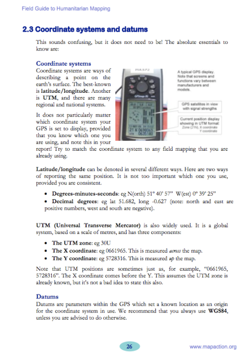
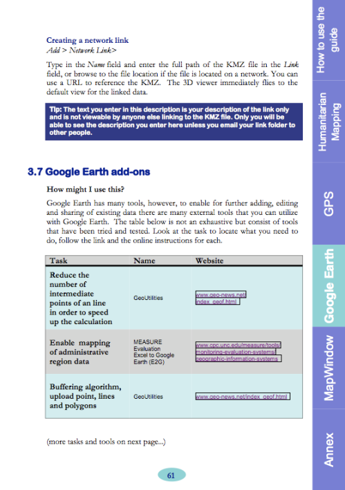
Field Guide for Humanitarian Mapping (3.2mb PDF here, March 2009). Published by MapAction.
A textbook for using maps and GIS in humanitarian work. The Guide provides detailed information on data collection (GPS) and the use of Google Earth and MapWindow (free mapping software).
The guide was written to meet the need for practical, step-by-step advice for aid workers who wish to use free and open-source resources to produce maps both at field and headquarters levels. The first edition contains an introduction to the topic of GIS, followed by chapters focused on the use of two recommended free software tools: Google Earth, and MapWindow. However much of the guidance is also relevant for users of other software.
•••••
Some related resources:
- the Tutor/Mentor Collection’s GIS and Mapping Resources Page.
- slides & text from Erik Hersman’s Activist Mapping presentation at Where 2.0.
- the Atlas of Radical Cartography.
- Counter-Cartographies Collective & 3C’s Blog.
- An Introduction to Critical Cartography (176k PDF) by Jeremy Crampton & John Krygier (2006)
- “Protest Maps” (292k PDF) by Denis Wood & John Krygier (2009).
- Mapping: A Critical Introduction to Cartography & GIS by Jeremy Crampton (2009).
A Map of Beerdom – New York, 11th Ward, 1885
Posted in 02 Why Are You Making Your Map?, 03 Mappable Data, Advocacy Maps, Map History, tagged Advocacy Maps, Beer Maps, German Ethnic Maps, History of Cartography, statistical maps, Temperance Maps, thematic maps on January 27, 2009| 4 Comments »
“In the morning they come out with queer-looking eyes…”
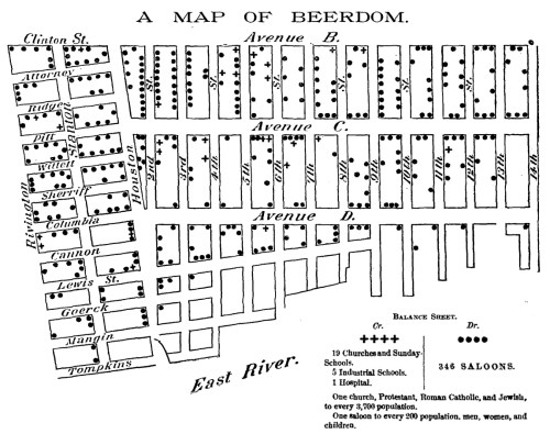
The above map represents one ward of New York City – the Eleventh.
The saloons as put upon this map were ascertained by the reporter of the Christian Union by actual count.
The saloons are largely beer saloons: for the base of the population is German, and a large intermingling of German sounds, German signs, German wares, and German smells generally, prevail.
Pretty much all the available space, after enough room has been taken out for houses and grown people and huckster’s stands, is filled by stout, chubby, healthy-looking children – with here and there a punier waif – of all ages and sizes, mostly young and small, and of all degrees of cleanliness, from comparatively clean to superlatively dirty.
The Ward is reported by the police to be as orderly as any in the city.
The German is peculiar. Unlike his Irish and Yankee cousins, he does not make a great noise and hurrah over his cups, and wind up with a street brawl. He gathers unto himself a few kindred spirits, and together they wend their way to the Trink-Halle, where, in a little back room, with closed doors and drawn curtains, they guzzle beer together till none of them can see. In the morning they come out with queer-looking eyes, but there has been no disturbance in the place.
Said a clergyman to your reporter, “I came into the ward expecting to find nothing but filth and vice. But I could take you into hundreds of homes where you would find ease and comfort and even culture.
Balance Sheet:
- 19 Churches and Sunday-Schools, 5 Industrial Schools, 1 Hospital
- 346 Saloons
- One saloon to every 200 population.
Christian Union, February 19, 1885. PDF of entire article and map is here.
New Book: The Natures of Maps by Wood & Fels
Posted in 01 What's A Map?, 02 Why Are You Making Your Map?, 03 Mappable Data, Advocacy Maps, Deep Map Thoughts, Map Books, Map History, tagged Cartographic Design, Cartographic Theory, Cartography & Nature, Critical Theory, Geography Theory, Map Design, Map Theory, Maps & Nature, Propositional Logic on December 23, 2008| 3 Comments »
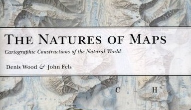
Denis Wood & John Fels’ new book The Natures of Maps is available now from the University of Chicago Press and many other sources. The lowest price I can find at this time is $29 (at Buy.com). Denis is, of course, co-author of the Making Maps book.
The book is big – almost a foot square – with color maps on almost every page. The book had a harrowing path to publication. Originally under contract to ESRI Press, the book was in final galleys (ready to print but for a handful of edits) when ESRI Press decided to cancel it and a dozen other books in process. Given the expense of producing the book (and the cost of reproduction rights to the illustrations) this seemed to be a peculiar business decision. The University of Chicago Press subsequently acquired the book, more or less ready to print.
Here’s an “editorial” blurb I wrote for the book:
If Wood & Fels’ The Power of Maps showed that maps were powerful, The Natures of Maps reveals the source of that power. The Natures of Maps is about a simple but profound idea: maps are propositions, maps are arguments. The book confronts nature on maps – nature as threatened, nature as threatening, nature as grandeur, cornucopia, possessable, as a system, mystery, and park – with intense slow readings of exemplary historical and contemporary maps, which populate this full color, beautifully illustrated and designed book.
The careful interrogation of maps reveals that far from passively reflecting nature, they instead make sustained, carefully crafted, and precise arguments about nature. The Natures of Maps shows how maps establish nature, and how we establish maps. The power of maps extends not only from their ability to express the complexities of the natural world in an efficient and engaging manner, but in their ability to mask that they are an argument, a proposal about what they show.
The implications of the arguments in The Natures of Maps are significant, empowering map users and makers. The Natures of Maps shows that neither map users or map creators are passive, merely accepting or purveying reality; they are, instead, actively engaged in a vital process of shaping our understanding of nature in all its complexity. Map users have a critical responsibility, the power to accept, reject, or counter-argue with the maps they encounter. Map creators have creative responsibility, the power to build and finesse their arguments, marshalling data and design for broader goals of understanding and communicating truths about the world. Rethinking how maps work in terms of propositional logic, with its 2000-year history and vast methodological and theoretical foundation, promises to be one of the most profound advances in cartographic theory in decades, and The Natures of Maps shows the way in a captivating manner.
Considering maps from the perspective of propositional logic provides a rigorous foundation for a theory of the map that transcends disciplinary boundaries. Scholars from the humanities, social sciences, and natural sciences will find Wood and Fels’ The Natures of Maps intellectually sound, methodologically useful, and deeply engaging. But the beauty of The Natures of Maps is that it is not merely an academic book. Wood and Fels’ The Natures of Maps is a powerful, beautifully illustrated and engaged argument about maps as arguments that will appeal to map lovers, map makers, map users, and map scholars.
Mapping the Failure of the Iraq “Surge”
Posted in 02 Why Are You Making Your Map?, 03 Mappable Data, Advocacy Maps, tagged Counter Mapping, Iraq Surge, Night-time Light Maps, Propositional Maps, Protest Mapping, Satellite Imagery on September 30, 2008| 11 Comments »
Making maps to counter prevailing assumptions and beliefs is a well established tradition. Counter mapping, radical mapping, protest mapping … the map proposes an alternative. Bolstered by its authoritative aura, the map can be quite convincing.
Geographers John Agnew, Thomas Gillespie, and Jorge Gonzalez, with Political Scientist Brian Min (all of UCLA) propose an alternative to the mantra – repeated by just about all on the political Right and Left – that the Iraq “Surge” has succeeded.
Agnew and his colleagues argue that the celebrated decline in violence in Baghdad is actually the result of inter-ethnic cleansing which began prior to the “Surge.” And this counter-proposal about the “Surge” is bolstered by a garrison of maps.
Counter-mapping the “Surge” depends on a relatively mundane set of meteorological satellite data, ironically generated by the Defense Meteorological Satellite Program – Operation Linescan System (KMSP-OLS). Nighttime light is one kind of data collected by this program.
Nighttime light certainly suggests population patterns – we have all seen the global maps of nighttime light – and also access to electricity.
Agnew and his colleagues asked a relatively simple question that can be answered with a series of maps based on the KMSP-OLS data: how has emitted nighttime light in Baghdad changed as U.S. Military strategy in Iraq changed?
The study area consists of the ten security districts in Baghdad, here indicated on a Landsat ETM satellite image.
Nighttime light imagery was selected and analyzed for dates after the U.S. invasion of Iraq (November 16, 2003, 9pm), before the “Surge” (March 20, 2006, 9pm), and after the “Surge” (March 21 and December 16, 2007, both 9pm).
The results seem to contradict proclamations of the success of the “Surge.” In general, Baghdad’s nighttime light increased between the initial U.S. invasion and mid 2006, then begins a rapid decline prior to the implementation of the “Surge” strategy.
Even more interesting, the mid-2006 decrease in nighttime light is not evenly distributed in Baghdad. The areas of declining nighttime light correspond with areas of ethnic violence and cleansing as documented in the Jones Report and its maps.
The greatest decline is in East and West Rashid – historically mixed Sunni and Shia – but also Adhamiya (Sunni), Kadamiya (Shia), Rusafa, and Karada (mixed and Sunni). No change was observed in Sadr City (Shia), New Baghdad (Shia), Karkh (Green Zone), and Al Mansour (historically mixed but heavily Sunni by late 2007). This is certainly easier to see on a map:
Agnew and his colleagues conclude:
Our findings suggest that … the surge has had no observable effect, except insofar as it has helped to provide a seal of approval for a process of ethno-sectarian neighborhood homogenization that is now largely achieved but with a tremendous decline in the extent of residential intermixing between groups and a probable significant loss of population in some areas.
Furthermore, the nighttime light signature of Baghdad data when matched with ground data provided by the report to the US Congress by Marine Corps General Jones and various other sources, makes it clear that the diminished level of violence in Iraq since the onset of the surge owes much to a vicious process of inter-ethnic cleansing.
Disagree? Raise your own army of data and maps to counter this counter-“Surge” proposition.
The text of Agnew, Gillespie, Gonzalez, and Min’s article “Baghdad Nights: Evaluating the U.S. Military ‘Surge’ Using Nighttime Light Signatures” is, for review and educational purposes, here.


