Feeds:
Posts
Comments

Archive for the ‘Map History’ Category

Three terrific new books on maps and mapping…

Review by Denis Wood

Linda Campbell, Andrew Newman, Sara Safransky, and Tim Stallman, eds., A People’s Atlas of Detroit (Wayne State University Press, Detroit, 2020).

Catherine D’Ignazio and Lauren Klein. Data Feminism (MIT Press, Cambridge, 2020).

Rasmus Grønfeldt Winther. When Maps Become the World (University of Chicago Press, Chicago, 2020).

I read these three books in order, one after the other, with ever increasing pleasure. A Blacks’ atlas of Detroit, two women writing about data from a feminist perspective, a philosopher of science using “map thinking” to mull over everything from geodetic surveys to genetics – these books could have been deadly, a sure prescription for eyes glazed-over as the books slipped from my fingers to the floor. Instead: great interest, continuous surprises, and mounting satisfaction.

Reading about Detroit made me think about growing up in Cleveland. Cleveland was an exciting place to live in the 1940s and 1950s. Its Terminal Tower was the tallest building in the world (outside of New York). In 1946 George Szell began conducting its symphony and in 1948 the Indians won the World Series. Thousands worked in the city’s steel mills. It had a fabulous streetcar system. Walking down Euclid Avenue in those days was like walking down Fifth Avenue in New York, just that crowded and exciting. Forty years later, in the middle of the afternoon, I lay down in the middle of Euclid Avenue and had to wait four minutes before a car came along to honk me out of the way. The place was a desert. When I was growing up Cleveland was the seventh largest city in the US. It’s the 53rd now and it feels it. It’s shrunken. It’s had its guts ripped out of it.

Back in those days Detroit was the fifth largest city in the US. It was Motor City, where the cars came from and, soon enough, Motown where the songs came from. Detroit’s fall was like Cleveland’s, though if you believed what you read it was actually much, much worse. Unlike Cleveland, Detroit was always in the news. Its miles of deserted, flattened blocks became notorious. The city went bankrupt, and it was taken over by a state-imposed manager. He wanted to sell the paintings out of the art museum! The place was an unmitigated disaster. Reading this stuff you’d never believe that Detroit, with its 670,000 inhabitants, is still the 23rd largest city in the US, that Metro Detroit with its 4.3 million inhabitants is the nation’s fourteenth, or that the art museum with its 677,000 annual visitors is among the most visited in the world. That is, you’d never believe that rather than a horrifying wasteland, Detroit’s an exciting, a vibrant place to live, maybe especially for the Blacks who man (and woman!) the front lines of a fierce struggle against racism, revanchism, and capitalism. This struggle is the subject of A People’s Atlas of Detroit.

The book’s introduction clarifies what it means by “people’s” and “atlas”. Not an atlas of all the peoples of Detroit – an atlas of Detroit – the book’s a collection of texts and maps (there are nearly four dozen of these) that illuminates a moment in the struggle of Black Detroiters for their city; and although it was published in 2020, that moment was essentially 2012 when most of the interviews here were collected. Laid out in six chapters, their titles capture the book’s contents: “Detroit and the Long Struggle for Liberation,” “This Land is Ours: Toward a New Urban Commons,” “Growing a Revolution,” “Suspending Democracy Is Violence,” “Gentrification Is Only Part of It: Understanding Race and Displacement in Detroit,” and “The Right to the City.” Each of these runs to some fifty pages of maps but, mostly, texts, texts drawn from the people the book’s about.

Take Grace Lee Boggs and Sterling Toles who have a conversation at the end of the first chapter. Grace Lee, the daughter of Chinese immigrants, married the Alabama-born African-American and Chrysler auto worker, James Boggs, in 1953, and in 1974 these two activists and “fiercely independent intellectuals” published Revolution and Evolution in the Twentieth Century which, still very much in print (along with the rest of their work), remains a key text for radical thinking. Toles, on the other hand, is “an illustrator, sound sculptor, DJ and music producer” who runs a recording studio out of his home. While you might imagine that Toles would be interviewing Boggs, it turns out to be the other way around, Boggs probing Toles about his work with the local kids who’d been censored at other studios: “My whole thing was, I wouldn’t censor them, but I would ask them why they felt what they felt. One of the premises that I really work on is that so much of this culture is about conduct, control, and behavior control as opposed to nourishment,” which leads into talk about “nurturing.” After James Boggs died, in 1993, the James and Grace Lee Boggs Center to Nurture Community Leadership was founded, and “nurture” turns out to be a theme that that runs throughout A People’s Atlas of Detroit.

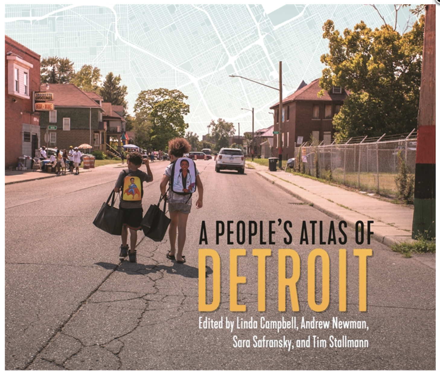
The whole book’s like this, insanely dense. Take the cover. While a piece of a street map fills the sky, otherwise the cover’s a photo of two Black kids walking down a street away from the camera. On the left Crocketts Groceries sells beer and wine. On the right a chain-link fence topped with barbed wire encloses a yard. If you look closely you can see in the distance that the street’s been closed off since, as a note on the back cover makes clear, the photo was taken at “Yusef Shakur’s twelfth annual backpack giveaway and neighborhood festival,” which explains the kids’ shiny new backpacks. Now, I rarely expect book covers to have much to do with the book. Usually they’re designed after the book’s on its way to the press, by a designer who may have only the sketchiest idea of its contents. So it was shock to come across, on page 293, in the introduction to Yusef “Bunchy” Shakur’s “Reclaiming Our Souls,” that Shakur’s coffee shop “is a community space that offers a public computer station, features local art, hosts poetry readings, and organizes an annual back-to-school backpack drive, which is featured on the cover of this book.” I mean, this almost never happens.

But then the whole book’s terrific, building smoothly to the cymbal crash of the concluding chapter, “The Right to the City,” where interviews are presented on the rights to water, to environmental justice, to mobility, to education, and to freedom from crime and police harassment, in each case examining situations in which these rights have been or are denied: the notorious water shutoffs; the serious perils of pollution, with a focus on the city’s incinerator; the problems stemming from the city’s fragmented transit systems; the school closures; and the impact of the city’s insane rates of incarceration. In each case solutions are advanced whereby Detroiters have or are reclaiming these rights, in the process reclaiming, as “Bunchy” Shakur puts it, “our souls.” It’s inspiring, but it’s also a mind-boggling amount of work, work Black Detroiters have embraced. That’s what’s really inspiring!

Data Feminism resources here

Catherine D’Ignazio and Lauren Klein’s Data Feminism is a whole different kettle of fish. A book by two feminist academics explaining why data science needs feminism, it would be hard to imagine anything further from A People’s Atlas of Detroit; and yet it’s animated by a similar spirit of defiant resistance, and it shares with the atlas a determined resolution to address the problems it identifies. These are laid out in seven chapters that follow a welcoming and incisive introduction, and again their titles neatly capture the book’s contents: “The Power Chapter,” “Collect, Analyze, Imagine, Teach,” “ On Rational, Scientific, Objective Viewpoints from Mythical, Imaginary Impossible Standpoints,” “What Gets Counted Counts,” “Unicorns, Janitors, Ninjas, Wizards, and Rock Stars,” “The Numbers Don’t Speak for Themselves,” and “Show Your Work.” An active principle, effectively a subtitle, interpret these: “Examine Power,” “Challenge Power,” “Elevate Emotion and Embodiment,” “Rethink Binaries and Hierarchies,” “Embrace Pluralism,” “Consider Context,” and “Make Labor Visible.”

Each subtitle is then further spelled out in an attached sentence. For example, “Challenge Power,” is followed by “Data Feminism commits to challenging unequal power structures and working toward justice.” This chapter opens with a comparison of the Detroit Geographical Expedition and Institute’s map, Where Commuters Run Over Black Children on the Pointes-Downtown Track, with the Detroit Board of Commerce’s Residential Security Map. The first was made by a collaboration between young Black adults and white academics from local universities, while the second was made by white men collaborating with the Federal Home Loan Bank Board, producing – to cut to the chase – a map of Detroit neighborhoods on which the Black neighborhoods appear in red. This 1939 map is an early instance of what became known as “redlining” maps, denying to most of those who lived within the red borders the ability to borrow money to buy a home. D’Ignazio and Klein compare these redlining maps to the way big data are fetishized today – as rational, scientific, and objective – where what is overlooked is the unequal power structures that underlie and dictate the character of the rational, scientific, and objective data used. In the redlining maps, that character was all about protecting and preserving home ownership as a way of accumulating wealth and power for whites. D’Ignazio and Klein contrast this data with the data underlying the Run Over Black Children map which, previously unavailable, had to be collected from the police (with no little effort), and then compiled and plotted by the young Blacks who lived in the community itself. A sharper example of a challenge to power working toward justice would be hard to imagine.

Each chapter opens with a similarly compelling example, and then proceeds to think through the issues raised, typically through further examples, before closing with another, equally compelling example. In the power chapter the concluding example arises out of an idea called “mathematics for spatial justice,” specifically from a project, Local Lotto, that unfolded in the Bronx. Local Lotto grounded the teaching of statistics and data collection in contexts of equity, specifically the question whether the New York state lottery was good or bad for the neighborhood. The students learned about statistics and data analysis, roamed the neighborhood to collect their data, analyzed it, and gave presentations to each other. Finally they created “a data-driven argument: an opinion piece supported with evidence from their statistical and spatial analyses, as well as their fieldwork.” Again, the challenge to power is in your face and, like so many of the rest of the projects in the book, it’s rich, detailed, many-layered and multi-stranded.

Organizing the book’s arguments is what sociologist Patricia Hill Collins calls “the matrix of domination,” a construct she uses to explain how systems of power are configured and experienced. Her matrix embraces four domains – law and policies; their enforcement; culture and media; and individual experiences of oppression – which D’Ignazio and Klein return to again and again, as in … the question of pocket sizes. Here the larger issue is classification systems, specifically “how race, gender, and class (among other things) intersect to enhance opportunities for some people and constrain opportunities for others.” The examples D’Ignazio and Klein deploy make it clear the the forces operating through the matrix of domination are “sneaky and diffuse”: here, for instance, women’s pants pockets are almost half as long as those for men (that is, they’re too small for a smartphone). Of course this has a history, and it’s one in which the matrix of domination plays a role again and again, and so this difference in pocket sizes leads into a discussion of gender, especially the gender binary, which leads to the issue of binaries in general, which is a big player in what gets counted. That is, binaries are a big constraint on what gets counted.

The example that opens the fifth chapter is San Francisco’s Anti-Eviction Mapping Project, exhibiting (among other things) how “partiality and contestation” can take place in graphical design, thereby upholding the fourth principle of data feminism: the embrace of pluralism. Constructively, this builds on the previous chapter’s dismay over the constraints of binaries, here expanded to a polemic against the cleansing and tidying to which datasets are regularly subjected in order to make them amenable to … well, to simple “yes” or “no” outcomes for what are immensely complicated public debates. As D’Ignazio and Klein conclude the chapter: “embracing pluralism is a feminist strategy for mitigating this risk. It allows both time and space for a range of participants to contribute their knowledge of a data project and to do so at all stages of that project.”

But what’s really great about this book is the way it practices what it preaches. When you reach the end of the text, you don’t reach the end of the book. Instead it continues for another ninety-nine pages, half again as long as the text itself. These open with “Our Values and Our Metrics for Holding Ourselves Accountable,” which opens with an historical note that in turn opens with an allusion to the “open peer review process” that took place online. Okay, that’s unusual enough, but it then proceeds to list their key values: intersectionality, equity, proximity, the humanity of data, reflexivity, transparency, accountability and positionality. As they say, legitimate knowledge “has a race and a gender, as well as a class and geographic location,” concluding that “values are not enough. We have to put those values into action and hold ourselves accountable again and again.” Therefore this section is followed by Isabel Carter’s “Auditing Data Feminism,” which explains how the audit, included in the previous section, was carried out.

After this come “Acknowledgment of Community Organizations,” describing the two organizations to which a portion of the royalties from Data Feminism have been redirected; and, then, detailed “Figure Credits,” sixty-six pages of notes, a name index, and a subject index. And these are some notes. Not your common citations, these are discursive and enriching, expanding the text in the valuable directions. These are notes you don’t mind flipping to the back to read because the content warrants the disruption, or rather the extension, because that’s what they do, they extend the arguments of the text. Footnotes to the redlining text, for example, expand on the way the tactic is still used to deny housing to Blacks, citing among many other cases the one brought in 2018 against Facebook by the Department of Housing and Urban Development for enabling discriminatory advertising by housing providers. At the same time they expanded on the way Gwendolyn Warren’s work on the Run Over Black Children map has been so often misattributed to Bill Bunge (by me among others).

No, this is a good book, meriting a very careful read.

Martin Waldseemüller’s 1507 Universalis cosmographia. “This map is the first known visualization showing America as a separate continent, and naming it as such, in honor of the Florentine explorer Amerigo Vespucci. Waldseemüller’s map is known as the “birth certificate” of America.” Source

When Maps Become the World, by Rasmus Grønfeldt Winther, demands a very careful read, if only to to keep up with the arguments, which are many, mutually-referencing, and continually compounding. Winther is a philosopher of science and this is straight-up philosophy of science. In fact his central thesis is “that science is an overarching mapping project of the world,” a thesis that more than justifies the four-chapter-long explication of what he calls “map-thinking.” “Map thinking,” says Winther, “refers to philosophical reflection concerning what maps are and how they are made and used,” where “philosophical reflection” is precisely that, reflection. But … philosophical reflection: “Map thinking massages the imagination; excavates hidden assumptions; challenges and synthesizes dualisms; and invites us to reflect on space and time – including the future.” This should make plain that When Maps Become the World is discursive, which means, as Merriam-Webster confirms, that it’s: “marked by a method of resolving complex expressions into simpler or more basic ones: marked by analytical reasoning.”

Here the complex expression is “map thinking” and the simpler or more basic things into which it’s resolved include: eight map analogies (e.g., “A scientific theory is a map of the world”), assumption archeology, an abstraction-ontologizing account, partitioning frames, pernicious reification, contextual objectivity with its integration platform, and a multiple representations account. Each of these is in turn resolved into similarly simpler parts, as in the multiple representations account getting thought through ontologizing, merely-seeing-as, and pluralistic ontologizing. Here ontologizing is said to occur “when an individual takes the internal world of a map or scientific representation to really be the world it intends to represent.” In contrast, when merely-seeing-as, a user “comprehends that the content of the map, model, or theory is one limited way of viewing, and acting, in the world.” We’re said to be pluralistically ontologizing when we “communally, deliberately, and mindfully respect multiple representations,” including those unfamiliar or taken-for-granted.

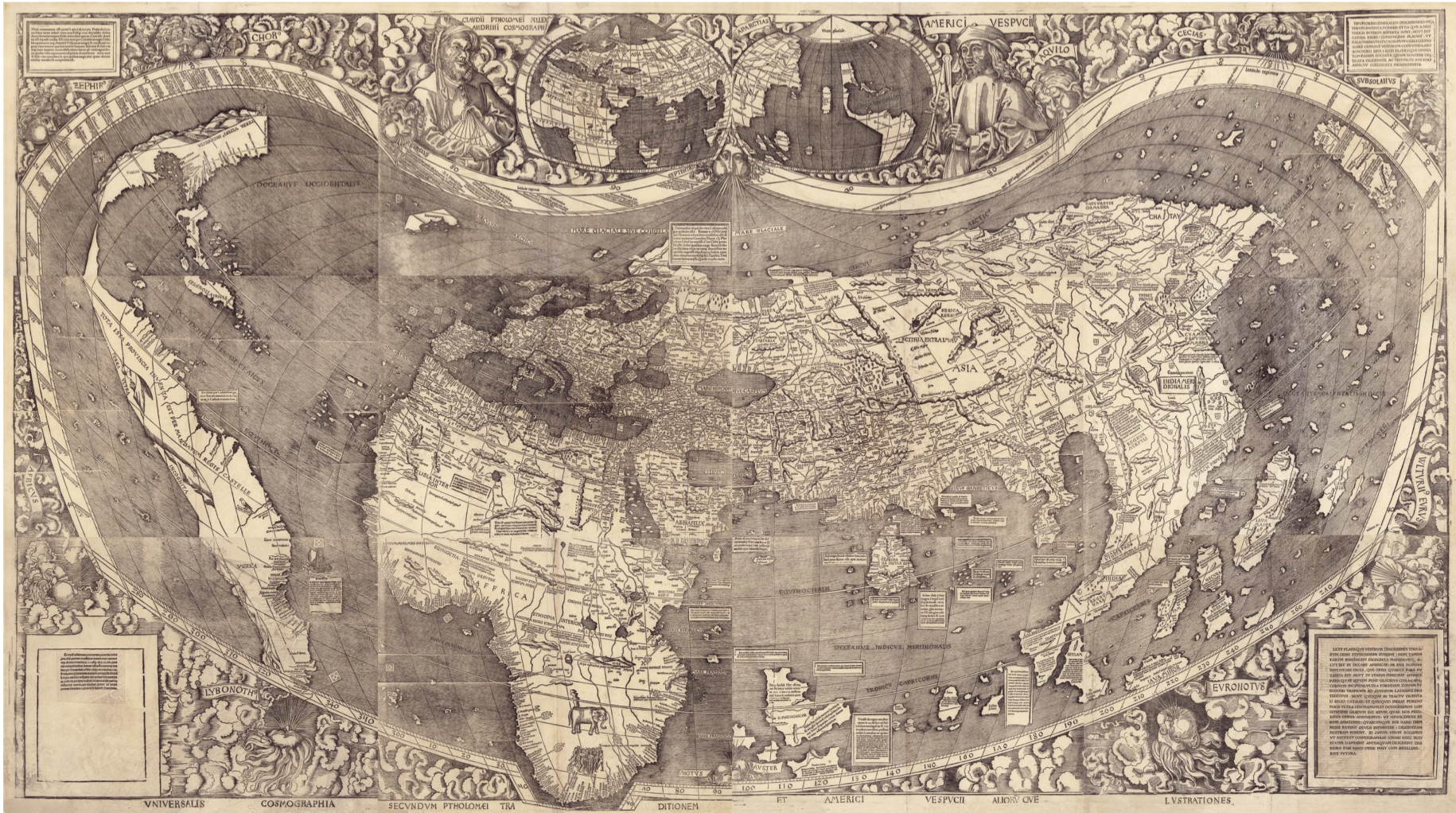
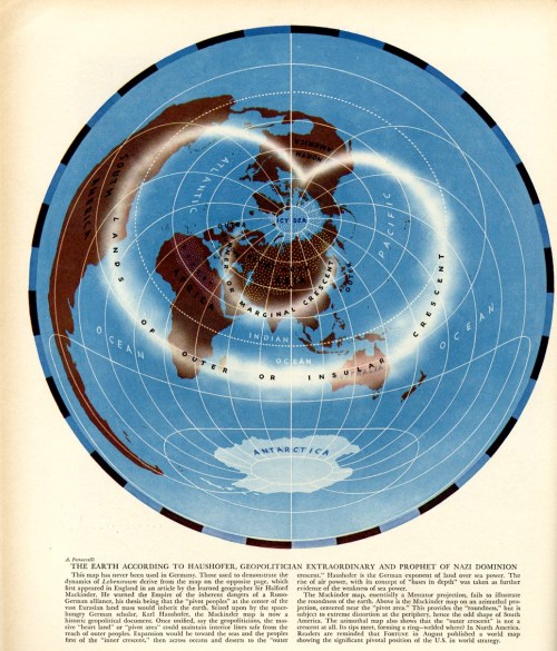
Ontologizing, merely-seeing-as, and pluralistic ontologizing amount to three different postures that can be taken with respect to existence. For example, the ontologist who has grown up with the Mercator projection alone may be inclined to believe Greenland is about the size of Africa, whereas Africa is actually fourteen times the size of Greenland. One who merely-sees-as understands there are other ways to see the world: for example, that offered by the Gall-Peters projection which, while it does show things in their true sizes does not, as does the Mercator, show them in their true shapes. A pluralistic ontologist understands that there are more ways to think about the world than you can squeeze onto a projection, and opens him- or herself up to wholly other world views, ancient, anthropological, or just plain loony (like most contemporary flat-earth apostles). In another domain, Galen’s humoral theory explained disease as an imbalance of the humors. Long and widely ontologized in the West, in the later nineteenth century humoral theory was forced to compete with the then new germ theory of Louis Pasteur and Robert Koch, after which this became, well, the world. Today germ theory is merely-seen-as the explanation for most diseases, dominantly in our age of the coronavirus, but more pluralistic ontologists understand that illness can have many causes, viruses and bacteria, but also radiation and lead poisoning, nutritional deficiencies, stress, and so on.

Maps become the world when either literal maps or scientific theories get mistaken for the world, foreclosing alternatives. Maps like these lurk behind phrases like, “It’s hard to imagine but people used to believe …” before the unfolding of alternative, typically “old-fashioned” views, like that of a flat earth (now spherical), or those with the earth in the center of the universe (which is now at the edge of a minor galaxy), or the one in which ice, water, and steam were different substances (whereas today they’re different phases of a common substance), or that in which different “races” were all but different species (which today are non-existent), or that of the earth without plate tectonics. I grew up in that one, with geologists teaching me geosynclinal theory and making fun of “this plate-tectonic nonsense” which, of course, today is … the world.

Having laid out this way of thinking about the world, with its pernicious reification and contextual objectivity, Winther applies it to science to show it in action, that is, to sciences, since When Maps Become the World takes on no fewer than eight of them. Naturally he starts with the universe which naturally he begins with the Big Bang. Here we begin with the cosmic microwave background map, of the universe shortly after its birth. Winther contrasts this with the map of the current universe created by Margaret Geller and associates in 1977, or at least with the positions of a thousand of its galaxies. Finally Wither turns to the more recent three-dimensional maps of galactic motion, of Hélene Courtois, R. Brent Tully and their team, which track the motions of hundreds of thousands of galaxies. Winther takes this as an opportunity to review his abstraction-ontologizing account with its complicated problems of the calibration of cosmic distances, the collection and management of cosmological data, and their generalization into extreme space maps.

Next he drops his gaze to the earth where, with conventionally scaled geologic mapping, he traces the history and state of plate tectonics; before freaking out with state-space maps in physics and physical chemistry (also known as phase diagrams). Finally he considers analogous maps in mathematics where we not only consider mathematical mappings but the literal cartography of the great German mathematician, Carl Friedrich Gauss, work that through his student Bernhard Riemann’s work on manifolds underwrites all of twentieth century physics. It’s all space and time – Winther makes that case convincingly – and so all this can be thought through the lens of map thinking quite easily.

This proves no less true of the examples in the following chapter where Winther emphasizes the importance of assumption archeology and the power of countermapping. Here he’s tackling our mapping of ourselves: migration mapping, brain mapping, and statistical causal mapping. He opens with the abstractive-averaging assumptions so common under maps of migration, tracing these through the work of Ernst Ravenstein, Waldo Tobler and others. These he counters with, for example, the migrant death mapping of Humane Borders/Fronteras Compasivas; and with the mapping of Tunisian migration by Robby Habans for the Spaces in Migration project of Martina Tazzioli and colleagues. Both of these radically resist the abstractive-averaging assumptions of “mainstream” migration mapping. Winther explores brain mapping the same way, a tour through decompositional assumptions, phrenological maps, and the somatosensory and motor homunculi being followed by the countermaps of Russell Poldrack and Michael Anderson, namely, cognitive ontologies and functional fingerprints. The path diagrams of statistical causal maps get countered by Eric Turkheimer and Helen Longino’s doubts about the utility of the whole approach, opening questions about, for example, the very possibility of decomposing the statistical interactions into the individual behaviors of the interacting individuals, and so asking: what’s being explained?

In his final science chapter Winther turns to genetics (the subject of his forthcoming book), to look at seven genetic maps, integrating them into a paradigmatic integration platform on which he notes each map’s genetic type, its partitioning frame, its space and time frames, and its map type. Take the linear genetic map. Its partitioning frame features morphological character, chromosome bands and nucleotides in chromosomal and nucleotide space in the time that a crossover takes in a germ cell. It’s an extreme-scale map. In contrast the literal genetic map partitions the domain into genes and their relevant geographic regions in geographic space and evolutionary time. It’s a literal geographic map. There’s lots more, some of it completely abstract (the adaptive landscape, for instance). The last chapter embeds all of this, and the seven previous chapters, into the philosophy of science, concluding with an invitation to dream. I think it’s safe to say that the book ends on a high …

It’s only three-hundred pages but When Maps Become the World is a lot of book with a lot of thought-provoking propositions about life and how to live it. Masquerading as a book about maps and science, it’s a manual on how to be in the world, a manual on how to live. Just as D’Ignazio and Klein’s Data Feminism turns out to be a manual on how to write a book (to say nothing of how to deal with data), and A People’s Atlas of Detroit turns out to be a manual on how to stake a claim to a place. They’re all terrific books with claims on our attention far beyond what you’d imagine they might have to offer. Read ‘em!

Read Full Post »

Matthew H. Edney. Cartography. The Ideal and Its History. xiii + 309 pp., figs., bibl., index. Chicago: The University of Chicago Press, 2019. $30.00 (paper), ISBN 9780226605685.


Matthew Edney @ USM

Matthew Edney @ Mapping As Process


Google Books Book Information

University of Chicago Press Book Information

Amazon Book Information


Book Review by John Krygier published in Isis: A Journal of the History of Science Society—Volume 111, Number 1, March 2020 (pp. 207-208)


There is no such thing as cartography, and this is a book about it. (p. 1)

Matthew Edney’s Cartography: The Ideal and its History provides a necessary corrective to the normative ideal of maps, mapping and the field of cartography. While of interest to scholars in the history of cartography, Edney’s book is just as important to the growing number of scholars whose research engages maps and mapping as part of diverse studies of culture, society and human history. Cartography: The Ideal and its History details problematic assumptions about maps, mapping and cartography, but it’s the creative potential of Edney’s book that’s most notable. As untenable assumptions are discarded, new insights emerge, insights which have the potential to greatly expand our understanding of maps and mapping across many different studies and disciplines.

Edney’s Cartography is situated in the intermingled fields of the history of cartography and critical cartography with touchstones including The History of Cartography, Book 1, edited by J.B. Harley and David Woodward (1987), Harley’s “Deconstructing the Map” (1989) and Denis Wood’s The Power of Maps (1992). These works, and many that followed, undermined narrow definitions of the map and broadened our understanding of the cultural, social and political context of mapping. Edney’s work as editor of later volumes of the History of Cartography, extensive publications on maps from Europe, North America and India as well as critical cartography make him an ideal scholar to take on the ideal of cartography. He does so by characterizing the traditional study of maps and mapping as “a profound act of cultural misdirection.” Maps and mapping are more complex, nuanced and disjunct than the universalizing, idealized conceptions offered by modern cartography, a thesis strongly supported by Edney’s immersion in diverse historical maps and mapping practices.

The most appealing parts of Cartography: The Ideal and its History are the delineation of fourteen modes of Western mapping and an intellectual assault on cartography’s idealized preconceptions. These issues are addressed in the first third of the book, prefaced by a discussion of the ideal and its limitations. Mapping modes include place, urban, property, engineering, chorographical, cosmographical, geographical, marine, celestial, boundary, geodetic, analytic, and overhead imaging. The concept of modes shifts focus away from a singular, idealized map (and map making process) to distinct (but evolving and interrelated) map types and processes that are better understood free of the narrow, idealized context within which they are typically situated. Cartography’s idealized preconceptions include ontology, pictorialness, individuality, materiality, observation, efficacy, discipline, publicity, morality and singularity & universality. In each case, Edney describes, critiques, and offers alternatives to these preconceptions. With the concept of mapping modes and critique of preconceptions in place, an intellectually sophisticated, nuanced and creative understanding of maps and mapping processes can play out.

Chapter 4, The Ideal of Cartography, details the construction of cartography as “a modern myth.” The chapter weaves in references to mapping modes and idealized preconceptions. One is left, upon finishing this chapter, with a history of the construction of modern cartography as well as an understanding of its limitations. Chapter 5 critiques the idealized geometry at the heart of modern cartography, specifically map scale. Much like maps and cartography in general, it is easy to naturalize map scale. This chapter, like the rest of the book, brings a sense of unease: many seemingly natural aspects of our common understanding of cartography are carefully constructed myths.

Cartography: The Ideal and its History is scholarly, well-written and a significant contribution to the history of science. It covers some ground explored by other recent scholars (including Matthew Wilson’s 2017 New Lines) but with a stronger footing in historical scholarship. Edney’s mapping modes and idealized preconceptions provide actionable ideas which are often lacking in critical cartography literature. It’s not clear, however, if Edney’s work will have much of an impact on modern mapping practitioners (cartography, geographic information systems, Geospatial technology) or academics in these technical fields. The myth of cartography is, if anything, functional and serves the needs of particular people and groups (property ownership, the military, government bureaucracy, business, etc.). Online mapping and navigational tools, such as Google Maps, are rife with problems (such as the inclusion of fake businesses that generate income for Google and for companies who pay to have these businesses on the map). Alas, people find such services useful and don’t really think the maps and information they engage with are anything other than an image of the real world. At the very least, scholars should not fall into the same trap: Matthew Edney’s Cartography: The Ideal and its History provides a corrective, a reimagined intellectual framework for maps and mapping that will, when engaged and operationalized, greatly broaden our understanding of the wondrous array of inscriptions and practices we call maps and mapping.

John Krygier

Professor of Geography
Ohio Wesleyan University

Delaware, OH. 43015

jbkrygier@owu.edu

Read Full Post »

Screen Shot 2019-02-07 at 11.01.40 AM.png

Antonio Petrucelli’s name is probably unfamiliar to map people, although it shouldn’t be. Petrucelli was one of the artists whose work was commonly found on the cover (and inside) Fortune magazine from the 1930s through the 1950s. Petrucelli collaborated with Richard Edes Harrison and was a contemporary of Boris Artzybasheff. Like Edes Harrison and Artzybasheff, Petrucelli had an interest in and proclivity for maps. This is evident in the cover (below) from the September 1936 issue of Fortune, created by Petrucelli and Edes Harrison. “This was a collaboration with Ricky Harrison, who did the basic map projection and I the final art.” (source)

petrucelli_fortune_cover_w-harrison

The best source for information on Petrucelli and his work is the very cool but very confusingly organized series of pages at Chris Mullen’s Fulltable.com site. Mullen visited and interviewed Petrucelli in the early 1980s. Petrucelli died in 1994.

petrucelli_fortune_cover

Petrucelli was a textile designer in the 1920s and early 1930s (for Cheney Brothers), eventually ending up in pajama design. In 1932 the Art Alliance of America awarded Petrucelli first prize (in textile design) for a series of urban geography pajama designs (below), including men building skyscrapers, tugboats, and firemen spraying hoses.

petrucelli_cloth1

My beautiful picture

My beautiful picture

Map-inspired designs for pajama cloth, 1932

An undated but ca. 1957 article from the Citizen newspaper (New Jersey) shows Petrucelli working on a map of Palestine, which appeared in the Life Magazine book The World’s Great Religions (1957).

sh494

A map of Texas appeared in Fortune in December of 1939: This was a dot map made of map pins stuck into the map, then photographed. This raises the specter of map pins and pinnage (and a Bit More on Map Pins)!

“On a map of Texas 1939, a paper paste-up perspective, I used some hundreds of coloured map pins to locate resources, industries etc. I worked from a mass of detailed data, enough for a dozen Texases, with statistically minded researchers. The result was a colourful but confusing jumble. The girls volunteered to remove and arrange the clusters of pins if I would let them. Sure, I think they had more fun than I would have done – for them a departure into new pastures. If you look closely some pin holes are visible in the repro.” (source)

Screen Shot 2019-02-07 at 12.06.19 PM.png

petrucelli_texas

On the theme of U.S. states, an even grander map of Washington and Oregon, in four sections, published in Fortune in March of 1940. The pictorial style is reminiscent of the work of Erwin Raisz, such as the maps used in his Atlas de Cuba (1949). Three insets are below, then the entire map.

Screen Shot 2019-02-07 at 11.13.49 AM

Screen Shot 2019-02-07 at 11.14.22 AM

Screen Shot 2019-02-07 at 11.14.06 AM

…and the entire map (four sections together; they don’t quite match!):

petrucelli_washingtonoregon

A typically racist WW2 propaganda map, undated and I believe unpublished, is included in the Fulltable.com archive of Petrucelli’s manuscript work. A closeup, then the entire map follows:

Screen Shot 2019-02-07 at 11.24.36 AM

My beautiful picture

A map of New Guinea appeared in the May 1945 issue of Fortune. One close-up is below then the entire two-page spread map follows.

Screen Shot 2019-02-07 at 11.26.34 AM

petrucelli_new_guinea

A map of the Congo River and its region, from the November 1952 issue of Fortune.

petrucelli_congo

Heartland“The Earth According to Haushofer, Geopolitician Extraordinary and Prophet of Nazi Domination” published in Fortune, November 1941. The text below this map indicates that it is azimuthal map projection, upon which Sir Halford Mackinder’s map of lebensraum (right) is transferred.

“The Mackinder map… fails to illustrate the roundness of the earth. Above is the Mackinder map on an azimuthal projection, centered near the ‘pivot area.’ This provides the ’roundness,’ but is subject to extreme distortion at the periphery… The azimuthal map also shows that the ‘outer crescent’ is not a crescent at all. Its tips meet, forming a ring – welded where? In North America.”

petrucelli_geopolitical

Finally, a cartogram of U.S. Army supply sources that accompanies an article called The Industrial Northeast” in Fortune (undated, included at Fulltable.com on this page).

Screen Shot 2019-02-07 at 12.01.19 PM

Read Full Post »

mm_trumpcover

Read Full Post »

Screen Shot 2019-01-16 at 10.19.50 AM.png

hand.png
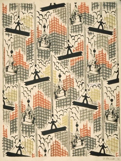
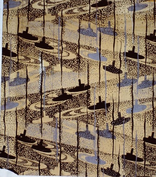
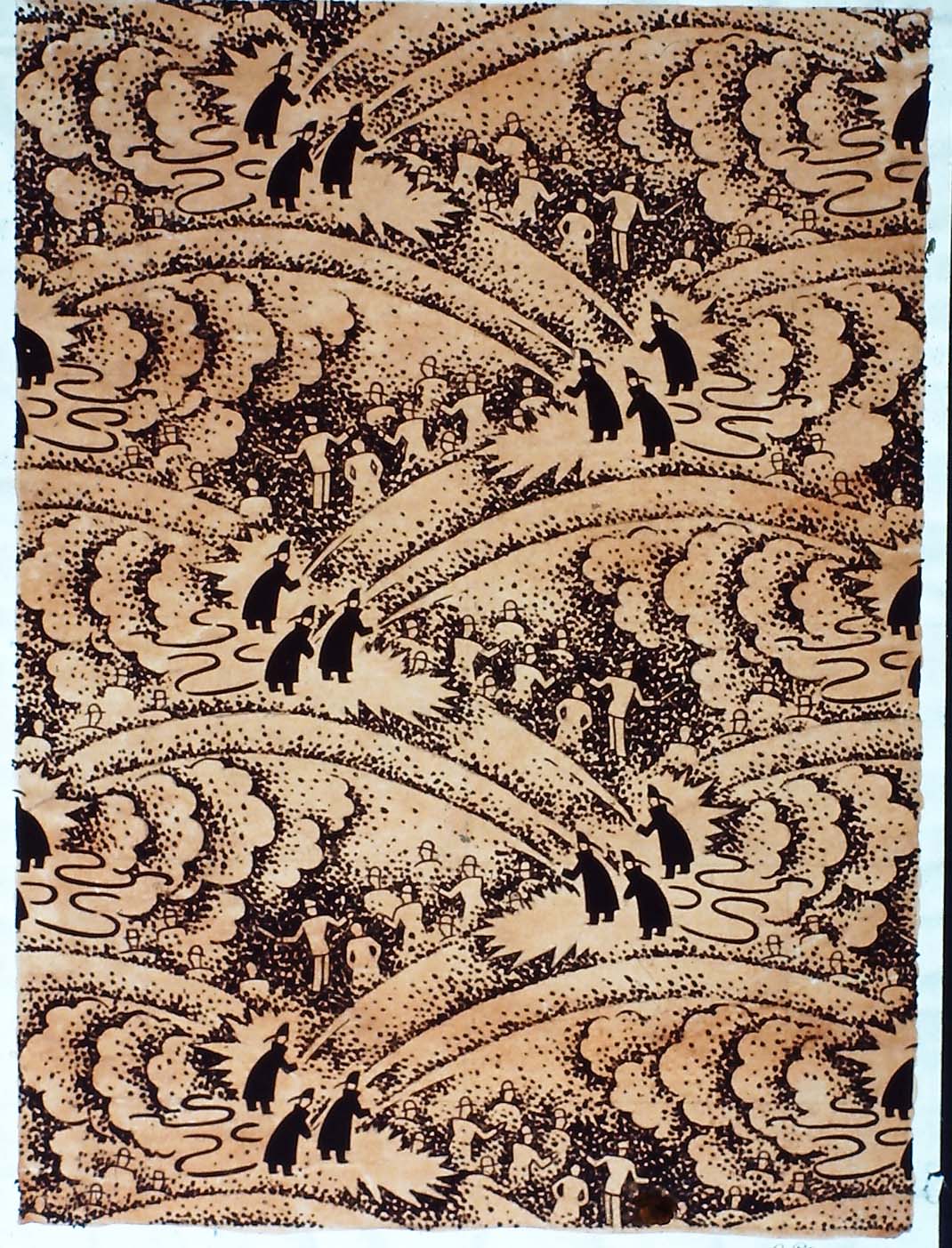
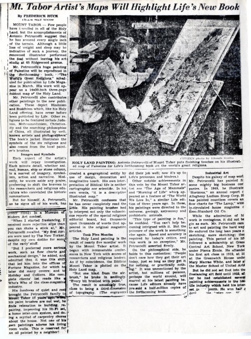
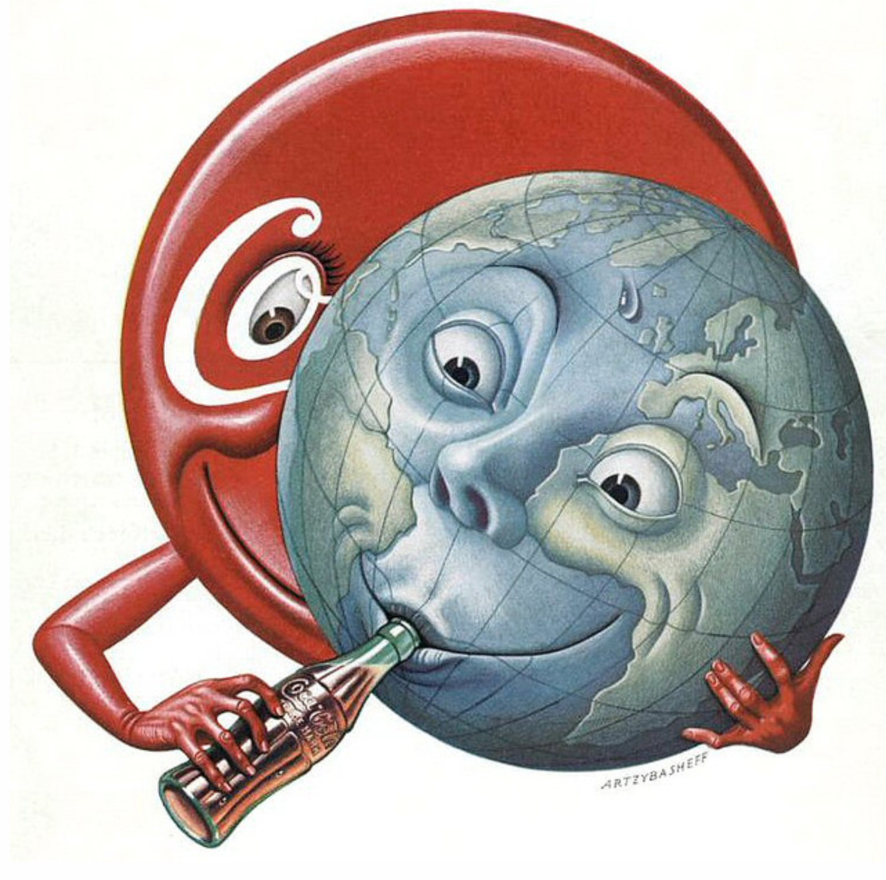
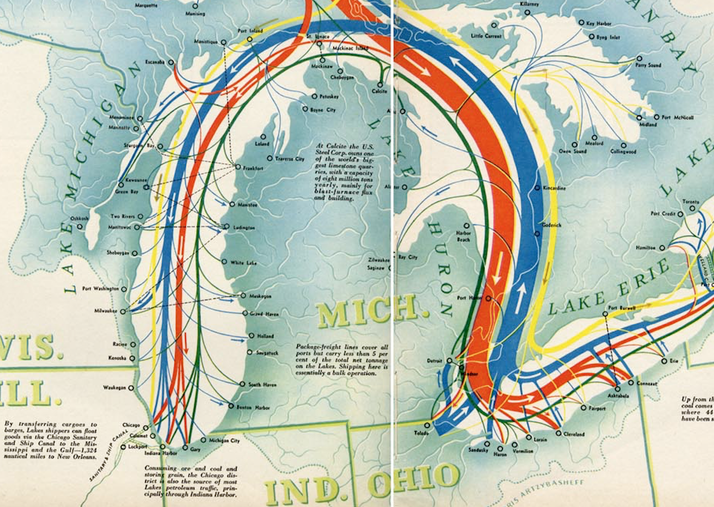
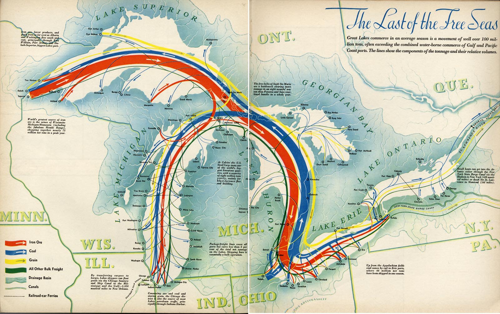
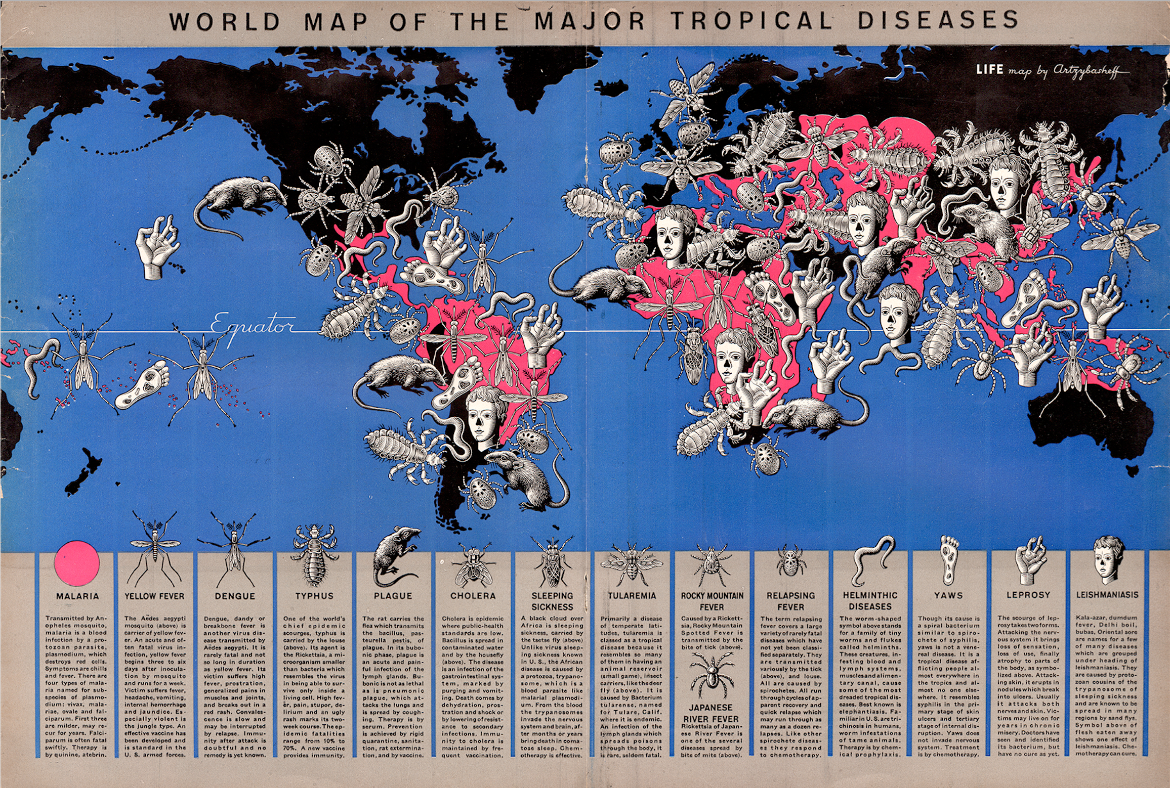
Back when Denis Wood and I were planning the 3rd edition of Making Maps, I stumbled upon a map of world tropical diseases Boris Artzybasheff created for Life Magazine (“World Map of the Major Tropical Diseases,” Life Magazine, May 1, 1944; high-resolution version at the David Rumsey Map Collection).

Boris Artzybasheff was born in 1899 in the Ukranian city of Kharkov. His father was author Mikhail Artsybashev. He emmigrated to the U.S. in 1919. Artzybasheff created 219 covers for Time Magazine between 1942 and 1966. He was also a commercial graphic designer and worked for the U.S. Department of State during and after WW2. He is best known for his grotesque and surrealistic graphic work (source). Just google his name, or see a gallery of his diverse work here.

The tropical diseases map is relatively conventional except for the 14 disease symbols Artzybasheff crowded on the map. If the point was to make those who peered at the two-page spread feel uncomfortable, the map hit its mark.

Mapping conventions are so imposing that even the most distinctive and creative map maker bows to convention over creativity. Not quite so, at least in this case, with Artzybasheff. The symbols are a prime example of Artzybasheff’s style, grotesque neo-realism, with a whif of the macabre; one of the prime instances where a major graphic artist applied his aesthetic, largely unimpeded, to the cartographic arts.

artzy_disease_map_crop_clean_transp.jpg

Screen Shot 2019-01-16 at 10.21.32 AM.png

Artzybasheff’s Maps and other Information Graphics

1940septfortuneapilot'sblackout 
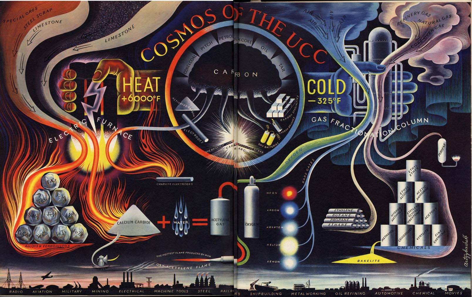
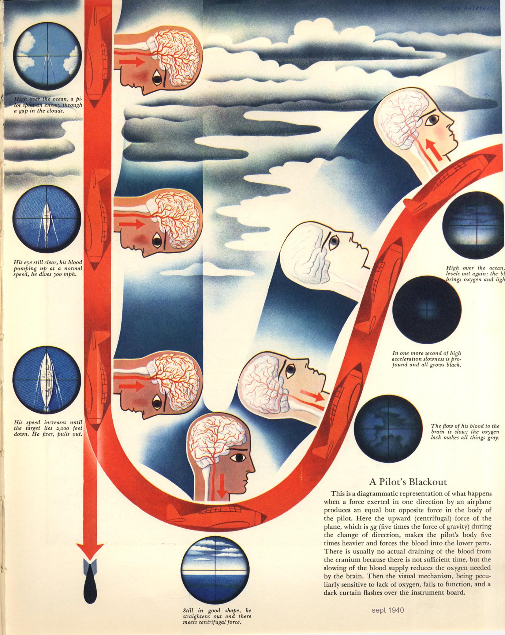
“In the late 1930s and early 1940s Artzybasheff began illustrating articles for Fortune and other popular magazines, usually with vividly drawn graphic renditions of maps or other informational diagrams. In the September, 1940 issue of Fortune magazine, for example, Artzybasheff provided a striking and colorful illustration for an article on how military pilots experience oxygen deficiencies and aeroembolism (decompression sickness or temporary blackouts attributed to nitrogen bubbles that form in the spinal fluid) when ascending rapidly to heights of 30,000 feet.” (Williams, 2007, p. 126). Diagram (left): “A Pilot’s Blackout,” from “Selection of Military Pilots: Not Every Flyer is Fit for Combat,” Fortune, September 1940, p. 81.

SH316.jpg

“In another, he provided a clear and detailed map of China’s main roads and rivers, showing which areas were under Japanese control, and how Chiang Kai-shek was dealing with the distribution of oil and other natural resources.” Map: “China in Japan,” Fortune, December, 1940, 106.

Work for the U.S. Department of State

Artzybasheff had other cartogaphic ties during and after WW2, driven by his friendship with S.W. Boggs, the U.S. Department of State’s official geographer (1927-1954). “Boggs was responsible for initiating partnerships between artists such as Artzybasheff and the State Department for technical cartographic advice and map production, but in the process absorbed an appreciation of these artists’ global visualization and their sense of the larger American public.” (Barney, 2011, p. 186)

Artzybasheff “…became advisor to the US Department of State and Psychological Warfare Branch, institutions heavily involved in the marketing of national policies and war propaganda. The war had been a period of active political involvement both for Artzybasheff and his wife, who was employed as recruitment chairman in the Manhattan Volunteer Office of Civilian Defense.” (Patsiaouras, Fitchett, & Saren, 2014, p. 127).

There is mention of an atlas by several sources, the earliest being R. John Williams in 2007: “Artzybasheff also worked as a geographer for the State Department, and developed an atlas that would be used by the U.S. Army Training Command, providing important visual information to military strategists in Europe.” (Williams, 2007, p. 140). Williams does not cite the source for this information, and I have not found any evidence this atlas was published (although it may be in an archive somewhere).

Boggs also enlisted Artzybasheff as a consultant on a 1947 film called Expanding World Relationships. The film was distributed by the U.S. Information Agency. (Barney, 2011, p. 189-191).

A final Boggs inspired project involved an effort to communicate the impact of map projections on perception of the earth and global political relations. The outcome was published in an article called “Global Relations of the United States” in The Department of State Bulletin (vol. 30, #781, June 14, 1954, here).

boggs_artzy_1954_fig3
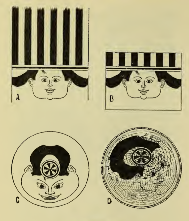
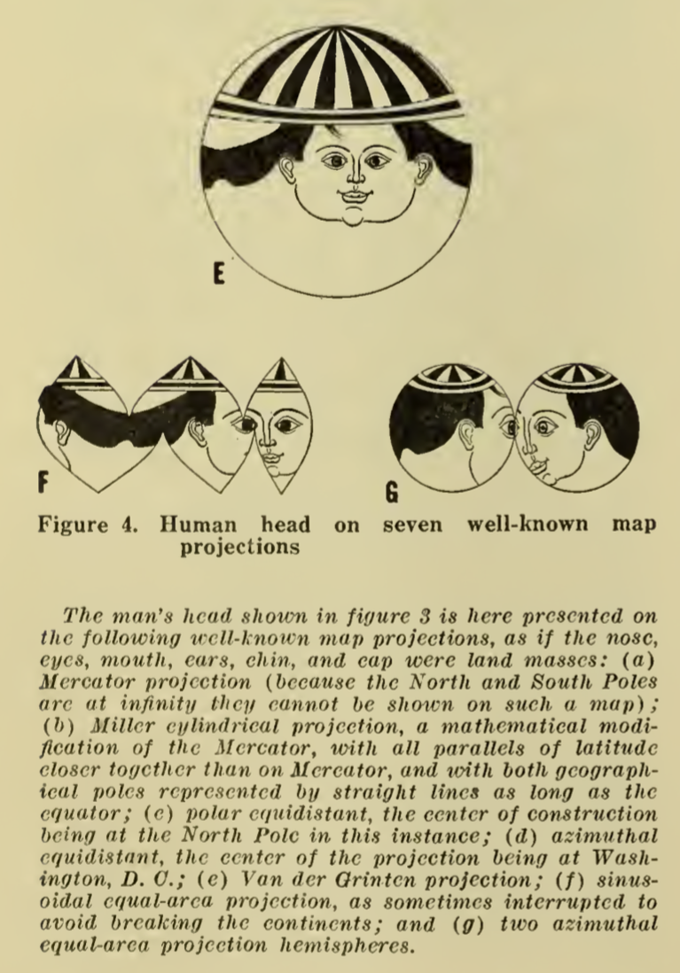
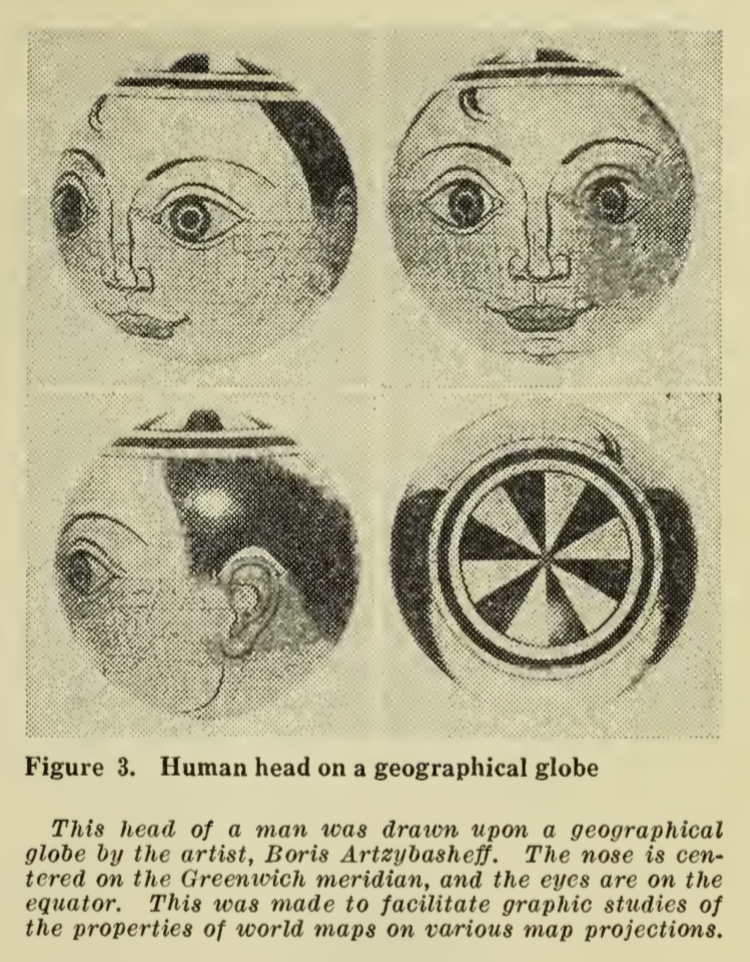
“In a 1942 letter to Artzybasheff, Boggs asks if the artist could potentially draw the head of a man on a white billiard ball, in hopes of designing a model that could show how projecting global features creates significant distortions on a flat map—in other words, flattening the nations and populations of the world is much like flattening a person’s face beyond all recognition. As he points out to Artzybasheff, ‘What I would like to get across to the ‘flat-mappers’ is that when we are looking at a flat map which includes the whole world, we are looking at a caricature which is analogous to representing the face, both sides of the head, back and top of the head, and beneath the chin all on one flat surface.” (Barney, 2011, p. 189)

The outcome, also illustrated in”Global Relations of the United States” was not particularly successful as these types of diagrams go. The face did not cover enough of the sphere to be distorted that greatly, and what we are left with is the tonsured hair of the figure spread about the projected illustration.

boggs_artzy_1954_fig4a.png boggs_artzy_1954_fig4b

Sources

Timothy Barney, (Re)Placing America: Cold War Mapping And The Mediation Of International Space, Dissertation, University of Maryland, 2011. Direct PDF download here. Published as Mapping the Cold War: Cartography and the Framing of America’s International Power, 2015.

Georgios Patsiaouras, James Fitchett & Michael Saren. “Boris Artzybasheff and the Art of Anthropomorphic Marketing in Early American Consumer Culture.” Journal of Marketing Management, Vol. 30, Nos. 1–2, pp. 117–137, 2014.

R. John Williams. “‘I Like Machines’: Boris Artzybasheff’s Machine Aesthetic and the Ends of Cyborg Culture.” Technoculture: Special Issue of Interdisciplinary Humanities 23.1, pp. 120-142, 2007. PDF here.


A few additional Artzybasheff maps follow.

The cover for Time Magazine (May 15, 1950) was graced by a Coke sucking earth:

1950_Coke_Time_Cover_May15_1950.png

“Cosmos of the UCC,” from Fortune, June 1941. UCC is Union Carbide & Carbon Corporation.

38

A map to accompany an article “The Industrial South” (Fortune, November 18, 1938) is not unlike the style of Erwin Raisz (previously, on this blog) in its use of pictorial map symbols.

1938_Nov_18_Fortune_IndusSouth_closeup.png

1938_Nov_18_Fortune_IndusSouth.jpg

“Chemical Valley” (West Virginia’s Kanawha Valley) from the September 1941 issue of Fortune:

1941_sept_fortune_chemical_valley_close

1941_Sept_Fortune_Chemical_Valley.jpg

“The Last of the Free Seas” was published in Fortune in July of 1940.

1940_July_Fortune_Great_Lakes_detail.png

1940_July_Fortune_Great_Lakes.jpg

Read Full Post »

LovelyLesserCover_150

Cover of Estelle H. Ries’ opuscule on a miscellany of “lesser arts.”

Estelle H. Ries. The Lovely Lesser Arts: Leather Making, Screens, Map Making, Silhouettes, and What To Do About Nudes (1948). Girard KS: Haldeman-Julius Publications (B-686).

••••••••••

Ms. Ries here situates makers of maps among other lesser artists – leather toolers, silhouette cutters, screen decorators, and carvers of ivory. Ries concludes her work with a few comments on the dreaded nude:

What to do about nudes, if anything, is always more or less of a ticklish problem. No matter how 20th-century we are or wish to be, some of us have inherited enough from the Mauve Decade, or have been surrounded by the traditions of Victorianism to such an extent, that the very word, Nude, is often veiled in whispers even if the object itself is veiled in nothing more than the atmosphere.

As for maps and their makers, Ries has many thoughts:

The first matters to be charted were direction and distance and these are still essential to every map. If you hear of that better place you can keep going until you get there if you but travel in the right direction. (p. 12)

Having north at the top of the map, we are used to the shapes of countries in this position. It would be the same world if we turned it upside down and had the south at the top, but try it once and you will see how unfamiliar and confusing it looks so. Yet the world is so upside down in most particulars right now, that perhaps it would be more true to print the maps that way after all. (p. 12)

In the jungles of Bengal they have a custom of breaking a branch from the wayside, and when it wilts it is considered that a krosh has been traveled. They do not realize that this varies with the season the type of tree from which the branch is taken, the speed of the walker or his idea of wilting! (p. 13)

One long-established concern publishing maps is in touch with all foreign governments through a branch office in Washington which contacts all the embassies. They consider a man in their cartography department an apprentice for the first three or four years of service which will give you a clue to the difficulty and importance of this type of work. (p. 15).

••••••••••

The full text of section III, “The Human Side of Map Making,” from The Lovely Lesser Arts is below. A PDF (13.3 mb) of the entire 30 page booklet is here.

••••••••••

III. THE HUMAN SIDE OF MAP MAKING

Once upon a time the nations of the world knew little or nothing of one another: The hazards of travel in an uncharted world prevented people from going far afield. What lay beyond the horizon? Who dwelt there? These questions were answered by silence or by mythical imaginings. But necessity and curiosity joined hands and impelled discovery of these unknown places. Which way to a better land? How far to more fertile ground? These questions were answered by a map.

The first matters to be charted were direction and distance and these are still essential to every map. If you hear of that better place you can keep going until you get there if you but travel in the right direction.

To get this sense of direction you must start from somewhere. Today maps have the true north at the top. This was not always so. The religious movements of the Middle Ages developed special reverence for the East. Paradise itself was represented on the maps and was supposed to be in the Garden of Eden, in the East. But Paradise was Heaven, and Heaven was above, so the East was at the top of the map and there it remained until the compass came along and displaced Paradise by pointing north itself.

Having north at the top of the map, we are used to the shapes of countries in this position. It would be the same world if we turned it upside down and had the south at the top, but try it once and you will see how unfamiliar and confusing it looks so. Yet the world is so upside down in most particulars right now, that perhaps it would be more true to print the maps that way after all.

A map is not earth size, of course, so that distances must be represented to a scale. Otherwise your map is too vague to have much use. It is harder to do this than to get direction because a knowledge of mathematics is needed both to measure distance on the ground and still more to show it on a map. In some parts of India a unit of measurement, the krosh, is given as “two statutory miles, more or less.” In the jungles of Bengal they have a custom of breaking a branch from the wayside, and when it wilts it is considered that a krosh has been traveled. They do not realize that this varies with the season the type of tree from which the branch is taken, the speed of the walker or his idea of wilting! Obviously mapmaking could not advance far until some facts of mathematics and astronomy could be applied. The best early maps came from Egypt, Babylon, China and Greece where these abilities first flourished.

The absence of such knowledge in most of Europe during the middle ages led the monks who made the maps never to leave any blank space on a map. To do so was an open confession of ignorance. They filled up all vacant areas with elaborate decorations-sometimes of fantastic creatures, or of legendary tales. Through the 18th century maps were decorative rather than practical, truly works of art, and are even now collectors’ items of rich beauty. Perhaps as an alibi to conceal their lack of accurate data, the idea was allowed to get around that accurate observations would be of value to trade rivals or enemies.

Of course, there were always some serious geographers who tried to promote accuracy in maps. Ptolemy, a famous Egyptian astronomer of the 2nd century, was first to draw the equator upon a globe and measure off the lines of latitude and longitude. Such lines, he explained, would locate any place on the map better than any amount of description. He also pointed out that a flat sheet of papyrus or paper would not fit around a sphere and that flat maps would involve too much distortion to be accurate. For a long time he pondered, “How can I show a map of the globe on a flat surface without too much distortion?” And then he had an idea. He took a cone and fitted a piece of papyrus around it tightly. It went on without any bulges, and when he took it off, it could be flattened out. He placed the cone, which was hollow, over the globe as far as the equator and drew his lines upon it. Then he took another cone going from the South Pole to the equator, and so invented the conical projection for flat maps. Ptolemy’s contributions to map-making were of great importance, but during the centuries new discoveries were made which were not on his maps. Moreover they had some inaccuracies of their own due to the unreliability of his sources, although his scientific methods were correct.

Mercator, a Flemish mathematician in the 16th century recognized the troubles with the earlier maps and decided to make something that would combine their advantages and remove their faults. Where Ptolemy used a conical projection, Mercator devised one based on a cylinder, and this solved the problems he had set himself.

The difficulties of making a map increase when we try to show on a flat surface the variations in height such as hills or mountains, yet their importance is too great to overlook. Mountains are not only a distinguishing physical characteristic of a region, but they affect rainfall and climate; they are the sources of rivers; they influence the amount of timber or the agricultural conditions; they serve as political boundaries and in many other ways. At first glance it would seem that the best way to show these would be on an actual model. However, models are costly to produce and cumbersome to handle, as they cannot be rolled, bound, folded or otherwise carried around conveniently. Most important, however, there has to be a different scale used for horizontal and vertical distances, else a relief model of the globe without such a difference would show little more in the way of relief inequalities than the skin of an orange. For example, Mount Everest is only 1/2000 of the earth’s diameter. On an 18-inch globe, it is estimated, it would be represented by less than 1/100 of an inch. Thus the highest mountain in the world wouldn’t even show!

A map combines the qualities of a picture and a book. Elevations of mountains or depths in water are depicted by forms of shading. A town is indicated by a dot, a road or river by a line. Codes of color can be employed, and other conventions are customary. The mapmaker must exercise some choice in the matter of naming places. He has to decide whether to use an American form of a foreign town or its native name, or one recently changed as an expression of national self-determination. Koln or Cologne; Dublin or Baile Atha Cliath? Praha or Prague; Munchen or Munich? This grows even more complex if the alphabet used by the natives is not related to a European one. There seems to be quite an assortment of spellings for the names of places in Persia (itself called Iran), China, India and other oriental lands. Maps should, of course, be clear and uncrowded, and the mapmaker should decide at the outset which kinds of things he must emphasize.

Of course, since Mercator’s Atlas appeared in 1585, mapmaking has grown continuously more scientific and accurate. The modern era of discovery and exploration does not consist in the vague adventuring by land and by sea which in a large measure constituted discovery up to the time of Captain Cook-and in some parts of the world long after that time. Today’s cartographers have precision instruments and theoretical knowledge far beyond any then in use. Mapping by airplane, for instance, is one of the newest and most popular methods giving access to hitherto inaccessible places. Telegraph, cable, radio, weather bureau and countless similar services have simplified the work of mapmakers and at the same time have given them far greater responsibilities. There is so much less excuse for them to be other than strictly reliable.

The modern mapmaker is an expert and his results go to experts whereas the early seafarer was more of a rough and ready adventurer who took a long chance hoping for gain, and did not care too much if he lost. By the old methods and equipment much of the world was discovered by accident. Desire for trade and wealth, missionary zeal, piracy, or sheer adventurousness were the usual reasons for exploration. In those times an explorer would ask for a little money to find a land that one could see and profit by. Today explorers like Roy Chapman Andrews require a quarter of a million dollars to explore a portion of the Gobi desert for knowledge of a world buried millions of years ago; not for financial profit in any way but for study of rocks and skeletons to reveal the beginnings of life on earth. It has been pointed out that while Columbus spent only about $2,000 to discover America, Byrd needed over $1,000,000 to enter the Antarctic. He spent nearly $200,000 merely to make a 17-hour trip over the North Polar Sea by air. Few modern explorers are able to take a large scientific staff into the field under a cost of $100,000.

When explorers have mapped the surface of the earth, will the job of mapmaker be finished? By no means. The whole idea has expanded and will continue to do so, for map making means many things to many people. Alexander von Humboldt, for instance, was puzzled by the fact that London was farther north than New York and yet was warmer in winter, while other places in the same latitudes varied in temperature. He began to plot new lines on the map running through places having the same temperatures, just as each line of latitude runs through all places of like distance from the equator. The temperature lines ran zigzag all over the map. He called them isotherms, and today no student of geography can do without his isothermic map. He followed this up with many other queries about the climate, and from his extended travels in South America and elsewhere he remembered certain facts. The height above sea level counts in climate, he knew from some of his own exciting mountain climbs. Mountains affect the rainfall too, he recalled. In his marvelous book, “Cosmos,” the science of physical geography was born, and Humboldt showed us a new way to look at ourselves and our earth.

Following the work of Humboldt and others, Joseph Henry gave us the daily weather map with its high and low-pressure regions and other data. Again, four-fifths of the earth is under water and this is a great field for investigators. Years ago, Lieutenant Maury of the U.S. Navy devoted his life to describing and mapping the sea – its currents, winds, temperatures, depths and many other qualities. Through him, the father of oceanography, navigators can take advantage of the most favorable winds and currents and many other benefits. Other types of explorers, like William Beebe, map the land of the fish, the actual depth and bottom of the sea, while Auguste Piccard did the opposite and soared 10 miles into the stratosphere. John Milne investigated the inside of the earth-the causes of earthquakes, and improved the seismograph which gives warning of impending disasters of this kind. And so today we still live in an age of discovery, and the vague notions of far-off countries give way to the most precise records. Accurate measurements of distances, heights, weather conditions, geological conditions; productive regions of the earth-its oil, minerals, wheat and other economic resources; plant life, animal life, human distribution, wealth maps, health maps-all these open fields of interest, work and achievement.

A basic necessity for compiling up-to-date maps is the collection and analysis of geographic and economic data. Several hundred thousand maps, charts, geographical reports, statistical records, post office guides, survey and exploration reports, historical notes and handbooks from all parts of the world are available for intensive study and research carried on by cartographers. All this research, traveling, surveying, compiling and drawing are essential to the production of the modern map. And today changing conditions make other maps of vital importance. One long-established concern publishing maps is in touch with all foreign governments through a branch office in Washington which contacts all the embassies. They consider a man in their cartography department an apprentice for the first three or four years of service which will give you a clue to the difficulty and importance of this type of work. New or old, maps and mapmaking are powerfully fascinating, bringing the world of war and work, peace and plenty, romance and reality, before our very eyes in a glowing panorama of adventure.

Read Full Post »

01_gilpin_world_1872_transverse 02_gilpin_world_1872

Map of the World. Delineating the Contrasted Longitudinal and Latitudinal forms of the continents: the Isothermal Zodiac and Axis of Intensity Round the World; and the Line of Cosmopolitan Railway and it Longitudinal Feeders.

••••••••••

Herein lie a half dozen very odd yet striking maps, published in William Gilpin’s Mission of the North American People (1873). Gilpin, a quaker from Philadelphia, moved west in the 1830s, joining John C. Frémont on his 1843 expedition. Eventually serving as governor of Colorado, Gilpin was a booster of the American West in general with a vision of boundless future prosperity. His belief in manifest destiny wedded to odd climatological theories, some of which are mapped out here, promoted his vision of the American West.

Maps are from Mission of the North American People, Geographical, Social, and Political. Illustrated by Six Charts Delineating the Physical Architecture and Thermal laws of all the Continents. By William Gilpin, Late Governor of Colorado. Philadelphia: J.B. Lippincott & Co. 1873. Maps can be found at David Rumsey’s site as well as the full text of Gilpin’s book at the Internet Archive.


03_gilpin_northamerica_1872

Map of North America in which are delineated the Mountain System as a Unit, the Great Calcareous Plain and its Details, and the Continuous Encircling Maritime Selvage.


04_gilpin_northamerica_2_1872

Map of North America. Delineating the “Mountain System” and its details, The “Great Calcarious Plain” as a unit, and the continuous encircling “Maritime Selvage.”


05_gilpin_america_1872

Map Illustrating the System of the Parcs, and the Domestic Relations of the “Great Plains,” the “North American Andes,” and the “Pacific Maritime Front.”


06_gilpin_colorado_1872

Map of Colorado Territory, and Northern Portion of New Mexico Showing the System of Parcs.


07_gilpin_northamerica_3_1872

Thermal Map of North America. Delineating the Isothermal Zodiac, the Isothermal Axis of Identity, and its expansions up and down the “Plateau.”

Read Full Post »


001_title200

The Atlas de Cuba by Gerardo Canet and Erwin Raisz, featured in a recent posting here, is accompanied by a large color map entitled Mapa de los Paisajes de Cuba (Map of the Landscapes of Cuba). The map is a hybrid of Raisz’s landform map style supplemented with diverse human landscape components. Canet and Raisz explain their methodology:

The accompanying map of Cuba is a new experiment in cartography. Color suggests land types: cultivated fields, pastures, mountains, swamps, valleys, etc. The symbols were selected after a series of flights over the Island and on analysis of numerous color photographs taken from the air It is expected that in this way the map will better reflect reality; more closely resembling on air view of the Island than the conventional maps we now have.

This approach is part of a tradition of natural or real color mapping combining terrain (in particular, shaded relief) with air imagery or map symbolization inspired by air imagery, an obvious outcome of aerial mapping in the early part of the 20th century. An article by Tom Patterson and Nathaniel Vaughn Kelso entitled Hal Shelton Revisited: Designing and Producing Natural-Color Maps with Satellite Land Cover Data (2004) delineates the author’s development of the Natural Earth data (shaded terrain + satellite land use data) in the context of earlier, related work by Hal Shelton, Eduard Imhof, Heinrich Berann, Richard Edes Harrison and Tibor Toth. It seems that Raisz was also an innovator in this realm of air-imagery inspired map design.

••••••••••••

See also, at this blog, Raisz’s History of American Cartography TimelinesMap Symbols: Landforms & Terrain, and Raisz’s currently available landform maps at www.raiszmaps.com.

••••••••••••

raisz_cuba_150dpi

Mapa de los Paisajes de Cuba, 1949 (36.6mb)

••••••••••••••••••

Map details:

002_Cuba_Canet_Raisz_Map 003_Cuba_Canet_Raisz_Map 004_Cuba_Canet_Raisz_Map 005_Cuba_Canet_Raisz_Map 006_Cuba_Canet_Raisz_Map 007_Cuba_Canet_Raisz_Map 008_Cuba_Canet_Raisz_Map 009_Cuba_Canet_Raisz_Map 010_Cuba_Canet_Raisz_Map 011_Cuba_Canet_Raisz_Map 012_Cuba_Canet_Raisz_Map 013_Cuba_Canet_Raisz_Map 014_Cuba_Canet_Raisz_Map

Read Full Post »

raisz_atlas_of_cuba_p00_title

This Atlas is more than an attempt to describe Cuba. Our aim is not only to present the setting in which the drama of Cuban life is played but to show how this life itself changes its own setting, creating new problems and new adjustments to them.

This dynamic element is usually absent from the impersonal atlases produced by governments, societies and publishing houses, which merely give a graphic report of a given moment of time. Our objective is to give a living picture of Cuban geography as far as possible in 64 pages. Our approach is as follows: 1. What are the facts?, 2. What are the essential problems?, 3. What will be their effects in the future and what may be done about them? For instance, Cuba, by reason of its close proximity to the United States become its chief source of tropical products, especially sugar. Thus the Cuban economy has become dependent on the fluctuating sugar demand, whereas a diversification of crops and industries would be advisable.

We have presented the results of our labor in graphical form. An old Chinese proverb says: “A picture says more than a thousand words.” Moreover by visual representation the most complicated problems may be brought within the understanding of the layman. Everyone should know the geography of his own country, and in the case of Cuba this need is imperative, since few countries have such clear-cut dependence on location, climate and soil Cuba’s internal problems of adjustment and interdependence with the rest of the world demand a high degree of understanding from its citizens.

– from Introduction

•••••••••••••••••••••••••••••••••

In addition to many dozens of unique landform maps, Erwin Raisz produced three atlases in his lifetime, including the Atlas of Global Geography (Global Press Corp., 1944), the Atlas de Cuba (Harvard University Press, 1949) and the Atlas of Florida (University of Florida Press, 1964). Copies of the Global and Florida atlases are relatively easy to find (used or in libraries); this is not the case with the Cuba atlas, which seems to have had a relatively low print run. A series of maps, diagrams and illustrations from the Cuba atlas are included below.

The Atlas de Cuba strongly reflects Raisz’s aesthetic, combining creative illustration with his bold and cozy aesthetic of map design. Part of the appeal of Raisz’s work is its humane feel, reflecting the manual mapping tools used to create his maps. Raisz’s maps and illustrations clearly reveal the hand of a human creator.

A large format map, included in the back of the Atlas de Cuba, will be the subject of a subsequent post.

See also, at this blog, Raisz’s History of American Cartography TimelinesMap Symbols: Landforms & Terrain, and Raisz’s currently available landform maps at www.raiszmaps.com.

•••••••••••••••••••••••••••••••••

raisz_atlas_of_cuba_p05_worldaroundcuba_close raisz_atlas_of_cuba_p05_worldaroundcuba

El Mundo Alrededor de Cuba | The World Around Cuba (Excerpt & entire p. 5)

•••••••••••••••••••••••••••••••••

raisz_atlas_of_cuba_p09_colonial

Cuba Colonial | Colonial Cuba (excerpt, p. 9)

 •••••••••••••••••••••••••••••••••

raisz_atlas_of_cuba_p14_cyclones_close

raisz_atlas_of_cuba_p14_cyclones

Ciclones | Cyclones (excerpt & entire p. 14)

 •••••••••••••••••••••••••••••••••

raisz_atlas_of_cuba_p18-19_geol_close raisz_atlas_of_cuba_p18-19_geol

Geologia | Geology (excerpt & entire pp. 18-19)

 •••••••••••••••••••••••••••••••••

raisz_atlas_of_cuba_p20-21_geomorph_close raisz_atlas_of_cuba_p20-21_geomorph

Geomorfologia | Geomorphology (excerpt & entire pp. 20-21)

 •••••••••••••••••••••••••••••••••

raisz_atlas_of_cuba_p25_fish

Pesca | Fish (excerpt, p. 25)

 •••••••••••••••••••••••••••••••••

raisz_atlas_of_cuba_p26-27_veg_close raisz_atlas_of_cuba_p26-27_veg

Vegetacion | Vegetation (excerpt & entire pp. 26-27)

 •••••••••••••••••••••••••••••••••

raisz_atlas_of_cuba_p29_centerpop

Poblacion | Population (excerpt, p. 29)

 •••••••••••••••••••••••••••••••••

raisz_atlas_of_cuba_p35_immigration

Composition Social | Social Composition (excerpt, p. 35)

 •••••••••••••••••••••••••••••••••

raisz_atlas_of_cuba_p38-39_tourism_close raisz_atlas_of_cuba_p38-39_tourism

Tourismo | Tourism (excerpt & entire pp. 38-39)

 •••••••••••••••••••••••••••••••••

raisz_atlas_of_cuba_p40_students

Educacion | Education (excerpt, p. 40)

 •••••••••••••••••••••••••••••••••

raisz_atlas_of_cuba_p42-43_agriculture_close raisz_atlas_of_cuba_p42-43_agriculture_close2 raisz_atlas_of_cuba_p42-43_agriculture

Agricultura | Agriculture (excerpts & entire pp. 42-43)

 •••••••••••••••••••••••••••••••••

raisz_atlas_of_cuba_p44_importexport

Azucar | Sugar (excerpt, p. 44)

 •••••••••••••••••••••••••••••••••

raisz_atlas_of_cuba_p46-47_mining_close raisz_atlas_of_cuba_p46-47_mining

Minerales | Minerals (excerpt & entire pp. 46-47)

 •••••••••••••••••••••••••••••••••

raisz_atlas_of_cuba_p49_exports

Tabaco | Tobacco (excerpt, p. 49)

 •••••••••••••••••••••••••••••••••

raisz_atlas_of_cuba_p51_fruit

Frutas | Fruit (excerpt, p. 51)

 •••••••••••••••••••••••••••••••••

Atlas de Cuba

Garardo Canet & Erwin Raisz

Harvard University Press

1949

Read Full Post »

Fujimi_jusanshu_yochi_zenzu_c2 Fujimi_jusanshu_yochi_zenzu_c1

Fujimi_jusanshu_yochi_zenzu_c_legFujimi_jusanshu_yochi_zenzu_c0

Fujimi jūsanshū yochi zenzu
(Map of the thirteen provinces from which Mt. Fuji is visible)
1843  |  Edo : Yamashiroya Sahei
Source

••••••••••

Kaiho_Kai_no_Kuni_ezu_c2 Kaiho_Kai_no_Kuni_ezu_c1

Kaiho_Kai_no_Kuni_ezu_c_legKaiho_Kai_no_Kuni_ezu_c0

Kaihō Kai no Kuni ezu
(Pocket map of Kai Province)
1842  |  Kōfu, Kai Province : Murataya Kōtarō
Source

••••••••••

saka_yori_Tokai_ni_itaru_kairo_no_zu_c2 saka_yori_Tokai_ni_itaru_kairo_no_zu_c1 saka_yori_Tokai_ni_itaru_kairo_no_zu_c0

 Ōsaka yori Tōkai ni itaru kairo no zu
(Tōkaidō and the sea route from Ōsaka to Edo)
1855  |  Manuscript
Source

••••••••••

Shiga_kenka_Shigagun_Fujiomura_chinai_aza_hira_Kaigaya_Maegaki_jissokuzu_c2 Shiga_kenka_Shigagun_Fujiomura_chinai_aza_hira_Kaigaya_Maegaki_jissokuzu_c1

Shiga_kenka_Shigagun_Fujiomura_chinai_aza_hira_Kaigaya_Maegaki_jissokuzu_c_legShiga_kenka_Shigagun_Fujiomura_chinai_aza_hira_Kaigaya_Maegaki_jissokuzu_c0

Shiga kenka Shiga-gun Fujio-mura chinai aza Ōhira Kaigaya Maegaki jissokuzu
(Measured map of Ōhira Kaigaya Maegaki, in Fujio Village, Shiga County, Shiga Prefecture – Gunpowder Safety Map)
1870  |  Manuscript
Source

••••••••••

University of British Columbia
Collection: Japanese Maps of the Tokugawa Era
Source & Description

Read Full Post »

Older Posts »