Feeds:
Posts
Comments

Archive for the ‘Making Maps Book News’ Category

And now… what at least a dozen of you have been waiting for…


mm3

Denis and I spent quite a bit of time rethinking significant parts of the second edition of Making Maps in several intense work sessions in Columbus, Ohio and Raleigh, North Carolina. Fists were pounded upon tables, changes demanded, reservations expressed, ideas refined, markers used to blot out the unacceptable and sketches drawn for new sections in the new edition. It was terrible fun.

It explains my lack of posts here at the Making Maps blog.

While the overall design of the book remains consistent with the 2nd edition, those of you with a technical bent will appreciate that the 2nd edition was entirely created in Freehand MX and Guilford and I translated the entire book to Adobe Illustrator and InDesign for the 3rd edition. You have no idea how much trouble that was.

After Denis and I settled the changes and updates, I spent over a year and a half producing the maps, graphics and text for the book, many hundreds of hours of research and production. A significant amount of the work was completed while sitting at my daughter Annabelle’s synchronized swimming practices (11 hours a week!). I can still smell chlorine when I look at the book.

Changes in the 3rd edition of Making Maps include:

  • 40+ new pages of content
  • expansion of substantive color examples by 25%
  • 35+ new, map exemplars throughout book
  • changes on over 50% of the pages in the book
  • new introductory maps including
    • Jack Kerouac’s hand drawn map he drew while planning On the Road
    • Boris Artzybasheff’s creepy map of global tropical diseases
    • Gwendolyn Warren and Bill Bunge’s famous map of Children’s Traffic Fatalities in Detroit
    • Guy Harold Smith’s Physiographic (and typographic) map of South America
  • expansion and split of chapter 9 on map symbolization into two chapters, focusing on map symbols of less and more abstract geographic data
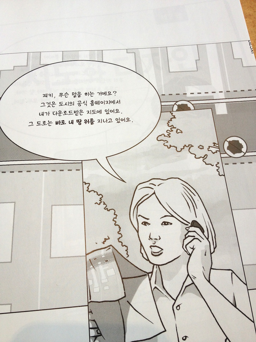
  • significant expansion of the graphic novel, extended throughout the book, as an exemplar how making maps can change the world

But that’s not all…

  • expanded discussion of when mapping is inappropriate
  • updated content on map medium guidelines
  • addition of content on viewing distance rules
  • expanded discussion of Impact Evaluation with new fracking oil shale example
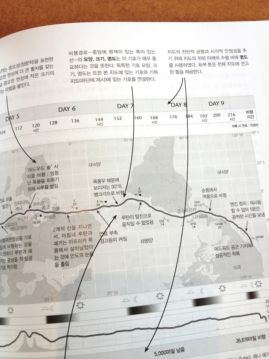
  • expanded discussion of time and mapping, including mapping the future
  • addition of content and examples of geodata locational services and privacy
  • addition of geoweb concepts including interoperabily, open data layers, tile maps
  • extensive refinement and clarification of map projection terminology
  • discussion of when map projections don’t matter
  • updated data in maps on poverty, hate groups, firearms deaths, election results, African American absence, etc.
  • new maps on slavery and lynchings in the US
  • expanded discussion with 10 new examples in Ways to Think about Map Symbols section
  • new two pages section on symbolizing terrain
  • new section on Ways to Think about Map Symbolization Abstraction with new maps on Detroit children traffic fatalities
  • reorganization of Color chapter into a more logical progression with a trio of new Voyager maps showing monochrome, two color, and full color examples
  • revision, expansion, and updates of More information sections in each chapter
  • new map quotes

Despite 40 new pages of material in the book, it is still under 300 pages. No bloat here – no “book junk.”

I’ll post more bits from the book in the coming weeks, months, …

And the book starts thusly…

Screen Shot 2016-07-29 at 11.00.26 AM Screen Shot 2016-07-29 at 11.00.39 AM Screen Shot 2016-07-29 at 11.00.49 AM Screen Shot 2016-07-29 at 11.01.03 AM Screen Shot 2016-07-29 at 11.01.15 AM Screen Shot 2016-07-29 at 11.01.32 AM Screen Shot 2016-07-29 at 11.01.45 AM Screen Shot 2016-07-29 at 11.01.59 AM Screen Shot 2016-07-29 at 11.02.09 AM

Read Full Post »

MM_Korean_01_cover

Sigma Press, 2013

ISBN 9788997927692

Some of the pages…

MM_Korean_02

MM_Korean_05

MM_Korean_03

MM_Korean_04

MM_Korean_06

Read Full Post »

To understand map design, and how maps work, it is useful to see how map design concepts play out on a real map.

One of the significant updates to the 2nd edition of Making Maps was the inclusion of a map of the 1986 trans-global flight of the experimental aircraft called Voyager. This map, originally designed and created by David DiBiase and I back in 1987 for David Woodward’s map design course (and in the University of Wisconsin Cartographic Lab), is repeated thirteen times in seven of the chapters, annotated to show how the concepts and ideas in these chapters play out on the map.

The repeatedly annotated Voyager map serves as an example of map design in practice, but also a guide to “reading” a map from the perspective of map design.

Martin Dodge suggested the annotated maps be available together, for instructional purposes. A good idea! So here they are. Each individual map on this page is a 800k PNG file (click for full size).

A PDF file (8.8mb) with all thirteen higher resolution TIFF images is available here.

The Voyager map project was quite a bit of fun to create back in the day. It won a map design award, was published in the book about the Voyager flight, and printed on paper as part of a promotion for the Waukesha County, Wisconsin Airport. I cannot imagine anything much more exciting than that.

••••••••••

The second map in the series prefaces the initial chapter in Making Maps 2nd edition, and poses a series of questions that will be addressed in future chapters (and annotated Voyager maps):

Chapter 2, What’s Your Map For?, sets the context of the map (and of its re-creation for the book) and how such context shapes the design of the map:

Chapter 6, The Big Picture of Map Design, repeats the Voyager map five times, focusing on the key map design concepts covered in the chapter. This is where the map flips orientation south up (a controversial design choice, according to some reviewers: good! Think about why such a choice is controversial, and if it should be [or ask your students to do so]):

South is now up (so the story reads from left to right):


Annotations about map pieces including title, scale, explanatory text, legend, directional indicator, border, sources, credits, and insets & locator maps:

Annotations about visual arrangement including path, visual center, balance, symmetry, sight-lines, and grids:

Annotations about graphical excellence, based on Edward Tufte’s ideas, including complexity, detail, design variation & data variation, context, revision, non-data ink, data-ink ratio, explanatory text, editing, chartjunk & map crap, redundancy, and multivariate data:

Chapter 7, The Inner Workings of Map Design, reveals the Voyager map with no visual differences (a confusing mess of lines and type):

The map with visual differences is then annotated, with regard to key methods for establishing visual differences, including detail, edges, texture, layering, shape, size, closure, proximity, simplicity, direction, familiarity, and color:

Chapter 8, Map Generalization and Classification, annotates the Voyager map in terms of the generalization concepts of selection, dimension change, simplification, smoothing, displacement, and enhancement:

Chapter 9, Map Symbolization, annotates the map in terms of the visual variables: shape, size, color hue, color value, color intensity, and texture:

Chapter 10, Words on Maps, annotates the Voyager map with regards to typographic variables including typeface, type form, type weight, and type size:

I have a few ideas for additional annotated Voyager maps (such as a full color map) which I hope to cobble together in the future. If you have any other ideas for variations that might be useful or interesting, let me know.

Read Full Post »

It’s out! Got my copies yesterday. A terrific upgrade from the first edition of the book – larger format, better paper, complete redesign, lots of new content. Shipping from Amazon and other similar sites. Let me know what you think if (when) you get a copy!

A few pre-publication reviews:

James E. Meacham, Senior Research Associate and InfoGraphics Lab Director, Department of Geography, University of Oregon: “Building on their solid first edition, Krygier and Wood have created a new and much richer follow-up. The second edition represents a serious reworking of subject matter and graphics. The book uses extraordinary map exemplars to address the full range of basic cartographic concepts and to demonstrate many subtle and advanced design techniques as well. Addressing current social issues including map agendas, ethics, and democracy, it is the kind of book that will inspire readers and cultivate admiration for the field.”

Paul Longley, Department of Geography, University College London, United Kingdom: “Krygier and Wood’s book should be used by anyone interested in the way the world looks, the way the world works, or the way the world should be. It remains the most accessible yet comprehensive guide of its kind. The second edition meets the needs and expectations of the ‘Google generation’ of map users while remaining true to the guiding principles that govern how maps look, work, and function. The very accessible, extensively illustrated format makes the book easily usable by students at all levels, as well as those taking steps to develop expertise in cartographic design.”

Read Full Post »

Cover, Making Maps, 2nd edition (AmazonGuilford)

Krygier and Wood’s book should be used by anyone interested in the way the world looks, the way the world works, or the way the world should be. It remains the most accessible yet comprehensive guide of its kind. The second edition meets the needs and expectations of the “Google generation” of map users while remaining true to the guiding principles that govern how maps look, work, and function. The very accessible, extensively illustrated format makes the book easily usable by students at all levels, as well as those taking steps to develop expertise in cartographic design. Paul Longley, Department of Geography, University College London, United Kingdom.

Building on their solid first edition, Krygier and Wood have created a new and much richer follow-up. The second edition represents a serious reworking of subject matter and graphics. The book uses extraordinary map exemplars to address the full range of basic cartographic concepts and to demonstrate many subtle and advanced design techniques as well. Making Maps is appropriate for beginning to intermediate college cartography students and others who want to tap into the power of map creation. Addressing current social issues including map agendas, ethics, and democracy, it is the kind of book that will inspire readers and cultivate admiration for the field. James E. Meacham, Senior Research Associate and InfoGraphics Lab Director, Department of Geography, University of Oregon.

More than two years in the making, the second edition of the book Making Maps is set for printing. Copies should be available in February or March of 2011. A Korean translation (?!) is planned for 2012.

This is no weenie update: Denis and I ruthlessly reorganized and rethought every bit of content in the book. I then redesigned the entire book and spent the better part of eight months producing it. We both think it’s a much better book.

Denis and I were careful to keep the spirit of the first edition of Making Maps intact while sharpening the overall look, content, and usability of the book. The goal from the beginning was to create a map design text that was different from other map design texts – more visual, creative, critical, engaging, and focused on making maps as well as really understanding how they work. It is a synthesis of what we like most about the academic study of maps and the actual design and production of maps. It is difficult to express how complex and challenging achieving this goal has been. When I look at this new edition, it feels so easy. Why couldn’t we have just done this 8 years ago when I started on the initial edition of the book?

The 2nd edition is larger in size (now 7″ x 10″) allowing more content on each page. In a Tuftean fit of non-data-ink removal, gone are a bunch of pages that didn’t have much content (such as the overview pages near the beginning of each chapter). We did retain ample white space, since absence makes the heart fonder.

We also added new material, including many real mapped examples, yet we are dozens of pages shorter than the first edition. Our goal was a lean book – “the greatest number of ideas in the shortest time with the least ink in the smallest space” – as Tufte put it.

The cover initiates an expanded version of the “road connector controversy” which sets up the point of the book – you make things happen by making maps.

There is a completely new first chapter setting the context for the entire book. It introduces The Flight of Voyager map, which is annotated a dozen times over throughout the book showing how map design concepts in the text play out on an actual map:

The chapters in the book are about the same, with a new first chapter and some recast chapter names:

Introduction

1: How to Make a Map
2: What’s Your Map For?
3: Mappable Data
4: Map Making Tools
5: Geographic Framework
6: The Big Picture of Map Design
7: The Inner Workings of Map Design
8: Map Generalization and Classification
9: Map Symbolization
10: Words on Maps
11: Color on Maps

While some chapters retain a significant amount of the original edition’s material, chapters 6 and 7 were extensively revised.

A makingmaps.net blog posting “How Useful is Tufte for Making Maps?” led me to incorporate Tufte’s ideas in the book in a much more explicit manner than in the 1st edition. See, for example, the Tufte-influenced annotated Flight of Voyager map (2 page spread, chapter 6) below:

Chapter 7 was revised as “The Inner Workings of Map Design” including figure ground:

Chapter 9 on map symbols also underwent significant renovations:

•••••••••••••••

Making Making Maps … Second Edition

I am but slightly embarrassed to admit that, once again, I produced the entire book in a 6-year-old version of the now defunct Freehand MX software. My original plan was to shift to InDesign since I was redesigning the entire book, but in the end I just wanted to make the damn book rather than futzing with transferring the maps and graphics from Freehand to InDesign and learning the ins and outs of InDesign. So my plan is to eventually shift the entire book to InDesign assuming a 3rd edition sometime in the future.

The book was produced on my 4-year-old MacBook Pro, which allowed me to work on it at home on the dining room table, at home on the table on our front porch (where Denis and I had earlier sat and pounded through the plan for the 2nd edition), at CupOJoe coffee at the end of the block, at Panera while waiting to pick up Annabelle after her morning pre-school, at soccer practice at some god-forsaken indoor soccer warehouse in the hellish outer suburbs of Columbus, in Raleigh NC whilst visiting Denis to work on the book, at the OSU recreation center with the climbing wall, at the OSU recreation center with the pool (both while waiting for kids to finish various climbey or splashy activities), at my parents house in Waukesha (Wisconsin), the Caribou Coffee in Waukesha, my in-laws in River Hills Wisconsin, and in my office at Ohio Wesleyan.

•••••••••••••••

This is really a labor of love – given the time and brain power expended on the text – and we both hope this new edition lives up to the expectations of the kind and usually enthusiastic readers of the first edition.

Read Full Post »

Q: How does Making Maps relate to GIS software?

A: Making Maps focuses on the mapping side of GIS, or any software that allows you to design and create maps. The examples in the book were not, for the most part, created with desktop GIS software. This is because it is difficult (if not impossible) to achieve (carto)graphic excellence in contemporary GIS software. Most design cartographers who use GIS exit GIS software and design their work in software like Illustrator, Freehand, or Corel Draw. The design capacity of GIS software will undoubtedly improve. Making Maps provides exemplary design and ideals to shoot for. If you can’t do something shown or suggested in Making Maps with the GIS software you happen to be using, complain to the software company, and get a copy of Illustrator, Freehand, or Corel. Such software are not that difficult to learn and will provide you with a multitude of creative design options not available to you in typical GIS software. Your maps, in other words, will be better. A diversity of software for working with geographic information exists, and is evolving and developing on a daily basis. Making Maps defines design guidelines, principles, and exemplars which transcend the diversity (and limitations) of constantly evolving GIS software.

Read Full Post »

Q: Making Maps is an weird cartography book – what were some of the ideas behind its creation?

A: A NACIS Conference (Oct. 12-15 in Salt Lake City) included a panel of critics (Stuart Allan, George McCleary, Peter Keller, Margaret Pearce) interrogating Cindy Brewer’s new book Designing Better Maps (ESRI Press, 2005) and Making Maps. I prepared a statement about the intent and ideas that shaped the look and content of Making Maps.

Da Bomb

Making Maps: A Visual Guide to Map Design for GIS: Author’s Intent

When Peter Wissoker (then of Guilford Publications) asked me to write a cartography text, I told him the world did not need another cartography text. The number of academic cartography courses were not growing, and probably declining, despite the explosive growth of GIS. Peter then asked if I liked existing cartography texts, and I said I did not use them in my courses. “So what kind of text would you use, if it existed?” asked he. This question led to Making Maps. I wanted a book that would get readers excited about maps (existing texts are rather languid), I wanted good examples to show why map design matters and how it works (also not found in abundance in existing texts), and I wanted to promote creativity – fundamental to good map design, and difficult to teach. Denis helped to shape and refine the goals and develop the content of the book.

I designed the book like I would design a map. The audience? Cartography courses, maybe as a supplement, GIS courses, certainly as a supplement, and individuals who make maps (or like maps) but don’t have a background in cartography, and don’t want to be academic cartographers. Then what? Coherent concept, a hierarchy of content emphasizing what is important and excising the rest, creative design to grab attention and make a point, all so that the book works as well as possible for its readers. A few key ideas shaped the design of Making Maps:

1. Maps are visual, so make the book visual (rather than textual), to promote visual thinking and creativity, both fundamental to map design. As far as possible, focus each page on maps and arrange text around the maps (rather than the reverse, which is what other texts do). To subsume text and emphasize the maps required a profound generalization of all the words about maps that dominate cartographic texts. We promote maps as a vital way of seeing patterns in data that would not otherwise be evident, and stress that less is better than more. Apply these ideas to a map design text: carefully designed maps, rather than words, used to reveal map design principles.

2. It is impossible to teach map design without good and creative examples, but it helps to have poor examples to contrast with the good to show how and why design matters. Eduard Imhof used this visual approach to the map design process in his classic article on map type, and I applied this idea throughout Making Maps. I also tried to incorporate good and creative design in all the maps in the book, supposing one can learn by seeing.

3. Enthusiasm and excitement about maps abound in a world where maps and the tools to make them proliferate, so design the book to espouse enthusiasm and excitement about maps. Many of the real maps in the book comprise a cartography of affect – hate crimes, AIDS deaths, bombing sprees, hurricane impacts, war deaths, poverty, alcohol, queer geography, projected naked bodies, suicide, radioactive fallout, military targeting maps, spiritual geographies, and aliens. The text and maps were also infused with a ludic sensibility – humor, farce, satire, sarcasm, irony and play. The mystery maps that preface the book and are between chapters encourage playful engagement (what is it?) with maps, their visual form, and the curious things we can map. Engaged emotion and play promote enthusiasm and excitement about maps, and creativity in their design, counter-balancing the stern normative content (rules, regulations, good/poor, do this-not that’s) in Making Maps.

Making Maps covers the basics of maps and map design, although I do believe it to be more sophisticated than it may appear at first glance. I am pondering Making Maps II, or Making More Maps, and what exactly a more “advanced” cartographic design text might look like.

Read Full Post »

Q: How were all the example maps in Making Maps created?

A: The primary software I used to create Making Maps was Freehand on a Mac. I learned Illustrator and Freehand in versions 1.0 back in the day while working at the Cartographic Lab at UW Madison. I have always liked Freehand better than Illustrator, despite extensive work with both software packages. Many of the map projections in the book were created in GeoCart, and I used ArcGIS to create a few dozen maps. All were imported into Freehand and redesigned.

The entire book layout and design was done with Freehand – somewhat unconventional. Because the book design and layout I wanted was unusual, I decided to “mock it up” in Freehand, assuming the whole book would be reworked by a professional book designer, sorta following my ideas. In the end, this never happened, my “mock up” is what became the final book layout and design. I think I need to take a book design course, and learn more about typography (I think the typeface and text in the book is one of its weaker points) for the 2nd edition. William Meyer (at Guilford Publications) took the Freehand files, chopped them up into single pages (I did two-page layouts, as facing pages almost always were designed to relate to each other) and converted them to PDF (with surprisingly few problems) and sent them off to the printer.

Read Full Post »

Q: What tunes did you listen to while making Making Maps?

A: iTunes was essential software for the completion of Making Maps. I have always listened to music while making maps, but have never been able to listen to music while doing other work. Curious. Various and sundry tunes wafted in the background whilst I worked on all the graphics, but a few stand out, mostly because they embody the quirky, hard to pin down qualities I tried to embody in Making Maps. A pair of CDs I have never stopped listening to – since I bought them decades ago – are the last two CDs by Talk Talk, Sprit of Eden (1988) and Laughing Stock (1991). Best known for its early 1980s start as a Duran Duran wannabe band, Talk Talk mutated into something weird and inexplicable in the late 1980s. While I revisit some of my college-era tunes occasionally, most all sound somewhat dated (and I am not old enough to get nostalgic yet). But not these two Talk Talk cds. A more recent CD that embodies the same spirit (and drummer) as Talk Talk is Bark Psychosis and their recent ///Codename:DustSucker. There is nothing similar about Talk Talk and Bark Psychosis but they are very similar. One more and I will stop: n.Lannon. Now I am not a big fan of folk music. And I am not a big fan of techno. But n.Lannon put them together on Chemical Friends and the outcome (Folktronica, I guess) is irresistible to anyone making hundreds of quirky maps.

Read Full Post »