
Archive for the ‘12 Finishing Your Map’ Category
Making Maps now at makingmaps.substack.com
Posted in 01 What's A Map?, 02 Why Are You Making Your Map?, 03 Mappable Data, 04 Map-Making Tools, 05 Geographic Framework, 06 Map Layout, 07 Hierarchies, 08 Generalization & Classification, 09 Map Symbolization, 10 Type on Maps, 11 Color on Maps, 12 Finishing Your Map, tagged Cartography, data analytics, Denis Wood, Geographic Information Systems, geospatial, information design, John Krygier, Making Maps, maps on January 17, 2025| Leave a Comment »
Map Symbols: Permanent Snow & Ice
Posted in 09 Map Symbolization, 12 Finishing Your Map, Map History, tagged Cartographic Design, Map Design, map symbols, Snow & Ice - Map Symbols on March 17, 2009| 2 Comments »

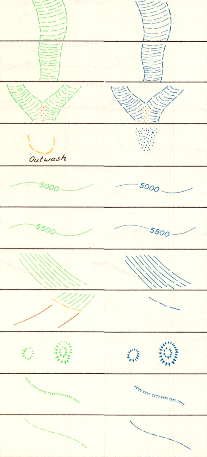
This manual establishes the design, weights, and gauges of symbols, and the type styles and sizes to be used in compiling and drafting standard topographic maps prepared by the Army Map Service for publication at the scale of 1:1,000,000.
During the compilation stages, strict adherence to symbol specifications shall not be required. Line weights and gauges may be varied twenty percent (20%), plus or minus, from prescribed specifications.
In using the symbols specified for drafting, strict adherence to the prescribed weights and gauges must be maintained.
The examples below are map symbols for permanent ice and snow features.
The 1953 Army Map Service guide Symbols for Small Scale Maps details map symbol specifications for compiled maps (left, below) and drafted maps (right, below). Compiled maps are the initial draft of a map, where diverse sources of information are drawn together. Using the compiled map, a cartographic draftsman creates the final, drafted map, suitable for printing.

The map symbol specifications include detailed symbol dimensions:
Specifications for glaciers:

Specifications for ice cliffs:

Specifications for the limits of icefields or snowfields:

The entire page 22 of the Army Map Service Symbols for Small Scale Maps, including specifications for permanent snow and ice features is linked below:

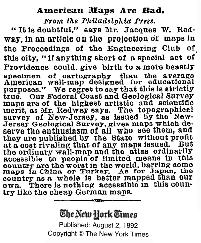
American Maps Are Bad
Posted in 02 Why Are You Making Your Map?, 12 Finishing Your Map, Bad Maps, Map History, tagged Bad Maps, Cartography, maps, Wall maps on March 18, 2008| Leave a Comment »
From the New York Times, August 2, 1892:
American Maps Are Bad
“It is doubtful,” says Mr. Jacques W. Redway, in an article on the projection of maps in the Proceedings of the Engineering Club of this city. “if anything short of a special act of Providence could give birth to a more beastly specimen of cartography than the average American wall-map designed for educational purposes.” We regret to say that this is strictly true. Our Federal Coast and Geological Survey maps are of the highest artistic and scientific merit, as Mr. Redway says. The topographical survey of New-Jersey, as issued by the New-Jersey Geological Survey, gives maps which deserve the enthusiasm of all who see them, and they are published by the State without profit at a cost rivaling that of any maps issued. But the ordinary wall-map and the atlas ordinarily accessible to people of limited means in this country are the worst in the world, barring some maps in China or Turkey. As for Japan, the country as a whole is better mapped than our own. There is nothing accessible in this country like the cheap German maps.
Thank God for the bad maps of China and Turkey.
Original article:
How Useful is Tufte for Making Maps?
Posted in 06 Map Layout, 07 Hierarchies, 08 Generalization & Classification, 09 Map Symbolization, 10 Type on Maps, 12 Finishing Your Map, Map Books on August 16, 2007| 21 Comments »
Edward Tufte’s The Visual Display of Quantitative Information (1998, 2nd edition 2001) is a classic book, arguably his best, and certainly a key text in the field of information graphics (which encompasses cartography). I know some cartography courses use the book as a text.
I recall being inspired by the book as a neophyte cartographer back in the late 1990s.
The book looked great: its design communicated the importance of design (when most other cartography and information graphics books were clunky and poorly designed). The tone was serious and high-minded: I was designing information graphics. And I think I absorbed Tufte’s minimalist design philosophy, although cartographic design, at least the way I learned it, was largely minimalist, with no allowance for flourish, fake 3D embellishment, or other chartjunk (or “map-crap” as I call it in the Making Maps book).
While I won’t impugn the importance of lofty inspiration, I did wonder what kind of practical guidelines I could derive from Tufte’s book. You know, specific stuff that would help me to design and make better maps. I sat down one day and made a list of Tufteisms from the book: that list is below.
Map Police Review: the MLA Language Map of the US
Posted in 03 Mappable Data, 04 Map-Making Tools, 08 Generalization & Classification, 12 Finishing Your Map, Map Police on July 9, 2007| 1 Comment »
The proliferation of mapping sites on the web provides ample fodder for critique by the map police (cartographic insiders). I usually feel a bit bad whining about the cartographic limitations of such sites. Cartographers have a history of obsessing with rules and such obsession has, arguably, limited creativity and undermined innovations. Bad cop. However, not following the rules does not necessarily produce creative and innovative mapping. I, for one, don’t entirely enjoy being the map police, but will try to at least be a good cop.
Lets look at a site that has been around awhile: The Modern Language Association’s Language Map. The site allows you map language data collected in the 2000 U.S. Census. A nice focused site with interesting data (I use it in my classes and the students enjoy pondering the patterns): here is the default map of the total number of language speakers in each county:
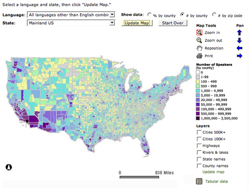
The basic language map allows you to view 33 different languages, mapped by county in the U.S. The total number of people who speak a particular language (above) can be mapped, but mapping totals can be deceptive, as the sizes of the counties vary. Thus a county may have more speakers of a particular language just because it covers more area than a smaller county. To account for these variations in county size, map the data as a percentage (the percent of people in a county that speak a particular language, see below). But you can map totals and there are sometimes good reasons to do so. Just realize the potential limitations of what you are seeing.
