
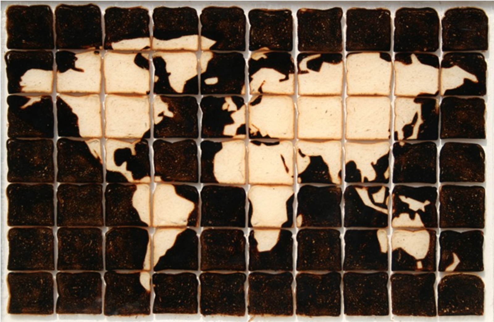
Archive for the ‘03 Mappable Data’ Category
Making Maps now at makingmaps.substack.com
Posted in 01 What's A Map?, 02 Why Are You Making Your Map?, 03 Mappable Data, 04 Map-Making Tools, 05 Geographic Framework, 06 Map Layout, 07 Hierarchies, 08 Generalization & Classification, 09 Map Symbolization, 10 Type on Maps, 11 Color on Maps, 12 Finishing Your Map, tagged Cartography, data analytics, Denis Wood, Geographic Information Systems, geospatial, information design, John Krygier, Making Maps, maps on January 17, 2025| Leave a Comment »
Book Review: Matthew Edney: Cartography. The Ideal and Its History
Posted in 01 What's A Map?, 02 Why Are You Making Your Map?, 03 Mappable Data, 04 Map-Making Tools, Deep Map Thoughts, Map Books, Map History on June 30, 2020| 1 Comment »
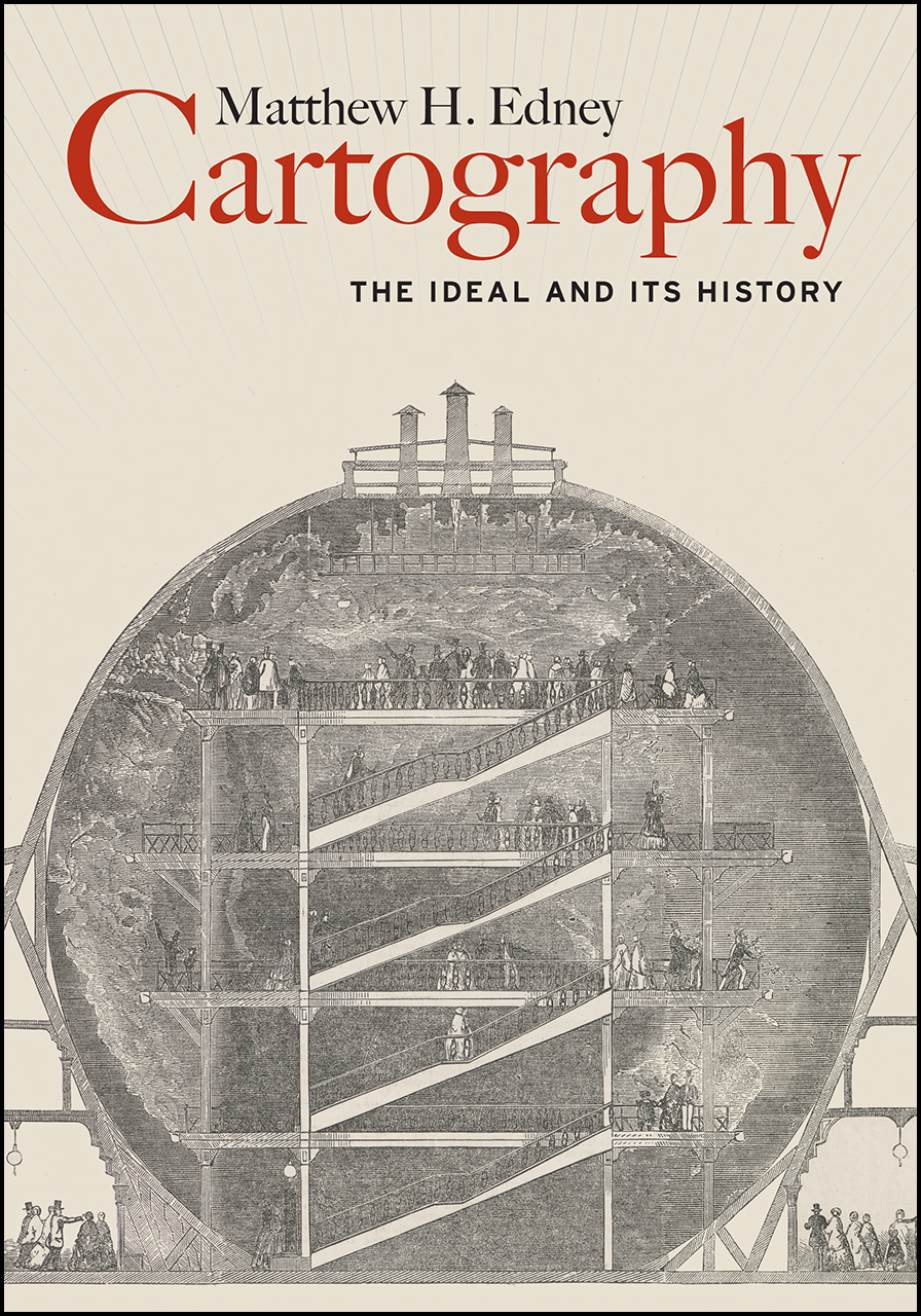
Matthew H. Edney. Cartography. The Ideal and Its History. xiii + 309 pp., figs., bibl., index. Chicago: The University of Chicago Press, 2019. $30.00 (paper), ISBN 9780226605685.
Matthew Edney @ USM
Matthew Edney @ Mapping As Process
University of Chicago Press Book Information
Book Review by John Krygier published in Isis: A Journal of the History of Science Society—Volume 111, Number 1, March 2020 (pp. 207-208)
There is no such thing as cartography, and this is a book about it. (p. 1)
Matthew Edney’s Cartography: The Ideal and its History provides a necessary corrective to the normative ideal of maps, mapping and the field of cartography. While of interest to scholars in the history of cartography, Edney’s book is just as important to the growing number of scholars whose research engages maps and mapping as part of diverse studies of culture, society and human history. Cartography: The Ideal and its History details problematic assumptions about maps, mapping and cartography, but it’s the creative potential of Edney’s book that’s most notable. As untenable assumptions are discarded, new insights emerge, insights which have the potential to greatly expand our understanding of maps and mapping across many different studies and disciplines.
Edney’s Cartography is situated in the intermingled fields of the history of cartography and critical cartography with touchstones including The History of Cartography, Book 1, edited by J.B. Harley and David Woodward (1987), Harley’s “Deconstructing the Map” (1989) and Denis Wood’s The Power of Maps (1992). These works, and many that followed, undermined narrow definitions of the map and broadened our understanding of the cultural, social and political context of mapping. Edney’s work as editor of later volumes of the History of Cartography, extensive publications on maps from Europe, North America and India as well as critical cartography make him an ideal scholar to take on the ideal of cartography. He does so by characterizing the traditional study of maps and mapping as “a profound act of cultural misdirection.” Maps and mapping are more complex, nuanced and disjunct than the universalizing, idealized conceptions offered by modern cartography, a thesis strongly supported by Edney’s immersion in diverse historical maps and mapping practices.
The most appealing parts of Cartography: The Ideal and its History are the delineation of fourteen modes of Western mapping and an intellectual assault on cartography’s idealized preconceptions. These issues are addressed in the first third of the book, prefaced by a discussion of the ideal and its limitations. Mapping modes include place, urban, property, engineering, chorographical, cosmographical, geographical, marine, celestial, boundary, geodetic, analytic, and overhead imaging. The concept of modes shifts focus away from a singular, idealized map (and map making process) to distinct (but evolving and interrelated) map types and processes that are better understood free of the narrow, idealized context within which they are typically situated. Cartography’s idealized preconceptions include ontology, pictorialness, individuality, materiality, observation, efficacy, discipline, publicity, morality and singularity & universality. In each case, Edney describes, critiques, and offers alternatives to these preconceptions. With the concept of mapping modes and critique of preconceptions in place, an intellectually sophisticated, nuanced and creative understanding of maps and mapping processes can play out.
Chapter 4, The Ideal of Cartography, details the construction of cartography as “a modern myth.” The chapter weaves in references to mapping modes and idealized preconceptions. One is left, upon finishing this chapter, with a history of the construction of modern cartography as well as an understanding of its limitations. Chapter 5 critiques the idealized geometry at the heart of modern cartography, specifically map scale. Much like maps and cartography in general, it is easy to naturalize map scale. This chapter, like the rest of the book, brings a sense of unease: many seemingly natural aspects of our common understanding of cartography are carefully constructed myths.
Cartography: The Ideal and its History is scholarly, well-written and a significant contribution to the history of science. It covers some ground explored by other recent scholars (including Matthew Wilson’s 2017 New Lines) but with a stronger footing in historical scholarship. Edney’s mapping modes and idealized preconceptions provide actionable ideas which are often lacking in critical cartography literature. It’s not clear, however, if Edney’s work will have much of an impact on modern mapping practitioners (cartography, geographic information systems, Geospatial technology) or academics in these technical fields. The myth of cartography is, if anything, functional and serves the needs of particular people and groups (property ownership, the military, government bureaucracy, business, etc.). Online mapping and navigational tools, such as Google Maps, are rife with problems (such as the inclusion of fake businesses that generate income for Google and for companies who pay to have these businesses on the map). Alas, people find such services useful and don’t really think the maps and information they engage with are anything other than an image of the real world. At the very least, scholars should not fall into the same trap: Matthew Edney’s Cartography: The Ideal and its History provides a corrective, a reimagined intellectual framework for maps and mapping that will, when engaged and operationalized, greatly broaden our understanding of the wondrous array of inscriptions and practices we call maps and mapping.
John Krygier
Professor of Geography
Ohio Wesleyan University
Delaware, OH. 43015
jbkrygier@owu.edu
Denis Wood: Where? Nowhere
Posted in 01 What's A Map?, 02 Why Are You Making Your Map?, 03 Mappable Data, Deep Map Thoughts, Map Books on March 11, 2019| Leave a Comment »
Review by Denis Wood of
Katherine Marsh. Nowhere Boy (Roaring Brook, New York, 2018)
Glenda Garelli, Federica Sossi & Martina Tazzioli. Spaces in Migration: Postcards of a Revolution (Pavement Books, London, 2013).
James Cheshire and Oliver Uberti. Where the Animals Go: Tracking Wildlife with Technology in 50 Maps and Graphics (Norton, New York, 2017)
Where? Nowhere
One of them doesn’t exist.
What could that mean, doesn’t exist? Clearly he exists. He has flesh. He has bones. What he doesn’t have are … papers. Which is another way of saying … any rights. No rights. This is to say that spatially he has no right to exist where he does. Where he does? What could that possibly mean? Where else except where he is could he exist?
Well, nowhere, obviously. So this must mean something else. But it’s hard to say what. The boy we’re talking about is Syrian, which is to say that he was born in Syria and until recently lived there. Now he’s in Brussels, in the corner of a basement in a house whose other inhabitants don’t know he’s there. He comes out at night to filch a little food but is very quiet because if they knew he was there they’d turn him over to the authorities who would lock him up. Or send him back to Syria which he’d fled because of the war there. He had the right to be in Syria, but no way to be in Syria. He has a way to be in Brussels, but no right to be there.
Rights don’t seem to be very strongly connected to the way things are, to the actual state of things.
Rights are permissions granted to people by others. To say that the boy – his name is Ahmed – had no right to exist in Brussels is to say that those around him hadn’t given him permission to exist there. Well, this isn’t quite right either. Max had. Max was another boy living in the house, one who did exist, who did have a right to be there. A partial right. His family had moved there from Washington when his father was posted to Brussels. Max finds, he ferrets out Ahmed in the basement. The two become friends and Max abets Ahmed’s secret life in the house.
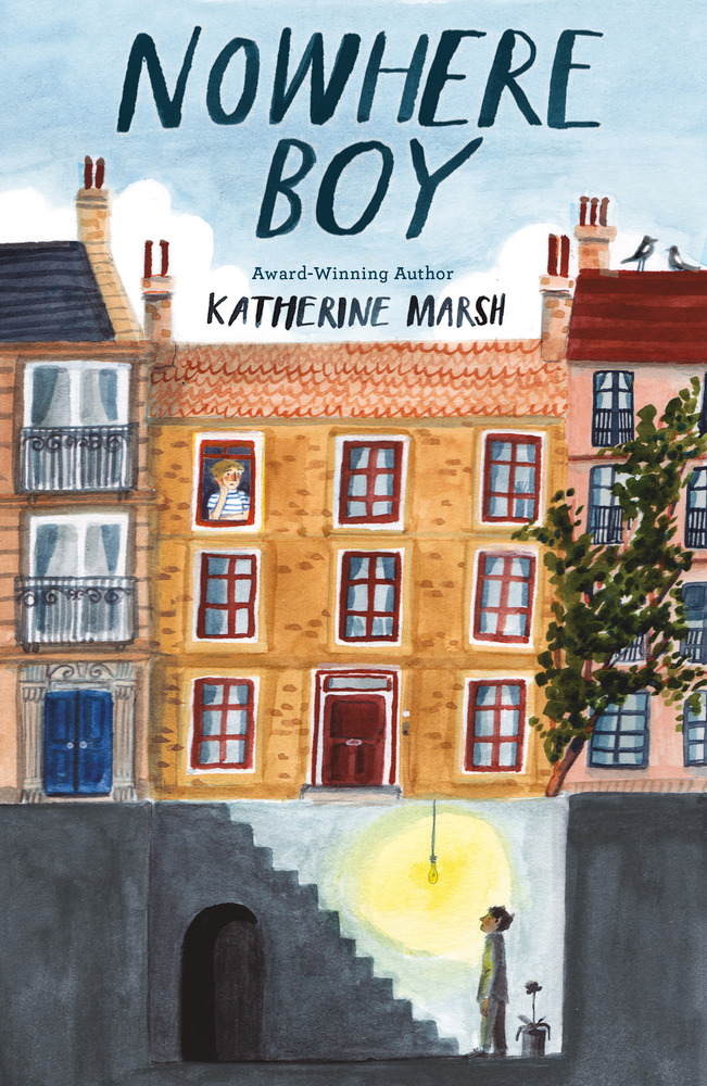
The boys are characters in Katherine Marsh’s Nowhere Boy (Roaring Brook, New York, 2018), a young adult novel about the refugees coming to Europe, these days through the desert and across the seas. Those fleeing to Europe are fleeing war and destitution and tend to be Muslim, which is pretty stigmatized in Europe. These people are not wanted, even in countries that desperately need their labor, like Hungary. Ironically Ahmed and Max end up in Hungary, in Kiskunhalas, near its border with Serbia, where Ahmed’s father is in detention. It’s a young adult novel, so it ends well. But until it does, Ahmed “didn’t want to go anywhere anymore. He felt safer being nowhere.”
Which is what not existing means: it means being nowhere.
Being nowhere means you can’t be plotted to a map. Not existing, being nowhere, and being unmappable are all vaguely synonymous. Of course they’re abstractions. One flesh and blood body can annihilate them all. Which is what Ahmed’s body did, violated the abstractions, rendering him existent, there, and mappable. This is also what the Tunisians from Lampedusa in Paris did when they occupied 51 Avenue Simon Bolivar, hanging out a banner that read, “Ni police, ni charité. Un lieu pour s’organiser.” Which is to say, “No police, no charity. A place where we can organize.” A place. They wanted a place which, nowhere, nonexistent and unmappable, they didn’t, they couldn’t have. What they had, two days later, were police, plenty of them, who forced them back onto the streets and so rendered them, once more, nonexistent, nowhere, and unmappable.
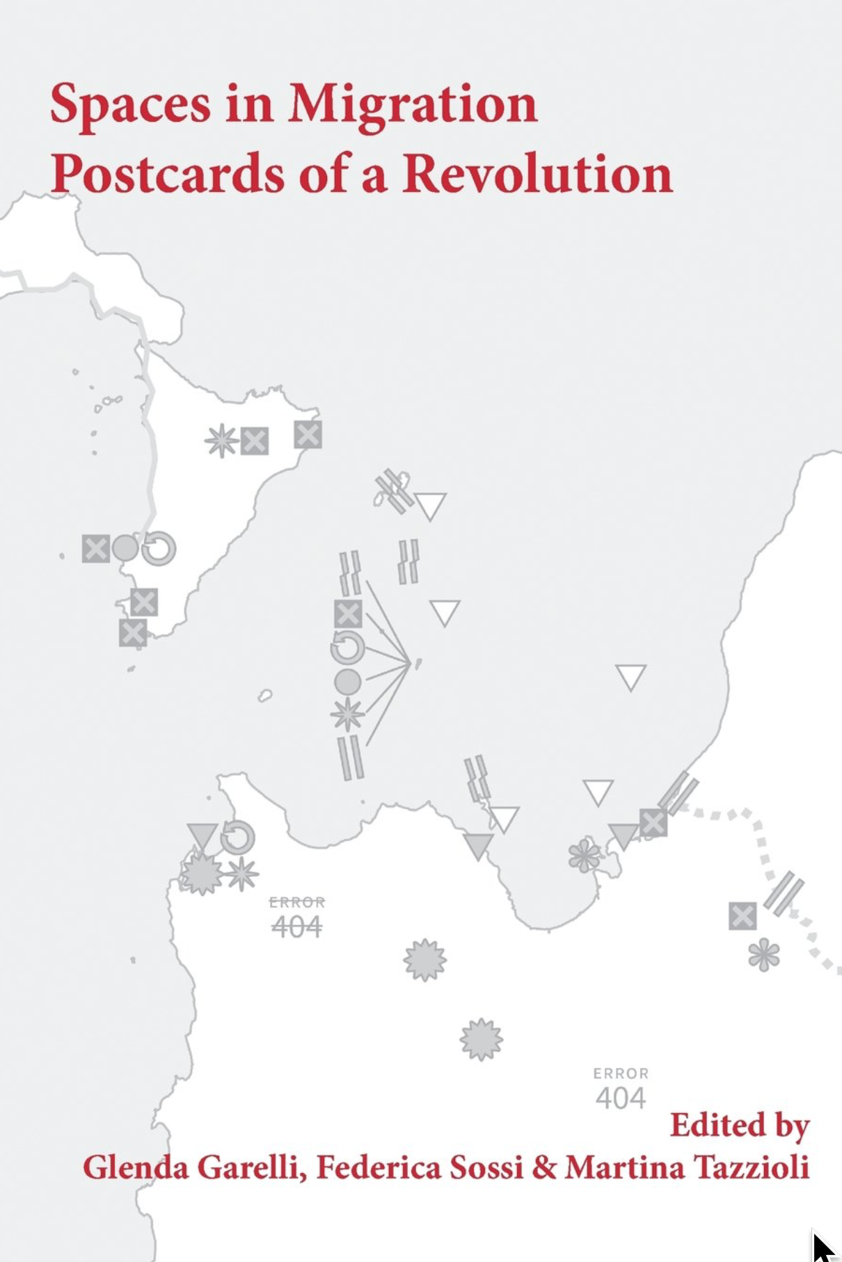
These were the harraga, “those who burn.” Meaning both “young people who ‘burn’ frontiers as they migrate across the Mediterranean sea and those who are ready to burn their documents (but also their pasts and eventually their lives).” The words are those of Paola Gandolfi from her “Spaces in Migration” in Glenda Garelli, Federica Sossi and Martina Tazzioli’s Spaces in Migration: Postcards of a Revolution (Pavement Books, London, 2013). “Spaces in migration” is an ambiguous phrase, implying both spaces moving in the process of migration (for example, the spaces moving with the migrants’ bodies) but also the spaces emerging in the process of migration (like 51 Avenue Simon Bolivar, like the detention facilities on Lampedusa). Either, or both of these taken along with the burning of frontiers and the burning of documents can melt the solidities, the certainties, of the contemporary system of nation-states.
Which are, after all, bounded places (states) with a population that is more or less culturally coherent (nations). There may be no true nation-states these days, given the bewildering range of peoples that live in even the smallest of them (Abkhazia, for example), but there are states galore, with ever more jealously guarded borders.
When these are “burned” by harraga it’s as though a body were being wounded, anything might get in, there would be no integrity, the body could come apart. So when the Tunisians started crossing the Mediterranean for France and reached Lampedusa, a minute island midway between Sfax, in Tunisia, and Malta, from which, thanks to a permit granted by the Italians, they were able to travel freely through the Schengen Area, you’d think the whole African continent was attempting to pour into Europe. The few thousand who initially reached Lampedusa, well, Lampedusa is small. It’s not eight square miles. But still, the first few thousands that arrived immediately aroused a language of Biblical proportions, of natural disasters: plagues, floods, tsunamis, simply overwhelming numbers which, in fact, didn’t amount to single thousandth of a single percent of the even the Italian population. Even in August when the number did reach fifty thousand it was still inconceivably small.
You’d think a dagger was being driven into the Italian, into the French heart.
The French closed its border with Italy. There was no way they were letting all these Tunisians into la patrie, despite their own earlier colonization of Tunisia. The French into Tunisia? Certainly. (And they didn’t give it up until 1956). But Tunisians into France? Unthinkable! To say nothing of the Libyans, who with their numbers soon revealed how few the Tunisians had been, the Eritreans, the Senegalese, the Syrians … All barely existent nowhere people on the move …
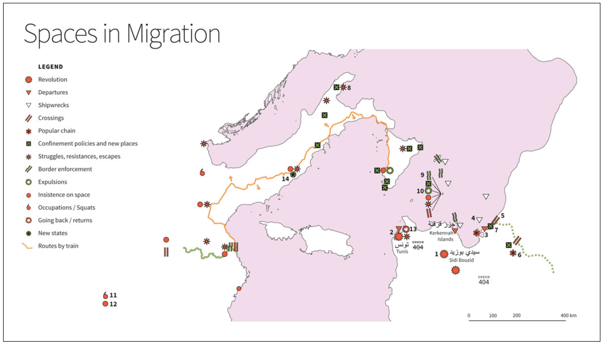
The map here may confuse some people. For one thing, north is to the left of the map. For another we’re not used to seeing this piece of the Mediterranean, turned this way, at this scale. Tunisia is in the lower right. That’s Libya above it. Lampedusa is the dot from which the items labeled 9 and 10, among others, are emanating. Paris is indicated by 12. Be that as it may, it’s astonishing how tight everything is, how close, how these two continents so firmly separated by Mohammed and Charlemagne almost kiss, even here in the middle of the sea. Lampedusa has kin, Linosa and Lampione. You can even see Tunisia from Pantelleria (it’s only 37 miles away). Despite this the rhetorical distance separating Europe and Africa remains all but uncrossable.
For the undocumented burning their way across it is crossable, but only as long as they remain nonexistent, nowhere, and unmappable. The problem is, “You start to get hungry, you smell and you only have one pair of jeans to wear. You never take your shoes off and your feet hurt. You call home, not too often, to let them know you are still alive but you do not speak of your insistence on space, and sometimes you start to think about returning. You even go as far as to insist on consulate offices to try to work out how to get home. But you burnt a border when you left on a boat, one that won’t allow you to burn it again on the return journey.” This comes from Garelli, Sossi, and Tazzioli’s “Postcards of a Revolution,” the conclusion to their book (it’s also online here). This is as close as you can get to despairing without actually giving up.
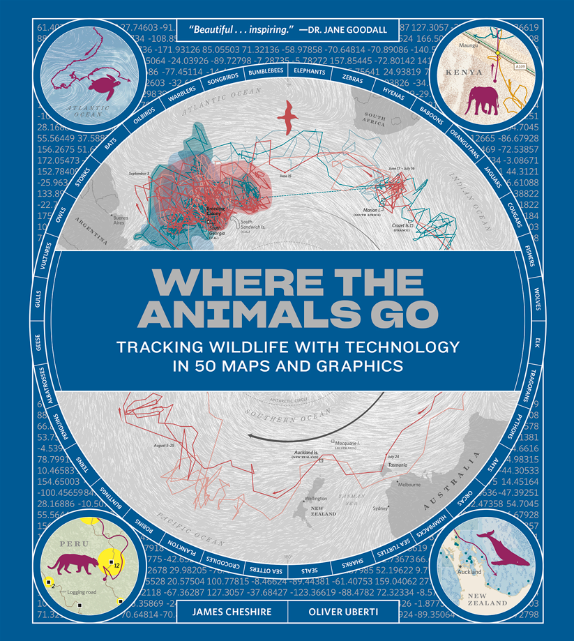
Placeless: often this is to say on the move, and since in motion, unmappable, wherever they may happen to be. It’s hard to map things in motion. All the ways we’ve developed are workarounds. Some of the best of these are captured in the recent book, Where the Animals Go: Tracking Wildlife with Technology in 50 Maps and Graphics (Norton, New York, 2017) by James Cheshire and Oliver Uberti. Like Ahmed in Brussels, like the Tunisians in Paris, animals too are undocumented, and like Ahmed and the Tunisians they too burn borders without hesitation. If they’re even aware of them.
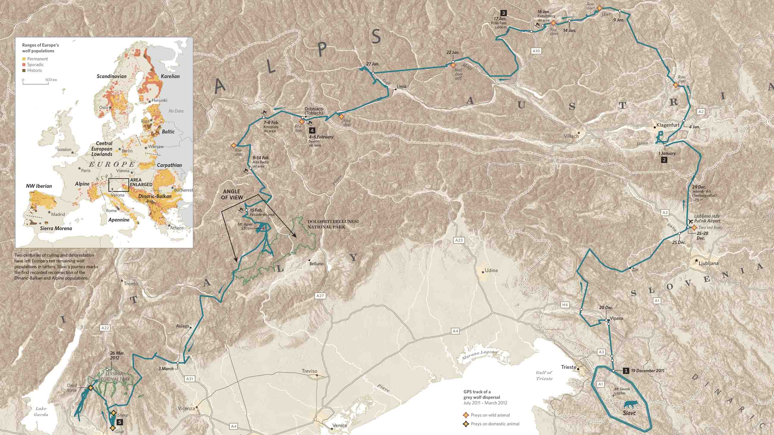
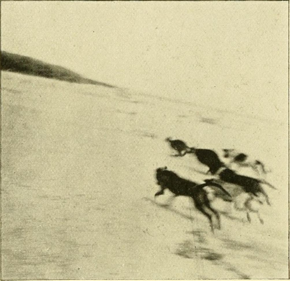
Take Slavc, a young wolf from the mountains on the Croatian-Slovenian border. He left his maternal pack and struck out on his own, crossing motorways and major rivers, navigating the Dolomites in the middle of winter and the suburbs of Verona; moving from the Dinaric Alps, across the Drava into the Alps, and so from Slovenia into Austria, and into and through the Dolomites, which is to say into Italy, before settling in the upper plateau of Monte Lessini. Slavc leaves Croatia, crosses Slovenia and Austria, and slips into Italy, all without so much as a by-your-leave from a single border agent. Of course he’s not a human so … who cares?
That he’s visible at all is because he’d been radio collared by a University of Ljubljana conservationist who tracked his GPS transmissions. The collar sent about seven locations a day, allowing Hubert Potočnik to interpolate the rest of Slavc’s movements. Mostly he moved at night, more like Ahmed than the Tunisians. He didn’t kill a domestic animal until he reached the outskirts of Verona, so if he hadn’t been radio collared he would have been completely invisible.
The carnivore at the top of the food chain is less easily hidden and, when seen, needs to be able to exhibit papers. The simmering European refugee “crisis” has led to an armoring of border and after border, including the one in the Dinarics that Slavc crossed between Croatia and Slovenia. The Dinarics are home to many animals that now move freely across the Slovenian and Croatian border, wolves, obviously, but also, among the collared, lynx and bears. The borders that impede the movement of Syrians and Eritreans also impede and usually preclude the movement of all the larger mammals. Impenetrable barriers are horrifying intrusions into their lives and genetically disastrous.
But what is this terror of the mobile? Only that it implies the fragility of the police states into which most modern states have evolved. Is there any that lacks its apparatus of control, its mechanisms for identifying, tracking, apprehending and expelling any it stigmatizes as unwelcome? It has less success with wolves, with storks, with whales but only because, inhuman, they’re less subject to scrutiny. As we have seen this has its downside: unintended control by barriers meant for humans. How many animals moving back and forth across the US-Mexico border will be trapped on one side or the other by Trump’s wall? How many will have their ranges severed? How many will be separated from their families?
I think it’s easy enough to answer, “Enough, enough will be separated from their families,” just as Ahmed was separated from his, as the Tunisians were separated from theirs, as animals around the world are separated from theirs.
Why do we even care where any of these are?
Isn’t it enough to know where we are? And when you stop to think about it, isn’t that hard enough?
Boris Artzybasheff’s Maps
Posted in 03 Mappable Data, 09 Map Symbolization, Map History on January 17, 2019| 5 Comments »
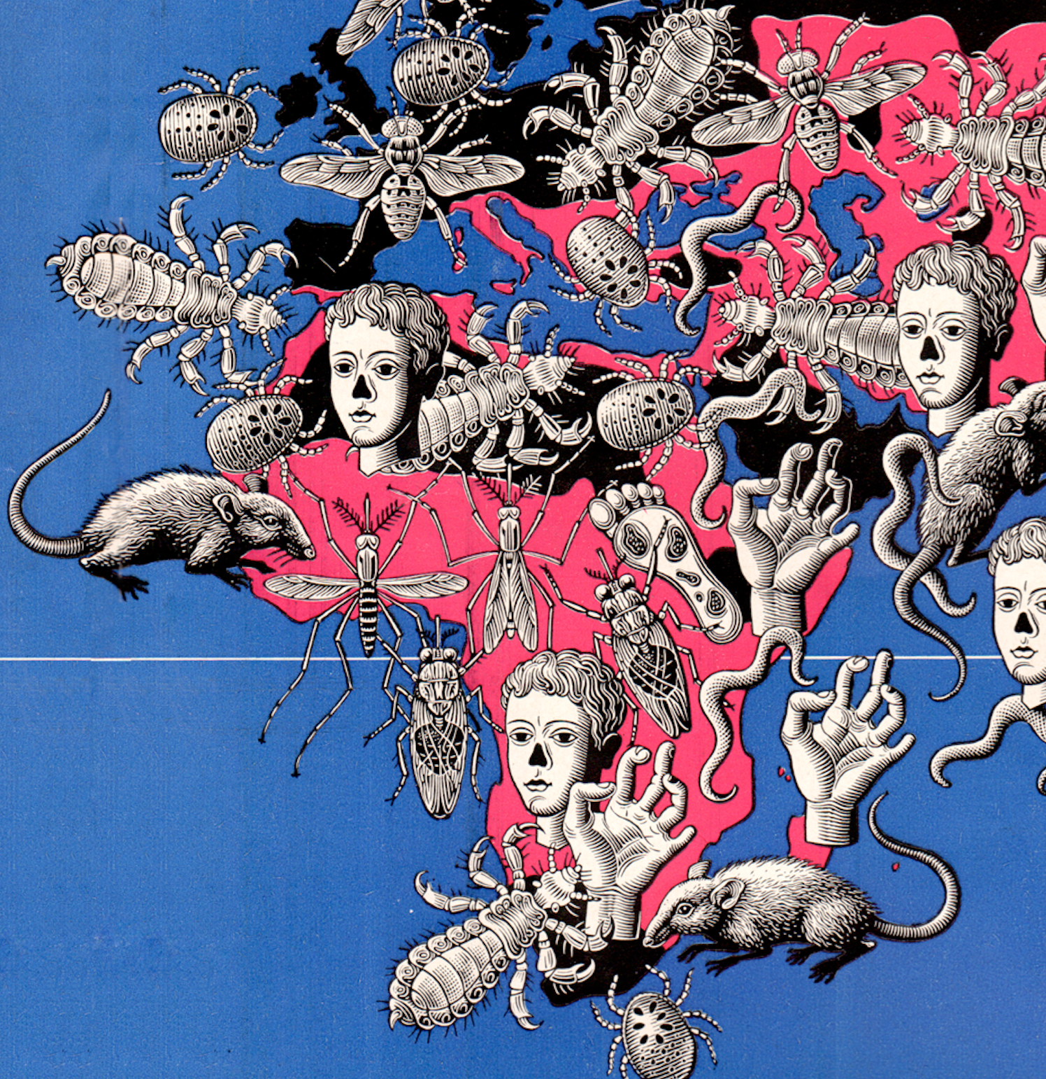
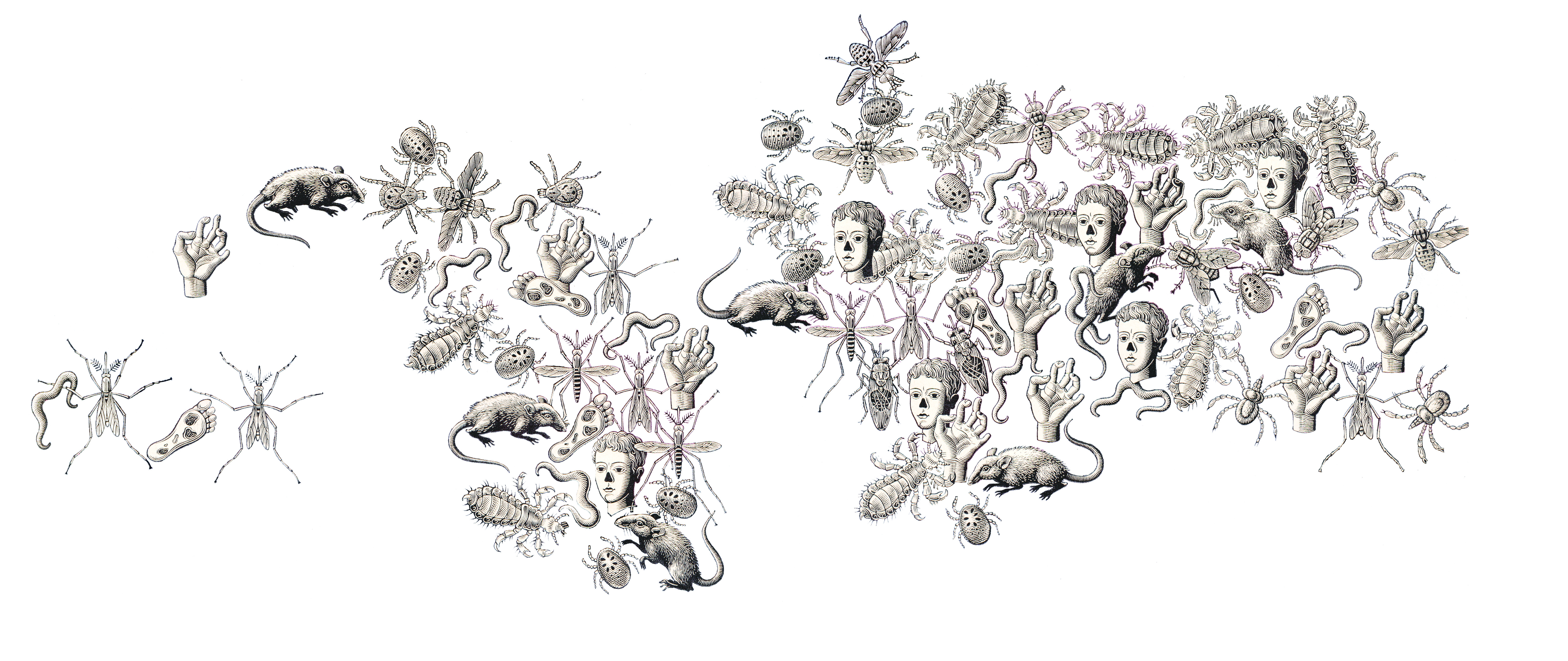
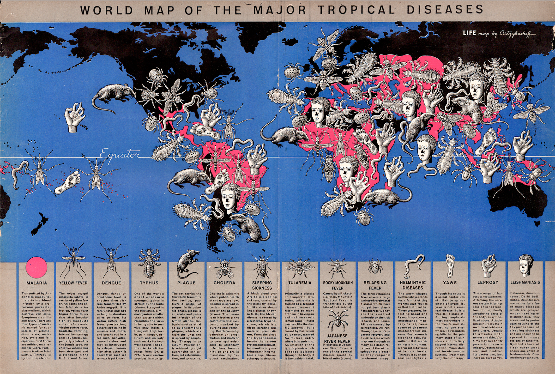
 Back when Denis Wood and I were planning the 3rd edition of Making Maps, I stumbled upon a map of world tropical diseases Boris Artzybasheff created for Life Magazine (“World Map of the Major Tropical Diseases,” Life Magazine, May 1, 1944; high-resolution version at the David Rumsey Map Collection).
Boris Artzybasheff was born in 1899 in the Ukranian city of Kharkov. His father was author Mikhail Artsybashev. He emmigrated to the U.S. in 1919. Artzybasheff created 219 covers for Time Magazine between 1942 and 1966. He was also a commercial graphic designer and worked for the U.S. Department of State during and after WW2. He is best known for his grotesque and surrealistic graphic work (source). Just google his name, or see a gallery of his diverse work here.
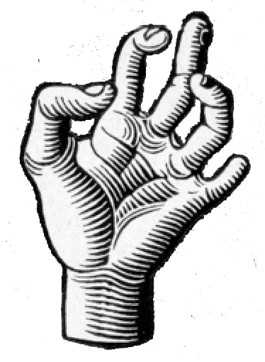
The tropical diseases map is relatively conventional except for the 14 disease symbols Artzybasheff crowded on the map. If the point was to make those who peered at the two-page spread feel uncomfortable, the map hit its mark.
Mapping conventions are so imposing that even the most distinctive and creative map maker bows to convention over creativity. Not quite so, at least in this case, with Artzybasheff. The symbols are a prime example of Artzybasheff’s style, grotesque neo-realism, with a whif of the macabre; one of the prime instances where a major graphic artist applied his aesthetic, largely unimpeded, to the cartographic arts.
Artzybasheff’s Maps and other Information Graphics
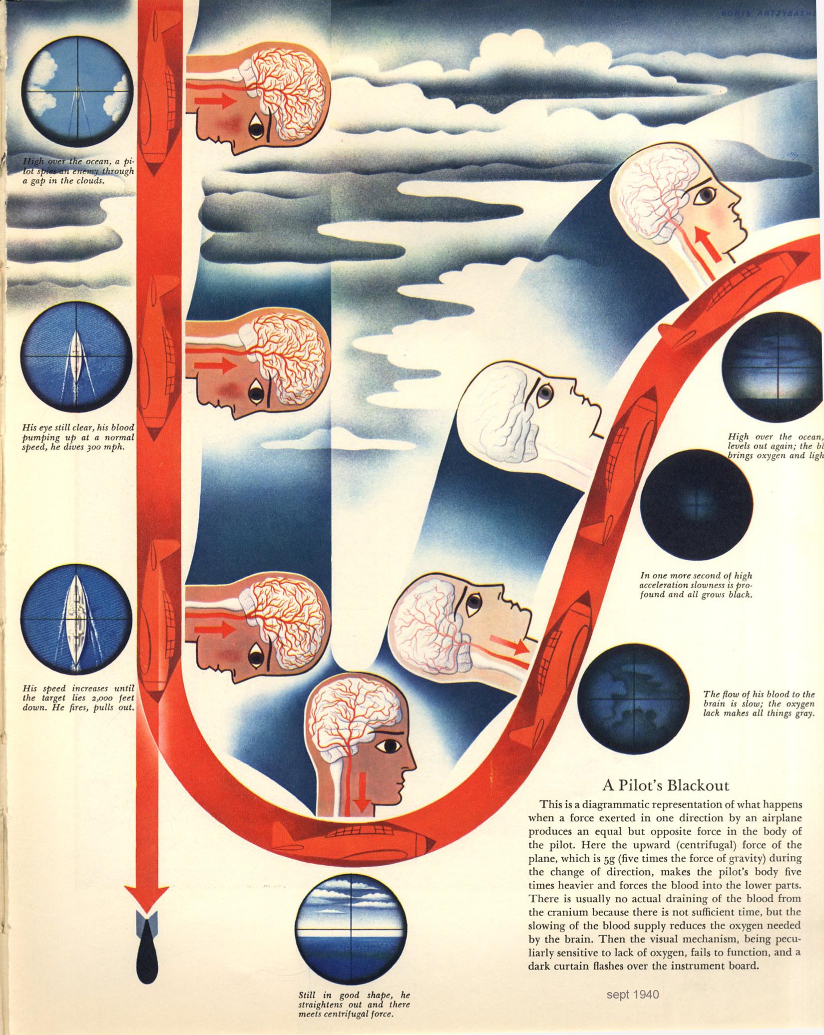 “In the late 1930s and early 1940s Artzybasheff began illustrating articles for Fortune and other popular magazines, usually with vividly drawn graphic renditions of maps or other informational diagrams. In the September, 1940 issue of Fortune magazine, for example, Artzybasheff provided a striking and colorful illustration for an article on how military pilots experience oxygen deficiencies and aeroembolism (decompression sickness or temporary blackouts attributed to nitrogen bubbles that form in the spinal fluid) when ascending rapidly to heights of 30,000 feet.” (Williams, 2007, p. 126). Diagram (left): “A Pilot’s Blackout,” from “Selection of Military Pilots: Not Every Flyer is Fit for Combat,” Fortune, September 1940, p. 81.
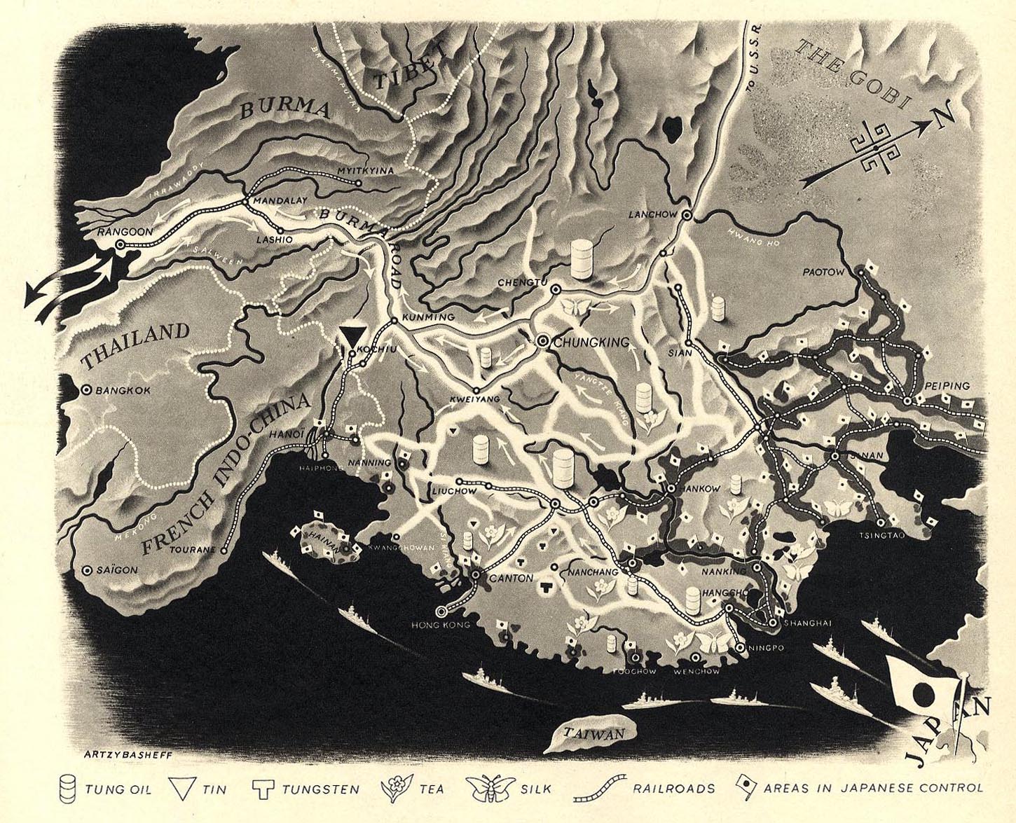
“In another, he provided a clear and detailed map of China’s main roads and rivers, showing which areas were under Japanese control, and how Chiang Kai-shek was dealing with the distribution of oil and other natural resources.” Map: “China in Japan,” Fortune, December, 1940, 106.
Work for the U.S. Department of State
Artzybasheff had other cartogaphic ties during and after WW2, driven by his friendship with S.W. Boggs, the U.S. Department of State’s official geographer (1927-1954). “Boggs was responsible for initiating partnerships between artists such as Artzybasheff and the State Department for technical cartographic advice and map production, but in the process absorbed an appreciation of these artists’ global visualization and their sense of the larger American public.” (Barney, 2011, p. 186)
Artzybasheff “…became advisor to the US Department of State and Psychological Warfare Branch, institutions heavily involved in the marketing of national policies and war propaganda. The war had been a period of active political involvement both for Artzybasheff and his wife, who was employed as recruitment chairman in the Manhattan Volunteer Office of Civilian Defense.” (Patsiaouras, Fitchett, & Saren, 2014, p. 127).
There is mention of an atlas by several sources, the earliest being R. John Williams in 2007: “Artzybasheff also worked as a geographer for the State Department, and developed an atlas that would be used by the U.S. Army Training Command, providing important visual information to military strategists in Europe.” (Williams, 2007, p. 140). Williams does not cite the source for this information, and I have not found any evidence this atlas was published (although it may be in an archive somewhere).
Boggs also enlisted Artzybasheff as a consultant on a 1947 film called Expanding World Relationships. The film was distributed by the U.S. Information Agency. (Barney, 2011, p. 189-191).
A final Boggs inspired project involved an effort to communicate the impact of map projections on perception of the earth and global political relations. The outcome was published in an article called “Global Relations of the United States” in The Department of State Bulletin (vol. 30, #781, June 14, 1954, here).
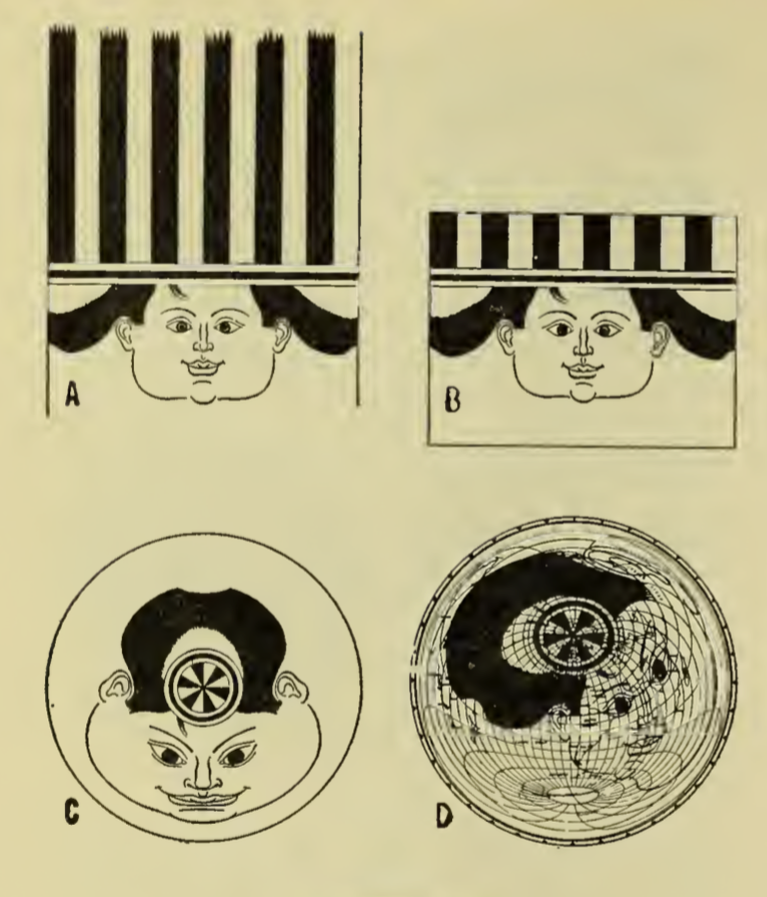
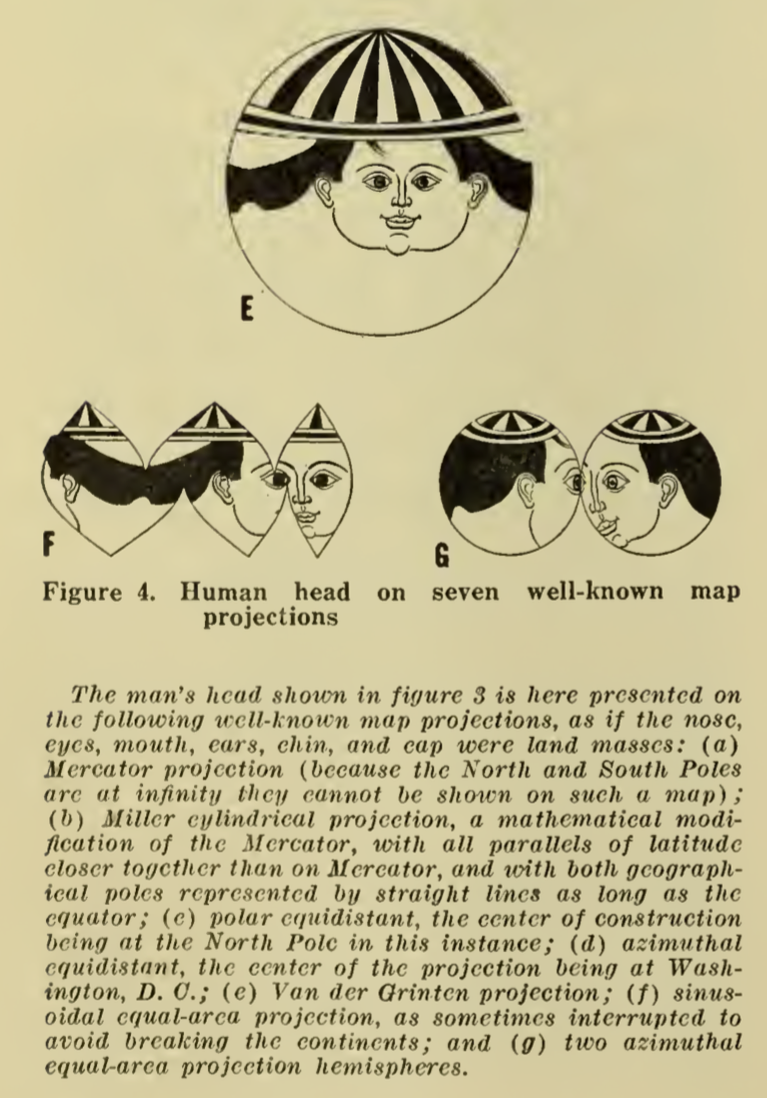
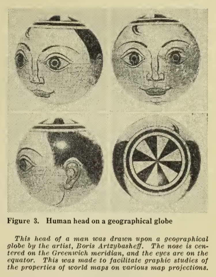 “In a 1942 letter to Artzybasheff, Boggs asks if the artist could potentially draw the head of a man on a white billiard ball, in hopes of designing a model that could show how projecting global features creates significant distortions on a flat map—in other words, flattening the nations and populations of the world is much like flattening a person’s face beyond all recognition. As he points out to Artzybasheff, ‘What I would like to get across to the ‘flat-mappers’ is that when we are looking at a flat map which includes the whole world, we are looking at a caricature which is analogous to representing the face, both sides of the head, back and top of the head, and beneath the chin all on one flat surface.” (Barney, 2011, p. 189)
The outcome, also illustrated in”Global Relations of the United States” was not particularly successful as these types of diagrams go. The face did not cover enough of the sphere to be distorted that greatly, and what we are left with is the tonsured hair of the figure spread about the projected illustration.
 |
 |
Sources
Timothy Barney, (Re)Placing America: Cold War Mapping And The Mediation Of International Space, Dissertation, University of Maryland, 2011. Direct PDF download here. Published as Mapping the Cold War: Cartography and the Framing of America’s International Power, 2015.
Georgios Patsiaouras, James Fitchett & Michael Saren. “Boris Artzybasheff and the Art of Anthropomorphic Marketing in Early American Consumer Culture.” Journal of Marketing Management, Vol. 30, Nos. 1–2, pp. 117–137, 2014.
R. John Williams. “‘I Like Machines’: Boris Artzybasheff’s Machine Aesthetic and the Ends of Cyborg Culture.” Technoculture: Special Issue of Interdisciplinary Humanities 23.1, pp. 120-142, 2007. PDF here.
A few additional Artzybasheff maps follow.
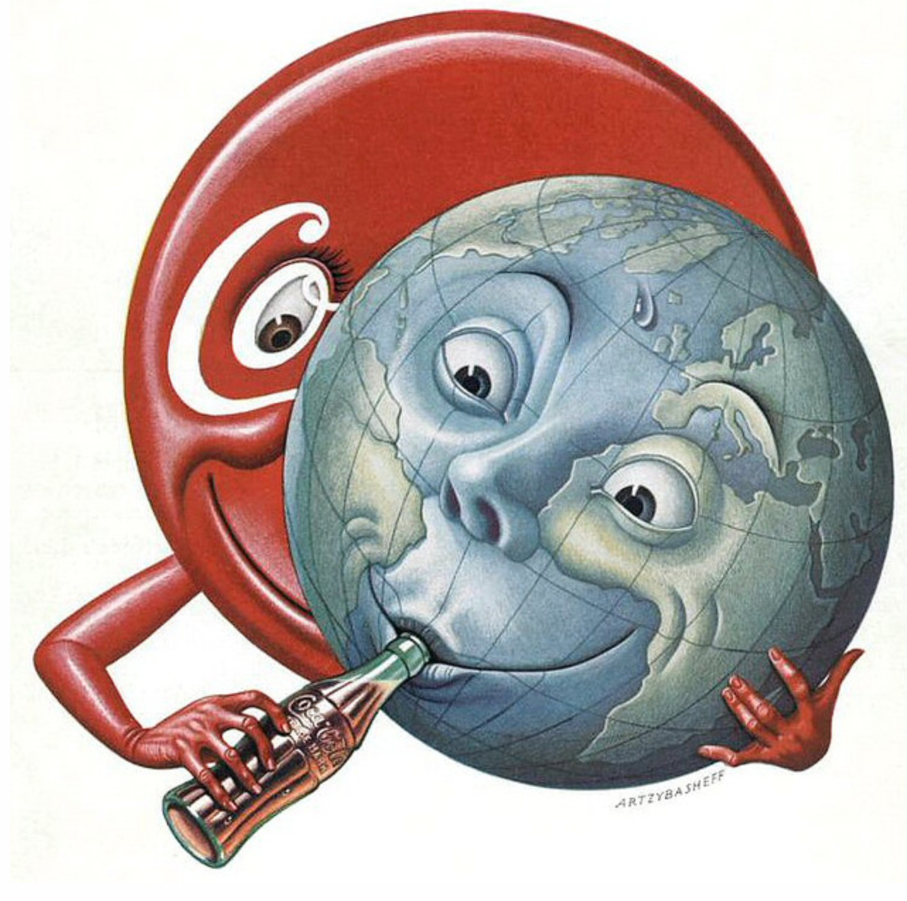
The cover for Time Magazine (May 15, 1950) was graced by a Coke sucking earth:
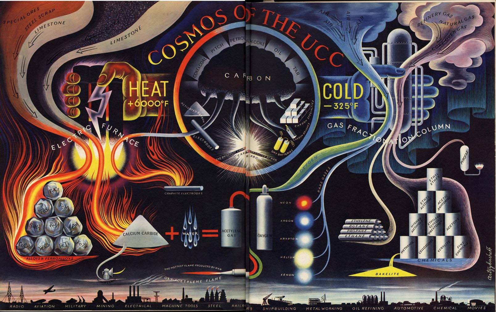
“Cosmos of the UCC,” from Fortune, June 1941. UCC is Union Carbide & Carbon Corporation.
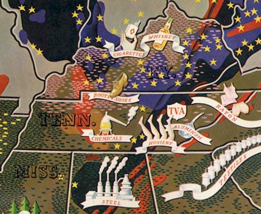
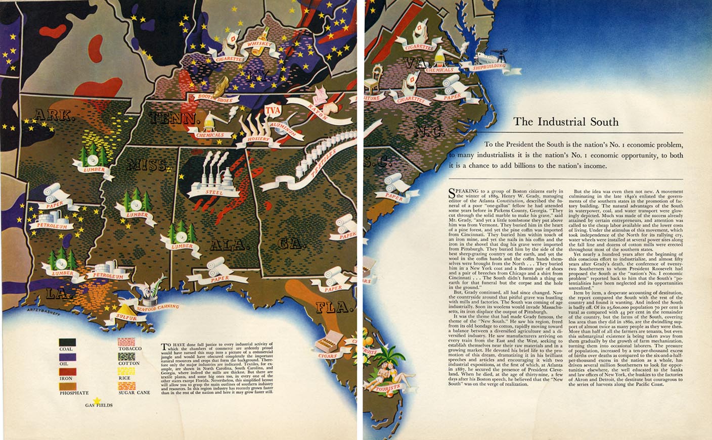
A map to accompany an article “The Industrial South” (Fortune, November 18, 1938) is not unlike the style of Erwin Raisz (previously, on this blog) in its use of pictorial map symbols.
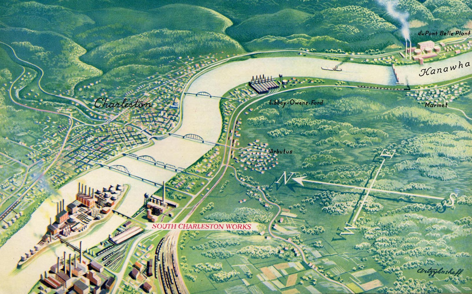
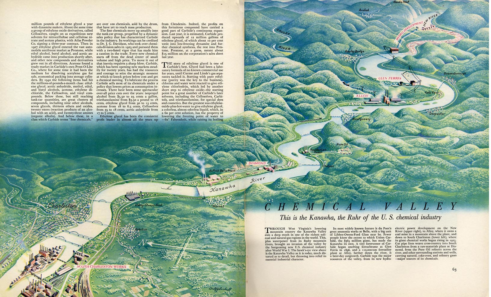
“Chemical Valley” (West Virginia’s Kanawha Valley) from the September 1941 issue of Fortune:
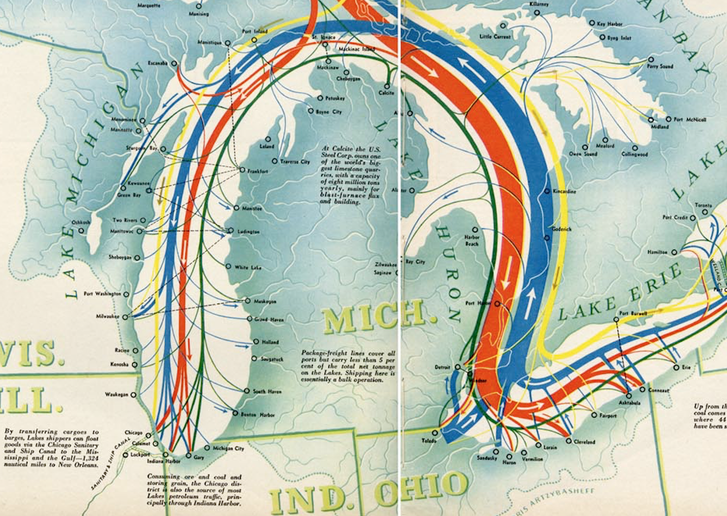
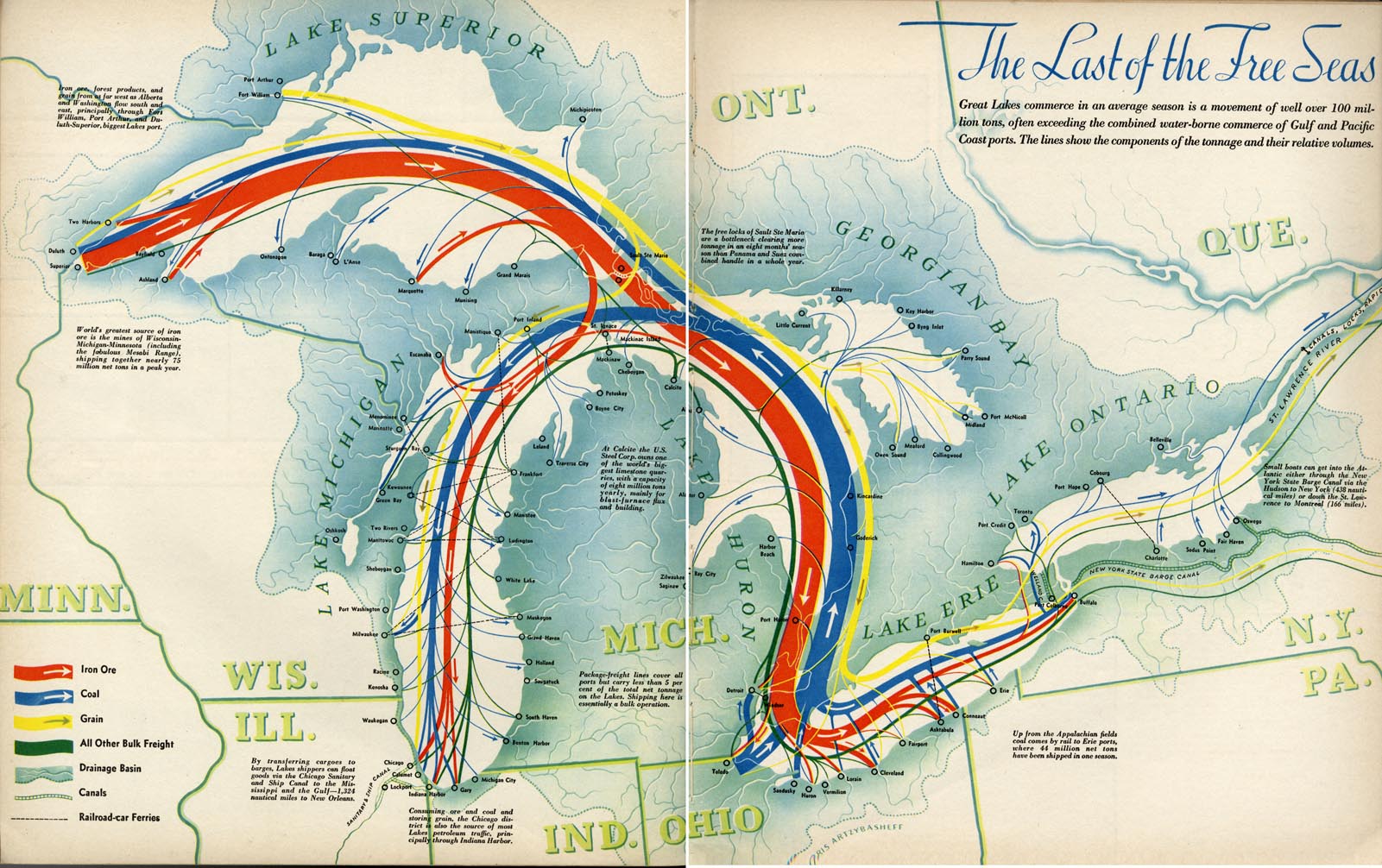
“The Last of the Free Seas” was published in Fortune in July of 1940.
Mapping Deeply by Denis Wood
Posted in 01 What's A Map?, 03 Mappable Data, Deep Map Thoughts, tagged deep mapping, Denis Wood, maps, maps and the humanities on August 11, 2015| 2 Comments »
Mapping Deeply by Denis Wood
This is a description of an avant la lettre deep mapping project carried out by a geographer and a number of landscape architecture students in the early 1980s. Although humanists seem to take the “mapping” in deep mapping more metaphorically than cartographically, in this neighborhood mapping project, the mapmaking was taken literally, with the goal of producing an atlas of the neighborhood. In this, the neighborhood was construed as a transformer, turning the stuff of the world (gas, water, electricity) into the stuff of individual lives (sidewalk graffiti, wind chimes, barking dogs), and vice versa. Maps in the central transformer section of the atlas were to have charted this process in action, as in one showing the route of an individual newspaper into the neighborhood, then through the neighborhood to a home, and finally, as trash, out of the neighborhood in a garbage truck; though few of these had been completed when the project concluded in 1986. Resurrected in 1998 in an episode on Ira Glass’ This American Life, the atlas was finally published, as Everything Sings: Maps for a Narrative Atlas, in 2010 (and an expanded edition in 2013).
Deep maps, deep mapping…
Yes, yes, but such a strange name for the practice. A practice that so often delivers far, far less than it promises. Especially maps. So many instances of deep mapping lack any at all.
Why mapping? Why not…thick description? Oh. Maybe because deep mapping is about place, while thick description is about…behavior? But aren’t the two all mixed up together? Isn’t that what deep mapping is supposed to be about—at least one of the things it’s supposed to be about—the unfolding of human life here, the mutual relations of people and soil and plants and animals and…go on, you name it…here in this…place?
Well, obviously I’m just trying to figure out why they call it deep mapping, when mapping isn’t what they are about, at all. They’re storytellers mostly, which is great, but mostly they’re not mappers. I’m talking about almost all of them, from William Least Heat-Moon to the most recent anthology of work on spatial narratives.
Not that you can’t tell stories with maps. You can. In fact, every map tells a story, stories actually, many of them. Even maps that people who don’t know much about maps call thin maps tell stories, ordinary, taken-for-granted maps, like highway maps, like the state highway map of North Carolina that John Fels and I spent fifty pages writing about back in 1986, and whose surface we barely scratched [1,2]. Thin maps…
Maps are models of concision, especially the ordinary taken-for-granted ones, cramming so many layers—so much history—into each line, into this line, for instance, this county border, the border of Wake County, first drawn in 1771 when the county was laid out of from parts of previously existing counties, but redrawn in 1787, 1881 and 1911, and named after Margaret Wake in 1771, the wife of William Tryon, then the colonial governor of North Carolina. All of this and so much more are caught up in that line that looks so simple but is anything but. And there’re a hundred counties on this highway map of North Carolina, which also sports state borders, coasts, highways, roads, cities, towns, parks, reservations, military bases, forests and other things. This map is not simple, this map. It’s not thin. It’s deep and thick. Most maps are like this.
A lot of them wield power too, great power. We think about maps as being representations of the world, but they’re not. They’re arguments about the world, and many of these arguments are serious. “High court to hear map challenge in August” reads the headline to an article on the second page of yesterday’s News and Observer [3]. A couple of days earlier, the lead editorial had been headed: “Rule on maps: the N.C. Supreme Court must quickly resolve a challenge to redistricting maps.” [4]. These maps are about who gets to vote in which districts, that is, are about whether Democrats or Republicans will reign in state government. This has huge consequences for the distribution of wealth, education, health, you name it.
Let’s not even think about the problems with immigration caused by the lines called national borders; or about the lines that bound school districts.
Some have more power than others, but all maps have it.
1. My Fight with Maps
My fight with maps, actually with cartography, was ignited by their rejection of modernism. As modernism was noisily turning its back on the failed rationalities, on the empty harmonies, on the make-believe coherences of Enlightenment, of Victorian thinking, cartography was clutching them ever more tightly to its breast. Painters may have been deconstructing pictorial space, composers shredding inherited tonalities, architects stripping walls of pilasters, cornices, and dentil moldings, poets following Pound’s cry to “Make it new”, and novelists indulging a self-consciousness that was all but the hallmark of the age, but cartographers, they were content to hone, to polish, to extend inherited forms.
Cartography exalted its unreflective empiricism as its raison d’être. It cherished the graphic conventions it had laid down in the 19th century. Even today, few maps acknowledge the 19th century’s over. This, despite the fact maps were never what they were claimed to be, never what the map themselves claimed to be: veridical and value-free pictures of reality. They were always arguments about the way the maps’ makers—or about the way those who paid the maps’ makers—thought the world should be.
With modernism came a predisposition for resistance and smashing traditional forms, for going someplace stripped down, someplace essential, someplace real, for asking, Why not? I long felt around for a new map that wasn’t of the same old subjects, that didn’t have the same old forms, that looked and felt modern. Schoenberg wanted to emancipate the dissonance. Arp wanted to destroy existing modes of making art. Fifty years later, I wanted to destroy the existing ways of making maps through which millions were subjugated, herded, and all too often killed. I wanted to emancipate dream and desire as subjects of the map.
Hard to do in geography: it was nearly as hidebound as cartography.
But when I found myself teaching landscape architecture studios in the School of Design at North Carolina State University, I found my opportunity. I knew nothing about landscape architecture. I knew less about studios, about how they worked, about what they were supposed to do. However, I figured landscape architects needed to know something about the environment in which they were working, and I figured that making maps might be a good way to learn—to discover—what it was they needed to know. So I set the first studio I taught—well, I set the students—the task of mapping a nearby neighborhood. The thing was, these were design students. They were undergraduate design students.
They had had little professional training (they weren’t hidebound). They were wildly creative (which is why they had entered the School of Design). They knew nothing about the conventions of making maps (they were blank slates). So when I set them tasks like mapping sounds, or making maps from the perspective of bees, or constructing maps out of food they leaped at them like, like frolicking gazelles! They were all over these projects. They made the most amazing things.
I kept none of the maps. I mean, there were always more studios, more students, more maps. However, in a studio I co-taught with Robin Moore in the spring of 1982, we decided to make an atlas, a neighborhood atlas, an atlas we could reproduce on a copy machine, that we could distribute to the neighbors when we had finished. This meant the work had to make sense in black and white (in the early 1980s, color copy machines barely existed, and landscape architecture students loved to use colored markers), and it had to make sense to the neighbors (and so not be completely off-the-wall). This did not mean it had to be mapmaking the way these grad students had come to know it (and they were much more hidebound than the undergrads). That I was adamant about. But it didn’t matter what they were mapping: I couldn’t get them to leave the streets off their maps.
I was trying to get them to map the way the land smelled, the way it felt in their legs when they walked it, the way twilight made all the difference. I wasn’t sure what the streets had to do with any of these, but the streets were an irreducible subject in the eyes of these students, the whatever-it-was that made the neighborhood a neighborhood. If you’re going to be laying out subdivisions, which a lot of these students would be doing professionally, streets are really all you have to play with. I got that, but at the same time, the streets did seem to inhibit the other qualities I was trying to draw the students’ attentions to. No matter how far into the background they intended the streets to recede, somehow they always stood out front.
Then, once when we were working on a map of streetlights, we just kept paring away the non-streetlights. We dumped the map crap (the neat line, the scale, the north arrow), the neighborhood boundaries, and the topography. Finally, we dumped the streets: first the scaled streets, then a schematic grid of the streets, finally even a hint of a grid of the streets. Daylight went too—that default daylight that most maps take for granted—so that we were fooling around with circles of white on a black background. That’s when it became clear that the map wasn’t about lamp posts, but about lamp light, and light was something we weren’t sure how to deal with. Certainly, the uniform white circles we’d been drawing caught nothing of the way the light was fringed by the trees; and one night, armed with a camera, we scaled a fence and climbed a radio tower on the edge of the neighborhood hoping to catch the night lights on film. What a disappointment. The view from above was nothing like walking in and out of the pools of dappled light on the streets below. But I had a pochoir brush at home and when Carter Crawford—who had put himself in charge of atlas graphics—used it to draw the circles, it was magical (Figure 1). Nothing but blotches of white: that was the way it felt to be walking the streets at night.
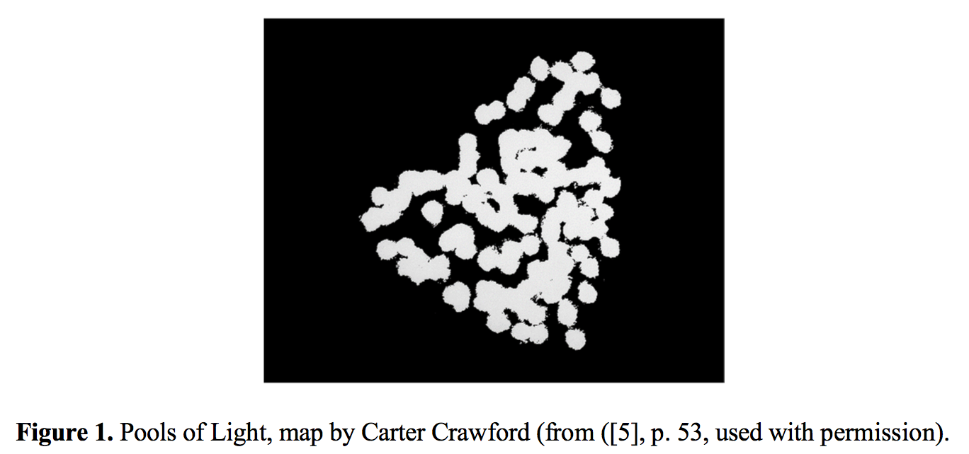
The usual “efficient” map would have located everything on the street onto a single sheet—that is, different marks for lamp posts, fire hydrants, street signs, trees. Our inefficient map concentrated on a single subject and rather than lamp posts, it brought the pools of light into view. No legend, no north arrow, no neat line, none of the usual apparatus. At last: a modernist feel! Maybe even a sense of poetry, something imagistic, a little like Pound’s “The apparition of these faces in the crowd;/Petals on a wet, black bough” [6] or Williams’s red wheel barrow, but as it might manifest on a map, a map attentive to the experience of place [7].
That’s when I knew we could write poems in maps. That’s when I began thinking seriously about a poetics of cartography.
2. Making Maps
Once we got to this point, we started wanting to map everything. …
…Continue reading & footnotes & sources: PDF of article (here) and at Humanities — Open Access Journal (here – full text link on upper left)
Gilpin’s Map of the Isothermal Zodiac and Axis of Intensity Round the World + Calcareous Plain & Maritime Selvage, Etc., Etc. Maps | 1873
Posted in 02 Why Are You Making Your Map?, 03 Mappable Data, 09 Map Symbolization, 11 Color on Maps, Map History, tagged Manifest Destiny - Maps, Maps - Color, William Gilpin - Maps on September 30, 2014| 2 Comments »
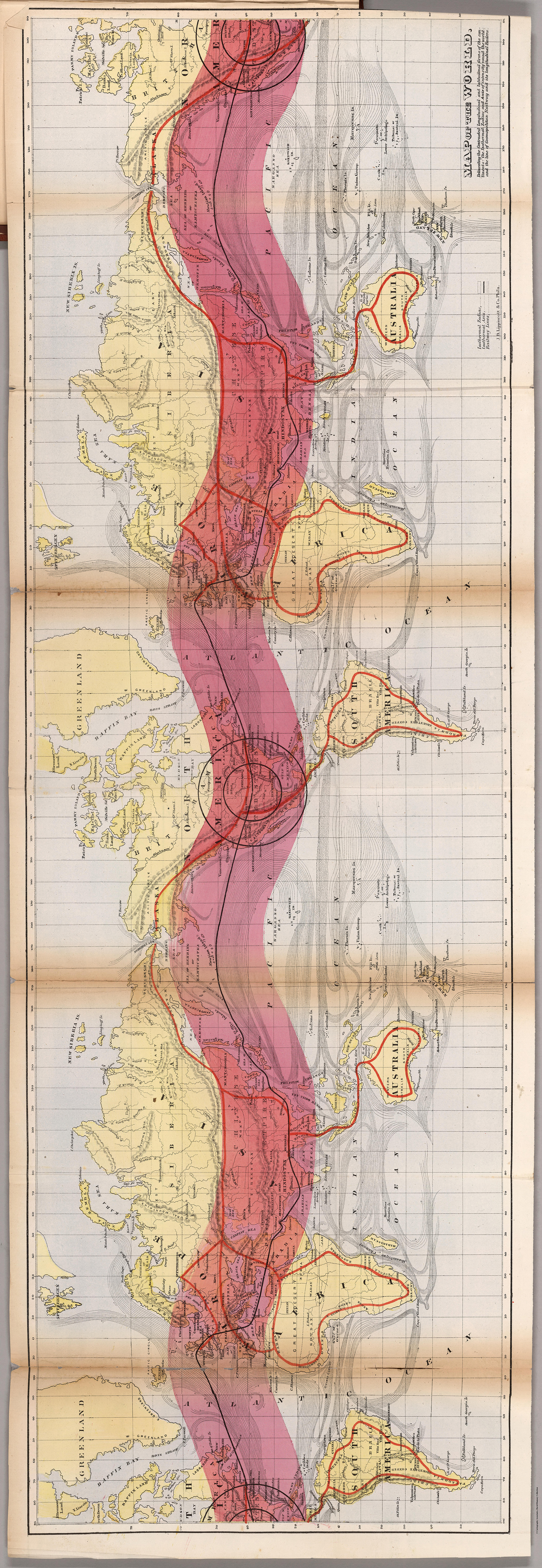
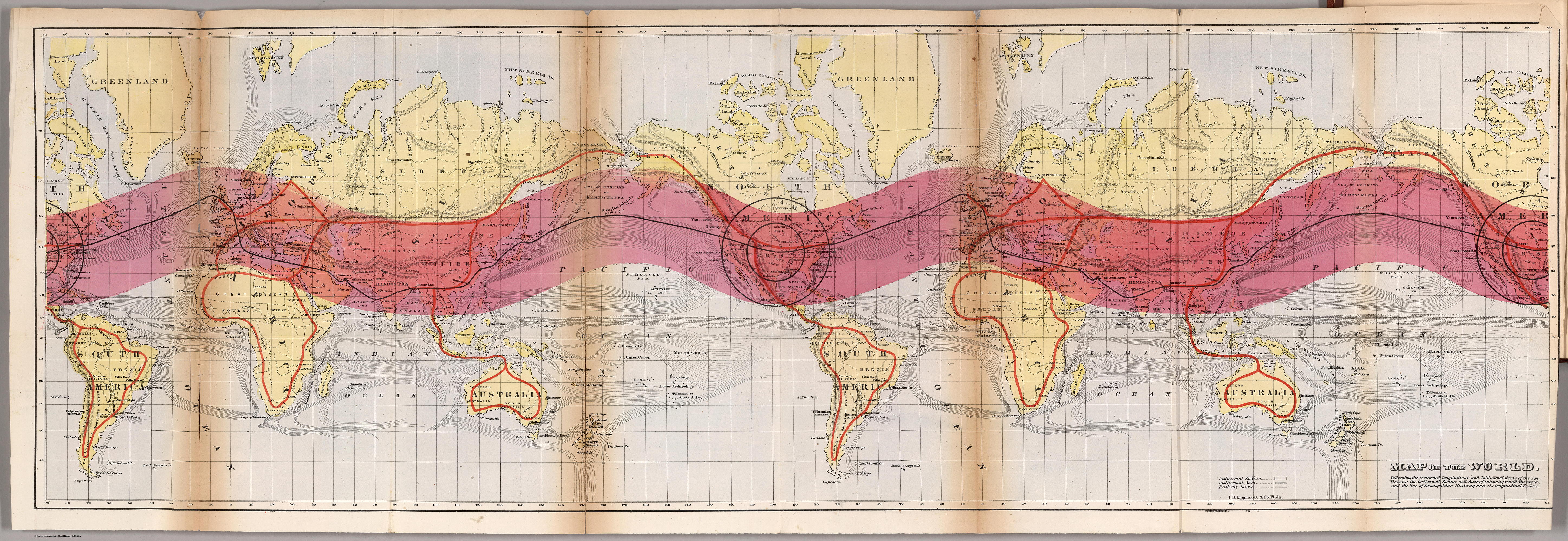
Map of the World. Delineating the Contrasted Longitudinal and Latitudinal forms of the continents: the Isothermal Zodiac and Axis of Intensity Round the World; and the Line of Cosmopolitan Railway and it Longitudinal Feeders.
••••••••••
Herein lie a half dozen very odd yet striking maps, published in William Gilpin’s Mission of the North American People (1873). Gilpin, a quaker from Philadelphia, moved west in the 1830s, joining John C. Frémont on his 1843 expedition. Eventually serving as governor of Colorado, Gilpin was a booster of the American West in general with a vision of boundless future prosperity. His belief in manifest destiny wedded to odd climatological theories, some of which are mapped out here, promoted his vision of the American West.
Maps are from Mission of the North American People, Geographical, Social, and Political. Illustrated by Six Charts Delineating the Physical Architecture and Thermal laws of all the Continents. By William Gilpin, Late Governor of Colorado. Philadelphia: J.B. Lippincott & Co. 1873. Maps can be found at David Rumsey’s site as well as the full text of Gilpin’s book at the Internet Archive.

Map of North America in which are delineated the Mountain System as a Unit, the Great Calcareous Plain and its Details, and the Continuous Encircling Maritime Selvage.

Map of North America. Delineating the “Mountain System” and its details, The “Great Calcarious Plain” as a unit, and the continuous encircling “Maritime Selvage.”
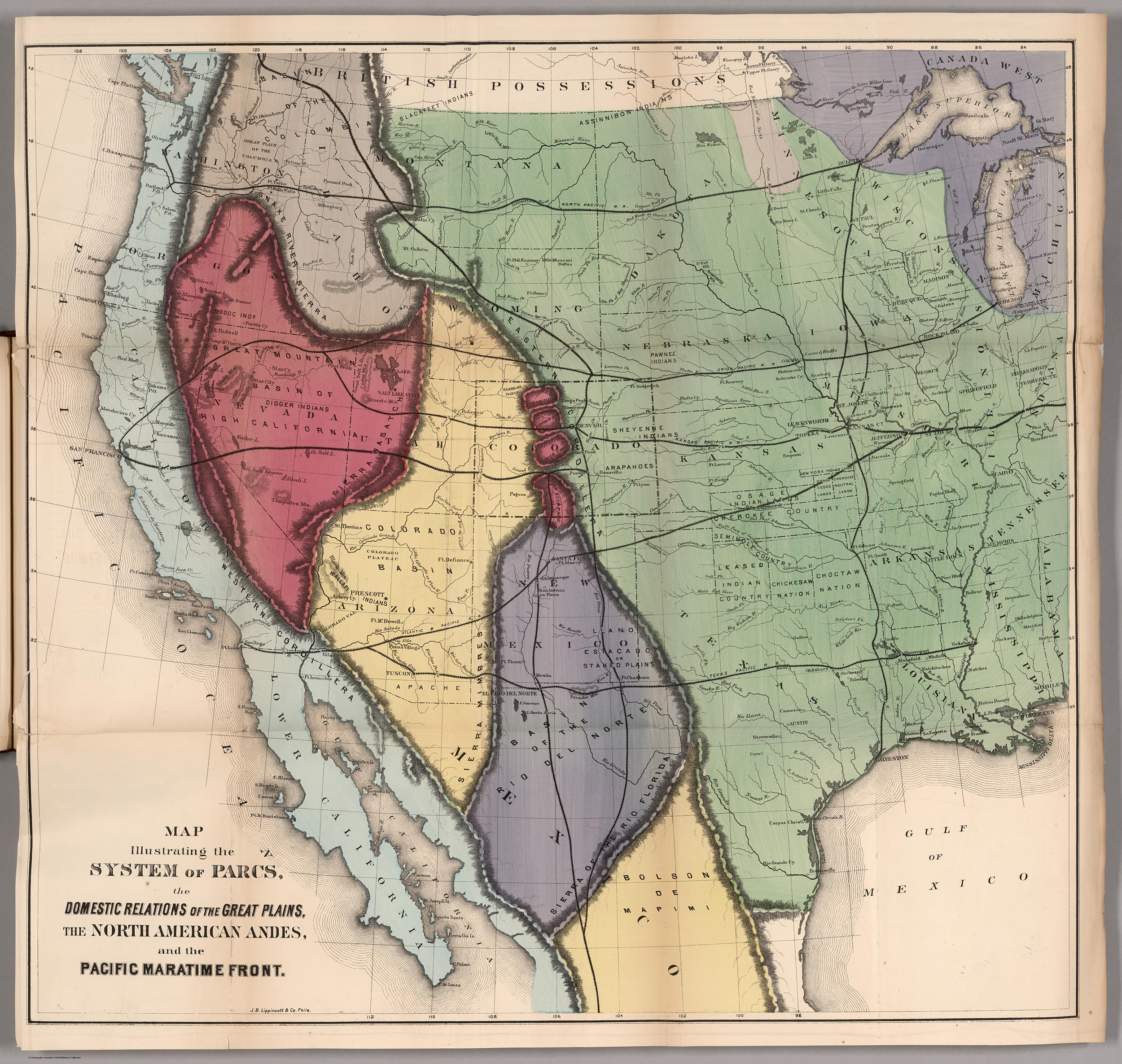
Map Illustrating the System of the Parcs, and the Domestic Relations of the “Great Plains,” the “North American Andes,” and the “Pacific Maritime Front.”
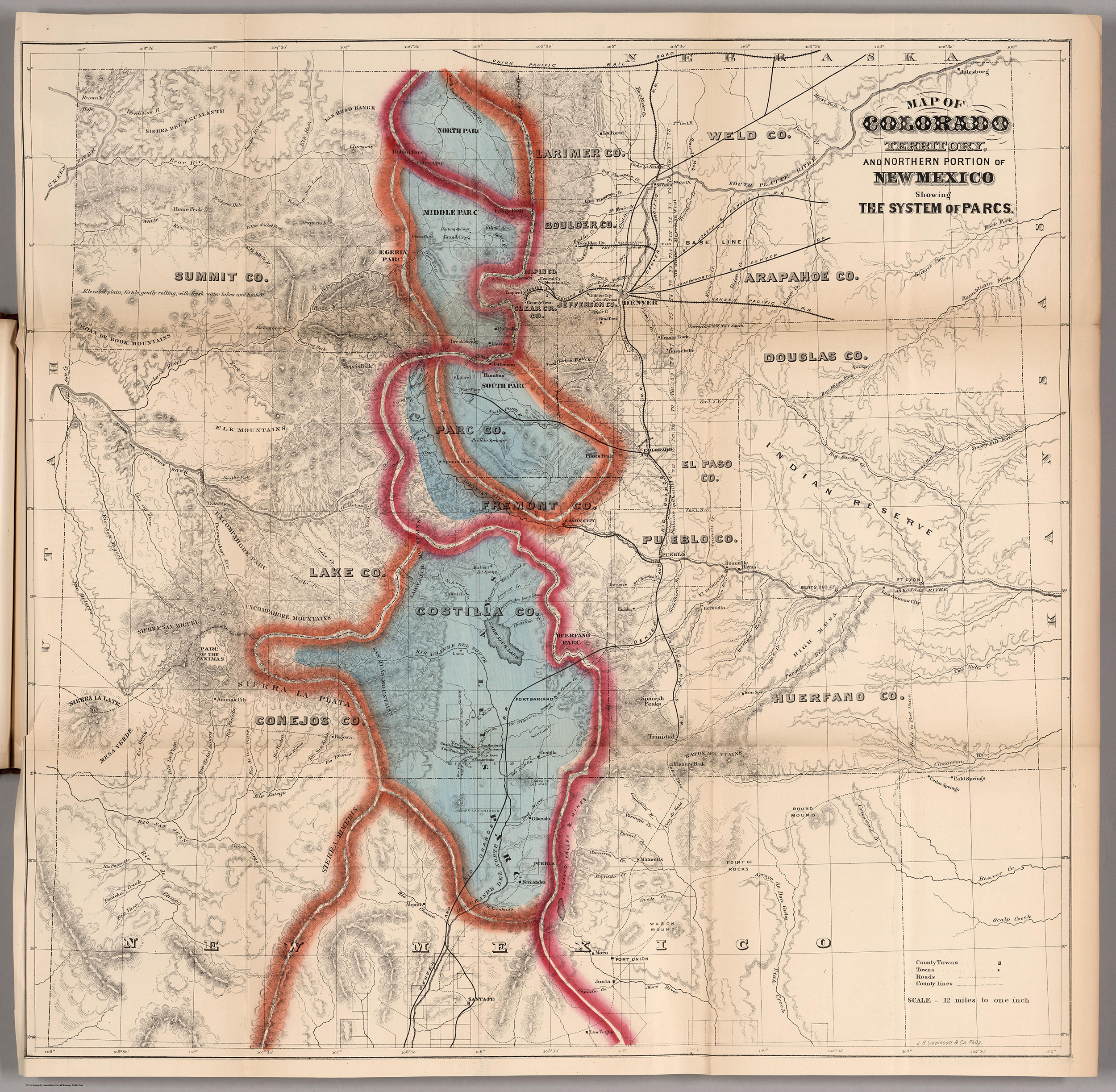
Map of Colorado Territory, and Northern Portion of New Mexico Showing the System of Parcs.

Thermal Map of North America. Delineating the Isothermal Zodiac, the Isothermal Axis of Identity, and its expansions up and down the “Plateau.”
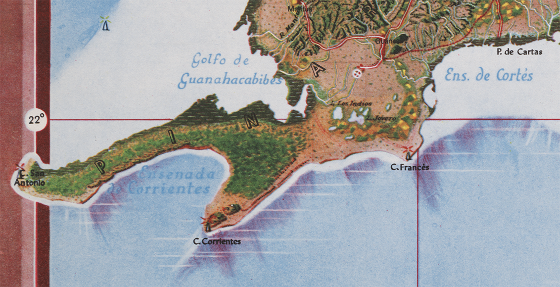
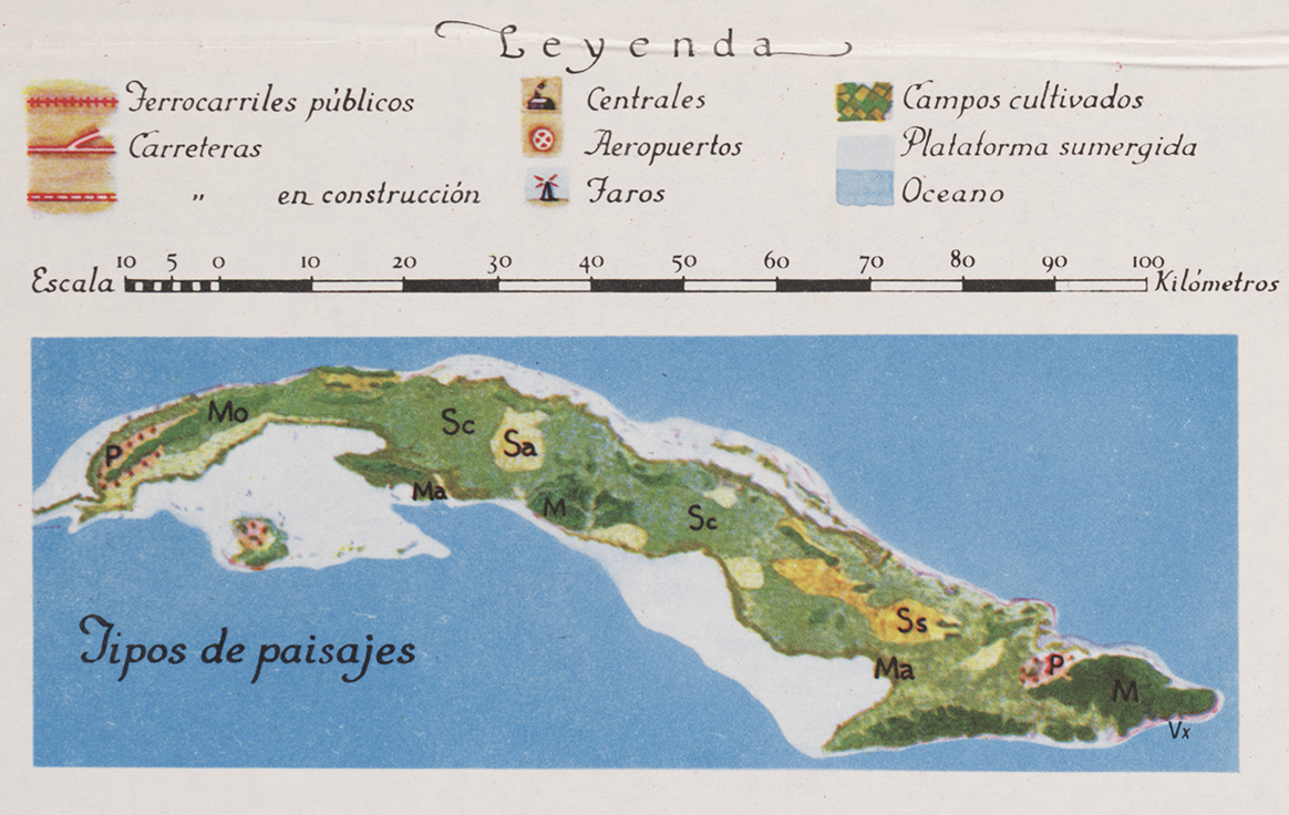
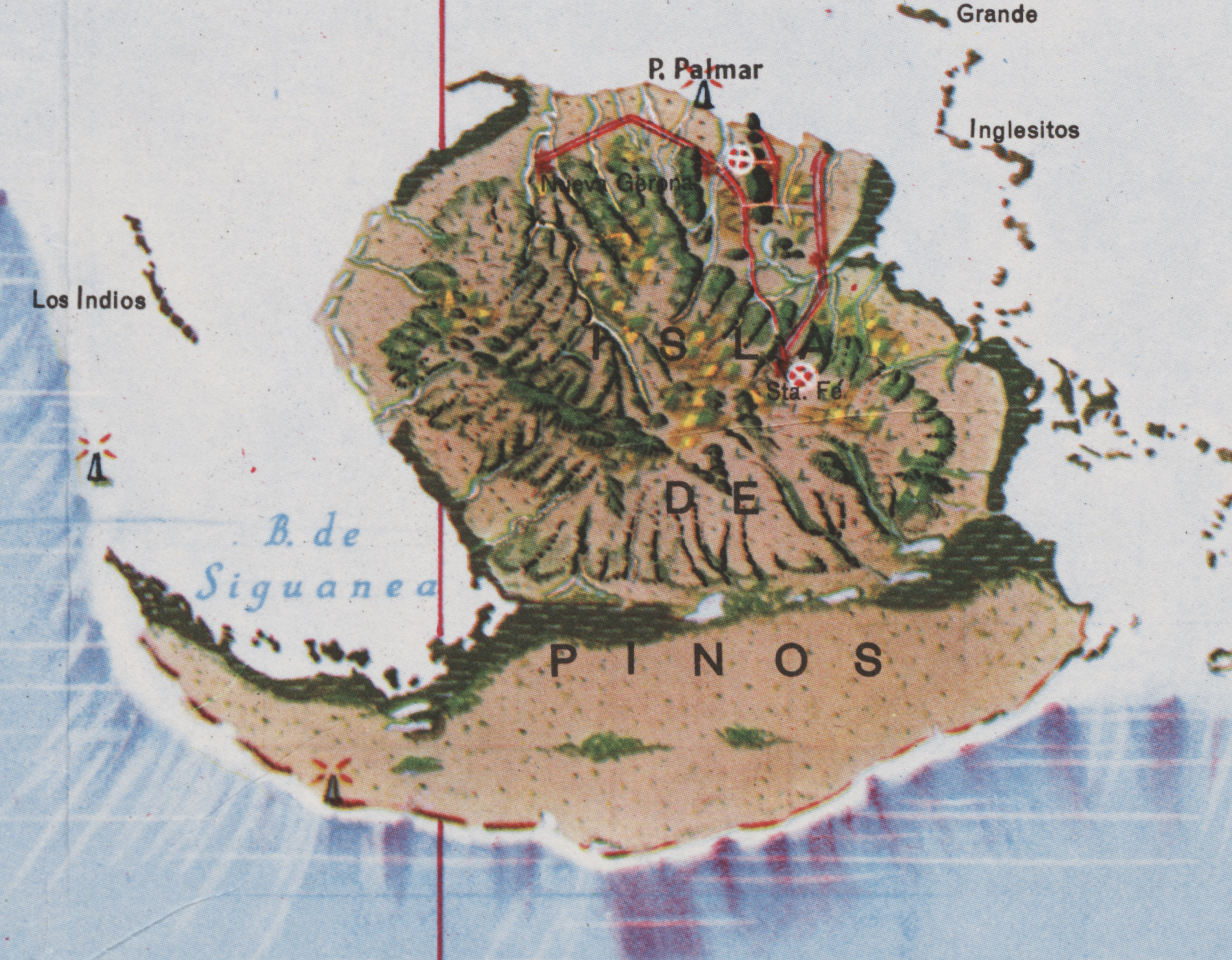
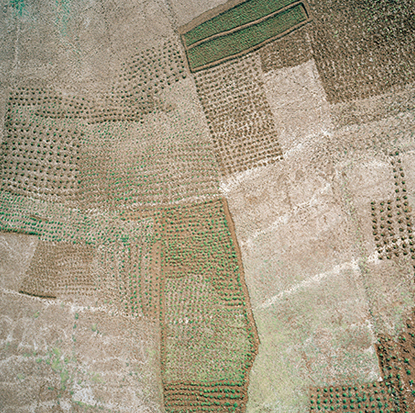
Mapa de los Paisajes de Cuba | Map of the Landscapes of Cuba | 1949 | Gerardo Canet & Erwin Raisz
Posted in 02 Why Are You Making Your Map?, 03 Mappable Data, 04 Map-Making Tools, 09 Map Symbolization, 11 Color on Maps, Map History, tagged Cuba - maps, Erwin Raisz - Atlases, Erwin Raisz - Map Design, Natural color mapping - history on July 29, 2014| 10 Comments »

The Atlas de Cuba by Gerardo Canet and Erwin Raisz, featured in a recent posting here, is accompanied by a large color map entitled Mapa de los Paisajes de Cuba (Map of the Landscapes of Cuba). The map is a hybrid of Raisz’s landform map style supplemented with diverse human landscape components. Canet and Raisz explain their methodology:
The accompanying map of Cuba is a new experiment in cartography. Color suggests land types: cultivated fields, pastures, mountains, swamps, valleys, etc. The symbols were selected after a series of flights over the Island and on analysis of numerous color photographs taken from the air It is expected that in this way the map will better reflect reality; more closely resembling on air view of the Island than the conventional maps we now have.
This approach is part of a tradition of natural or real color mapping combining terrain (in particular, shaded relief) with air imagery or map symbolization inspired by air imagery, an obvious outcome of aerial mapping in the early part of the 20th century. An article by Tom Patterson and Nathaniel Vaughn Kelso entitled Hal Shelton Revisited: Designing and Producing Natural-Color Maps with Satellite Land Cover Data (2004) delineates the author’s development of the Natural Earth data (shaded terrain + satellite land use data) in the context of earlier, related work by Hal Shelton, Eduard Imhof, Heinrich Berann, Richard Edes Harrison and Tibor Toth. It seems that Raisz was also an innovator in this realm of air-imagery inspired map design.
••••••••••••
See also, at this blog, Raisz’s History of American Cartography Timelines, Map Symbols: Landforms & Terrain, and Raisz’s currently available landform maps at www.raiszmaps.com.
••••••••••••

Mapa de los Paisajes de Cuba, 1949 (36.6mb)
••••••••••••••••••
Map details:


Map Art Exhibitions, 2012-13
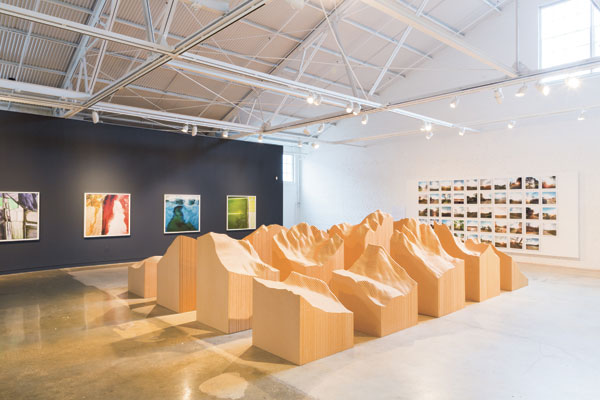
Posted in 01 What's A Map?, 02 Why Are You Making Your Map?, 03 Mappable Data, 04 Map-Making Tools, 09 Map Symbolization, Deep Map Thoughts, tagged Cartography - art, Maps - art, maps - art - exhibits on May 12, 2014| 2 Comments »
Céline Boyer: Empreintes (from Céline Boyer)
•••••••
Denis Wood’s 2010 book Rethinking the Power of Maps includes a discussion of exhibits devoted to maps created by artists prior to 2010. A significant number of exhibits have opened since the book was published. Map Art Exhibitions, 2010-11 was posted in late 2012, and an update for 2012-13 is below.
Map Art Exhibitions, 2012-13
While we know there were more exhibitions than we cover here – so please note any we’ve overlooked in the comments – the last two years have marked a slackening of interest in map art as the genre is increasingly taken for granted. Map art is gradually seeping into art the way landscape painting did into the Western tradition in the fifteenth and sixteenth centuries, solidifying its position in the world of art as it loses its novelty.
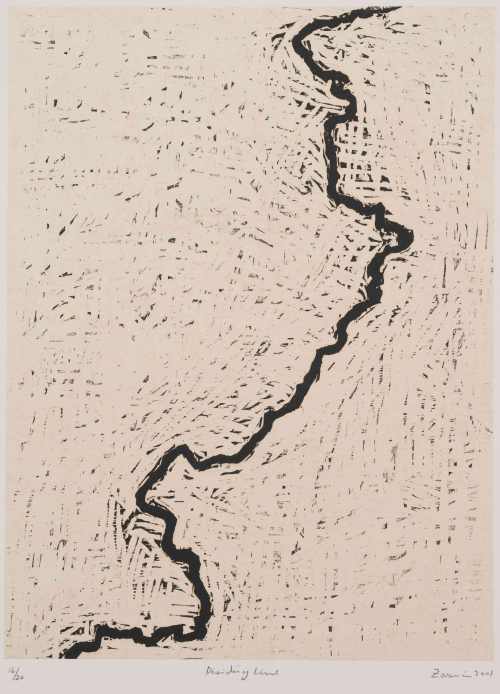
Zarina: Dividing Line (Paper Like Skin, Guggenheim)
One thing this means is that map art is beginning to show up in broader bodies of work – as in Zarina Hasmi’s (above) or Erik Parker’s (below) – and in exhibitions on other themes – as in three of shows we’ve included here.
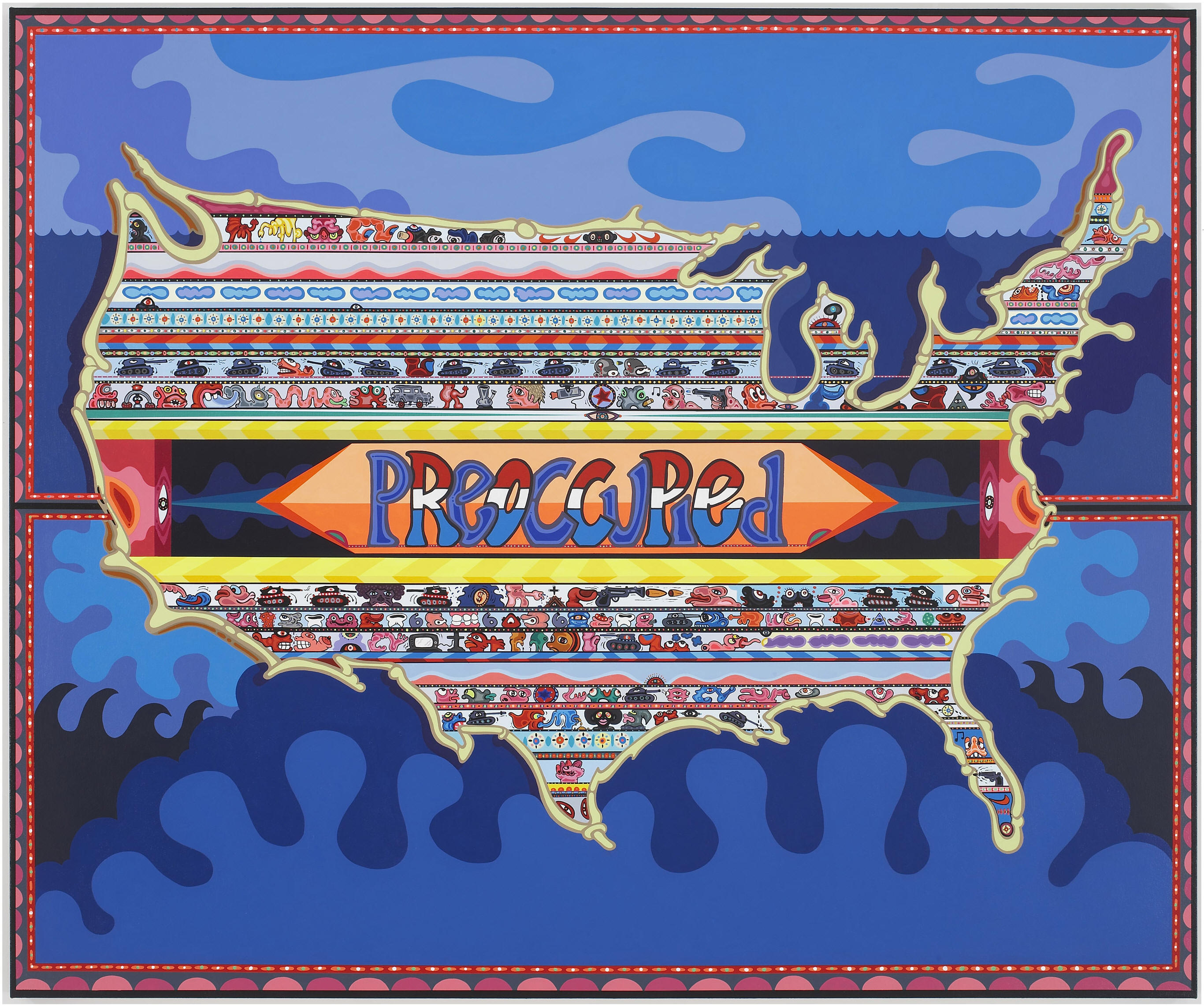
Eric Parker: Preoccupied (Too Mad to be Scared: Aldrich Contemporary Art Museum)
•••••••
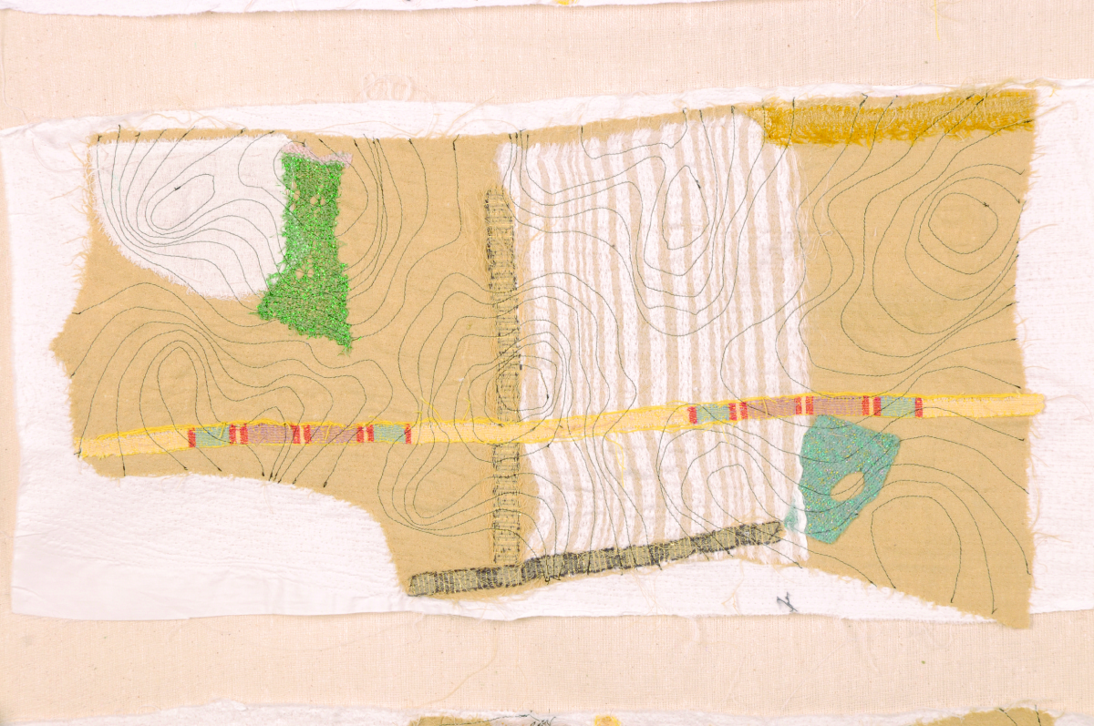
Julia Penrose: from Mapping the Future: Where Are You Now?
Mapping The Future: Where Are You Now? Textile Forum South West, Gallery at The Brewhouse Theatre & Arts Centre, Taunton, England, 2012. Following a successful Textiles Forum South West (TFSW) conference, Maps define the future: where are you now? held at Somerset College in 2011, our exhibition here included the work of 35 textile artists reflecting on a variety of map themes. The artists utilized a range of experimental techniques, including delicate hand stitch, felt making, quilting, collage knitting, sculpture as well as digital media. Reviews of the show are posted at the exhibition site, along with descriptions of all the projects. There’s a catalogue too, as well as a DVD of the show.
•••••••

Joyce Kozloff: JEEZ (Joyce Kozloff)
Joyce Kozloff: JEEZ, The Armory Show Modern, New York, 2012. About JEEZ, which hung at the main entrance of the 2012 Armory Show Modern in New York, Kozloff has said, “JEEZ is my election year piece, a 12’ x 12’ painting based on the Ebstorf map, a 13th century mappa mundi, which depicted Biblical stories and pagan myths within the world as it was then known, with Christ’s body as a symbolic and literal frame. I have inserted and rendered 125 images of Jesus from the history of art and worldwide popular culture – black, Latino, female, Asian; adults and babies; gay and straight; images from the movies and New Age hippies off the Internet – each true to its artistic ideal. As the archetypes and stereotypes accumulate, holy portraits are transformed into a rogue’s gallery of mismatched characters. Seen altogether, this proliferation wryly erodes their power.” Kozloff’s work was also included in a number of the other exhibitions noted here, in exhibitions at D. C. Moore in New York, and elsewhere.
•••••••

from Atlas Critique
Atlas critique, Parc Saint Léger, Contemporary Art Centre, Pougues-les-Eaux, France, 2012. The curators of this very interesting show wrote: “Although we are aware of the extent to which cartography as a discipline has been profoundly imbricated in the performative production of the narratives of modernity, in objective and positivist rationality, but also the history of colonialism and nationalistic constructions, for artists today, it has become a privileged site for the invention of counter-practices that open up new perspectives and participate in a deconstruction of hegemonies and post-colonial epistemologies as alternative tools for the production of knowledges, narratives and realities.” In demonstration of this they showed the work of, Francis Alÿs, Erick Beltrán, Berger & Berger, Border Art Workshop [a San Diego-based collaborative], Mark Boulos, Lewis Carroll / Henry Holiday, Chto delat? [a Russian art collective], Fernand Deligny, Michael Druks, Claire Fontaine, Internacional Errorista [an international art movement], Pedro Lasch, Vincent Meessen, Nástio Mosquito, Estefanía Peñafiel Loaiza, Lia Perjovschi, Radek Community+Dmitri Gutov [Moscow-based group], Philippe Rekacewicz, R.E.P. Group [a Ukrainian art collective], Allan Sekula & Noël Burch, Société Réaliste [a Parisian cooperative], Stalker [a walking group based in Rome], Endre Tót, David Wojnarowicz / James Wentzy / AIDS Community Television. This was an amazing exhibition, accompanied by conferences, performances, and films.
•••••••
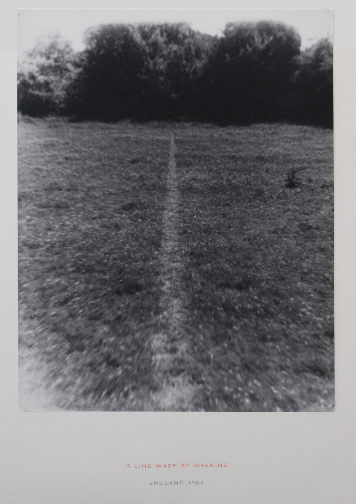
Richard Long: A Line Made by Walking (from Contemporary Cartographies: Drawing Thought)
Contemporary Cartographies: Drawing Thought, CaixaForum, Barcelona, Spain, 2012. Curated by Helena Tatay, this important exhibition included more than 140 works by 77 artists, from the classics (Dalí, Debord, Duchamp) to the contemporary (Alÿs, Kentridge, Kuitca), with the goal of “inviting the visitor to question both the systems of representation that we use and the ideas that underpin them.” As the press release put it, “The central aim of this exhibition is, therefore, to explore the ways in which contemporary artists have used cartographic language to subvert traditional systems of representation, propose new formulas or suggest the very impossibility of representing a globalised, ever more chaotic world.”
•••••••
Joyce Kozloff: Targets (from The Map as Art, Kemper Museum)
The Map as Art, Kemper Museum. St. Louis, Missouri, 2013. Inspired by Katharine Harmon’s best-selling book, The Map as Art, this exhibition presented work that explored the issue of mapping – whether conceptually or quite literally – while examining systems of personal gesture involved in large-scale works. The exhibition featured more than 30 works by seven artists: Ingrid Calame, Nathan Carter, Tiffany Chung, Joyce Kozloff, Lordy Rodriguez, Robert Walden, and Heidi Whitman, several of whom made presentations in the extensive programming that accompanied the show. It was co-curated by Kemper Museum curator Barbara O’Brien and Katharine Harmon. There was an illustrated gallery card. Sept 14, 2012-April 21, 2013.
•••••••
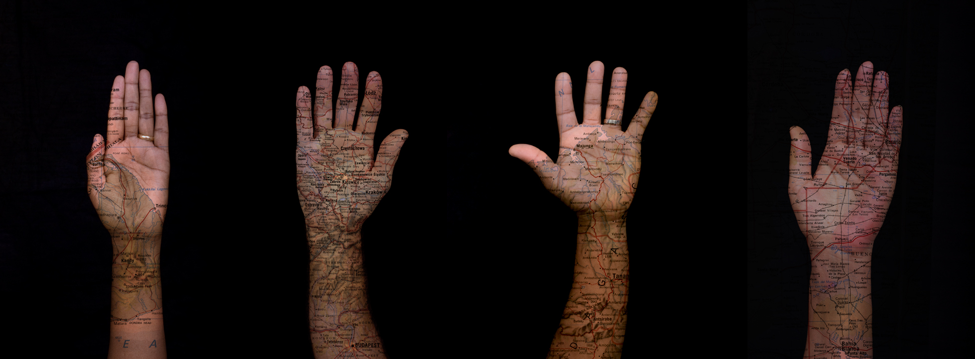
David Reimondo: Patch World Inverso (from MAPPAMUNDI, art et cartography)
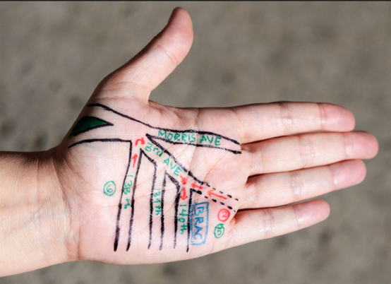
MAPPAMUNDI, art et cartographie, Hôtel des Arts, Centre d’art du Conseil général du Var, Toulon, 2013. Less pretentious than some shows, but more exciting, MAPPAMUNDI brought together 58 works by 26 artists, a number of them represented in Atlas critique (for example, Stalker) and/or Contemporary Cartographies: Drawing Thought (for example, Kuitca) in a show organized by Guillaume Monsaingeon around three themes: the body, combat, and the tale. Monsaingeon also wrote the fully-illustrated, 190-page catalogue, MAPPAMUNDI, art et cartographie, which opens with a long history of maps and map art. The exhibition included Céline Boyer’s project Empreintes, a collection of photographs of hands, against black backgrounds, on which maps of their places of origin (Senegal, Iran, Spain, and so on) have been superimposed. A 100-page book – all of which fold out – documents Empreintes. Boyer’s project is connected to those in the exhibition of Qin Ga and Kuitca, though indeed this show was rich in resonances.
•••••••

Expanded Map (from Expanded Map)
Expanded Map, RM Gallery, Auckland, New Zealand, 2013. Curated by Ruth Watson and James Wylie, who both co-authored the catalogue and have pieces in the show, Expanded Map is an artists show in an artists space. With the exception of Gigi Scaria, Lize Mogel, and Clare Noonan all the artists are locals: Auckland has a rich map art scene! The show was divided into two parts, both of them covered in the color catalogue.
•••••••
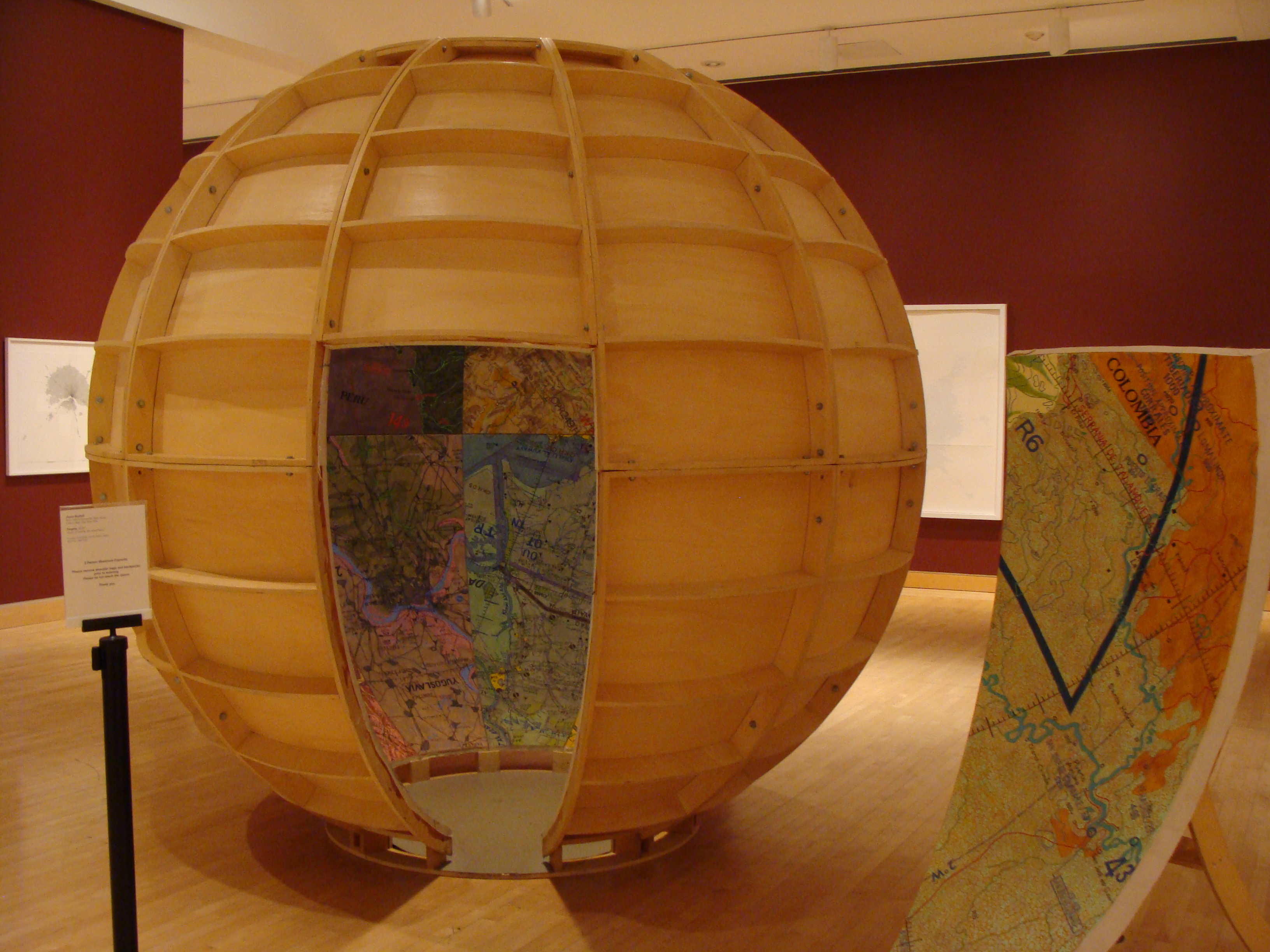
Mark Schatz: Universe Hive (From ArtHopper.com)
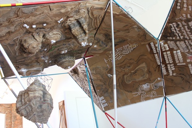
Universe, The Sculpture Center, Cleveland, Ohio, 2013. Mark Schatz mapped the world in this sprawling, double-sided landscape model built with ideas from architects, planners, hobbyists, and self-taught artists,. The faceted map could be folded up to make a Buckminster Fuller-inspired cuboctohedron; and it drew attention to individual perceptions of ones place, ones residence or “home,” and how it’s all a multifaceted, living, growing experience.
•••••••
Samuel Rowlett, Still From “Landscape Painting in the Expanded Field” (from Artfcity.com)
Artists’ Walks: The Persistence of Peripateticism, Dorsky Gallery, New York, 2013. Curated by Earl Miller, this is an example of a show tangential to the world of map art, but in an essential way, for walking, after all was for most of human history how we came to know the world. A lot of peripatetic art still uses maps to document the walks. Here this was the case for the work of Danica Phelps, Gwen MacGregor, and Sandra Rechico. The latter two also organized a piece, “Map It Out (New York),” in which they invited people to map the travels they’d made during the day, and then they assembled the collected drawings into a psychogeographic portrait of New York that hung alongside works by Richard Long, Hamish Fulton, and others. Neat show.
•••••••
Joseph Kosuth: From Memory, Draw a Map of the United States (from Huffington Post)
From Memory: Draw a Map of the United States, Sean Kelly Gallery, New York, 2013. This show is the first presentation of a project conceived and produced in 1971-1972 by Hisachika Takahashi. Takahashi, a Japanese artist living in New York, asked twenty-two fellow artists to each draw or paint a map of the United States entirely from memory on the handmade Japanese paper he provided: Arakawa, Jed Bark, Mel Bochner, Juan Downey, Alex Hay, Jasper Johns, Joseph Kosuth, Jeffrey Lew, Jane Logemann, Brice Marden, Gordon Matta-Clark, Richard Nonas, Robert Petersen, Robert Rauschenberg, Dorothea Rockburne, James Rosenquist, Keith Sonnier, Hisachika Takahashi, Cy Twombly, Susan Weil, Lawrence Weiner, Robert Whitman and Don Wyman. It’s a valuable document of the scene and of the map ferment beginning to grip the art world.
•••••••

Detail from Nalini Malani and Iftikhar Dadi: Bloodlines (from IndiWeek)
Lines of Control: Partition as a Productive Space, Nasher Museum of Art, Duke University, Durham, North Carolina, 2013-14. This is another show at once tangential to map art and yet concerned with an essential map element: lines of control. The lines of control in this case are mostly borders through contested areas (India/Pakistan, Israel/Palestine, Mexico/US, and so on). Green Cardamom brought together more than thirty contemporary artists (from Francis Alÿs to Muhammad Zeeshan) and a host of other contributors (including Iftikhar Dadi and Irit Rogoff) to mount a ceaselessly stimulating exhibition, first in 2012 at Cornell and then in 2013-14 at Duke. It spawned a 240-page full-color catalogue. A great stimulating show and a terrific catalogue!
•••••••
Maya Lin: Blue Lake Pass (from IndiWeek)
Surveying the Terrain, Contemporary Art Museum, Raleigh, 2013-14. While Lines of Control was up at Duke in Durham, across the Triangle in Raleigh, CAM was showing Surveying the Terrain, another show tangential to map art, yet equally concerned with an essential subject; or, as the gallery brochure put it, “Surveying the Terrain explores contemporary artworks that map our terrain.” Curated by Dan Solomon, it featured ten artists including Alfredo Jaar, Laura Kurgan, Maya Lin, and Trevor Paglen. Beautiful work!
•••••••
(from Bronx River Art)
MAPnificent! Artists Use Maps, Bronx River Art Center, New York, 2013-14. Curated by Yulia Tikhonova, this show’s 18 artists – among whom were Paula Scher and Mannahatta – approached the map from every direction. This may have been the year’s most classic map art show, a fading form.
•••••••
Roosmarijn Pallandt (from Roosmarijnpallandt.com)
Unmapping the World, EXD’13 / Instituto de Investigação Científica Tropical, Palácio dos Condes da Calheta, Lisbon, Portugal, 2013. Part of Experimental International Design Biennial 2013, and curated by Annelids de Vet (of the Subjective Atlas of … fame) and Nuno Coelho, the exhibit was “an exploration into the field of reactive map making practices. It aims to counterpoise the apparent neutrality of professional cartography through contemporary engaged mapping projects. In this exhibition, ways of mapping are used to resist the authority of state, to question ruling power structures and to expose the propensity of maps to simplify our world. The act of uncapping is presented as a poetic form of resistance.” And so much more!
•••••••

Across the Wall: Israeli Settlement Bus Routes: Ahmad Barclay & Polypod (from Visualizing Palestine)
The Cartography of the Unseen, The Research Gallery, Holon Institute of Technology, Holon, Israel, 2013. This exhibition dealt with “the political reading of the overt and covert mechanisms embedded in the act of cartography, by exposing the ideological aspects, as well as the solicitation to action performed through mapping. The exhibition analyses the ways in which the design of maps conditions the very interpretation of them, and examines how the act of mapping affects the reorganization of the mapped territory.” Thirteen projects from as many territories were presented, including work from both Israel and Palestine. Radical presentation!
•••••••
Old Map Newsreels 1935-1965: British Pathé
Posted in 02 Why Are You Making Your Map?, 03 Mappable Data, 04 Map-Making Tools, 09 Map Symbolization, Map History, tagged cartography - history, cartography - videos, Maps - History, maps - videos on April 26, 2014| 3 Comments »
The World Is Round! (1935)
••••••••••
Air Mapping (1935)
••••••••••
Moon Mapping (1953)
••••••••••
Map to the Coronation (1937)
••••••••••
Mainly Maps (1938)
••••••••••
Mapping It Out! (1940)
••••••••••
Map Depot In Desert (1943)
••••••••••
Map Making By Women’s Voluntary Service – Quite So! (1943)
••••••••••
New Maps for New Worlds (1945)
••••••••••
Mobile Map Truck (Step On It!) (1944)
••••••••••
Plastic Maps (1947)
••••••••••
Map Making (1952)
••••••••••
Interpol See Scotland Yard (Pre-Computer GIS) (1958)
••••••••••
Map Making (1961)
••••••••••
School Playground Map (1961)
••••••••••
Map Survey (1965)
••••••••••
Aerial Photography Aids Map Makers – Hungary (1965)
Mapping Vice in San Francisco (1885) | Mapping the Nation | Susan Schulten
Posted in 02 Why Are You Making Your Map?, 03 Mappable Data, 09 Map Symbolization, Map History, tagged Maps - 19th Century American, Maps - History on August 8, 2013| 1 Comment »
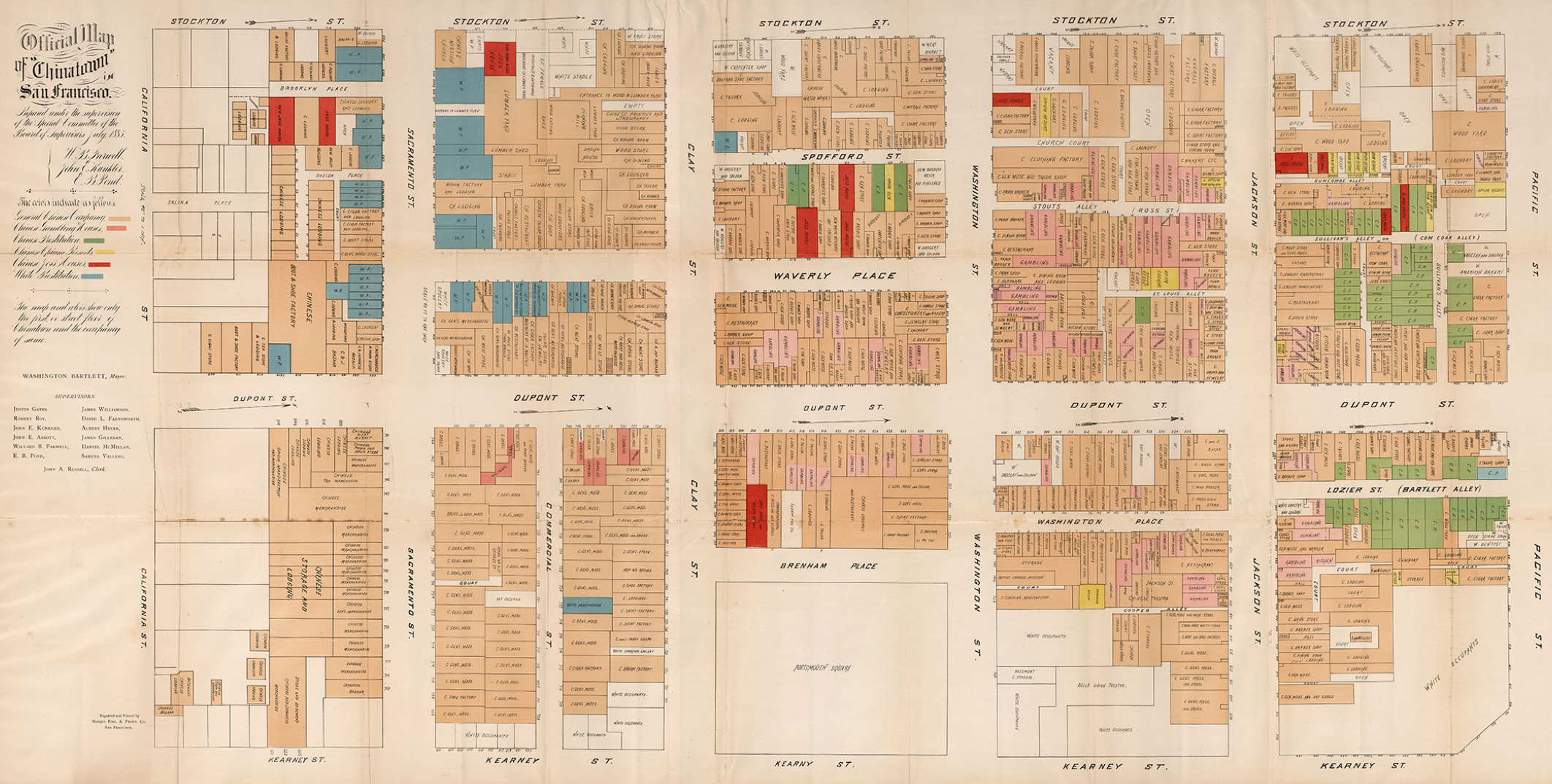
Detail from a rare 1885 map showing vice in San Francisco’s Chinatown. Vice includes gambling (dark orange), Chinese prostitution (green), opium houses (yellow), Joss Houses (red) and White prostitution (blue). The map, from the Rumsey Map Collection, is an early example of detailed urban social mapping, in this case motivated by strong anti-Chinese sentiment. Click on the map (above) for more details from Historian Susan Schulten’s blog Mapping the Nation.
Schulten’s blog and website for her terrific book Mapping the Nation: History and Cartography in Nineteenth-Century America contain a wealth of maps and graphics. The book itself looks at the pivotal 19th century – when mapping expanded to include a diversity of human, social, cultural, political and environmental phenomena.
Selected details of maps from the blog are below: click on the title or image to see the entire map.
••••••••••
Emma Willard, “Introductory” Map of American History (1828)
“This map opened one of the first historical atlases of America, created by the noted educator Emma Willard. Note that she marked not just the location of tribes, but their migration over time.”
••••••••••
Emma Willard, “First” Map of American History (1828)
“Willard’s second map in the atlas marked the earliest voyages to America, and took pains to represent change over time. Note the inclusion of failed voyages and settlements.”
••••••••••
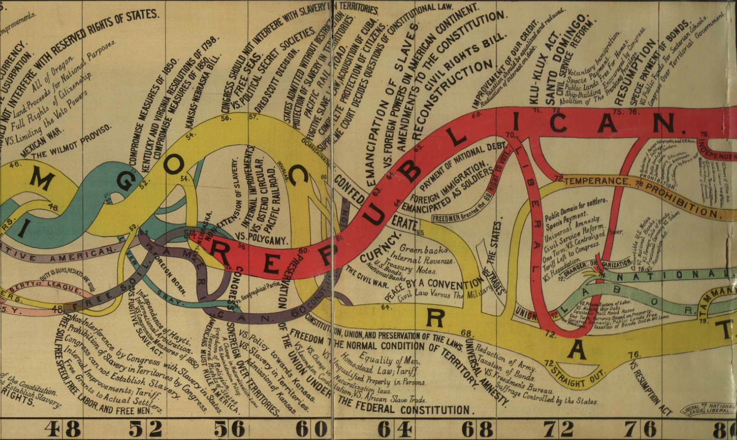
Diagram of the History of Political Parties in the United States (to 1880) (1880)
“Here is one of the many attempts to represent American history in graphic terms that flourished in the wake of the nation’s centennial, and which was updated in 1894.”
••••••••••
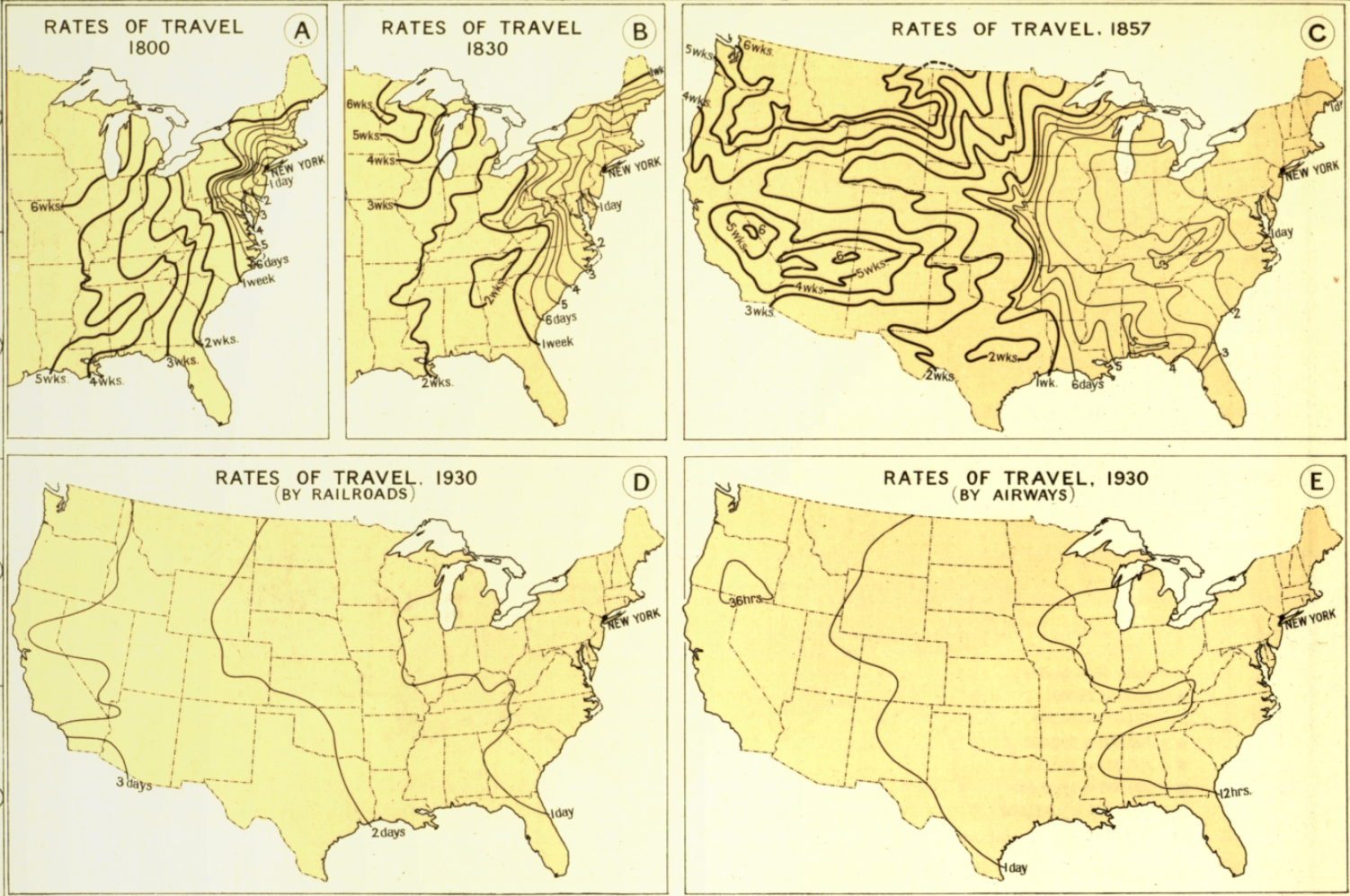
Transportation and Rates of Travel (1932)
“Here Charles Paullin represented advances in transportation technology in geographic terms in order to depict the qualitative changes over the course of American history.”
••••••••••
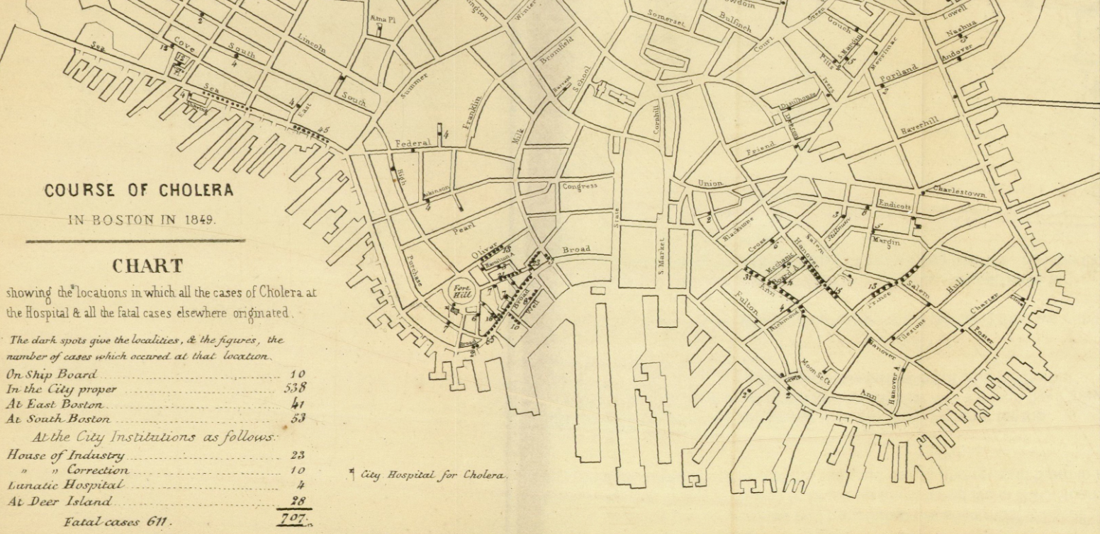
Course of Cholera in Boston in 1849 (1849)
“This is one of many examples of a map designed for etiological purposes, in this case to locate the source of the city’s 1849 cholera epidemic.”
••••••••••
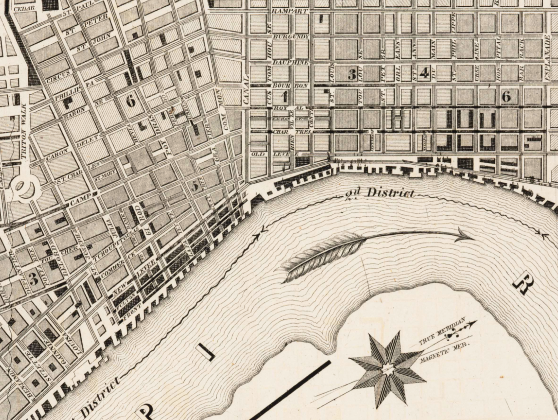
Sanitary Map of the City of New Orleans (1855)
“Barton compiled this complex map to locate the origin of the yellow fever outbreak of 1853, even noting the arrival of ships in the city port.”
••••••••••
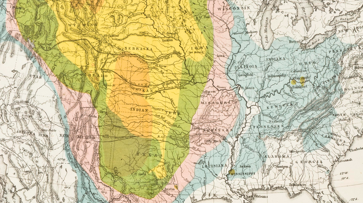
Map of the Cotton Regions of North America (1862)
“Mallet designed this complex map to guide the British as they developed cotton in India, drawing on existing geological and environmental maps from the era.”
••••••••••
Map Showing the Distribution of the Slave Population of the Southern States (1861)
“One of the first American attempts to translate the census into cartographic form, and a favorite of President Lincoln during the Civil War.”
••••••••••
Map of Bison Distribution Over Time (1876)
“This map depicts the shrinking bison population, highlighting the effects of expansion at the nation’s centennial. It became the model for William Temple Hornaday’s well-known map of 1887.”
••••••••••
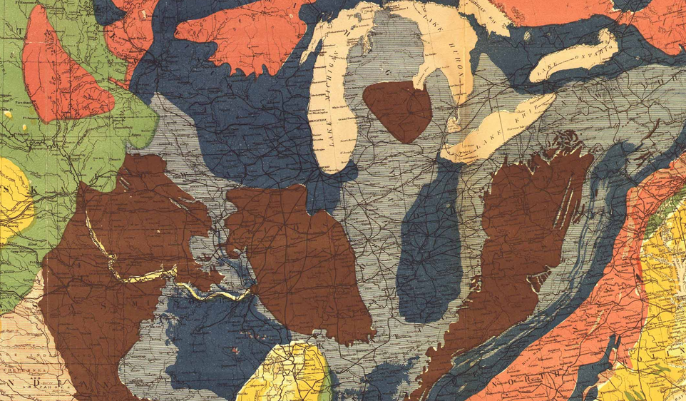
Geological Map of the United States (1872)
“This stunning map owed much to its antebellum maps of geology as well as the fine chromolithography of Julius Bien.”
••••••••••
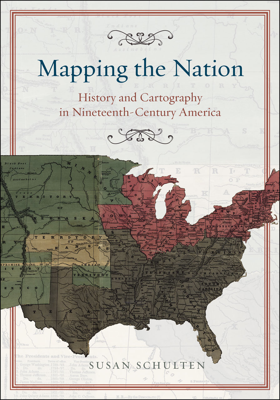
Susan Schulten
Mapping the Nation: History and Cartography in Nineteenth-Century America
University of Chicago Press, 2012
Part One: Mapping the Past
Chapter 1: The Graphic Foundations of American History
Chapter 2: Capturing the Past through Maps
Part Two: Mapping the Present
Chapter 3: Disease, Expansion, and the Rise of Environmental Mapping
Chapter 4: Slavery and the Origin of Statistical Cartography
Chapter 5: The Cartographic Consolidation of America
