
Archive for the ‘02 Why Are You Making Your Map?’ Category
Making Maps now at makingmaps.substack.com
Posted in 01 What's A Map?, 02 Why Are You Making Your Map?, 03 Mappable Data, 04 Map-Making Tools, 05 Geographic Framework, 06 Map Layout, 07 Hierarchies, 08 Generalization & Classification, 09 Map Symbolization, 10 Type on Maps, 11 Color on Maps, 12 Finishing Your Map, tagged Cartography, data analytics, Denis Wood, Geographic Information Systems, geospatial, information design, John Krygier, Making Maps, maps on January 17, 2025| Leave a Comment »
Book Review: Matthew Edney: Cartography. The Ideal and Its History
Posted in 01 What's A Map?, 02 Why Are You Making Your Map?, 03 Mappable Data, 04 Map-Making Tools, Deep Map Thoughts, Map Books, Map History on June 30, 2020| 1 Comment »
Matthew H. Edney. Cartography. The Ideal and Its History. xiii + 309 pp., figs., bibl., index. Chicago: The University of Chicago Press, 2019. $30.00 (paper), ISBN 9780226605685.
Matthew Edney @ USM
Matthew Edney @ Mapping As Process
University of Chicago Press Book Information
Book Review by John Krygier published in Isis: A Journal of the History of Science Society—Volume 111, Number 1, March 2020 (pp. 207-208)
There is no such thing as cartography, and this is a book about it. (p. 1)
Matthew Edney’s Cartography: The Ideal and its History provides a necessary corrective to the normative ideal of maps, mapping and the field of cartography. While of interest to scholars in the history of cartography, Edney’s book is just as important to the growing number of scholars whose research engages maps and mapping as part of diverse studies of culture, society and human history. Cartography: The Ideal and its History details problematic assumptions about maps, mapping and cartography, but it’s the creative potential of Edney’s book that’s most notable. As untenable assumptions are discarded, new insights emerge, insights which have the potential to greatly expand our understanding of maps and mapping across many different studies and disciplines.
Edney’s Cartography is situated in the intermingled fields of the history of cartography and critical cartography with touchstones including The History of Cartography, Book 1, edited by J.B. Harley and David Woodward (1987), Harley’s “Deconstructing the Map” (1989) and Denis Wood’s The Power of Maps (1992). These works, and many that followed, undermined narrow definitions of the map and broadened our understanding of the cultural, social and political context of mapping. Edney’s work as editor of later volumes of the History of Cartography, extensive publications on maps from Europe, North America and India as well as critical cartography make him an ideal scholar to take on the ideal of cartography. He does so by characterizing the traditional study of maps and mapping as “a profound act of cultural misdirection.” Maps and mapping are more complex, nuanced and disjunct than the universalizing, idealized conceptions offered by modern cartography, a thesis strongly supported by Edney’s immersion in diverse historical maps and mapping practices.
The most appealing parts of Cartography: The Ideal and its History are the delineation of fourteen modes of Western mapping and an intellectual assault on cartography’s idealized preconceptions. These issues are addressed in the first third of the book, prefaced by a discussion of the ideal and its limitations. Mapping modes include place, urban, property, engineering, chorographical, cosmographical, geographical, marine, celestial, boundary, geodetic, analytic, and overhead imaging. The concept of modes shifts focus away from a singular, idealized map (and map making process) to distinct (but evolving and interrelated) map types and processes that are better understood free of the narrow, idealized context within which they are typically situated. Cartography’s idealized preconceptions include ontology, pictorialness, individuality, materiality, observation, efficacy, discipline, publicity, morality and singularity & universality. In each case, Edney describes, critiques, and offers alternatives to these preconceptions. With the concept of mapping modes and critique of preconceptions in place, an intellectually sophisticated, nuanced and creative understanding of maps and mapping processes can play out.
Chapter 4, The Ideal of Cartography, details the construction of cartography as “a modern myth.” The chapter weaves in references to mapping modes and idealized preconceptions. One is left, upon finishing this chapter, with a history of the construction of modern cartography as well as an understanding of its limitations. Chapter 5 critiques the idealized geometry at the heart of modern cartography, specifically map scale. Much like maps and cartography in general, it is easy to naturalize map scale. This chapter, like the rest of the book, brings a sense of unease: many seemingly natural aspects of our common understanding of cartography are carefully constructed myths.
Cartography: The Ideal and its History is scholarly, well-written and a significant contribution to the history of science. It covers some ground explored by other recent scholars (including Matthew Wilson’s 2017 New Lines) but with a stronger footing in historical scholarship. Edney’s mapping modes and idealized preconceptions provide actionable ideas which are often lacking in critical cartography literature. It’s not clear, however, if Edney’s work will have much of an impact on modern mapping practitioners (cartography, geographic information systems, Geospatial technology) or academics in these technical fields. The myth of cartography is, if anything, functional and serves the needs of particular people and groups (property ownership, the military, government bureaucracy, business, etc.). Online mapping and navigational tools, such as Google Maps, are rife with problems (such as the inclusion of fake businesses that generate income for Google and for companies who pay to have these businesses on the map). Alas, people find such services useful and don’t really think the maps and information they engage with are anything other than an image of the real world. At the very least, scholars should not fall into the same trap: Matthew Edney’s Cartography: The Ideal and its History provides a corrective, a reimagined intellectual framework for maps and mapping that will, when engaged and operationalized, greatly broaden our understanding of the wondrous array of inscriptions and practices we call maps and mapping.
John Krygier
Professor of Geography
Ohio Wesleyan University
Delaware, OH. 43015
jbkrygier@owu.edu
Denis Wood: Where? Nowhere
Posted in 01 What's A Map?, 02 Why Are You Making Your Map?, 03 Mappable Data, Deep Map Thoughts, Map Books on March 11, 2019| Leave a Comment »
Review by Denis Wood of
Katherine Marsh. Nowhere Boy (Roaring Brook, New York, 2018)
Glenda Garelli, Federica Sossi & Martina Tazzioli. Spaces in Migration: Postcards of a Revolution (Pavement Books, London, 2013).
James Cheshire and Oliver Uberti. Where the Animals Go: Tracking Wildlife with Technology in 50 Maps and Graphics (Norton, New York, 2017)
Where? Nowhere
One of them doesn’t exist.
What could that mean, doesn’t exist? Clearly he exists. He has flesh. He has bones. What he doesn’t have are … papers. Which is another way of saying … any rights. No rights. This is to say that spatially he has no right to exist where he does. Where he does? What could that possibly mean? Where else except where he is could he exist?
Well, nowhere, obviously. So this must mean something else. But it’s hard to say what. The boy we’re talking about is Syrian, which is to say that he was born in Syria and until recently lived there. Now he’s in Brussels, in the corner of a basement in a house whose other inhabitants don’t know he’s there. He comes out at night to filch a little food but is very quiet because if they knew he was there they’d turn him over to the authorities who would lock him up. Or send him back to Syria which he’d fled because of the war there. He had the right to be in Syria, but no way to be in Syria. He has a way to be in Brussels, but no right to be there.
Rights don’t seem to be very strongly connected to the way things are, to the actual state of things.
Rights are permissions granted to people by others. To say that the boy – his name is Ahmed – had no right to exist in Brussels is to say that those around him hadn’t given him permission to exist there. Well, this isn’t quite right either. Max had. Max was another boy living in the house, one who did exist, who did have a right to be there. A partial right. His family had moved there from Washington when his father was posted to Brussels. Max finds, he ferrets out Ahmed in the basement. The two become friends and Max abets Ahmed’s secret life in the house.
The boys are characters in Katherine Marsh’s Nowhere Boy (Roaring Brook, New York, 2018), a young adult novel about the refugees coming to Europe, these days through the desert and across the seas. Those fleeing to Europe are fleeing war and destitution and tend to be Muslim, which is pretty stigmatized in Europe. These people are not wanted, even in countries that desperately need their labor, like Hungary. Ironically Ahmed and Max end up in Hungary, in Kiskunhalas, near its border with Serbia, where Ahmed’s father is in detention. It’s a young adult novel, so it ends well. But until it does, Ahmed “didn’t want to go anywhere anymore. He felt safer being nowhere.”
Which is what not existing means: it means being nowhere.
Being nowhere means you can’t be plotted to a map. Not existing, being nowhere, and being unmappable are all vaguely synonymous. Of course they’re abstractions. One flesh and blood body can annihilate them all. Which is what Ahmed’s body did, violated the abstractions, rendering him existent, there, and mappable. This is also what the Tunisians from Lampedusa in Paris did when they occupied 51 Avenue Simon Bolivar, hanging out a banner that read, “Ni police, ni charité. Un lieu pour s’organiser.” Which is to say, “No police, no charity. A place where we can organize.” A place. They wanted a place which, nowhere, nonexistent and unmappable, they didn’t, they couldn’t have. What they had, two days later, were police, plenty of them, who forced them back onto the streets and so rendered them, once more, nonexistent, nowhere, and unmappable.
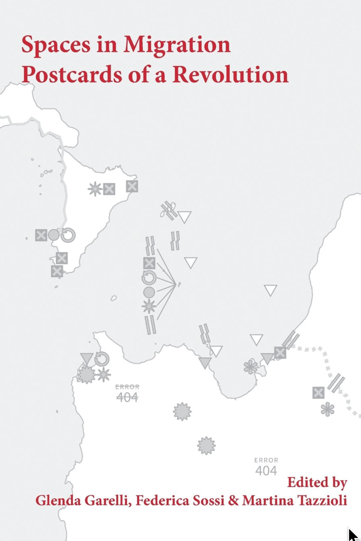
These were the harraga, “those who burn.” Meaning both “young people who ‘burn’ frontiers as they migrate across the Mediterranean sea and those who are ready to burn their documents (but also their pasts and eventually their lives).” The words are those of Paola Gandolfi from her “Spaces in Migration” in Glenda Garelli, Federica Sossi and Martina Tazzioli’s Spaces in Migration: Postcards of a Revolution (Pavement Books, London, 2013). “Spaces in migration” is an ambiguous phrase, implying both spaces moving in the process of migration (for example, the spaces moving with the migrants’ bodies) but also the spaces emerging in the process of migration (like 51 Avenue Simon Bolivar, like the detention facilities on Lampedusa). Either, or both of these taken along with the burning of frontiers and the burning of documents can melt the solidities, the certainties, of the contemporary system of nation-states.
Which are, after all, bounded places (states) with a population that is more or less culturally coherent (nations). There may be no true nation-states these days, given the bewildering range of peoples that live in even the smallest of them (Abkhazia, for example), but there are states galore, with ever more jealously guarded borders.
When these are “burned” by harraga it’s as though a body were being wounded, anything might get in, there would be no integrity, the body could come apart. So when the Tunisians started crossing the Mediterranean for France and reached Lampedusa, a minute island midway between Sfax, in Tunisia, and Malta, from which, thanks to a permit granted by the Italians, they were able to travel freely through the Schengen Area, you’d think the whole African continent was attempting to pour into Europe. The few thousand who initially reached Lampedusa, well, Lampedusa is small. It’s not eight square miles. But still, the first few thousands that arrived immediately aroused a language of Biblical proportions, of natural disasters: plagues, floods, tsunamis, simply overwhelming numbers which, in fact, didn’t amount to single thousandth of a single percent of the even the Italian population. Even in August when the number did reach fifty thousand it was still inconceivably small.
You’d think a dagger was being driven into the Italian, into the French heart.
The French closed its border with Italy. There was no way they were letting all these Tunisians into la patrie, despite their own earlier colonization of Tunisia. The French into Tunisia? Certainly. (And they didn’t give it up until 1956). But Tunisians into France? Unthinkable! To say nothing of the Libyans, who with their numbers soon revealed how few the Tunisians had been, the Eritreans, the Senegalese, the Syrians … All barely existent nowhere people on the move …
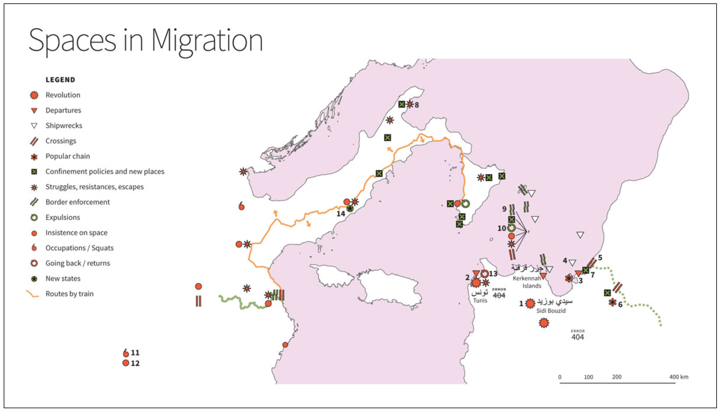
The map here may confuse some people. For one thing, north is to the left of the map. For another we’re not used to seeing this piece of the Mediterranean, turned this way, at this scale. Tunisia is in the lower right. That’s Libya above it. Lampedusa is the dot from which the items labeled 9 and 10, among others, are emanating. Paris is indicated by 12. Be that as it may, it’s astonishing how tight everything is, how close, how these two continents so firmly separated by Mohammed and Charlemagne almost kiss, even here in the middle of the sea. Lampedusa has kin, Linosa and Lampione. You can even see Tunisia from Pantelleria (it’s only 37 miles away). Despite this the rhetorical distance separating Europe and Africa remains all but uncrossable.
For the undocumented burning their way across it is crossable, but only as long as they remain nonexistent, nowhere, and unmappable. The problem is, “You start to get hungry, you smell and you only have one pair of jeans to wear. You never take your shoes off and your feet hurt. You call home, not too often, to let them know you are still alive but you do not speak of your insistence on space, and sometimes you start to think about returning. You even go as far as to insist on consulate offices to try to work out how to get home. But you burnt a border when you left on a boat, one that won’t allow you to burn it again on the return journey.” This comes from Garelli, Sossi, and Tazzioli’s “Postcards of a Revolution,” the conclusion to their book (it’s also online here). This is as close as you can get to despairing without actually giving up.
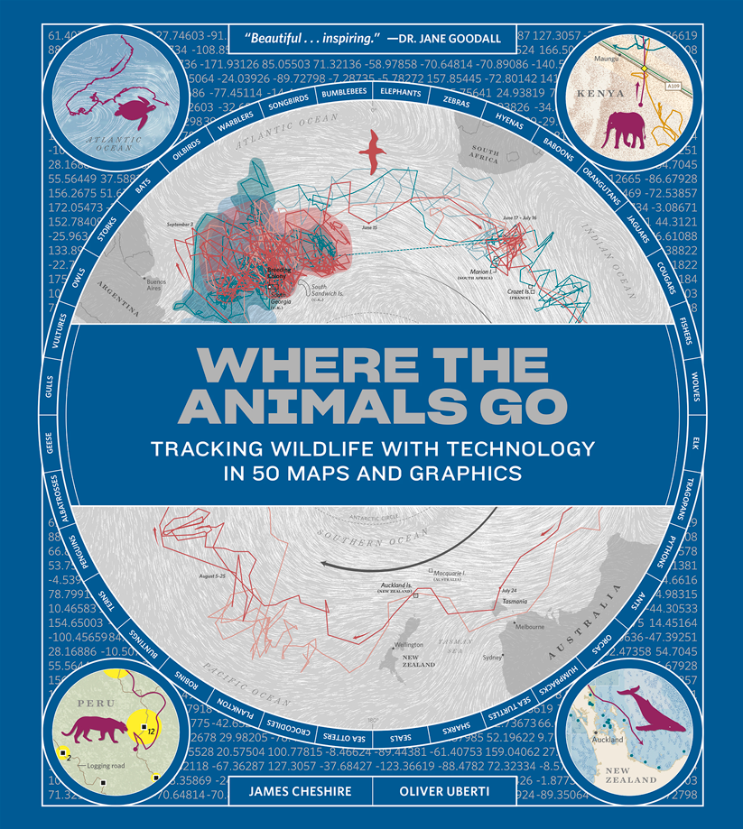
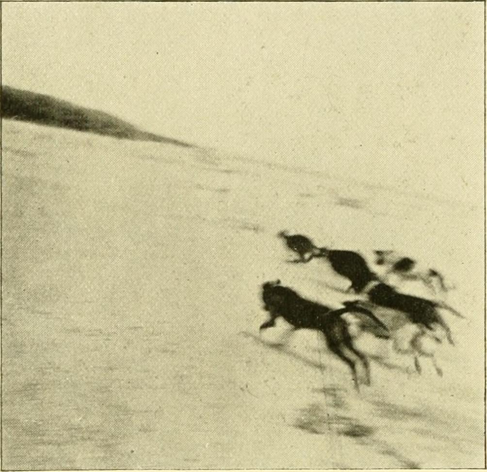
Placeless: often this is to say on the move, and since in motion, unmappable, wherever they may happen to be. It’s hard to map things in motion. All the ways we’ve developed are workarounds. Some of the best of these are captured in the recent book, Where the Animals Go: Tracking Wildlife with Technology in 50 Maps and Graphics (Norton, New York, 2017) by James Cheshire and Oliver Uberti. Like Ahmed in Brussels, like the Tunisians in Paris, animals too are undocumented, and like Ahmed and the Tunisians they too burn borders without hesitation. If they’re even aware of them.
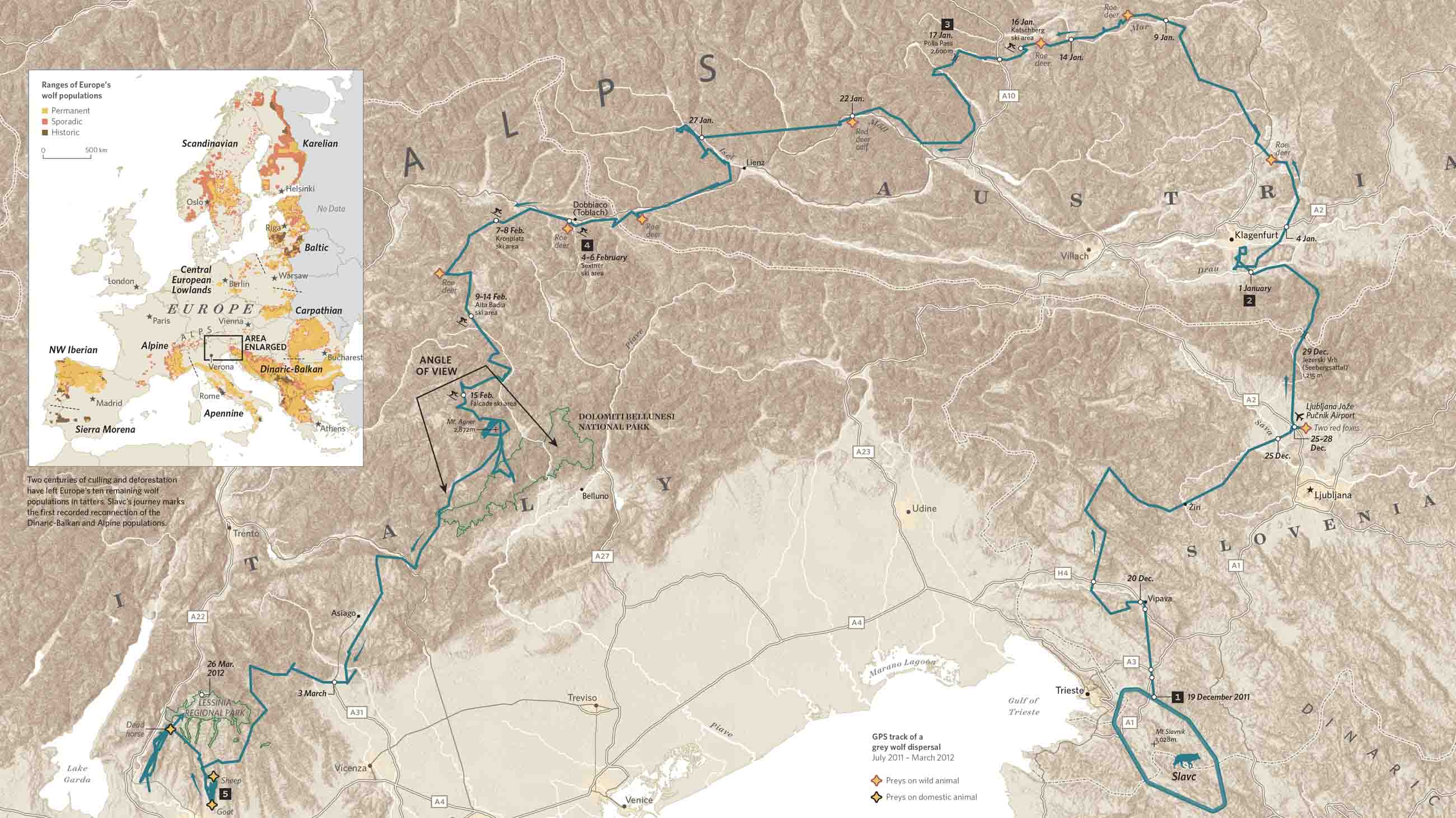
Take Slavc, a young wolf from the mountains on the Croatian-Slovenian border. He left his maternal pack and struck out on his own, crossing motorways and major rivers, navigating the Dolomites in the middle of winter and the suburbs of Verona; moving from the Dinaric Alps, across the Drava into the Alps, and so from Slovenia into Austria, and into and through the Dolomites, which is to say into Italy, before settling in the upper plateau of Monte Lessini. Slavc leaves Croatia, crosses Slovenia and Austria, and slips into Italy, all without so much as a by-your-leave from a single border agent. Of course he’s not a human so … who cares?
That he’s visible at all is because he’d been radio collared by a University of Ljubljana conservationist who tracked his GPS transmissions. The collar sent about seven locations a day, allowing Hubert Potočnik to interpolate the rest of Slavc’s movements. Mostly he moved at night, more like Ahmed than the Tunisians. He didn’t kill a domestic animal until he reached the outskirts of Verona, so if he hadn’t been radio collared he would have been completely invisible.
The carnivore at the top of the food chain is less easily hidden and, when seen, needs to be able to exhibit papers. The simmering European refugee “crisis” has led to an armoring of border and after border, including the one in the Dinarics that Slavc crossed between Croatia and Slovenia. The Dinarics are home to many animals that now move freely across the Slovenian and Croatian border, wolves, obviously, but also, among the collared, lynx and bears. The borders that impede the movement of Syrians and Eritreans also impede and usually preclude the movement of all the larger mammals. Impenetrable barriers are horrifying intrusions into their lives and genetically disastrous.
But what is this terror of the mobile? Only that it implies the fragility of the police states into which most modern states have evolved. Is there any that lacks its apparatus of control, its mechanisms for identifying, tracking, apprehending and expelling any it stigmatizes as unwelcome? It has less success with wolves, with storks, with whales but only because, inhuman, they’re less subject to scrutiny. As we have seen this has its downside: unintended control by barriers meant for humans. How many animals moving back and forth across the US-Mexico border will be trapped on one side or the other by Trump’s wall? How many will have their ranges severed? How many will be separated from their families?
I think it’s easy enough to answer, “Enough, enough will be separated from their families,” just as Ahmed was separated from his, as the Tunisians were separated from theirs, as animals around the world are separated from theirs.
Why do we even care where any of these are?
Isn’t it enough to know where we are? And when you stop to think about it, isn’t that hard enough?
Book Review: Denis Wood reviews “The Power of Maps” – But not his “The Power of Maps”
Posted in 02 Why Are You Making Your Map?, Advocacy Maps, Map Books, tagged CTA Publishing, Participatory GIS, Participatory Mapping, The Power of Maps on October 17, 2016| 2 Comments »
Denis Wood’s delightfully snarky review of a new book, The Power of Maps, but not The Power of Maps he wrote in 1992. The review provides a critique of participatory mapping and GIS from the perspective of critical cartography that has developed over the past several decades.
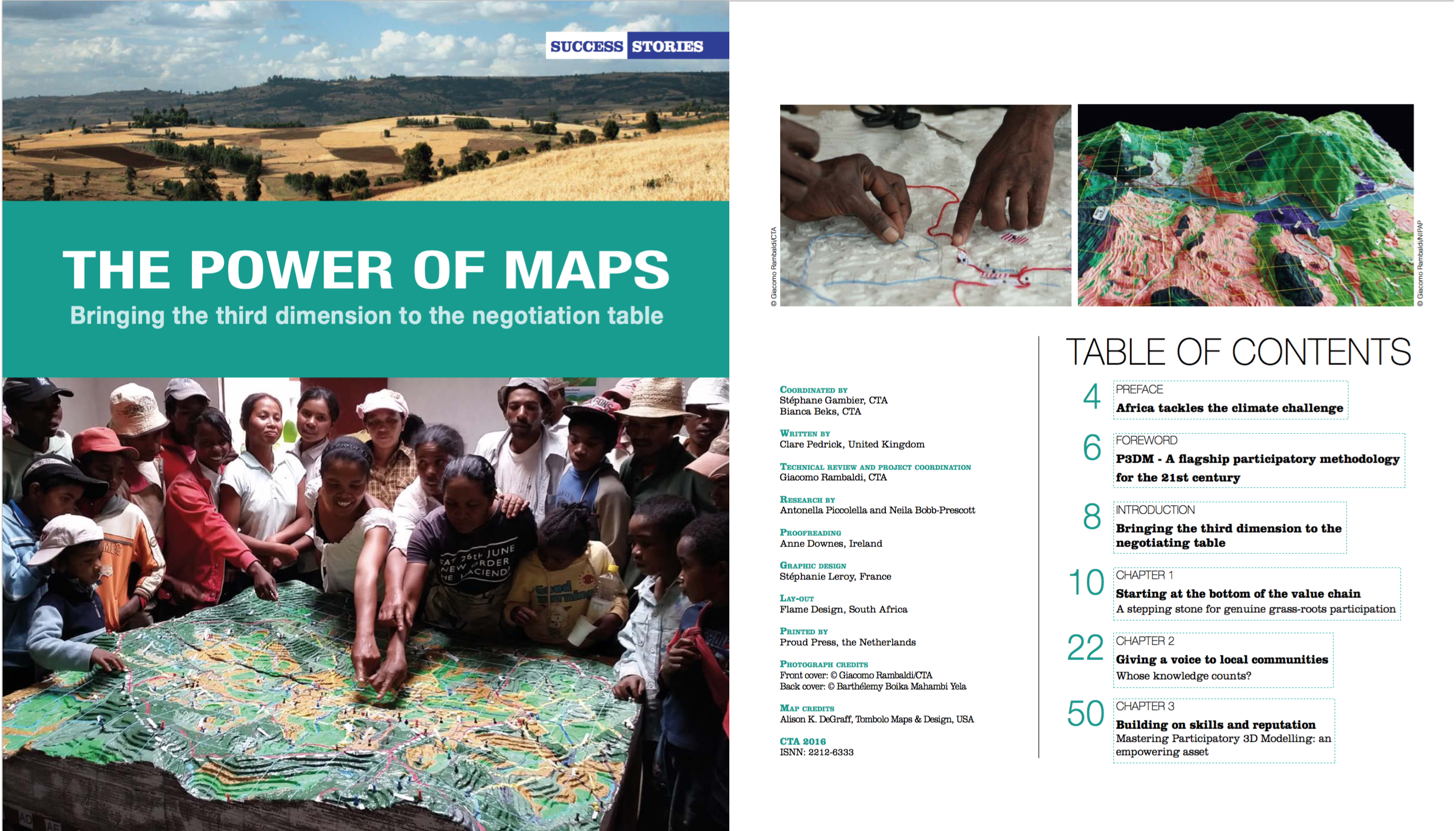
Review: The Power of Maps: Bringing the Third Dimension to the Negotiation Table
C. Pedrick (editor)
Technical Centre for Agricultural and Rural Cooperation (CTA)
Order book or free PDF here.
by Denis Wood
Interesting title, The Power of Maps. Once I wrote a book called The Power of Maps (Guilford, New York, 1992), but that was then and this book was just published. My book was about how maps, instead of being objective and neutral, were interested, and about how hard maps labored to mask this interest. In the end it was about maps as malign instruments that hid their commitment to advancing the interests of those who commissioned them.
CTA’s The Power of Maps is one of these masks.
Or maybe I shouldn’t put it that way. That may be too harsh, too sweeping. But, my god, just take a look at the cover! In the upper right is the boxed phrase, “Success Stories,” letting us know right off that we’re in for some kind of fluff. Below, bracketing the title, are photos of a landscape and of a bunch of kids clustered excitedly around a three-dimensional model of it, or at least we assume the model’s of the pictured landscape (we hope it is): it’s never stated. The kids, a diversity of ages, are proud, and as we later learn, they should be, since presumably these are the kids who made the model. “Bringing the third dimension to the negotiation table,” says the subtitle, though these kids don’t look like they’re negotiating anything and, as it turns out, they’re not.
All sorts of prefatory fluff precede twelve stories with titles like “Mapping in Madagascar – from skepticism to ownership” and “Scaling up P3DM: A powerful community engagement tool.” The exciting titles are unfolded in exciting texts. Wonderful things happen when participatory 3D models are constructed. Generations come together (since the youth build the model which “the elders” interpret), people who have trouble with maps move over the model with ease (as we can see in the photos), government officials are impressed (evidently), and soon … everybody’s negotiating, they’re taking their future into their own hands, they’re triggering green lights for environmental restoration.
In these stories it’s almost magical the ways these things happen. The kids just build the model; the elders cluster around it annotating it with colors, yarn, pushpins; the officials just show up. In better than three dozen full-color photos, kids happily work, elders eagerly collaborate, attentive outsiders look and listen. P3DM really is magical! It really works!
That this a profound illusion The Power of Maps reveals only in its list of further readings on page 67 (the whole document runs only 74 pages). The first item, Giacomo Rambaldi’s Participatory Three-dimensional Modeling: Guiding Principles and Applications: 2010 edition runs 98 pages, each crammed with facts, figures, diagrams and tasks, tasks, tasks. There’s a lot to do before the locals can start making their model, and lots of outsiders are going to work to get it done. To begin with:
Organizing and facilitating a P3DM exercise requires a multidisciplinary team with at least three facilitators covering – as an example – the following disciplines: geography/cartography/GIS; natural resource management/environment; and social sciences. (p. 52)
and:
Logistical aspects vary from project to project. The more complex the initiative the more demanding are the logistical arrangements. All projects, whether they involve single or multiple communities and ethnic groups scattered over a large area, must handle logistical details for field activities, workshop venues, travel, accommodation and catering for community members and technical staff. Other matters to be arranged include contracts for a venue sufficiently large and possibly with electric power to allow the manufacture of the model, board and lodging, equipment rental or purchase and procurement and safe storage of supplies including the base maps. Additional staff may be hired and vehicles made available – in short, a variety of logistical arrangements are required for the project to run smoothly. All of these arrangements must be made in a timely fashion, and many must be in place during the earliest stages of the project and before project activities get underway. (p. 31)
That’s my emphasis, but there are lots of people from the outside who are going to be involved, and it all has to be paid for (materials for the model alone will run about a thousand bucks), there are salaries, and so there are sponsoring agencies and so on (and so on). While there’s a philosophical inclination to insist that these projects are “demand driven” – by the locals – it’s plain enough that they’re instigated by the agencies funding the work and so they’re in pursuit of agency goals.
Further along in the further-readings is CTA’s “Training kit on participatory spatial information management and communication” (2010). This consists of fifteen modules, most of which contains four units, none of which takes less than an hour, which is to say we’re talking about a commitment of more than 60 hours, and that’s without all the stuff they ask you to download and read or watch. Working through this training kit demands a serious chunk of time and energy. But, then, the whole thing does. The least of it is the construction and interpretation of the model, since once that’s done the whole thing has to be turned into a GIS, and maps have to be made. Maps, as my Power of Maps made plain, will be the tools used to implement any action, which since these are more or less all government projects, pretty much goes without saying. The 3D models are really about securing buy in, consensus, on the part of the locals.
I’ve critiqued participatory mapping before, in the keynote, “Public? Participation? Geographic? Information? Systems?” that I gave to the 2005 URISA Conference on PPGIS in Cleveland. The title should make the nature of my complaint clear enough. At the time I was unaware of Bill Cooke and Uma Kotiiari’s Participation: the New Tyranny? (Zed Books, London 2001) which examines many of my complaints in piercing detail; and I certainly didn’t know of Cooke’s “Rules of thumb for participatory change agents” (from Samuel Hickey and Giles Mohan’s Participation – From Tyranny to Transformation?, Zed Books, London, 2004), the first of which is, “Don’t work for the World Bank,” which naturally enough turns out to have funded “Mapping in Madagascar – from skepticism to ownership.” In fact, most of the projects laid out in The Power of Maps violate most of Cooke’s rules. One of these, “Data belong to those from whom they were taken,” includes “The use of photographs of participants in presentations and publications without their consent, informed or otherwise.” Again, nearly every one of the better than four dozen photos in The Power of Maps consists of photos of the people, the kids, the adults, the “elders” and, far more rarely, the government and NGO folk involved. Can you imagine the photographer of the image on the cover scurrying around to solicit the permission of each of the 23 caught? (Why bother? They’re mostly kids.) Under the same rubric Cooke mentions the use of material gathered in one capacity, as a participatory change agent, in another, for example as an academic in a journal, again without permission. Further he notes the public disclosure of information, in conferences or faculty staff rooms, again without permission, and contrasts this with the censure that would clobber people working with First World clients (therapists, for example).
There are others – the skewed rates of pay offered locals, government employees, and consultant academics – but to work through the list would be too disheartening. Worst of all is the way this – all this! – and more is obscured in The Power of Maps behind a curtain that could conceal an Oz. It’s this above all else that raises my ire, who tried to expose precisely this kind of deceit in a book whose title probably should have been The Real Power of Maps. Worst did I say? No, that’s actually not the worst of it. The worst of it is the startling lack of evidence that all this cardboard and plaster and paint and yarn has paid off in significant benefits for the locals, who end up no more than exposing their local knowledge to outsiders whose ultimate goal is buy in from the locals.
Okay, I’m carping from way outside, and by no means want to castigate all the work accomplished with P3DM which is often a huge improvement, if nothing else, over the options. And maybe it’s just their use of my title, over which of course I have no title. But there’s something about this self-congratulatory volume that sticks in my craw. Why couldn’t they have called it, The Power of 3D Models or The Use of 3D Models? Or better yet Preparing the Ground for Capitalism?
André Luiz Mesquita | Dissenting Maps: Propositions on a World in Crisis (1960-2010)
Posted in 02 Why Are You Making Your Map?, Deep Map Thoughts, tagged Activism maps, Advocacy Maps, Öyvind Fahlström - Maps, Bureau d’Études - Maps, Cartographic Design, Cartographic Theory, Counter Mapping, Counter-Cartographies Collective - Maps, Critical Cartography, Iconoclasistas - Maps, Mark Lombardi - Maps on April 13, 2015| 6 Comments »

André Luiz Mesquita’s dissertation (in Portuguese), Mapas Dissidentes: Proposições Sobre um Mundo em Crise (1960-2010), (Dissenting Maps: Propositions on a World in Crisis, 1960-2010), looks at the maps and diagrams of artists and activists from 1960 to 2010, all working in social, political, and economic contexts of crisis and change, conflict and various forms of resistance. He approaches the work of three generations of artists through an analysis of endless documents, catalogs, manifestos, articles, photographs, documentaries, art works, reproductions of maps, and interviews.
Mesquita begins by examining the games and maps created in the 1960s and ’70s by the Swedish-Brazilian artist, Öyvind Fahlström (1928-1976), made under the geopolitical tensions of the Cold War (1947-1991) and the structural and organizational changes in global capitalism of the 1970s.
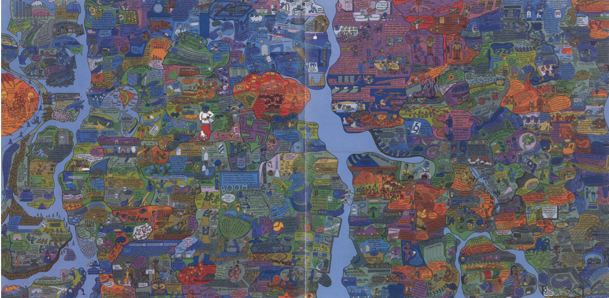
Öyvind Fahlström’s World Map
He then turns to the work of the American artist, Mark Lombardi (1951-2000), who, in the 1990s, mapped international power networks and obscure financial transactions involving banks, governments, and neoliberal elites.
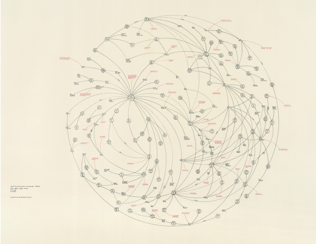
Mark Lombard’s World Finance
Finally Mesquita addresses the counter-cartography practices developed between the 1990s and 2010’s by three activist art collectives: Bureau d’Études (France), the Counter-Cartographies Collective (United States), and Iconoclasistas (Argentina). Based on the interrelations between contemporary art, political activism, and critical cartography, Mesquita holds that the work of these activists-artists has created a significant opposition to the “neutral and objective” maps made in the interests of corporate, governmental, and military bodies.

Bureau de’Etudes’s Refuse the Biopolice
•••••

Counter-Cartographies Collective’s DisOrientation Guide
•••••
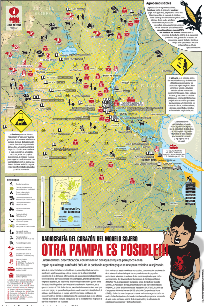
Iconoclasistas’ Radiografía del Corazón del Modelo Sojero
What’s really exciting is the mining Mesquita has done, coming up with a range of map work that will surprise the causal observer of, say, Fahlström (in particular); but also the way he attaches all this work to that of antecedents (like the Surrealists and the Situationists) and parallels (as in the work of Trevor Paglen).
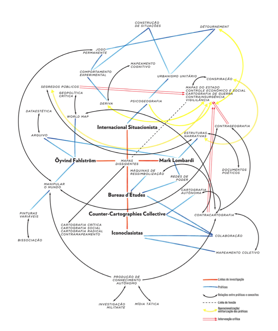
Map of the Dissertation’s Argument
This is an important piece of work. Mesquita is currently working on a translation to English.
The full dissertation can be downloaded here or here (55.4 mb)
The Lovely Lesser Arts: Leather Making, Screens, Map Making, Silhouettes, and What To Do About Nudes (1948)
Posted in 01 What's A Map?, 02 Why Are You Making Your Map?, Cartominutiae, Deep Map Thoughts, Map History, tagged map making on December 9, 2014| Leave a Comment »

Cover of Estelle H. Ries’ opuscule on a miscellany of “lesser arts.”
Estelle H. Ries. The Lovely Lesser Arts: Leather Making, Screens, Map Making, Silhouettes, and What To Do About Nudes (1948). Girard KS: Haldeman-Julius Publications (B-686).
••••••••••
Ms. Ries here situates makers of maps among other lesser artists – leather toolers, silhouette cutters, screen decorators, and carvers of ivory. Ries concludes her work with a few comments on the dreaded nude:
What to do about nudes, if anything, is always more or less of a ticklish problem. No matter how 20th-century we are or wish to be, some of us have inherited enough from the Mauve Decade, or have been surrounded by the traditions of Victorianism to such an extent, that the very word, Nude, is often veiled in whispers even if the object itself is veiled in nothing more than the atmosphere.
As for maps and their makers, Ries has many thoughts:
The first matters to be charted were direction and distance and these are still essential to every map. If you hear of that better place you can keep going until you get there if you but travel in the right direction. (p. 12)
Having north at the top of the map, we are used to the shapes of countries in this position. It would be the same world if we turned it upside down and had the south at the top, but try it once and you will see how unfamiliar and confusing it looks so. Yet the world is so upside down in most particulars right now, that perhaps it would be more true to print the maps that way after all. (p. 12)
In the jungles of Bengal they have a custom of breaking a branch from the wayside, and when it wilts it is considered that a krosh has been traveled. They do not realize that this varies with the season the type of tree from which the branch is taken, the speed of the walker or his idea of wilting! (p. 13)
One long-established concern publishing maps is in touch with all foreign governments through a branch office in Washington which contacts all the embassies. They consider a man in their cartography department an apprentice for the first three or four years of service which will give you a clue to the difficulty and importance of this type of work. (p. 15).
••••••••••
The full text of section III, “The Human Side of Map Making,” from The Lovely Lesser Arts is below. A PDF (13.3 mb) of the entire 30 page booklet is here.
••••••••••
III. THE HUMAN SIDE OF MAP MAKING
Once upon a time the nations of the world knew little or nothing of one another: The hazards of travel in an uncharted world prevented people from going far afield. What lay beyond the horizon? Who dwelt there? These questions were answered by silence or by mythical imaginings. But necessity and curiosity joined hands and impelled discovery of these unknown places. Which way to a better land? How far to more fertile ground? These questions were answered by a map.
The first matters to be charted were direction and distance and these are still essential to every map. If you hear of that better place you can keep going until you get there if you but travel in the right direction.
To get this sense of direction you must start from somewhere. Today maps have the true north at the top. This was not always so. The religious movements of the Middle Ages developed special reverence for the East. Paradise itself was represented on the maps and was supposed to be in the Garden of Eden, in the East. But Paradise was Heaven, and Heaven was above, so the East was at the top of the map and there it remained until the compass came along and displaced Paradise by pointing north itself.
Having north at the top of the map, we are used to the shapes of countries in this position. It would be the same world if we turned it upside down and had the south at the top, but try it once and you will see how unfamiliar and confusing it looks so. Yet the world is so upside down in most particulars right now, that perhaps it would be more true to print the maps that way after all.
A map is not earth size, of course, so that distances must be represented to a scale. Otherwise your map is too vague to have much use. It is harder to do this than to get direction because a knowledge of mathematics is needed both to measure distance on the ground and still more to show it on a map. In some parts of India a unit of measurement, the krosh, is given as “two statutory miles, more or less.” In the jungles of Bengal they have a custom of breaking a branch from the wayside, and when it wilts it is considered that a krosh has been traveled. They do not realize that this varies with the season the type of tree from which the branch is taken, the speed of the walker or his idea of wilting! Obviously mapmaking could not advance far until some facts of mathematics and astronomy could be applied. The best early maps came from Egypt, Babylon, China and Greece where these abilities first flourished.
The absence of such knowledge in most of Europe during the middle ages led the monks who made the maps never to leave any blank space on a map. To do so was an open confession of ignorance. They filled up all vacant areas with elaborate decorations-sometimes of fantastic creatures, or of legendary tales. Through the 18th century maps were decorative rather than practical, truly works of art, and are even now collectors’ items of rich beauty. Perhaps as an alibi to conceal their lack of accurate data, the idea was allowed to get around that accurate observations would be of value to trade rivals or enemies.
Of course, there were always some serious geographers who tried to promote accuracy in maps. Ptolemy, a famous Egyptian astronomer of the 2nd century, was first to draw the equator upon a globe and measure off the lines of latitude and longitude. Such lines, he explained, would locate any place on the map better than any amount of description. He also pointed out that a flat sheet of papyrus or paper would not fit around a sphere and that flat maps would involve too much distortion to be accurate. For a long time he pondered, “How can I show a map of the globe on a flat surface without too much distortion?” And then he had an idea. He took a cone and fitted a piece of papyrus around it tightly. It went on without any bulges, and when he took it off, it could be flattened out. He placed the cone, which was hollow, over the globe as far as the equator and drew his lines upon it. Then he took another cone going from the South Pole to the equator, and so invented the conical projection for flat maps. Ptolemy’s contributions to map-making were of great importance, but during the centuries new discoveries were made which were not on his maps. Moreover they had some inaccuracies of their own due to the unreliability of his sources, although his scientific methods were correct.
Mercator, a Flemish mathematician in the 16th century recognized the troubles with the earlier maps and decided to make something that would combine their advantages and remove their faults. Where Ptolemy used a conical projection, Mercator devised one based on a cylinder, and this solved the problems he had set himself.
The difficulties of making a map increase when we try to show on a flat surface the variations in height such as hills or mountains, yet their importance is too great to overlook. Mountains are not only a distinguishing physical characteristic of a region, but they affect rainfall and climate; they are the sources of rivers; they influence the amount of timber or the agricultural conditions; they serve as political boundaries and in many other ways. At first glance it would seem that the best way to show these would be on an actual model. However, models are costly to produce and cumbersome to handle, as they cannot be rolled, bound, folded or otherwise carried around conveniently. Most important, however, there has to be a different scale used for horizontal and vertical distances, else a relief model of the globe without such a difference would show little more in the way of relief inequalities than the skin of an orange. For example, Mount Everest is only 1/2000 of the earth’s diameter. On an 18-inch globe, it is estimated, it would be represented by less than 1/100 of an inch. Thus the highest mountain in the world wouldn’t even show!
A map combines the qualities of a picture and a book. Elevations of mountains or depths in water are depicted by forms of shading. A town is indicated by a dot, a road or river by a line. Codes of color can be employed, and other conventions are customary. The mapmaker must exercise some choice in the matter of naming places. He has to decide whether to use an American form of a foreign town or its native name, or one recently changed as an expression of national self-determination. Koln or Cologne; Dublin or Baile Atha Cliath? Praha or Prague; Munchen or Munich? This grows even more complex if the alphabet used by the natives is not related to a European one. There seems to be quite an assortment of spellings for the names of places in Persia (itself called Iran), China, India and other oriental lands. Maps should, of course, be clear and uncrowded, and the mapmaker should decide at the outset which kinds of things he must emphasize.
Of course, since Mercator’s Atlas appeared in 1585, mapmaking has grown continuously more scientific and accurate. The modern era of discovery and exploration does not consist in the vague adventuring by land and by sea which in a large measure constituted discovery up to the time of Captain Cook-and in some parts of the world long after that time. Today’s cartographers have precision instruments and theoretical knowledge far beyond any then in use. Mapping by airplane, for instance, is one of the newest and most popular methods giving access to hitherto inaccessible places. Telegraph, cable, radio, weather bureau and countless similar services have simplified the work of mapmakers and at the same time have given them far greater responsibilities. There is so much less excuse for them to be other than strictly reliable.
The modern mapmaker is an expert and his results go to experts whereas the early seafarer was more of a rough and ready adventurer who took a long chance hoping for gain, and did not care too much if he lost. By the old methods and equipment much of the world was discovered by accident. Desire for trade and wealth, missionary zeal, piracy, or sheer adventurousness were the usual reasons for exploration. In those times an explorer would ask for a little money to find a land that one could see and profit by. Today explorers like Roy Chapman Andrews require a quarter of a million dollars to explore a portion of the Gobi desert for knowledge of a world buried millions of years ago; not for financial profit in any way but for study of rocks and skeletons to reveal the beginnings of life on earth. It has been pointed out that while Columbus spent only about $2,000 to discover America, Byrd needed over $1,000,000 to enter the Antarctic. He spent nearly $200,000 merely to make a 17-hour trip over the North Polar Sea by air. Few modern explorers are able to take a large scientific staff into the field under a cost of $100,000.
When explorers have mapped the surface of the earth, will the job of mapmaker be finished? By no means. The whole idea has expanded and will continue to do so, for map making means many things to many people. Alexander von Humboldt, for instance, was puzzled by the fact that London was farther north than New York and yet was warmer in winter, while other places in the same latitudes varied in temperature. He began to plot new lines on the map running through places having the same temperatures, just as each line of latitude runs through all places of like distance from the equator. The temperature lines ran zigzag all over the map. He called them isotherms, and today no student of geography can do without his isothermic map. He followed this up with many other queries about the climate, and from his extended travels in South America and elsewhere he remembered certain facts. The height above sea level counts in climate, he knew from some of his own exciting mountain climbs. Mountains affect the rainfall too, he recalled. In his marvelous book, “Cosmos,” the science of physical geography was born, and Humboldt showed us a new way to look at ourselves and our earth.
Following the work of Humboldt and others, Joseph Henry gave us the daily weather map with its high and low-pressure regions and other data. Again, four-fifths of the earth is under water and this is a great field for investigators. Years ago, Lieutenant Maury of the U.S. Navy devoted his life to describing and mapping the sea – its currents, winds, temperatures, depths and many other qualities. Through him, the father of oceanography, navigators can take advantage of the most favorable winds and currents and many other benefits. Other types of explorers, like William Beebe, map the land of the fish, the actual depth and bottom of the sea, while Auguste Piccard did the opposite and soared 10 miles into the stratosphere. John Milne investigated the inside of the earth-the causes of earthquakes, and improved the seismograph which gives warning of impending disasters of this kind. And so today we still live in an age of discovery, and the vague notions of far-off countries give way to the most precise records. Accurate measurements of distances, heights, weather conditions, geological conditions; productive regions of the earth-its oil, minerals, wheat and other economic resources; plant life, animal life, human distribution, wealth maps, health maps-all these open fields of interest, work and achievement.
A basic necessity for compiling up-to-date maps is the collection and analysis of geographic and economic data. Several hundred thousand maps, charts, geographical reports, statistical records, post office guides, survey and exploration reports, historical notes and handbooks from all parts of the world are available for intensive study and research carried on by cartographers. All this research, traveling, surveying, compiling and drawing are essential to the production of the modern map. And today changing conditions make other maps of vital importance. One long-established concern publishing maps is in touch with all foreign governments through a branch office in Washington which contacts all the embassies. They consider a man in their cartography department an apprentice for the first three or four years of service which will give you a clue to the difficulty and importance of this type of work. New or old, maps and mapmaking are powerfully fascinating, bringing the world of war and work, peace and plenty, romance and reality, before our very eyes in a glowing panorama of adventure.
Gilpin’s Map of the Isothermal Zodiac and Axis of Intensity Round the World + Calcareous Plain & Maritime Selvage, Etc., Etc. Maps | 1873
Posted in 02 Why Are You Making Your Map?, 03 Mappable Data, 09 Map Symbolization, 11 Color on Maps, Map History, tagged Manifest Destiny - Maps, Maps - Color, William Gilpin - Maps on September 30, 2014| 2 Comments »
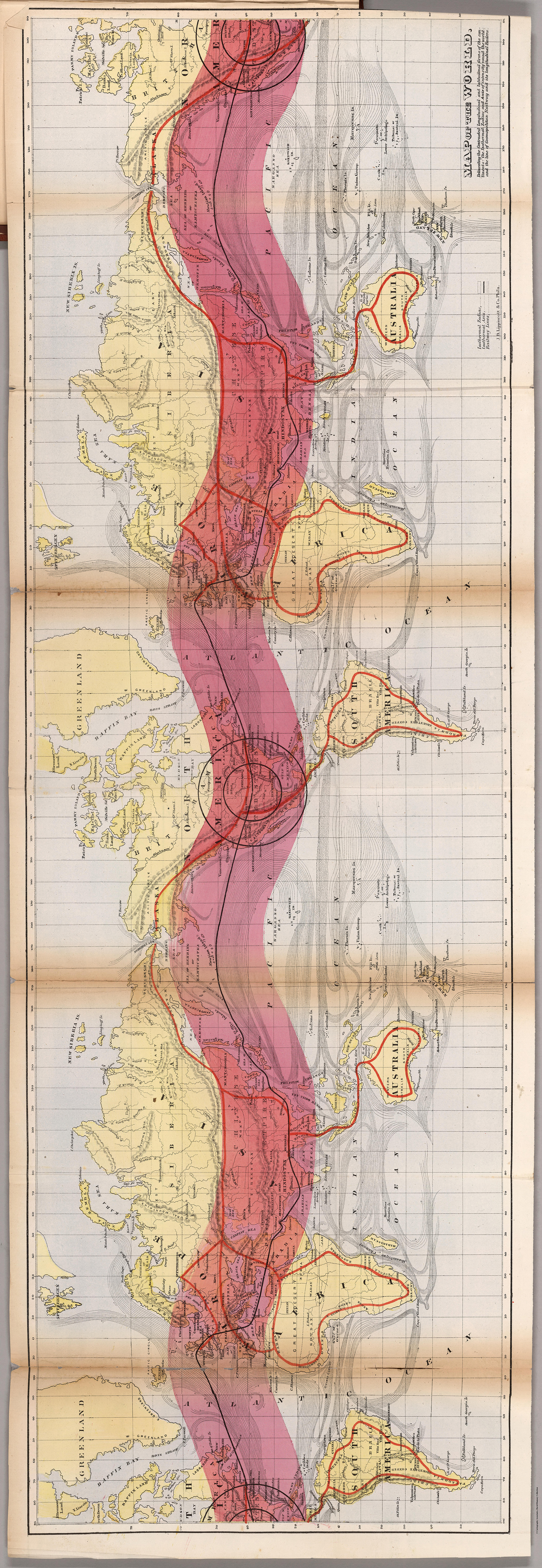
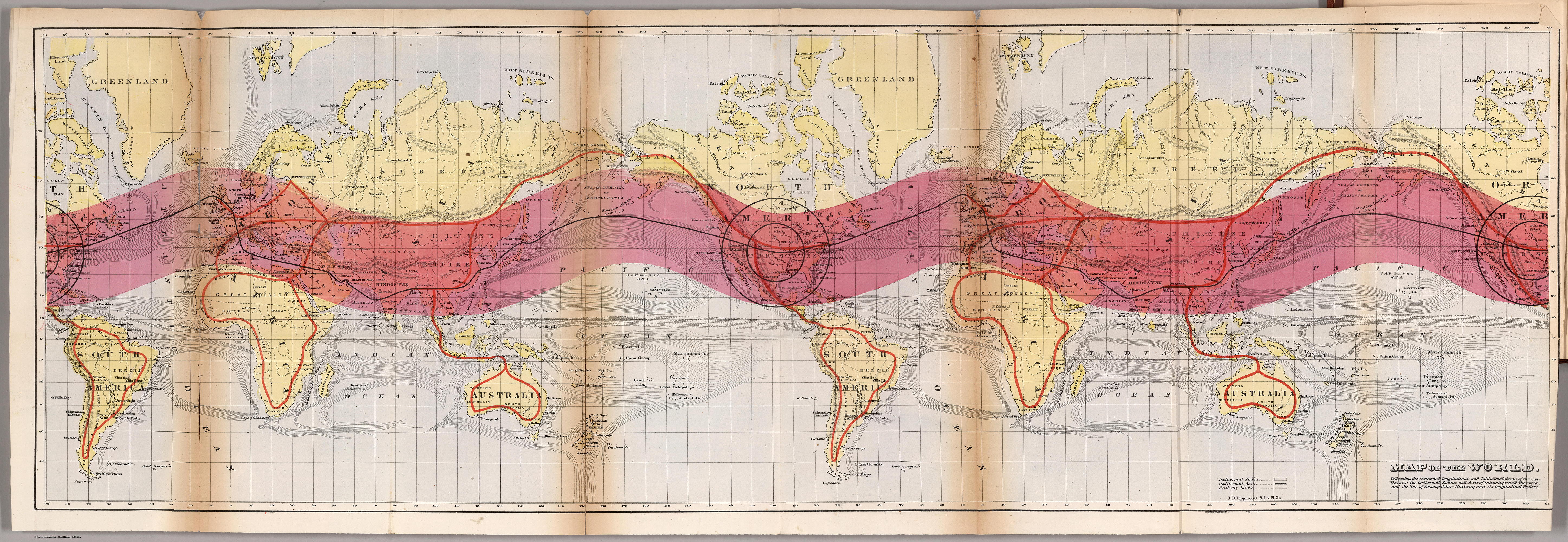
Map of the World. Delineating the Contrasted Longitudinal and Latitudinal forms of the continents: the Isothermal Zodiac and Axis of Intensity Round the World; and the Line of Cosmopolitan Railway and it Longitudinal Feeders.
••••••••••
Herein lie a half dozen very odd yet striking maps, published in William Gilpin’s Mission of the North American People (1873). Gilpin, a quaker from Philadelphia, moved west in the 1830s, joining John C. Frémont on his 1843 expedition. Eventually serving as governor of Colorado, Gilpin was a booster of the American West in general with a vision of boundless future prosperity. His belief in manifest destiny wedded to odd climatological theories, some of which are mapped out here, promoted his vision of the American West.
Maps are from Mission of the North American People, Geographical, Social, and Political. Illustrated by Six Charts Delineating the Physical Architecture and Thermal laws of all the Continents. By William Gilpin, Late Governor of Colorado. Philadelphia: J.B. Lippincott & Co. 1873. Maps can be found at David Rumsey’s site as well as the full text of Gilpin’s book at the Internet Archive.

Map of North America in which are delineated the Mountain System as a Unit, the Great Calcareous Plain and its Details, and the Continuous Encircling Maritime Selvage.

Map of North America. Delineating the “Mountain System” and its details, The “Great Calcarious Plain” as a unit, and the continuous encircling “Maritime Selvage.”
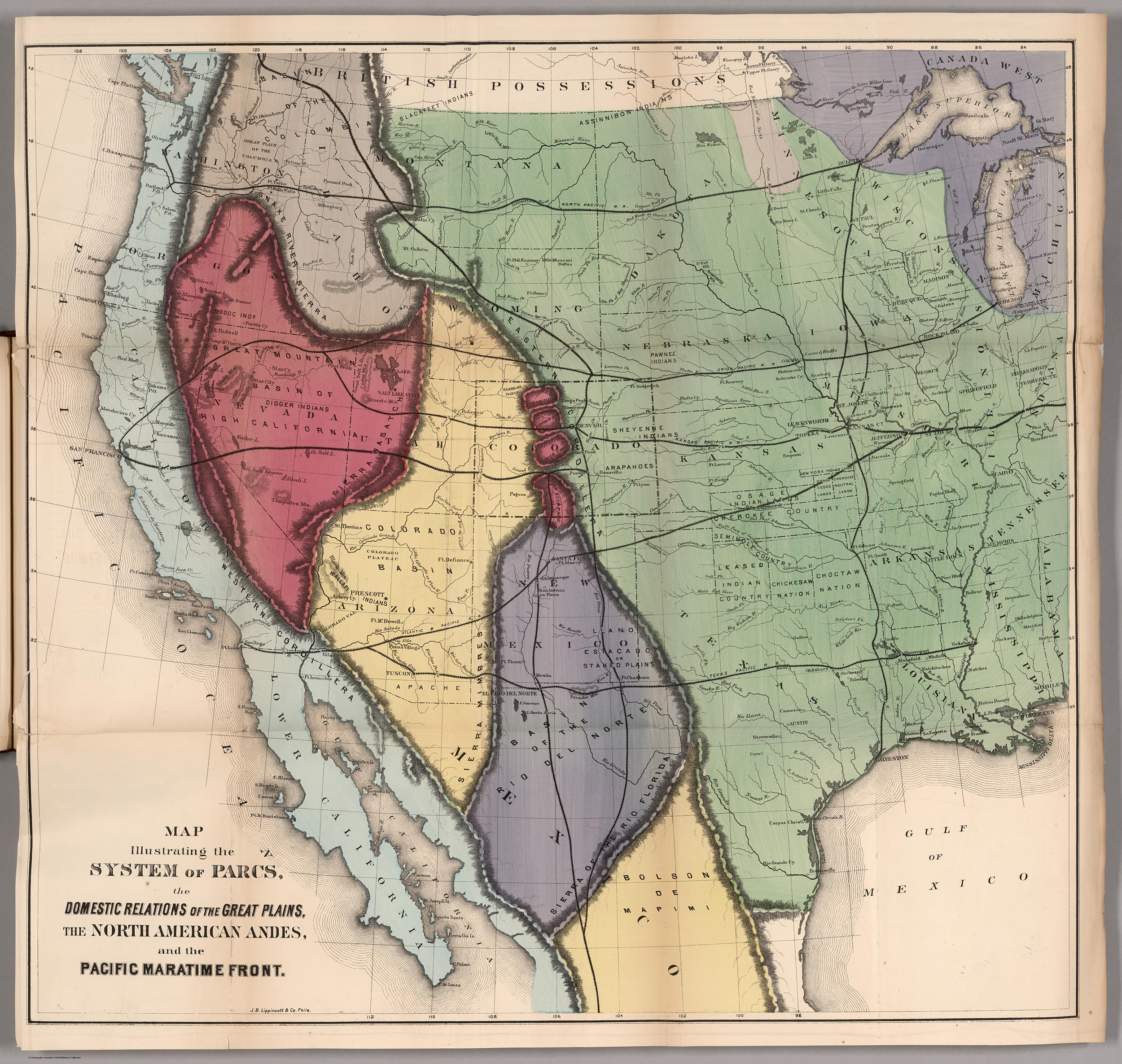
Map Illustrating the System of the Parcs, and the Domestic Relations of the “Great Plains,” the “North American Andes,” and the “Pacific Maritime Front.”
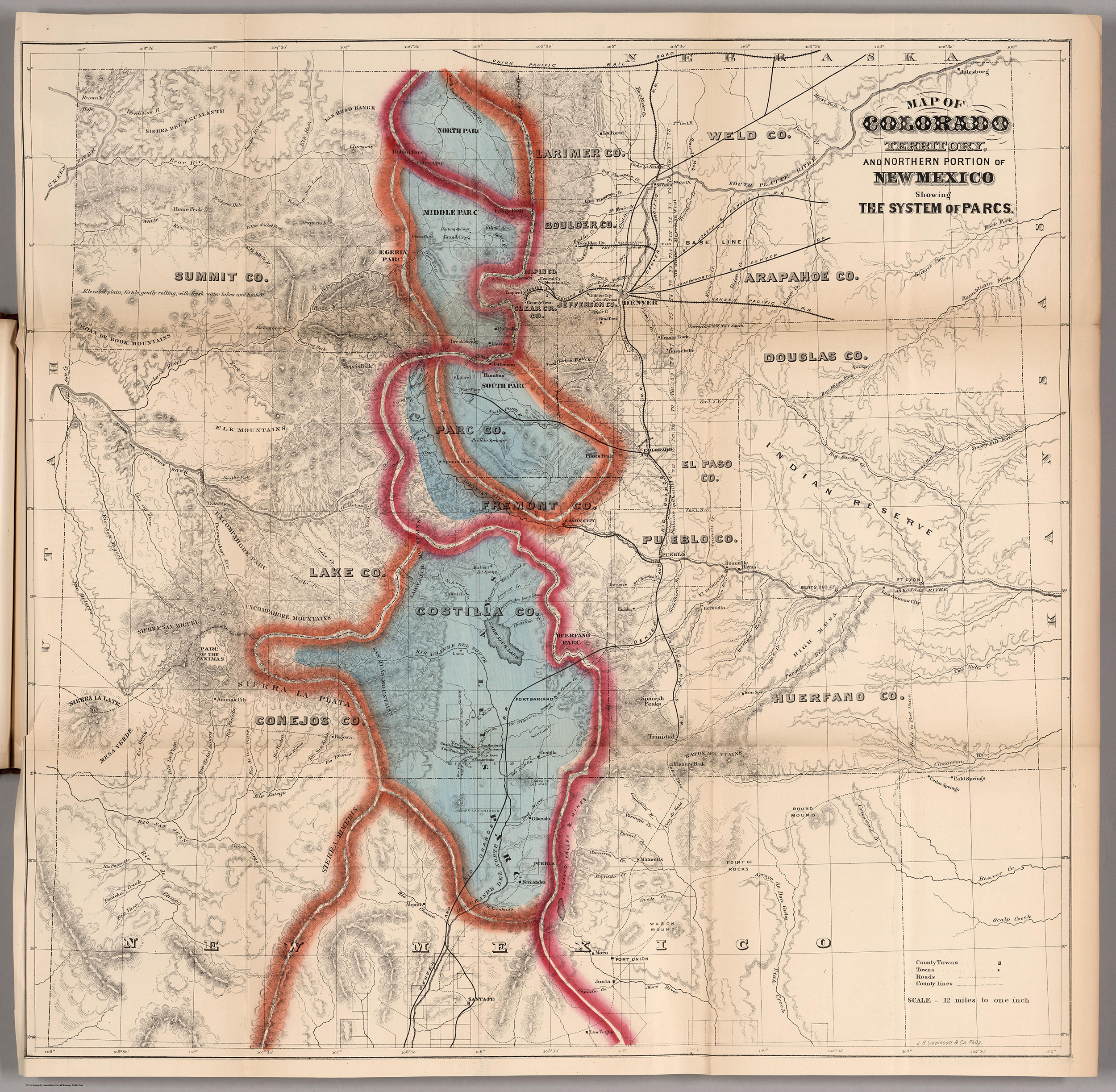
Map of Colorado Territory, and Northern Portion of New Mexico Showing the System of Parcs.

Thermal Map of North America. Delineating the Isothermal Zodiac, the Isothermal Axis of Identity, and its expansions up and down the “Plateau.”
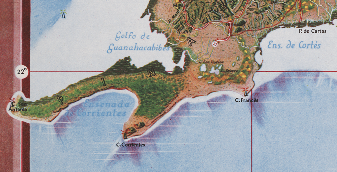
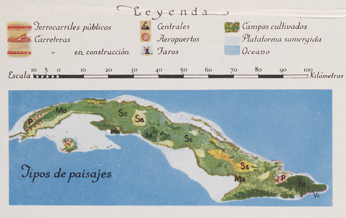
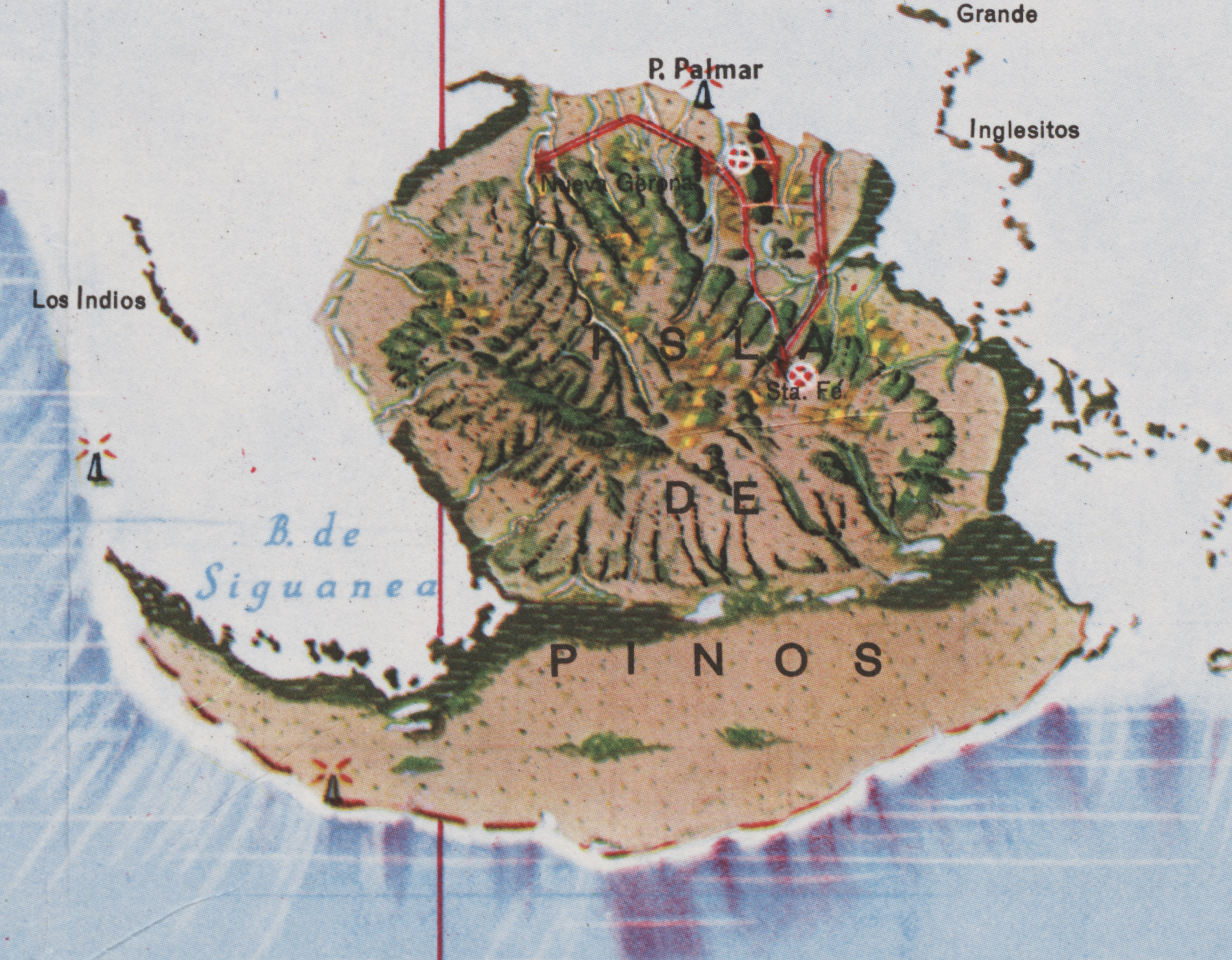
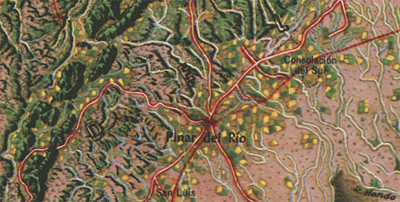
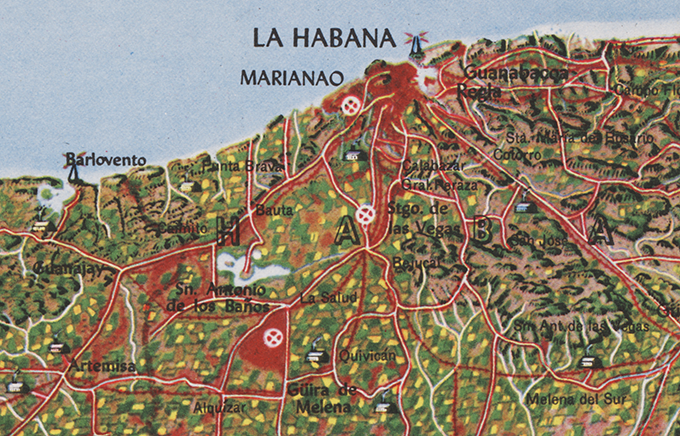
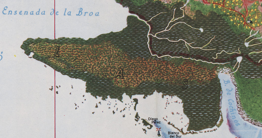
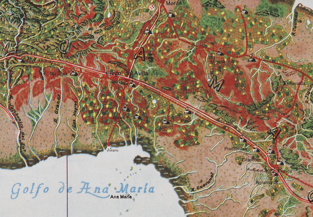
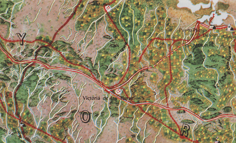
Mapa de los Paisajes de Cuba | Map of the Landscapes of Cuba | 1949 | Gerardo Canet & Erwin Raisz
Posted in 02 Why Are You Making Your Map?, 03 Mappable Data, 04 Map-Making Tools, 09 Map Symbolization, 11 Color on Maps, Map History, tagged Cuba - maps, Erwin Raisz - Atlases, Erwin Raisz - Map Design, Natural color mapping - history on July 29, 2014| 10 Comments »

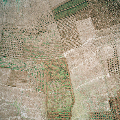
The Atlas de Cuba by Gerardo Canet and Erwin Raisz, featured in a recent posting here, is accompanied by a large color map entitled Mapa de los Paisajes de Cuba (Map of the Landscapes of Cuba). The map is a hybrid of Raisz’s landform map style supplemented with diverse human landscape components. Canet and Raisz explain their methodology:
The accompanying map of Cuba is a new experiment in cartography. Color suggests land types: cultivated fields, pastures, mountains, swamps, valleys, etc. The symbols were selected after a series of flights over the Island and on analysis of numerous color photographs taken from the air It is expected that in this way the map will better reflect reality; more closely resembling on air view of the Island than the conventional maps we now have.
This approach is part of a tradition of natural or real color mapping combining terrain (in particular, shaded relief) with air imagery or map symbolization inspired by air imagery, an obvious outcome of aerial mapping in the early part of the 20th century. An article by Tom Patterson and Nathaniel Vaughn Kelso entitled Hal Shelton Revisited: Designing and Producing Natural-Color Maps with Satellite Land Cover Data (2004) delineates the author’s development of the Natural Earth data (shaded terrain + satellite land use data) in the context of earlier, related work by Hal Shelton, Eduard Imhof, Heinrich Berann, Richard Edes Harrison and Tibor Toth. It seems that Raisz was also an innovator in this realm of air-imagery inspired map design.
••••••••••••
See also, at this blog, Raisz’s History of American Cartography Timelines, Map Symbols: Landforms & Terrain, and Raisz’s currently available landform maps at www.raiszmaps.com.
••••••••••••

Mapa de los Paisajes de Cuba, 1949 (36.6mb)
••••••••••••••••••
Map details:


Japanese Maps | Tokugawa Era | 1600-1870
Posted in 01 What's A Map?, 02 Why Are You Making Your Map?, 09 Map Symbolization, 10 Type on Maps, 11 Color on Maps, Map History, tagged Maps - History, Maps - Japan - Tokugawa Era - history on May 28, 2014| 1 Comment »


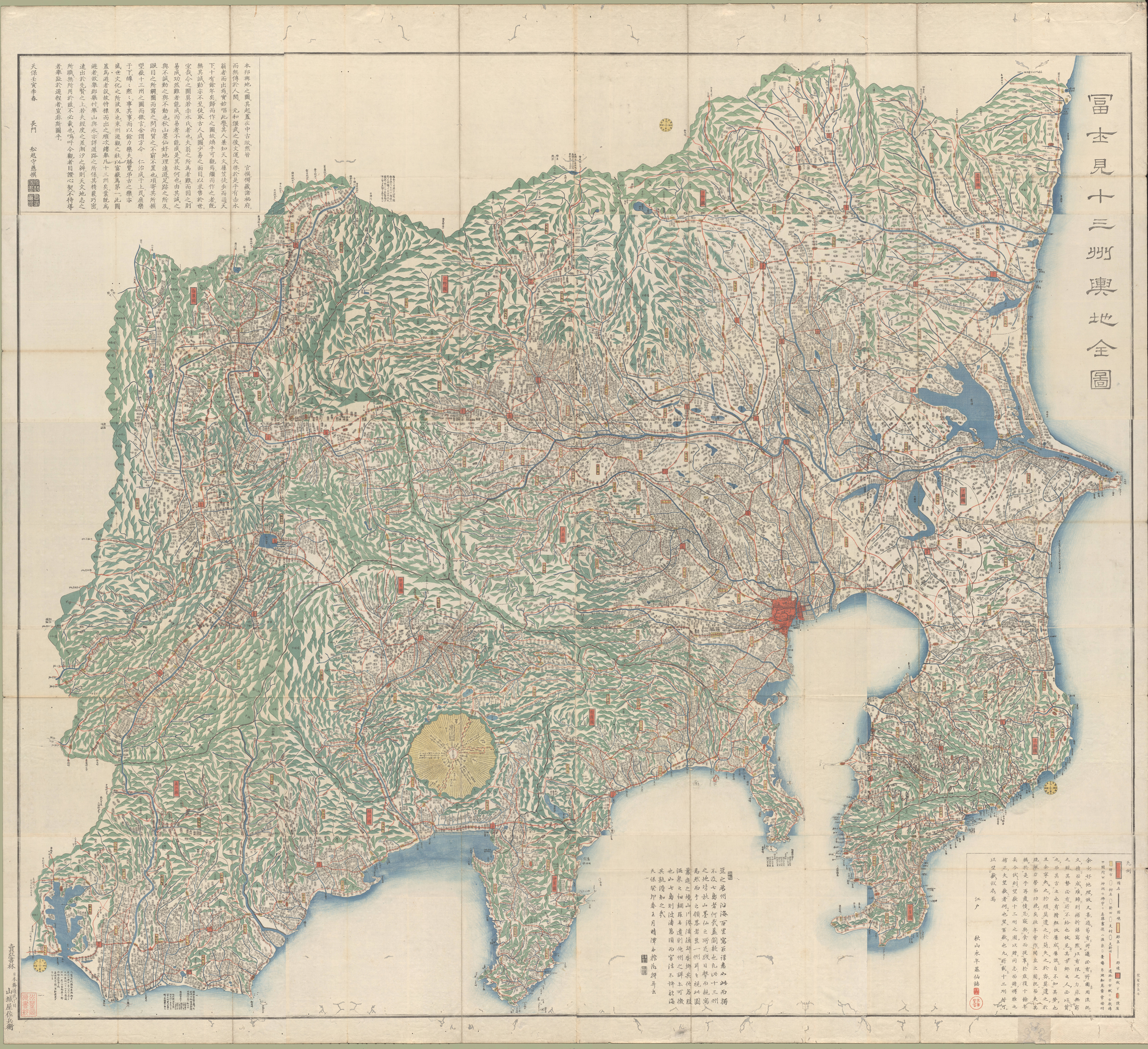
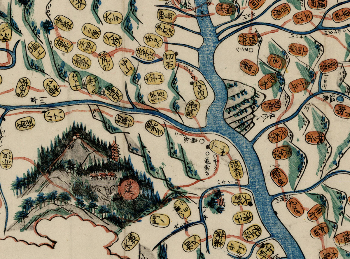
Fujimi jūsanshū yochi zenzu
(Map of the thirteen provinces from which Mt. Fuji is visible)
1843 | Edo : Yamashiroya Sahei
Source
••••••••••


Kaihō Kai no Kuni ezu
(Pocket map of Kai Province)
1842 | Kōfu, Kai Province : Murataya Kōtarō
Source
••••••••••


Ōsaka yori Tōkai ni itaru kairo no zu
(Tōkaidō and the sea route from Ōsaka to Edo)
1855 | Manuscript
Source
••••••••••
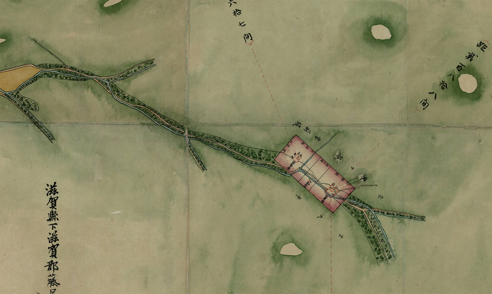

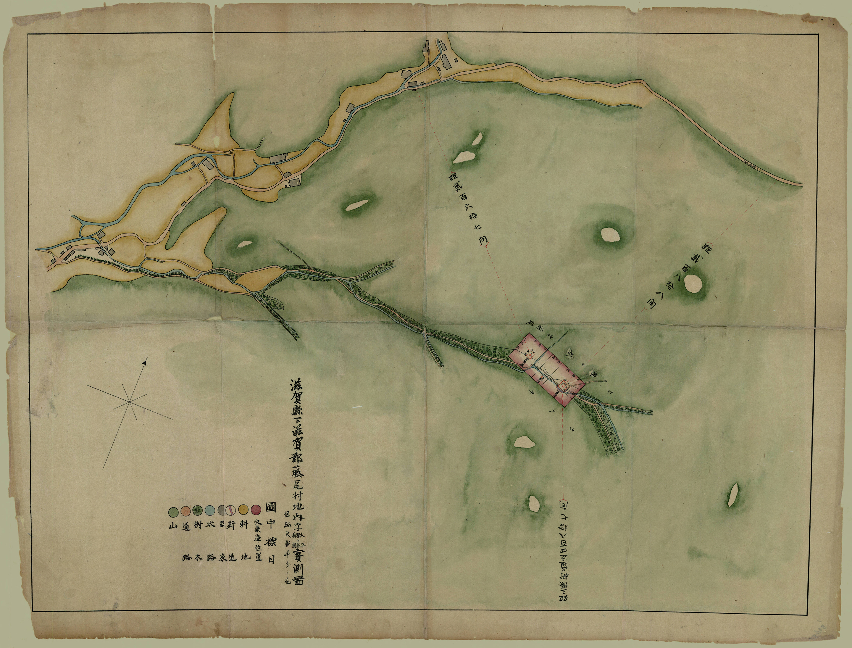
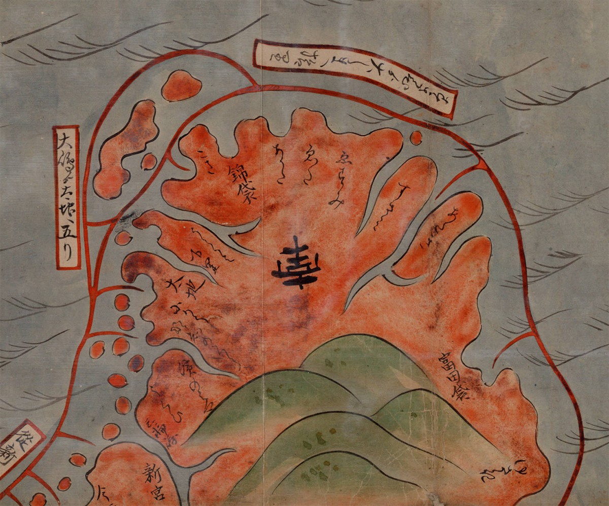
Shiga kenka Shiga-gun Fujio-mura chinai aza Ōhira Kaigaya Maegaki jissokuzu
(Measured map of Ōhira Kaigaya Maegaki, in Fujio Village, Shiga County, Shiga Prefecture – Gunpowder Safety Map)
1870 | Manuscript
Source
••••••••••
University of British Columbia
Collection: Japanese Maps of the Tokugawa Era
Source & Description
Map Art Exhibitions, 2012-13
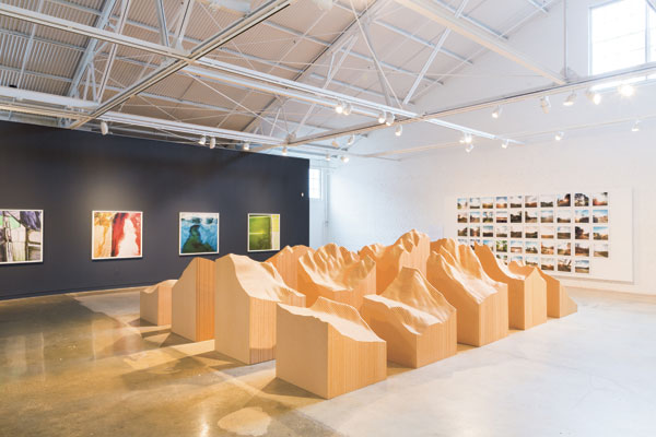
Posted in 01 What's A Map?, 02 Why Are You Making Your Map?, 03 Mappable Data, 04 Map-Making Tools, 09 Map Symbolization, Deep Map Thoughts, tagged Cartography - art, Maps - art, maps - art - exhibits on May 12, 2014| 2 Comments »
Céline Boyer: Empreintes (from Céline Boyer)
•••••••
Denis Wood’s 2010 book Rethinking the Power of Maps includes a discussion of exhibits devoted to maps created by artists prior to 2010. A significant number of exhibits have opened since the book was published. Map Art Exhibitions, 2010-11 was posted in late 2012, and an update for 2012-13 is below.
Map Art Exhibitions, 2012-13
While we know there were more exhibitions than we cover here – so please note any we’ve overlooked in the comments – the last two years have marked a slackening of interest in map art as the genre is increasingly taken for granted. Map art is gradually seeping into art the way landscape painting did into the Western tradition in the fifteenth and sixteenth centuries, solidifying its position in the world of art as it loses its novelty.
Zarina: Dividing Line (Paper Like Skin, Guggenheim)
One thing this means is that map art is beginning to show up in broader bodies of work – as in Zarina Hasmi’s (above) or Erik Parker’s (below) – and in exhibitions on other themes – as in three of shows we’ve included here.
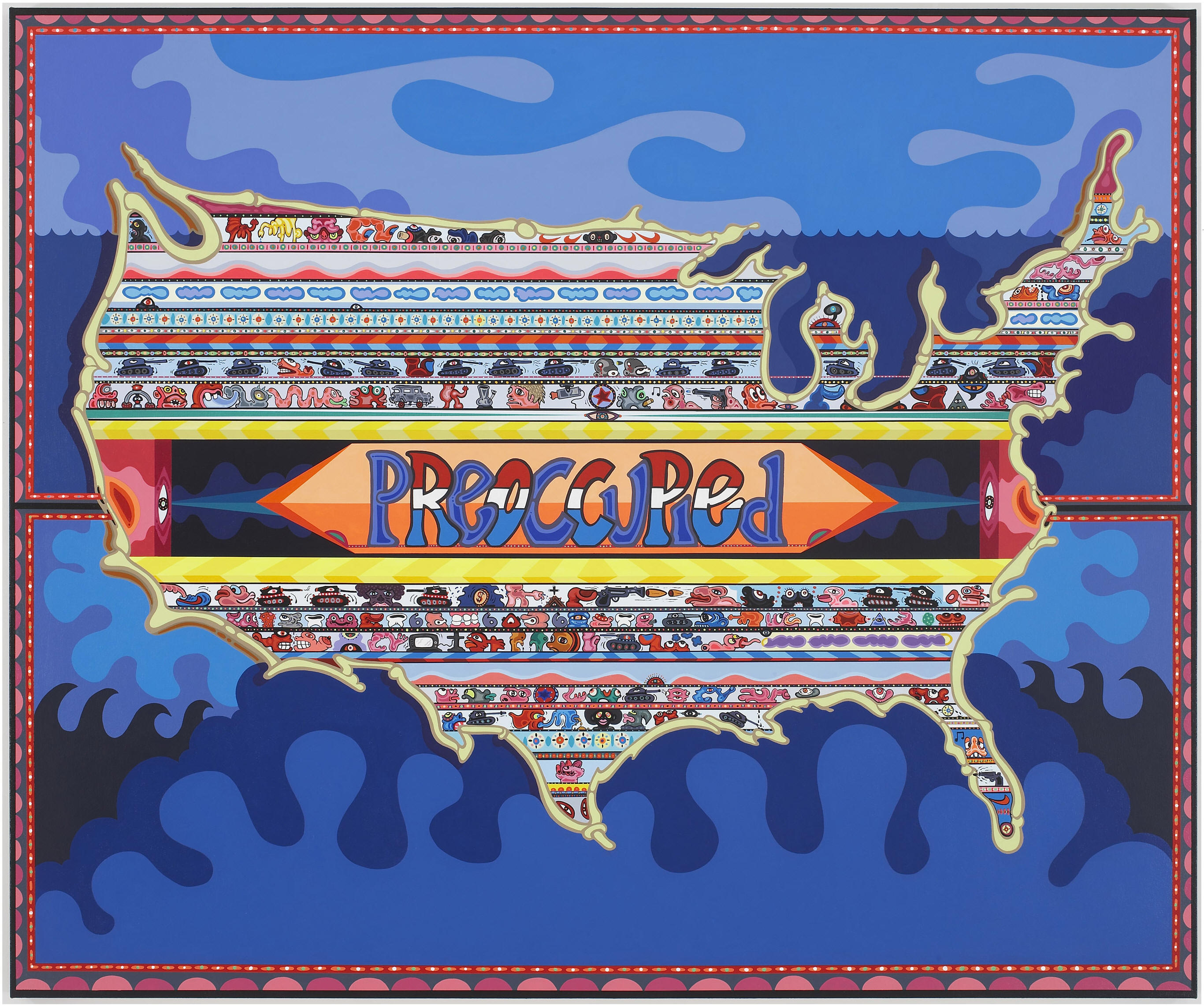
Eric Parker: Preoccupied (Too Mad to be Scared: Aldrich Contemporary Art Museum)
•••••••
Julia Penrose: from Mapping the Future: Where Are You Now?
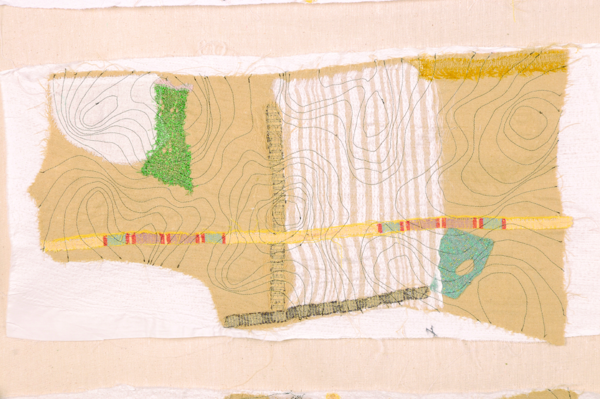
Mapping The Future: Where Are You Now? Textile Forum South West, Gallery at The Brewhouse Theatre & Arts Centre, Taunton, England, 2012. Following a successful Textiles Forum South West (TFSW) conference, Maps define the future: where are you now? held at Somerset College in 2011, our exhibition here included the work of 35 textile artists reflecting on a variety of map themes. The artists utilized a range of experimental techniques, including delicate hand stitch, felt making, quilting, collage knitting, sculpture as well as digital media. Reviews of the show are posted at the exhibition site, along with descriptions of all the projects. There’s a catalogue too, as well as a DVD of the show.
•••••••

Joyce Kozloff: JEEZ (Joyce Kozloff)
Joyce Kozloff: JEEZ, The Armory Show Modern, New York, 2012. About JEEZ, which hung at the main entrance of the 2012 Armory Show Modern in New York, Kozloff has said, “JEEZ is my election year piece, a 12’ x 12’ painting based on the Ebstorf map, a 13th century mappa mundi, which depicted Biblical stories and pagan myths within the world as it was then known, with Christ’s body as a symbolic and literal frame. I have inserted and rendered 125 images of Jesus from the history of art and worldwide popular culture – black, Latino, female, Asian; adults and babies; gay and straight; images from the movies and New Age hippies off the Internet – each true to its artistic ideal. As the archetypes and stereotypes accumulate, holy portraits are transformed into a rogue’s gallery of mismatched characters. Seen altogether, this proliferation wryly erodes their power.” Kozloff’s work was also included in a number of the other exhibitions noted here, in exhibitions at D. C. Moore in New York, and elsewhere.
•••••••

from Atlas Critique
Atlas critique, Parc Saint Léger, Contemporary Art Centre, Pougues-les-Eaux, France, 2012. The curators of this very interesting show wrote: “Although we are aware of the extent to which cartography as a discipline has been profoundly imbricated in the performative production of the narratives of modernity, in objective and positivist rationality, but also the history of colonialism and nationalistic constructions, for artists today, it has become a privileged site for the invention of counter-practices that open up new perspectives and participate in a deconstruction of hegemonies and post-colonial epistemologies as alternative tools for the production of knowledges, narratives and realities.” In demonstration of this they showed the work of, Francis Alÿs, Erick Beltrán, Berger & Berger, Border Art Workshop [a San Diego-based collaborative], Mark Boulos, Lewis Carroll / Henry Holiday, Chto delat? [a Russian art collective], Fernand Deligny, Michael Druks, Claire Fontaine, Internacional Errorista [an international art movement], Pedro Lasch, Vincent Meessen, Nástio Mosquito, Estefanía Peñafiel Loaiza, Lia Perjovschi, Radek Community+Dmitri Gutov [Moscow-based group], Philippe Rekacewicz, R.E.P. Group [a Ukrainian art collective], Allan Sekula & Noël Burch, Société Réaliste [a Parisian cooperative], Stalker [a walking group based in Rome], Endre Tót, David Wojnarowicz / James Wentzy / AIDS Community Television. This was an amazing exhibition, accompanied by conferences, performances, and films.
•••••••
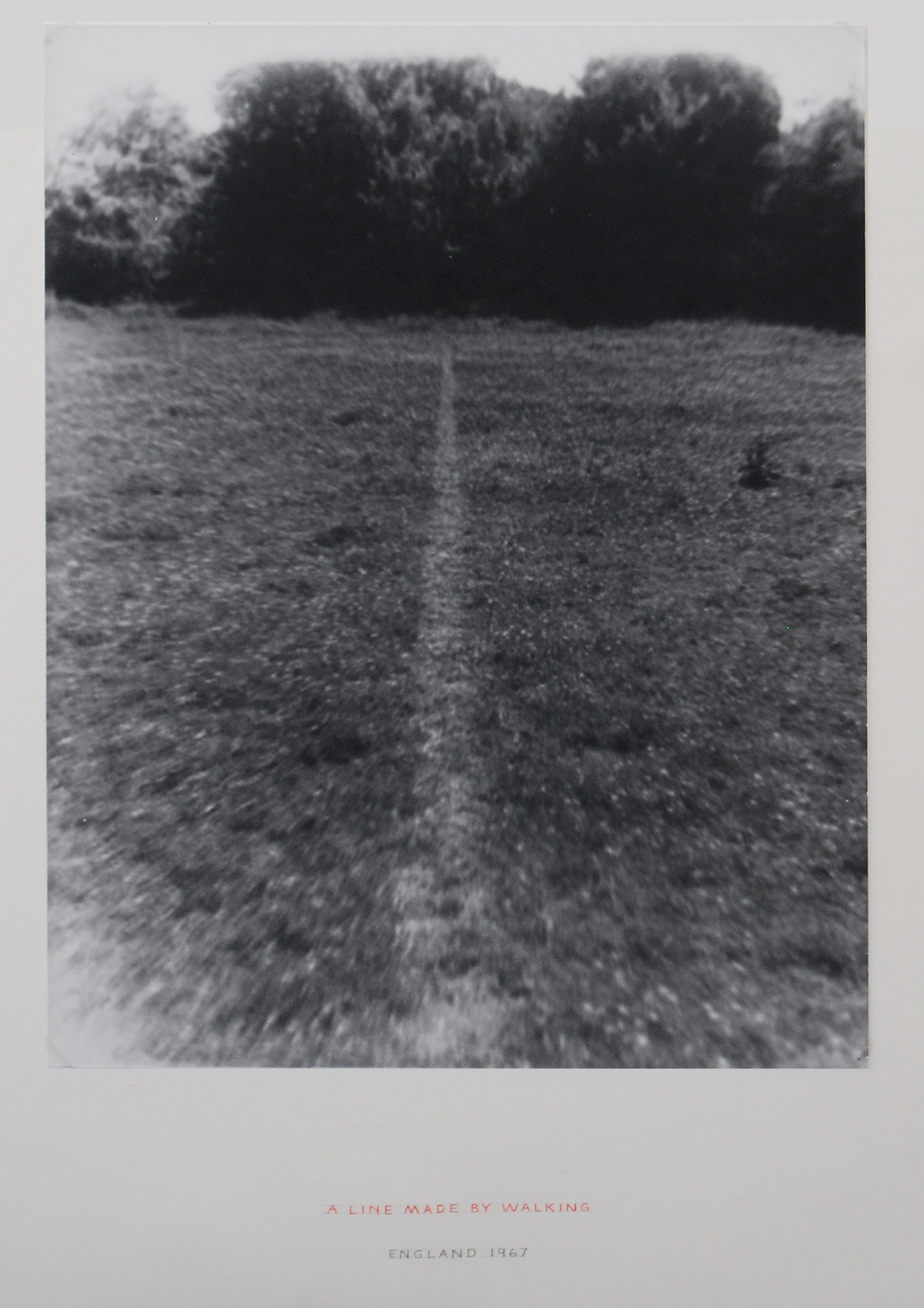
Richard Long: A Line Made by Walking (from Contemporary Cartographies: Drawing Thought)
Contemporary Cartographies: Drawing Thought, CaixaForum, Barcelona, Spain, 2012. Curated by Helena Tatay, this important exhibition included more than 140 works by 77 artists, from the classics (Dalí, Debord, Duchamp) to the contemporary (Alÿs, Kentridge, Kuitca), with the goal of “inviting the visitor to question both the systems of representation that we use and the ideas that underpin them.” As the press release put it, “The central aim of this exhibition is, therefore, to explore the ways in which contemporary artists have used cartographic language to subvert traditional systems of representation, propose new formulas or suggest the very impossibility of representing a globalised, ever more chaotic world.”
•••••••
Joyce Kozloff: Targets (from The Map as Art, Kemper Museum)
The Map as Art, Kemper Museum. St. Louis, Missouri, 2013. Inspired by Katharine Harmon’s best-selling book, The Map as Art, this exhibition presented work that explored the issue of mapping – whether conceptually or quite literally – while examining systems of personal gesture involved in large-scale works. The exhibition featured more than 30 works by seven artists: Ingrid Calame, Nathan Carter, Tiffany Chung, Joyce Kozloff, Lordy Rodriguez, Robert Walden, and Heidi Whitman, several of whom made presentations in the extensive programming that accompanied the show. It was co-curated by Kemper Museum curator Barbara O’Brien and Katharine Harmon. There was an illustrated gallery card. Sept 14, 2012-April 21, 2013.
•••••••
David Reimondo: Patch World Inverso (from MAPPAMUNDI, art et cartography)
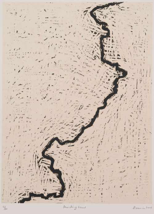
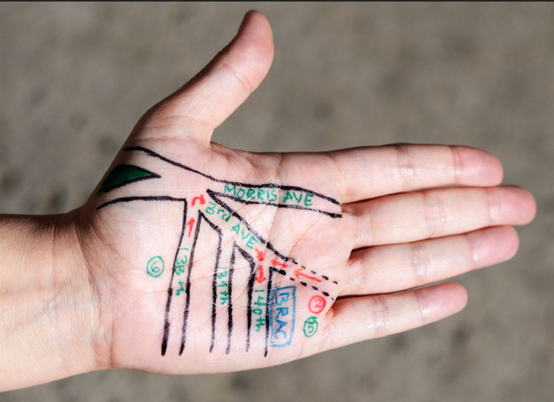
MAPPAMUNDI, art et cartographie, Hôtel des Arts, Centre d’art du Conseil général du Var, Toulon, 2013. Less pretentious than some shows, but more exciting, MAPPAMUNDI brought together 58 works by 26 artists, a number of them represented in Atlas critique (for example, Stalker) and/or Contemporary Cartographies: Drawing Thought (for example, Kuitca) in a show organized by Guillaume Monsaingeon around three themes: the body, combat, and the tale. Monsaingeon also wrote the fully-illustrated, 190-page catalogue, MAPPAMUNDI, art et cartographie, which opens with a long history of maps and map art. The exhibition included Céline Boyer’s project Empreintes, a collection of photographs of hands, against black backgrounds, on which maps of their places of origin (Senegal, Iran, Spain, and so on) have been superimposed. A 100-page book – all of which fold out – documents Empreintes. Boyer’s project is connected to those in the exhibition of Qin Ga and Kuitca, though indeed this show was rich in resonances.
•••••••

Expanded Map (from Expanded Map)
Expanded Map, RM Gallery, Auckland, New Zealand, 2013. Curated by Ruth Watson and James Wylie, who both co-authored the catalogue and have pieces in the show, Expanded Map is an artists show in an artists space. With the exception of Gigi Scaria, Lize Mogel, and Clare Noonan all the artists are locals: Auckland has a rich map art scene! The show was divided into two parts, both of them covered in the color catalogue.
•••••••
Mark Schatz: Universe Hive (From ArtHopper.com)
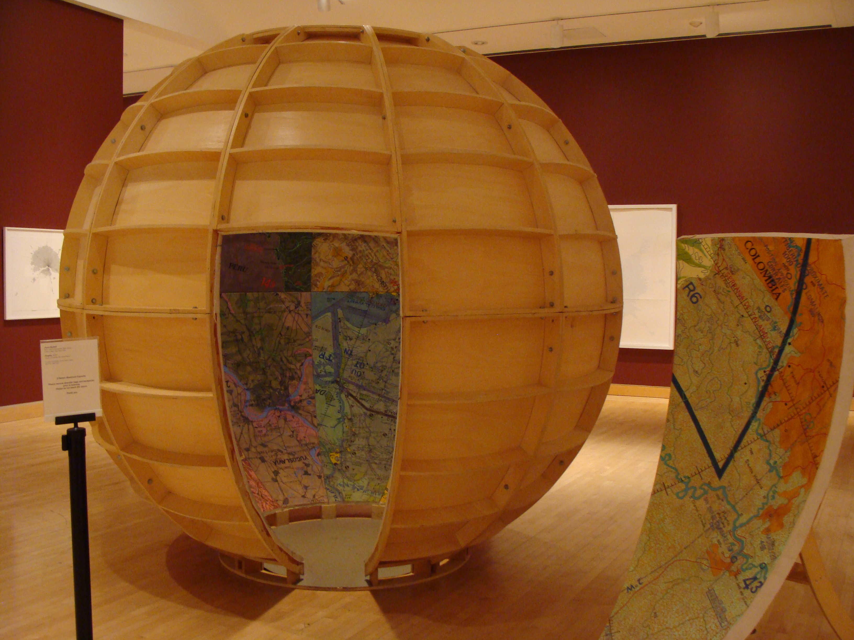
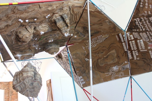
Universe, The Sculpture Center, Cleveland, Ohio, 2013. Mark Schatz mapped the world in this sprawling, double-sided landscape model built with ideas from architects, planners, hobbyists, and self-taught artists,. The faceted map could be folded up to make a Buckminster Fuller-inspired cuboctohedron; and it drew attention to individual perceptions of ones place, ones residence or “home,” and how it’s all a multifaceted, living, growing experience.
•••••••
Samuel Rowlett, Still From “Landscape Painting in the Expanded Field” (from Artfcity.com)
Artists’ Walks: The Persistence of Peripateticism, Dorsky Gallery, New York, 2013. Curated by Earl Miller, this is an example of a show tangential to the world of map art, but in an essential way, for walking, after all was for most of human history how we came to know the world. A lot of peripatetic art still uses maps to document the walks. Here this was the case for the work of Danica Phelps, Gwen MacGregor, and Sandra Rechico. The latter two also organized a piece, “Map It Out (New York),” in which they invited people to map the travels they’d made during the day, and then they assembled the collected drawings into a psychogeographic portrait of New York that hung alongside works by Richard Long, Hamish Fulton, and others. Neat show.
•••••••
Joseph Kosuth: From Memory, Draw a Map of the United States (from Huffington Post)
From Memory: Draw a Map of the United States, Sean Kelly Gallery, New York, 2013. This show is the first presentation of a project conceived and produced in 1971-1972 by Hisachika Takahashi. Takahashi, a Japanese artist living in New York, asked twenty-two fellow artists to each draw or paint a map of the United States entirely from memory on the handmade Japanese paper he provided: Arakawa, Jed Bark, Mel Bochner, Juan Downey, Alex Hay, Jasper Johns, Joseph Kosuth, Jeffrey Lew, Jane Logemann, Brice Marden, Gordon Matta-Clark, Richard Nonas, Robert Petersen, Robert Rauschenberg, Dorothea Rockburne, James Rosenquist, Keith Sonnier, Hisachika Takahashi, Cy Twombly, Susan Weil, Lawrence Weiner, Robert Whitman and Don Wyman. It’s a valuable document of the scene and of the map ferment beginning to grip the art world.
•••••••

Detail from Nalini Malani and Iftikhar Dadi: Bloodlines (from IndiWeek)
Lines of Control: Partition as a Productive Space, Nasher Museum of Art, Duke University, Durham, North Carolina, 2013-14. This is another show at once tangential to map art and yet concerned with an essential map element: lines of control. The lines of control in this case are mostly borders through contested areas (India/Pakistan, Israel/Palestine, Mexico/US, and so on). Green Cardamom brought together more than thirty contemporary artists (from Francis Alÿs to Muhammad Zeeshan) and a host of other contributors (including Iftikhar Dadi and Irit Rogoff) to mount a ceaselessly stimulating exhibition, first in 2012 at Cornell and then in 2013-14 at Duke. It spawned a 240-page full-color catalogue. A great stimulating show and a terrific catalogue!
•••••••
Maya Lin: Blue Lake Pass (from IndiWeek)
Surveying the Terrain, Contemporary Art Museum, Raleigh, 2013-14. While Lines of Control was up at Duke in Durham, across the Triangle in Raleigh, CAM was showing Surveying the Terrain, another show tangential to map art, yet equally concerned with an essential subject; or, as the gallery brochure put it, “Surveying the Terrain explores contemporary artworks that map our terrain.” Curated by Dan Solomon, it featured ten artists including Alfredo Jaar, Laura Kurgan, Maya Lin, and Trevor Paglen. Beautiful work!
•••••••
(from Bronx River Art)
MAPnificent! Artists Use Maps, Bronx River Art Center, New York, 2013-14. Curated by Yulia Tikhonova, this show’s 18 artists – among whom were Paula Scher and Mannahatta – approached the map from every direction. This may have been the year’s most classic map art show, a fading form.
•••••••
Roosmarijn Pallandt (from Roosmarijnpallandt.com)
Unmapping the World, EXD’13 / Instituto de Investigação Científica Tropical, Palácio dos Condes da Calheta, Lisbon, Portugal, 2013. Part of Experimental International Design Biennial 2013, and curated by Annelids de Vet (of the Subjective Atlas of … fame) and Nuno Coelho, the exhibit was “an exploration into the field of reactive map making practices. It aims to counterpoise the apparent neutrality of professional cartography through contemporary engaged mapping projects. In this exhibition, ways of mapping are used to resist the authority of state, to question ruling power structures and to expose the propensity of maps to simplify our world. The act of uncapping is presented as a poetic form of resistance.” And so much more!
•••••••

Across the Wall: Israeli Settlement Bus Routes: Ahmad Barclay & Polypod (from Visualizing Palestine)
The Cartography of the Unseen, The Research Gallery, Holon Institute of Technology, Holon, Israel, 2013. This exhibition dealt with “the political reading of the overt and covert mechanisms embedded in the act of cartography, by exposing the ideological aspects, as well as the solicitation to action performed through mapping. The exhibition analyses the ways in which the design of maps conditions the very interpretation of them, and examines how the act of mapping affects the reorganization of the mapped territory.” Thirteen projects from as many territories were presented, including work from both Israel and Palestine. Radical presentation!
•••••••
