
Archive for the ‘06 Map Layout’ Category
Making Maps now at makingmaps.substack.com
Posted in 01 What's A Map?, 02 Why Are You Making Your Map?, 03 Mappable Data, 04 Map-Making Tools, 05 Geographic Framework, 06 Map Layout, 07 Hierarchies, 08 Generalization & Classification, 09 Map Symbolization, 10 Type on Maps, 11 Color on Maps, 12 Finishing Your Map, tagged Cartography, data analytics, Denis Wood, Geographic Information Systems, geospatial, information design, John Krygier, Making Maps, maps on January 17, 2025| Leave a Comment »
Atlas de Cuba | 1949 | Gerardo Canet & Erwin Raisz
Posted in 06 Map Layout, 07 Hierarchies, 09 Map Symbolization, 10 Type on Maps, 11 Color on Maps, Map Books, Map History, tagged Erwin Raisz - Atlases; Map design - atlases; Cuba - atlases on July 9, 2014| 9 Comments »

This Atlas is more than an attempt to describe Cuba. Our aim is not only to present the setting in which the drama of Cuban life is played but to show how this life itself changes its own setting, creating new problems and new adjustments to them.
This dynamic element is usually absent from the impersonal atlases produced by governments, societies and publishing houses, which merely give a graphic report of a given moment of time. Our objective is to give a living picture of Cuban geography as far as possible in 64 pages. Our approach is as follows: 1. What are the facts?, 2. What are the essential problems?, 3. What will be their effects in the future and what may be done about them? For instance, Cuba, by reason of its close proximity to the United States become its chief source of tropical products, especially sugar. Thus the Cuban economy has become dependent on the fluctuating sugar demand, whereas a diversification of crops and industries would be advisable.
We have presented the results of our labor in graphical form. An old Chinese proverb says: “A picture says more than a thousand words.” Moreover by visual representation the most complicated problems may be brought within the understanding of the layman. Everyone should know the geography of his own country, and in the case of Cuba this need is imperative, since few countries have such clear-cut dependence on location, climate and soil Cuba’s internal problems of adjustment and interdependence with the rest of the world demand a high degree of understanding from its citizens.
– from Introduction
•••••••••••••••••••••••••••••••••
In addition to many dozens of unique landform maps, Erwin Raisz produced three atlases in his lifetime, including the Atlas of Global Geography (Global Press Corp., 1944), the Atlas de Cuba (Harvard University Press, 1949) and the Atlas of Florida (University of Florida Press, 1964). Copies of the Global and Florida atlases are relatively easy to find (used or in libraries); this is not the case with the Cuba atlas, which seems to have had a relatively low print run. A series of maps, diagrams and illustrations from the Cuba atlas are included below.
The Atlas de Cuba strongly reflects Raisz’s aesthetic, combining creative illustration with his bold and cozy aesthetic of map design. Part of the appeal of Raisz’s work is its humane feel, reflecting the manual mapping tools used to create his maps. Raisz’s maps and illustrations clearly reveal the hand of a human creator.
A large format map, included in the back of the Atlas de Cuba, will be the subject of a subsequent post.
See also, at this blog, Raisz’s History of American Cartography Timelines, Map Symbols: Landforms & Terrain, and Raisz’s currently available landform maps at www.raiszmaps.com.
•••••••••••••••••••••••••••••••••

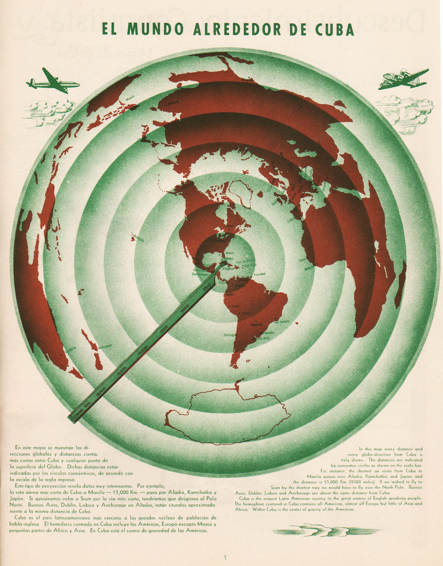
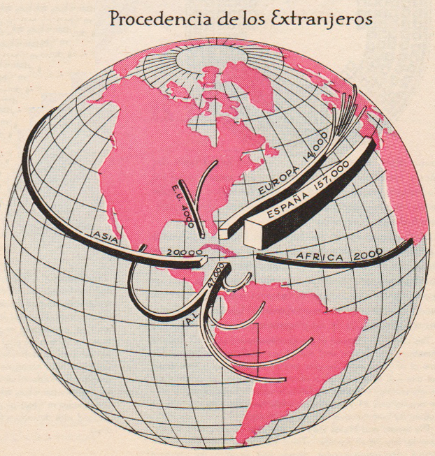
El Mundo Alrededor de Cuba | The World Around Cuba (Excerpt & entire p. 5)
•••••••••••••••••••••••••••••••••
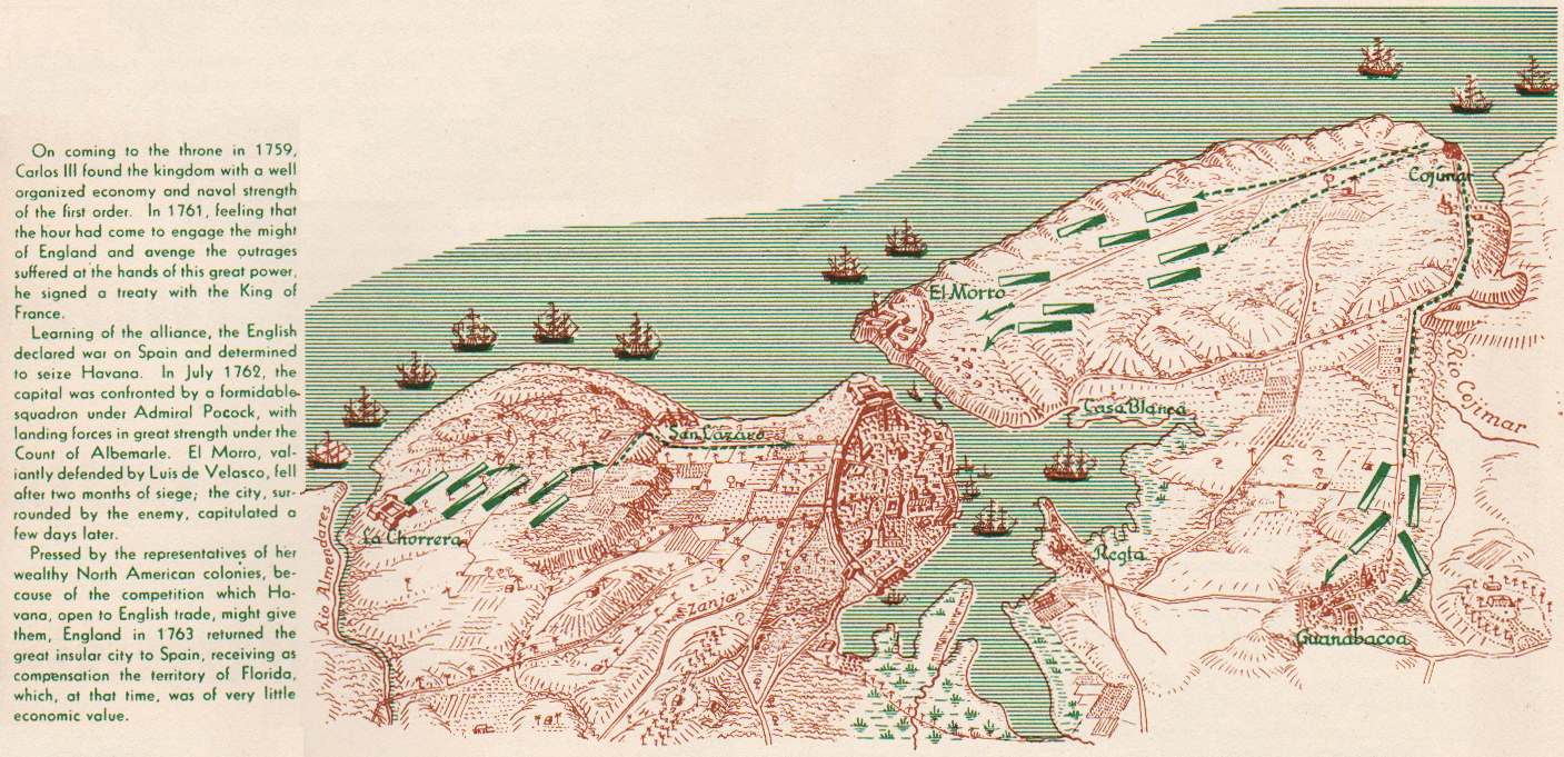
Cuba Colonial | Colonial Cuba (excerpt, p. 9)
•••••••••••••••••••••••••••••••••

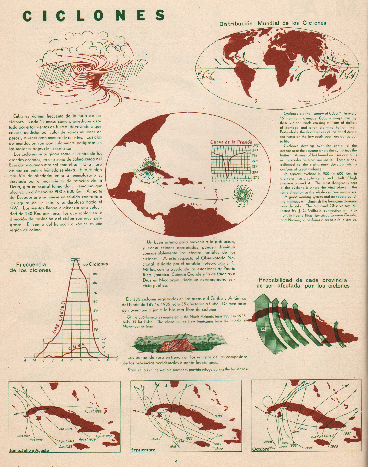
Ciclones | Cyclones (excerpt & entire p. 14)
•••••••••••••••••••••••••••••••••

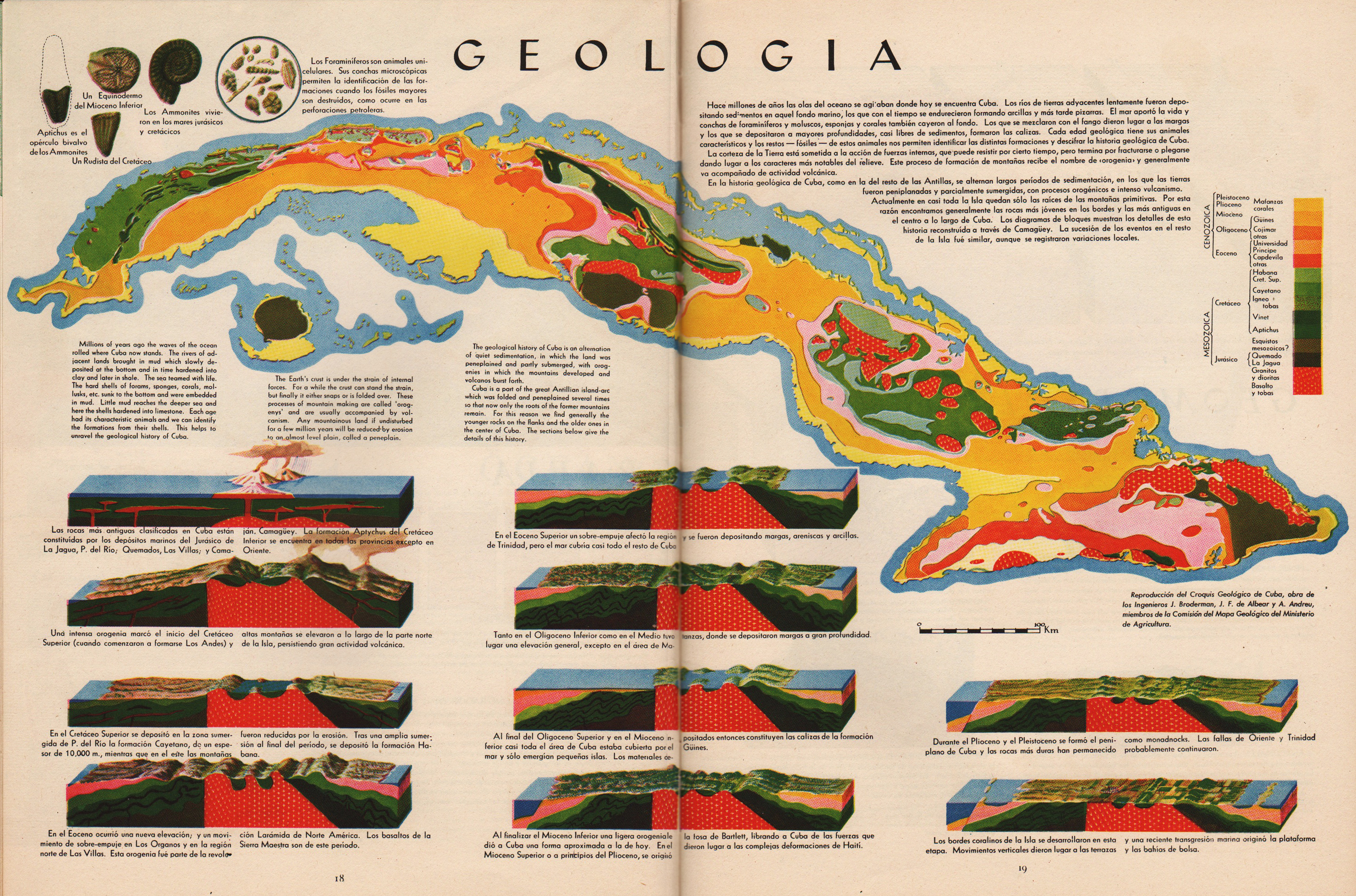
Geologia | Geology (excerpt & entire pp. 18-19)
•••••••••••••••••••••••••••••••••


Geomorfologia | Geomorphology (excerpt & entire pp. 20-21)
•••••••••••••••••••••••••••••••••

Pesca | Fish (excerpt, p. 25)
•••••••••••••••••••••••••••••••••


Vegetacion | Vegetation (excerpt & entire pp. 26-27)
•••••••••••••••••••••••••••••••••

Poblacion | Population (excerpt, p. 29)
•••••••••••••••••••••••••••••••••
Composition Social | Social Composition (excerpt, p. 35)
•••••••••••••••••••••••••••••••••


Tourismo | Tourism (excerpt & entire pp. 38-39)
•••••••••••••••••••••••••••••••••
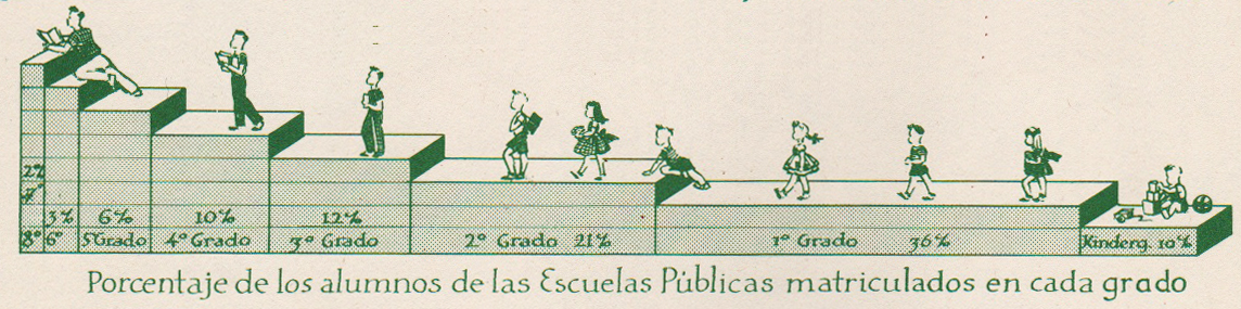
Educacion | Education (excerpt, p. 40)
•••••••••••••••••••••••••••••••••


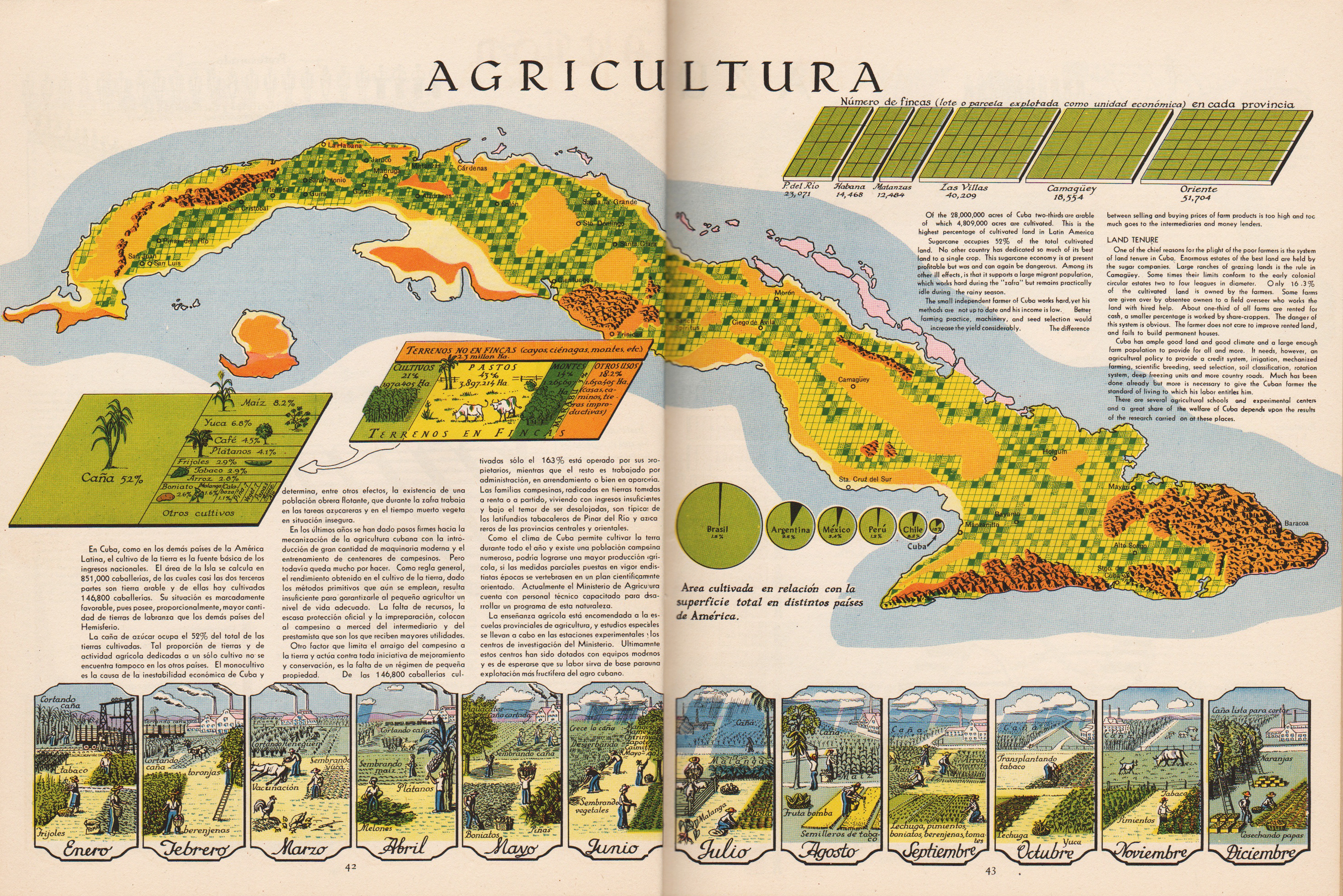
Agricultura | Agriculture (excerpts & entire pp. 42-43)
•••••••••••••••••••••••••••••••••
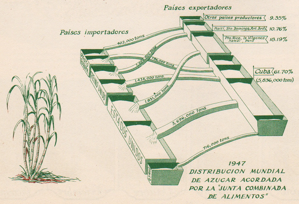
Azucar | Sugar (excerpt, p. 44)
•••••••••••••••••••••••••••••••••

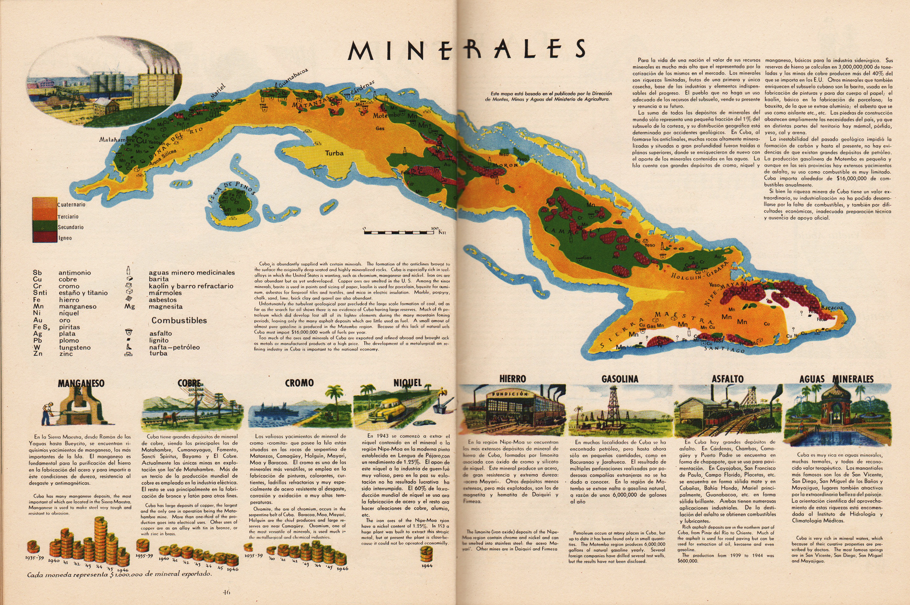
Minerales | Minerals (excerpt & entire pp. 46-47)
•••••••••••••••••••••••••••••••••
Tabaco | Tobacco (excerpt, p. 49)
•••••••••••••••••••••••••••••••••

Frutas | Fruit (excerpt, p. 51)
•••••••••••••••••••••••••••••••••
Atlas de Cuba
Garardo Canet & Erwin Raisz
Harvard University Press
1949
Moving Enormous Maps | 1917
Posted in 01 What's A Map?, 02 Why Are You Making Your Map?, 06 Map Layout, Map History on June 19, 2013| 4 Comments »
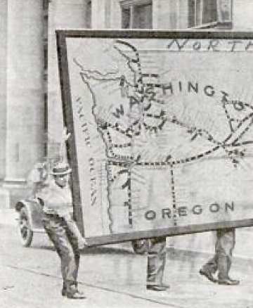
It measures 69 feet long and 11 feet wide and required the services of nearly a dozen men to carry it…
Enormous map moving, ca. 1917.
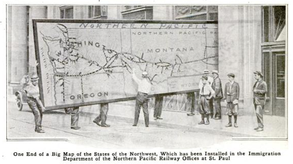
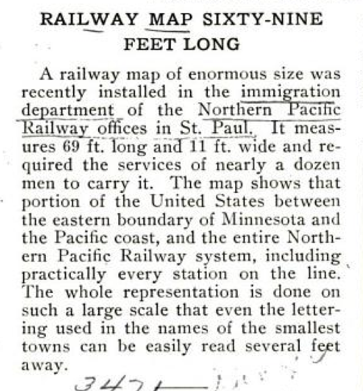
The map shows that portion of the United States between the eastern boundary of Minnesota and the Pacific coast, and the entire Northern Pacific Railway system, including practically every station on the line.
Popular Mechanics, February 1917.
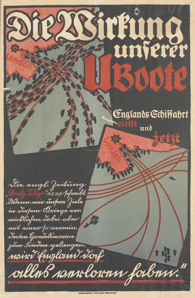
Map Posters | Spain | Germany | 1917-1936
Posted in 06 Map Layout, 07 Hierarchies, 09 Map Symbolization, 11 Color on Maps, Map History, tagged Map Design, Maps - History, Posters - Map, Spanish Revolution - Maps, World War 1 - Maps on June 9, 2013| Leave a Comment »
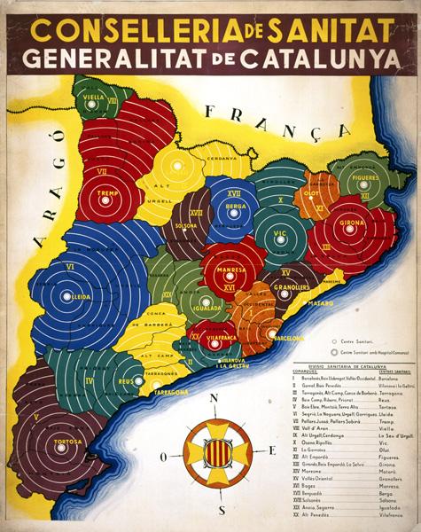
Catalonian Health Administration Areas (1936-39)
•••••
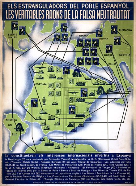
Foreign interests allied against the Spanish Republic (1937)
•••••
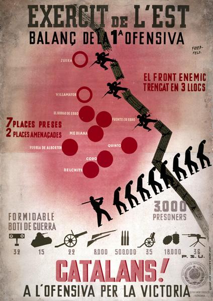
Aragon Front of the war: Republican gains shown as broken barbed wire, prisoners taken shown as silhouettes of men marching under guard, and captured armaments shown as images of specific weapons with numbers captured (1936).
•••••
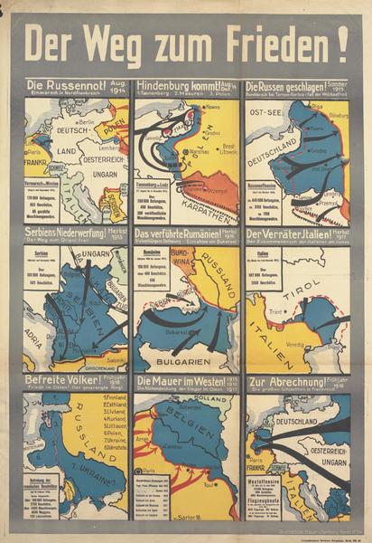
The Way to Peace! Nine maps of German campaigns from August 1914 to spring 1918.
•••••
•••••
Spanish Civil War Poster Collection
Posters of Conflict Collection
•••••
Thanks to A London Salmagundi for original link
Map Design Annotated: 13 Voyager Maps from Making Maps 2nd Edition
Posted in 01 What's A Map?, 02 Why Are You Making Your Map?, 06 Map Layout, 07 Hierarchies, 08 Generalization & Classification, 09 Map Symbolization, 10 Type on Maps, Making Maps Book News, Maps Made, tagged Annotated Maps, Map Design, Maps - Annotated, Maps - Design on October 17, 2011| 1 Comment »

To understand map design, and how maps work, it is useful to see how map design concepts play out on a real map.
One of the significant updates to the 2nd edition of Making Maps was the inclusion of a map of the 1986 trans-global flight of the experimental aircraft called Voyager. This map, originally designed and created by David DiBiase and I back in 1987 for David Woodward’s map design course (and in the University of Wisconsin Cartographic Lab), is repeated thirteen times in seven of the chapters, annotated to show how the concepts and ideas in these chapters play out on the map.
The repeatedly annotated Voyager map serves as an example of map design in practice, but also a guide to “reading” a map from the perspective of map design.
Martin Dodge suggested the annotated maps be available together, for instructional purposes. A good idea! So here they are. Each individual map on this page is a 800k PNG file (click for full size).
A PDF file (8.8mb) with all thirteen higher resolution TIFF images is available here.
The Voyager map project was quite a bit of fun to create back in the day. It won a map design award, was published in the book about the Voyager flight, and printed on paper as part of a promotion for the Waukesha County, Wisconsin Airport. I cannot imagine anything much more exciting than that.
••••••••••
The second map in the series prefaces the initial chapter in Making Maps 2nd edition, and poses a series of questions that will be addressed in future chapters (and annotated Voyager maps):

Chapter 2, What’s Your Map For?, sets the context of the map (and of its re-creation for the book) and how such context shapes the design of the map:

Chapter 6, The Big Picture of Map Design, repeats the Voyager map five times, focusing on the key map design concepts covered in the chapter. This is where the map flips orientation south up (a controversial design choice, according to some reviewers: good! Think about why such a choice is controversial, and if it should be [or ask your students to do so]):

South is now up (so the story reads from left to right):

Annotations about map pieces including title, scale, explanatory text, legend, directional indicator, border, sources, credits, and insets & locator maps:

Annotations about visual arrangement including path, visual center, balance, symmetry, sight-lines, and grids:

Annotations about graphical excellence, based on Edward Tufte’s ideas, including complexity, detail, design variation & data variation, context, revision, non-data ink, data-ink ratio, explanatory text, editing, chartjunk & map crap, redundancy, and multivariate data:

Chapter 7, The Inner Workings of Map Design, reveals the Voyager map with no visual differences (a confusing mess of lines and type):

The map with visual differences is then annotated, with regard to key methods for establishing visual differences, including detail, edges, texture, layering, shape, size, closure, proximity, simplicity, direction, familiarity, and color:

Chapter 8, Map Generalization and Classification, annotates the Voyager map in terms of the generalization concepts of selection, dimension change, simplification, smoothing, displacement, and enhancement:

Chapter 9, Map Symbolization, annotates the map in terms of the visual variables: shape, size, color hue, color value, color intensity, and texture:

Chapter 10, Words on Maps, annotates the Voyager map with regards to typographic variables including typeface, type form, type weight, and type size:

I have a few ideas for additional annotated Voyager maps (such as a full color map) which I hope to cobble together in the future. If you have any other ideas for variations that might be useful or interesting, let me know.
More Old School Cartograms, 1921-1938
Posted in 03 Mappable Data, 06 Map Layout, 09 Map Symbolization, Map History, tagged cartograms, Cartograms - history, Distorted Maps on November 30, 2010| 6 Comments »

Cartogram, 1930: “A Distorted Map of the United States Showing Population of Each State and of Cities of 50,000 or More in 1930” (Printers’ Ink Publishing Co., Inc., Chart by Walter P. Burns and Associates, Inc., New York City)
A cartogram scales geographic areas to some value other than geographic area. In two previous blog posts, 1911 Cartogram: “Apportionment Map” and 1923 Patented Cartogram, a few old-school cartograms were resurrected from musty old publications. Here find eight more cartograms published between 1921 and 1938.
This post opens with a peculiar item – the U.S. states as well as the areas of major cities are scaled to population, in essence two cartograms together. Symbols representing “people living on farms” are scattered about, each symbol equal to a number (undisclosed) of persons. Weird.
From the Literary Digest in 1921:

Cartogram, 1921: “Relative Size of Each of the United States if Based on Electrical Energy Sold for Light and Power in 1921” (Literary Digest, April 23, 1921)
•••••••••••••••

Cartogram, 1931: “The United States With the Area of the States Proportional to the Urban Population of 1930” (The Dartnell Corp., Chicago, Ill., 1931)
•••••••••••••••

Cartogram, 1933: “Horsepower Map of the United States in 1933 With the Area of Each State Drawn Proportional to the Amount of Horsepower Installed in the State” (Power Plant Engineering, New York City, 1933)
•••••••••••••••
I had an old slide of the following cartogram but did not know its source: turns out it is from an advertisement for The Mutual Broadcasting Network, showing that 80% of business in the U.S. is transacted in states east of the Mississippi – MBN’s broadcasting area:


Cartogram, date unknown (1930s): “Look to Your Sales Mileage” advertisement (The Mutual Broadcasting System).
•••••••••••••••
A very diagram-ish cartogram which places an un-cartogrammed map of the US in the background:

Cartogram, 1937: “The United States With the Areas of the States Proportional to Their Manufacturing Output in 1935” (Business Week, June 12, 1937, New York City)
•••••••••••••••
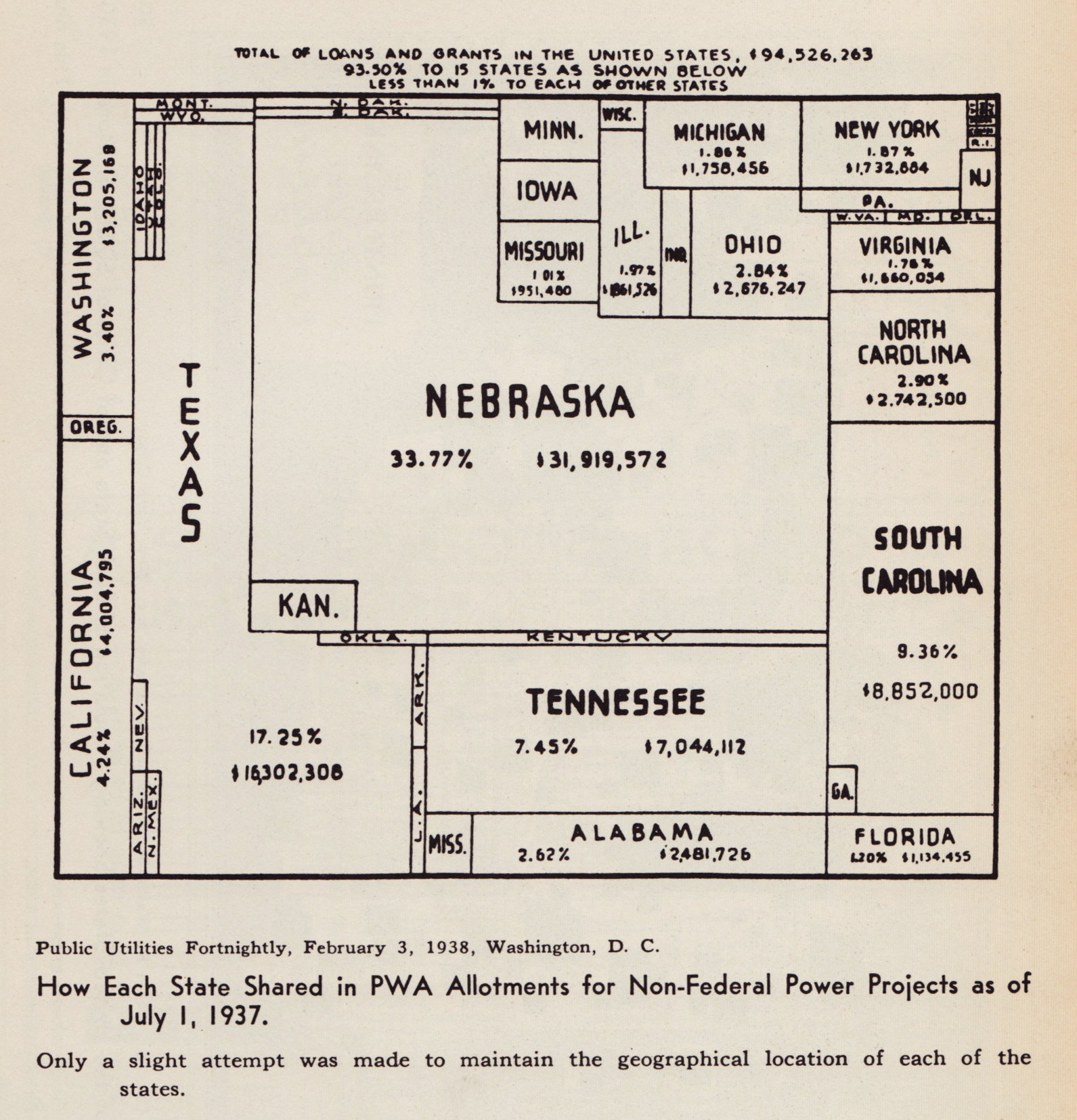
Cartogram, 1938: “How Each State Shared in PWA Allotments for Non-Federal Power Projects as of July 1, 1937” (Public Utilities Fortnightly, February 3, 1938, Washington DC)
•••••••••••••••
Reproduced from Willard C. Brinton’s Graphic Presentation (1939).
1910 | Topographic Maps | Map Symbols | Egypt
Posted in 06 Map Layout, 07 Hierarchies, 09 Map Symbolization, 10 Type on Maps, 11 Color on Maps, Cartominutiae, Map Music, tagged Desert Maps, Egypt - maps, Empty maps, History of Cartography, Map Symbols - history, Maps - History, The Survey of Egypt on November 2, 2010| Leave a Comment »

The Survey of Egypt, 1910, 1:1,000,000, Sheet 5 (detail 1, close-up)
•••
Found while cleaning out an old map cabinet: oceans of just about nothing, punctuated by signs of a minimal landscape. Soiled, creased, tears, dusty. Thumb-print and fading pencil marks, from someone who stared at this map a long time ago.
Details from a topographic map of Egypt in 6 sheets, published by The Survey of Egypt in 1910, scale 1:1,000,000.
Click on any map for a larger version of the scan.
•••

The Survey of Egypt, 1910, 1:1,000,000, Sheet 5 (detail 1)
•••

The Survey of Egypt, 1910, 1:1,000,000, Sheet 1 (detail 1)
•••

The Survey of Egypt, 1910, 1:1,000,000, Sheet 1 (detail 2)
•••

Note the type leaking over the map border (Mediterranean, Lake Borollos, Gharbia)
The Survey of Egypt, 1910, 1:1,000,000, Sheet 1 (detail 3 – close-up)
•••

Note the type leaking over the map border (Mediterranean, Lake Borollos, Gharbia)
The Survey of Egypt, 1910, 1:1,000,000, Sheet 1 (detail 3)
•••

The Survey of Egypt, 1910, 1:1,000,000, Sheet 3 (detail 1 – close-up)
•••

The Survey of Egypt, 1910, 1:1,000,000, Sheet 3 (detail 1)
•••

The Survey of Egypt, 1910, 1:1,000,000, Sheet 5 (detail 2)
•••

The Survey of Egypt, 1910, 1:1,000,000, Sheet 6 (detail 1)
New Atlas | Denis Wood | Everything Sings
Posted in 01 What's A Map?, 03 Mappable Data, 04 Map-Making Tools, 06 Map Layout, 07 Hierarchies, 09 Map Symbolization, Deep Map Thoughts, Map Books, tagged Art and maps, Atlas, Community Mapping, Counter Mapping, Critical Cartography, Denis Wood, Participatory Mapping, psychogeography on September 7, 2010| Leave a Comment »

•••••
That a cartographer could set out on a mission that’s so emotional, so personal, so idiosyncratic, was news to me.
—Ira Glass, host of This American Life

•••••
Everything Sings: Maps for a Narrative Atlas by Denis Wood with an introduction by Ira Glass. Pub date: Nov. 12.
$28 . Paper . 112 pages . 85 black and white illustrations, including more than 50 maps . ISBN: 978-0-9799562-4-9
Preorder
•••••
These maps remind me of all the radio stories I love most. After all, most radio is a boring salaryman, waking up before you and me to announce the headlines or play the hits to some predetermined demographic. Yet some radio stories elbow their way into the world in defiance of that unrelentingly practical mission, with the same goal Denis Wood’s maps have: to take a form that’s not intended for feeling or mystery and make it breathe with human life. —Ira Glass, host of This American Life
See a longer excerpt from Ira Glass’s introduction to Everything Sings: Maps for a Narrative Atlas by Denis Wood.
•••••
From the Publisher:
Denis Wood has created an atlas unlike any other. Surveying Boylan Heights, his small neighborhood in North Carolina, he subverts the traditional notions of mapmaking to discover new ways of seeing both this place in particular and the nature of place itself. Each map attunes the eye to the invisible, the overlooked, and the seemingly insignificant. From radio waves permeating the air to the location of Halloween pumpkins on porches, Wood searches for the revelatory details in what has never been mapped or may not even be mappable. In his pursuit of a “poetics of cartography,” the experience of place is primary, useless knowledge is exalted, and representation strives toward resonance. Our perception of maps and how to read them changes as we regard their beauty, marvel at their poetry, and begin to see the neighborhoods we live in anew. Everything Sings weaves a multi-layered story about one neighborhood as well as about the endeavor of truly knowing the places which we call home.
See the Siglio Press Facebook page with seven of the Atlas maps.
The Press Release for Everything Sings.
See the previous post (on the Making Maps blog): Denis Wood: A Narrative Atlas of Boylan Heights
Making Psychogeography Maps
Posted in 01 What's A Map?, 02 Why Are You Making Your Map?, 03 Mappable Data, 06 Map Layout, 09 Map Symbolization, Deep Map Thoughts, Maps Made, unMaking Maps, tagged Maps - Grades 6-8, Maps - Weird, psychogeography, Psychogeography - Grades 6-8, Psychogeography - Lesson Plans, Psychogeography Maps, Sensory Mapping on June 22, 2009| 29 Comments »

Guide Psychogéographique de OWU (2009, med res jpg)
•••••
During the week of June 15-19 (2009) five intrepid Ohio students and myself engaged in improvisational psychogeography, culminating in the map opening this post. A printable 11″ x 17″ (300dpi 1.4mb) PDF of the map is here.
•••

Map detail: The path taken through campus followed the outline of a wolfie hand-shadow cast on a campus map.
•••

Map detail: Stuff smelt, heard, and felt with its allure or disallure indicated with faces.
•••
The map was the product of a course – Mapping Weird Stuff – I offered at the OWjL (Ohio Wesleyan University Junior League of Columbus) summer camp for gifted and talented middle school students.
Based on the kid’s ideas and work collecting diverse data, I designed a layout and look for the map. The map itself was created in FreehandMX, now dead-tech thanks to Adobe (I still prefer Freehand even though I started with Illustrator back at version 1).
Making the map once again reminded me that it’s fun to make maps, if you have interesting stuff to map. The design and layout are certainly nothing one could generate with typical mapping software – thus the use of graphic illustration software. Diverse and interesting maps are not really the domain of web and pc-based map generation software. Maybe sometimes. Not usually.
•••

Map detail: An abstracted linear “map” sequencing smells, textures, and sounds from one end to the other of the path investigated.
•••
My vague intent was to do some kind of weird mapping project on campus – sensory mapping, psychogeography, etc. My search for resources for this age student (grades 6-8) resulted in a few finds, but not much. The materials I compiled on the course blog (here) served as the basis of our work, which developed as the students engaged the ideas. We met for 1.5 hours a day, for 5 days.
•••

Special glasses indicate how serious we were about this project.
The Hulk hand inspired confidence in our powers.
•••
The students, Django, Mallory, McKenna, Erica, and Ben, were great. They jumped into the project, came up with ideas that shaped our direction, and collected all of the data on the map. I had some ideas about what kind of psychogeography we would do, and what kind of map we would create, then it all transmogrified into something else which turned out great.
We did a dérive (“a technique of transient passage through varied ambiances”) to get a feel for the campus and its “resonances,” some blind-folded, ear-plugged tours through the campus (with me or one of the students leading the others along) collecting smells and sounds, as well as a few texture collection expeditions (inspired, in part, by Denis Wood’s Narrative Atlas of Boylan Heights project).
•••


Guiding much of our work was a single, inspiring Hulk hand.
•••
A bit of background on Psychogeography:
Psychogeography, according to its founder Guy Debord, is “the study of the precise laws and specific effects of the geographical environment, consciously organized or not, on the emotions and behavior of individuals.”
In practice, psychogeography inherently resists any narrow definitions. It encompasses diverse activities that raise awareness of the natural and cultural environment, is attentive to senses and emotions as they relate to place and environment, is often political and critical of the status quo, and must be both very serious and fun.
Psychogeography overlaps with Kevin Lynch’s work on mental maps, as nicely reviewed in Denis Wood’s article “Lynch Debord” as well as work on non-visual sensory-scapes (smellscape, soundscape, touchscape, tastescape, etc.).
The most famous psychogeography map is Debord’s Guide Pychogéographique de Paris:

Guy Debord, Guide Pychogéographique de Paris
•••

•••

Mapping with Isotype
Posted in 02 Why Are You Making Your Map?, 06 Map Layout, 09 Map Symbolization, 10 Type on Maps, 11 Color on Maps, Map Books, Map History on February 17, 2009| 16 Comments »


I was moving some piles of junk in a storage room and came across a 1934 U.S. Public Works Administration book on Mississippi Valley public works projects (Report of the Mississippi Valley Committee of the Public Works Administration, October 1, 1934). The book is full of maps and other information graphics influenced by Otto Neurath, Gerd Arntz, and Marie Reidemeister’s picture language, isotype.
I always thought isotype had a great look to it. Its context, in Vienna Circle logical positivism, is a bit wonky, and the idea that symbols – if designed carefully enough – could be “universally communicable” across all cultural and social differences, is merely the dream of those born with a peculiar neurology. Nevertheless, the isotype “look” is cool in a retro sort of way, and it has certainly influenced the current spare design ethos in cartography.
Some annotated examples of the isotype “language” from a 1937 article by Neurath:


The Gerd Arntz Web Archive is a spectacular collection of thousands of isotype symbols designed by Arntz. All seem to be free to use. (symbols are copyrighted by Pictoright – thanks to Jonathan Hunt for pointing this out). The site also has a breif biography of Arntz.


In casting about the internets, I was gladdened to find someone had scanned the isotype classic, Atlas of Gesellschaft und Wirtschaft (1930, 14+mb PDF). As far as I know the atlas was printed (on sheets) in limited numbers and has never been easy to find. Sybilla Nikolow discusses the atlas in her article “Society and Economy: An Atlas in Otto Neurath’s Pictorial Statistics from 1930.” (PDF)
A sampling of maps and graphs from the Atlas follows, and a few more useful isotype resources can be found way at the end.


•••••
A few interesting isotype resources:
The Isotype Institute documents the history of isotype and has much useful information.
A snazzy discussion of isotype done up by mixing isotype and text is Modern Hieroglyphics. (PDF)
Ellen Lupton reviews the history and significance of isotype in her article “Reading Isotype.” (PDF)

Neurath and the Vienna Method of Picture Statistics (PDF). A chapter out of an e-book called Speaking of Graphics An Essay on Graphicacy in Science, Technology and Business by Paul J. Lewi. Seems like a nice overview of the history of isotype and its characteristics.
The DADA Companion has much information on design and art related to isotype. Search for “isotype” or “Neurath.”
A new book to be published in April of 2009 is called The Transformer: Principles of Making Isotype Charts by Marie Neurath and Robin Kinross.
Austin Kleon’s blog on graphic design has a nice posting on isotype, comics, and information graphics design. Search the blog for other isotype references.
The web magazine Mute has a feature called The Dutch Are Weeping in Four Universal Pictorial Languages At Least that reviews a series of contemporary exhibits that focus on isotype and related ideas. One exhibit called After Neurath has a significant amount of information and links.
The New York Times summarized 2007 US and Coalition member deaths in Iraq in a isotype-esque chart (click for larger version):

Stroom De Haag writes (in the online magazine Archined) about Neurath as the “grandfather of open source.”
