Why don’t you get a copy of Matthew Wilson’s book New Lines (University of Minnesota Press, 2017). The paperback isn’t very expensive. Grab a pencil and take notes in the margins as you read. Skip stuff that does not seem that interesting. And write down ideas as you read.
I know some of the folks who follow this blog aren’t academics, and even if they are, they may not be into contemporary critical theory. New Lines isn’t perfect. But it does take maps very seriously. That’s important for people who are following this blog because there is something about maps that… well, there’s just something about them. Otherwise, you wouldn’t be here.
You can find Matt and his info on the web here.
•••••••
I think you should read Matt’s book, even if you don’t think it’s your thing. Your time would be better spent reading New Lines than reading what I wrote below – notes and reactions rather than a review. Stuff that blipped in my mind as I read New Lines, with some reactions and elaborations.
•••••••
New Lines is proposed to be a “manifesto for a revival of Critical GIS mapping practice” (23-24).
•••••••
I’ll start where I end this (long) posting:
Maybe it’s about making maps, period. And providing the kind of ideas and motivations that get more people making more interesting and impactful and creative maps. Any resource, guide, book, article, class, talk, or manifesto will be judged by its ability to inspire just that.
•••••••
I just attended a meeting in Atlanta called CommGeog19 – “the first national workshop on community geography” (January 25-26 2019, web stuff is here). It was a great meeting, small, diverse, very interactive and all about an emerging field that builds on many ideas I’ve been engaged with over the last several decades. Many of those ideas are woven through Matt Wilson’s New Lines, which was the specific impetus for reading the book.
That meeting was full of people committed to critical GIS mapping practice.
•••••••
Let me first say that the critical approaches reviewed and propelled forward in New Lines are the impetus for the Making Maps book and this blog. While it may not seem as if Making Maps is a critical cartography (or GIS) book, it is. Maybe without all the words and jargon and scribble scribble scribble.
The academic sub-fields of Critical Cartography and Critical GIS have direct roots in the 1980s and 1990s when academics such as Brian Harley (“Deconstructing the Map“) and Denis Wood (The Power of Maps) distilled ideas from a range of continental philosophy (and other traditions, such as pragmatism) and aimed it at the things we call maps, the people who create them (“cartographers”) and technologies such as Geographic Information Systems (GIS). The critical interrogation of maps goes back earlier than the 1980s, a theme explored in an article (“An Introduction to Critical Cartography“) Jeremy Crampton and I wrote in 2010. An important touchstone for Critical GIS is Nadine Schuurman’s dissertation Critical GIS: Theorizing an Emerging Science published in the journal Cartographica (36:4, pp. 7-108).
An unruly flock of related ideas and approaches surround these critical themes, including qualitative GIS, participatory GIS (PPGIS and PGIS), citizen GIScience, feminist GIS, digital humanities, cartographic and GIS ethics, geohumanities, the geoweb, neogeography, community GIS, mapping and community geography, psychogeography, public scholarship… among others. These are theories, concepts, approaches, technologies, cross-disciplinary areas of study and interesting things that people do that, in many cases, have embedded mapping practices.
Many mapping and GIS folks find these approaches to be too academic, to jargon-laden, too distant from the practical and useful. That’s too bad because to paraphrase Matt Wilson in his book New Lines: Critical GIS and the Trouble of the Map, all these critical approaches share one important commonality: they take maps very seriously.
I thank Wilson for this point: all these critical approaches are appealing to me because I’ve never found maps to be simple, easy, uncomplicated. From the start, when I started making maps in the Cartographic Lab at UW-Madison back in the 1980s, it was clear that there was much more going on than what was written down in a textbook like Robinson’s Elements of Cartography. That Brian and Denis and other folks started writing all this crazy stuff just around the time I was deeply engaged in making actual maps was very opportune. They saw something really important in maps and mapping. The traditional world of map making and the critical world swirled around and together into, well, stuff like this blog and the Making Maps book.
•••••••
Below find quotes and bits from New Lines with my reflections and thoughts (all part of my preparation for forthcoming projects).
•••••••
Habits (xi). Habits and the habitual are part of mapping to an excessive degree. To what extent is it possible and important to break habits (the rules of making maps)? The Making Maps book highlights habits (good habits? Ok habits? Bad habits?) but tries to work in all sorts of anti-habitual cues. The unMaking Maps project is even more focused on anti-habitual practices.
Representation (3). I’m curious about the continued reliance on what seems to be basic representational thinking. See Denis and my comic on this fun topic, published in Rethinking Maps (edited by Martin Dodge, Rob Kitchin, and Chris Perkins; Routledge 2009), as chapter 11: Ce n’est pas le Monde [This is not the world]. There’s a PDF at my blog posting about the Rethinking Maps book. Denis Wood and John Fels The Natures of Maps interrogates the idea of maps as propositions in a much more substantive manner. Non-representational concepts (such as propositions) seem to get at some of the other things Matt Wilson ponders in New Lines ch. 4 (“Attention”) when he quotes Arthur Robinson on maps and advertising. If we look at maps as a kind of advertising (“the act or practice of calling public attention to one’s product, service, need, etc…”) then thinking about maps as propositions might work better than thinking about maps as representations. That’s not to say you can’t think of them as both representational and propositional (and more).
“Critical GIS requires practice.” (9): This should make mapping and GIS practitioners happy. Take maps seriously by taking practice seriously. But not just how to use ArcGIS or fine-tune colors in Adobe Illustrator. The idea of practice is embedded in modern cartography and GIS from simplistic debates about the alleged utilitarian vs conceptual approaches to mapping and GIS through ontological arguments growing out of pragmatic approaches. (I wrote about one take on these ideas a long time ago as “The Praxis of Public Participation GIS and Visualization.” In Community Participation and Geographic Information Systems, 2002).
On habit vs. practice: Someone needs to write something on this…
“Critical GIS is always a doing and an undoing” … a “…productive schizophrenia…” (10). More than doing (habit, practice?) one needs to undo. Again, I think of the goals of the unMaking Maps project (which may be aimed at breaking the representational mirage of maps) but also issues about specific strategies of undoing, non-habits, counter-practice, etc. Certainly, “critical thinking” but are there more specific forms of “productive schizophrenia” that can be compiled? Could these be used by non-academic map practitioners?
Monsters (13): Maybe not exactly as Wilson intends, but a compilation of map monsters would be pleasant to see. Actually, this blog has more than its share. The word monster is from Latin monstrum “divine omen, portent, sign; abnormal shape; monster, monstrosity,” figuratively “repulsive character, object of dread, awful deed, abomination,” from root of monere “to admonish, warn, advice,” from PIE *moneyo-, suffixed (causative) form of root *men- (1) “to think.” (source).
“The map as an event, a kind of aporia, a difficulty, a perplexity.” (13) Aporia! I’m thinking we need the world maporia: spatial expressions that are “impassable” and “inclined to doubt;” leading to “a perplexity or difficulty.”
Experiments & experimentation (14). The Robinsonian approach (which expanded from the perceptual to the behavioral and cognitive, but all drawing core methods from psychology) was experimental. The idea of experiments and experimentation can be much broader. It comes up in psychogeography all the time. Remember that maps used to be (and sometimes are still) made in “cartographic laboratories.” Maps are “experiments with territories.”
Compelling, maps as (16-17). If maps compel do they have agency?
Psychogeography (27). The point of Debord’s psychogeography “was to resist actions made habit through the relationship with the map.” We are back to habits, and breaking them. With its strong focus on practice and experimenting (and undoing), psychogeography seems to be a fundamentally important approach to the kind of critical GIS mapping practice Wilson is calling for. Yet psychogeography gets a relatively short treatment in New Lines. See “Lynch Debord: About Two Psychogeographies” (Denis Wood, 2010).
“Wild” Bill Bunge (27). Bunge too, with his Fitzgerald: Geography of a Revolution is a central figure in the critical GIS mapping firmament (although much of his work came before computer GIS was a thing): the practice of mapping with a firm critique of both the economy and the academy. A complicated person with a complicated legacy. He used to stop by once in a while to talk to us grad students at UW-Madison, setting the faculty aflutter. Let’s just say Bunge is another exemplar of the kind of work Wilson wants to see more of as part of a critical GIS mapping.
Origin stories (31). “The research agenda for critical GIS has never been broader. It has also remained largely unchanged since its earlier incarnation at the Initiative 19 meetings in 1996.” Rina Ghose (here on ResearchGate) made a similar point at the CommGeog19 meeting last week. I do have the feeling that many of the key ideas and hopes for critical GIS and mapping have not been realized. But I’m not sure anyone was ever particularly clear about what exactly these fields were supposed to accomplish. This just popped up on ResearchGate: “Rethinking PGIS: Participatory or (Post)Political GIS?”
Origin stories (31). Missing from the list is Denis Wood. Another complicated person. But it’s hard to deny the impact that his book The Power of Maps had on the way we think about maps and mapping, especially outside of academic Geography. His publications in the 1980s and early 1990s really rattled cages. I recall a graduate seminar at UW-Madison on the history of cartography. Denis’s work rattled rankled and caught the attention of both David Woodward (who taught the seminar) and Brian Harley (who attended some meetings). The point: Denis was someone taking maps very seriously, but at a trajectory that often seemed to be perpendicular to that of David and Brian. Critical cartography (and GIS) is not a monoculture! I can’t overstate how exciting that specific time and place was. I captured some of these experiences in “Reflections on J.B. Harley’s ‘‘Deconstructing the Map’’ (2015)
Maps and staging (33): “How does the map stage?” Cinematic or theatrical metaphors. Hints to the later discussion of cinema and maps/GIS.
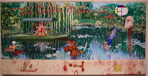
“My hope for qualitative GIS.” (37): A mixed media artwork by Enrique Chagoya is casually offered up as Wilson’s hope for qualitative GIS. Ok! What is it, reverse modernism? A critique of cultural appropriation? While intriguing, it feels like this kind of hope does not offer much hope. It ends up as an exemplar with no path (besides complete departure) from current, normative mapping practices. The same for the issue of maps as cinema raised later. What does mapping and GIS practice, shaped by all these exemplars (and many decades of theoretical writings), look like? It’s sort of like saying there’s a real problem with income inequality in the U.S. then showing a picture of a fish as the goal, the hope. Wtf?
Richard Edes Harrison (44): Edes Harrison seems to be a hero in New Lines. That’s ok! But his role in the creative mapping during and after WW2 is more complicated than presented. Shaping Edes Harrison’s vision was S.W. Boggs, the U.S. Department of State’s official geographer (1927-1954). Boggs enlisted the help of Harrison and other artists to create global visualizations he apparently could not get from traditional mapmakers. I touch on some of this in a recent posting on Boris Artzybasheff’s Maps. “Boggs was responsible for initiating partnerships between artists such as Artzybasheff and the State Department for technical cartographic advice and map production, but in the process absorbed an appreciation of these artists’ global visualization and their sense of the larger American public.” (Barney, 2011, p. 186). I think this era produced numerous exemplars of the kind of disruptive, new mapping Wilson wants to see. Yet at the same time, these efforts were a political vision of American dominance, economic globalization, produced by artists who themselves were largely funded through creating advertising for global capital. Yikes! We shouldn’t be naive about disruptive, new cartographies. Finally, Edes Harrison’s famed global visualizations were, from one perspective, just drawings of a globe from different perspectives! There, I said it. (See Timothy Barney’s Mapping the Cold War [2015] and the dissertation it was based on: (Re)Placing America: Cold War Mapping And The Mediation Of International Space, Dissertation, University of Maryland, 2011. Direct PDF download here). This cool article also: “Richard Edes Harrison and the Cartographic Perspective of Modern Internationalism.”
“Certainly, then and now, the drawing of a line is the making of a difference.” (44=45). As with other chapters in New Lines, this one drops a bunch of interesting ideas in a few paragraphs at the end.
“…the gloss, or patina, of contemporary geovisualizations, made with advanced geospatial and illustration software, can risk breaking with a key commitment of early to mid-twentieth-century geographic representations: a commitment to the wide participation of a map-reading audience in the reading and wonder of the world.”
Ok, I’m hearing Wilson channel Harley back in the day. Then it was good old paper maps (typically topographic maps), public, accessible, engendering wonder being replaced by GIS and computer mapping software that was restrictive and too flashy. Harley didn’t like email either. Called it evil-mail. A whiff of the nostalgic.
“How might design resist the gloss of spectacle and elevate slow-mapping, where the representation intervenes in the known? How might the fine adjustments made in geospatial and illustration software further disguise the mechanics of representation from a public? How might cartographic experimentation forgo the rush toward a faddish polishing of infographics and instead amplify the disruptive potential of geographic representation?”
I believe the reference here is maps like those made by Edes Harrison and Raisz. The “fine adjustments” comes across as the reaction one might have in attending a session at a NACIS conference. Talk about fine people into fine adjustments! But Edes Harrison et al. were all about fine adjustments too. They were master graphic designers. Like the NACIS folks. I’m left wanting something here… more examples (not just Edes Harrison) of the disruptive, but also examples that are not postcolonial paintings or art movies.
Digitality (47-). I enjoyed the discussion of Howard Fisher and the Harvard Laboratory for Computer Graphics. This is, of course, one of the origins of ESRI (which dominates mainstream mapping and GIS, along with Google). This story was documented in an ESRI Press book by Nick Chrisman, Charting the Unknown: How Computer Mapping at Harvard Became GIS (2006) which Wilson does not cite. I have not read Charting the Unknown. Maybe it’s too much of a hagiography. But this chapter seems also to be a bit hagiographic. Although I like the concept of Howard Fisher.
Regarding the emerging computer technology in the 1960s: “Fisher was disinterested in the routine utility of these systems, but interested in how they might be pushed to do something not yet imagined, how to use and abuse these techniques in service of something more disruptive.” (50). And I get that. But what I can’t shake is the sense that Fisher and the other folks in this story (hard workers all!) largely replicated the most fundamental, conservative, and functional aspects of cartography in this new digital world. Points, lines, areas! Overlay analysis! Codification of quantitative geography! Symbolization (first typewriter approximations but later the standardized symbols used in analog cartography). Nothing new there. Digital mapping also excluded the artisanal mapping (just praised in the previous chapter of New Lines) produced by Edes Harrison and Erwin Raisz (who was at Harvard at the time). I know, I know… think about what was to come. But wait, what was coming was military-industrial GIS, glossy geovisualization, etc. Those trajectories don’t end up in a very favorable place in New Lines either. I guess I need more evidence that Fisher was questioning much at all about 1960s cartography; mostly it seems he was trying to figure out how to make computers do maps as defined by a very non-radical, non-disruptive cartography.
“All maps are a con.” (61) This is a cool quote from Fisher. Wilson follows: “Fisher understood that the computer disrupted the relationship between the author of the map and the reader, a relationship that had always been based largely on deception.” It’s probably true that early computer maps did cause disruptions.

Harvard Graphics Lab SYMAP map ca., 1965. More or less a typewriter map.
The look of these maps was weird, and it led the viewer to notice the form of the map, rather than the content. That’s one of the things you teach in map design. Get the viewer into the content, not the form. If the colors are wonky, or hard to distinguish, or the type is too small, the viewer notices the design and not the content (and that isn’t good). Thus “bad maps” are disruptive.
I’m not sure how to sort this out: these early computer maps were disruptive and drew attention to the fact that the maps were authored (not just magic images of the real world). Wilson goes on to quote Fisher some more: “The goal of mapping is understanding, not maps.” That is, more or less, the beacon of modern cartography (at least since WW2).
Movement (69-). This chapter gets close to my world, as it was, at Penn State back in the early 2000s. What was abuzz was geographic visualization, inspired by scientific visualization, itself spurred by advances in computers. Animated maps were central to this “new paradigm.” The origins in scientific visualization, or SciViz, are important (but not really discussed in New Lines).
“The rise of GIScience can be understood, from one perspective, as an elaboration on centuries of practice to capture time, to render time immobile, in order to fix (ate on) spatiality.” (72).
Sure. And the mantra ca. 2000 was to harness new computer technology and its ability to map time to time. Rather than time to space. Animated maps were disruptive, although possibly more novelty than disruption. Keep in mind that humans are evolutionarily hardwired to notice movement (one of the Four Arguments for the Elimination of Television). Keep in mind that animated maps were not new (they could be found prior to pre-WW2). Keep in mind that the emerging WWW had all sorts of moving stuff. In the big scheme of things, I’m not sure movement and maps were (or are) that big of a deal.
But it was a time of great map experimentation. And that is important to note.
Wilson sets up a binary here where objective, Robinsonian cartography is contrasted with “subjective” aspects of mapping, including “harmony, movement, balance, and proportion.” Robinson is open to these… but what does he (and a neo-Robinsonian bevy of cartographers) do with such unruly subjects? These are components of interest, says Wilson, to critical geography.
Are we, then, linking maps to theories?
“I recall an economist once telling me that the map was a theory which geographers had accepted.” (Ullman, 1953 p. 57)
As there are different geographic theories, then there can be different kinds of corresponding maps. And we can experiment with new maps, based on new theories. Or maybe theories that don’t typically serve as the foundation for maps.
The problem is when “more resolved cartographers … attempt to pin down these more slippery elements. Herein lies the trouble.” (77) Who is supposed to pin down slippery elements?
Wilson does not like attempts by mainstream cartography to operationalize what he sees as subjective components (harmony, movement, etc.). It is too reductionist, too close to standard mapping practice, too devoid of human, subjective experiences. “We need further conceptual development to take up those more subjective elements of cartography, which cause readers to gaze unendingly at the moving spatial representation in front of them.” (80)
So what is the “further conceptual development”? One answer is cinema. And there are some interesting discussions in this part of the book. But I do think some of the early work on map animation gets short shrift. In other words, before we move on to making movies, don’t dismiss the work that went on with animated and dynamic maps in the early 2000s.
I still think Wilson wants cinema. But his subject is maps.
So why not make movies? Why not paint paintings? I believe that these expressive media may be far superior to maps (even the craziest, radical, disruptive maps) in expressing the kinds of social and human things Wilson (and critical geography) is striving for.
I can tell you that thinking about cinema, movies, and film was part of the discussion in the early 00s as we took on making some sense out of what map animation could be. And the dynamic variables (published in “Animation and the Role of Map Design in Scientific Visualization,” 1992) were the result of that effort. A few points about that effort:
The work was really much more David DiBiase (the lead author) than Alan MacEachren, as is implied in New Lines. Alan was very supportive, but David was driving force. The traditional neo-Robinsonian concerns with psychological evaluation, perceptual or cognitive, of which Alan is an expert, did not really play much of a role in this effort. That would come later, Alan and Mark Harrower in particular.
David was motivated by the emerging field of scientific visualization (the early stirrings of big data in the natural sciences) wedded to exploratory data analysis (EDA) from statistics (J.W. Tukey) wedded to Edward Tufte. None of these people or approaches were part of the Robinsonian or neo-Robinsonian world: indeed, they fully lacked interest in the psychological, evaluatory approach and, in the case of Tufte, were explicitly opposed to it. David’s interest in music (he used to be in a prog-country-rock band in Madison, Wisconsin) also informed the work on dynamic variables (it was David that suggested the research I did on mapping with sound).
Catherine Reeves played a big part in bringing her interest and knowledge of cinema and film (and music) to bear on the effort. Her creative insights and interest in social human geography and mapping were vital to the project. She got the reductionist, variables approach we were working with (such approaches can be useful) but kept us thinking that there was a bigger and more complex context out there.
The variables idea came from Bertin, but Bertin has always had an uneasy place in Robinsonian cartography.
A Swedish scholar named Janos Szegö played a significant role in the thinking behind the dynamic variables effort, in his attempt to refine some viable guidelines for socially relevant mapping. The book was: Human Cartography: Mapping the World of Man (Swedish Council for Building Research, 1987). The World of Man!
I do think the work at Penn State in the early 2000s was more disruptive and less tied to a neo-Robinsonian agenda than portrayed in Wilson’s book. Indeed, it was a moment where a bunch of the students, many (but not all) map and cartography focused (including Catherine and I), issued the seriously absurdist Globehead! Journal of Extreme Geography:
In March 1994, a graduate student, Nikolas H. ” Ni4k” Huffman … and fellow maverick editors exhibited anarchic glee while parading Globehead!’s outrageous, often incendiary maps, essays, illustrations, photographs, recipes, and classified ads. Globehead!, spearheading the extreme geography idea, thus set itself out to be geography’s problem child by “aping the Game” and its counterfeit seriousness and playing up to irony and indignation. By posturing themselves as extreme geography thinkers and practitioners against disciplined academic solemnity and reveling in ridicule and the ridiculous, Globehead! participants exuded hyperradical postmodern attitudes at a time in the history of geographic thought when the bloom was new on the rose of the epoch of postmodern geographies. (from an entry on Extreme Geography by David J. Nemeth, Encyclopedia of Geography, 2010).
That’s also part of the context out of which the dynamic variables emerged.
After all that history: back to New Lines. I feel like Wilson continues to call for a cartography that is – among many things – experimental, humane, subjective, dynamic, compelling, cinematic, monstrous, emerging from practice and engagement. The problem is, the examples are rather scarce and meh.
It’s like having a space in the periodical table of elements where you know something should be, but not being able to find it.
Attention (95-): This is where Wilson’s work on participatory and qualitative GIS comes into the story. I do think this area is central to ongoing developments in critical GIS and mapping. There is enthusiasm from all sorts of places, many outside of academic geography and even academia. For example, I was just skimming an article that popped up on my Research Gate account: Nora Morales & Salomon Gonzalez, “Map Making: Mobilizing Local Knowledge and Fostering Collaboration” published in Ethnographic Praxis in Industry Conference Proceedings 2018 (1): 125-143. What the hell is ethnographic praxis in industry? That’s great, whatever it is.
And the Community Geography effort, mentioned above, suggests the same enthusiasm.
Synthesis: What’s missing from all of this is some synthesis of 20+ years of work on engaged community geography, participatory GIS and mapping, critical mapping and GIS. I don’t want to be the old guy yelling “we did that 20 years ago!” at the youngsters. I think, however, it is the time that some kind of approachable synthesis (eg., not a lofty academic tome) is overdue. I’m thinking New Lines makes some leeway. But maybe not enough.
The problem is that the diversity of ideas and work over the past 20+ years is spread over many academic fields, much of it outside of academia in NGOs and other organizations (full of smart people with cool projects). I think community geography is the right place for this to happen: its geography with a small “g” and not large “G.” Mapping and GIS and spatial information is vital, but not limiting: it’s about community engagement in a spatial context first (using spatial methods when appropriate).
Social Justice (99-) and the implicit, rather than explicit: The problem with the social justice focus of much of the academic writing on participatory GIS and mapping (and critical GIS and mapping) is that there are many practitioners (potential partners, collaborators, etc.) who don’t see themselves as motivated by social justice per se. This could apply to a whole range of natural science (citizen science) and environmental applications. Many of these have social justice implications (community-engaged research that documents E. coli in streams and figures out ways to reduce it has a general, social justice impact). But the heavy social theory front can discourage rather than encourage. Thus a need to talk about this field and what it does and how to do it (in a synthesis) in a way that does not immediately exclude participants. There is a way for academics to do implicit, theoretically sophisticated work that propels people to do cool stuff.
Help and Helping (105) and maybe “not helping”: Wilson’s New Lines, particularly in the Attention chapter, is invested in the notion of PGIS as helping. This has been a component of participatory mapping and GIS and community-oriented geography from the beginning. Helping is, of course, fraught with political consequences. Thus a need to include guidance on how not to help as a strategy in any kind of coherent synthesis.
Gardens (107) and “not mapping”: “Time spent on Facebook and Google Docs is in direct competition with time spent in the gardens.” One might add GIS and mapping to that list of distracting technologies. They are part of the “attention economy” but simultaneously distracting. Another tough problem for critical GIS and mapping. Thus the need to include not mapping as a component of any coherent synthesis.
On contemporary academic cartography (114): Wilson rapidly comes back to his thesis that Arthur Robinson’s agenda defines modern cartography as this chapter draws to a close. I don’t see a coherent contemporary academic cartography anymore, at least not like there was back when I wandered into the UW Madison Cart Lab (in the late 1990s). Cartography positions have been replaced by GIS folks, many of which are pretty damn technical or imbued in the quantitative tradition (because of the pioneering work done by Howard Fischer discussed in New Lines). But some GIS folks have gone more in a qualitative, PPGIS direction. Also, human geographers, environmental geographers, physical geographers have picked up aspects of critical GIS and mapping. And it certainly has generated interest outside of Geography. Maps and mapping, along with critical perspectives, are all over the place, and nowhere in particular. Like any good practice-based methodology should be.
I get the sense that Wilson is tilting at a “contemporary academic cartography” that is largely gone. It’s diffused, with some of the old “behavioralists” around but mostly not. I worry that tilting against this particular windmill is not productive. It’s not there!
On What Matt Wants (114): a post-Robinsonian cartography/mapping/GIS/critical whatever approach that is subjective, affective, relational, attention-generating, moving, somehow emerging out of participatory mapping/GIS/etc. and critical geography, and so on. I’ve said this before. This can all be theorized, like the missing element on the periodical table. But I’m not seeing enough progress towards actually finding it. At least not examples I can behold!
Heading into the home stretch…
“Indeed, while Arthur Robinson’s Elements of Cartography dominated mid- to late 20th century thought regarding the map and provided the primary foundation for contemporary map design research, I suggest the force of this thought simply does not take maps seriously enough. He writes, “Most maps are functional in that they are designed, like a bridge or a house, for a purpose.” This is hardly the full story, and yet Alan MacEachren’s How Maps Work in 1995 also does not greatly alter the imagination of the cartographer, nor the register within which the cartographer may ask questions of their craft.” (136)
I think the biggest problem with New Lines is that it’s beating a dead horse. And that dead horse was being beaten a decade ago, and 20 years ago. Cartography is Dead (Thank God!) was published in 2003 and was pretty much a foregone conclusion back then. This is not to say that the behavioral/cognitive Robinsonian tradition is dead. It isn’t. And it produces research that is at least as interesting and useful as academic research in general. I’m reminded of a quote from Dickens’ Nicholas Nickleby, chapter 9:
And, in this place, it may be as well to apprise the reader, that Miss Fanny Squeers was in her three-and-twentieth year. If there be any one grace or loveliness inseparable from that particular period of life, Miss Squeers may be presumed to have been possessed of it, as there is no reason to suppose that she was a solitary exception to an universal rule.
Slow maps (139-141): New Lines unveils the slow maps concept as its most ambitious attempt at capturing a post-Robinsonian approach to mapping, GIS, etc. It does gather in many of the characteristics Wilson has moved through in the prior pages.
This, of course, made me think of slow food, careful selection of wholesome ingredients, prepared with care and love and consumed in the company of loved ones who have managed to set aside the chaos of modern life.
This idea also has a whiff of nostalgia, Erwin Raisz crouched over his drafting table, drawing a million little marks that somehow captured the landforms of just about everywhere in the world, or Edes Harrison and his bevy of artists, and even myself, putting hundreds of hours of work into my youthful map projects (or the +1000 hours of production that went into making the Making Maps book, in Illustrator and InDesign). Talk about fuckin’ slow maps!
Why does NACIS get picked on? That bunch is really into slow maps. These are cool, obsessive people who generate slow maps on a regular basis.
Slow is good because the focus is care and investment of time and effort and brain power. But you can put a huge amount of time into constructing a map that is used to kill people or databases of mapped big data that target and exploit consumers. Thus I guess we need some kind of ethical check: unlike the grace or loveliness of young women the age of Fanny Squeers, there is no universal rule when it comes to the loveliness of slow maps.
“What might map intervention look like that slows the process of map communication, to directly counter map design research that seeks to speed up the process of map reading?” (139): This makes me think of the impact of the geographic visualization critique of communication model cartography that emerged at Penn State (and other places) 20 some years ago. Inspired by scientific visualization, EDA and Edward Tufte, the point was to map out complex data (quantitative and qualitative and beyond those simplistic binaries). The creation of such maps (traditional or interactive) was slow and laborious; the engagement just as slow and laborious. The whole effort was meant and was taken as a critique of Robinsonian cartography, and it caused sniffs of consternation among the few dozen academics who cared. But that was 20 years ago! I also think of all the artists who have engaged in work that involves maps and mapping. This too is slow mapping. I think. And the crowdsourced mapping, like Open Street Map. Thousands of people building a global database bit by bit, all in their spare time! Psychogeography. And all the community mapping and GIS over the last few decades. I think slow mapping is and has been happening all along.
That’s not to say that the Robinsonian tradition is gone. Fragments of that tradition, the results of testing and evaluating many components of maps and mapping have been selectively reviewed and those elements found to be useful have been incorporated in functioning systems (like Google Maps an ArcGIS) and contemporary textbooks (like Making Maps). For good or for bad.
“The slow map intensifies and produces desire. As maps of traces, slow maps resist the temptation of a fast-map, neo-Robinsonian functionalism, in order to foster different thought and action. The map, through such slow map experimentation, becomes theory in the sense of a creative conceptualization.” (139)
I think we need fast maps. I don’t want to sit and ponder Google Maps for too long when I’m trying to figure out the fastest route to get to my daughter’s synchronized swimming practice during Columbus rush hour.
So no to a monoculture of slow maps. Or fast maps.
Google Maps can intensify and produce desire. Many people spend much time exploring the digital world (including ground-based images) compiled together, with a huge investment of time and effort, in Google Maps.
Google Maps is corporate stuff, I get it. But it can still generate the kind of effect, or affect, that Wilson desires.
“To examine a piece of hand-drawn cartography, like Raisz’s Landforms, is to seemingly witness the movement of the cartographer’s pen, the force of their body against the manuscript. These are the maps that compel our attention, to attend to the movements of their lines amid the static.” (140)
I think it is very important to look back at past maps and mapping traditions for inspiration. This blog is about that. As is the Making Maps book. But it can’t be uncritical nostalgia. It shouldn’t look at just about every map and mapping tradition in the last few decades as somehow deficient, and old maps, made by men like Raisz or Harrison or Howard Fisher, closer to the mark. It’s not exactly Make Maps Great Again but it might wander in that direction.
Maybe it’s about making maps, period. And providing the kind of ideas and motivations that get more people making more interesting and impactful and creative maps. Any resource, guide, book, article, class, talk, or manifesto will be judged by its ability to inspire just that.
Read Full Post »