
Archive for the ‘07 Hierarchies’ Category
Making Maps now at makingmaps.substack.com
Posted in 01 What's A Map?, 02 Why Are You Making Your Map?, 03 Mappable Data, 04 Map-Making Tools, 05 Geographic Framework, 06 Map Layout, 07 Hierarchies, 08 Generalization & Classification, 09 Map Symbolization, 10 Type on Maps, 11 Color on Maps, 12 Finishing Your Map, tagged Cartography, data analytics, Denis Wood, Geographic Information Systems, geospatial, information design, John Krygier, Making Maps, maps on January 17, 2025| Leave a Comment »
Atlas de Cuba | 1949 | Gerardo Canet & Erwin Raisz
Posted in 06 Map Layout, 07 Hierarchies, 09 Map Symbolization, 10 Type on Maps, 11 Color on Maps, Map Books, Map History, tagged Erwin Raisz - Atlases; Map design - atlases; Cuba - atlases on July 9, 2014| 9 Comments »

This Atlas is more than an attempt to describe Cuba. Our aim is not only to present the setting in which the drama of Cuban life is played but to show how this life itself changes its own setting, creating new problems and new adjustments to them.
This dynamic element is usually absent from the impersonal atlases produced by governments, societies and publishing houses, which merely give a graphic report of a given moment of time. Our objective is to give a living picture of Cuban geography as far as possible in 64 pages. Our approach is as follows: 1. What are the facts?, 2. What are the essential problems?, 3. What will be their effects in the future and what may be done about them? For instance, Cuba, by reason of its close proximity to the United States become its chief source of tropical products, especially sugar. Thus the Cuban economy has become dependent on the fluctuating sugar demand, whereas a diversification of crops and industries would be advisable.
We have presented the results of our labor in graphical form. An old Chinese proverb says: “A picture says more than a thousand words.” Moreover by visual representation the most complicated problems may be brought within the understanding of the layman. Everyone should know the geography of his own country, and in the case of Cuba this need is imperative, since few countries have such clear-cut dependence on location, climate and soil Cuba’s internal problems of adjustment and interdependence with the rest of the world demand a high degree of understanding from its citizens.
– from Introduction
•••••••••••••••••••••••••••••••••
In addition to many dozens of unique landform maps, Erwin Raisz produced three atlases in his lifetime, including the Atlas of Global Geography (Global Press Corp., 1944), the Atlas de Cuba (Harvard University Press, 1949) and the Atlas of Florida (University of Florida Press, 1964). Copies of the Global and Florida atlases are relatively easy to find (used or in libraries); this is not the case with the Cuba atlas, which seems to have had a relatively low print run. A series of maps, diagrams and illustrations from the Cuba atlas are included below.
The Atlas de Cuba strongly reflects Raisz’s aesthetic, combining creative illustration with his bold and cozy aesthetic of map design. Part of the appeal of Raisz’s work is its humane feel, reflecting the manual mapping tools used to create his maps. Raisz’s maps and illustrations clearly reveal the hand of a human creator.
A large format map, included in the back of the Atlas de Cuba, will be the subject of a subsequent post.
See also, at this blog, Raisz’s History of American Cartography Timelines, Map Symbols: Landforms & Terrain, and Raisz’s currently available landform maps at www.raiszmaps.com.
•••••••••••••••••••••••••••••••••

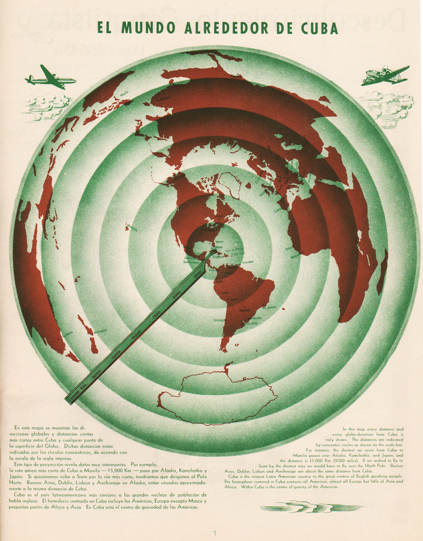
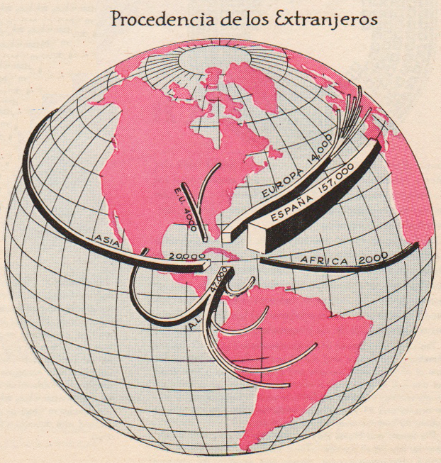
El Mundo Alrededor de Cuba | The World Around Cuba (Excerpt & entire p. 5)
•••••••••••••••••••••••••••••••••
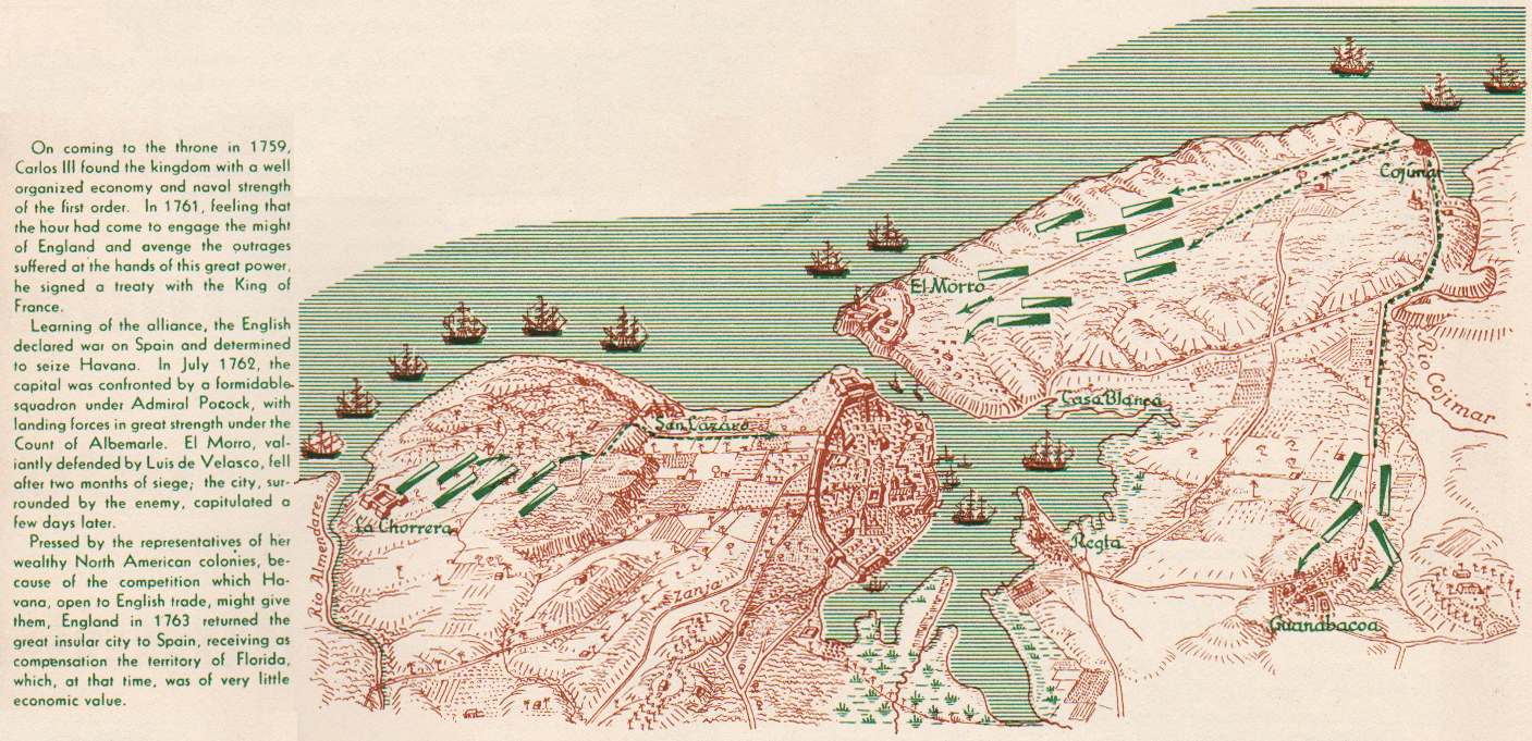
Cuba Colonial | Colonial Cuba (excerpt, p. 9)
•••••••••••••••••••••••••••••••••

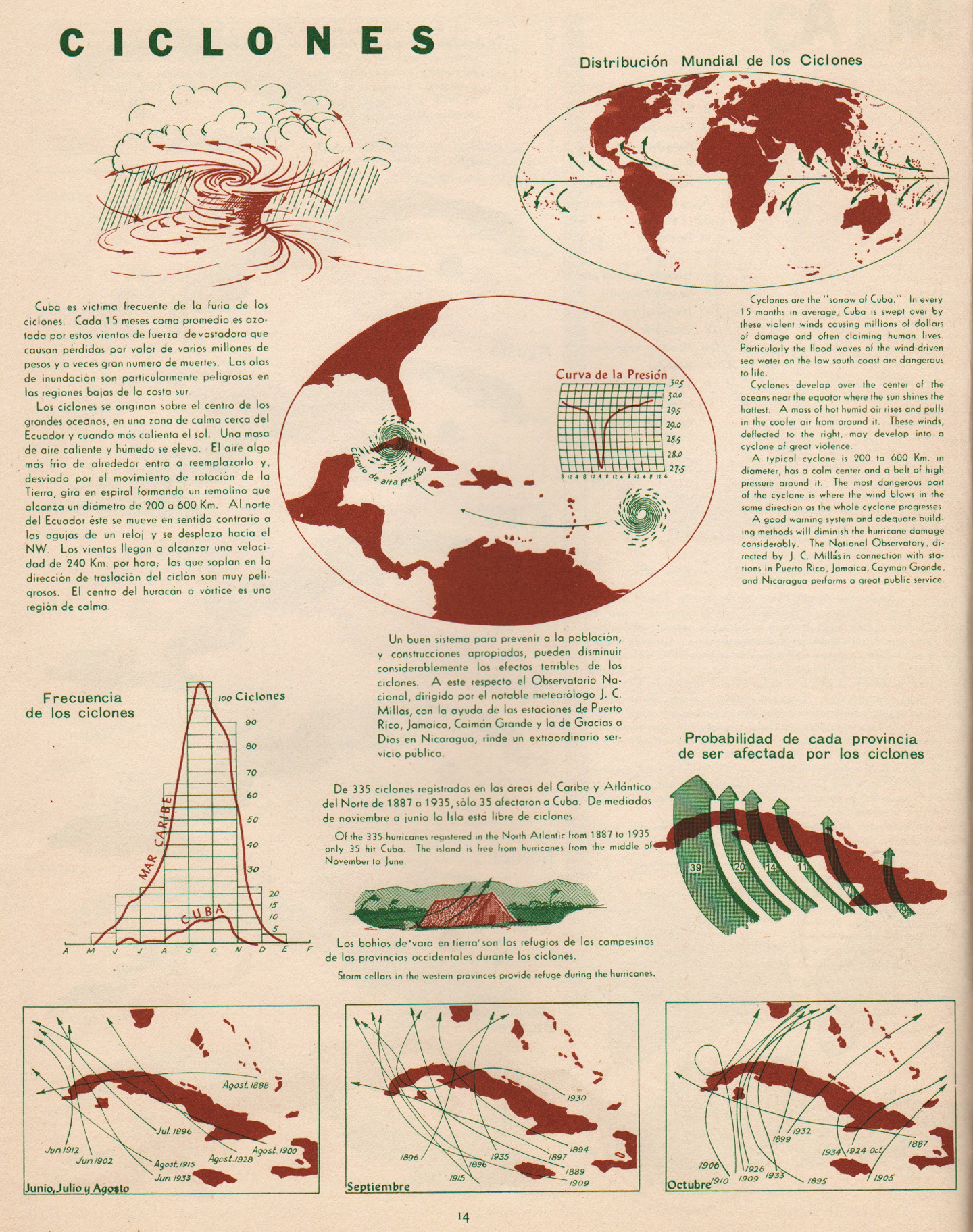
Ciclones | Cyclones (excerpt & entire p. 14)
•••••••••••••••••••••••••••••••••

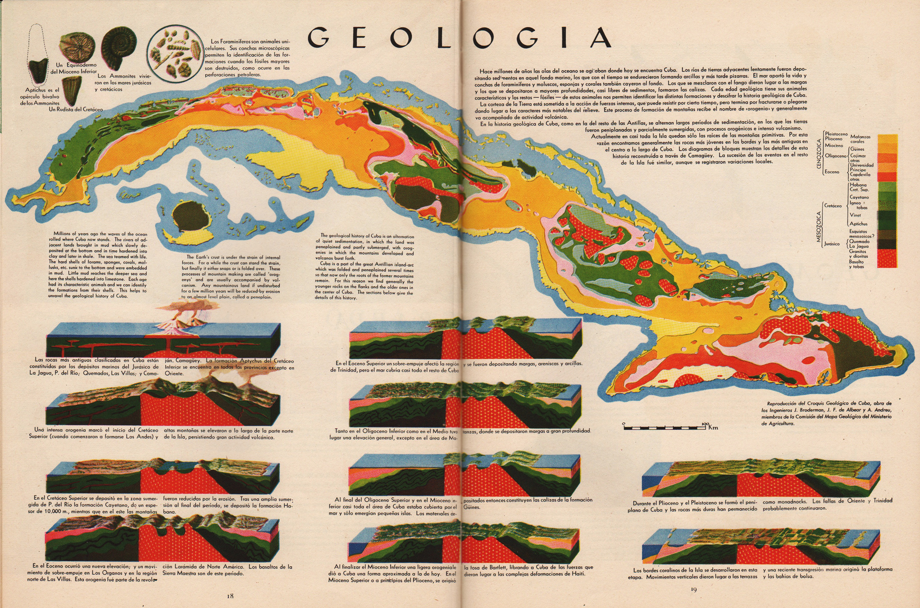
Geologia | Geology (excerpt & entire pp. 18-19)
•••••••••••••••••••••••••••••••••


Geomorfologia | Geomorphology (excerpt & entire pp. 20-21)
•••••••••••••••••••••••••••••••••

Pesca | Fish (excerpt, p. 25)
•••••••••••••••••••••••••••••••••


Vegetacion | Vegetation (excerpt & entire pp. 26-27)
•••••••••••••••••••••••••••••••••

Poblacion | Population (excerpt, p. 29)
•••••••••••••••••••••••••••••••••
Composition Social | Social Composition (excerpt, p. 35)
•••••••••••••••••••••••••••••••••


Tourismo | Tourism (excerpt & entire pp. 38-39)
•••••••••••••••••••••••••••••••••
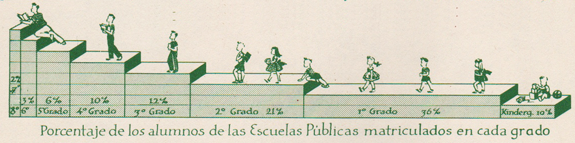
Educacion | Education (excerpt, p. 40)
•••••••••••••••••••••••••••••••••


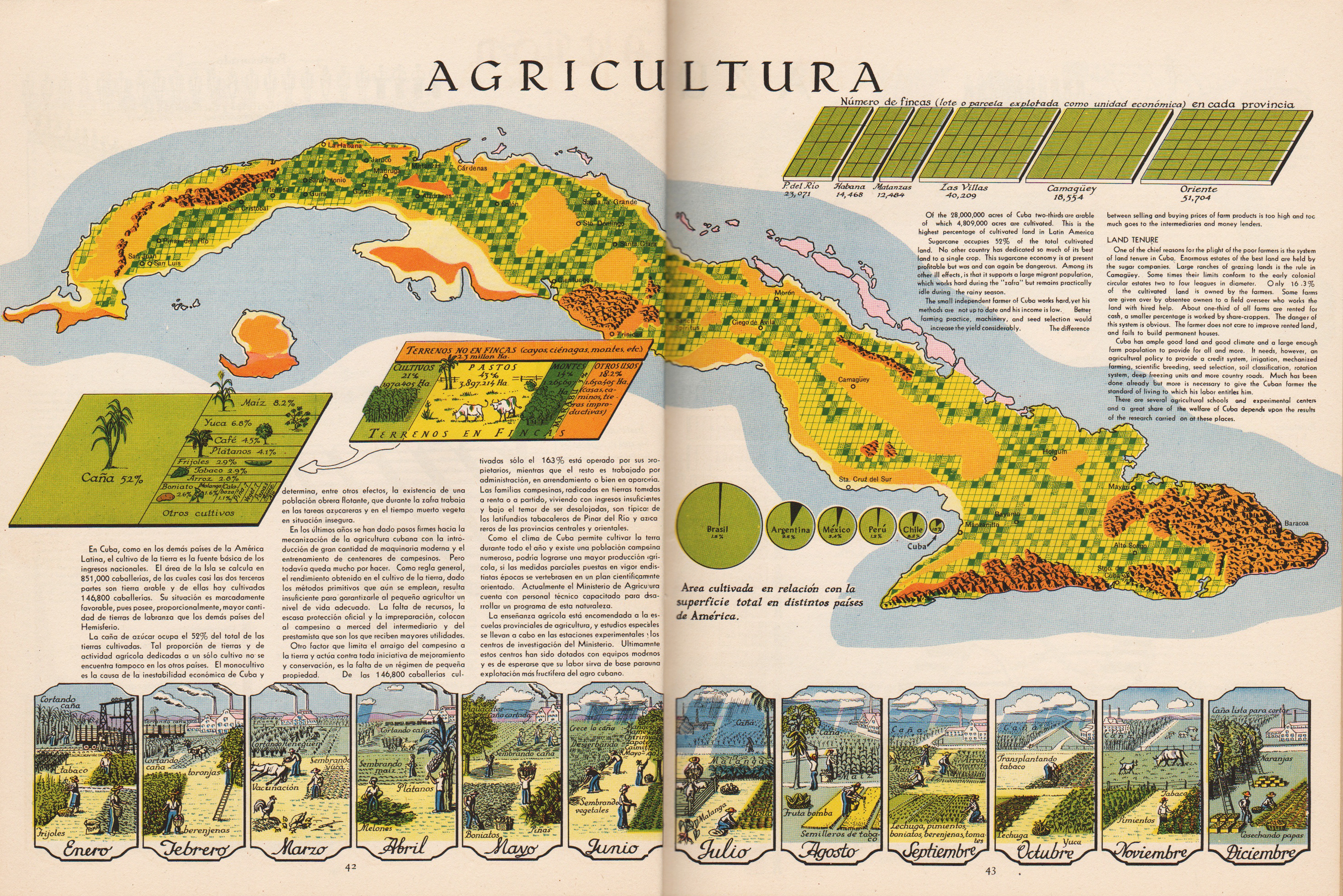
Agricultura | Agriculture (excerpts & entire pp. 42-43)
•••••••••••••••••••••••••••••••••
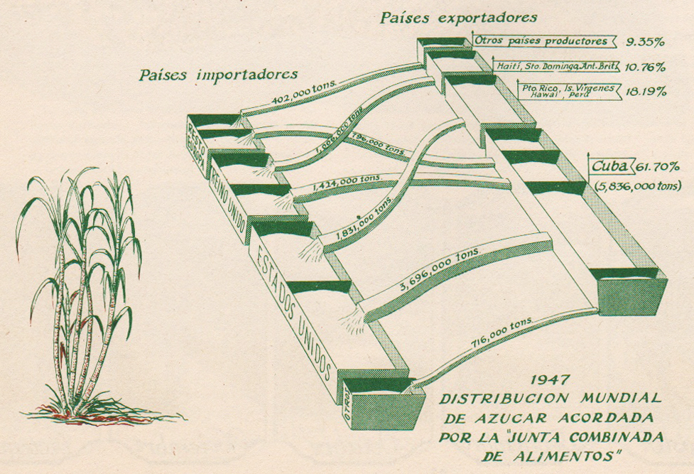
Azucar | Sugar (excerpt, p. 44)
•••••••••••••••••••••••••••••••••

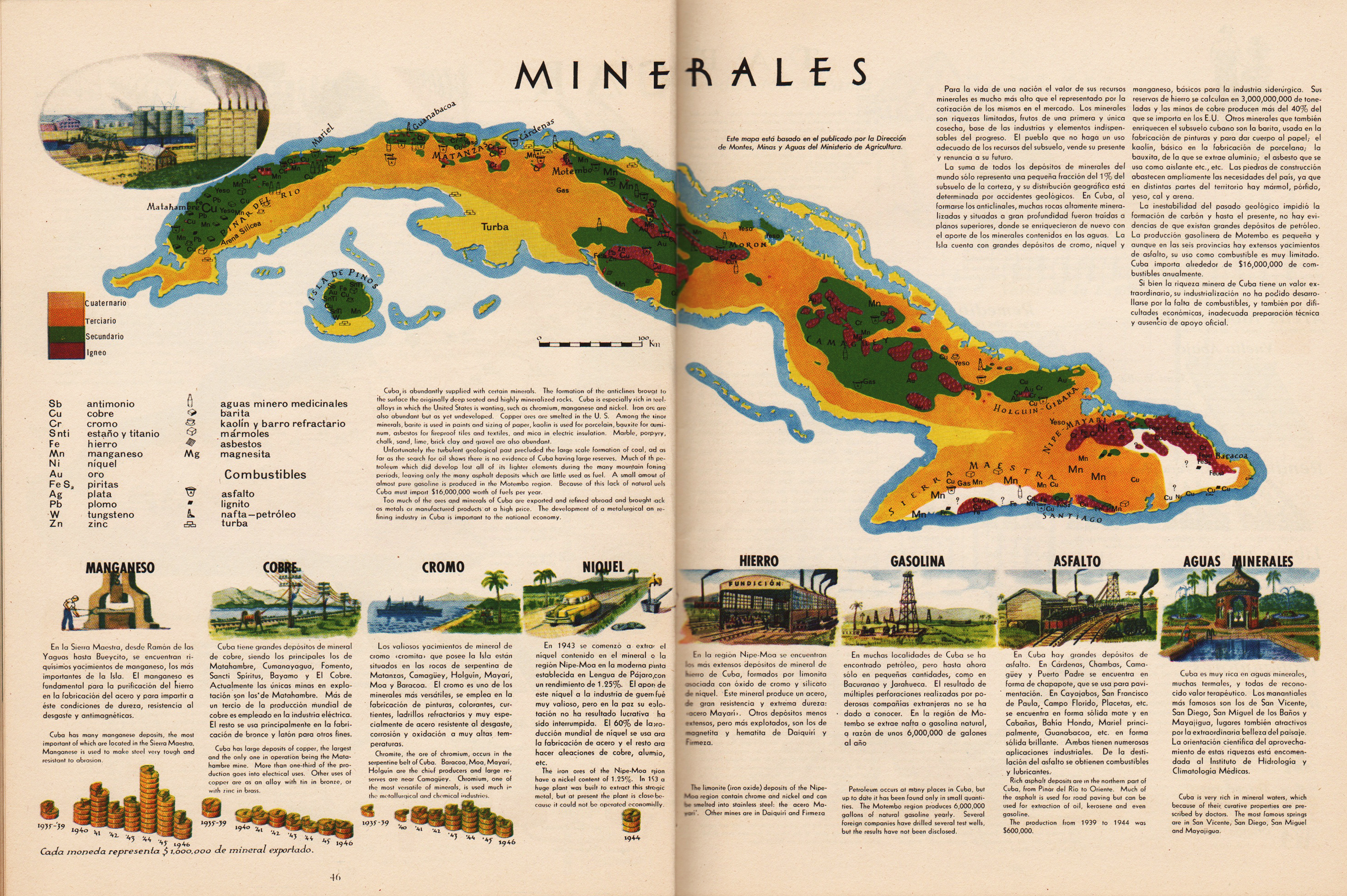
Minerales | Minerals (excerpt & entire pp. 46-47)
•••••••••••••••••••••••••••••••••
Tabaco | Tobacco (excerpt, p. 49)
•••••••••••••••••••••••••••••••••

Frutas | Fruit (excerpt, p. 51)
•••••••••••••••••••••••••••••••••
Atlas de Cuba
Garardo Canet & Erwin Raisz
Harvard University Press
1949
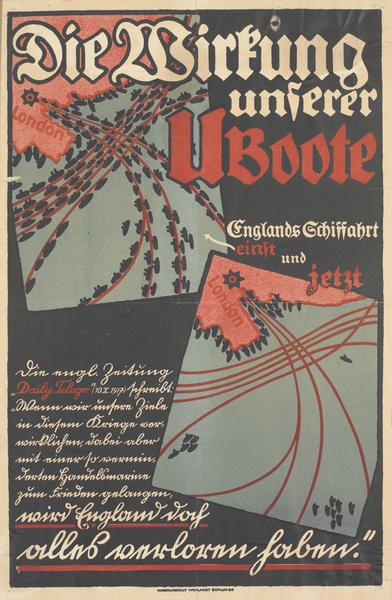
Map Posters | Spain | Germany | 1917-1936
Posted in 06 Map Layout, 07 Hierarchies, 09 Map Symbolization, 11 Color on Maps, Map History, tagged Map Design, Maps - History, Posters - Map, Spanish Revolution - Maps, World War 1 - Maps on June 9, 2013| Leave a Comment »
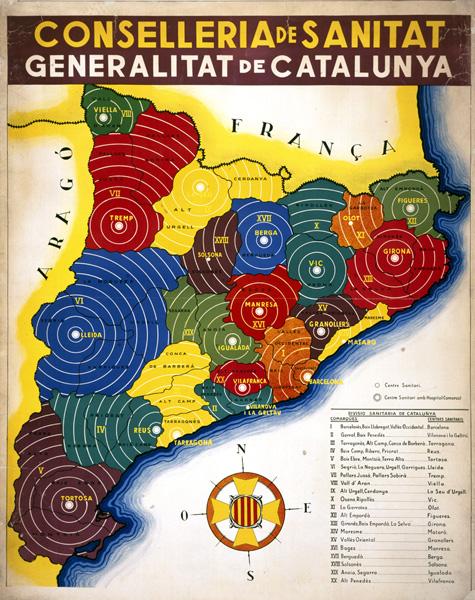
Catalonian Health Administration Areas (1936-39)
•••••
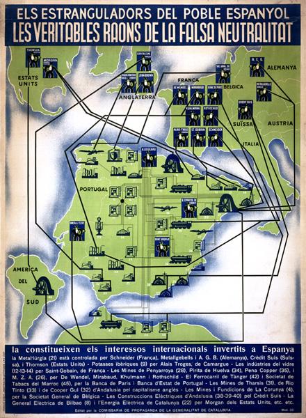
Foreign interests allied against the Spanish Republic (1937)
•••••
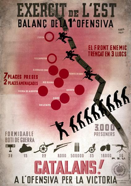
Aragon Front of the war: Republican gains shown as broken barbed wire, prisoners taken shown as silhouettes of men marching under guard, and captured armaments shown as images of specific weapons with numbers captured (1936).
•••••
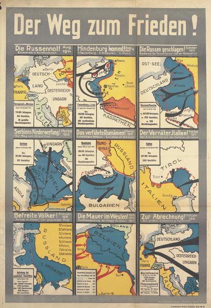
The Way to Peace! Nine maps of German campaigns from August 1914 to spring 1918.
•••••
•••••
Spanish Civil War Poster Collection
Posters of Conflict Collection
•••••
Thanks to A London Salmagundi for original link
Map Design Annotated: 13 Voyager Maps from Making Maps 2nd Edition
Posted in 01 What's A Map?, 02 Why Are You Making Your Map?, 06 Map Layout, 07 Hierarchies, 08 Generalization & Classification, 09 Map Symbolization, 10 Type on Maps, Making Maps Book News, Maps Made, tagged Annotated Maps, Map Design, Maps - Annotated, Maps - Design on October 17, 2011| 1 Comment »

To understand map design, and how maps work, it is useful to see how map design concepts play out on a real map.
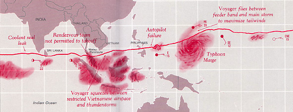
One of the significant updates to the 2nd edition of Making Maps was the inclusion of a map of the 1986 trans-global flight of the experimental aircraft called Voyager. This map, originally designed and created by David DiBiase and I back in 1987 for David Woodward’s map design course (and in the University of Wisconsin Cartographic Lab), is repeated thirteen times in seven of the chapters, annotated to show how the concepts and ideas in these chapters play out on the map.
The repeatedly annotated Voyager map serves as an example of map design in practice, but also a guide to “reading” a map from the perspective of map design.
Martin Dodge suggested the annotated maps be available together, for instructional purposes. A good idea! So here they are. Each individual map on this page is a 800k PNG file (click for full size).
A PDF file (8.8mb) with all thirteen higher resolution TIFF images is available here.
The Voyager map project was quite a bit of fun to create back in the day. It won a map design award, was published in the book about the Voyager flight, and printed on paper as part of a promotion for the Waukesha County, Wisconsin Airport. I cannot imagine anything much more exciting than that.
••••••••••
The second map in the series prefaces the initial chapter in Making Maps 2nd edition, and poses a series of questions that will be addressed in future chapters (and annotated Voyager maps):

Chapter 2, What’s Your Map For?, sets the context of the map (and of its re-creation for the book) and how such context shapes the design of the map:

Chapter 6, The Big Picture of Map Design, repeats the Voyager map five times, focusing on the key map design concepts covered in the chapter. This is where the map flips orientation south up (a controversial design choice, according to some reviewers: good! Think about why such a choice is controversial, and if it should be [or ask your students to do so]):

South is now up (so the story reads from left to right):

Annotations about map pieces including title, scale, explanatory text, legend, directional indicator, border, sources, credits, and insets & locator maps:

Annotations about visual arrangement including path, visual center, balance, symmetry, sight-lines, and grids:

Annotations about graphical excellence, based on Edward Tufte’s ideas, including complexity, detail, design variation & data variation, context, revision, non-data ink, data-ink ratio, explanatory text, editing, chartjunk & map crap, redundancy, and multivariate data:

Chapter 7, The Inner Workings of Map Design, reveals the Voyager map with no visual differences (a confusing mess of lines and type):

The map with visual differences is then annotated, with regard to key methods for establishing visual differences, including detail, edges, texture, layering, shape, size, closure, proximity, simplicity, direction, familiarity, and color:

Chapter 8, Map Generalization and Classification, annotates the Voyager map in terms of the generalization concepts of selection, dimension change, simplification, smoothing, displacement, and enhancement:

Chapter 9, Map Symbolization, annotates the map in terms of the visual variables: shape, size, color hue, color value, color intensity, and texture:

Chapter 10, Words on Maps, annotates the Voyager map with regards to typographic variables including typeface, type form, type weight, and type size:

I have a few ideas for additional annotated Voyager maps (such as a full color map) which I hope to cobble together in the future. If you have any other ideas for variations that might be useful or interesting, let me know.
1910 | Topographic Maps | Map Symbols | Egypt
Posted in 06 Map Layout, 07 Hierarchies, 09 Map Symbolization, 10 Type on Maps, 11 Color on Maps, Cartominutiae, Map Music, tagged Desert Maps, Egypt - maps, Empty maps, History of Cartography, Map Symbols - history, Maps - History, The Survey of Egypt on November 2, 2010| Leave a Comment »

The Survey of Egypt, 1910, 1:1,000,000, Sheet 5 (detail 1, close-up)
•••
Found while cleaning out an old map cabinet: oceans of just about nothing, punctuated by signs of a minimal landscape. Soiled, creased, tears, dusty. Thumb-print and fading pencil marks, from someone who stared at this map a long time ago.
Details from a topographic map of Egypt in 6 sheets, published by The Survey of Egypt in 1910, scale 1:1,000,000.
Click on any map for a larger version of the scan.
•••

The Survey of Egypt, 1910, 1:1,000,000, Sheet 5 (detail 1)
•••

The Survey of Egypt, 1910, 1:1,000,000, Sheet 1 (detail 1)
•••

The Survey of Egypt, 1910, 1:1,000,000, Sheet 1 (detail 2)
•••

Note the type leaking over the map border (Mediterranean, Lake Borollos, Gharbia)
The Survey of Egypt, 1910, 1:1,000,000, Sheet 1 (detail 3 – close-up)
•••

Note the type leaking over the map border (Mediterranean, Lake Borollos, Gharbia)
The Survey of Egypt, 1910, 1:1,000,000, Sheet 1 (detail 3)
•••

The Survey of Egypt, 1910, 1:1,000,000, Sheet 3 (detail 1 – close-up)
•••

The Survey of Egypt, 1910, 1:1,000,000, Sheet 3 (detail 1)
•••

The Survey of Egypt, 1910, 1:1,000,000, Sheet 5 (detail 2)
•••

The Survey of Egypt, 1910, 1:1,000,000, Sheet 6 (detail 1)
New Atlas | Denis Wood | Everything Sings
Posted in 01 What's A Map?, 03 Mappable Data, 04 Map-Making Tools, 06 Map Layout, 07 Hierarchies, 09 Map Symbolization, Deep Map Thoughts, Map Books, tagged Art and maps, Atlas, Community Mapping, Counter Mapping, Critical Cartography, Denis Wood, Participatory Mapping, psychogeography on September 7, 2010| Leave a Comment »

•••••
That a cartographer could set out on a mission that’s so emotional, so personal, so idiosyncratic, was news to me.
—Ira Glass, host of This American Life

•••••
Everything Sings: Maps for a Narrative Atlas by Denis Wood with an introduction by Ira Glass. Pub date: Nov. 12.
$28 . Paper . 112 pages . 85 black and white illustrations, including more than 50 maps . ISBN: 978-0-9799562-4-9
Preorder
•••••
These maps remind me of all the radio stories I love most. After all, most radio is a boring salaryman, waking up before you and me to announce the headlines or play the hits to some predetermined demographic. Yet some radio stories elbow their way into the world in defiance of that unrelentingly practical mission, with the same goal Denis Wood’s maps have: to take a form that’s not intended for feeling or mystery and make it breathe with human life. —Ira Glass, host of This American Life
See a longer excerpt from Ira Glass’s introduction to Everything Sings: Maps for a Narrative Atlas by Denis Wood.
•••••
From the Publisher:
Denis Wood has created an atlas unlike any other. Surveying Boylan Heights, his small neighborhood in North Carolina, he subverts the traditional notions of mapmaking to discover new ways of seeing both this place in particular and the nature of place itself. Each map attunes the eye to the invisible, the overlooked, and the seemingly insignificant. From radio waves permeating the air to the location of Halloween pumpkins on porches, Wood searches for the revelatory details in what has never been mapped or may not even be mappable. In his pursuit of a “poetics of cartography,” the experience of place is primary, useless knowledge is exalted, and representation strives toward resonance. Our perception of maps and how to read them changes as we regard their beauty, marvel at their poetry, and begin to see the neighborhoods we live in anew. Everything Sings weaves a multi-layered story about one neighborhood as well as about the endeavor of truly knowing the places which we call home.
See the Siglio Press Facebook page with seven of the Atlas maps.
The Press Release for Everything Sings.
See the previous post (on the Making Maps blog): Denis Wood: A Narrative Atlas of Boylan Heights
More Principles of Map Design
Posted in 02 Why Are You Making Your Map?, 06 Map Layout, 07 Hierarchies, 08 Generalization & Classification, 09 Map Symbolization, Deep Map Thoughts, tagged Cartographic Design, Cartography, Design, Design Principles, Hate Group Maps, Map Design, maps, Run Over Children Maps, Terror Maps on February 5, 2008| 17 Comments »

Making maps is rife with rules. But following rules does not necessarily produce a great (or even good) map. It may be the implementation of broader design principles that leads to a successful map.
Principles are an intellectual generalization of a broad field of knowledge: a kind of map, in the broadest sense of the word.
They are useful for guiding map makers and helping map users understand how maps work.
There are numerous sets of cartographic design principles. My previous post on Edward Tufte distilled six map design principles (or commandments as I called them) from Tufte’s first book, The Visual Display of Quantitative Information.
In 1999 the British Cartographic Society’s Design Group proposed “Five Principles of Cartographic Design.” When I first came across this set of principles I thought them interesting – even a bit passionate – a rare state of affairs in the often stoic world of cartography. I added a few maps and my own comments (in italics).
More on these map design principles below: Concept before Compilation, Hierarchy with Harmony, Simplicity from Sacrifice, Maximum Information at Minimum Cost, and Engage the Emotion to Engage the Mind.
Cool maps below include: Geo-Smiley Terror Spree Map, The Continents and Islands of Mankind, Hate Groups and Hate Crimes Map, and Where Commuters Run Over Black Children, Detroit 1968.
(more…)
How Useful is Tufte for Making Maps?
Posted in 06 Map Layout, 07 Hierarchies, 08 Generalization & Classification, 09 Map Symbolization, 10 Type on Maps, 12 Finishing Your Map, Map Books on August 16, 2007| 21 Comments »
Edward Tufte’s The Visual Display of Quantitative Information (1998, 2nd edition 2001) is a classic book, arguably his best, and certainly a key text in the field of information graphics (which encompasses cartography). I know some cartography courses use the book as a text.
I recall being inspired by the book as a neophyte cartographer back in the late 1990s.
The book looked great: its design communicated the importance of design (when most other cartography and information graphics books were clunky and poorly designed). The tone was serious and high-minded: I was designing information graphics. And I think I absorbed Tufte’s minimalist design philosophy, although cartographic design, at least the way I learned it, was largely minimalist, with no allowance for flourish, fake 3D embellishment, or other chartjunk (or “map-crap” as I call it in the Making Maps book).
While I won’t impugn the importance of lofty inspiration, I did wonder what kind of practical guidelines I could derive from Tufte’s book. You know, specific stuff that would help me to design and make better maps. I sat down one day and made a list of Tufteisms from the book: that list is below.
Map Graphic Design Guides
Posted in 07 Hierarchies on July 25, 2007| 2 Comments »
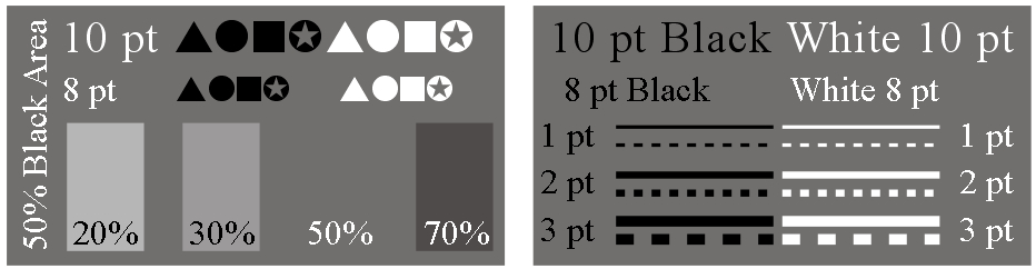
Back in the day when I was working at the University of Wisconsin Cartographic Lab we created graphic design guides with different size type, lines, and area shading. Such guides provide, for example, a quick idea of what 10 point black type over a 50% gray background looks like, and help to see design alternatives.
I include a simple monochrome graphic design guide in the Making Maps book in chapter 7, on intellectual and visual hierarchies (excerpt). Three downloadable versions of that guide are available below (in Illustrator, Freehand, and JPG formats).
