I was catching up on back issues of the magazine The Independent (the May 22, 1920 issue) and came across this historical tidbit entitled “These Maps Tell Lies.”

“An absolutely accurate and truthful map can be used in skillful hands to mislead the unwary. Only the crudest propagandists will distort his facts; it is far better to take the facts as nature gives them and present them in such a way to convey a false impression.”
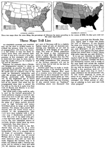
At this point in the article we turn to an evil Bolshevist propaganda cartographer, mapping the Soviet Union with a Mercator projection, using “Bolshevist red.”
“To the frightened eye it would seem that the Soviets now ruled about half of the planet.”
The frightened eye! Great name for a band.
“The chance that placed Bolshevism near the Arctic Circle was a godsend to the propagandist, who could have done nothing with a Mercator map if Bolshevism prevailed in India.”
Another example, illustrated, reveals the effects of changing the classification scheme and shading to play-up or play-down illiteracy rate data on a map of the U.S.
“It is not our intention to shake the reader’s faith in the cartographic presentation of statistics.”
“No one will be deceived if he will ask himself a few questions such as (1) Is this an equal area map or must I make allowance for the projection? (2) Is this writer thinking in terms of areas or of people? (3) Is this writer dealing with absolute figures or percentages? (4) What system of shading or coloring is here used and with what purpose?”
Sober advice for 1920.

If Bolshevism occurred in India, then the Peters projection would be suitable.
I had an interesting idea, how about using an oblique stereographic projection centered on the Antarctic peninsula, and show nearly the entire world. It would place the USSR at the outer rim of the map, greatly enlarged (and distorted), indicating that “no escape is possible”. The effect would be something like this: http://en.wikipedia.org/wiki/Image:StereographicProjectionTube.jpg