Click map for larger version; full version (7.3 mb PDF) here
The beauty of words on maps is often not evident, embedded, as they are, in an array of other symbols. A “word map” of South America (above), published by the Geographical Press in 1935, consists entirely of hand-lettered words. The map is supposed to show the labeled landforms of South America; this copy was erroneously printed without the landforms. The map is another find from the dusty old Departmental archives here at Ohio Wesleyan.
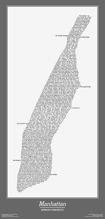
The South America word map is not that dissimilar from the word map poetry of Howard Horowitz: below, Manhattan:
A few examples of “word maps” or “typographic maps” have recently popped up on the internets.
National Geographic’s What’s in a Surname (below) interactive map of the dominant surnames in different parts of the US (upper Midwest, and Southwest) reveal structure (the form of the US is evident) as well as meaning (variations in ethnicity across the US).
Axis Maps Typographic Map series works in much the same way, but at a different scale and in a bit more complex manner:
Chicago Typographic Map (Axis Maps)
Boston Typographic Map (Axis Maps)
The Axis Typographic Maps use typography as line and area map symbols, providing a nuanced exposition of the geography of these places, the grid of Chicago or the meandering roads of Boston. Again, both meaning and structure are generated by words alone.
But back to the old South America map…
The South American map follows the typical “rules” about type placement, worked out in practice throughout the last few hundred years, and now embedded in cartography texts and in automatic text placement algorithms in GIS software. These rules will, in most cases, make the map easier to read and understand. On the excerpts of the South America map below
- City names are mixed caps/lower case, roman, and horizontal
- Country names are upper case, horizontal, and spread out to define the areas
- Natural features are in the more flowing italics form; if referring to a point, they are horizontal, if they refer to linear or area features (rivers, regions) they are curved to fit the feature.
In practice, placement is complicated, as words cross other words, wrap around each other, and (on most maps) vie for space with other map symbols. The South America map has some neat examples of the art of placing words on maps:
The size of the words varies – suggesting large areas, or places of more importance.
Below find a few pages from the new (2nd) edition of Making Maps (2011) on type as a map symbol. These pages show how typography can be used to express both qualitative and quantitative characteristics of the data they stand for on a map. Typographic guidelines on these pages include typeface (font), type size, type weight, and form (including italics, roman, color, case, and spacing).


[…] artykuł na: Word Maps | Words on Maps | Map Typography « Making Maps: DIY … consists-entirely, geographical, often-not, other-symbols-, south, south-america, symbols […]
Hi John,
Very cool post. I wish I had the time and tenacity to explore maps and mapping with you.
Ed Arabas
[…] This post was mentioned on Twitter by Design Democracy, Mahdi Rahimi. Mahdi Rahimi said: Making Maps: DIY Cartography: Word Maps | Words on Maps | Map Typography http://bit.ly/hv41zp […]
[…] moda de los mapas tipográficos amenaza con terminar por aburrir, o puede que se convierta en toda una clase de mapas ampliamente […]
One of the things I’ve always found interesting about cartography (and most non cartographers find somewhat paradoxical) is how much more complex a process placing type is than almost any other aspect of producing a map.
On crowded street maps type placement can be the most complex work done, having to find a way to properly and clearly place a large number of labels in a small area so they are all legible and do their job as description and symbol.
On less dense maps the problem is sometimes the abundance of freedom we have at placing or symbolizing the labels that consumes our time. Unlike most geographic features or political boundaries type has less fixed positions in the real world (and often no required fixed position). We are free to make any number of silly mistakes with our placement and style choices where in most other cases the feature itself will guide our choices. That freedom can be a real pain when all you want to do is finish the map! ;)
[…] 2, 3, 4, 5 Share this:Like this:LikeBe the first to like this post. « Previous […]
[…] DIY Cartography Typographic Maps Typo Maps […]
[…] să exprime cantitativ și calitativ caracteristicile datelor prezentate. Un ghid disponibil la Making Maps: DIY Cartography enumeră tipul de font, mărimea sau forma. Cel de-al doilea nivel este reprezentat de conținut, […]