Feeds:
Posts
Comments

Archive for the ‘03 Mappable Data’ Category

bomb-multiple.jpg

Google’s My Maps allows the easy creation of pseudo map mash-ups, where you can map your own data as points, lines, and area symbols with Google Maps as the background.

I wrote about My Maps – basic how-to and some of its limits – in another blog post, Allelopathic Maps & Google’s “My Maps.” One of the My Maps limits, the inadequate and corny set of available map symbols, has been removed: you can now create and use your own map symbols in My Maps.

To work with My Maps you need a Google account, and to use custom symbols (icons, as Google calls them) you need some server space to upload your symbols: you must provide a URL to the symbols. You should be able to find a free web hosting service that allows hot-linking (the placement of an image hosted on the free site in a My Maps map in this case). You can also embed images in the pop-up balloon associated with points, lines, and areas on My Maps, and you need server space to host those files.

In Custom Icons for Your Maps, a posting on the official Google Earth/Maps blog, PNG files with transparent backgrounds are recommended, although JPG and GIF should also work. PNGs and GIFs can have transparent backgrounds, essential if you don’t want a white box surrounding your symbol. As Google says PNG, lets PNG.

(more…)

Read Full Post »

animatedchoro.gif

Google Earth can display geographic data with a time component, and thus show animated maps. Animated mapping has garnered much attention among cartographers in the last decade.

I created a few Google Earth animated choropleth (literally, area-filling) maps of population change in Ohio. One map shows total population by county from 1900 to 2006. The other shows percent population change from decade to decade. Details on how I created these animated maps along with links to the downloadable KMZ files are below.

(more…)

Read Full Post »

The proliferation of mapping sites on the web provides ample fodder for critique by the map police (cartographic insiders). I usually feel a bit bad whining about the cartographic limitations of such sites. Cartographers have a history of obsessing with rules and such obsession has, arguably, limited creativity and undermined innovations. Bad cop. However, not following the rules does not necessarily produce creative and innovative mapping. I, for one, don’t entirely enjoy being the map police, but will try to at least be a good cop.

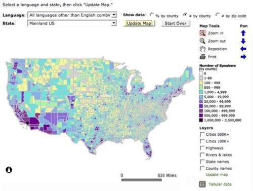
Lets look at a site that has been around awhile: The Modern Language Association’s Language Map. The site allows you map language data collected in the 2000 U.S. Census. A nice focused site with interesting data (I use it in my classes and the students enjoy pondering the patterns): here is the default map of the total number of language speakers in each county:

mla-totals.jpg

The basic language map allows you to view 33 different languages, mapped by county in the U.S. The total number of people who speak a particular language (above) can be mapped, but mapping totals can be deceptive, as the sizes of the counties vary. Thus a county may have more speakers of a particular language just because it covers more area than a smaller county. To account for these variations in county size, map the data as a percentage (the percent of people in a county that speak a particular language, see below). But you can map totals and there are sometimes good reasons to do so. Just realize the potential limitations of what you are seeing.

(more…)

Read Full Post »

« Newer Posts