The proliferation of mapping sites on the web provides ample fodder for critique by the map police (cartographic insiders). I usually feel a bit bad whining about the cartographic limitations of such sites. Cartographers have a history of obsessing with rules and such obsession has, arguably, limited creativity and undermined innovations. Bad cop. However, not following the rules does not necessarily produce creative and innovative mapping. I, for one, don’t entirely enjoy being the map police, but will try to at least be a good cop.
Lets look at a site that has been around awhile: The Modern Language Association’s Language Map. The site allows you map language data collected in the 2000 U.S. Census. A nice focused site with interesting data (I use it in my classes and the students enjoy pondering the patterns): here is the default map of the total number of language speakers in each county:
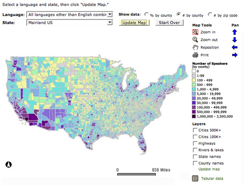
The basic language map allows you to view 33 different languages, mapped by county in the U.S. The total number of people who speak a particular language (above) can be mapped, but mapping totals can be deceptive, as the sizes of the counties vary. Thus a county may have more speakers of a particular language just because it covers more area than a smaller county. To account for these variations in county size, map the data as a percentage (the percent of people in a county that speak a particular language, see below). But you can map totals and there are sometimes good reasons to do so. Just realize the potential limitations of what you are seeing.
The basic map also allows you to map the data by state or zip code, and to add additional information (cities, roads, county & state names, etc.). The basic map does not allow you to change the classification scheme, and the arbitrary classification schemes the map uses are weird (but probably chosen so different maps can be compared to each other). Different classification schemes will produce different patterns, so take the patterns produced on these maps with a grain of salt: they will change if you (could) change the classification scheme. It would be also good to flip the legend, putting higher numbers (high =more) at the top of the legend, and lower numbers (low=less) at the bottom.
Here is the % by county map of the same data:

The symbolization of the county (or state or zip) boundaries on the map is annoyingly prominent. One of the Six Fancy Ideas (future post!) I took from Edward Tufte’s first book (The Visual Display of Quantitative Information, 2001) is to remove or minimize non-data ink, or, in this case, less important data-ink. This is a version of the old cartographic adage about visual hierarchies: stuff on your map that is more important should jump out, and stuff that is less important should fall back. The county boundaries (in gray) are so prominent that they obscure the data in smaller counties on the MLA map (at a national scale) and are certainly overly noticeable at all scales. Why not just make the boundaries white, and as fine as possible, so we can see the most important part of the map, the language data?
The map projection (the manner in which the surface of our 3D earth is flattened to 2D) is the plate carree, a typical default for web mapping software. Unfortunately, the plate carree distorts area (as you move north) thus this map projection is distorting the data. Dammit! Counties and states in the north are bigger than they should be in comparison to the counties and states in the south, which may distort your interpretation of the area patterns on the map.
Finally: map crap alert! Why include a north arrow when the vast majority of map viewers will recognize the U.S. and that north is up is? Why a scale bar showing 838 (?!) miles? Zoom in and you get 419 or 209 miles. Is anyone ever going to need to make measurements on this map? And the plate carree projection distorts distances anyway.
So: a decent, focused and useful site that could use a few tweaks. The MLA site also allows you to compare two language maps and play a bit with the data (in the Map Data Center).

John:
Fellow Penn Stater, here–I’d be quite interested in seeing that post on Tufte principles applied to cartography–especially as it might pertain to interactive web mapping.
Cheers,
Brian Timoney