
Posts Tagged ‘maps’
Making Maps now at makingmaps.substack.com
Posted in 01 What's A Map?, 02 Why Are You Making Your Map?, 03 Mappable Data, 04 Map-Making Tools, 05 Geographic Framework, 06 Map Layout, 07 Hierarchies, 08 Generalization & Classification, 09 Map Symbolization, 10 Type on Maps, 11 Color on Maps, 12 Finishing Your Map, tagged Cartography, data analytics, Denis Wood, Geographic Information Systems, geospatial, information design, John Krygier, Making Maps, maps on January 17, 2025| Leave a Comment »
Mapping Deeply by Denis Wood
Posted in 01 What's A Map?, 03 Mappable Data, Deep Map Thoughts, tagged deep mapping, Denis Wood, maps, maps and the humanities on August 11, 2015| 2 Comments »
Mapping Deeply by Denis Wood
This is a description of an avant la lettre deep mapping project carried out by a geographer and a number of landscape architecture students in the early 1980s. Although humanists seem to take the “mapping” in deep mapping more metaphorically than cartographically, in this neighborhood mapping project, the mapmaking was taken literally, with the goal of producing an atlas of the neighborhood. In this, the neighborhood was construed as a transformer, turning the stuff of the world (gas, water, electricity) into the stuff of individual lives (sidewalk graffiti, wind chimes, barking dogs), and vice versa. Maps in the central transformer section of the atlas were to have charted this process in action, as in one showing the route of an individual newspaper into the neighborhood, then through the neighborhood to a home, and finally, as trash, out of the neighborhood in a garbage truck; though few of these had been completed when the project concluded in 1986. Resurrected in 1998 in an episode on Ira Glass’ This American Life, the atlas was finally published, as Everything Sings: Maps for a Narrative Atlas, in 2010 (and an expanded edition in 2013).
Deep maps, deep mapping…
Yes, yes, but such a strange name for the practice. A practice that so often delivers far, far less than it promises. Especially maps. So many instances of deep mapping lack any at all.
Why mapping? Why not…thick description? Oh. Maybe because deep mapping is about place, while thick description is about…behavior? But aren’t the two all mixed up together? Isn’t that what deep mapping is supposed to be about—at least one of the things it’s supposed to be about—the unfolding of human life here, the mutual relations of people and soil and plants and animals and…go on, you name it…here in this…place?
Well, obviously I’m just trying to figure out why they call it deep mapping, when mapping isn’t what they are about, at all. They’re storytellers mostly, which is great, but mostly they’re not mappers. I’m talking about almost all of them, from William Least Heat-Moon to the most recent anthology of work on spatial narratives.
Not that you can’t tell stories with maps. You can. In fact, every map tells a story, stories actually, many of them. Even maps that people who don’t know much about maps call thin maps tell stories, ordinary, taken-for-granted maps, like highway maps, like the state highway map of North Carolina that John Fels and I spent fifty pages writing about back in 1986, and whose surface we barely scratched [1,2]. Thin maps…
Maps are models of concision, especially the ordinary taken-for-granted ones, cramming so many layers—so much history—into each line, into this line, for instance, this county border, the border of Wake County, first drawn in 1771 when the county was laid out of from parts of previously existing counties, but redrawn in 1787, 1881 and 1911, and named after Margaret Wake in 1771, the wife of William Tryon, then the colonial governor of North Carolina. All of this and so much more are caught up in that line that looks so simple but is anything but. And there’re a hundred counties on this highway map of North Carolina, which also sports state borders, coasts, highways, roads, cities, towns, parks, reservations, military bases, forests and other things. This map is not simple, this map. It’s not thin. It’s deep and thick. Most maps are like this.
A lot of them wield power too, great power. We think about maps as being representations of the world, but they’re not. They’re arguments about the world, and many of these arguments are serious. “High court to hear map challenge in August” reads the headline to an article on the second page of yesterday’s News and Observer [3]. A couple of days earlier, the lead editorial had been headed: “Rule on maps: the N.C. Supreme Court must quickly resolve a challenge to redistricting maps.” [4]. These maps are about who gets to vote in which districts, that is, are about whether Democrats or Republicans will reign in state government. This has huge consequences for the distribution of wealth, education, health, you name it.
Let’s not even think about the problems with immigration caused by the lines called national borders; or about the lines that bound school districts.
Some have more power than others, but all maps have it.
1. My Fight with Maps
My fight with maps, actually with cartography, was ignited by their rejection of modernism. As modernism was noisily turning its back on the failed rationalities, on the empty harmonies, on the make-believe coherences of Enlightenment, of Victorian thinking, cartography was clutching them ever more tightly to its breast. Painters may have been deconstructing pictorial space, composers shredding inherited tonalities, architects stripping walls of pilasters, cornices, and dentil moldings, poets following Pound’s cry to “Make it new”, and novelists indulging a self-consciousness that was all but the hallmark of the age, but cartographers, they were content to hone, to polish, to extend inherited forms.
Cartography exalted its unreflective empiricism as its raison d’être. It cherished the graphic conventions it had laid down in the 19th century. Even today, few maps acknowledge the 19th century’s over. This, despite the fact maps were never what they were claimed to be, never what the map themselves claimed to be: veridical and value-free pictures of reality. They were always arguments about the way the maps’ makers—or about the way those who paid the maps’ makers—thought the world should be.
With modernism came a predisposition for resistance and smashing traditional forms, for going someplace stripped down, someplace essential, someplace real, for asking, Why not? I long felt around for a new map that wasn’t of the same old subjects, that didn’t have the same old forms, that looked and felt modern. Schoenberg wanted to emancipate the dissonance. Arp wanted to destroy existing modes of making art. Fifty years later, I wanted to destroy the existing ways of making maps through which millions were subjugated, herded, and all too often killed. I wanted to emancipate dream and desire as subjects of the map.
Hard to do in geography: it was nearly as hidebound as cartography.
But when I found myself teaching landscape architecture studios in the School of Design at North Carolina State University, I found my opportunity. I knew nothing about landscape architecture. I knew less about studios, about how they worked, about what they were supposed to do. However, I figured landscape architects needed to know something about the environment in which they were working, and I figured that making maps might be a good way to learn—to discover—what it was they needed to know. So I set the first studio I taught—well, I set the students—the task of mapping a nearby neighborhood. The thing was, these were design students. They were undergraduate design students.
They had had little professional training (they weren’t hidebound). They were wildly creative (which is why they had entered the School of Design). They knew nothing about the conventions of making maps (they were blank slates). So when I set them tasks like mapping sounds, or making maps from the perspective of bees, or constructing maps out of food they leaped at them like, like frolicking gazelles! They were all over these projects. They made the most amazing things.
I kept none of the maps. I mean, there were always more studios, more students, more maps. However, in a studio I co-taught with Robin Moore in the spring of 1982, we decided to make an atlas, a neighborhood atlas, an atlas we could reproduce on a copy machine, that we could distribute to the neighbors when we had finished. This meant the work had to make sense in black and white (in the early 1980s, color copy machines barely existed, and landscape architecture students loved to use colored markers), and it had to make sense to the neighbors (and so not be completely off-the-wall). This did not mean it had to be mapmaking the way these grad students had come to know it (and they were much more hidebound than the undergrads). That I was adamant about. But it didn’t matter what they were mapping: I couldn’t get them to leave the streets off their maps.
I was trying to get them to map the way the land smelled, the way it felt in their legs when they walked it, the way twilight made all the difference. I wasn’t sure what the streets had to do with any of these, but the streets were an irreducible subject in the eyes of these students, the whatever-it-was that made the neighborhood a neighborhood. If you’re going to be laying out subdivisions, which a lot of these students would be doing professionally, streets are really all you have to play with. I got that, but at the same time, the streets did seem to inhibit the other qualities I was trying to draw the students’ attentions to. No matter how far into the background they intended the streets to recede, somehow they always stood out front.
Then, once when we were working on a map of streetlights, we just kept paring away the non-streetlights. We dumped the map crap (the neat line, the scale, the north arrow), the neighborhood boundaries, and the topography. Finally, we dumped the streets: first the scaled streets, then a schematic grid of the streets, finally even a hint of a grid of the streets. Daylight went too—that default daylight that most maps take for granted—so that we were fooling around with circles of white on a black background. That’s when it became clear that the map wasn’t about lamp posts, but about lamp light, and light was something we weren’t sure how to deal with. Certainly, the uniform white circles we’d been drawing caught nothing of the way the light was fringed by the trees; and one night, armed with a camera, we scaled a fence and climbed a radio tower on the edge of the neighborhood hoping to catch the night lights on film. What a disappointment. The view from above was nothing like walking in and out of the pools of dappled light on the streets below. But I had a pochoir brush at home and when Carter Crawford—who had put himself in charge of atlas graphics—used it to draw the circles, it was magical (Figure 1). Nothing but blotches of white: that was the way it felt to be walking the streets at night.
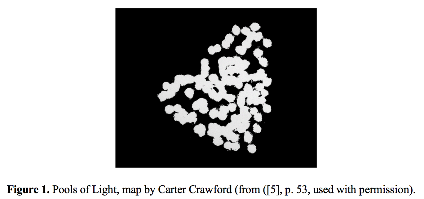
The usual “efficient” map would have located everything on the street onto a single sheet—that is, different marks for lamp posts, fire hydrants, street signs, trees. Our inefficient map concentrated on a single subject and rather than lamp posts, it brought the pools of light into view. No legend, no north arrow, no neat line, none of the usual apparatus. At last: a modernist feel! Maybe even a sense of poetry, something imagistic, a little like Pound’s “The apparition of these faces in the crowd;/Petals on a wet, black bough” [6] or Williams’s red wheel barrow, but as it might manifest on a map, a map attentive to the experience of place [7].
That’s when I knew we could write poems in maps. That’s when I began thinking seriously about a poetics of cartography.
2. Making Maps
Once we got to this point, we started wanting to map everything. …
…Continue reading & footnotes & sources: PDF of article (here) and at Humanities — Open Access Journal (here – full text link on upper left)
Denis Wood’s Dissertation – I Don’t Want To But I Will (PDF)
Posted in 01 What's A Map?, 02 Why Are You Making Your Map?, 03 Mappable Data, 04 Map-Making Tools, Advocacy Maps, Deep Map Thoughts, tagged Cartography, Denis Wood, maps, Mental Mapping, psychogeography on March 27, 2012| 8 Comments »

I Don’t Want To But I Will: Title Page of Denis Wood’s Dissertation
Throughout graduate school I heard tales of the Denis Wood’s outrageous dissertation, curiously titled I Don’t Want To But I Will. Of particular interest are the scathing Acknowledgments, where Denis took his advisors to task. A worn copy of the Acknowledgments was passed among grad students as a bit of intellectual contraband.
But the content was what was most important. It’s a crazy dissertation. It’s about maps, mental maps, getting kicked off a bus, psychogeography, single element veridicality analysis, Europe, cartography, Kevin Lynch, passed-out subjects, Peter Gould, psychogeomorphology, the Shirelles, and the invention of “Environmental a” – a language for mapping. Among other things. It is driving the wrong way down the one-way-street of academia.
The dissertation was printed in a very limited number by the Clark University Cartographic Laboratory. Denis has recently made available a PDF of this never-really-in-print gem. I have reproduced Denis’ comments on the different chapters in the dissertation, along with links to the entire document and each chapter, from his web pages (here).
••••••••••
I DON’T WANT TO, BUT I WILL
By Denis Wood
1973
Download it by chapters (below) or as a single 685-page document.
The front matter, including the dedication (by the Shirelles), the notorious acknowledgements (my unhelpful faculty and the rare humans), credits (as in a movie), and Introduction (opening with Ed’s story, a night watchman on the edge of Castle Hill park, and going on to talk about psychogeography and various kinds of mental maps).
PART I: Psyching Up for the Trip (a sort of philosophy section).
Chapter 1: The Beginning of All This (“How would you like to go to Europe this summer?” Bob Beck asked me; and the design of the study).
Chapter 2: Some Relevant Ancestors (individual, consensual, and standard mental maps, Peter Gould, and Kevin Lynch; or, what passes in the trade for the “review of the literature”).
Chapter 3: The Study Tools (Bob and I invent Environmental a, a mapping language).
Chapter 4: The Study Starts Before the Trip (long-distance training in Environmental a and the “predictive morphologies” of London, Rome, and Paris).
PART II: The Trip or Denis’ Inferno (the novelesque part).
Chapter 5: What Others Have Thought of Travel (a bouquet of quotations about travel).
Chapter 6: A Terminal Wet Towel (Bob and I meet the Group L kids at Kennedy and what happens after that).
Chapter 7: A Day on a Tour (the first day: I will show you blood in a handful of data).
Chapter 8: Down and Out in London (the week in London).
Chapter 9: Parnassus in Innsbruck (and one of the kids ODs or, well, just passes out).
Chapter 10: When in Rome, Don’t Do as I Did (in which I get drunk and kicked off the bus).
Chapter 11: Kid’s Lib, or Aristocracy in Exile (in which the kids take control of the research and collect all the Paris data).
Chapter 12: Old Tours Never Die, They Just Fade Away (in which, months later, a bunch of us get together again for a weekend in New York).
PART III: After the Trip; or What’s in Klein’s Bottle (the “science” part of the dissertation).
Chapter 13: Tripping and Tracing through the Data (trace events; or the crumbs of the cookies left for Santa).
Chapter 14: The Content of the Tour (applying Lynchian content analysis to the traces left by the Group L kids).
Chapter 15: Travel Connections (or trying to wrap graph theory around the kids sketch maps).
Chapter 16: Hanging Out the Rivers to Dry (trying to read the maps through something I called single element veridicality analysis).
Chapter 17: Pagan Curves, Lincoln Variations, and Eber Aberrations (or the quest for the warped space of human experience and psychogeomorphology).
Chapter 18: Bigger is Better – Or Worse (you draw what you feel; or, the analysis of the areal and feelin overlays).
Chapter 19: You Are Where You Sit (the analysis of the bus seating charts and their relation to the maps; or, Fixers, Mixers, and Rangers).
Chapter 20: That’s the End of the Movie! ! ? ? ! ? ? (which is a whole long list of “conclusionettes” that concludes, “That the subject can have the first, last and most comprehensive word on the subject of the investigation itself, specifically that: I DIDN’T WANT TO, BUT I DID.”
A Crooked Stick Straightened: Map Making as Juvenile Delinquent Reform
Posted in 02 Why Are You Making Your Map?, Deep Map Thoughts, Map History, tagged Making Maps, maps, Maps-Bad Boys, Maps-Reformatory, Maps-School Marms on November 17, 2010| 1 Comment »
From a slouching, unkempt, uncouth, shambling, horrid boy, he emerged into being a respectable, neat, tidy, order-loving, painstaking, and industrious young man.
– Miss Winthrop, 1888

I had an ugly, unruly boy in my room, and be gave me more trouble than all the rest of the class. When I inherited him I felt as if Nemesis had overtaken me, and just how to control him and secure any kind of work from him was a problem I long wrestled with.
For several weeks he was the terror of the room, and my reputation for good order and dignity was, I felt, fast disappearing. The boy would not obey unless he felt like it, and punishments had no effect on him. Every plan I evolved for the regeneration of the boy proved abortive. He wouldn’t reform. Finally, by accident, I stumbled on the cure.

I discovered that he was interested in his drawing, or rather was interested in sketching odd bits of scenery, or objects in the room, not even omitting his respected teacher, who was a typical schoolmarm and wore glasses. I resolved to make the most of this one talent – if talent it was – and so one day, when I was in my best and sweetest mood, I asked the terror if he would not draw a plan for some shelves I wanted put up in my closet. He assented, and the sketch was neatly and accurately made. There was a new look in his eyes and a new expression on his face when he gave me the paper on which his drawings were made.


Then I advanced slowly and cautiously. I needed some maps made, following a new invention of mine in cartography, and again I employed the terror, and again the result was encouraging. The maps were models of neatness and precision. I judiciously praised him, and exhibited the maps to the class.

We were studying the continent of Asia, and the terror never had his geography lesson learned; but when I suggested that if he were to keep up his reputation in drawing he must draw the details of the county he was sketching, geography became a new study to him, and he easily wade excellent progress in this branch.
The terror came out of his chrysalis state a new creature. His old ways were left, and he readily adopted the better method of doing and living. From a slouching, unkempt, uncouth, shambling, horrid boy, he emerged into being a respectable, neat, tidy, order-loving, painstaking, and industrious young man.
•••••••••••••••••••••••••••••••••••••••••••••••••••••••••••••••••••••••••••••••••••••
Text:
- Miss Winthrop, “A Crooked Stick Straightened,” American Teacher, 1888 (reprinted in Scientific American, November 26, 1887, Vol. LVII., No. 22., pg. 346)
Illustrations:
- Sighting Along the Ruler: The Youth’s Companion, August 8, 1918
- Map of Two Brooks Farm: The Youth’s Companion, Aug 12, 1915
- Wisconsin, Massachusetts, Asia: Lenore Congdon Schutze, Schutze’s Amusing Geography and System of Map Drawing (San Francisco, 1900)
Out Now | Denis Wood | Everything Sings
Posted in 01 What's A Map?, 03 Mappable Data, 09 Map Symbolization, Map Books, Maps Made, tagged Atlas, Cartography, Critical Cartography, Denis Wood, Making Maps, maps, Participatory Mapping, Raleigh NC on October 26, 2010| 3 Comments »
Denis Wood’s Everything Sings: Maps for a Narrative Atlas
Now shipping from Siglio Press
Use discount code PUMPKIN for 20% off until November 12, 2010
Three maps from Everything Sings are below
Sidewalk Graffiti | Wind Chimes | Radio Waves
•••••

Sidewalk Graffiti (detail)
Scratched, scrawled, or stamped into drying concrete—mostly from the 60s into the 80s—is a fragmentary and tragically conventional body of folklore.

Sidewalk Graffiti (click to enlarge)
•••••

Wind Chimes (detail)
When we did the house types survey, we also paid attention to the presence of wind chimes. They were all over—bamboo, glass, shell, metal tubes. Depending on where you stood, the force of the wind, and the time of day, you could hear several chiming, turning the neighborhood into a carillon.

Wind Chimes (click to enlarge)
•••••

Radio Waves (detail)
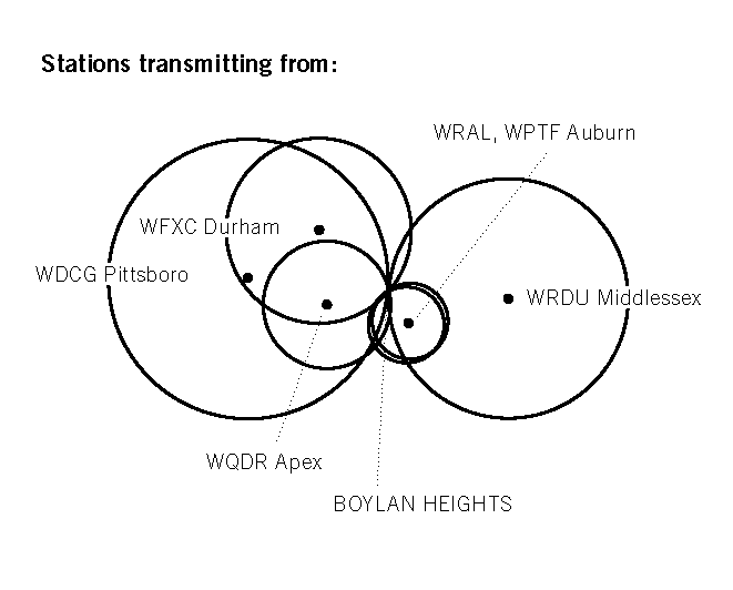
Unlike the wave fronts of wind chimes which—requiring a lot of energy to move the air molecules—never get very large, radio waves don’t propagate in air. They propagate in space and travel undisturbed through non-metallic objects like house walls and bodies. Depending on the location of the transmitter, their wave fronts can be enormous, yet they pass through the neighborhood silently, unfelt, and unnoticed, unless tuned into. In the mid-1980s, Boylan Heights listened mostly to a mix of Top 40, Oldies, Country, R&B, and talk radio on six radio stations: WDGC transmitting from Pittsboro, WFXC from Durham, WQDR from Apex, WRDU in Middlesex, WRAL and WPTF from Auburn. As the neighborhood has changed, so have the radio stations it listens to. Today, it’s mostly NPR broadcast by WUNC in Chapel Hill.
![]()
In the key, Boylan Heights is the point of tangency of these six fronts of radio waves. On the map, you can see which waves belong to which stations by their shape and direction. Because radio waves are concave to their point of origin, a wave concave to the lower right (southeast) is coming from Auburn, and one concave to the upper left (northwest) is from Durham. The degree of curvature depends on the size of the wave front and its distance from the source: the straighter the line, the farther away the transmitter. (Sensible curvature decreases with size which is why the earth seems flat.) These wave fronts, ever expanding, make different patterns in other places.Radio waves also come from the stars. Their wave fronts are effectively flat and they come from every direction, silently, unfelt, and unnoticed.

Radio Waves (click to enlarge)
•••••
“There were no maps before 1500” | Denis Wood | New Book | Rethinking the Power of Maps
Posted in 01 What's A Map?, 02 Why Are You Making Your Map?, Advocacy Maps, Deep Map Thoughts, Map Books, Map History, tagged Cartography, Critical Cartography, Denis Wood, maps, maps - theory, The Power of Maps on August 30, 2010| 1 Comment »

Denis Wood’s followup to his classic The Power of Maps (1992) is almost entirely new in content. I have included the book’s table of contents below. A PDF copy of chapter 1 is included. This chapter argues, provocatively, “there were no maps before 1500” – a serious challenge to our assumptions about the map as a human and historical universal.
I. Mapping
1. Maps Blossom in the Springtime of the State (PDF)
2. Unleashing the Power of the Map
3. Signs in the Service of the State
4. Making Signs Talk to Each Other
II. Counter-Mapping
5. Counter-Mapping and the Death of Cartography
6. Talking Back to the Map
7. Map Art: Stripping the Mask from the Map
8. Mapmaking, Counter-Mapping, and Map Art in the Mapping of Palestine
From the publisher: “Denis Wood shows how maps are not impartial reference objects, but rather instruments of communication, persuasion, and power. By connecting us to a reality that could not exist in the absence of maps – a world of property lines and voting rights, taxation districts and enterprise zones – they embody and project the interests of their creators.”
Nicholas Chrisman, Department of Geomatic Sciences, Université Laval, says: “Rethinking the Power of Maps sharpens the argument of Wood’s earlier work and focuses its attention on the construction of power. Every student of cartography should take notice.”
Chris Perkins of the University of Manchester says: “In an age when mapping is sexy again Wood explains why it should matter to everyone, explores how maps came to be deployed by states, and how the authority of the image is now being used by many different voices. This is a carefully developed humanist argument for a critical approach to mapping, strongly academic, but reassuringly accessible. Denis Wood’s work always challenges – the passionate style and panache of his scholarship carries the reader along and persuades us to listen to his original ideas.”
Flies on a Map
Posted in 01 What's A Map?, 09 Map Symbolization, Map Cartoons, Map History, tagged Cartoons, maps, Maps - Africa, Maps - cartoons, Maps - Flies on April 14, 2009| 1 Comment »

Don’t you think we’d better skidoo? They say this part of the map won’t be safe for big game this year.”
Life, February 4, 1909
Map Symbols: Landforms & Terrain
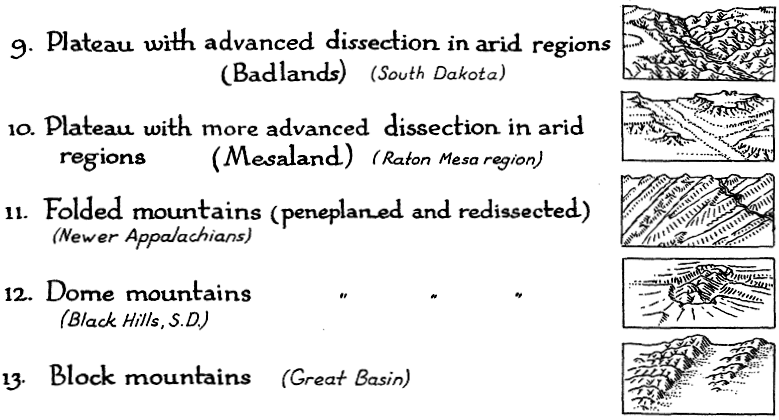
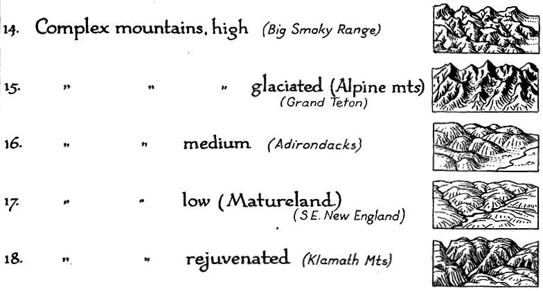
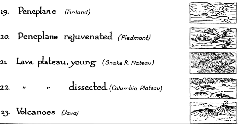
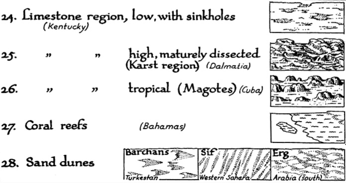
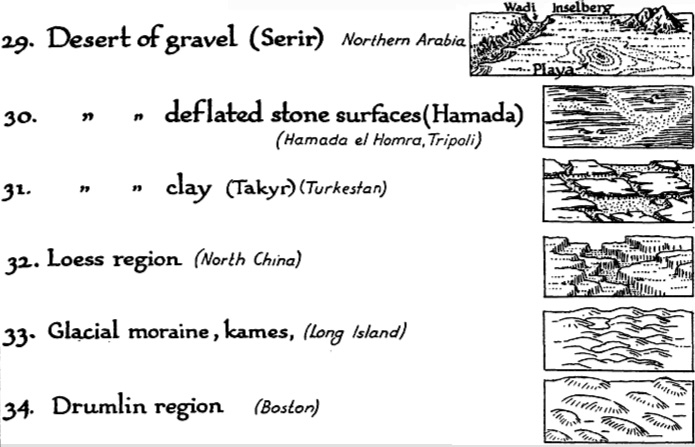
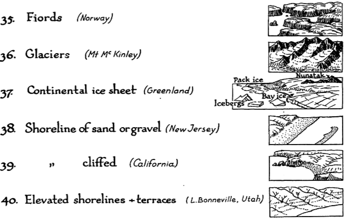
Posted in 03 Mappable Data, 09 Map Symbolization, Map History, tagged Cartographic Design, Cartography, landform maps, Map Design, map symbols, maps, scenery on maps, terrain maps on April 3, 2008| 16 Comments »
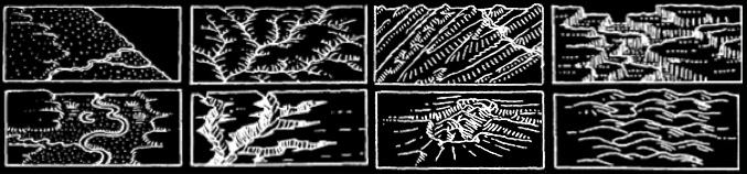
Erwin Raisz is among the most creative cartographers of the 20th century, known in particular for his maps of landforms.
In 1931 Raisz outlined and illustrated the methods behind his landform maps, in an article in the Geographical Review (Vol. 21, No. 2, April 1931). Excerpts from the text and graphics in the article are included below.
Raisz’s approach is to create complex pictorial map symbols for specific landform types. Each specific application, of course, would have to modify the symbols to fit the configuration of particular landforms.
One of the limitations of Raisz’s work is that it is so personal and idiosyncratic that it virtually defies automation or application in the realm of computer mapping. Thus digital cartography has, in some cases, limited the kind of maps we can produce.
Raisz writes:
There is one problem in cartography which has not yet been solved: the depiction of the scenery of large areas on small-scale maps.


Most of our school maps show contour lines with or without color tints. Excellent as this method is on detailed topographic sheets … it fails when it has to be generalized for a small-scale map of a large area. Nor does the other common method, hachuring, serve better.
For the study of settlement, land utilization, or any other aspect of man’s occupation of the earth it is more important to have information about the ruggedness, trend, and character of mountains, ridges, plains, plateaus, canyons, and so on-in a word, the physiography of the region.
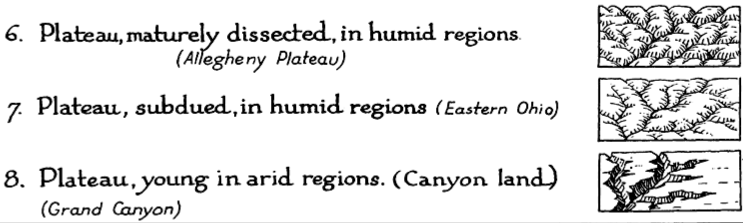
Our purpose here is to describe and define more closely a method already, in use, what we may call the physiographic method of showing scenery. This method is an outgrowth of the block diagram. [T]he method was fully developed by William Morris Davis. Professor Davis has used block diagrams more to illustrate physiographic principles than to represent actual scenery.
Professor A. K. Lobeck’s Physiographic Diagram of the United States and the one of Europe do away entirely with the block form, and the physiographic symbols are systematically applied to the vertical map. His book Block Diagrams is the most extended treatise on the subject.
It is probable that the mathematically-minded cartographer will abhor this method. It goes back to the primitive conceptions of the early maps, showing mountains obliquely on a map where everything should be seen vertically. We cannot measure off elevation or the angle of slope. Nevertheless, this method is based on as firm a scientific principle as a contour or hachure map: the underlying science is not mathematics but physiography.
If we regard the physiographic map as a systematic application of a set of symbols instead of a bird’s-eye view of a region, we do not violate cartographic principles even though the symbols are derived from oblique views instead of vertical views. It may be observed that our present swamp symbols are derived from a side view of water plants.
••••••
Landform map symbols include: plains (sand & gravel, semiarid, grassland, savannah, forest, needle forest, forest swamp, swamp, tidal marsh, cultivated land), coastal plain, flood plain, alluvial fans, conoplain, cuesta land, plateau (subdued, young, dissected), folded mountains, dome mountains, block mountains, complex mountains (high, glaciated, medium, low, rejuvenated), peneplane, lava plateau (young, dissected), volcanoes, limestone region (with sinkholes, dissected, karst, tropical, mogotes), coral reefs, sand dunes, desert of gravel (serir), deflated stone surfaces (hamada), clay (takyr), loess region, glacial moraine, kames, drumlin region, fjords, glaciers, shoreline (sand, gravel, cliffed), and elevated shorelines & terraces.
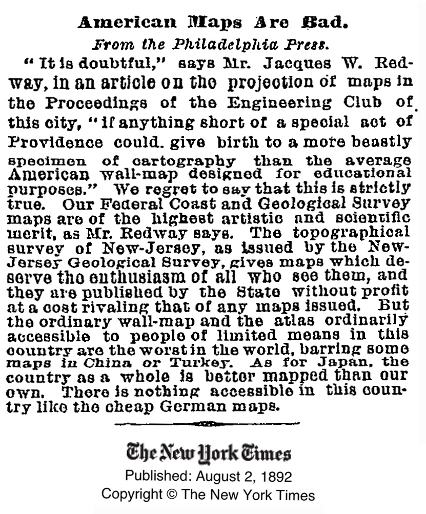
American Maps Are Bad
Posted in 02 Why Are You Making Your Map?, 12 Finishing Your Map, Bad Maps, Map History, tagged Bad Maps, Cartography, maps, Wall maps on March 18, 2008| Leave a Comment »
From the New York Times, August 2, 1892:
American Maps Are Bad
“It is doubtful,” says Mr. Jacques W. Redway, in an article on the projection of maps in the Proceedings of the Engineering Club of this city. “if anything short of a special act of Providence could give birth to a more beastly specimen of cartography than the average American wall-map designed for educational purposes.” We regret to say that this is strictly true. Our Federal Coast and Geological Survey maps are of the highest artistic and scientific merit, as Mr. Redway says. The topographical survey of New-Jersey, as issued by the New-Jersey Geological Survey, gives maps which deserve the enthusiasm of all who see them, and they are published by the State without profit at a cost rivaling that of any maps issued. But the ordinary wall-map and the atlas ordinarily accessible to people of limited means in this country are the worst in the world, barring some maps in China or Turkey. As for Japan, the country as a whole is better mapped than our own. There is nothing accessible in this country like the cheap German maps.
Thank God for the bad maps of China and Turkey.
Original article:
Map Songs: Longitude and Latitude Song
Posted in 05 Geographic Framework, 13 Multimedia Mapping, Map Music, tagged Cartography, latitude, longitude, Map Music, maps, Singing Science on February 27, 2008| 8 Comments »
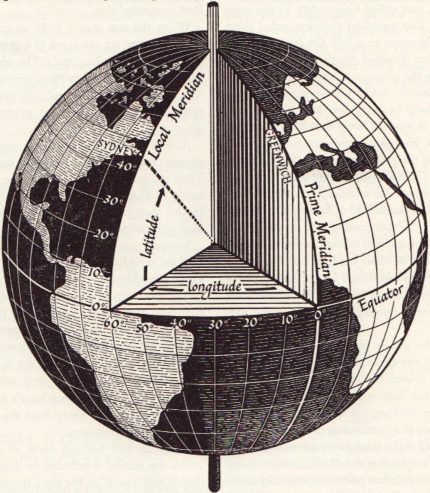
Maps and cartography are not particularly popular as song themes.
But there is the Longitude and Latitude Song (MP3 file here). Careful or you’ll be singing this one out loud in your cubicle.
Performed by Tom Glazer and Dottie Evans, and written by Hy Zaret, the song is one of a series of sciency tunes, aimed to inspire Sputnik-era kiddies, on the Space Songs album, recorded in 1959.
Jeff Poskanzer’s terrific Singing Science web page has all the tracks from Space Songs, as well as the tracks from subsequent albums Energy and Motion Songs (“Ultraviolet and Infrared”), Experiment Songs (“We Know the Air is There”), Weather Songs (“The Water Cycle Song”), Nature Songs (“Song of the Rocks”), and More Nature Songs (“What is an Animal”).
Absent from the albums are other potential map songs: “Which Datum Do You Use?” “Project Me,” “The Large Scale/Small Scale Polka,” “Your Love is like a Decorative Font,” “She’s Natural Breaks, I’m Quantiles,” and “The Symbols of my Love are Abstract Shapes in a Selection of Different Hues Corresponding to Qualitative Data Variation.” I’ll stop now.
A quick search of a few open-source music databases (FreeDB and MusicBrainz) results in hundreds of songs with map in the title. Not many latitude/longitude songs, though. There are also quite a few mappy band names: The Maps, Swell Maps, Maps and Diagrams, Maps of the Heart (blah!), Maps and Atlases, Relief Maps, The Plat Maps, Map, Map of Wyoming, Map of the World, Town Map, The Map, Map of Africa, Map of Hell, Penguin Map Mijinko, The Search Map, Book of Maps, Minus a Map, Map the Growth, Map of July, Days without Maps, Mind Maps, Maps of Norway, and Not on the Map.
The potentially evil, formerly-open-source music database Gracenote has a moderately interesting Music Maps page, which uses recent CD lookup data to map the geography of popular music.
And, of course, the excellent World Beat Music map of the world over at Strange Maps.
Latitude/longitude graphic from David Greenhood’s classic book Mapping.
