
Posts Tagged ‘Cartography’
Making Maps now at makingmaps.substack.com
Posted in 01 What's A Map?, 02 Why Are You Making Your Map?, 03 Mappable Data, 04 Map-Making Tools, 05 Geographic Framework, 06 Map Layout, 07 Hierarchies, 08 Generalization & Classification, 09 Map Symbolization, 10 Type on Maps, 11 Color on Maps, 12 Finishing Your Map, tagged Cartography, data analytics, Denis Wood, Geographic Information Systems, geospatial, information design, John Krygier, Making Maps, maps on January 17, 2025| Leave a Comment »
Denis Wood’s Dissertation – I Don’t Want To But I Will (PDF)
Posted in 01 What's A Map?, 02 Why Are You Making Your Map?, 03 Mappable Data, 04 Map-Making Tools, Advocacy Maps, Deep Map Thoughts, tagged Cartography, Denis Wood, maps, Mental Mapping, psychogeography on March 27, 2012| 8 Comments »

I Don’t Want To But I Will: Title Page of Denis Wood’s Dissertation
Throughout graduate school I heard tales of the Denis Wood’s outrageous dissertation, curiously titled I Don’t Want To But I Will. Of particular interest are the scathing Acknowledgments, where Denis took his advisors to task. A worn copy of the Acknowledgments was passed among grad students as a bit of intellectual contraband.
But the content was what was most important. It’s a crazy dissertation. It’s about maps, mental maps, getting kicked off a bus, psychogeography, single element veridicality analysis, Europe, cartography, Kevin Lynch, passed-out subjects, Peter Gould, psychogeomorphology, the Shirelles, and the invention of “Environmental a” – a language for mapping. Among other things. It is driving the wrong way down the one-way-street of academia.
The dissertation was printed in a very limited number by the Clark University Cartographic Laboratory. Denis has recently made available a PDF of this never-really-in-print gem. I have reproduced Denis’ comments on the different chapters in the dissertation, along with links to the entire document and each chapter, from his web pages (here).
••••••••••
I DON’T WANT TO, BUT I WILL
By Denis Wood
1973
Download it by chapters (below) or as a single 685-page document.
The front matter, including the dedication (by the Shirelles), the notorious acknowledgements (my unhelpful faculty and the rare humans), credits (as in a movie), and Introduction (opening with Ed’s story, a night watchman on the edge of Castle Hill park, and going on to talk about psychogeography and various kinds of mental maps).
PART I: Psyching Up for the Trip (a sort of philosophy section).
Chapter 1: The Beginning of All This (“How would you like to go to Europe this summer?” Bob Beck asked me; and the design of the study).
Chapter 2: Some Relevant Ancestors (individual, consensual, and standard mental maps, Peter Gould, and Kevin Lynch; or, what passes in the trade for the “review of the literature”).
Chapter 3: The Study Tools (Bob and I invent Environmental a, a mapping language).
Chapter 4: The Study Starts Before the Trip (long-distance training in Environmental a and the “predictive morphologies” of London, Rome, and Paris).
PART II: The Trip or Denis’ Inferno (the novelesque part).
Chapter 5: What Others Have Thought of Travel (a bouquet of quotations about travel).
Chapter 6: A Terminal Wet Towel (Bob and I meet the Group L kids at Kennedy and what happens after that).
Chapter 7: A Day on a Tour (the first day: I will show you blood in a handful of data).
Chapter 8: Down and Out in London (the week in London).
Chapter 9: Parnassus in Innsbruck (and one of the kids ODs or, well, just passes out).
Chapter 10: When in Rome, Don’t Do as I Did (in which I get drunk and kicked off the bus).
Chapter 11: Kid’s Lib, or Aristocracy in Exile (in which the kids take control of the research and collect all the Paris data).
Chapter 12: Old Tours Never Die, They Just Fade Away (in which, months later, a bunch of us get together again for a weekend in New York).
PART III: After the Trip; or What’s in Klein’s Bottle (the “science” part of the dissertation).
Chapter 13: Tripping and Tracing through the Data (trace events; or the crumbs of the cookies left for Santa).
Chapter 14: The Content of the Tour (applying Lynchian content analysis to the traces left by the Group L kids).
Chapter 15: Travel Connections (or trying to wrap graph theory around the kids sketch maps).
Chapter 16: Hanging Out the Rivers to Dry (trying to read the maps through something I called single element veridicality analysis).
Chapter 17: Pagan Curves, Lincoln Variations, and Eber Aberrations (or the quest for the warped space of human experience and psychogeomorphology).
Chapter 18: Bigger is Better – Or Worse (you draw what you feel; or, the analysis of the areal and feelin overlays).
Chapter 19: You Are Where You Sit (the analysis of the bus seating charts and their relation to the maps; or, Fixers, Mixers, and Rangers).
Chapter 20: That’s the End of the Movie! ! ? ? ! ? ? (which is a whole long list of “conclusionettes” that concludes, “That the subject can have the first, last and most comprehensive word on the subject of the investigation itself, specifically that: I DIDN’T WANT TO, BUT I DID.”
2nd Edition | Making Maps | Early 2011
Posted in Making Maps Book News, Map Books, Maps Made, tagged Cartography, Denis Wood, Geographic Information Systems, GIS, Graphic Design, John Krygier, Making Maps, Making Maps - book - second edition, Map Design, Map texts, Visualization on December 15, 2010| 4 Comments »

Cover, Making Maps, 2nd edition (Amazon | Guilford)
Krygier and Wood’s book should be used by anyone interested in the way the world looks, the way the world works, or the way the world should be. It remains the most accessible yet comprehensive guide of its kind. The second edition meets the needs and expectations of the “Google generation” of map users while remaining true to the guiding principles that govern how maps look, work, and function. The very accessible, extensively illustrated format makes the book easily usable by students at all levels, as well as those taking steps to develop expertise in cartographic design. Paul Longley, Department of Geography, University College London, United Kingdom.
Building on their solid first edition, Krygier and Wood have created a new and much richer follow-up. The second edition represents a serious reworking of subject matter and graphics. The book uses extraordinary map exemplars to address the full range of basic cartographic concepts and to demonstrate many subtle and advanced design techniques as well. Making Maps is appropriate for beginning to intermediate college cartography students and others who want to tap into the power of map creation. Addressing current social issues including map agendas, ethics, and democracy, it is the kind of book that will inspire readers and cultivate admiration for the field. James E. Meacham, Senior Research Associate and InfoGraphics Lab Director, Department of Geography, University of Oregon.
More than two years in the making, the second edition of the book Making Maps is set for printing. Copies should be available in February or March of 2011. A Korean translation (?!) is planned for 2012.
This is no weenie update: Denis and I ruthlessly reorganized and rethought every bit of content in the book. I then redesigned the entire book and spent the better part of eight months producing it. We both think it’s a much better book.
Denis and I were careful to keep the spirit of the first edition of Making Maps intact while sharpening the overall look, content, and usability of the book. The goal from the beginning was to create a map design text that was different from other map design texts – more visual, creative, critical, engaging, and focused on making maps as well as really understanding how they work. It is a synthesis of what we like most about the academic study of maps and the actual design and production of maps. It is difficult to express how complex and challenging achieving this goal has been. When I look at this new edition, it feels so easy. Why couldn’t we have just done this 8 years ago when I started on the initial edition of the book?
The 2nd edition is larger in size (now 7″ x 10″) allowing more content on each page. In a Tuftean fit of non-data-ink removal, gone are a bunch of pages that didn’t have much content (such as the overview pages near the beginning of each chapter). We did retain ample white space, since absence makes the heart fonder.
We also added new material, including many real mapped examples, yet we are dozens of pages shorter than the first edition. Our goal was a lean book – “the greatest number of ideas in the shortest time with the least ink in the smallest space” – as Tufte put it.
The cover initiates an expanded version of the “road connector controversy” which sets up the point of the book – you make things happen by making maps.


There is a completely new first chapter setting the context for the entire book. It introduces The Flight of Voyager map, which is annotated a dozen times over throughout the book showing how map design concepts in the text play out on an actual map:

The chapters in the book are about the same, with a new first chapter and some recast chapter names:
Introduction
1: How to Make a Map
2: What’s Your Map For?
3: Mappable Data
4: Map Making Tools
5: Geographic Framework
6: The Big Picture of Map Design
7: The Inner Workings of Map Design
8: Map Generalization and Classification
9: Map Symbolization
10: Words on Maps
11: Color on Maps
While some chapters retain a significant amount of the original edition’s material, chapters 6 and 7 were extensively revised.
A makingmaps.net blog posting “How Useful is Tufte for Making Maps?” led me to incorporate Tufte’s ideas in the book in a much more explicit manner than in the 1st edition. See, for example, the Tufte-influenced annotated Flight of Voyager map (2 page spread, chapter 6) below:

Chapter 7 was revised as “The Inner Workings of Map Design” including figure ground:

Chapter 9 on map symbols also underwent significant renovations:


•••••••••••••••
Making Making Maps … Second Edition
I am but slightly embarrassed to admit that, once again, I produced the entire book in a 6-year-old version of the now defunct Freehand MX software. My original plan was to shift to InDesign since I was redesigning the entire book, but in the end I just wanted to make the damn book rather than futzing with transferring the maps and graphics from Freehand to InDesign and learning the ins and outs of InDesign. So my plan is to eventually shift the entire book to InDesign assuming a 3rd edition sometime in the future.
The book was produced on my 4-year-old MacBook Pro, which allowed me to work on it at home on the dining room table, at home on the table on our front porch (where Denis and I had earlier sat and pounded through the plan for the 2nd edition), at CupOJoe coffee at the end of the block, at Panera while waiting to pick up Annabelle after her morning pre-school, at soccer practice at some god-forsaken indoor soccer warehouse in the hellish outer suburbs of Columbus, in Raleigh NC whilst visiting Denis to work on the book, at the OSU recreation center with the climbing wall, at the OSU recreation center with the pool (both while waiting for kids to finish various climbey or splashy activities), at my parents house in Waukesha (Wisconsin), the Caribou Coffee in Waukesha, my in-laws in River Hills Wisconsin, and in my office at Ohio Wesleyan.
•••••••••••••••
This is really a labor of love – given the time and brain power expended on the text – and we both hope this new edition lives up to the expectations of the kind and usually enthusiastic readers of the first edition.
Out Now | Denis Wood | Everything Sings
Posted in 01 What's A Map?, 03 Mappable Data, 09 Map Symbolization, Map Books, Maps Made, tagged Atlas, Cartography, Critical Cartography, Denis Wood, Making Maps, maps, Participatory Mapping, Raleigh NC on October 26, 2010| 3 Comments »
Denis Wood’s Everything Sings: Maps for a Narrative Atlas
Now shipping from Siglio Press
Use discount code PUMPKIN for 20% off until November 12, 2010
Three maps from Everything Sings are below
Sidewalk Graffiti | Wind Chimes | Radio Waves
•••••

Sidewalk Graffiti (detail)
Scratched, scrawled, or stamped into drying concrete—mostly from the 60s into the 80s—is a fragmentary and tragically conventional body of folklore.

Sidewalk Graffiti (click to enlarge)
•••••

Wind Chimes (detail)
When we did the house types survey, we also paid attention to the presence of wind chimes. They were all over—bamboo, glass, shell, metal tubes. Depending on where you stood, the force of the wind, and the time of day, you could hear several chiming, turning the neighborhood into a carillon.

Wind Chimes (click to enlarge)
•••••

Radio Waves (detail)
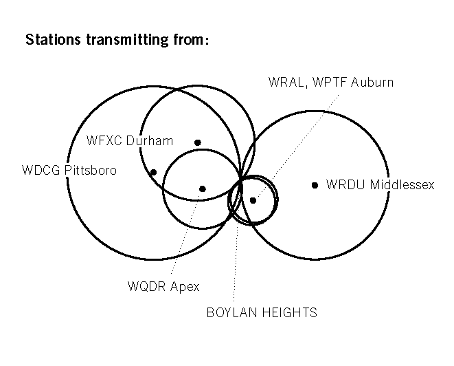
Unlike the wave fronts of wind chimes which—requiring a lot of energy to move the air molecules—never get very large, radio waves don’t propagate in air. They propagate in space and travel undisturbed through non-metallic objects like house walls and bodies. Depending on the location of the transmitter, their wave fronts can be enormous, yet they pass through the neighborhood silently, unfelt, and unnoticed, unless tuned into. In the mid-1980s, Boylan Heights listened mostly to a mix of Top 40, Oldies, Country, R&B, and talk radio on six radio stations: WDGC transmitting from Pittsboro, WFXC from Durham, WQDR from Apex, WRDU in Middlesex, WRAL and WPTF from Auburn. As the neighborhood has changed, so have the radio stations it listens to. Today, it’s mostly NPR broadcast by WUNC in Chapel Hill.
![]()
In the key, Boylan Heights is the point of tangency of these six fronts of radio waves. On the map, you can see which waves belong to which stations by their shape and direction. Because radio waves are concave to their point of origin, a wave concave to the lower right (southeast) is coming from Auburn, and one concave to the upper left (northwest) is from Durham. The degree of curvature depends on the size of the wave front and its distance from the source: the straighter the line, the farther away the transmitter. (Sensible curvature decreases with size which is why the earth seems flat.) These wave fronts, ever expanding, make different patterns in other places.Radio waves also come from the stars. Their wave fronts are effectively flat and they come from every direction, silently, unfelt, and unnoticed.

Radio Waves (click to enlarge)
•••••
“There were no maps before 1500” | Denis Wood | New Book | Rethinking the Power of Maps
Posted in 01 What's A Map?, 02 Why Are You Making Your Map?, Advocacy Maps, Deep Map Thoughts, Map Books, Map History, tagged Cartography, Critical Cartography, Denis Wood, maps, maps - theory, The Power of Maps on August 30, 2010| 1 Comment »

Denis Wood’s followup to his classic The Power of Maps (1992) is almost entirely new in content. I have included the book’s table of contents below. A PDF copy of chapter 1 is included. This chapter argues, provocatively, “there were no maps before 1500” – a serious challenge to our assumptions about the map as a human and historical universal.
I. Mapping
1. Maps Blossom in the Springtime of the State (PDF)
2. Unleashing the Power of the Map
3. Signs in the Service of the State
4. Making Signs Talk to Each Other
II. Counter-Mapping
5. Counter-Mapping and the Death of Cartography
6. Talking Back to the Map
7. Map Art: Stripping the Mask from the Map
8. Mapmaking, Counter-Mapping, and Map Art in the Mapping of Palestine
From the publisher: “Denis Wood shows how maps are not impartial reference objects, but rather instruments of communication, persuasion, and power. By connecting us to a reality that could not exist in the absence of maps – a world of property lines and voting rights, taxation districts and enterprise zones – they embody and project the interests of their creators.”
Nicholas Chrisman, Department of Geomatic Sciences, Université Laval, says: “Rethinking the Power of Maps sharpens the argument of Wood’s earlier work and focuses its attention on the construction of power. Every student of cartography should take notice.”
Chris Perkins of the University of Manchester says: “In an age when mapping is sexy again Wood explains why it should matter to everyone, explores how maps came to be deployed by states, and how the authority of the image is now being used by many different voices. This is a carefully developed humanist argument for a critical approach to mapping, strongly academic, but reassuringly accessible. Denis Wood’s work always challenges – the passionate style and panache of his scholarship carries the reader along and persuades us to listen to his original ideas.”
Making Maps is Back!
Posted in Blog News, tagged Cartography, Making Maps, map making on August 29, 2010| 2 Comments »

The Making Maps blog is back!
Denis and I have been busy with new projects and new publications – some just published and some coming in the near future. I will highlight these projects over the next few weeks and then get back into the groove of blogging.
John K.
Map Symbols: Landforms & Terrain
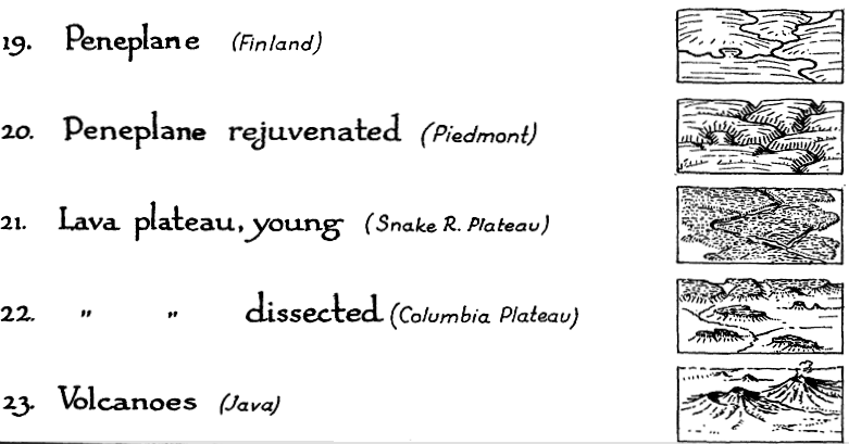
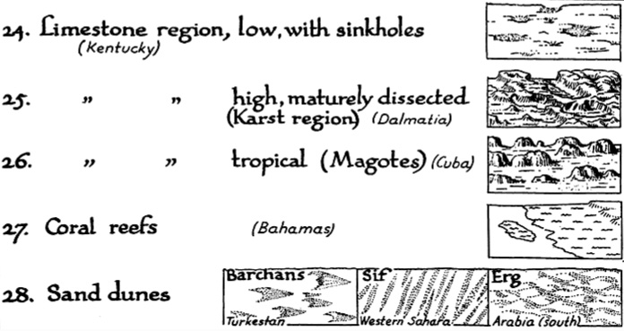
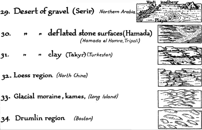
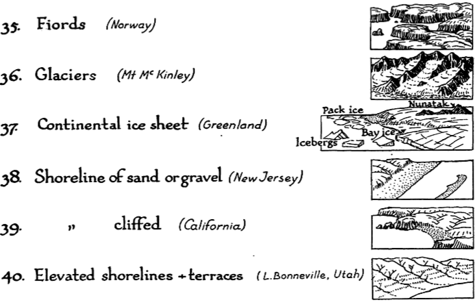
Posted in 03 Mappable Data, 09 Map Symbolization, Map History, tagged Cartographic Design, Cartography, landform maps, Map Design, map symbols, maps, scenery on maps, terrain maps on April 3, 2008| 16 Comments »
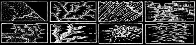
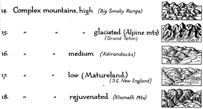
Erwin Raisz is among the most creative cartographers of the 20th century, known in particular for his maps of landforms.
In 1931 Raisz outlined and illustrated the methods behind his landform maps, in an article in the Geographical Review (Vol. 21, No. 2, April 1931). Excerpts from the text and graphics in the article are included below.
Raisz’s approach is to create complex pictorial map symbols for specific landform types. Each specific application, of course, would have to modify the symbols to fit the configuration of particular landforms.
One of the limitations of Raisz’s work is that it is so personal and idiosyncratic that it virtually defies automation or application in the realm of computer mapping. Thus digital cartography has, in some cases, limited the kind of maps we can produce.
Raisz writes:
There is one problem in cartography which has not yet been solved: the depiction of the scenery of large areas on small-scale maps.


Most of our school maps show contour lines with or without color tints. Excellent as this method is on detailed topographic sheets … it fails when it has to be generalized for a small-scale map of a large area. Nor does the other common method, hachuring, serve better.
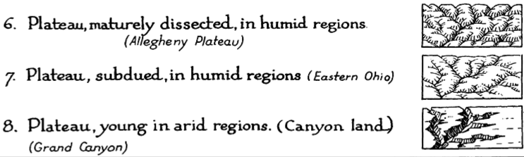
For the study of settlement, land utilization, or any other aspect of man’s occupation of the earth it is more important to have information about the ruggedness, trend, and character of mountains, ridges, plains, plateaus, canyons, and so on-in a word, the physiography of the region.
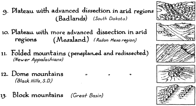
Our purpose here is to describe and define more closely a method already, in use, what we may call the physiographic method of showing scenery. This method is an outgrowth of the block diagram. [T]he method was fully developed by William Morris Davis. Professor Davis has used block diagrams more to illustrate physiographic principles than to represent actual scenery.
Professor A. K. Lobeck’s Physiographic Diagram of the United States and the one of Europe do away entirely with the block form, and the physiographic symbols are systematically applied to the vertical map. His book Block Diagrams is the most extended treatise on the subject.
It is probable that the mathematically-minded cartographer will abhor this method. It goes back to the primitive conceptions of the early maps, showing mountains obliquely on a map where everything should be seen vertically. We cannot measure off elevation or the angle of slope. Nevertheless, this method is based on as firm a scientific principle as a contour or hachure map: the underlying science is not mathematics but physiography.
If we regard the physiographic map as a systematic application of a set of symbols instead of a bird’s-eye view of a region, we do not violate cartographic principles even though the symbols are derived from oblique views instead of vertical views. It may be observed that our present swamp symbols are derived from a side view of water plants.
••••••
Landform map symbols include: plains (sand & gravel, semiarid, grassland, savannah, forest, needle forest, forest swamp, swamp, tidal marsh, cultivated land), coastal plain, flood plain, alluvial fans, conoplain, cuesta land, plateau (subdued, young, dissected), folded mountains, dome mountains, block mountains, complex mountains (high, glaciated, medium, low, rejuvenated), peneplane, lava plateau (young, dissected), volcanoes, limestone region (with sinkholes, dissected, karst, tropical, mogotes), coral reefs, sand dunes, desert of gravel (serir), deflated stone surfaces (hamada), clay (takyr), loess region, glacial moraine, kames, drumlin region, fjords, glaciers, shoreline (sand, gravel, cliffed), and elevated shorelines & terraces.
American Maps Are Bad
Posted in 02 Why Are You Making Your Map?, 12 Finishing Your Map, Bad Maps, Map History, tagged Bad Maps, Cartography, maps, Wall maps on March 18, 2008| Leave a Comment »
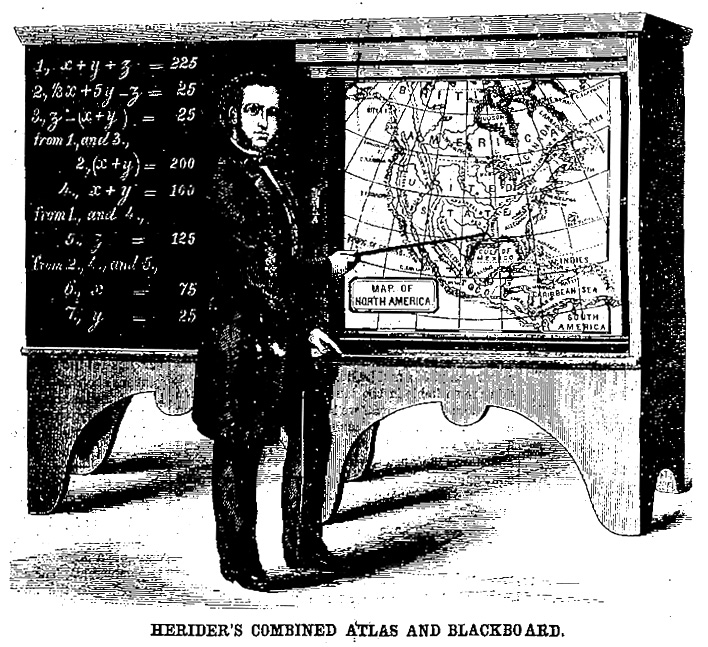
From the New York Times, August 2, 1892:
American Maps Are Bad
“It is doubtful,” says Mr. Jacques W. Redway, in an article on the projection of maps in the Proceedings of the Engineering Club of this city. “if anything short of a special act of Providence could give birth to a more beastly specimen of cartography than the average American wall-map designed for educational purposes.” We regret to say that this is strictly true. Our Federal Coast and Geological Survey maps are of the highest artistic and scientific merit, as Mr. Redway says. The topographical survey of New-Jersey, as issued by the New-Jersey Geological Survey, gives maps which deserve the enthusiasm of all who see them, and they are published by the State without profit at a cost rivaling that of any maps issued. But the ordinary wall-map and the atlas ordinarily accessible to people of limited means in this country are the worst in the world, barring some maps in China or Turkey. As for Japan, the country as a whole is better mapped than our own. There is nothing accessible in this country like the cheap German maps.
Thank God for the bad maps of China and Turkey.
Original article:
Map Songs: Longitude and Latitude Song
Posted in 05 Geographic Framework, 13 Multimedia Mapping, Map Music, tagged Cartography, latitude, longitude, Map Music, maps, Singing Science on February 27, 2008| 8 Comments »
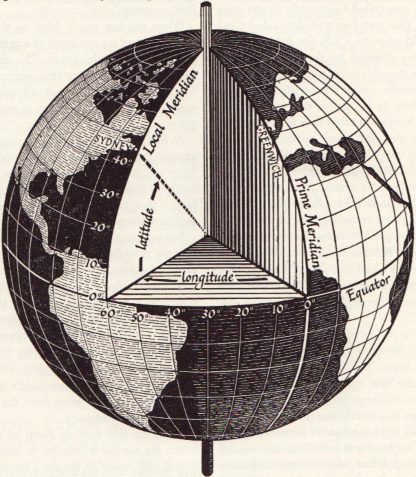
Maps and cartography are not particularly popular as song themes.
But there is the Longitude and Latitude Song (MP3 file here). Careful or you’ll be singing this one out loud in your cubicle.
Performed by Tom Glazer and Dottie Evans, and written by Hy Zaret, the song is one of a series of sciency tunes, aimed to inspire Sputnik-era kiddies, on the Space Songs album, recorded in 1959.
Jeff Poskanzer’s terrific Singing Science web page has all the tracks from Space Songs, as well as the tracks from subsequent albums Energy and Motion Songs (“Ultraviolet and Infrared”), Experiment Songs (“We Know the Air is There”), Weather Songs (“The Water Cycle Song”), Nature Songs (“Song of the Rocks”), and More Nature Songs (“What is an Animal”).
Absent from the albums are other potential map songs: “Which Datum Do You Use?” “Project Me,” “The Large Scale/Small Scale Polka,” “Your Love is like a Decorative Font,” “She’s Natural Breaks, I’m Quantiles,” and “The Symbols of my Love are Abstract Shapes in a Selection of Different Hues Corresponding to Qualitative Data Variation.” I’ll stop now.
A quick search of a few open-source music databases (FreeDB and MusicBrainz) results in hundreds of songs with map in the title. Not many latitude/longitude songs, though. There are also quite a few mappy band names: The Maps, Swell Maps, Maps and Diagrams, Maps of the Heart (blah!), Maps and Atlases, Relief Maps, The Plat Maps, Map, Map of Wyoming, Map of the World, Town Map, The Map, Map of Africa, Map of Hell, Penguin Map Mijinko, The Search Map, Book of Maps, Minus a Map, Map the Growth, Map of July, Days without Maps, Mind Maps, Maps of Norway, and Not on the Map.
The potentially evil, formerly-open-source music database Gracenote has a moderately interesting Music Maps page, which uses recent CD lookup data to map the geography of popular music.
And, of course, the excellent World Beat Music map of the world over at Strange Maps.
Latitude/longitude graphic from David Greenhood’s classic book Mapping.
Map Symbols: Showing Multivariate Data with Texture
Posted in 03 Mappable Data, 09 Map Symbolization, Map History, tagged Cartographic Design, Cartography, Edward Tufte, ethnicity maps, Jacques Bertin, Map Design, map symbols, maps, multivariate, texture, visual variables on February 13, 2008| 18 Comments »
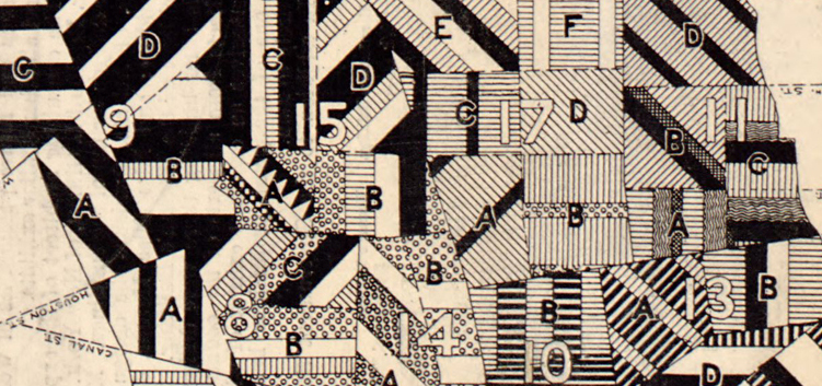
Map of New York City, Showing the Distribution of the Principal Nationalities by Sanitary Districts published in Harper’s Weekly (January 5, 1895, pp. 60–61) using 1890 U.S. Census data.
This map looks great, revealing a substantial amount of information with its intense, juxtaposed patterns.
The textures on the map show the relative amounts of different nationalities (qualitative data) in each of the areas (sanitary districts) on the map:

The map shows if a district has more or less diversity (more or fewer lines of different textures), the relative proportions of different nationalities, the nationalities themselves, and, at a broader scale, the districts that are similar or differ in their nationality constitution. Because of the careful rotation of the lines of textures, the different sanitary districts can also be distinguished from each other.
