Feeds:
Posts
Comments

color-sloane-montz.jpg

Selecting effective colors for your maps is a challenge. In Making Maps I review basic color issues, including how we see and create colors, as well as the complexity of color interactions and some basic color guidelines.

A myriad of color resources for mapping exist. A few of the more useful are below.

ColorBrewer: Cindy Brewer and Mark Harrower’s ColorBrewer is a terrific and easy-to-use web-based tool for choosing appropriate color schemes. While the focus is on colors for choropleth maps, the color schemes are appropriate for other map types and information graphics. Color recommendations are displayed on a map (upon which roads, city symbols, and boundaries can be viewed). Icons indicate if the selected color scheme works well for the color blind, if photocopied, or on a computer projector, LCD, or CRT computer screen. Color schemes are specified in five different color models (CMYK, RGB, HEX, LAB, and AV3), making colors easy to transfer to mapping or graphic design software. Color recommendations are based on Brewer’s extensive color research. Requires Flash 5 or later.

Color Oracle: Up to 12% of the population is colorblind. A common form of colorblindness results in red and green looking the same. It’s a problem, then, if you create a map where red and green distinguish different phenomena. Bernhard Jenny and Nathaniel Vaughn Kelso’s Color Oracle is a free software application that simulates three types of color blindness on your computer screen. With your map on screen, start the software and toggle between different kinds of colorblindness to see if your colors work for people with that type of colorblindness. Simple and useful. Mac, Windows, and Linux versions.

Continue Reading »

I was catching up on back issues of the magazine The Independent (the May 22, 1920 issue) and came across this historical tidbit entitled “These Maps Tell Lies.”

these-maps-tell-lies_tn.jpg (link to larger PDF)

“An absolutely accurate and truthful map can be used in skillful hands to mislead the unwary. Only the crudest propagandists will distort his facts; it is far better to take the facts as nature gives them and present them in such a way to convey a false impression.”

Continue Reading »

The proliferation of mapping sites on the web provides ample fodder for critique by the map police (cartographic insiders). I usually feel a bit bad whining about the cartographic limitations of such sites. Cartographers have a history of obsessing with rules and such obsession has, arguably, limited creativity and undermined innovations. Bad cop. However, not following the rules does not necessarily produce creative and innovative mapping. I, for one, don’t entirely enjoy being the map police, but will try to at least be a good cop.

Lets look at a site that has been around awhile: The Modern Language Association’s Language Map. The site allows you map language data collected in the 2000 U.S. Census. A nice focused site with interesting data (I use it in my classes and the students enjoy pondering the patterns): here is the default map of the total number of language speakers in each county:

mla-totals.jpg

The basic language map allows you to view 33 different languages, mapped by county in the U.S. The total number of people who speak a particular language (above) can be mapped, but mapping totals can be deceptive, as the sizes of the counties vary. Thus a county may have more speakers of a particular language just because it covers more area than a smaller county. To account for these variations in county size, map the data as a percentage (the percent of people in a county that speak a particular language, see below). But you can map totals and there are sometimes good reasons to do so. Just realize the potential limitations of what you are seeing.

Continue Reading »

I started a blog for my Making Maps book a few years back, all done in HTML, in part so it didn’t look like every other generic blog out there. Alas, it is time to shift to a real blog. I will recycle some of the posts from the old blog here before adding some new ones that focus on extending the Making Maps philosophy of DIY Cartography. More on the goals of this blog on the About page.

John K.

Hacking Making Maps

Q: That weird stuff in Making Maps… did you hack your book?!

A: Hacking has diverse meanings as documented at Wikipedia. It can be a prank or elaborate joke, a clever solution to a problem, a legal or illegal modification of a computer program (for good or evil purposes), or anything that is fun and clever. A hack can also serve to undermine the hegemonic discourse of advertising or media or government or science or academia. Maps can be hacked as a prank or joke, to solve a particular problem, or to generate some creative outcome not intended by the original map. Of course, a map hack may also serve to assault and undermine hegemonic discourse. Can a textbook full of rules and regulations about map design, such as Making Maps be hacked by its author, the hacking embedded in the design and content of the book? Nah, that would be absurd.

Q: How does Making Maps relate to GIS software?

A: Making Maps focuses on the mapping side of GIS, or any software that allows you to design and create maps. The examples in the book were not, for the most part, created with desktop GIS software. This is because it is difficult (if not impossible) to achieve (carto)graphic excellence in contemporary GIS software. Most design cartographers who use GIS exit GIS software and design their work in software like Illustrator, Freehand, or Corel Draw. The design capacity of GIS software will undoubtedly improve. Making Maps provides exemplary design and ideals to shoot for. If you can’t do something shown or suggested in Making Maps with the GIS software you happen to be using, complain to the software company, and get a copy of Illustrator, Freehand, or Corel. Such software are not that difficult to learn and will provide you with a multitude of creative design options not available to you in typical GIS software. Your maps, in other words, will be better. A diversity of software for working with geographic information exists, and is evolving and developing on a daily basis. Making Maps defines design guidelines, principles, and exemplars which transcend the diversity (and limitations) of constantly evolving GIS software.

Q: Making Maps is an weird cartography book – what were some of the ideas behind its creation?

A: A NACIS Conference (Oct. 12-15 in Salt Lake City) included a panel of critics (Stuart Allan, George McCleary, Peter Keller, Margaret Pearce) interrogating Cindy Brewer’s new book Designing Better Maps (ESRI Press, 2005) and Making Maps. I prepared a statement about the intent and ideas that shaped the look and content of Making Maps.

Da Bomb

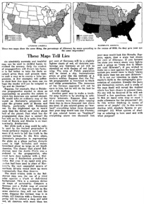
Making Maps: A Visual Guide to Map Design for GIS: Author’s Intent

When Peter Wissoker (then of Guilford Publications) asked me to write a cartography text, I told him the world did not need another cartography text. The number of academic cartography courses were not growing, and probably declining, despite the explosive growth of GIS. Peter then asked if I liked existing cartography texts, and I said I did not use them in my courses. “So what kind of text would you use, if it existed?” asked he. This question led to Making Maps. I wanted a book that would get readers excited about maps (existing texts are rather languid), I wanted good examples to show why map design matters and how it works (also not found in abundance in existing texts), and I wanted to promote creativity – fundamental to good map design, and difficult to teach. Denis helped to shape and refine the goals and develop the content of the book.

I designed the book like I would design a map. The audience? Cartography courses, maybe as a supplement, GIS courses, certainly as a supplement, and individuals who make maps (or like maps) but don’t have a background in cartography, and don’t want to be academic cartographers. Then what? Coherent concept, a hierarchy of content emphasizing what is important and excising the rest, creative design to grab attention and make a point, all so that the book works as well as possible for its readers. A few key ideas shaped the design of Making Maps:

1. Maps are visual, so make the book visual (rather than textual), to promote visual thinking and creativity, both fundamental to map design. As far as possible, focus each page on maps and arrange text around the maps (rather than the reverse, which is what other texts do). To subsume text and emphasize the maps required a profound generalization of all the words about maps that dominate cartographic texts. We promote maps as a vital way of seeing patterns in data that would not otherwise be evident, and stress that less is better than more. Apply these ideas to a map design text: carefully designed maps, rather than words, used to reveal map design principles.

2. It is impossible to teach map design without good and creative examples, but it helps to have poor examples to contrast with the good to show how and why design matters. Eduard Imhof used this visual approach to the map design process in his classic article on map type, and I applied this idea throughout Making Maps. I also tried to incorporate good and creative design in all the maps in the book, supposing one can learn by seeing.

3. Enthusiasm and excitement about maps abound in a world where maps and the tools to make them proliferate, so design the book to espouse enthusiasm and excitement about maps. Many of the real maps in the book comprise a cartography of affect – hate crimes, AIDS deaths, bombing sprees, hurricane impacts, war deaths, poverty, alcohol, queer geography, projected naked bodies, suicide, radioactive fallout, military targeting maps, spiritual geographies, and aliens. The text and maps were also infused with a ludic sensibility – humor, farce, satire, sarcasm, irony and play. The mystery maps that preface the book and are between chapters encourage playful engagement (what is it?) with maps, their visual form, and the curious things we can map. Engaged emotion and play promote enthusiasm and excitement about maps, and creativity in their design, counter-balancing the stern normative content (rules, regulations, good/poor, do this-not that’s) in Making Maps.

Making Maps covers the basics of maps and map design, although I do believe it to be more sophisticated than it may appear at first glance. I am pondering Making Maps II, or Making More Maps, and what exactly a more “advanced” cartographic design text might look like.

Q: How were all the example maps in Making Maps created?

A: The primary software I used to create Making Maps was Freehand on a Mac. I learned Illustrator and Freehand in versions 1.0 back in the day while working at the Cartographic Lab at UW Madison. I have always liked Freehand better than Illustrator, despite extensive work with both software packages. Many of the map projections in the book were created in GeoCart, and I used ArcGIS to create a few dozen maps. All were imported into Freehand and redesigned.

The entire book layout and design was done with Freehand – somewhat unconventional. Because the book design and layout I wanted was unusual, I decided to “mock it up” in Freehand, assuming the whole book would be reworked by a professional book designer, sorta following my ideas. In the end, this never happened, my “mock up” is what became the final book layout and design. I think I need to take a book design course, and learn more about typography (I think the typeface and text in the book is one of its weaker points) for the 2nd edition. William Meyer (at Guilford Publications) took the Freehand files, chopped them up into single pages (I did two-page layouts, as facing pages almost always were designed to relate to each other) and converted them to PDF (with surprisingly few problems) and sent them off to the printer.

Making Real Maps

Q: Did you ever make real maps?

A: Denis makes maps, and had some – from his work in progress on the Boylan Heights neighborhood in Raleigh NC – featured on NPR’s This American Life. A few of his maps are linked there but they ain’t great scans. I will get some better ones and post them here sometime soon. As for me, Making Maps has over 300 maps in it and I made most of them; they sorta count. Below find a few maps I made in the olden days – with scribers, stick-up type, pens and ink, all finished off with photomechanical processes in the dark room. I was the last generation to learn and work with traditional (non digital) map production (late 1980s) and the first to learn and work with computer graphic design software that could make maps as well as the old traditional techniques (Illustrator and Freehand on a Mac).

Da Bomb

Chippewa Moraine Ice Age National Scenic Reserve (1987) was created in David Woodward’s Map Design course at the University of Wisconsin Madison:

Chippewa Moraine Ice Age National Scenic Reserve (1987) David knew how to do shaded relief by hand, with graphite, and showed me how. The glacial terrain on the map was easier than “normal” terrain and the result was not bad (for a beginner). The rest of the map was scribed & used stick-up type. My mom’s family (the Wolf’s) live near the area shown on the map. The map won an Honorable Mention in the 1987 R.R. Donnelly and Sons Map Design Competition (see below for the map that won the competition that year).

Da Bomb

David DiBiase and I created The Flight of Voyager (1987) when we were students at Madison (we both worked in the Cartographic Lab):

The Flight of Voyager (1987) David DiBiase started this project when he acquired detailed flight information about the Voyager flight – the first airplane to fly around the world without refueling. When the publisher of the book about the flight heard we had the data, they asked us to create the map for the book endpapers (thus the gap in the middle of the map: the left half was the front endpaper, the right half the back endpaper). The map was published in the hard cover version of J. Yeager and D. Rutan Voyager (New York: Knopf). The map won the 1987 R.R. Donnelly and Sons Map Design Competition. I had to scan the map in several pieces and there is some distortion where I photoshopped the pieces together.

Da Bomb

I created the University of Colorado at Boulder Campus Map (detail) (1988) mostly by myself as a UW Madison Cartographic Lab project:

University of Colorado at Boulder Campus Map (detail) (1988) The map was – amazingly I think – done with technical pens and ink. I traveled to Boulder to sketch and photograph each building on campus. Back in the lab, I had to develop a generalized sketch of each building – not too detailed but detailed enough to distinguish the building. Each sketch was then inked on mylar and cleaned up with an x-acto knife. I created the building windows by scanning the inked buildings into Adobe Illustrator (probably version 1.0!), creating the windows (not the buildings) then printed the windows really big, then reduced the printout in the darkroom, burned it on the same film we used for type stickup, and stuck them up. I also drew all the trees by hand (pen & ink again). This map was a tremendous amount of work. I doubt the map is used anymore, and here is a clickable WWW version that, at least in part, replaced it. Looking at the WWW map suggests to me that technology is providing us with more diverse media for mapping, but that the design of maps in these new media is often mediocre at best.

Q: Is cartography dead?

A: Denis Wood thinks so, me too (maybe – kinda depends on what you mean by “cartography”). Read his polemic Cartography is Dead (Thank God!) (download/view the PDF here originally published in Cartographic Perspectives number 45, Spring 2003). It isn’t that Denis believes mapping is dead – quite the contrary. There is so much exciting stuff going on with mapping it is hard to keep track of it all (see some of the links on the bottom of the Making Maps book main page). A lot of this work is outside of the realm of academic cartography, which itself seems to be rather quiet, at least in the American context (examples of recent cartographic research can be seen in the AUTOCARTO and NACIS conference proceedings and programs). There is some life beyond North America (see the ICA web site) and in “geovisualization” (maybe that is how cartography will survive in academia). The world of custom cartography firms and freelance cartography seems quite vital. The most wobbly, thinks I, is the state of academic map design. While you can find abundant ways to learn about GIS in general as well as ArcGIS, Java, Google Map Hacking, Flash, and other technologies for mapping, there are few places to learn about the design of maps in those contexts or in general. We seem to be back to the late 1940s when Arthur Robinson wrote The Look of Maps bemoaning the lack of attention paid to map design and suggesting an agenda to address the problem. Robinson’s agenda, largely based on advertising and psychology methods, user testing, etc. (and its evolution into cognitive map studies, which bobble along, squeezing out a few peculiar research articles a year – see Daniel Montello’s review article on “Cognitive Map Design Research in the 20th Century.”) didn’t necessarily provide much new practical information for map designers, and academic cartographic design research doesn’t seem to have found a comfortable place in the discipline of geography as design has in fields such as landscape architecture, architecture, and planning (and this, in the end, is my big problem with academic cartography – it has not done a great job of keeping up with all sorts of interesting conceptual developments in geography – but that is my own hang-up). Academic map design folks did get lots of dispersed map design know-how gathered together in text books, made it possible for map design to be taught at universities, and established cartographic labs (I wonder how many map designers developed their skills in those cartographic labs?). Alas, classic cartography texts (such as The Elements of Cartography and Dent’s Thematic Cartography) are out of date or unavailable, cartography faculty are replaced by GIS folks, cartography and map design classes are replaced by GIS classes, and the cartographic lab has transmogrified into something else – a GIS lab or whatever – usually for, well, making maps (with GIS!).