A wiki for the State of the Map Conference (14-15 July ’07 in Manchester, UK) links to a series of presentations (audio, and sometimes slides) on map related topics. Titles include “This Mapping Stuff Could Really Take Off,” “Why Mash-ups Suck (and Cartography Matters),” “Bringing Maps to Life,” “20 Years of Web Mapping,” and “Mashups Without Pushpins.”
Archive for 2007
State of the Map
Posted in 04 Map-Making Tools on July 24, 2007| Leave a Comment »
Map Symbols: Nautical Dangers
Posted in 09 Map Symbolization, Map History on July 19, 2007| 15 Comments »
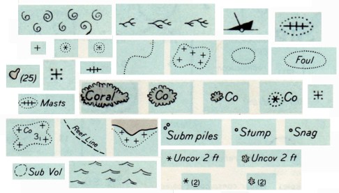
Rock which does not cover,
Coral reef, detached,
Wreck always partially submerged.
A number of sunken wrecks,
Obstruction of any kind,
Limiting danger line.
Foul ground, discolored water,
Position doubtful,
Existence doubtful.
Old map symbols and their descriptions can be poetic, enjoyable to view and read while providing ideas for symbols on contemporary maps. Indeed, is it possible that “maps are poems and poems are maps?” (see Howard Veregin’s “Geo-Poesy.”
Good map designers and map makers always look at other maps, including old maps, for map design ideas.
These symbols and textual descriptions of nautical dangers are taken from section O of Chart #1, Nautical chart symbols and abbreviations used by U.S. Lake Survey, Corps of Engineers, U.S. Army, Dept. of Defense; U.S. Coast and Geodetic Survey, Dept. of Commerce; U.S. Navy Hydrographic Office, Dept. of Defense (Washington DC, 1957). The entire page O from which the symbols were taken is here. A contemporary version of these symbols, still Chart #1, is here.
Map Color Resources
Posted in 09 Map Symbolization, 11 Color on Maps on July 16, 2007| 1 Comment »

Selecting effective colors for your maps is a challenge. In Making Maps I review basic color issues, including how we see and create colors, as well as the complexity of color interactions and some basic color guidelines.
A myriad of color resources for mapping exist. A few of the more useful are below.
ColorBrewer: Cindy Brewer and Mark Harrower’s ColorBrewer is a terrific and easy-to-use web-based tool for choosing appropriate color schemes. While the focus is on colors for choropleth maps, the color schemes are appropriate for other map types and information graphics. Color recommendations are displayed on a map (upon which roads, city symbols, and boundaries can be viewed). Icons indicate if the selected color scheme works well for the color blind, if photocopied, or on a computer projector, LCD, or CRT computer screen. Color schemes are specified in five different color models (CMYK, RGB, HEX, LAB, and AV3), making colors easy to transfer to mapping or graphic design software. Color recommendations are based on Brewer’s extensive color research. Requires Flash 5 or later.
Color Oracle: Up to 12% of the population is colorblind. A common form of colorblindness results in red and green looking the same. It’s a problem, then, if you create a map where red and green distinguish different phenomena. Bernhard Jenny and Nathaniel Vaughn Kelso’s Color Oracle is a free software application that simulates three types of color blindness on your computer screen. With your map on screen, start the software and toggle between different kinds of colorblindness to see if your colors work for people with that type of colorblindness. Simple and useful. Mac, Windows, and Linux versions.
These Maps Tell Lies!
Posted in 05 Geographic Framework, 08 Generalization & Classification, Map History on July 12, 2007| 1 Comment »
I was catching up on back issues of the magazine The Independent (the May 22, 1920 issue) and came across this historical tidbit entitled “These Maps Tell Lies.”

“An absolutely accurate and truthful map can be used in skillful hands to mislead the unwary. Only the crudest propagandists will distort his facts; it is far better to take the facts as nature gives them and present them in such a way to convey a false impression.”
Map Police Review: the MLA Language Map of the US
Posted in 03 Mappable Data, 04 Map-Making Tools, 08 Generalization & Classification, 12 Finishing Your Map, Map Police on July 9, 2007| 1 Comment »
The proliferation of mapping sites on the web provides ample fodder for critique by the map police (cartographic insiders). I usually feel a bit bad whining about the cartographic limitations of such sites. Cartographers have a history of obsessing with rules and such obsession has, arguably, limited creativity and undermined innovations. Bad cop. However, not following the rules does not necessarily produce creative and innovative mapping. I, for one, don’t entirely enjoy being the map police, but will try to at least be a good cop.
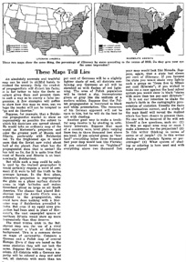
Lets look at a site that has been around awhile: The Modern Language Association’s Language Map. The site allows you map language data collected in the 2000 U.S. Census. A nice focused site with interesting data (I use it in my classes and the students enjoy pondering the patterns): here is the default map of the total number of language speakers in each county:
The basic language map allows you to view 33 different languages, mapped by county in the U.S. The total number of people who speak a particular language (above) can be mapped, but mapping totals can be deceptive, as the sizes of the counties vary. Thus a county may have more speakers of a particular language just because it covers more area than a smaller county. To account for these variations in county size, map the data as a percentage (the percent of people in a county that speak a particular language, see below). But you can map totals and there are sometimes good reasons to do so. Just realize the potential limitations of what you are seeing.
Making Maps: DIY Cartography
Posted in Blog News on March 19, 2007| 1 Comment »
I started a blog for my Making Maps book a few years back, all done in HTML, in part so it didn’t look like every other generic blog out there. Alas, it is time to shift to a real blog. I will recycle some of the posts from the old blog here before adding some new ones that focus on extending the Making Maps philosophy of DIY Cartography. More on the goals of this blog on the About page.
John K.
