Feeds:
Posts
Comments

Archive for June, 2009

owjl-finalmap_low

Guide Psychogéographique de OWU (2009, med res jpg)

(larger version jpg)

•••••

During the week of June 15-19 (2009) five intrepid Ohio students and myself engaged in improvisational psychogeography, culminating in the map opening this post. A printable 11″ x 17″ (300dpi 1.4mb) PDF of the map is here.

•••

Picture 1

Map detail: The path taken through campus followed the outline of a wolfie hand-shadow cast on a campus map.

•••

Picture 2

Map detail: Stuff smelt, heard, and felt with its allure or disallure indicated with faces.

•••

The map was the product of a course – Mapping Weird Stuff – I offered at the OWjL (Ohio Wesleyan University Junior League of Columbus) summer camp for gifted and talented middle school students.

Based on the kid’s ideas and work collecting diverse data, I designed a layout and look for the map. The map itself was created in FreehandMX, now dead-tech thanks to Adobe (I still prefer Freehand even though I started with Illustrator back at version 1).

Making the map once again reminded me that it’s fun to make maps, if you have interesting stuff to map. The design and layout are certainly nothing one could generate with typical mapping software – thus the use of graphic illustration software. Diverse and interesting maps are not really the domain of web and pc-based map generation software. Maybe sometimes. Not usually.

•••

Picture 3

Map detail: An abstracted linear “map” sequencing smells, textures, and sounds from one end to the other of the path investigated.

•••

My vague intent was to do some kind of weird mapping project on campus – sensory mapping, psychogeography, etc. My search for resources for this age student (grades 6-8) resulted in a few finds, but not much. The materials I compiled on the course blog (here) served as the basis of our work, which developed as the students engaged the ideas. We met for 1.5 hours a day, for 5 days.

•••

kids

Special glasses indicate how serious we were about this project.
The
Hulk hand inspired confidence in our powers.

•••

The students, Django, Mallory, McKenna, Erica, and Ben, were great. They jumped into the project, came up with ideas that shaped our direction, and collected all of the data on the map. I had some ideas about what kind of psychogeography we would do, and what kind of map we would create, then it all transmogrified into something else which turned out great.

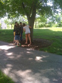
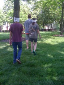
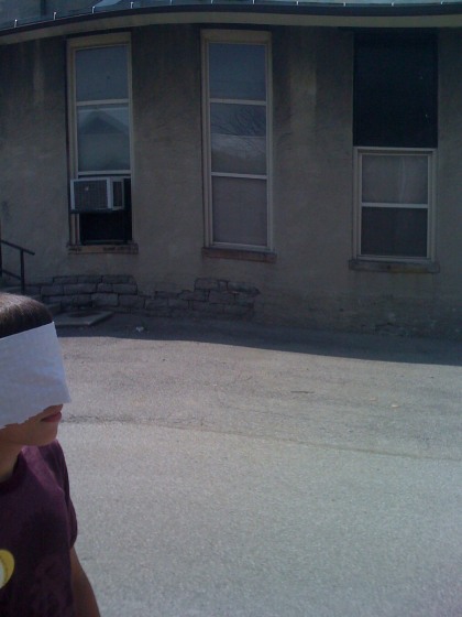
We did a dérive (“a technique of transient passage through varied ambiances”) to get a feel for the campus and its “resonances,” some blind-folded, ear-plugged tours through the campus (with me or one of the students leading the others along) collecting smells and sounds, as well as a few texture collection expeditions (inspired, in part, by Denis Wood’s Narrative Atlas of Boylan Heights project).

•••

Guiding much of our work was a single, inspiring Hulk hand.

•••

A bit of background on Psychogeography:

Psychogeography, according to its founder Guy Debord, is “the study of the precise laws and specific effects of the geographical environment, consciously organized or not, on the emotions and behavior of individuals.”

In practice, psychogeography inherently resists any narrow definitions. It encompasses diverse activities that raise awareness of the natural and cultural environment, is attentive to senses and emotions as they relate to place and environment, is often political and critical of the status quo, and must be both very serious and fun.

Psychogeography overlaps with Kevin Lynch’s work on mental maps, as nicely reviewed in Denis Wood’s article “Lynch Debord” as well as work on non-visual sensory-scapes (smellscape, soundscape, touchscape, tastescape, etc.).

The most famous psychogeography map is Debord’s Guide Pychogéographique de Paris:

debord-guide

Guy Debord, Guide Pychogéographique de Paris

•••

grassyfoot

•••

bomb

Read Full Post »

combined_header_2

The construction of symbols on maps requires the interaction of many elements.  How these elements come together – literally the intersection of bits of points, lines, and areas – is the subject of a series of illustrations entitled “The Drawing of Combined Symbols.”  The majority of these guidelines focus on peculiar details that when done well, the typical map user won’t even notice. They are among the fascinating hyper-minutiae of cartography.

Faces indicate the quality of the choices illustrated – good, ok, and poor.

Examples are illustrated by Prof. Kei Kanazawa (heading the Working Group of the Japan Cartographers Association) in a chapter entitled “Techniques of Map Drawing and Lettering” in the out-of-print book Basic Cartography, Vol. 1 (International Cartographic Association, 1984, p. 45). These guidelines were developed for the pen and ink era of cartography, yet most are applicable to contemporary digital mapping.

Illustrations are for educational purposes only. Click on an illustration for a larger version.

•••••

combined_3-2-1

Railway Symbols: Note arrangement of tics and black and white parts.

•••••

combined_3-2-2

Manner of connecting line symbols corresponding to broken lines.

•••••

combined_3-2-3

Several examples of crossing line symbols.

•••••

combined_3-2-4

Drawing of double broken line symbols.

•••••

combined_3-2-5

Drawing of double line road symbols in connection with other symbols.

•••••

combined_3-2-6

Position of individual point symbols: (1) Place of explanation symbol, (2) Point symbols corresponding to the exact place on the ground.

•••••

combined_3-2-7

Drawing of contours.

•••••

combined_3-2-8

Relation of contours and road symbols.

•••••

combined_3-2-9

Boundary along linear objects. Parts of a boundary along linear objects such as a river, road, and so on which are clearly recognized are usually omitted.

Read Full Post »

fat-tailed-map

from “Fat Tailed Sheep on Maps of Africa”
The Map Collector, 1 June 1979

Collectors are a peculiar lot.  They can frustrate somber scholars with their unconventional research methods and seeming interest in objects rather than context.  Yet the passion and obsessiveness of collectors often produces an endless source of interesting materials.

The Map Collector (1977-1996) was a magazine devoted to maps as collectible objects.  Within its pages could be found some rather interesting articles on all sorts of maps and cartographic ephemera.

Where else would one find an article about fat-tailed sheep illustrated on old maps of Africa?

fattai01

Yes they are real (source and here)

Kunstpedia, a “knowledge base on fine and decorative arts, popularly stated arts and antiques, with the exception of contemporary art” has acquired permission to publish Map Collector articles, full text with images, on their web pages.

Articles, which continue to be added to the site, include:

Hotchkiss

“One of America’s Foremost Cartographers: Jed Hotchkiss”
by Peter Roper

•••••

cigarette

“Maps on Cigarette Cards”
by Martin Murray

•••••

“Pocket Maps for Travellers”
by Katherine R. Goodwin

•••••

“Maps that made Cabmen Honest”
by Ralph Hyde

•••••

“The Indigenous Maps and Mapping of North American Indians”
by G. Malcolm Lewis

•••••

“The Great Lakes of Africa”
by R.V. Tooley

•••••

“History of Watermarks”
by Bob Akers

•••••

“Old Korean Hand Atlases”
by Shannon McCune

•••••

Also of interest:

Read Full Post »

bunge_runovermap.jpg

When Bill Bunge mapped out the locations of car/pedestrian collisions in Detroit (Detroit Geographical Expedition, 1968) he and the map were advocating a way of thinking about what was happening to the black community in Detroit – and advocating for change.

All maps advocate.

To advocate means to “to speak or write in favor of; support or urge by argument; recommend publicly.” The word derives from the Latin advocate: “to call to one’s aid.”

What map does not advocate, or argue for something? We are always calling maps to our aid.

Three free books on maps and advocacy have been made available for download recently, and are worth a look.

•••••

Two New PDF Books [added June 6 2009]:

Good Practices in Participatory Mapping (2mb PDF here, 2009). Published by International Fund for Agricultural Development.

A review of participatory mapping methods.

This report will review existing knowledge related to participatory mapping and recent developments. Specifically:

  • Section 1 will define the main features of participatory mapping;
  • Section 2 will discuss key applications of participatory mapping;
  • Section 3 will present specific tools used in participatory mapping, including their strengths and weaknesses;
  • Section 4 will identify good practices and explore the significance of process in participatory mapping initiatives.

participatorymapping

•••••

Toolbox & Manual: Mapping the Vulnerability of Communities (4.4mb PDF English version here, Portuguese version aqui, 2008). Published by Salzburg University Centre for Geoinformatics.

A overview of concepts and methods for community mapping, focused on vulnerability.

Within the research and project context it is aimed to provide the local communities with appropriate maps of their communities. The maps should enhance planning and decision making processes within the communities in regard to reduce local vulnerabilities and allow appropriate planning of disaster response measures. It is the first time in Mozambique that maps have been produced with such an accuracy (high resolution data) and for disaster risk management through the integration of participatory practices.

mappingvulnerability

•••••

•••••

Visualizing Information for Advocacy: an Introduction to Information Design (7mb PDF here, January 2008). Published by Tactical Technology Collective.

Succinct, well-designed, with many good examples of maps and information graphics for advocacy.

…a manual aimed at helping NGOs and advocates strengthen their campaigns and projects through communicating vital information with greater impact. This project aims to raise awareness, introduce concepts, and promote good practice in information design – a powerful tool for advocacy, outreach, research, organization and education.

vifa1

vifa2

•••••

Maps for Advocacy: An Introduction to Geographic Mapping Techniques (3mb PDF here, September 2008). Published by Tactical Technology Collective.

A great overview of maps and advocacy with many examples and resources.

The booklet is an effective guide to using maps in advocacy. The mapping process for advocacy is explained vividly through case studies, descriptions of procedures and methods, a review of data sources as well as a glossary of mapping terminology. Scattered through the booklet are links to websites which afford a glance at a few prolific mapping efforts.

mfa1

mfa2•••••

Field Guide for Humanitarian Mapping (3.2mb PDF here, March 2009). Published by MapAction.

A textbook for using maps and GIS in humanitarian work.  The Guide provides detailed information on data collection (GPS) and the use of Google Earth and MapWindow (free mapping software).

The guide was written to meet the need for practical, step-by-step advice for aid workers who wish to use free and open-source resources to produce maps both at field and headquarters levels. The first edition contains an introduction to the topic of GIS, followed by chapters focused on the use of two recommended free software tools: Google Earth, and MapWindow. However much of the guidance is also relevant for users of other software.

fghm1 fghm2

•••••

Some related resources:

Read Full Post »