Feeds:
Posts
Comments

Posts Tagged ‘Cartographic Design’

Cover of dissertation

André Luiz Mesquita’s dissertation (in Portuguese), Mapas Dissidentes: Proposições Sobre um Mundo em Crise (1960-2010), (Dissenting Maps: Propositions on a World in Crisis, 1960-2010), looks at the maps and diagrams of artists and activists from 1960 to 2010, all working in social, political, and economic contexts of crisis and change, conflict and various forms of resistance. He approaches the work of three generations of artists through an analysis of endless documents, catalogs, manifestos, articles, photographs, documentaries, art works, reproductions of maps, and interviews.

Mesquita begins by examining the games and maps created in the 1960s and ’70s by the Swedish-Brazilian artist, Öyvind Fahlström (1928-1976), made under the geopolitical tensions of the Cold War (1947-1991) and the structural and organizational changes in global capitalism of the 1970s.

Öyvind Fahlström's World Map

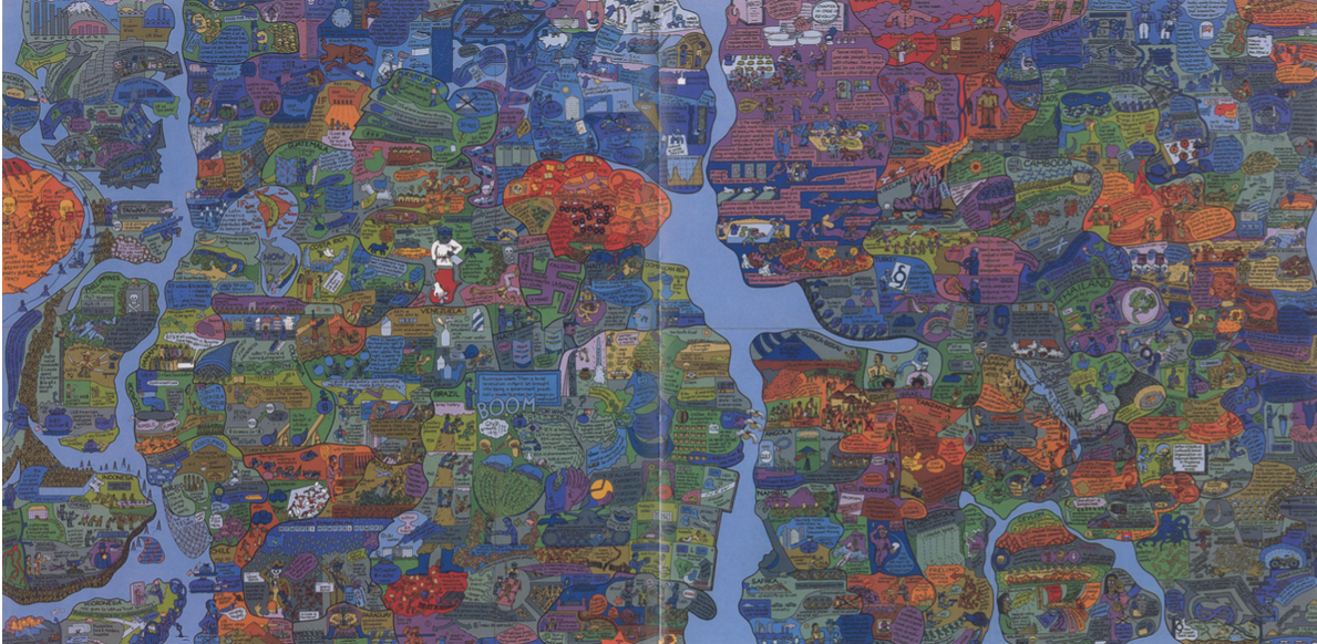
Öyvind Fahlström’s World Map

He then turns to the work of the American artist, Mark Lombardi (1951-2000), who, in the 1990s, mapped international power networks and obscure financial transactions involving banks, governments, and neoliberal elites.

Mark Lombard's World Finance

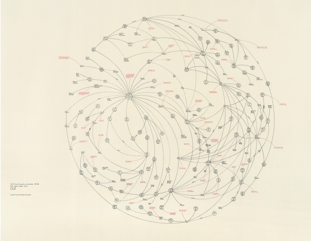
Mark Lombard’s World Finance

Finally Mesquita addresses the counter-cartography practices developed between the 1990s and 2010’s by three activist art collectives: Bureau d’Études (France), the Counter-Cartographies Collective (United States), and Iconoclasistas (Argentina). Based on the interrelations between contemporary art, political activism, and critical cartography, Mesquita holds that the work of these activists-artists has created a significant opposition to the “neutral and objective” maps made in the interests of corporate, governmental, and military bodies.

Bureau de'Etudes's Refuse the Biopolice

Bureau de’Etudes’s Refuse the Biopolice

•••••

Counter-Cartographies Collective's DisOrientation Guide

Counter-Cartographies Collective’s DisOrientation Guide

•••••

Iconoclasistas' Radiografía del Corazón del modelo sojero

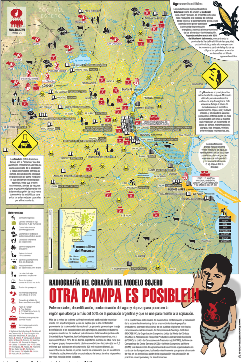
Iconoclasistas’ Radiografía del Corazón del Modelo Sojero

What’s really exciting is the mining Mesquita has done, coming up with a range of map work that will surprise the causal observer of, say, Fahlström (in particular); but also the way he attaches all this work to that of antecedents (like the Surrealists and the Situationists) and parallels (as in the work of Trevor Paglen).

Structure of the dissertation's argument

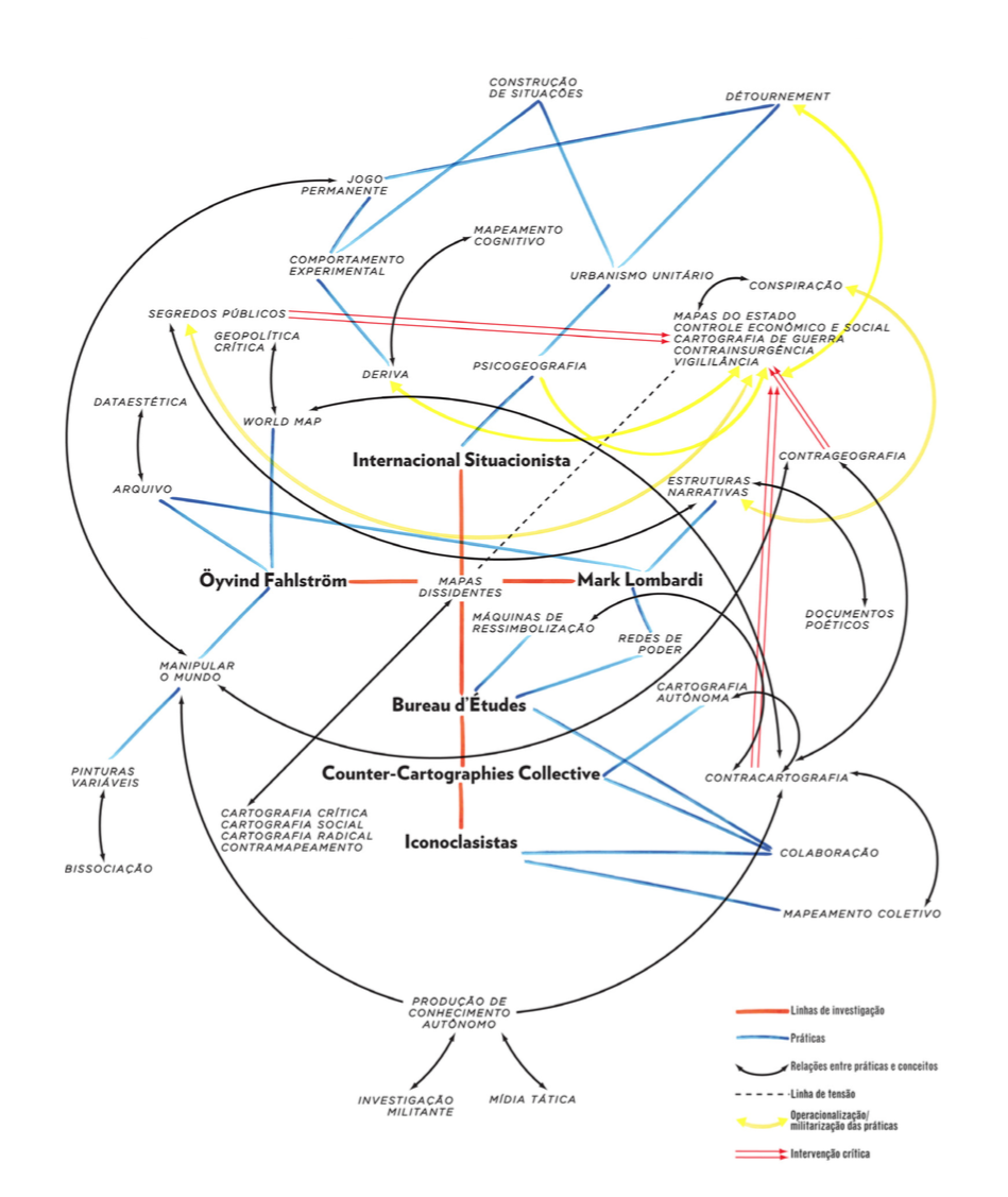
Map of the Dissertation’s Argument

This is an important piece of work. Mesquita is currently working on a translation to English.

The full dissertation can be downloaded here or here (55.4 mb)

Contact André Luiz Mesquita

Read Full Post »

Francois de Dainville, in his Le Language des Geographes (1964, p. 162), compiled map symbols for various water crossings from historical European maps (1543-1777).

The symbols include boats (Bac, above), fords (Gué, below)…

…and bridges (Pont, below).

The entire set of symbols in one image:

Read Full Post »

bunge_runovermap.jpg

When Bill Bunge mapped out the locations of car/pedestrian collisions in Detroit (Detroit Geographical Expedition, 1968) he and the map were advocating a way of thinking about what was happening to the black community in Detroit – and advocating for change.

All maps advocate.

To advocate means to “to speak or write in favor of; support or urge by argument; recommend publicly.” The word derives from the Latin advocate: “to call to one’s aid.”

What map does not advocate, or argue for something? We are always calling maps to our aid.

Three free books on maps and advocacy have been made available for download recently, and are worth a look.

•••••

Two New PDF Books [added June 6 2009]:

Good Practices in Participatory Mapping (2mb PDF here, 2009). Published by International Fund for Agricultural Development.

A review of participatory mapping methods.

This report will review existing knowledge related to participatory mapping and recent developments. Specifically:

  • Section 1 will define the main features of participatory mapping;
  • Section 2 will discuss key applications of participatory mapping;
  • Section 3 will present specific tools used in participatory mapping, including their strengths and weaknesses;
  • Section 4 will identify good practices and explore the significance of process in participatory mapping initiatives.

participatorymapping

•••••

Toolbox & Manual: Mapping the Vulnerability of Communities (4.4mb PDF English version here, Portuguese version aqui, 2008). Published by Salzburg University Centre for Geoinformatics.

A overview of concepts and methods for community mapping, focused on vulnerability.

Within the research and project context it is aimed to provide the local communities with appropriate maps of their communities. The maps should enhance planning and decision making processes within the communities in regard to reduce local vulnerabilities and allow appropriate planning of disaster response measures. It is the first time in Mozambique that maps have been produced with such an accuracy (high resolution data) and for disaster risk management through the integration of participatory practices.

mappingvulnerability

•••••

•••••

Visualizing Information for Advocacy: an Introduction to Information Design (7mb PDF here, January 2008). Published by Tactical Technology Collective.

Succinct, well-designed, with many good examples of maps and information graphics for advocacy.

…a manual aimed at helping NGOs and advocates strengthen their campaigns and projects through communicating vital information with greater impact. This project aims to raise awareness, introduce concepts, and promote good practice in information design – a powerful tool for advocacy, outreach, research, organization and education.

vifa1

vifa2

•••••

Maps for Advocacy: An Introduction to Geographic Mapping Techniques (3mb PDF here, September 2008). Published by Tactical Technology Collective.

A great overview of maps and advocacy with many examples and resources.

The booklet is an effective guide to using maps in advocacy. The mapping process for advocacy is explained vividly through case studies, descriptions of procedures and methods, a review of data sources as well as a glossary of mapping terminology. Scattered through the booklet are links to websites which afford a glance at a few prolific mapping efforts.

mfa1

mfa2•••••

Field Guide for Humanitarian Mapping (3.2mb PDF here, March 2009). Published by MapAction.

A textbook for using maps and GIS in humanitarian work.  The Guide provides detailed information on data collection (GPS) and the use of Google Earth and MapWindow (free mapping software).

The guide was written to meet the need for practical, step-by-step advice for aid workers who wish to use free and open-source resources to produce maps both at field and headquarters levels. The first edition contains an introduction to the topic of GIS, followed by chapters focused on the use of two recommended free software tools: Google Earth, and MapWindow. However much of the guidance is also relevant for users of other software.

fghm1 fghm2

•••••

Some related resources:

Read Full Post »

snowice_header

This manual establishes the design, weights, and gauges of symbols, and the type styles and sizes to be used in compiling and drafting standard topographic maps prepared by the Army Map Service for publication at the scale of 1:1,000,000.

During the compilation stages, strict adherence to symbol specifications shall not be required.  Line weights and gauges may be varied twenty percent (20%), plus or minus, from prescribed specifications.

In using the symbols specified for drafting, strict adherence to the prescribed weights and gauges must be maintained.

The examples below are map symbols for permanent ice and snow features.

The 1953 Army Map Service guide Symbols for Small Scale Maps details map symbol specifications for compiled maps (left, below) and drafted maps (right, below). Compiled maps are the initial draft of a map, where diverse sources of information are drawn together.  Using the compiled map, a cartographic draftsman creates the final, drafted map, suitable for printing.

snowice_symbols1

The map symbol specifications include detailed symbol dimensions:

Specifications for glaciers:

snowice_glacier

Specifications for ice cliffs:

snowice_icecliff

Specifications for the limits of icefields or snowfields:

snowice_limits

The entire page 22 of the Army Map Service Symbols for Small Scale Maps, including specifications for permanent snow and ice features is linked below:

snowice_symbols_all

Read Full Post »

wood_natures_maps1

Denis Wood & John Fels’ new book The Natures of Maps is available now from the University of Chicago Press and many other sources. The lowest price I can find at this time is $29 (at Buy.com). Denis is, of course, co-author of the Making Maps book.

The book is big – almost a foot square – with color maps on almost every page.  The book had a harrowing path to publication.  Originally under contract to ESRI Press, the book was in final galleys (ready to print but for a handful of edits) when ESRI Press decided to cancel it and a dozen other books in process.  Given the expense of producing the book (and the cost of reproduction rights to the illustrations) this seemed to be a peculiar business decision.  The University of Chicago Press subsequently acquired the book, more or less ready to print.

Here’s an “editorial” blurb I wrote for the book:

If Wood & Fels’ The Power of Maps showed that maps were powerful, The Natures of Maps reveals the source of that power. The Natures of Maps is about a simple but profound idea: maps are propositions, maps are arguments. The book confronts nature on maps – nature as threatened, nature as threatening, nature as grandeur, cornucopia, possessable, as a system, mystery, and park – with intense slow readings of exemplary historical and contemporary maps, which populate this full color, beautifully illustrated and designed book.

The careful interrogation of maps reveals that far from passively reflecting nature, they instead make sustained, carefully crafted, and precise arguments about nature. The Natures of Maps shows how maps establish nature, and how we establish maps. The power of maps extends not only from their ability to express the complexities of the natural world in an efficient and engaging manner, but in their ability to mask that they are an argument, a proposal about what they show.

The implications of the arguments in The Natures of Maps are significant, empowering map users and makers. The Natures of Maps shows that neither map users or map creators are passive, merely accepting or purveying reality; they are, instead, actively engaged in a vital process of shaping our understanding of nature in all its complexity. Map users have a critical responsibility, the power to accept, reject, or counter-argue with the maps they encounter. Map creators have creative responsibility, the power to build and finesse their arguments, marshalling data and design for broader goals of understanding and communicating truths about the world. Rethinking how maps work in terms of propositional logic, with its 2000-year history and vast methodological and theoretical foundation, promises to be one of the most profound advances in cartographic theory in decades, and The Natures of Maps shows the way in a captivating manner.

Considering maps from the perspective of propositional logic provides a rigorous foundation for a theory of the map that transcends disciplinary boundaries. Scholars from the humanities, social sciences, and natural sciences will find Wood and Fels’ The Natures of Maps intellectually sound, methodologically useful, and deeply engaging. But the beauty of The Natures of Maps is that it is not merely an academic book. Wood and Fels’ The Natures of Maps is a powerful, beautifully illustrated and engaged argument about maps as arguments that will appeal to map lovers, map makers, map users, and map scholars.

Read Full Post »

00_opener_invert.jpg

Erwin Raisz is among the most creative cartographers of the 20th century, known in particular for his maps of landforms.

In 1931 Raisz outlined and illustrated the methods behind his landform maps, in an article in the Geographical Review (Vol. 21, No. 2, April 1931). Excerpts from the text and graphics in the article are included below.

Raisz’s approach is to create complex pictorial map symbols for specific landform types. Each specific application, of course, would have to modify the symbols to fit the configuration of particular landforms.

One of the limitations of Raisz’s work is that it is so personal and idiosyncratic that it virtually defies automation or application in the realm of computer mapping. Thus digital cartography has, in some cases, limited the kind of maps we can produce.

Raisz writes:

There is one problem in cartography which has not yet been solved: the depiction of the scenery of large areas on small-scale maps.

00_title.jpg

01_plains.png

02-05_coastal.png

Most of our school maps show contour lines with or without color tints. Excellent as this method is on detailed topographic sheets … it fails when it has to be generalized for a small-scale map of a large area. Nor does the other common method, hachuring, serve better.

06-08_plateau.png

For the study of settlement, land utilization, or any other aspect of man’s occupation of the earth it is more important to have information about the ruggedness, trend, and character of mountains, ridges, plains, plateaus, canyons, and so on-in a word, the physiography of the region.

09-13_plateau.png

Our purpose here is to describe and define more closely a method already, in use, what we may call the physiographic method of showing scenery. This method is an outgrowth of the block diagram. [T]he method was fully developed by William Morris Davis. Professor Davis has used block diagrams more to illustrate physiographic principles than to represent actual scenery.

14-18_complex.png

19-23_pene.png

Professor A. K. Lobeck’s Physiographic Diagram of the United States and the one of Europe do away entirely with the block form, and the physiographic symbols are systematically applied to the vertical map. His book Block Diagrams is the most extended treatise on the subject.

24-28_lime.jpg

29_34_desert.jpg

It is probable that the mathematically-minded cartographer will abhor this method. It goes back to the primitive conceptions of the early maps, showing mountains obliquely on a map where everything should be seen vertically. We cannot measure off elevation or the angle of slope. Nevertheless, this method is based on as firm a scientific principle as a contour or hachure map: the underlying science is not mathematics but physiography.

35-40_fiords.png

If we regard the physiographic map as a systematic application of a set of symbols instead of a bird’s-eye view of a region, we do not violate cartographic principles even though the symbols are derived from oblique views instead of vertical views. It may be observed that our present swamp symbols are derived from a side view of water plants.

••••••

Landform map symbols include: plains (sand & gravel, semiarid, grassland, savannah, forest, needle forest, forest swamp, swamp, tidal marsh, cultivated land), coastal plain, flood plain, alluvial fans, conoplain, cuesta land, plateau (subdued, young, dissected), folded mountains, dome mountains, block mountains, complex mountains (high, glaciated, medium, low, rejuvenated), peneplane, lava plateau (young, dissected), volcanoes, limestone region (with sinkholes, dissected, karst, tropical, mogotes), coral reefs, sand dunes, desert of gravel (serir), deflated stone surfaces (hamada), clay (takyr), loess region, glacial moraine, kames, drumlin region, fjords, glaciers, shoreline (sand, gravel, cliffed), and elevated shorelines & terraces.

Read Full Post »

spring_wells_stack.jpg

Wells

Springs

Successful, Unsuccessful

Nonmineral, Mineral

Nonmineral, Mineral, Artesian, Gravity, Artesian, Gravity

Rise, No Rise, Rise, No rise, Cold, Warm, Cold, Cold, Warm, Cold

Flowing, Nonflowing, Flowing, Nonflowing

Those are all the wells and springs…

springs_wells_150dpi.jpg

In general there has been no attempt at uniformity of practice in the delineation on maps of underground water features or of wells or springs… …it now appears desirable that a concerted movement be made to develop a uniform system of symbols for use on maps.

The number of symbols devised should be sufficient for the representation of all features which it is desirable to show. If wholly arbitrary devices are used, confusion will result whenever a considerable number are used simultaneously, but this difficulty will be largely avoided if the system adopted is based on a few suggestive forms grouped according to easily remembered principles.

The principles to be considered in devising a system of well and spring symbols for underground water maps are (1) simplicity, (2) clearness, (3) ease of making, and (4) suggestiveness. Failure to answer these various requirements ruled out many of the arbitrary systems used in the past…

It is believed that a system of symbols can be most logically developed if a single arbitrary device is taken as a base. In common practice a circle is most often used for a well, while more or less closely allied devices are used for springs. Inasmuch as both wells and springs are ordinarily approximately circular, this device, which seems to have both the required simplicity and suggestiveness, is proposed.

Words of map symbolization wisdom from “Representation of Wells and Springs on Maps” by Myron Fuller in Water-Supply and Irrigation Paper No. 160, U.S. Geological Survey (1906).

Read Full Post »


cartogram-1911_title.jpg

A cartogram varies the size of geographic areas based on the data values associated with each area. Typical cartograms scale geographic areas to population, GNP, electoral votes, etc.

This “apportionment map,” as creator William B. Bailey (Professor of Political Economy, Yale University) calls it, scales the size of U.S. states to the size of their population (in 1910). Note that New York has colonized much of the upper Midwest.

The map, published April 6, 1911 in The Independent is one of the earliest cartograms I have seen.

Apportionment means “allotment in proper shares.” Thus, each state size is allotted based on population, not actual geographical area. Is a curious term to use, possibly more meaningful than the somewhat vague term “cartogram” (a “map diagram”).

Bailey writes:

The map shown on this page is drawn on the principle that the population is evenly distributed thruout the whole United States, and that the area of the States varies directly with their population. With the map constructed on this principle some curious changes become apparent. On the ordinary map the four States, Montana, Wyoming, Colorado, and New Mexico, together with the seven States which lie to the west of them, comprise more than one-third of the territory of the United States, and the area of each one of them is considerably larger than that of New York State; yet the population of New York State alone is nearly one-fourth larger than the combined population of these eleven Western States. In fact, the entire territory to the west of the Mississippi River contains only about 5 per cent. more people than are to be found in the New England States, together with New York, New Jersey, and Pennsylvania. Yet the territory at present covered by these nine Eastern States is only about two-thirds as large as the State of Texas. If we should add to these nine Eastern States the population of Ohio, the total would be greater by about three millions than the entire population west of the Mississippi. The State of Rhode Island, hardly visible to the naked eye on the ordinary map, now becomes almost as large as the territory of Utah and Arizona combined.

Were Texas as densely populated as is the State of Rhode Island, it would contain a population of nearly eighty-five millions, leaving only six millions of our people to be scattered thruout the rest of the country. Were the population of the United Stats as a whole as dense of that of Rhode Island this country would have more than a billion inhabitants.

(more…)

Read Full Post »

tenement-header.jpg

Map of New York City, Showing the Distribution of the Principal Nationalities by Sanitary Districts published in Harper’s Weekly (January 5, 1895, pp. 60–61) using 1890 U.S. Census data.

This map looks great, revealing a substantial amount of information with its intense, juxtaposed patterns.

The textures on the map show the relative amounts of different nationalities (qualitative data) in each of the areas (sanitary districts) on the map:

tenement_map_legend.jpg

The map shows if a district has more or less diversity (more or fewer lines of different textures), the relative proportions of different nationalities, the nationalities themselves, and, at a broader scale, the districts that are similar or differ in their nationality constitution. Because of the careful rotation of the lines of textures, the different sanitary districts can also be distinguished from each other.

(more…)

Read Full Post »

rgada_1209.jpg

Making maps is rife with rules. But following rules does not necessarily produce a great (or even good) map. It may be the implementation of broader design principles that leads to a successful map.

Principles are an intellectual generalization of a broad field of knowledge: a kind of map, in the broadest sense of the word.

They are useful for guiding map makers and helping map users understand how maps work.

There are numerous sets of cartographic design principles. My previous post on Edward Tufte distilled six map design principles (or commandments as I called them) from Tufte’s first book, The Visual Display of Quantitative Information.

In 1999 the British Cartographic Society’s Design Group proposed “Five Principles of Cartographic Design.” When I first came across this set of principles I thought them interesting – even a bit passionate – a rare state of affairs in the often stoic world of cartography. I added a few maps and my own comments (in italics).

More on these map design principles below: Concept before Compilation, Hierarchy with Harmony, Simplicity from Sacrifice, Maximum Information at Minimum Cost, and Engage the Emotion to Engage the Mind.

Cool maps below include: Geo-Smiley Terror Spree Map, The Continents and Islands of Mankind, Hate Groups and Hate Crimes Map, and Where Commuters Run Over Black Children, Detroit 1968.
(more…)

Read Full Post »