Feeds:
Posts
Comments

Posts Tagged ‘History of Cartography’

Francois de Dainville, in his Le Language des Geographes (1964, p. 162), compiled map symbols for various water crossings from historical European maps (1543-1777).

The symbols include boats (Bac, above), fords (Gué, below)…

…and bridges (Pont, below).

The entire set of symbols in one image:

Read Full Post »

The Survey of Egypt, 1910, 1:1,000,000, Sheet 5 (detail 1, close-up)

•••

Found while cleaning out an old map cabinet: oceans of just about nothing, punctuated by signs of a minimal landscape. Soiled, creased, tears, dusty. Thumb-print and fading pencil marks, from someone who stared at this map a long time ago.

Details from a topographic map of Egypt in 6 sheets, published by The Survey of Egypt in 1910, scale 1:1,000,000.

Click on any map for a larger version of the scan.

•••

The Survey of Egypt, 1910, 1:1,000,000, Sheet 5 (detail 1)

•••

The Survey of Egypt, 1910, 1:1,000,000, Sheet 1 (detail 1)

•••

The Survey of Egypt, 1910, 1:1,000,000, Sheet 1 (detail 2)

•••

Note the type leaking over the map border (Mediterranean, Lake Borollos, Gharbia)

The Survey of Egypt, 1910, 1:1,000,000, Sheet 1 (detail 3 – close-up)

•••

Note the type leaking over the map border (Mediterranean, Lake Borollos, Gharbia)

The Survey of Egypt, 1910, 1:1,000,000, Sheet 1 (detail 3)

•••

The Survey of Egypt, 1910, 1:1,000,000, Sheet 3 (detail 1 – close-up)

•••

The Survey of Egypt, 1910, 1:1,000,000, Sheet 3 (detail 1)

•••

The Survey of Egypt, 1910, 1:1,000,000, Sheet 5 (detail 2)

•••

The Survey of Egypt, 1910, 1:1,000,000, Sheet 6 (detail 1)

Read Full Post »

pop_proj_alone_150

Stop making cartograms! At least until permission is granted from the chap who holds the patent on them.

Karl Karsten’s “population projection” was published in his book Charts and Graphs (1923) and patented in 1925. As with the 1911 “Apportioinment Map” noted in an earlier post, the term “cartogram” was not used by Karsten to describe this creation.  He called it the “Population Projection.”

Curiously, it’s claimed that Karsten also invented the hedge fund.

But back to maps.

Karsten’s patent, (#1,556, 609, October 13, 1925) claimed rights to

…a map of a plurality of territories, having their boundary lines so distorted as to make their included areas represent graphically the relative importance of a given factor other than land area of one area with respect to another area, the boundaries being distorted without losing their familiar and significant features…

Karsten suggests using his “population projection” as a base upon which to map other data, such as truancy rates (below).  Thus it’s a bivariate cartogram (reproduced from p. 667 in Charts and Graphs):

truancy_popproj_150

The idea is good, but in practice it’s a bit wonky.  Several western US states are reduced to toothpick dimensions, and note the New York goiter (New York City). Also, Karsten seems to have some degree of difficulty maintaining the horizontal with the map and the legend. Could he have had an inner-ear infection?

But back to maps.

The illustration in Karsten’s patent reveals his methodology:

pop_proj_patentmap

Details of the methodology can be found in the text of the patent.

Karsten, in Charts and Graphs, explains the justification for using the “population projection” which is, more or less, the same line of argument used in current discussions of cartograms:

We do not sell our goods to the mountains, bill them to the rivers, or credit the forests with payment. Probably from at least a subconscious appreciation of this circumstance, many national distributors, advertisers, and sales-managers have discarded maps on which the rivers, forests or mountains are shown when they are studying the geographic distribution of their sales. The up-to-date sales manager lots his distributing points and records his sales in a great many ways upon maps which carry only faint State outlines or a the most show the location of larger cities. But why stop here? Your sales manager does not sell to square miles, acres, or other units of land-area measurement. He sells to human beings. Why should he use maps which show, not human beings, but square miles, that is, maps in which the areas indicate not the population but the land surface? Why indeed!

The result of this projection of the map of the United Statues upon a population basis rather than a land-area basis will be most surprising even to the most hardened travelers.

Needless to say, the picture of sales conditions which such a map exhibits, will be far more valuable and useful than the picture upon the usual land-area basis. In short, the corrected areas of the States serve to give an excellent background or evaluation of the importance of the statistics plotted upon the map.

The number of ways in which the map can be altered and projected for special purposes upon special bases is unlimited, but all are alike in one respect – that their areas no longer show physical land areas in square miles but show the actual values more important for the special purposes in view.

In 2005 a series of cartogram patents (here here here) failed to cite Karsten’s patent.

Read Full Post »

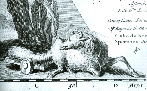
fat-tailed-map

from “Fat Tailed Sheep on Maps of Africa”
The Map Collector, 1 June 1979

Collectors are a peculiar lot.  They can frustrate somber scholars with their unconventional research methods and seeming interest in objects rather than context.  Yet the passion and obsessiveness of collectors often produces an endless source of interesting materials.

The Map Collector (1977-1996) was a magazine devoted to maps as collectible objects.  Within its pages could be found some rather interesting articles on all sorts of maps and cartographic ephemera.

Where else would one find an article about fat-tailed sheep illustrated on old maps of Africa?

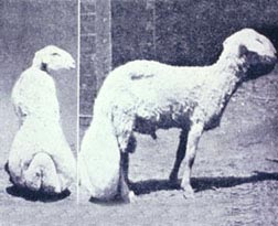
fattai01

Yes they are real (source and here)

Kunstpedia, a “knowledge base on fine and decorative arts, popularly stated arts and antiques, with the exception of contemporary art” has acquired permission to publish Map Collector articles, full text with images, on their web pages.

Articles, which continue to be added to the site, include:

Hotchkiss

“One of America’s Foremost Cartographers: Jed Hotchkiss”
by Peter Roper

•••••

cigarette

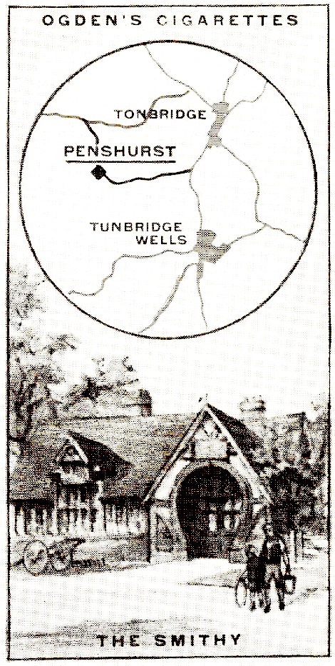
“Maps on Cigarette Cards”
by Martin Murray

•••••

“Pocket Maps for Travellers”
by Katherine R. Goodwin

•••••

“Maps that made Cabmen Honest”
by Ralph Hyde

•••••

“The Indigenous Maps and Mapping of North American Indians”
by G. Malcolm Lewis

•••••

“The Great Lakes of Africa”
by R.V. Tooley

•••••

“History of Watermarks”
by Bob Akers

•••••

“Old Korean Hand Atlases”
by Shannon McCune

•••••

Also of interest:

Read Full Post »

alsace_archaeo

arch-detail

alsace_archaeo_leg4

alsace_archaeo_leg3alsace_archaeo_leg2

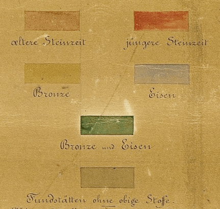
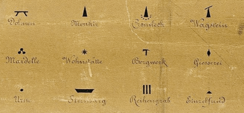
Prähistorische Karte von Südwestdeutschland und der Schweiz, 1879

(Protohistoric and Prehistoric Discoveries …)

Looking at working maps – manuscripts, field sketches, and provisional maps – reveals a diversity of symbolization and design which are lost in the monoculture of finished, standardized maps.

HistCarto brings together more than 4000 17th-19th century French manuscript maps.  All are working maps, and most are hand drawn.  Most contain signs of assessment:

These “signs of assessment” include textual commentaries or the addition of symbols, which provide some indication of the ways the maps were made or the uses to which they were put in an administrative or military capacity.

Map symbols and topics shown here include prehistoric sites, farm fields, trees and forests, rivers, hunting grounds, geology, terrain, and property parcels.

The site is in French.  Once at the site, click on the Acces a la base link on the right.  Then select Recherche (on the left) and Simple.  I tried to link each of the maps below to its page at the HistCarto site, but you must be logged into the site for the links to work.  Not optimal!  So I removed the links.  To find the maps, just search the site using the map’s title (below each map).

•••

Detail, farm fields near Neuhof forest (1787):

neuhof

Plan de la forêt du Neuhof

•••

Detail, farm fields near Poppenreuth (1795):

poppenreuth

Mappa Geographica Parochiae Poppenreutensis

•••

Detail, farm fields near Strasbourg (no date):

fields1

Carte des environs de Strasbourg

•••

Detail, farm fields near Herlisheim (1760):

gambsheim_1760_2

Projet d’une nouvelle route entre Gambsheim et Drusenheim

•••

Details, trees,  Château de Karlsruhe (no date):

karlsruhe

Plan du château de Karlsruhe

•••

Detail, forests near Molsheim (no date):

molsheim1

Plan de Molsheim

•••

Detail, forests near Mont Sainte Odile (1810):

odile

Les environs du Mont Sainte-Odile

•••

Detail, forests near Thann (1815):

thann1

Lever à Vue de la Ville de Thann et des Montagnes qui l’environnent

•••

Drachenkopf Forest, detail and full map (no date):

drachenkopf_1

drachenkopf_2

Forêt de Drachenkopf

•••

Detail, map of Strasburg (1765):

stras_water

Plan de Strasbourg en 1765

•••

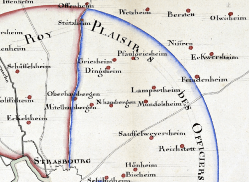
Hunting grounds in the vicinity of Strasbourg, reserved for the king and officers (1739):

strasbourg_1

Terrains de chasse aux environs de Strasbourg

•••

Revision on Geologic Map, Barr Region (no date):

barr

Région de Barr: Carte Géologique

•••

Detail, hand-drawn map of Euphrates (no date):

euphrates

The river Euphrates with the Cilician Taurus and Northern Syria

•••

Detail, terrain near Munster (no date):

belfort

Carte des Vosges depuis Belfort jusqu’à Landau

•••

Detail, terrain on map of mining concessions near Thann and Dauendorf (1705):

thann

Concessions minières dans les environs de Thann et de Dauendorf

•••

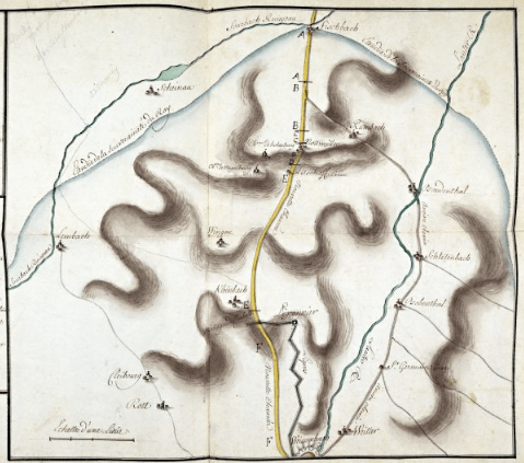
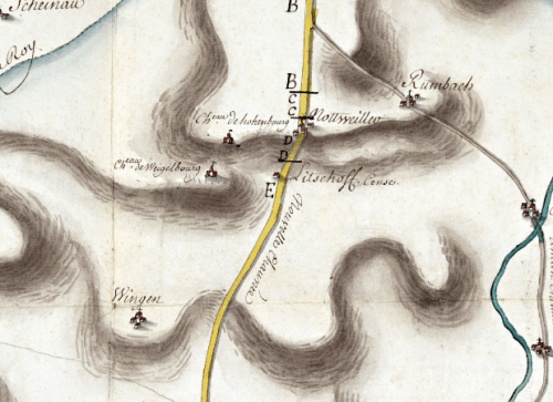
Map showing two roads linking Wissembourg and Fischbach and a new road (in yellow) (no date):
wissembourg_2

wissembourg_1

Deux routes reliant Fischbach et Wissembourg

•••

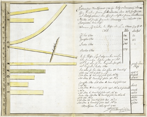
Parcels in a portion of municipal Nordheim (1782):
nordheim_1781

Portion du communal de Nordheim

Read Full Post »

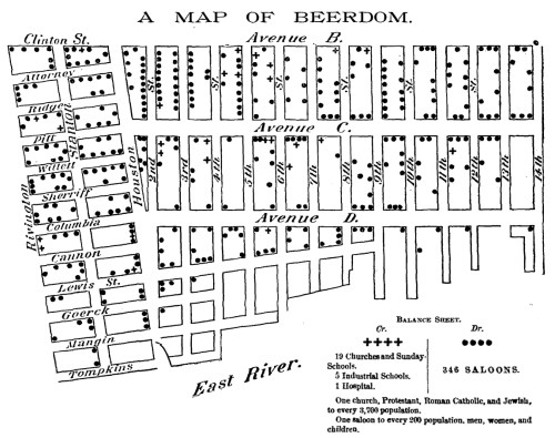
beerdom_map

“In the morning they come out with queer-looking eyes…”

The above map represents one ward of New York City – the Eleventh.

The saloons as put upon this map were ascertained by the reporter of the Christian Union by actual count.

The saloons are largely beer saloons: for the base of the population is German, and a large intermingling of German sounds, German signs, German wares, and German smells generally, prevail.

Pretty much all the available space, after enough room has been taken out for houses and grown people and huckster’s stands, is filled by stout, chubby, healthy-looking children – with here and there a punier waif – of all ages and sizes, mostly young and small, and of all degrees of cleanliness, from comparatively clean to superlatively dirty.

The Ward is reported by the police to be as orderly as any in the city.

The German is peculiar.  Unlike his Irish and Yankee cousins, he does not make a great noise and hurrah over his cups, and wind up with a street brawl.  He gathers unto himself a few kindred spirits, and together they wend their way to the Trink-Halle, where, in a little back room, with closed doors and drawn curtains, they guzzle beer together till none of them can see.  In the morning they come out with queer-looking eyes, but there has been no disturbance in the place.

Said a clergyman to your reporter, “I came into the ward expecting to find nothing but filth and vice.  But I could take you into hundreds of homes where you would find ease and comfort and even culture.

Balance Sheet:

  • 19 Churches and Sunday-Schools, 5 Industrial Schools, 1 Hospital
  • 346 Saloons
  • One saloon to every 200 population.

Christian Union, February 19, 1885.  PDF of entire article and map is here.

Read Full Post »

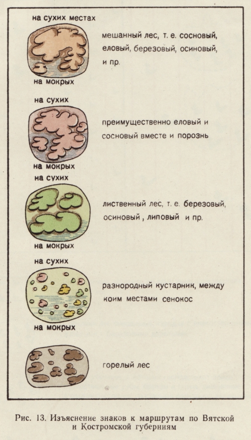
russian_forest_symbols_5

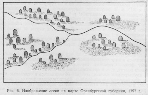
Examples of map symbols used to show trees and forests on old Russian maps (1700s & 1800s) are documented in Izobrazhenie Lesa Na Kartakh by Liudmila Andreevna Shaposhnikova.  The title is roughly translated to “How Forests are Depicted on Maps.” The book was published in Moskva, former USSR, in 1957.

russian_forest_symbols_4

russian_forest_symbols_6

russian_forest_symbols_7

russian_forest_symbols_8

russian_forest_symbols_12

russian_forest_symbols_13

russian_forest_symbols_14

1/22/09: Tree symbols from these maps inspired a new role-playing map by Chgowiz – very cool!  Click on the close-up below to get the entire map:

rpgmap

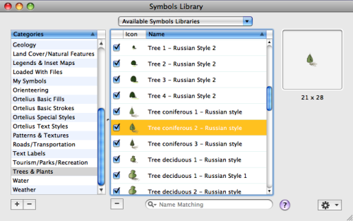
4/8/09: Tree symbols from these old Russian maps have also been incorporated in the soon to be released Ortelius map illustration software for Macintosh:

image

Read Full Post »

Holy crap!

What to do when one of the few iconic prehistoric maps isn’t a map?

The 6200 BC “map” of Çatalhöyük in Turkey, complete with erupting “volcano” in the background, prefaces many discussions of maps and mapping.  It is used to situate contemporary mapping as part of a long trajectory – “humans have always made maps.”

Alas, an important characteristic of any prehistoric “map” is that we can only speculate as to the intent of the creator. Yes we can look at some squiggly lines and say “hey, that looks like a map” but, of course, that depends on a modern sense of what a map is.  And, possibly, a tendency for us to see maps where there are none.

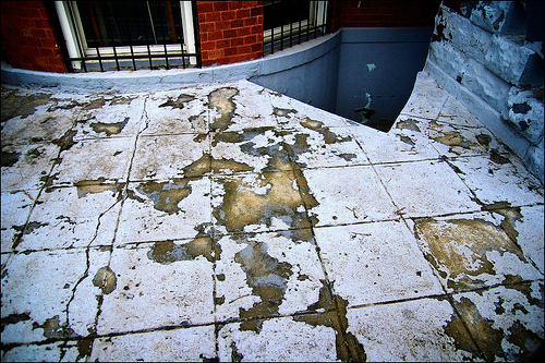
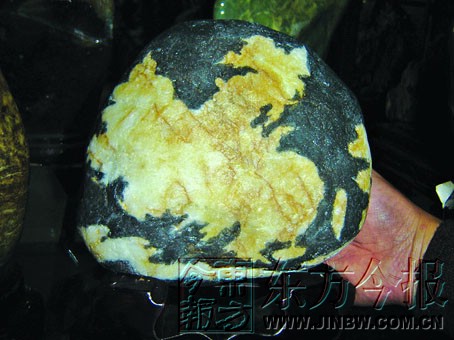
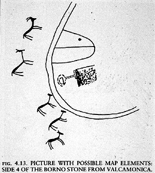
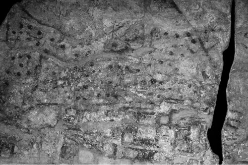
Indeed, many prehistoric “maps” may be the result of cartocacoethes – a mania, uncontrollable urge, compulsion or itch to see maps everywhere. Map simulacra like chipped paint: a stone China: a mud puddle Australia: and “geographic tongue:” – a medical condition that “looks like a map.”

See also the many prehistoric squiggles (below left) illustrated in Catherine Delano Smith’s “Cartography in the Prehistoric Period in the Old World” in Brian Harley and David Woodward’s The History of Cartography, Volume One (Chicago, 1987, pp. 54-101).

Part of me really wants these marks chipped in stone to be maps. But there does not seem to be much, if any, evidence that they are.

Why do we want mapping to stretch back into prehistory?  If maps didn’t exist in prehistory, and were scarce prior to 1500, does that somehow undermine the importance of contemporary maps and mapping? What drives this cartocacoethes?

The Çatalhöyük “map” provides a great case study of the perils of prehistoric map hunting.

The Çatalhöyük map was first brought to attention in a 1964 article entitled “Excavations at Çatal Hüyük, 1963, Third Preliminary Report” by James Mellaart (Anatolian Studies 14 (1964, pp. 39-119).

A map of the excavations (right) shows the area allegedly represented on the “map.”

Mellaart’s 1967 book Çatal Hüyük: A Neolithic Town in Anatolia claimed that the Neolithic Anatolians at Çatalhöyük created the World’s first map, and fame for the map followed.

“The oldest town plan in existence” says Jeremy Harwood in To the Ends of the Earth: 100 Maps that Changed the World. “The oldest authenticated map in the world” says J.B. Harley in the UNESCO Courier. Of maps, it is, says Catherine Delano Smith in Imago Mundi, “the oldest known.”  “The Catal Huyuk map … is perhaps 2000 years older than the oldest known writing system and 4000 or more years older than the oldest known alphabetical writing system…” says James Blaut in Transactions of the Institute of British Geographers. Heck, I even towed the party line in my introductory maps course lecture on the history of mapping.

Whoa, folks.

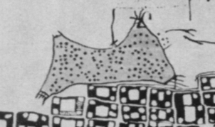
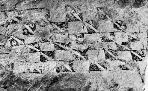
Archaeologist Stephanie Meece recently published an article in Anatolian Studies questioning the Çatalhöyük map’s status as a map.  The original “map” wall painting is shown below, in a photo from Mellaart’s 1964 article.  Most people have only seen the redrawing of the “map” with “volcano” (above) – not the original image.

In her article “A Bird’s Eye View – Of A Leopard’s Spots: The Çatalhöyük ‘Map’ and the Development of Cartographic Representation in Prehistory” (Anatolian Studies 56, 2006, pp. 1-16; full text here) Meece interrogates the claim that the particular wall painting found at Çatalhöyük is a map with erupting volcano in the background.  Meece writes (in an email exchange):

…one of the take-home messages of the article was to go beyond the tendency to identify the images in isolation, based on a personal recognition of similarity. I wanted to emphasise the need to understand the paintings in their contexts, as part of a generations-old, well developed cultural tradition; taking one image out of its context and pointing out its superficial resemblance to something else is a bane of archaeologists, and leads to von Daniken and his spaceships.

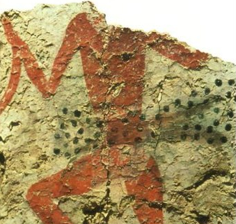
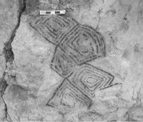
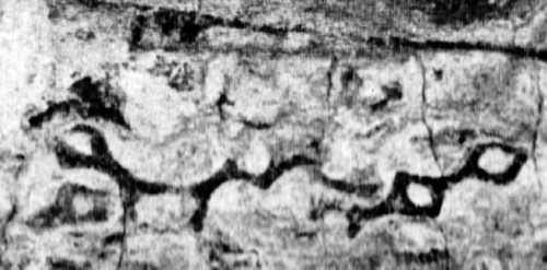
The “volcano” in the wall painting (below top; redrawing, bottom left) was originally interpreted by Mellaart as a leopard-skin costume, similar to other leopard skin images found at Çatalhöyük (bottom right). Meece writes:

In several later paintings, notably the large so-called hunting scenes, human figures are depicted wearing stiff ‘skirts’ and head coverings that are painted with simple dots. The skirts are conventionally depicted as two wide triangles connected at their base, with two sharp points.  They are twice as long as they are wide, and are filled in with dark-coloured dots, similar to the appearance of a stretched, prepared leopard skin.

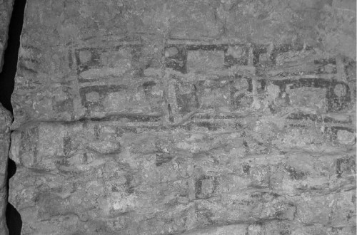
The lower part of the wall painting, the “map,” does resemble the general layout of houses at Çatalhöyük, with storerooms surrounding a central room.  Nevertheless, claims Meece,

These geometric designs below the leopard skin are better understood as part of the very common (though their abundance is under-represented in the published discussions of the paintings at the site) tradition of painted panels, placed along the lower registers of house walls.  The ‘map’ pattern is entirely consistent with the standard range of motifs used in other buildings: a cell-like structure, repeated in horizontal lines, often with borders or frames enclosing each cell.


Meece examines an impressive array of evidence surrounding the painting and concludes

… looking closely at the wall painting, and situating it within the corpus of art objects at Çatalhöyük, it is clear that the original interpretation is much more likely to be the correct one.  The painting is unlikely to be a map of Çatalhöyük, but rather depicts a leopard skin in the upper register, and the lower section is one of the very typical geometric patterns commonly found at the site.

Oh well.

In a forthcoming article entitled “Maps” Denis Wood and I argue

… if prehistoric humans did make maps – which is doubtful – they were neither made often nor in very many places; they likely served broadly pictorial, religious, ritual, symbolic, and/or magical functions; and their production was discontinuous with the practice of mapmaking encountered in historic populations.

Read Full Post »

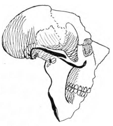
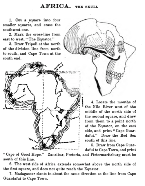
Drawing maps used to be a big part of the geography curriculum in the U.S. One guide for students, published in 1900, is Schutze’s Amusing Geography and System of Map Drawing by Lenore Schutze.  Tips for Africa, “The Skull” as Schutze sees it:

1. Cut a square into four smaller squares, and erase the southwest one.

2. Mark the cross-line from east to west, “The Equator.”

3. Draw Tripoli at the north of the division line from north to south, and Cape Town at the south end.

4. Locate the mouths of the Nile River west of the middle of the north side of the second square, and draw from them to a point north of the Equator, on the east side, and print “Cape Guardafui.”  Draw the Red Sea south of this line.

5. Draw from Cape Guardafuit to Cape Town, and print “Cape of Good Hope.”  Zanzibar, Pretoria, and Pietermaritzburg must be south of this line.

6. The west side of Africa extends somewhat above the north side of the first square, and does not quite reach the Equator.

7. Madagascar slants in about the same direction as the line from Cape Guardafui to Cape Town.

The entire page on Africa from Schutze’s Amusing Geography and System of Map Drawing (1900) p. 43 is below:

Read Full Post »