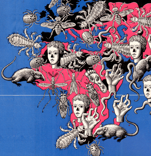
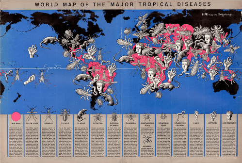
 Back when Denis Wood and I were planning the 3rd edition of Making Maps, I stumbled upon a map of world tropical diseases Boris Artzybasheff created for Life Magazine (“World Map of the Major Tropical Diseases,” Life Magazine, May 1, 1944; high-resolution version at the David Rumsey Map Collection).
Boris Artzybasheff was born in 1899 in the Ukranian city of Kharkov. His father was author Mikhail Artsybashev. He emmigrated to the U.S. in 1919. Artzybasheff created 219 covers for Time Magazine between 1942 and 1966. He was also a commercial graphic designer and worked for the U.S. Department of State during and after WW2. He is best known for his grotesque and surrealistic graphic work (source). Just google his name, or see a gallery of his diverse work here.
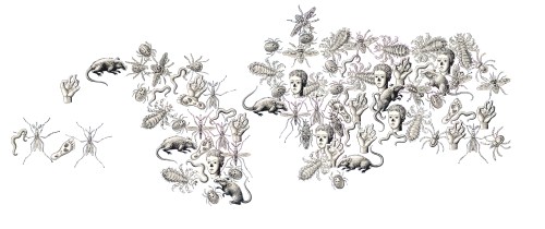
The tropical diseases map is relatively conventional except for the 14 disease symbols Artzybasheff crowded on the map. If the point was to make those who peered at the two-page spread feel uncomfortable, the map hit its mark.
Mapping conventions are so imposing that even the most distinctive and creative map maker bows to convention over creativity. Not quite so, at least in this case, with Artzybasheff. The symbols are a prime example of Artzybasheff’s style, grotesque neo-realism, with a whif of the macabre; one of the prime instances where a major graphic artist applied his aesthetic, largely unimpeded, to the cartographic arts.
Artzybasheff’s Maps and other Information Graphics
 “In the late 1930s and early 1940s Artzybasheff began illustrating articles for Fortune and other popular magazines, usually with vividly drawn graphic renditions of maps or other informational diagrams. In the September, 1940 issue of Fortune magazine, for example, Artzybasheff provided a striking and colorful illustration for an article on how military pilots experience oxygen deficiencies and aeroembolism (decompression sickness or temporary blackouts attributed to nitrogen bubbles that form in the spinal fluid) when ascending rapidly to heights of 30,000 feet.” (Williams, 2007, p. 126). Diagram (left): “A Pilot’s Blackout,” from “Selection of Military Pilots: Not Every Flyer is Fit for Combat,” Fortune, September 1940, p. 81.
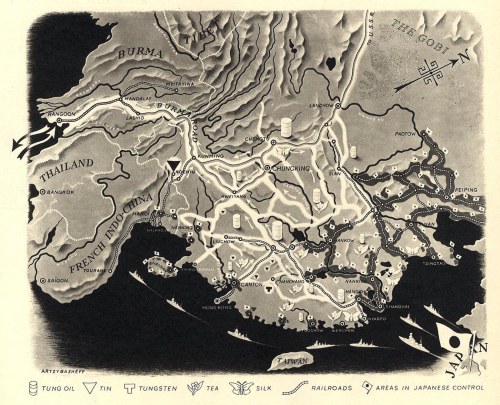
“In another, he provided a clear and detailed map of China’s main roads and rivers, showing which areas were under Japanese control, and how Chiang Kai-shek was dealing with the distribution of oil and other natural resources.” Map: “China in Japan,” Fortune, December, 1940, 106.
Work for the U.S. Department of State
Artzybasheff had other cartogaphic ties during and after WW2, driven by his friendship with S.W. Boggs, the U.S. Department of State’s official geographer (1927-1954). “Boggs was responsible for initiating partnerships between artists such as Artzybasheff and the State Department for technical cartographic advice and map production, but in the process absorbed an appreciation of these artists’ global visualization and their sense of the larger American public.” (Barney, 2011, p. 186)
Artzybasheff “…became advisor to the US Department of State and Psychological Warfare Branch, institutions heavily involved in the marketing of national policies and war propaganda. The war had been a period of active political involvement both for Artzybasheff and his wife, who was employed as recruitment chairman in the Manhattan Volunteer Office of Civilian Defense.” (Patsiaouras, Fitchett, & Saren, 2014, p. 127).
There is mention of an atlas by several sources, the earliest being R. John Williams in 2007: “Artzybasheff also worked as a geographer for the State Department, and developed an atlas that would be used by the U.S. Army Training Command, providing important visual information to military strategists in Europe.” (Williams, 2007, p. 140). Williams does not cite the source for this information, and I have not found any evidence this atlas was published (although it may be in an archive somewhere).
Boggs also enlisted Artzybasheff as a consultant on a 1947 film called Expanding World Relationships. The film was distributed by the U.S. Information Agency. (Barney, 2011, p. 189-191).
A final Boggs inspired project involved an effort to communicate the impact of map projections on perception of the earth and global political relations. The outcome was published in an article called “Global Relations of the United States” in The Department of State Bulletin (vol. 30, #781, June 14, 1954, here).
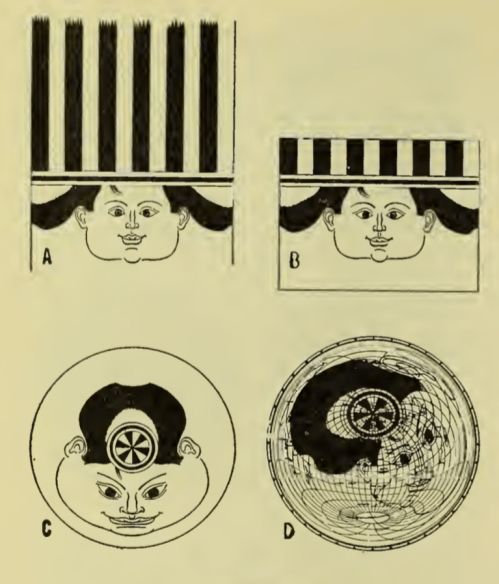
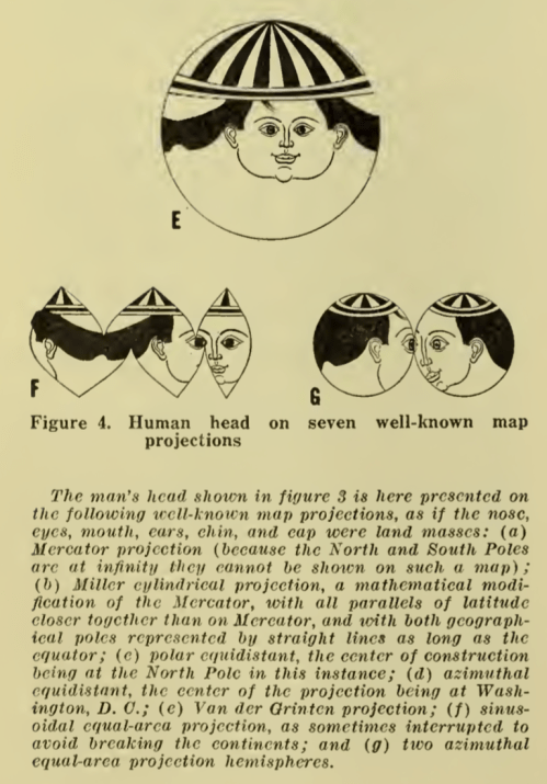
 “In a 1942 letter to Artzybasheff, Boggs asks if the artist could potentially draw the head of a man on a white billiard ball, in hopes of designing a model that could show how projecting global features creates significant distortions on a flat map—in other words, flattening the nations and populations of the world is much like flattening a person’s face beyond all recognition. As he points out to Artzybasheff, ‘What I would like to get across to the ‘flat-mappers’ is that when we are looking at a flat map which includes the whole world, we are looking at a caricature which is analogous to representing the face, both sides of the head, back and top of the head, and beneath the chin all on one flat surface.” (Barney, 2011, p. 189)
The outcome, also illustrated in”Global Relations of the United States” was not particularly successful as these types of diagrams go. The face did not cover enough of the sphere to be distorted that greatly, and what we are left with is the tonsured hair of the figure spread about the projected illustration.
 |
 |
Sources
Timothy Barney, (Re)Placing America: Cold War Mapping And The Mediation Of International Space, Dissertation, University of Maryland, 2011. Direct PDF download here. Published as Mapping the Cold War: Cartography and the Framing of America’s International Power, 2015.
Georgios Patsiaouras, James Fitchett & Michael Saren. “Boris Artzybasheff and the Art of Anthropomorphic Marketing in Early American Consumer Culture.” Journal of Marketing Management, Vol. 30, Nos. 1–2, pp. 117–137, 2014.
R. John Williams. “‘I Like Machines’: Boris Artzybasheff’s Machine Aesthetic and the Ends of Cyborg Culture.” Technoculture: Special Issue of Interdisciplinary Humanities 23.1, pp. 120-142, 2007. PDF here.
A few additional Artzybasheff maps follow.
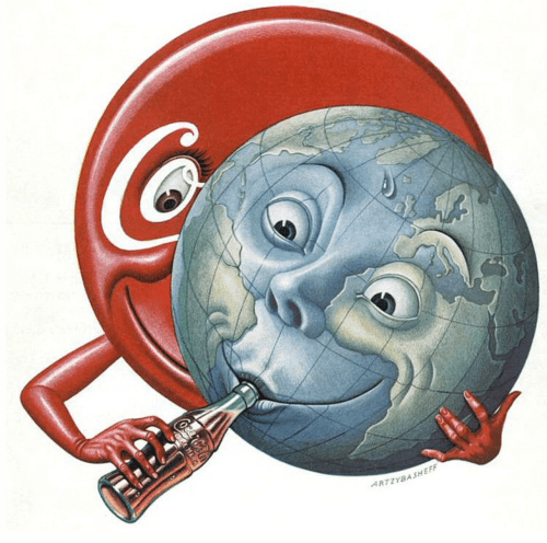
The cover for Time Magazine (May 15, 1950) was graced by a Coke sucking earth:
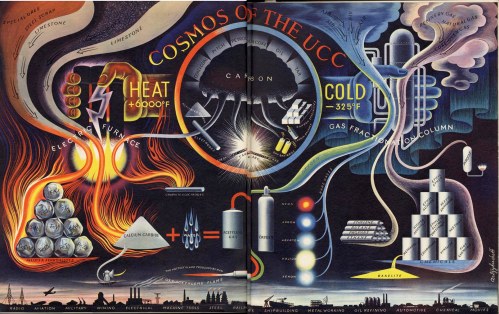
“Cosmos of the UCC,” from Fortune, June 1941. UCC is Union Carbide & Carbon Corporation.
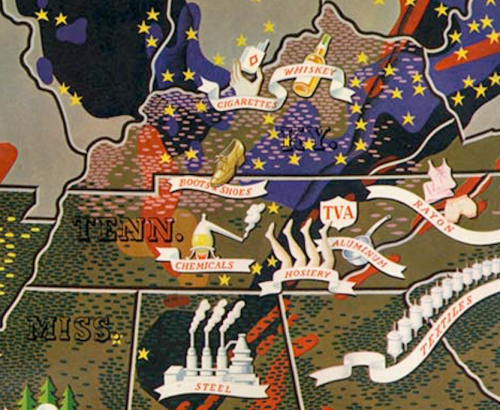
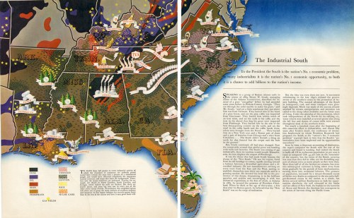
A map to accompany an article “The Industrial South” (Fortune, November 18, 1938) is not unlike the style of Erwin Raisz (previously, on this blog) in its use of pictorial map symbols.
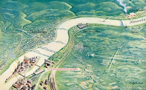
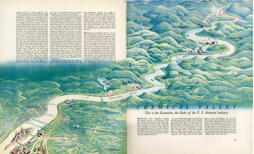
“Chemical Valley” (West Virginia’s Kanawha Valley) from the September 1941 issue of Fortune:
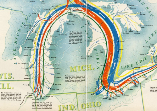
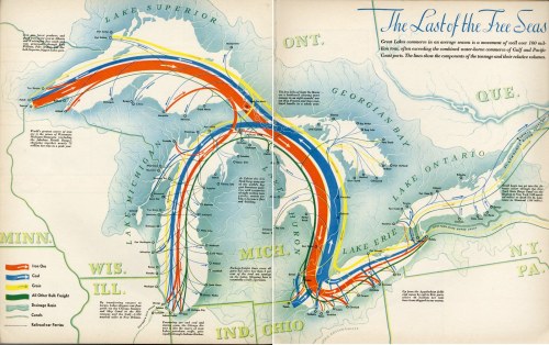
“The Last of the Free Seas” was published in Fortune in July of 1940.

This is a dynamite post John, thanks for sending it.
[…] Boris Artzybasheff’s Maps 2 by galfarragem | 0 comments on Hacker News. […]
[…] Boris Artzybasheff’s Maps 2 by galfarragem | 0 comments on Hacker News. […]
Splendid, John.
[…] doing research for the post on Boris Artzybasheff’s Maps I came across mention of a movie – Expanding World Relationships – created by State Department […]