Feeds:
Posts
Comments

Archive for the ‘02 Why Are You Making Your Map?’ Category

Crippled children study map on ceiling while they lie on table taking treatments…

Innovations in linoleum maps, ca 1942:

Linoleum_map

Located in the Shrine Hospital in San Francisco.

Map made from 451 individual pieces, and measures 32 feet by 12 feet.

Popular Mechanics, August 1942

Read Full Post »

Schmid_multivariate_suicide

In the field of sociology, perhaps one of the most useful devices for the graphic presentation of facts is the cartogram or statistical map. Recently there has been an increasing emphasis on the ecological and statistical phases of social analysis. This development has given the map much greater significance and utility in the methodology of sociology.

The chief value of the spot-map, though not highly refined or developed at present, seems to be that of an instrument of social discovery and analysis. Significant relations and correspondence of variables, which might otherwise be overlooked, are brought into graphic relief by the spotmap.

Schmid_multivariate_suicide_legend

Notwithstanding that the spot-map is characteristically quite elementary, if not, as some critics say, superficial, yet it can be delineated so that it shows several variables at once with specificity, accuracy, and clarity.

Schmid_multivariate_churches_legend

Although the spot-map has its limitations, it is justifiable to say that there is no other way in which the relation between so many facts as are contained in the above maps can be shown so clearly and concisely.

Schmid_multivariate_churches

It may be argued that a large number of symbols tends to obscure rather than to elucidate the significance of the data, and at the same time necessitating an unduly large amount of time and effort. This point of view may, in some instances, be justified, but if the number of symbols is reasonably large, and if they are simple in form and logically and visually arranged, this argument becomes untenable.

Calvin F. Schmid
“Notes on Two Multiple-Variable Spot Maps”
Social Forces, Vol. 6, No. 3. (Mar., 1928), pp. 378-382.

.

Read Full Post »

Schulten_Chinatown

Detail from a rare 1885 map showing vice in San Francisco’s Chinatown. Vice includes gambling (dark orange), Chinese prostitution (green), opium houses (yellow), Joss Houses (red) and White prostitution (blue). The map, from the Rumsey Map Collection, is an early example of detailed urban social mapping, in this case motivated by strong anti-Chinese sentiment. Click on the map (above) for more details from Historian Susan Schulten’s blog Mapping the Nation.

Schulten’s blog and website for her terrific book Mapping the Nation: History and Cartography in Nineteenth-Century America contain a wealth of maps and graphics. The book itself looks at the pivotal 19th century – when mapping expanded to include a diversity of human, social, cultural, political and environmental phenomena.

Selected details of maps from the blog are below: click on the title or image to see the entire map.

••••••••••

schulten_ch1-1

Emma Willard, “Introductory” Map of American History (1828)

“This map opened one of the first historical atlases of America, created by the noted educator Emma Willard. Note that she marked not just the location of tribes, but their migration over time.”

••••••••••

Schulten_ch1-2

Emma Willard, “First” Map of American History (1828)

“Willard’s second map in the atlas marked the earliest voyages to America, and took pains to represent change over time. Note the inclusion of failed voyages and settlements.”

••••••••••

Schulten_ch2-1

Diagram of the History of Political Parties in the United States (to 1880) (1880)

“Here is one of the many attempts to represent American history in graphic terms that flourished in the wake of the nation’s centennial, and which was updated in 1894.”

••••••••••

Schulten_ch2-2

Transportation and Rates of Travel (1932)

“Here Charles Paullin represented advances in transportation technology in geographic terms in order to depict the qualitative changes over the course of American history.”

••••••••••

Schulten_ch3-1

Course of Cholera in Boston in 1849 (1849)

“This is one of many examples of a map designed for etiological purposes, in this case to locate the source of the city’s 1849 cholera epidemic.”

••••••••••

Schulten_ch3-2

Sanitary Map of the City of New Orleans (1855)

“Barton compiled this complex map to locate the origin of the yellow fever outbreak of 1853, even noting the arrival of ships in the city port.”

••••••••••

Schulten_ch4-1

Map of the Cotton Regions of North America (1862)

“Mallet designed this complex map to guide the British as they developed cotton in India, drawing on existing geological and environmental maps from the era.”

••••••••••

Schulten_ch4-2

Map Showing the Distribution of the Slave Population of the Southern States (1861)

“One of the first American attempts to translate the census into cartographic form, and a favorite of President Lincoln during the Civil War.”

••••••••••

Schulten_ch5-1

Map of Bison Distribution Over Time (1876)

“This map depicts the shrinking bison population, highlighting the effects of expansion at the nation’s centennial. It became the model for William Temple Hornaday’s well-known map of 1887.”

••••••••••

Schulten_ch5-2

Geological Map of the United States (1872)

“This stunning map owed much to its antebellum maps of geology as well as the fine chromolithography of Julius Bien.”

••••••••••

9780226103969

Susan Schulten
Mapping the Nation: History and Cartography in Nineteenth-Century America
University of Chicago Press, 2012

Part One: Mapping the Past

Chapter 1: The Graphic Foundations of American History
Chapter 2: Capturing the Past through Maps

Part Two: Mapping the Present

Chapter 3: Disease, Expansion, and the Rise of Environmental Mapping
Chapter 4: Slavery and the Origin of Statistical Cartography
Chapter 5: The Cartographic Consolidation of America

Read Full Post »

spy_maps_close

Back in 2008 the word cartocacoethes was first used on this blog to describe “a mania, uncontrollable urge, compulsion or itch to see maps everywhere.”

Counter cartocacoethes can be applied in the world of espionage allowing spies to sneak intelligence out of hostile territories – making maps that don’t look like maps.

Stained-glass windows, butterfiles, leaves, moth heads…

spy_maps

In making the drawings of fortified positions after ascertaining their plans, it was the work of the spy so to disguise them that their true character would not be recognized in the event of his capture by military authorities in the country where he was operating.

The plans of a fortification were first drawn in a regular manner and then disguised. In one case this was done by sketching ostensibly a stained-glass window. To the casual observer the drawing would bear no indication of its importance, but to the spy it was a carefully executed map of a military stronghold.

In another case the spy chose an ivy leaf as a pattern, the veins being drawn to represent the outline of the fortified position; the shading marking the ground sheltered from fire, and heavy spots, resembling worm-eaten holes, the positions of the large guns.

The entire article, reproduced in Popular Mechanics (July 1915) from an article in The Sketch (February 24, 1915):

spy_maps_text1

spy_maps_text2

Read Full Post »

first_aid_explosives

First-Aid Station; Explosives Room

•••••

brattice

Concrete Brattice (with Manhole, Solid); Timber Door

•••••

along_the_line

Telephone; Power Line; Electric Light; Motor, Fan; Pump; Hoist; Gong

•••••

shaft_stations

Shaft Stations

•••••

Mine_Symbols_1919_3

Conventions Used on Mine Maps (entire plate)

•••••

mine_openings

Mine Openings: Shafts (Rectangular, Circular); Tunnels; Diamond Drill Hole; Churn Drill Prospect Hole; Water Well; Oil Well; Gas Well; Sulphur Well, Barren Well; Mines & Quarries; Prospects

•••••

Mine_Symbols_1919_2

Conventions Used on Topographic Maps (entire plate)

•••••

hypsography

Hypsography: Contours, Dumps, Dump and Car Track, Fills, Open Cuts, Cut, Stripping, Open Pits; Sand and Sand Dunes

•••••

Mine_Symbols_1919_1

Conventions Used on Topographic Maps (entire plate)

•••••

rock_types

Limestone, Sand, Conglomerate, Drift, Metamorphic Rock, Gneiss

•••••

Mine_Symbols_1919_4

Geologic Conventions (entire plate)

•••••

Source: Lester C. Uren (1919) “Conventional Symbols for Mine Maps.” Mining and Scientific Press (August 16, 1919 p. 231-235)

Read Full Post »

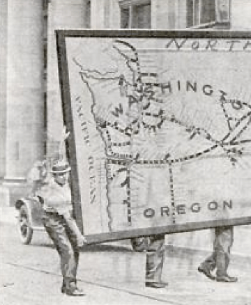
moving_large_map_crop

It measures 69 feet long and 11 feet wide and required the services of nearly a dozen men to carry it…

Enormous map moving, ca. 1917.

moving_large_map

moving_large_map_text

The map shows that portion of the United States between the eastern boundary of Minnesota and the Pacific coast, and the entire Northern Pacific Railway system, including practically every station on the line.

Popular Mechanics, February 1917.

Read Full Post »

Chemical smoke puffs represent exploding shells…

smoking_map_pg_may_1927

Surveyed through field glasses that make it appear miles away, a novel war map at Princeton University makes artillery practice realistic to students of the Princeton unit of the Reserve Officers Training Corps.

…Each student takes his turn at directing the miniature “barrage.” The ingenious map is operated by the instructor, who follows the student’s data and commands to fire. A small adjoining map is criss-crossed with lines showing where shells with various ranges would strike. Over this key chart moves a lever which, placed at the spot where the student’s shot would fall, swings a glass nozzle to a corresponding position on the large map; at the student’s word “fire” a puff of artificial smoke is released.

Popular Mechanics, May 1927

Read Full Post »

Several signal officers flying alone or as passengers were able to make usable sketch maps of the country below them, as they flew two or three thousand feet in the air.

airmap

The practicability of making war maps from aeroplanes during aerial scouting expeditions into the enemy’s territory has recently been tested by the signal corps of the United States army and found entirely feasible. Several signal officers flying alone or as passengers were able to make usable sketch maps of the country below them, as they flew two or three thousand feet in the air. Two maps that were made during these tests are reproduced [above].

One of them is the rough sketch map drawn by Lieut. W.C. Sherman while riding as a passenger in an aeroplane with Lieut. Thomas DeWitt Milling on his record flight from Texas City to San Antonio. Tex., on March 28, 1913. It was drawn while they were traveling 56 miles an hour and, by means of the signal corps symbols, gives a clear picture of the country tover which they passed. Railroads, highways, streams. towns, woods. etc., are marked, and the figures on the lefthand margin indicate the aeroplane’s time. The original sketch is 12 ft. long and to scale, 6 1/2 inches equaling 10 minutes, and 1 in. equaling 1.44 mile. The other is a completed map drawn from a sketch of San Diego; Cal., and vicinity made by Lieut. J. D. Park while flying alone on May 3, 1913. a few days before his death in an aeroplane accident on May 9. The coast line and the topography of the country are indicated clearly enough to be of value to an attacking force, and at various points clear fields where airmen might make safe landings are marked out. Although the strip of country included in the map is 5 miles wide and 15 miles long, the entire sketch was made during a 35-minute flight from the aviation field at the south along the line of the railroad. At times the airman reached a height of over 3,000 ft. and from there was able to note the character of the country for 10 miles about.

Popular Mechanics Magazine, Volume 20, Number 4, October 1913.

Read Full Post »

The isotherms nestle together,
The isobars tenderly twine…

cupids-weather-map-poem-1907_map

Cupid’s Weather Map

If Gladys had sent me no message,
Or the mail from Palm Beach met mishap,
Though I lacked premonition or presage
Or courage the wires to tap,
I am sure I could learn when she planned her return
From one look at the weather man’s map.

You’ll notice, no matter in what light
These loops and festoons you may view,
Wherever she moves, like a spot-light,
A zone of fair weather moves, too.
The breezes of May will be blowing her way
When our cars and our fingers are blue.

One sunshiny patch, set off clearly
In a country with rain-clouds all black,
To-day travels northward or nearly,
While a blizzard descends in its track.
Can I possibly err if from this I infer
That Gladys is on her way back?

No; the stupid old map of the weather
Tells the news in its tiniest line.
The isotherms nestle together,
The isobars tenderly twine,
While the forecast they print bears so rosy a tint
It well might be Cupid’s – or mine.

Philip Loring Allen

cupids-weather-map-poem-1907

Life, February 28, 1907, p. 49

Read Full Post »

I Don’t Want To But I Will: Title Page of Denis Wood’s Dissertation

Throughout graduate school I heard tales of the Denis Wood’s outrageous dissertation, curiously titled I Don’t Want To But I Will. Of particular interest are the scathing Acknowledgments, where Denis took his advisors to task. A worn copy of the Acknowledgments was passed among grad students as a bit of intellectual contraband.

But the content was what was most important. It’s a crazy dissertation. It’s about maps, mental maps, getting kicked off a bus, psychogeography, single element veridicality analysis, Europe, cartography, Kevin Lynch, passed-out subjects, Peter Gould, psychogeomorphology, the Shirelles, and the invention of “Environmental a” – a language for mapping. Among other things. It is driving the wrong way down the one-way-street of academia.

The dissertation was printed in a very limited number by the Clark University Cartographic Laboratory. Denis has recently made available a PDF of this never-really-in-print gem. I have reproduced Denis’ comments on the different chapters in the dissertation, along with links to the entire document and each chapter, from his web pages (here).

••••••••••

I DON’T WANT TO, BUT I WILL

By Denis Wood

1973

Download it by chapters (below) or as a single 685-page document.

The front matter, including the dedication (by the Shirelles), the notorious acknowledgements (my unhelpful faculty and the rare humans), credits (as in a movie), and Introduction (opening with Ed’s story, a night watchman on the edge of Castle Hill park, and going on to talk about psychogeography and various kinds of mental maps).

PART I: Psyching Up for the Trip (a sort of philosophy section).

Chapter 1: The Beginning of All This (“How would you like to go to Europe this summer?” Bob Beck asked me; and the design of the study).

Chapter 2: Some Relevant Ancestors (individual, consensual, and standard mental maps, Peter Gould, and Kevin Lynch; or, what passes in the trade for the “review of the literature”).

Chapter 3: The Study Tools (Bob and I invent Environmental a, a mapping language).

Chapter 4: The Study Starts Before the Trip (long-distance training in Environmental a and the “predictive morphologies” of London, Rome, and Paris).

PART II: The Trip or Denis’ Inferno (the novelesque part).

Chapter 5: What Others Have Thought of Travel (a bouquet of quotations about travel).

Chapter 6: A Terminal Wet Towel (Bob and I meet the Group L kids at Kennedy and what happens after that).

Chapter 7: A Day on a Tour (the first day: I will show you blood in a handful of data).

Chapter 8: Down and Out in London (the week in London).

Chapter 9: Parnassus in Innsbruck (and one of the kids ODs or, well, just passes out).

Chapter 10: When in Rome, Don’t Do as I Did (in which I get drunk and kicked off the bus).

Chapter 11: Kid’s Lib, or Aristocracy in Exile (in which the kids take control of the research and collect all the Paris data).

Chapter 12: Old Tours Never Die, They Just Fade Away (in which, months later, a bunch of us get together again for a weekend in New York).

PART III: After the Trip; or What’s in Klein’s Bottle (the “science” part of the dissertation).

Chapter 13: Tripping and Tracing through the Data (trace events; or the crumbs of the cookies left for Santa).

Chapter 14: The Content of the Tour (applying Lynchian content analysis to the traces left by the Group L kids).

Chapter 15: Travel Connections (or trying to wrap graph theory around the kids sketch maps).

Chapter 16: Hanging Out the Rivers to Dry (trying to read the maps through something I called single element veridicality analysis).

Chapter 17: Pagan Curves, Lincoln Variations, and Eber Aberrations (or the quest for the warped space of human experience and psychogeomorphology).

Chapter 18: Bigger is Better – Or Worse (you draw what you feel; or, the analysis of the areal and feelin overlays).

Chapter 19: You Are Where You Sit (the analysis of the bus seating charts and their relation to the maps; or, Fixers, Mixers, and Rangers).

Chapter 20: That’s the End of the Movie! ! ? ? ! ? ? (which is a whole long list of “conclusionettes” that concludes, “That the subject can have the first, last and most comprehensive word on the subject of the investigation itself, specifically that: I DIDN’T WANT TO, BUT I DID.”

BIBLIOGRAPHY

Read Full Post »

« Newer Posts - Older Posts »