Detail from a rare 1885 map showing vice in San Francisco’s Chinatown. Vice includes gambling (dark orange), Chinese prostitution (green), opium houses (yellow), Joss Houses (red) and White prostitution (blue). The map, from the Rumsey Map Collection, is an early example of detailed urban social mapping, in this case motivated by strong anti-Chinese sentiment. Click on the map (above) for more details from Historian Susan Schulten’s blog Mapping the Nation.
Schulten’s blog and website for her terrific book Mapping the Nation: History and Cartography in Nineteenth-Century America contain a wealth of maps and graphics. The book itself looks at the pivotal 19th century – when mapping expanded to include a diversity of human, social, cultural, political and environmental phenomena.
Selected details of maps from the blog are below: click on the title or image to see the entire map.
••••••••••

Emma Willard, “Introductory” Map of American History (1828)
“This map opened one of the first historical atlases of America, created by the noted educator Emma Willard. Note that she marked not just the location of tribes, but their migration over time.”
••••••••••

Emma Willard, “First” Map of American History (1828)
“Willard’s second map in the atlas marked the earliest voyages to America, and took pains to represent change over time. Note the inclusion of failed voyages and settlements.”
••••••••••

Diagram of the History of Political Parties in the United States (to 1880) (1880)
“Here is one of the many attempts to represent American history in graphic terms that flourished in the wake of the nation’s centennial, and which was updated in 1894.”
••••••••••

Transportation and Rates of Travel (1932)
“Here Charles Paullin represented advances in transportation technology in geographic terms in order to depict the qualitative changes over the course of American history.”
••••••••••

Course of Cholera in Boston in 1849 (1849)
“This is one of many examples of a map designed for etiological purposes, in this case to locate the source of the city’s 1849 cholera epidemic.”
••••••••••

Sanitary Map of the City of New Orleans (1855)
“Barton compiled this complex map to locate the origin of the yellow fever outbreak of 1853, even noting the arrival of ships in the city port.”
••••••••••

Map of the Cotton Regions of North America (1862)
“Mallet designed this complex map to guide the British as they developed cotton in India, drawing on existing geological and environmental maps from the era.”
••••••••••

Map Showing the Distribution of the Slave Population of the Southern States (1861)
“One of the first American attempts to translate the census into cartographic form, and a favorite of President Lincoln during the Civil War.”
••••••••••

Map of Bison Distribution Over Time (1876)
“This map depicts the shrinking bison population, highlighting the effects of expansion at the nation’s centennial. It became the model for William Temple Hornaday’s well-known map of 1887.”
••••••••••

Geological Map of the United States (1872)
“This stunning map owed much to its antebellum maps of geology as well as the fine chromolithography of Julius Bien.”
••••••••••

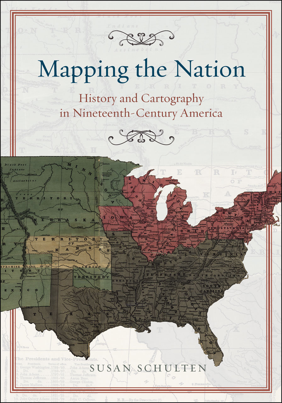
Susan Schulten
Mapping the Nation: History and Cartography in Nineteenth-Century America
University of Chicago Press, 2012
Part One: Mapping the Past
Chapter 1: The Graphic Foundations of American History
Chapter 2: Capturing the Past through Maps
Part Two: Mapping the Present
Chapter 3: Disease, Expansion, and the Rise of Environmental Mapping
Chapter 4: Slavery and the Origin of Statistical Cartography
Chapter 5: The Cartographic Consolidation of America
Read Full Post »