
Posts Tagged ‘Making Maps’
Making Maps now at makingmaps.substack.com
Posted in 01 What's A Map?, 02 Why Are You Making Your Map?, 03 Mappable Data, 04 Map-Making Tools, 05 Geographic Framework, 06 Map Layout, 07 Hierarchies, 08 Generalization & Classification, 09 Map Symbolization, 10 Type on Maps, 11 Color on Maps, 12 Finishing Your Map, tagged Cartography, data analytics, Denis Wood, Geographic Information Systems, geospatial, information design, John Krygier, Making Maps, maps on January 17, 2025| Leave a Comment »
2nd Edition | Making Maps | Early 2011
Posted in Making Maps Book News, Map Books, Maps Made, tagged Cartography, Denis Wood, Geographic Information Systems, GIS, Graphic Design, John Krygier, Making Maps, Making Maps - book - second edition, Map Design, Map texts, Visualization on December 15, 2010| 4 Comments »

Cover, Making Maps, 2nd edition (Amazon | Guilford)
Krygier and Wood’s book should be used by anyone interested in the way the world looks, the way the world works, or the way the world should be. It remains the most accessible yet comprehensive guide of its kind. The second edition meets the needs and expectations of the “Google generation” of map users while remaining true to the guiding principles that govern how maps look, work, and function. The very accessible, extensively illustrated format makes the book easily usable by students at all levels, as well as those taking steps to develop expertise in cartographic design. Paul Longley, Department of Geography, University College London, United Kingdom.
Building on their solid first edition, Krygier and Wood have created a new and much richer follow-up. The second edition represents a serious reworking of subject matter and graphics. The book uses extraordinary map exemplars to address the full range of basic cartographic concepts and to demonstrate many subtle and advanced design techniques as well. Making Maps is appropriate for beginning to intermediate college cartography students and others who want to tap into the power of map creation. Addressing current social issues including map agendas, ethics, and democracy, it is the kind of book that will inspire readers and cultivate admiration for the field. James E. Meacham, Senior Research Associate and InfoGraphics Lab Director, Department of Geography, University of Oregon.
More than two years in the making, the second edition of the book Making Maps is set for printing. Copies should be available in February or March of 2011. A Korean translation (?!) is planned for 2012.
This is no weenie update: Denis and I ruthlessly reorganized and rethought every bit of content in the book. I then redesigned the entire book and spent the better part of eight months producing it. We both think it’s a much better book.
Denis and I were careful to keep the spirit of the first edition of Making Maps intact while sharpening the overall look, content, and usability of the book. The goal from the beginning was to create a map design text that was different from other map design texts – more visual, creative, critical, engaging, and focused on making maps as well as really understanding how they work. It is a synthesis of what we like most about the academic study of maps and the actual design and production of maps. It is difficult to express how complex and challenging achieving this goal has been. When I look at this new edition, it feels so easy. Why couldn’t we have just done this 8 years ago when I started on the initial edition of the book?
The 2nd edition is larger in size (now 7″ x 10″) allowing more content on each page. In a Tuftean fit of non-data-ink removal, gone are a bunch of pages that didn’t have much content (such as the overview pages near the beginning of each chapter). We did retain ample white space, since absence makes the heart fonder.
We also added new material, including many real mapped examples, yet we are dozens of pages shorter than the first edition. Our goal was a lean book – “the greatest number of ideas in the shortest time with the least ink in the smallest space” – as Tufte put it.
The cover initiates an expanded version of the “road connector controversy” which sets up the point of the book – you make things happen by making maps.


There is a completely new first chapter setting the context for the entire book. It introduces The Flight of Voyager map, which is annotated a dozen times over throughout the book showing how map design concepts in the text play out on an actual map:

The chapters in the book are about the same, with a new first chapter and some recast chapter names:
Introduction
1: How to Make a Map
2: What’s Your Map For?
3: Mappable Data
4: Map Making Tools
5: Geographic Framework
6: The Big Picture of Map Design
7: The Inner Workings of Map Design
8: Map Generalization and Classification
9: Map Symbolization
10: Words on Maps
11: Color on Maps
While some chapters retain a significant amount of the original edition’s material, chapters 6 and 7 were extensively revised.
A makingmaps.net blog posting “How Useful is Tufte for Making Maps?” led me to incorporate Tufte’s ideas in the book in a much more explicit manner than in the 1st edition. See, for example, the Tufte-influenced annotated Flight of Voyager map (2 page spread, chapter 6) below:

Chapter 7 was revised as “The Inner Workings of Map Design” including figure ground:

Chapter 9 on map symbols also underwent significant renovations:


•••••••••••••••
Making Making Maps … Second Edition
I am but slightly embarrassed to admit that, once again, I produced the entire book in a 6-year-old version of the now defunct Freehand MX software. My original plan was to shift to InDesign since I was redesigning the entire book, but in the end I just wanted to make the damn book rather than futzing with transferring the maps and graphics from Freehand to InDesign and learning the ins and outs of InDesign. So my plan is to eventually shift the entire book to InDesign assuming a 3rd edition sometime in the future.
The book was produced on my 4-year-old MacBook Pro, which allowed me to work on it at home on the dining room table, at home on the table on our front porch (where Denis and I had earlier sat and pounded through the plan for the 2nd edition), at CupOJoe coffee at the end of the block, at Panera while waiting to pick up Annabelle after her morning pre-school, at soccer practice at some god-forsaken indoor soccer warehouse in the hellish outer suburbs of Columbus, in Raleigh NC whilst visiting Denis to work on the book, at the OSU recreation center with the climbing wall, at the OSU recreation center with the pool (both while waiting for kids to finish various climbey or splashy activities), at my parents house in Waukesha (Wisconsin), the Caribou Coffee in Waukesha, my in-laws in River Hills Wisconsin, and in my office at Ohio Wesleyan.
•••••••••••••••
This is really a labor of love – given the time and brain power expended on the text – and we both hope this new edition lives up to the expectations of the kind and usually enthusiastic readers of the first edition.
A Crooked Stick Straightened: Map Making as Juvenile Delinquent Reform
Posted in 02 Why Are You Making Your Map?, Deep Map Thoughts, Map History, tagged Making Maps, maps, Maps-Bad Boys, Maps-Reformatory, Maps-School Marms on November 17, 2010| 1 Comment »
From a slouching, unkempt, uncouth, shambling, horrid boy, he emerged into being a respectable, neat, tidy, order-loving, painstaking, and industrious young man.
– Miss Winthrop, 1888

I had an ugly, unruly boy in my room, and be gave me more trouble than all the rest of the class. When I inherited him I felt as if Nemesis had overtaken me, and just how to control him and secure any kind of work from him was a problem I long wrestled with.
For several weeks he was the terror of the room, and my reputation for good order and dignity was, I felt, fast disappearing. The boy would not obey unless he felt like it, and punishments had no effect on him. Every plan I evolved for the regeneration of the boy proved abortive. He wouldn’t reform. Finally, by accident, I stumbled on the cure.

I discovered that he was interested in his drawing, or rather was interested in sketching odd bits of scenery, or objects in the room, not even omitting his respected teacher, who was a typical schoolmarm and wore glasses. I resolved to make the most of this one talent – if talent it was – and so one day, when I was in my best and sweetest mood, I asked the terror if he would not draw a plan for some shelves I wanted put up in my closet. He assented, and the sketch was neatly and accurately made. There was a new look in his eyes and a new expression on his face when he gave me the paper on which his drawings were made.


Then I advanced slowly and cautiously. I needed some maps made, following a new invention of mine in cartography, and again I employed the terror, and again the result was encouraging. The maps were models of neatness and precision. I judiciously praised him, and exhibited the maps to the class.

We were studying the continent of Asia, and the terror never had his geography lesson learned; but when I suggested that if he were to keep up his reputation in drawing he must draw the details of the county he was sketching, geography became a new study to him, and he easily wade excellent progress in this branch.
The terror came out of his chrysalis state a new creature. His old ways were left, and he readily adopted the better method of doing and living. From a slouching, unkempt, uncouth, shambling, horrid boy, he emerged into being a respectable, neat, tidy, order-loving, painstaking, and industrious young man.
•••••••••••••••••••••••••••••••••••••••••••••••••••••••••••••••••••••••••••••••••••••
Text:
- Miss Winthrop, “A Crooked Stick Straightened,” American Teacher, 1888 (reprinted in Scientific American, November 26, 1887, Vol. LVII., No. 22., pg. 346)
Illustrations:
- Sighting Along the Ruler: The Youth’s Companion, August 8, 1918
- Map of Two Brooks Farm: The Youth’s Companion, Aug 12, 1915
- Wisconsin, Massachusetts, Asia: Lenore Congdon Schutze, Schutze’s Amusing Geography and System of Map Drawing (San Francisco, 1900)
Out Now | Denis Wood | Everything Sings
Posted in 01 What's A Map?, 03 Mappable Data, 09 Map Symbolization, Map Books, Maps Made, tagged Atlas, Cartography, Critical Cartography, Denis Wood, Making Maps, maps, Participatory Mapping, Raleigh NC on October 26, 2010| 3 Comments »
Denis Wood’s Everything Sings: Maps for a Narrative Atlas
Now shipping from Siglio Press
Use discount code PUMPKIN for 20% off until November 12, 2010
Three maps from Everything Sings are below
Sidewalk Graffiti | Wind Chimes | Radio Waves
•••••

Sidewalk Graffiti (detail)
Scratched, scrawled, or stamped into drying concrete—mostly from the 60s into the 80s—is a fragmentary and tragically conventional body of folklore.

Sidewalk Graffiti (click to enlarge)
•••••

Wind Chimes (detail)
When we did the house types survey, we also paid attention to the presence of wind chimes. They were all over—bamboo, glass, shell, metal tubes. Depending on where you stood, the force of the wind, and the time of day, you could hear several chiming, turning the neighborhood into a carillon.

Wind Chimes (click to enlarge)
•••••

Radio Waves (detail)
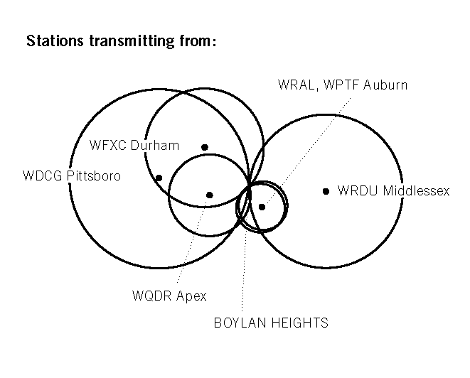
Unlike the wave fronts of wind chimes which—requiring a lot of energy to move the air molecules—never get very large, radio waves don’t propagate in air. They propagate in space and travel undisturbed through non-metallic objects like house walls and bodies. Depending on the location of the transmitter, their wave fronts can be enormous, yet they pass through the neighborhood silently, unfelt, and unnoticed, unless tuned into. In the mid-1980s, Boylan Heights listened mostly to a mix of Top 40, Oldies, Country, R&B, and talk radio on six radio stations: WDGC transmitting from Pittsboro, WFXC from Durham, WQDR from Apex, WRDU in Middlesex, WRAL and WPTF from Auburn. As the neighborhood has changed, so have the radio stations it listens to. Today, it’s mostly NPR broadcast by WUNC in Chapel Hill.
![]()
In the key, Boylan Heights is the point of tangency of these six fronts of radio waves. On the map, you can see which waves belong to which stations by their shape and direction. Because radio waves are concave to their point of origin, a wave concave to the lower right (southeast) is coming from Auburn, and one concave to the upper left (northwest) is from Durham. The degree of curvature depends on the size of the wave front and its distance from the source: the straighter the line, the farther away the transmitter. (Sensible curvature decreases with size which is why the earth seems flat.) These wave fronts, ever expanding, make different patterns in other places.Radio waves also come from the stars. Their wave fronts are effectively flat and they come from every direction, silently, unfelt, and unnoticed.

Radio Waves (click to enlarge)
•••••
Making Maps is Back!
Posted in Blog News, tagged Cartography, Making Maps, map making on August 29, 2010| 2 Comments »

The Making Maps blog is back!
Denis and I have been busy with new projects and new publications – some just published and some coming in the near future. I will highlight these projects over the next few weeks and then get back into the groove of blogging.
John K.
Drawing Maps: Africa, ca. 1900
Posted in 02 Why Are You Making Your Map?, 04 Map-Making Tools, Map Cartoons, Map History, tagged Africa Maps, Amusing Geography, Cartoon Maps, Drawing Maps, History of Cartography, Making Maps on October 3, 2008| 4 Comments »

Drawing maps used to be a big part of the geography curriculum in the U.S. One guide for students, published in 1900, is Schutze’s Amusing Geography and System of Map Drawing by Lenore Schutze. Tips for Africa, “The Skull” as Schutze sees it:
1. Cut a square into four smaller squares, and erase the southwest one.
2. Mark the cross-line from east to west, “The Equator.”
3. Draw Tripoli at the north of the division line from north to south, and Cape Town at the south end.
4. Locate the mouths of the Nile River west of the middle of the north side of the second square, and draw from them to a point north of the Equator, on the east side, and print “Cape Guardafui.” Draw the Red Sea south of this line.
5. Draw from Cape Guardafuit to Cape Town, and print “Cape of Good Hope.” Zanzibar, Pretoria, and Pietermaritzburg must be south of this line.

6. The west side of Africa extends somewhat above the north side of the first square, and does not quite reach the Equator.
7. Madagascar slants in about the same direction as the line from Cape Guardafui to Cape Town.
The entire page on Africa from Schutze’s Amusing Geography and System of Map Drawing (1900) p. 43 is below:

