A cartogram varies the size of geographic areas based on the data values associated with each area. Typical cartograms scale geographic areas to population, GNP, electoral votes, etc.
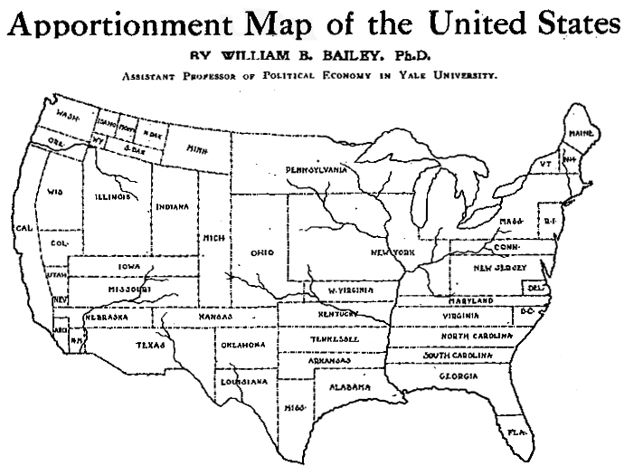
This “apportionment map,” as creator William B. Bailey (Professor of Political Economy, Yale University) calls it, scales the size of U.S. states to the size of their population (in 1910). Note that New York has colonized much of the upper Midwest.
The map, published April 6, 1911 in The Independent is one of the earliest cartograms I have seen.
Apportionment means “allotment in proper shares.” Thus, each state size is allotted based on population, not actual geographical area. Is a curious term to use, possibly more meaningful than the somewhat vague term “cartogram” (a “map diagram”).
Bailey writes:
The map shown on this page is drawn on the principle that the population is evenly distributed thruout the whole United States, and that the area of the States varies directly with their population. With the map constructed on this principle some curious changes become apparent. On the ordinary map the four States, Montana, Wyoming, Colorado, and New Mexico, together with the seven States which lie to the west of them, comprise more than one-third of the territory of the United States, and the area of each one of them is considerably larger than that of New York State; yet the population of New York State alone is nearly one-fourth larger than the combined population of these eleven Western States. In fact, the entire territory to the west of the Mississippi River contains only about 5 per cent. more people than are to be found in the New England States, together with New York, New Jersey, and Pennsylvania. Yet the territory at present covered by these nine Eastern States is only about two-thirds as large as the State of Texas. If we should add to these nine Eastern States the population of Ohio, the total would be greater by about three millions than the entire population west of the Mississippi. The State of Rhode Island, hardly visible to the naked eye on the ordinary map, now becomes almost as large as the territory of Utah and Arizona combined.
Were Texas as densely populated as is the State of Rhode Island, it would contain a population of nearly eighty-five millions, leaving only six millions of our people to be scattered thruout the rest of the country. Were the population of the United Stats as a whole as dense of that of Rhode Island this country would have more than a billion inhabitants.
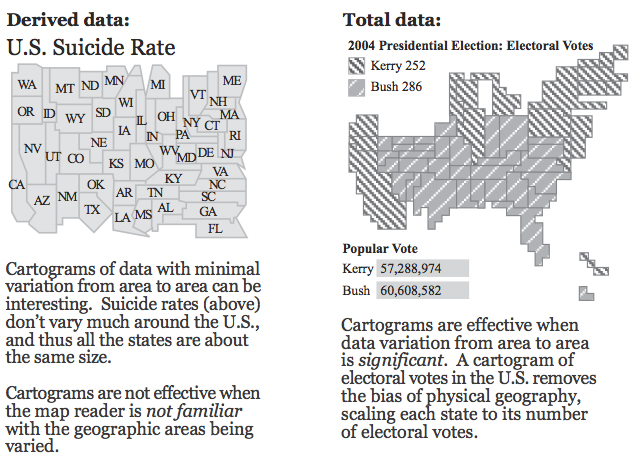
Cartograms can show derived data (suicide rate in U.S. states, left) or totals (electoral votes in U.S. states, right):
Cartograms can be contiguous or non-contiguous:

Illustrations taken from Making Maps book, p. 218-19.
According to Waldo Tobler (PDF article: “Thirty Five Years of Computer Cartograms”) the term cartogram has been used since at least 1851, but it seems like the kind of cartograms shown above are rare until the first few decades of the 20th century.
Confusingly, the term cartogram was commonly used to describe various kinds of graphs and statistical maps (also called thematic maps), making it difficult to trace the genealogy of the modern cartogram.
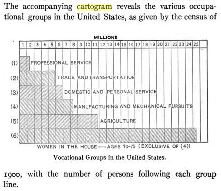
A “cartogram” (bar graph) from Vocational Education by John Morris Gillette (1910):
A “cartogram” (graduated circle map) from Junior High School Mathematics by George Wentworth et al., (1917):
A “cartogram” from the Foreign Missions Year Book of North America for 1919:

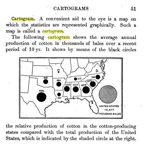
A “cartogram” (choropleth map) from Studies in Occupations (1921):

A “cartogram” from Isaiah Bowman’s The New World: Problems in Political Geography (1921):

••••••
Sara Fabrikant offers cartogram information, examples, and resources focused on the 2004 U.S. election. She includes references. The prolific Waldo Tobler has a half dozen of his cartogram articles available as PDFs.
Make your own cartograms with MAPresso and Frank Hardesty’s Cartogram Generator.
Cartogram Central has some interesting links, but has not been updated since 2002. Worldmapper has a passel of global cartograms.

Great posts. I like your use of historical maps, showing the way cartography has stayed consistent or evolved as we have moved almost exclusively to using computers for mapmaking.
-Tim-
thes.wordpress.com
Early writers (1910s-1930s) on thematic maps such as J.K. Wright often reserved the word “cartogram” for maps that were more chart or icon-like (as in the Bowman example you provide). They seemed to feel that they weren’t quite full or real maps.
[…] history of cartograms, which is the process of skewing geographic areas to fit data sets. [Making Maps, h/t The Map […]
Very interesting! Most scholars I’ve read track the earliest true value-by-area cartograms to either Levasseur (in the late 19th C.) or Hans Wiechel (in the 1900s). The former, though, appear to just be diagrammatic maps, and the latter aren’t reprinted anywhere that I can find. I was convinced, after reading Tobler’s “Thirty Five Years of Computer Cartograms”, that the prize for first cartogram went to “Grundy’s Map of the United States” from 1929 (published in the Washington Post at the time, and reprinted by Tobler). But this precedes it by almost 20 years!
I’m curious, have you (or anybody) seen earlier examples of true value-by-area cartograms?
I’ve not seen any “value-by-area” cartograms earlier than the 1911 “apportionment” map in this posting. The term was certainly used earlier, but it seems to have referred to a much broader category of maps, as the other examples in the posting, and ubikcan’s comments attest.
The “Grundy’s Map” is in the Tobler article linked to the posting.
If anyone has an earlier example, maybe someone with access to European sources, do let me know.
[…] John Krygier displays a true value-by-area cartogram older than any I’d seen prior. As I note in a comment on […]
Hi John
Zachary is correct, Levasseur is definitively earlier than Bailey.
Here is a graphic example of Levasseur’s work
Figure is taken from:
Funkhouser, H.G. (1937). Osiris, Vol. 3, on page 35, and described on p. 355. According to Funkhouser, the cartogram is from a geography text book by Levasseur titled:
La France, avec ses Colonies. Contenant 174 cartes, coupes et figures explicatives insérées dans le texte, Paris, 1868, 1875.
(France and its colonies, including 174 maps, illustrations and figures…)
Moreover, probably H. Haak and H. Wiechel (1903) is also earlier than Bailey! As I have written here:
Click to access fabrikant_cagis03.pdf
[…] John Krygier dug this one up — perhaps the first American cartogram, and an interesting example of the […]
[…] was published in his book Charts and Graphs (1923) and patented in 1925. As with the 1911 “Apportioinment Map” noted in an earlier post, the term “cartogram” was not used by Karsten to describe this […]
[…] scales geographic areas to some value other than geographic area. In two previous blog posts, 1911 Cartogram: “Apportionment Map” and 1923 Patented Cartogram, a few old-school cartograms were resurrected from musty old […]