Feeds:
Posts
Comments

Posts Tagged ‘statistical maps’

pop_proj_alone_150

Stop making cartograms! At least until permission is granted from the chap who holds the patent on them.

Karl Karsten’s “population projection” was published in his book Charts and Graphs (1923) and patented in 1925. As with the 1911 “Apportioinment Map” noted in an earlier post, the term “cartogram” was not used by Karsten to describe this creation.  He called it the “Population Projection.”

Curiously, it’s claimed that Karsten also invented the hedge fund.

But back to maps.

Karsten’s patent, (#1,556, 609, October 13, 1925) claimed rights to

…a map of a plurality of territories, having their boundary lines so distorted as to make their included areas represent graphically the relative importance of a given factor other than land area of one area with respect to another area, the boundaries being distorted without losing their familiar and significant features…

Karsten suggests using his “population projection” as a base upon which to map other data, such as truancy rates (below).  Thus it’s a bivariate cartogram (reproduced from p. 667 in Charts and Graphs):

truancy_popproj_150

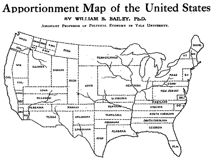
The idea is good, but in practice it’s a bit wonky.  Several western US states are reduced to toothpick dimensions, and note the New York goiter (New York City). Also, Karsten seems to have some degree of difficulty maintaining the horizontal with the map and the legend. Could he have had an inner-ear infection?

But back to maps.

The illustration in Karsten’s patent reveals his methodology:

pop_proj_patentmap

Details of the methodology can be found in the text of the patent.

Karsten, in Charts and Graphs, explains the justification for using the “population projection” which is, more or less, the same line of argument used in current discussions of cartograms:

We do not sell our goods to the mountains, bill them to the rivers, or credit the forests with payment. Probably from at least a subconscious appreciation of this circumstance, many national distributors, advertisers, and sales-managers have discarded maps on which the rivers, forests or mountains are shown when they are studying the geographic distribution of their sales. The up-to-date sales manager lots his distributing points and records his sales in a great many ways upon maps which carry only faint State outlines or a the most show the location of larger cities. But why stop here? Your sales manager does not sell to square miles, acres, or other units of land-area measurement. He sells to human beings. Why should he use maps which show, not human beings, but square miles, that is, maps in which the areas indicate not the population but the land surface? Why indeed!

The result of this projection of the map of the United Statues upon a population basis rather than a land-area basis will be most surprising even to the most hardened travelers.

Needless to say, the picture of sales conditions which such a map exhibits, will be far more valuable and useful than the picture upon the usual land-area basis. In short, the corrected areas of the States serve to give an excellent background or evaluation of the importance of the statistics plotted upon the map.

The number of ways in which the map can be altered and projected for special purposes upon special bases is unlimited, but all are alike in one respect – that their areas no longer show physical land areas in square miles but show the actual values more important for the special purposes in view.

In 2005 a series of cartogram patents (here here here) failed to cite Karsten’s patent.

Read Full Post »

beerdom_map

“In the morning they come out with queer-looking eyes…”

The above map represents one ward of New York City – the Eleventh.

The saloons as put upon this map were ascertained by the reporter of the Christian Union by actual count.

The saloons are largely beer saloons: for the base of the population is German, and a large intermingling of German sounds, German signs, German wares, and German smells generally, prevail.

Pretty much all the available space, after enough room has been taken out for houses and grown people and huckster’s stands, is filled by stout, chubby, healthy-looking children – with here and there a punier waif – of all ages and sizes, mostly young and small, and of all degrees of cleanliness, from comparatively clean to superlatively dirty.

The Ward is reported by the police to be as orderly as any in the city.

The German is peculiar.  Unlike his Irish and Yankee cousins, he does not make a great noise and hurrah over his cups, and wind up with a street brawl.  He gathers unto himself a few kindred spirits, and together they wend their way to the Trink-Halle, where, in a little back room, with closed doors and drawn curtains, they guzzle beer together till none of them can see.  In the morning they come out with queer-looking eyes, but there has been no disturbance in the place.

Said a clergyman to your reporter, “I came into the ward expecting to find nothing but filth and vice.  But I could take you into hundreds of homes where you would find ease and comfort and even culture.

Balance Sheet:

  • 19 Churches and Sunday-Schools, 5 Industrial Schools, 1 Hospital
  • 346 Saloons
  • One saloon to every 200 population.

Christian Union, February 19, 1885.  PDF of entire article and map is here.

Read Full Post »


cartogram-1911_title.jpg

A cartogram varies the size of geographic areas based on the data values associated with each area. Typical cartograms scale geographic areas to population, GNP, electoral votes, etc.

This “apportionment map,” as creator William B. Bailey (Professor of Political Economy, Yale University) calls it, scales the size of U.S. states to the size of their population (in 1910). Note that New York has colonized much of the upper Midwest.

The map, published April 6, 1911 in The Independent is one of the earliest cartograms I have seen.

Apportionment means “allotment in proper shares.” Thus, each state size is allotted based on population, not actual geographical area. Is a curious term to use, possibly more meaningful than the somewhat vague term “cartogram” (a “map diagram”).

Bailey writes:

The map shown on this page is drawn on the principle that the population is evenly distributed thruout the whole United States, and that the area of the States varies directly with their population. With the map constructed on this principle some curious changes become apparent. On the ordinary map the four States, Montana, Wyoming, Colorado, and New Mexico, together with the seven States which lie to the west of them, comprise more than one-third of the territory of the United States, and the area of each one of them is considerably larger than that of New York State; yet the population of New York State alone is nearly one-fourth larger than the combined population of these eleven Western States. In fact, the entire territory to the west of the Mississippi River contains only about 5 per cent. more people than are to be found in the New England States, together with New York, New Jersey, and Pennsylvania. Yet the territory at present covered by these nine Eastern States is only about two-thirds as large as the State of Texas. If we should add to these nine Eastern States the population of Ohio, the total would be greater by about three millions than the entire population west of the Mississippi. The State of Rhode Island, hardly visible to the naked eye on the ordinary map, now becomes almost as large as the territory of Utah and Arizona combined.

Were Texas as densely populated as is the State of Rhode Island, it would contain a population of nearly eighty-five millions, leaving only six millions of our people to be scattered thruout the rest of the country. Were the population of the United Stats as a whole as dense of that of Rhode Island this country would have more than a billion inhabitants.

(more…)

Read Full Post »