Feeds:
Posts
Comments

Posts Tagged ‘cartograms’

Cartogram, 1930: “A Distorted Map of the United States Showing Population of Each State and of Cities of 50,000 or More in 1930” (Printers’ Ink Publishing Co., Inc., Chart by Walter P. Burns and Associates, Inc., New York City)

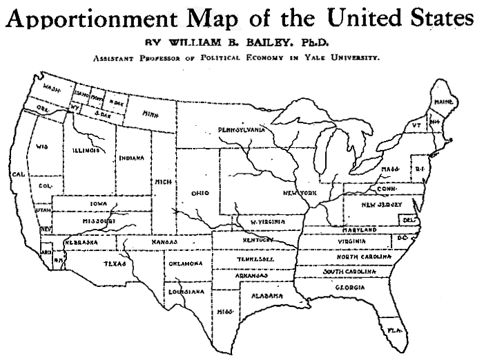
A cartogram scales geographic areas to some value other than geographic area. In two previous blog posts, 1911 Cartogram: “Apportionment Map” and 1923 Patented Cartogram, a few old-school cartograms were resurrected from musty old publications. Here find eight more cartograms published between 1921 and 1938.

This post opens with a peculiar item – the U.S. states as well as the areas of major cities are scaled to population, in essence two cartograms together. Symbols representing “people living on farms” are scattered about, each symbol equal to a number (undisclosed) of persons. Weird.

From the Literary Digest in 1921:

Cartogram, 1921: “Relative Size of Each of the United States if Based on Electrical Energy Sold for Light and Power in 1921” (Literary Digest, April 23, 1921)

•••••••••••••••

Cartogram, 1931: “The United States With the Area of the States Proportional to the Urban Population of 1930” (The Dartnell Corp., Chicago, Ill., 1931)

•••••••••••••••

Cartogram, 1933: “Horsepower Map of the United States in 1933 With the Area of Each State Drawn Proportional to the Amount of Horsepower Installed in the State” (Power Plant Engineering, New York City, 1933)

•••••••••••••••

I had an old slide of the following cartogram but did not know its source: turns out it is from an advertisement for The Mutual Broadcasting Network, showing that 80% of business in the U.S. is transacted in states east of the Mississippi – MBN’s broadcasting area:

Cartogram, date unknown (1930s): “Look to Your Sales Mileage” advertisement (The Mutual Broadcasting System).

•••••••••••••••

A very diagram-ish cartogram which places an un-cartogrammed map of the US in the background:

Cartogram, 1937: “The United States With the Areas of the States Proportional to Their Manufacturing Output in 1935” (Business Week, June 12, 1937, New York City)

•••••••••••••••

brinton_gp_cartograms_1938

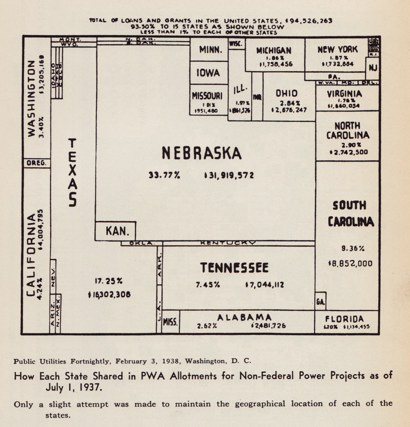
Cartogram, 1938: “How Each State Shared in PWA Allotments for Non-Federal Power Projects as of July 1, 1937” (Public Utilities Fortnightly, February 3, 1938, Washington DC)

•••••••••••••••

Reproduced from Willard C. Brinton’s Graphic Presentation (1939).

Read Full Post »


cartogram-1911_title.jpg

A cartogram varies the size of geographic areas based on the data values associated with each area. Typical cartograms scale geographic areas to population, GNP, electoral votes, etc.

This “apportionment map,” as creator William B. Bailey (Professor of Political Economy, Yale University) calls it, scales the size of U.S. states to the size of their population (in 1910). Note that New York has colonized much of the upper Midwest.

The map, published April 6, 1911 in The Independent is one of the earliest cartograms I have seen.

Apportionment means “allotment in proper shares.” Thus, each state size is allotted based on population, not actual geographical area. Is a curious term to use, possibly more meaningful than the somewhat vague term “cartogram” (a “map diagram”).

Bailey writes:

The map shown on this page is drawn on the principle that the population is evenly distributed thruout the whole United States, and that the area of the States varies directly with their population. With the map constructed on this principle some curious changes become apparent. On the ordinary map the four States, Montana, Wyoming, Colorado, and New Mexico, together with the seven States which lie to the west of them, comprise more than one-third of the territory of the United States, and the area of each one of them is considerably larger than that of New York State; yet the population of New York State alone is nearly one-fourth larger than the combined population of these eleven Western States. In fact, the entire territory to the west of the Mississippi River contains only about 5 per cent. more people than are to be found in the New England States, together with New York, New Jersey, and Pennsylvania. Yet the territory at present covered by these nine Eastern States is only about two-thirds as large as the State of Texas. If we should add to these nine Eastern States the population of Ohio, the total would be greater by about three millions than the entire population west of the Mississippi. The State of Rhode Island, hardly visible to the naked eye on the ordinary map, now becomes almost as large as the territory of Utah and Arizona combined.

Were Texas as densely populated as is the State of Rhode Island, it would contain a population of nearly eighty-five millions, leaving only six millions of our people to be scattered thruout the rest of the country. Were the population of the United Stats as a whole as dense of that of Rhode Island this country would have more than a billion inhabitants.

(more…)

Read Full Post »