
Cartogram, 1930: “A Distorted Map of the United States Showing Population of Each State and of Cities of 50,000 or More in 1930” (Printers’ Ink Publishing Co., Inc., Chart by Walter P. Burns and Associates, Inc., New York City)
A cartogram scales geographic areas to some value other than geographic area. In two previous blog posts, 1911 Cartogram: “Apportionment Map” and 1923 Patented Cartogram, a few old-school cartograms were resurrected from musty old publications. Here find eight more cartograms published between 1921 and 1938.
This post opens with a peculiar item – the U.S. states as well as the areas of major cities are scaled to population, in essence two cartograms together. Symbols representing “people living on farms” are scattered about, each symbol equal to a number (undisclosed) of persons. Weird.
From the Literary Digest in 1921:

Cartogram, 1921: “Relative Size of Each of the United States if Based on Electrical Energy Sold for Light and Power in 1921” (Literary Digest, April 23, 1921)
•••••••••••••••

Cartogram, 1931: “The United States With the Area of the States Proportional to the Urban Population of 1930” (The Dartnell Corp., Chicago, Ill., 1931)
•••••••••••••••

Cartogram, 1933: “Horsepower Map of the United States in 1933 With the Area of Each State Drawn Proportional to the Amount of Horsepower Installed in the State” (Power Plant Engineering, New York City, 1933)
•••••••••••••••
I had an old slide of the following cartogram but did not know its source: turns out it is from an advertisement for The Mutual Broadcasting Network, showing that 80% of business in the U.S. is transacted in states east of the Mississippi – MBN’s broadcasting area:


Cartogram, date unknown (1930s): “Look to Your Sales Mileage” advertisement (The Mutual Broadcasting System).
•••••••••••••••
A very diagram-ish cartogram which places an un-cartogrammed map of the US in the background:

Cartogram, 1937: “The United States With the Areas of the States Proportional to Their Manufacturing Output in 1935” (Business Week, June 12, 1937, New York City)
•••••••••••••••
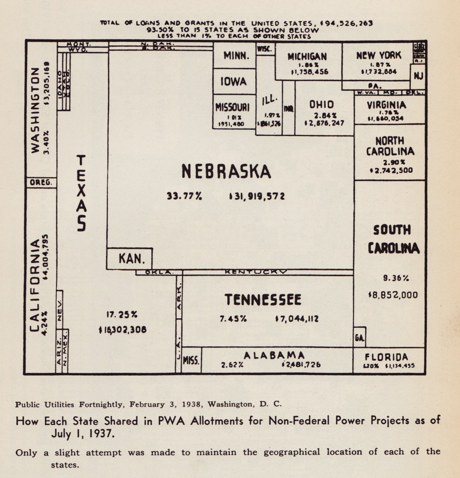
Cartogram, 1938: “How Each State Shared in PWA Allotments for Non-Federal Power Projects as of July 1, 1937” (Public Utilities Fortnightly, February 3, 1938, Washington DC)
•••••••••••••••
Reproduced from Willard C. Brinton’s Graphic Presentation (1939).

Hello, great site. Try as i might- am unable to determine who owns the copyright to: Cartogram, 1931: “The United States With the Area of the States Proportional to the Urban Population of 1930″ (The Dartnell Corp., Chicago, Ill., 1931)
-Do you have any idea? I very much want to get a poster made of this chart,
Thank you
The map you are referring to was taken from Willard Brinton’s Graphic Presentation (1939).
It is on page 239 of that book.
I believe the Dartnell Corporation at the URL below is the one from the scan on the blog.
http://www.dartnellcorp.com
The seem to focus on sales education material and I assume the cartogram was used to
relate something about the density of population – where your sales efforts might be
better focused. It is possible the original map is out of copyright, but you can contact
them to find out.
[…] And then you also have the early use of visualization by publications, such as magazines or newspapers, which still play an indisputable role in spreading the good practices of infographic design. Today’s opening pick comes from the Minneapolis Tribune archives, a 1921 cartogram by General Electric showing the United States scaled according to the proportion of electricity-using population. Thanks to Ben Welter for sharing, and we also included a couple of other vintage cartograms found on Making Maps. […]
[…] (Via) […]
[…] (Via) […]
[…] The United States With the Area of the States Proportional to the Urban Population of 1930” (The Dartnell Corp., Chicago, Ill., 1931).More Old School Cartograms, 1921-1938 — Making Maps: DIY Cartography […]