Feeds:
Posts
Comments

Archive for the ‘04 Map-Making Tools’ Category

bambi

Making maps kills baby animals!

Ok, they are claiming the frightened yet adorable faun fawn didn’t die.

A car making images for Google Map’s Street View wacked a faun fawn in upstate New York.

…As some people have noticed, one of our Street View cars hit a deer while driving on a rural road in upstate New York. Due to several user requests using the “Report a concern” tool, these images are no longer available in Street View.

The driver was understandably upset, and promptly stopped to alert the local police and the Street View team at Google. The deer was able to move and had left the area by the time the police arrived. The police explained to our driver that, sadly, this was not an uncommon occurrence in the region.

No word yet if the faun fawn has contacted a lawyer.

Via The Daily What.

Read Full Post »

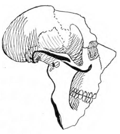
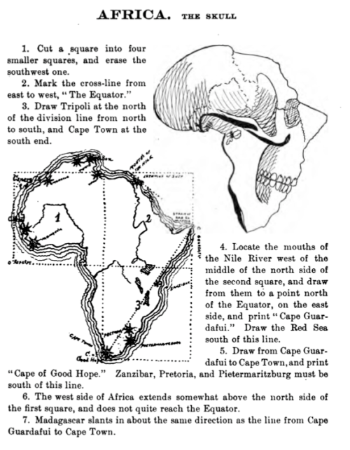
Drawing maps used to be a big part of the geography curriculum in the U.S. One guide for students, published in 1900, is Schutze’s Amusing Geography and System of Map Drawing by Lenore Schutze.  Tips for Africa, “The Skull” as Schutze sees it:

1. Cut a square into four smaller squares, and erase the southwest one.

2. Mark the cross-line from east to west, “The Equator.”

3. Draw Tripoli at the north of the division line from north to south, and Cape Town at the south end.

4. Locate the mouths of the Nile River west of the middle of the north side of the second square, and draw from them to a point north of the Equator, on the east side, and print “Cape Guardafui.”  Draw the Red Sea south of this line.

5. Draw from Cape Guardafuit to Cape Town, and print “Cape of Good Hope.”  Zanzibar, Pretoria, and Pietermaritzburg must be south of this line.

6. The west side of Africa extends somewhat above the north side of the first square, and does not quite reach the Equator.

7. Madagascar slants in about the same direction as the line from Cape Guardafui to Cape Town.

The entire page on Africa from Schutze’s Amusing Geography and System of Map Drawing (1900) p. 43 is below:

Read Full Post »

typewriter-map-symbols.jpg

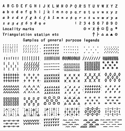
Map-making has often adapted technologies designed for purposes other than making maps.

I recall Scitex hardware as the state-of-the-art in large format color computer mapping in the early 1980s when I was first learning cartography. Cartography applications were developed when Scitex, its origins in designing and printing textiles, noticed “the similarity between printing large fabric surfaces and coloring topographic surfaces.” (PDF source).

Step back a few generations and we find the then ubiquitous typewriter adapted to making maps by DIY cartographers.

(more…)

Read Full Post »

animatedchoro.gif

Google Earth can display geographic data with a time component, and thus show animated maps. Animated mapping has garnered much attention among cartographers in the last decade.

I created a few Google Earth animated choropleth (literally, area-filling) maps of population change in Ohio. One map shows total population by county from 1900 to 2006. The other shows percent population change from decade to decade. Details on how I created these animated maps along with links to the downloadable KMZ files are below.

(more…)

Read Full Post »

A wiki for the State of the Map Conference (14-15 July ’07 in Manchester, UK) links to a series of presentations (audio, and sometimes slides) on map related topics. Titles include “This Mapping Stuff Could Really Take Off,” “Why Mash-ups Suck (and Cartography Matters),” “Bringing Maps to Life,” “20 Years of Web Mapping,” and “Mashups Without Pushpins.”

Read Full Post »

The proliferation of mapping sites on the web provides ample fodder for critique by the map police (cartographic insiders). I usually feel a bit bad whining about the cartographic limitations of such sites. Cartographers have a history of obsessing with rules and such obsession has, arguably, limited creativity and undermined innovations. Bad cop. However, not following the rules does not necessarily produce creative and innovative mapping. I, for one, don’t entirely enjoy being the map police, but will try to at least be a good cop.

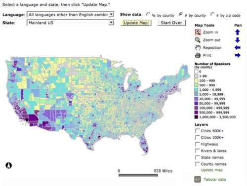
Lets look at a site that has been around awhile: The Modern Language Association’s Language Map. The site allows you map language data collected in the 2000 U.S. Census. A nice focused site with interesting data (I use it in my classes and the students enjoy pondering the patterns): here is the default map of the total number of language speakers in each county:

mla-totals.jpg

The basic language map allows you to view 33 different languages, mapped by county in the U.S. The total number of people who speak a particular language (above) can be mapped, but mapping totals can be deceptive, as the sizes of the counties vary. Thus a county may have more speakers of a particular language just because it covers more area than a smaller county. To account for these variations in county size, map the data as a percentage (the percent of people in a county that speak a particular language, see below). But you can map totals and there are sometimes good reasons to do so. Just realize the potential limitations of what you are seeing.

(more…)

Read Full Post »

« Newer Posts