Feeds:
Posts
Comments

typewriter-map-symbols.jpg

Map-making has often adapted technologies designed for purposes other than making maps.

I recall Scitex hardware as the state-of-the-art in large format color computer mapping in the early 1980s when I was first learning cartography. Cartography applications were developed when Scitex, its origins in designing and printing textiles, noticed “the similarity between printing large fabric surfaces and coloring topographic surfaces.” (PDF source).

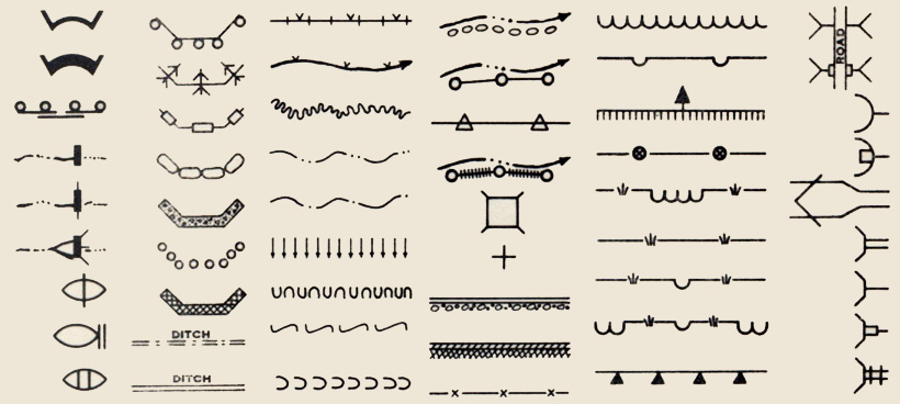
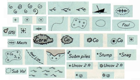
Step back a few generations and we find the then ubiquitous typewriter adapted to making maps by DIY cartographers.

Continue Reading »

thresholds.jpg

Cartographers have long been concerned with how map-readers perceive map symbols. How small can a map symbol be and still be noticed? What size do symbols have to be for a viewer to differentiate and clearly distinguish different shapes or forms? Such questions can be answered by using psychological methods of evaluation, as discussed in my previous post on the Perceptual Scaling of Map Symbols, or based on the experience of skilled map makers.

Examples of some thresholds of map symbol perception are illustrated by Prof. E. Spiess in a chapter entitled “Map Compilation” in the out-of-print book Basic Cartography, Vol. 2 (International Cartographic Association, 1984). At the time Spiess was the Director of the Department of Cartography at the Swiss Federal Institute of Technology.

Note: the illustrations below are guidelines for printed maps. Typically, increase sizes for computer displays. The illustrations have been slightly expanded in size from the originals to make them readable on a computer screen. Click on the image for a larger version. Illustrations are for educational purposes only.

Continue Reading »

flannery-check.jpg

flannery-check-yes.jpg

What if there was a gap between mapped data and our perception of it?

Buried in the ArcGIS symbolization options for proportional symbol maps is a puzzling check box labeled Appearance Compensation (Flannery) that addresses one gap between perception and data symbolized on maps.

This check box is a vestige of academic cartography’s extensive engagement with psychophysics beginning in the 1950s. Psychophysics relates “matter to the mind, by describing the relationship between the world and the way it is perceived.” Psychophysical studies select specific sensory stimuli and evaluate human perception of the stimuli. Cartographers studied thresholds (what is the smallest type size the average viewer can read?), discrimination (what is the minimum difference between two gray tones required for the average viewer to perceive a difference?), and scaling (how to scale a map symbol so the average user correctly judges the symbol’s value?).

The most studied map symbol was the proportionally scaled circle.

Continue Reading »

erosion-flood-symbols-sample.jpg

Dams, bulkheads, arches, ditches, flumes, outlet spreaders, outlet baffles, revetments, riprap, fence, gullies, borings, test pits, siphons, retaining walls, culverts, inlet transitions, jump structure, overfall, tree plantings, sheet erosion plantings, streams, lakes, terraces, ground water, water seepage, water limits, drains, percolators … the language of erosion and flood control in 1930s America.

The above symbols are selected from five pages (full PDF below) in Symbols and Instructions for Maps and Plans, a book compiled and published by the U.S. Department of the Interior Office of Indian Affairs in 1941.

Continue Reading »

voyager_snip.jpg

Edward Tufte’s The Visual Display of Quantitative Information (1998, 2nd edition 2001) is a classic book, arguably his best, and certainly a key text in the field of information graphics (which encompasses cartography). I know some cartography courses use the book as a text.

I recall being inspired by the book as a neophyte cartographer back in the late 1990s.

The book looked great: its design communicated the importance of design (when most other cartography and information graphics books were clunky and poorly designed). The tone was serious and high-minded: I was designing information graphics. And I think I absorbed Tufte’s minimalist design philosophy, although cartographic design, at least the way I learned it, was largely minimalist, with no allowance for flourish, fake 3D embellishment, or other chartjunk (or “map-crap” as I call it in the Making Maps book).

While I won’t impugn the importance of lofty inspiration, I did wonder what kind of practical guidelines I could derive from Tufte’s book. You know, specific stuff that would help me to design and make better maps. I sat down one day and made a list of Tufteisms from the book: that list is below.

Continue Reading »

raisz-timechart-bit.jpg

Harvard’s Erwin Raisz (1893-1968) was one of the 20th century’s preeminent cartographers (bio, bio, bio). Most people know of his landform maps, which are still in print. Raisz was also responsible for a series of atlases and hundreds of maps in books and academic articles.

In a 1937 article for the journal Isis entitled “Outline of the History of American Cartography” Raisz generated a pair of “timecharts of historical cartography” covering key events and individuals in American cartographic history, subdivided into official maps/surveys and private cartography.

Excerpts of the charts, for educational purposes, are linked below.

Continue Reading »

animatedchoro.gif

Google Earth can display geographic data with a time component, and thus show animated maps. Animated mapping has garnered much attention among cartographers in the last decade.

I created a few Google Earth animated choropleth (literally, area-filling) maps of population change in Ohio. One map shows total population by county from 1900 to 2006. The other shows percent population change from decade to decade. Details on how I created these animated maps along with links to the downloadable KMZ files are below.

Continue Reading »

bit-graphic-design-guide.jpg

Back in the day when I was working at the University of Wisconsin Cartographic Lab we created graphic design guides with different size type, lines, and area shading. Such guides provide, for example, a quick idea of what 10 point black type over a 50% gray background looks like, and help to see design alternatives.

I include a simple monochrome graphic design guide in the Making Maps book in chapter 7, on intellectual and visual hierarchies (excerpt). Three downloadable versions of that guide are available below (in Illustrator, Freehand, and JPG formats).

Continue Reading »

State of the Map

A wiki for the State of the Map Conference (14-15 July ’07 in Manchester, UK) links to a series of presentations (audio, and sometimes slides) on map related topics. Titles include “This Mapping Stuff Could Really Take Off,” “Why Mash-ups Suck (and Cartography Matters),” “Bringing Maps to Life,” “20 Years of Web Mapping,” and “Mashups Without Pushpins.”

nauticalchart-symbols.jpg

Rock which does not cover,
Coral reef, detached,
Wreck always partially submerged.

A number of sunken wrecks,
Obstruction of any kind,
Limiting danger line.

Foul ground, discolored water,
Position doubtful,
Existence doubtful.

Old map symbols and their descriptions can be poetic, enjoyable to view and read while providing ideas for symbols on contemporary maps. Indeed, is it possible that “maps are poems and poems are maps?” (see Howard Veregin’s “Geo-Poesy.”

Good map designers and map makers always look at other maps, including old maps, for map design ideas.

These symbols and textual descriptions of nautical dangers are taken from section O of Chart #1, Nautical chart symbols and abbreviations used by U.S. Lake Survey, Corps of Engineers, U.S. Army, Dept. of Defense; U.S. Coast and Geodetic Survey, Dept. of Commerce; U.S. Navy Hydrographic Office, Dept. of Defense (Washington DC, 1957). The entire page O from which the symbols were taken is here. A contemporary version of these symbols, still Chart #1, is here.