Making maps is rife with rules. But following rules does not necessarily produce a great (or even good) map. It may be the implementation of broader design principles that leads to a successful map.
Principles are an intellectual generalization of a broad field of knowledge: a kind of map, in the broadest sense of the word.
They are useful for guiding map makers and helping map users understand how maps work.
There are numerous sets of cartographic design principles. My previous post on Edward Tufte distilled six map design principles (or commandments as I called them) from Tufte’s first book, The Visual Display of Quantitative Information.
In 1999 the British Cartographic Society’s Design Group proposed “Five Principles of Cartographic Design.” When I first came across this set of principles I thought them interesting – even a bit passionate – a rare state of affairs in the often stoic world of cartography. I added a few maps and my own comments (in italics).
More on these map design principles below: Concept before Compilation, Hierarchy with Harmony, Simplicity from Sacrifice, Maximum Information at Minimum Cost, and Engage the Emotion to Engage the Mind.
Cool maps below include: Geo-Smiley Terror Spree Map, The Continents and Islands of Mankind, Hate Groups and Hate Crimes Map, and Where Commuters Run Over Black Children, Detroit 1968.
Five Principles of Map Design
Concept before Compilation
Without a grasp of concept, the whole of the design process is negated. The parts embarrass the whole. Once concept is understood, no design or content feature will be included which does not fit it. Design the whole before the part. Design comes in two stages, concept and parameters, and detail in execution. Design once, devise, design again. User first, user last. What does the user want from this map? What can the user get from this map? Is that what they want? If a map were a building, it shouldn’t fall over.
…or, why are you making your map, who is the audience, and what do they want from the map?
•••••
Hierarchy with Harmony
Important things must look important, and the most important thing should look the most important. “They also serve who only stand and wait.” Lesser things have their place and should serve to complement the important. From the whole to the part, and all the parts, contributing to the whole. Associated items must have associated treatment. Harmony is to do with the whole map being happy with itself. Successful harmony leads to repose. Perfect harmony of elements leads to a neutral bloom. Harmony is subliminal.
…or, what’s important? Make it visually jump out. What’s less important, but necessary in a supporting role? Make it fall back…
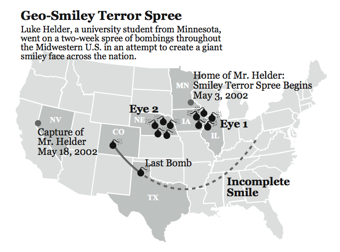
(Geo-Smiley Terror Spree Map. Reproduced from Making Maps, p. 144)
•••••
Simplicity from Sacrifice
Great design tends towards simplicity (Bertin). Its not what you put in that makes a great map but what you take out. The map design stage is complete when you can take nothing else out. Running the film of an explosion backwards, all possibilities rush to one point. They become the right point. This is the designer’s skill. Content may determine scale or scale may determine content, and each determines the level of generalization (sacrifice).
…or, less is more…
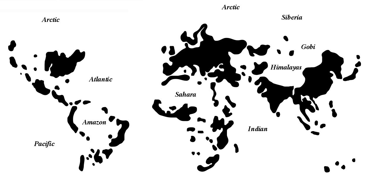
(Redrawn from William Bunge, The Continents and Islands of Mankind. Areas in black have more than 30 people per square mile. Reproduced from Making Maps, p. 160-161)
•••••
Maximum Information at Minimum Cost (after Ziff)
How much information can be gained from this map, at a glance. Functionality not utility. Design makes utility functional. All designs are a compromise, just as a new born baby is a compromise between its father and mother. The spark which makes a map special often only comes when the map is complete.
…or, carefully select the content and marks on the map (symbols) to maximize the map’s information content and communication capabilities…
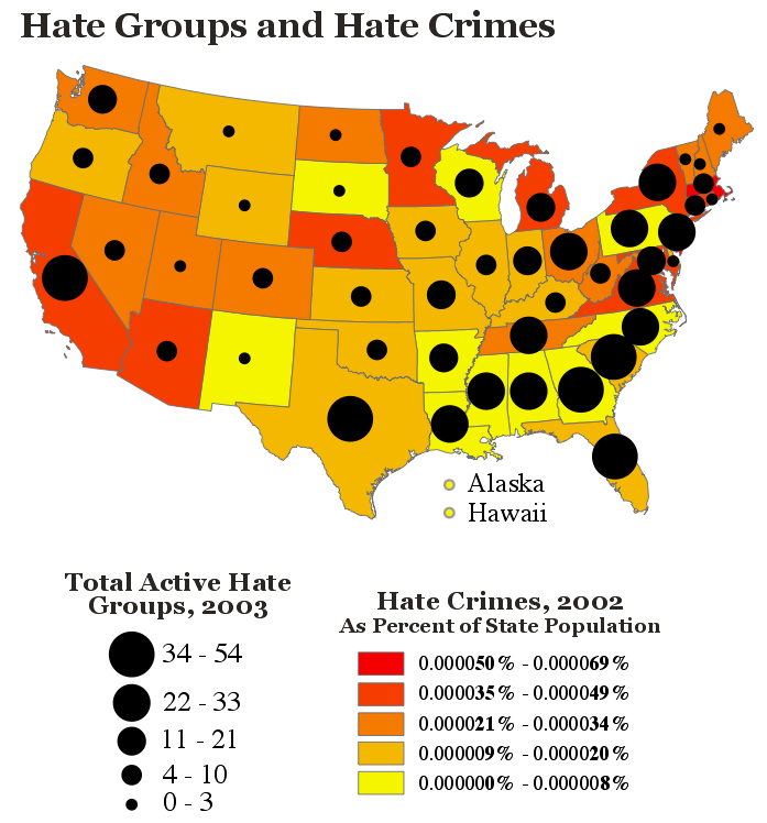
(Hate Groups and Hate Crimes Map. Apparently more hate groups in a state means fewer hate crimes. Reproduced from Making Maps, p. 208)
•••••
Engage the Emotion to Engage the Understanding
Design with emotion to engage the emotion. Only by feeling what the user feels can we see what the user sees. Good designers use Cartographic fictions, Cartographic impressions, Cartographic illusions to make a map. All of these have emotive contents. The image is the message. Good design is a result of the tension between the environment (the facts) and the designer. Only when the reader engages the emotion, the desire, will they be receptive to the map’s message. Design uses aesthetics but the principles of aesthetics are not those of design. We are not just prettying maps up. The philosophy is simple, beauty (aesthetics) focuses the attention. Focusing the attention is the purpose of map design!
…or, embed a bit of passion…
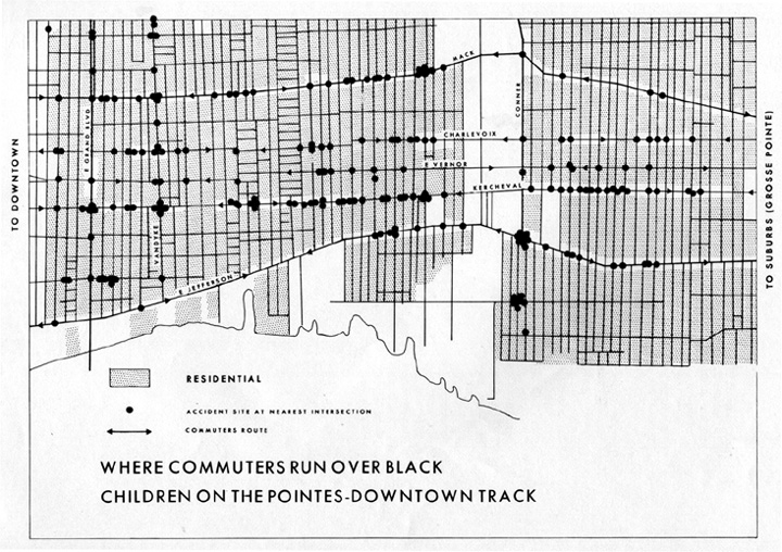
(Where Commuters Run Over Black Children, Detroit 1968. Detroit Geographical Expedition. The title says it all.)

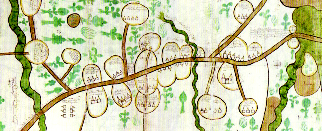
Where is the lead map on this entry from? It resembles in many respects a missionary’s map of a stretch of land in East Africa.
16th century Russian land-holdings map. Circular areas are agricultural, set off from surrounding forest. I will post a blog entry about these maps at some point in the near future. Source: Cartographies of Tsardom by Valerie Kivelson (Cornell University Press, 2006).
Via your URL for the image I googled up an interesting JSTOR article on Russian state-building and cartography (thanks!), though this map wasn’t displayed in the piece.
(The similar map from East Africa, by the way, is late 19th century.)
I would say one word to describe the new exhibition Maps: Finding Our Place in the World: incredible. Everything in this exhibition is an incredible example of mapping, sure, but also history, art, literature, technology, psychology… it hits on so many different aspects of life. I was recently at a preview where the curator, Will Noel, walked us through the exhibition. When He asked us how long ago we thought the Chinese men had mapped out their paths & routes on stone while estimating the gridlines accurately, he said…1130 B.C. What?! Incredible! This exhibition had me saying that a lot! It’s a chance to see and learn about rare art and artifacts for all ages. I definitely say it is a must see!
Go to http://www.baltimore.org/maps/maps.php for more info and to see videos of the curator talking about the exhibition.
I’d just like to say, as a fan of D&D, your website is invaluable!
[…] From Professor Krygier’s Making Maps blog: “Redrawn from William Bunge, The Continents and Islands of Mankind. Areas in black have more than 30 people per square mile. Reproduced from Making Maps, p. 160-161″ […]
[…] stylish, less-is-more map comes from the Making Maps blog where it’s credited as being “Redrawn from William Bunge, The Continents and Islands of […]
[…] Assignment 2: Map design Posted in Uncategorized by karlarosales on 05/20/2010 Five Principles of Map Design: https://makingmaps.net/2008/02/05/more-principles-of-map-design/ […]
[…] generalized interactive population density map inspired/stolen from a map by William Bunge entitled “Islands of Mankind” that I came across on John Krygier‘s blog. I thought Bunge’s map was a novel way to […]
[…] of the World, 2010.</a><br/>Concept stolen from Bill Bunge’s <a href=”https://makingmaps.net/2008/02/05/more-principles-of-map-design/“>“Islands of Mankind”</a> at John Krygier’s […]
[…] idea goes back to William Bunge‘s “Continents and Islands of Mankind”, redrawn at Making Maps. There we have a map of the areas where population density is greater than 30 per square kilometer, […]
[…] More Principles of Map Design […]
[…] MAP: William Bunge […]
[…] are trained to evoke emotion in their maps, whether geographical, literal or emotional. In the 5 Principles of Map Design proposed by The British Cartographer Society, designing to engage is highlighted as an essential […]
[…] https://makingmaps.net/2008/02/05/more-principles-of-map-design/ […]
[…] generalized interactive population density map inspired/stolen from a map by William Bunge entitled Islands of Mankind that I came across on John Krygier‘s blog. I thought Bunge’s map was a novel way to […]
Reblogged this on Arkarbor.