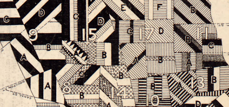
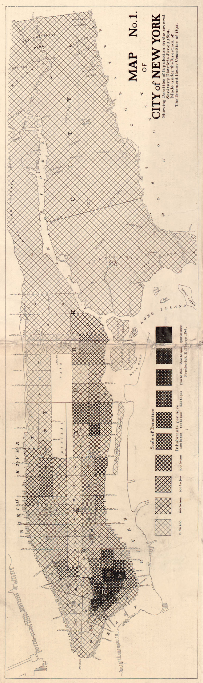
Map of New York City, Showing the Distribution of the Principal Nationalities by Sanitary Districts published in Harper’s Weekly (January 5, 1895, pp. 60–61) using 1890 U.S. Census data.
This map looks great, revealing a substantial amount of information with its intense, juxtaposed patterns.
The textures on the map show the relative amounts of different nationalities (qualitative data) in each of the areas (sanitary districts) on the map:

The map shows if a district has more or less diversity (more or fewer lines of different textures), the relative proportions of different nationalities, the nationalities themselves, and, at a broader scale, the districts that are similar or differ in their nationality constitution. Because of the careful rotation of the lines of textures, the different sanitary districts can also be distinguished from each other.
To quote the text which accompanies the maps (and explains the methodology of the map):
The census of 1890 obtained the nationality of the residents of each sanitary district by descent from the mother. The table in which this appears was made the basis of the nationality map. As a basis it will appear fair enough when it is considered that at the time of the census over seventy-six percent of the white population in the city had foreign-born mothers, and over forty per cent. were foreign-born themselves. So the latter certainly, and probably a majority of the thirty-six percent. of native-born of foreign mothers, would show the traits of their maternal nationality. All the nationalities given in the table are not plotted. The Scotch, English, Welsh, Scandinavian, and Canadians have not collected in colonies, but are scattered over the city. These, being in small numbers, and perhaps less foreign than the others, were disregarded. They appear in the unclassified [category] in the diagram at the foot of the map. Of the nationalities represented only those making up two-thirds of the population of any district have been plotted. This rule was adopted to bring out in clearer contrast those that do exist to a greater extent. The nationalities are represented by bands conventionally marked. The breadth of a band in any district bears the same relation to the sum of the breadths of the different bands in that district as the number of the nationality it represents bears to the two-thirds of the population in that district. Sanitary district S of the Twelfth Ward and the Twenty-third Ward are not touched. These were left blank because the method of representing nationalities gives an erroneous idea in regard to the density of population. These thinly populated districts where natives preponderate slightly would appear as native settlements. These, of course, they are, but not like other parts of the city, for they are suburban.
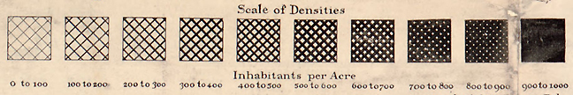
A map of population density (shown below) accompanies the Nationalities map, using increasingly dense textures to represent quantitative population differences:
The Nationalities map illustrates (in 1894) Edward Tufte’s demand for maps (and other information graphics) that reveal the multivariate and complex. This is a map to spend time with, not because it is poorly designed, but because it contains a substantial amount of information.
The New York City Principal Nationalities Map in its entirety (1890 data; rotated to fit your screen):

The New York City Population Density Map (1890 data):
The map pair, side by side for comparison (as originally published):

The map was created by Frederick E. Pierce for the Tenement-House Committee, one of the progressive organizations working against urban slums and blight in the late 19th and early 20th centuries. The text notes that the original map was in color, but was redrawn for publication in monochrome.
•••••
Texture is usually included as one of the cartographic visual variables. The visual variables, which provide a guide for matching visual marks to data characteristics (such as qualitative vs. quantitative data), are attributed to French semiotician Jacques Bertin.

I discuss and illustrate, with contrasting good/poor maps, the basic visual variables (shape, size, color hue, color value, color intensity, and texture) in chapter 9 (excerpt here) of Making Maps.
Texture can be difficult to work with as it can imply either qualitative or quantitative differences, and has a tendency to vibrate.
Back in the day, Zip-a-Tone (a brand of screentone) was used to create texture and gray-scale patterns on maps (and comics). Printed on a thin, clear material with adhesive backing, many a cartographer spent hours searching through sheets of Zip-a-Tone, cutting it to size, and adhering it to different areas on the map. Now diverse pattern fills are available in GIS and graphic design software (Illustrator, Corel).
The problem is that while generic textures – Zip-a-Tone or digital – could be used as “area fills” for a contemporary map of nationalities (like the 1890 Nationalities Map), one would still have to engage in the painstaking task of calculating ratios and creating appropriate areas for the different textures: the same task that engaged Mr. Pierce more than 100 years ago.
When I come across maps such as the 1890 Nationalities Map it reminds me that, despite the millions of maps generated by sophisticated software every day, few are information rich, complex, and multivariate – Tuftian. At least in this context – the high art and science of multivariate, data-intense mapping – we may not be much better off than we were in 1890.

I’d say the fact that modern printing can offer alternatives to the vibratey bars of those maps is progress.
What is disappointing, though, is that many maps today have not overcome the anti-Tuftian (if I may) tendency for plotted data to be encrypted via a map “key”. The user must always be hopping between the map and the legend. In this case, at least the double use of the legend to also show population totals puts it a step above many modern equivalents.
[…] from the “makingmaps” blog […]
Hi, it’s this graphic…

…yours?
I would like to use it (or a table based in it) in a teachbook about infographics.
I want to credit correctly and be sure of not being infringing the copyright conditions.
The teachbook will be published in digital with a Creative Commons by-sa 3.0 license in Spanish and Catalan.
Greetings.
David.
Yes: Please use it, just cite the source, which is J. Krygier & D. Wood, Making Maps: A Visual Guide to Map Design for GIS, 2005.
john k.
[…] inspiration for this project, I also drew heavily from two sources: Healthycity.org and a post on NYC sanitation district maps in John Krygier’s Making Maps: DIY Cartography blog (published in Harper’s Weekly (June 1, […]
[…] in a way that makes so much sense to me considering the material at hand. It reminded me of this great post on the DIY Cartography blog about mapping multivariate data with texture. I'm not sure what the […]
[…] https://makingmaps.net/2008/02/13/map-symbols-showing-multivariate-data-with-texture/ […]
[…] Check out an awesome, cross-hatched 1890 density map, along with insightful commentary from the Mapping Maps: Diy Cartography blog Posted on September 28, 2012, filed under maps, nyc. Follow any comments here with the RSS feed […]
[…] Showing the Distribution of the Principal Nationalities by Sanitary District, published in Harper’s Weekly (June 1, 1894). (link here) […]
Are there any prints of this map for sale? If so how much would it be?
I have seen that someone on the internets downloaded the full map from my blog posting, and is selling it for a significant $$$. Rather than go that direction, I urge you to save the full size file and take it to a copy shop where they should be able to print it at whatever size you want on what ever paper you want – probably for less than $10. John K.
Reblogged this on Italian Harlem and commented:
Here are detailed maps of the population and demographics of NYC, way back in 1894.
[…] Via: MakingMaps.net […]
Do you know if it possible to purchase a print of this Manhattan 1890s census “patchwork” map…its so beautiful.
See the comment below: the map is in the public domain, so download a high-rez copy from the link in the posting (http://memory.loc.gov/cgi-bin/query/h?ammem/gmd:@field(NUMBER+@band(g3804n+ct001463r))) and have a copy shop print it (in color) on some nice card stock.
[…] thanks to John Krygier, who has impressively analyzed the Pierce maps from the perspective of a working […]
Great find! The correct reference is Harper’s Weekly, January 5, 1895, pp. 60–61.
https://babel.hathitrust.org/cgi/pt?id=mdp.39015023105938;view=1up;seq=12;size=125
Also in: Report of the Tenement House Committee as authorized by chapter 479 of the Laws of 1894. Transmitted to the Legislature January 17, 1895
https://archive.org/stream/1342646.0001.001.umich.edu#page/n341/mode/2up