Archive for the ‘11 Color on Maps’ Category
Making Maps now at makingmaps.substack.com
Posted in 01 What's A Map?, 02 Why Are You Making Your Map?, 03 Mappable Data, 04 Map-Making Tools, 05 Geographic Framework, 06 Map Layout, 07 Hierarchies, 08 Generalization & Classification, 09 Map Symbolization, 10 Type on Maps, 11 Color on Maps, 12 Finishing Your Map, tagged Cartography, data analytics, Denis Wood, Geographic Information Systems, geospatial, information design, John Krygier, Making Maps, maps on January 17, 2025| Leave a Comment »
Gilpin’s Map of the Isothermal Zodiac and Axis of Intensity Round the World + Calcareous Plain & Maritime Selvage, Etc., Etc. Maps | 1873
Posted in 02 Why Are You Making Your Map?, 03 Mappable Data, 09 Map Symbolization, 11 Color on Maps, Map History, tagged Manifest Destiny - Maps, Maps - Color, William Gilpin - Maps on September 30, 2014| 2 Comments »
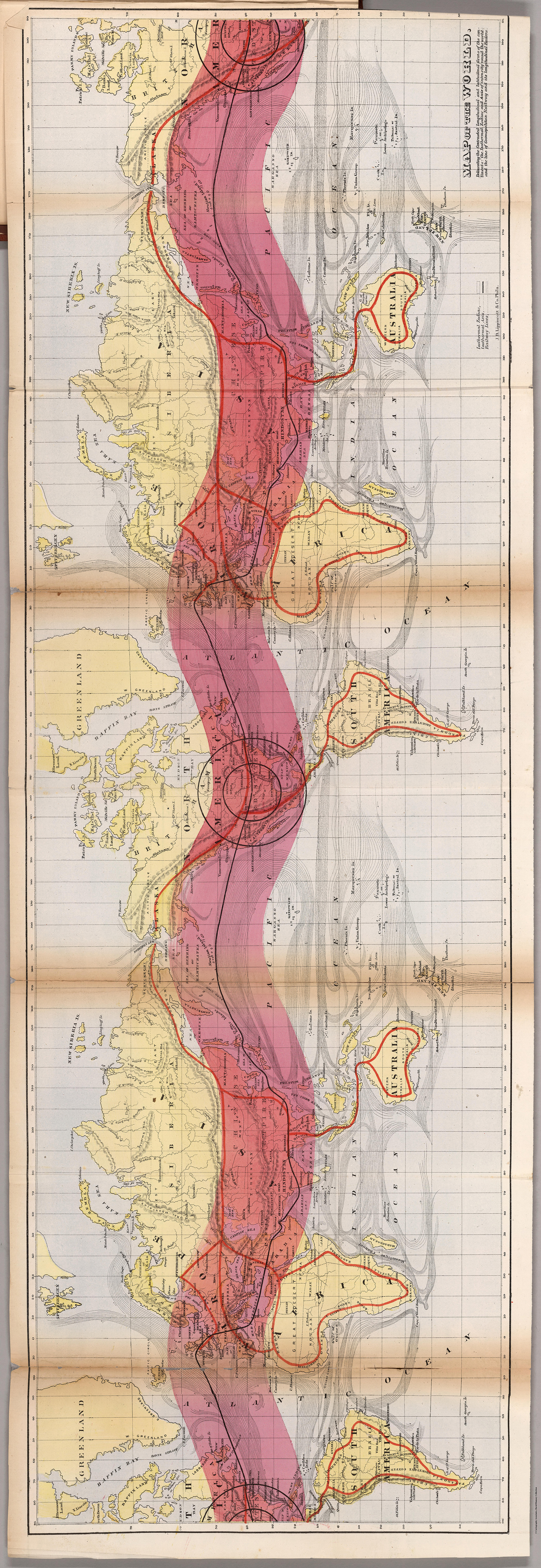
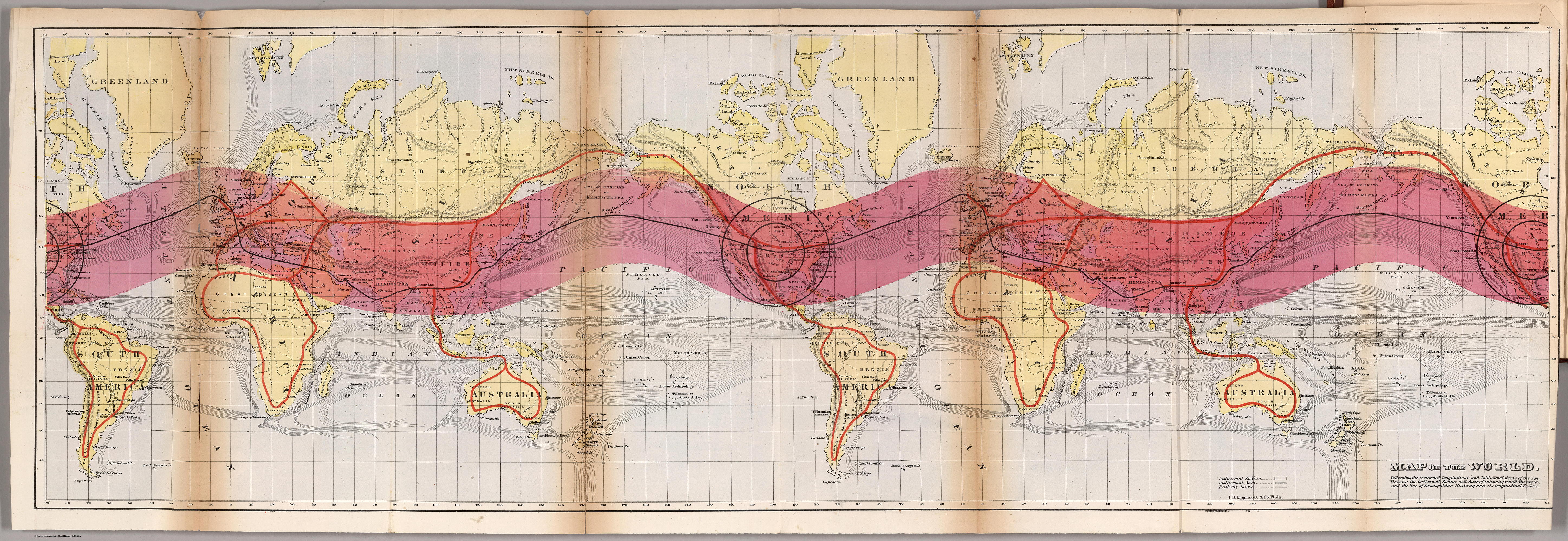
Map of the World. Delineating the Contrasted Longitudinal and Latitudinal forms of the continents: the Isothermal Zodiac and Axis of Intensity Round the World; and the Line of Cosmopolitan Railway and it Longitudinal Feeders.
••••••••••
Herein lie a half dozen very odd yet striking maps, published in William Gilpin’s Mission of the North American People (1873). Gilpin, a quaker from Philadelphia, moved west in the 1830s, joining John C. Frémont on his 1843 expedition. Eventually serving as governor of Colorado, Gilpin was a booster of the American West in general with a vision of boundless future prosperity. His belief in manifest destiny wedded to odd climatological theories, some of which are mapped out here, promoted his vision of the American West.
Maps are from Mission of the North American People, Geographical, Social, and Political. Illustrated by Six Charts Delineating the Physical Architecture and Thermal laws of all the Continents. By William Gilpin, Late Governor of Colorado. Philadelphia: J.B. Lippincott & Co. 1873. Maps can be found at David Rumsey’s site as well as the full text of Gilpin’s book at the Internet Archive.

Map of North America in which are delineated the Mountain System as a Unit, the Great Calcareous Plain and its Details, and the Continuous Encircling Maritime Selvage.

Map of North America. Delineating the “Mountain System” and its details, The “Great Calcarious Plain” as a unit, and the continuous encircling “Maritime Selvage.”
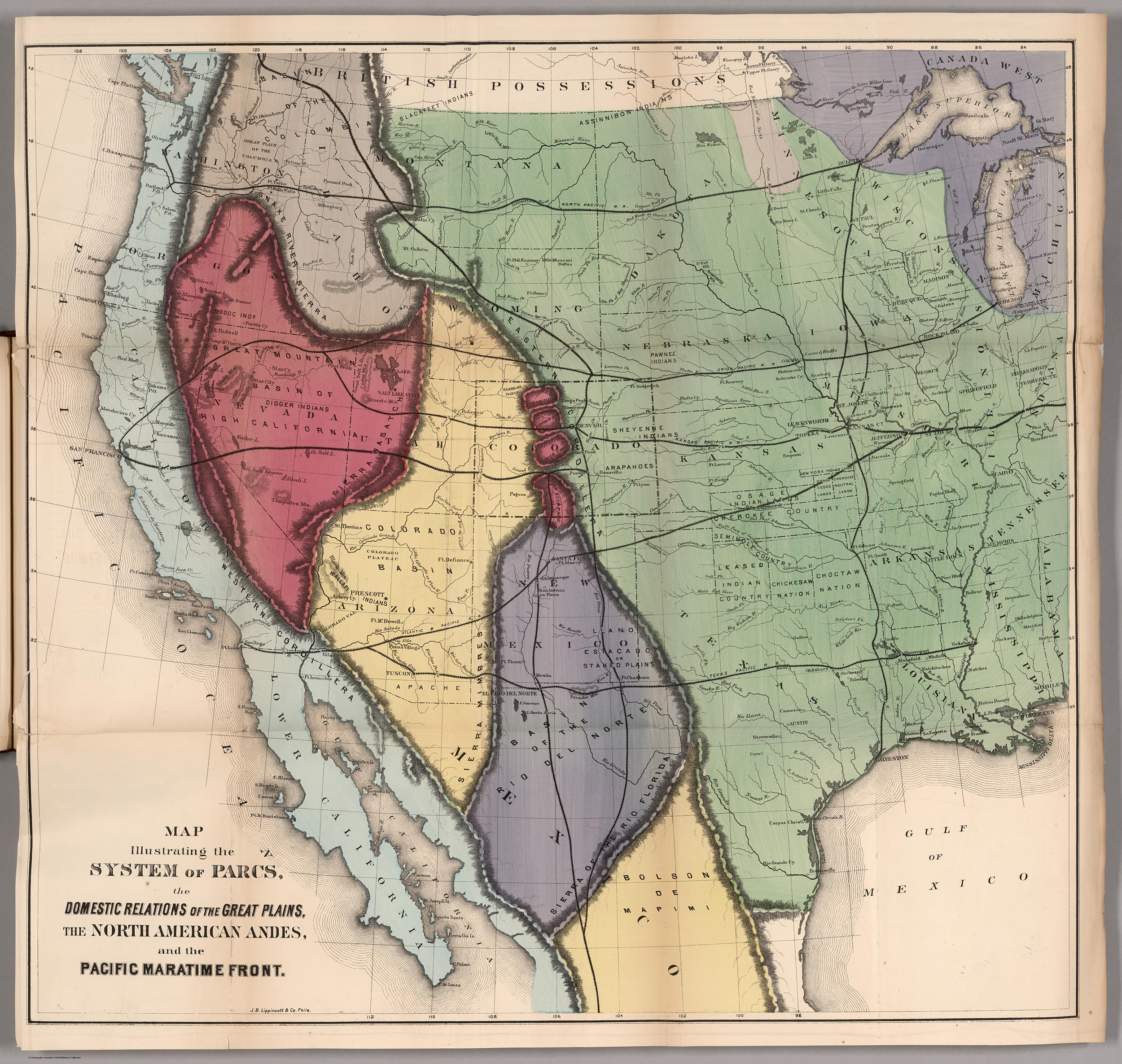
Map Illustrating the System of the Parcs, and the Domestic Relations of the “Great Plains,” the “North American Andes,” and the “Pacific Maritime Front.”
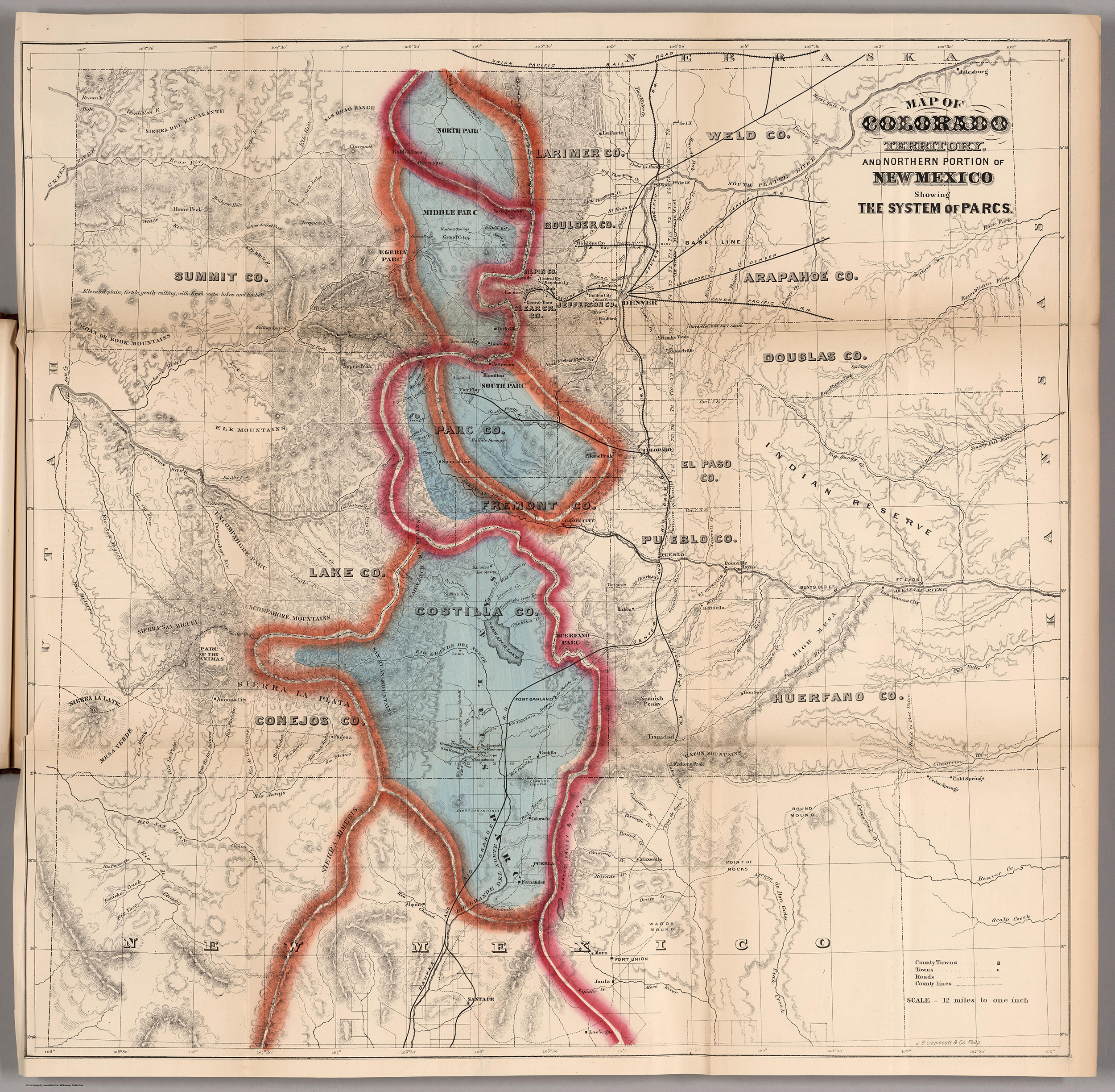
Map of Colorado Territory, and Northern Portion of New Mexico Showing the System of Parcs.

Thermal Map of North America. Delineating the Isothermal Zodiac, the Isothermal Axis of Identity, and its expansions up and down the “Plateau.”
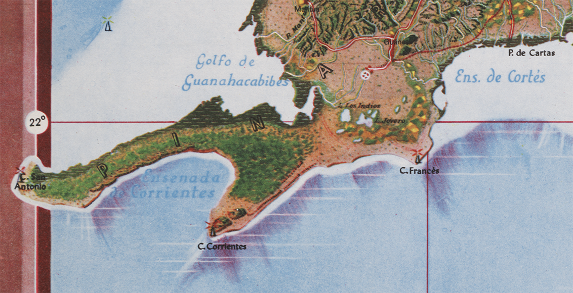
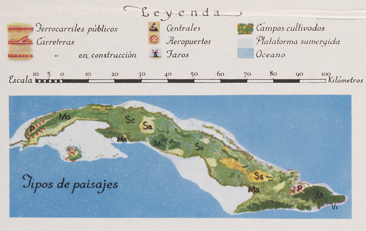
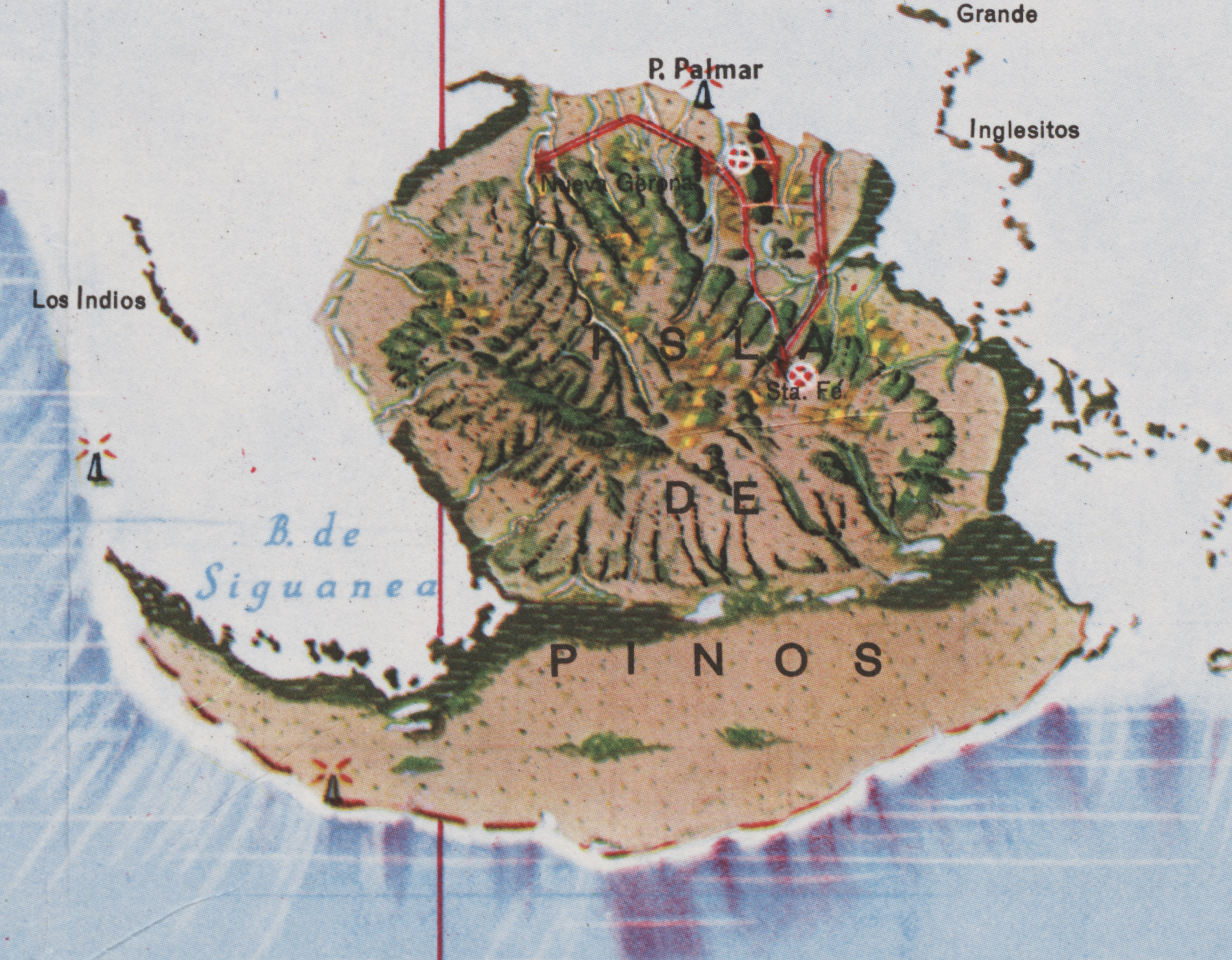
Mapa de los Paisajes de Cuba | Map of the Landscapes of Cuba | 1949 | Gerardo Canet & Erwin Raisz
Posted in 02 Why Are You Making Your Map?, 03 Mappable Data, 04 Map-Making Tools, 09 Map Symbolization, 11 Color on Maps, Map History, tagged Cuba - maps, Erwin Raisz - Atlases, Erwin Raisz - Map Design, Natural color mapping - history on July 29, 2014| 10 Comments »

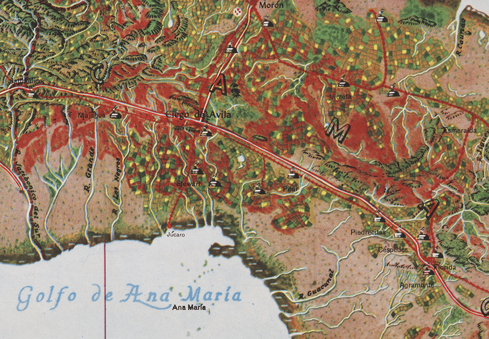
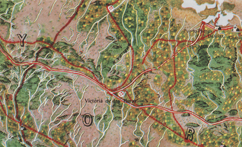
The Atlas de Cuba by Gerardo Canet and Erwin Raisz, featured in a recent posting here, is accompanied by a large color map entitled Mapa de los Paisajes de Cuba (Map of the Landscapes of Cuba). The map is a hybrid of Raisz’s landform map style supplemented with diverse human landscape components. Canet and Raisz explain their methodology:
The accompanying map of Cuba is a new experiment in cartography. Color suggests land types: cultivated fields, pastures, mountains, swamps, valleys, etc. The symbols were selected after a series of flights over the Island and on analysis of numerous color photographs taken from the air It is expected that in this way the map will better reflect reality; more closely resembling on air view of the Island than the conventional maps we now have.
This approach is part of a tradition of natural or real color mapping combining terrain (in particular, shaded relief) with air imagery or map symbolization inspired by air imagery, an obvious outcome of aerial mapping in the early part of the 20th century. An article by Tom Patterson and Nathaniel Vaughn Kelso entitled Hal Shelton Revisited: Designing and Producing Natural-Color Maps with Satellite Land Cover Data (2004) delineates the author’s development of the Natural Earth data (shaded terrain + satellite land use data) in the context of earlier, related work by Hal Shelton, Eduard Imhof, Heinrich Berann, Richard Edes Harrison and Tibor Toth. It seems that Raisz was also an innovator in this realm of air-imagery inspired map design.
••••••••••••
See also, at this blog, Raisz’s History of American Cartography Timelines, Map Symbols: Landforms & Terrain, and Raisz’s currently available landform maps at www.raiszmaps.com.
••••••••••••

Mapa de los Paisajes de Cuba, 1949 (36.6mb)
••••••••••••••••••
Map details:


Atlas de Cuba | 1949 | Gerardo Canet & Erwin Raisz
Posted in 06 Map Layout, 07 Hierarchies, 09 Map Symbolization, 10 Type on Maps, 11 Color on Maps, Map Books, Map History, tagged Erwin Raisz - Atlases; Map design - atlases; Cuba - atlases on July 9, 2014| 9 Comments »

This Atlas is more than an attempt to describe Cuba. Our aim is not only to present the setting in which the drama of Cuban life is played but to show how this life itself changes its own setting, creating new problems and new adjustments to them.
This dynamic element is usually absent from the impersonal atlases produced by governments, societies and publishing houses, which merely give a graphic report of a given moment of time. Our objective is to give a living picture of Cuban geography as far as possible in 64 pages. Our approach is as follows: 1. What are the facts?, 2. What are the essential problems?, 3. What will be their effects in the future and what may be done about them? For instance, Cuba, by reason of its close proximity to the United States become its chief source of tropical products, especially sugar. Thus the Cuban economy has become dependent on the fluctuating sugar demand, whereas a diversification of crops and industries would be advisable.
We have presented the results of our labor in graphical form. An old Chinese proverb says: “A picture says more than a thousand words.” Moreover by visual representation the most complicated problems may be brought within the understanding of the layman. Everyone should know the geography of his own country, and in the case of Cuba this need is imperative, since few countries have such clear-cut dependence on location, climate and soil Cuba’s internal problems of adjustment and interdependence with the rest of the world demand a high degree of understanding from its citizens.
– from Introduction
•••••••••••••••••••••••••••••••••
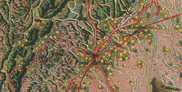
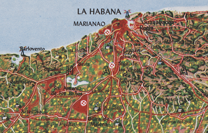
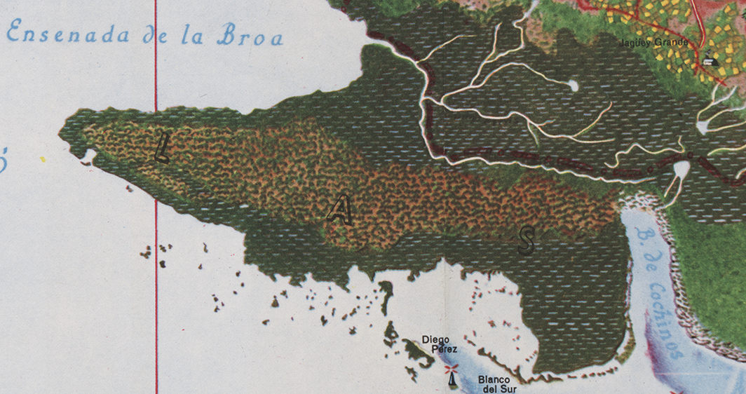
In addition to many dozens of unique landform maps, Erwin Raisz produced three atlases in his lifetime, including the Atlas of Global Geography (Global Press Corp., 1944), the Atlas de Cuba (Harvard University Press, 1949) and the Atlas of Florida (University of Florida Press, 1964). Copies of the Global and Florida atlases are relatively easy to find (used or in libraries); this is not the case with the Cuba atlas, which seems to have had a relatively low print run. A series of maps, diagrams and illustrations from the Cuba atlas are included below.
The Atlas de Cuba strongly reflects Raisz’s aesthetic, combining creative illustration with his bold and cozy aesthetic of map design. Part of the appeal of Raisz’s work is its humane feel, reflecting the manual mapping tools used to create his maps. Raisz’s maps and illustrations clearly reveal the hand of a human creator.
A large format map, included in the back of the Atlas de Cuba, will be the subject of a subsequent post.
See also, at this blog, Raisz’s History of American Cartography Timelines, Map Symbols: Landforms & Terrain, and Raisz’s currently available landform maps at www.raiszmaps.com.
•••••••••••••••••••••••••••••••••

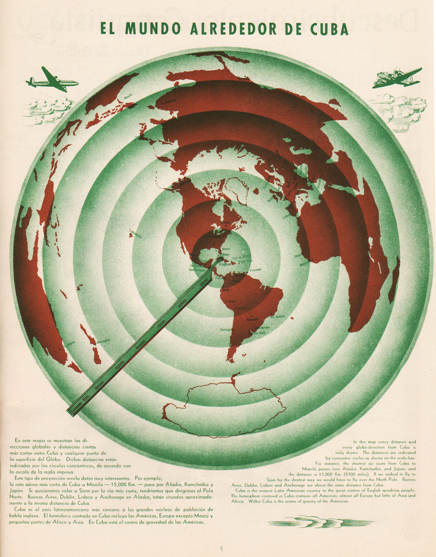
El Mundo Alrededor de Cuba | The World Around Cuba (Excerpt & entire p. 5)
•••••••••••••••••••••••••••••••••
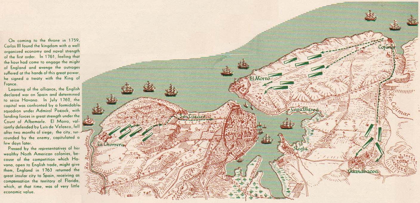
Cuba Colonial | Colonial Cuba (excerpt, p. 9)
•••••••••••••••••••••••••••••••••

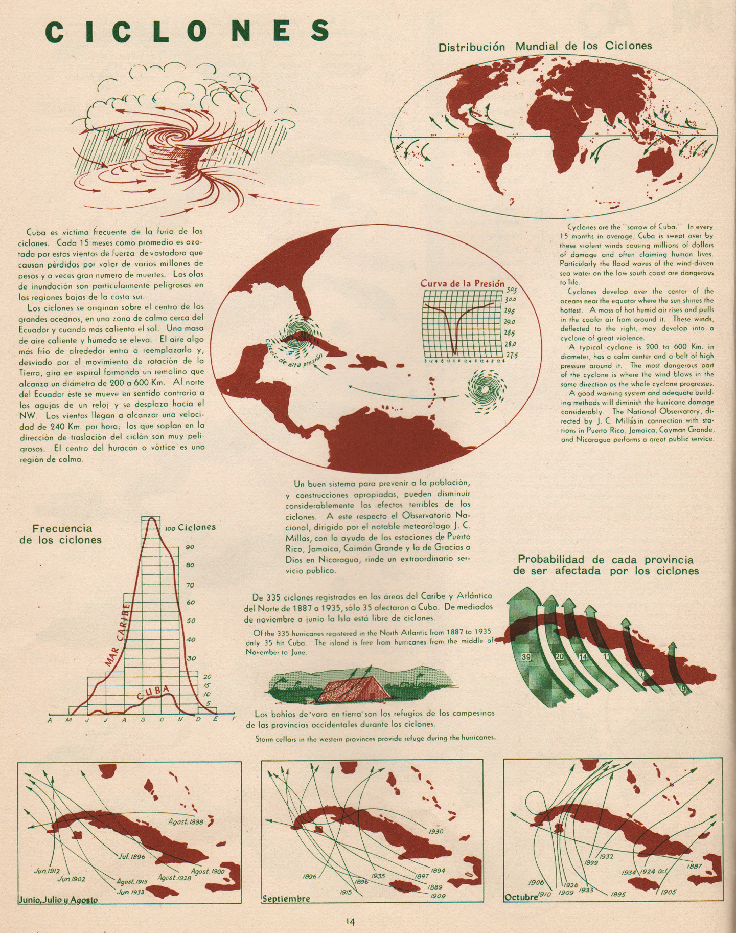
Ciclones | Cyclones (excerpt & entire p. 14)
•••••••••••••••••••••••••••••••••

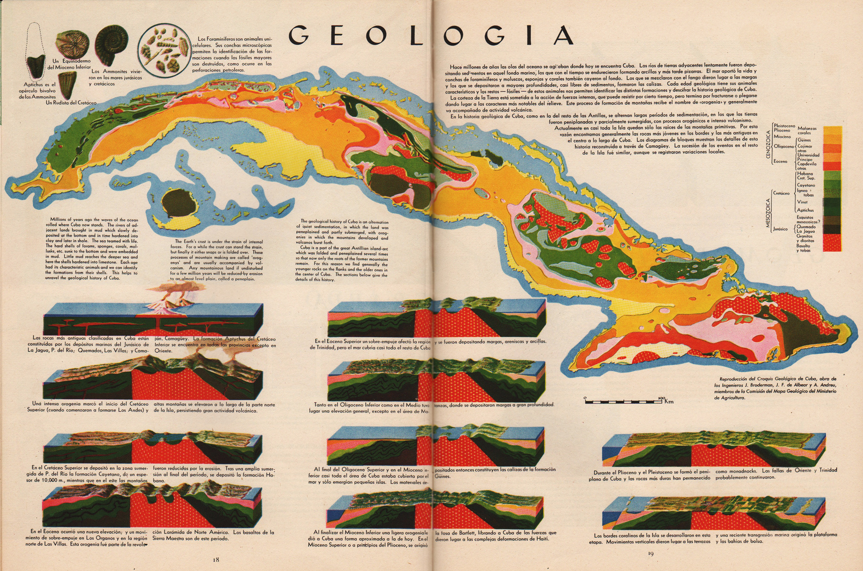
Geologia | Geology (excerpt & entire pp. 18-19)
•••••••••••••••••••••••••••••••••


Geomorfologia | Geomorphology (excerpt & entire pp. 20-21)
•••••••••••••••••••••••••••••••••

Pesca | Fish (excerpt, p. 25)
•••••••••••••••••••••••••••••••••


Vegetacion | Vegetation (excerpt & entire pp. 26-27)
•••••••••••••••••••••••••••••••••

Poblacion | Population (excerpt, p. 29)
•••••••••••••••••••••••••••••••••
Composition Social | Social Composition (excerpt, p. 35)
•••••••••••••••••••••••••••••••••


Tourismo | Tourism (excerpt & entire pp. 38-39)
•••••••••••••••••••••••••••••••••
Educacion | Education (excerpt, p. 40)
•••••••••••••••••••••••••••••••••


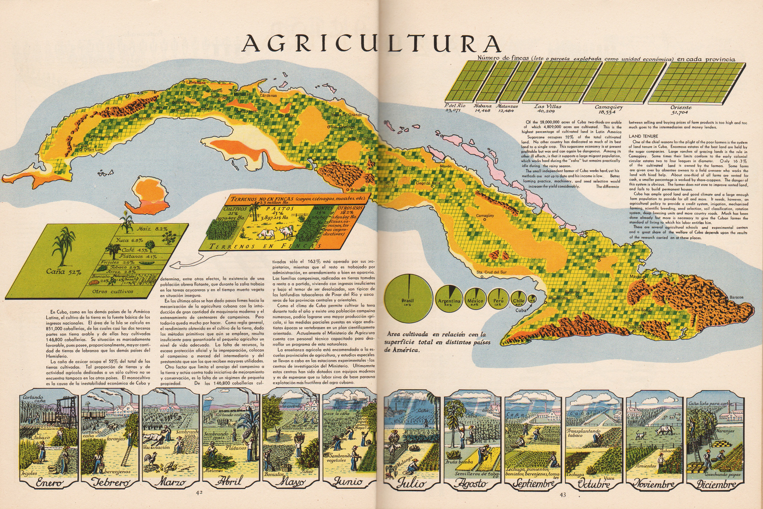
Agricultura | Agriculture (excerpts & entire pp. 42-43)
•••••••••••••••••••••••••••••••••
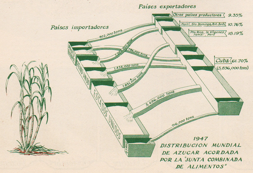
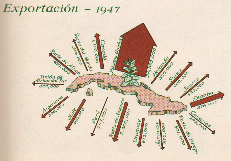
Azucar | Sugar (excerpt, p. 44)
•••••••••••••••••••••••••••••••••

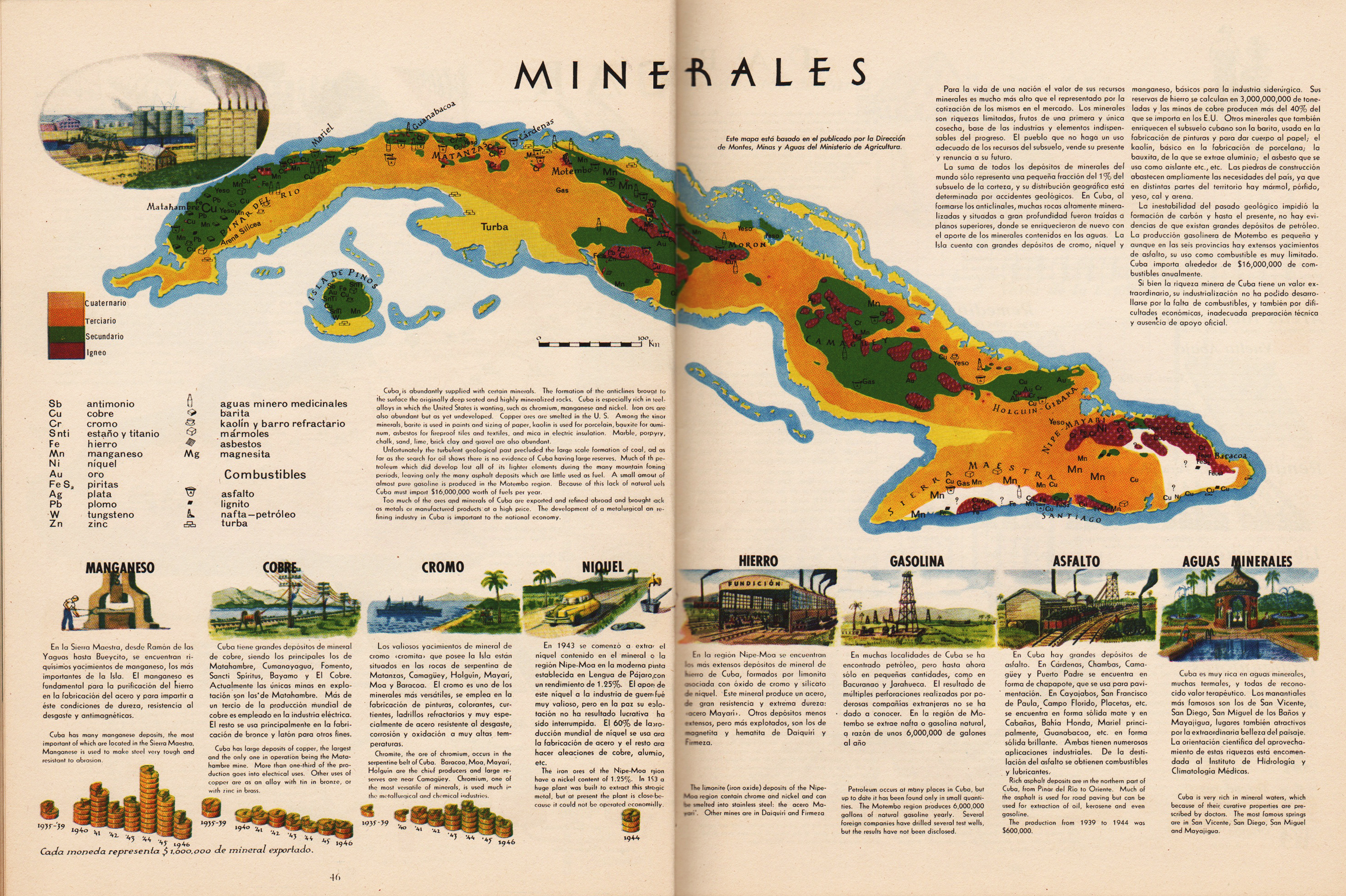
Minerales | Minerals (excerpt & entire pp. 46-47)
•••••••••••••••••••••••••••••••••
Tabaco | Tobacco (excerpt, p. 49)
•••••••••••••••••••••••••••••••••

Frutas | Fruit (excerpt, p. 51)
•••••••••••••••••••••••••••••••••
Atlas de Cuba
Garardo Canet & Erwin Raisz
Harvard University Press
1949
Japanese Maps | Tokugawa Era | 1600-1870
Posted in 01 What's A Map?, 02 Why Are You Making Your Map?, 09 Map Symbolization, 10 Type on Maps, 11 Color on Maps, Map History, tagged Maps - History, Maps - Japan - Tokugawa Era - history on May 28, 2014| 1 Comment »


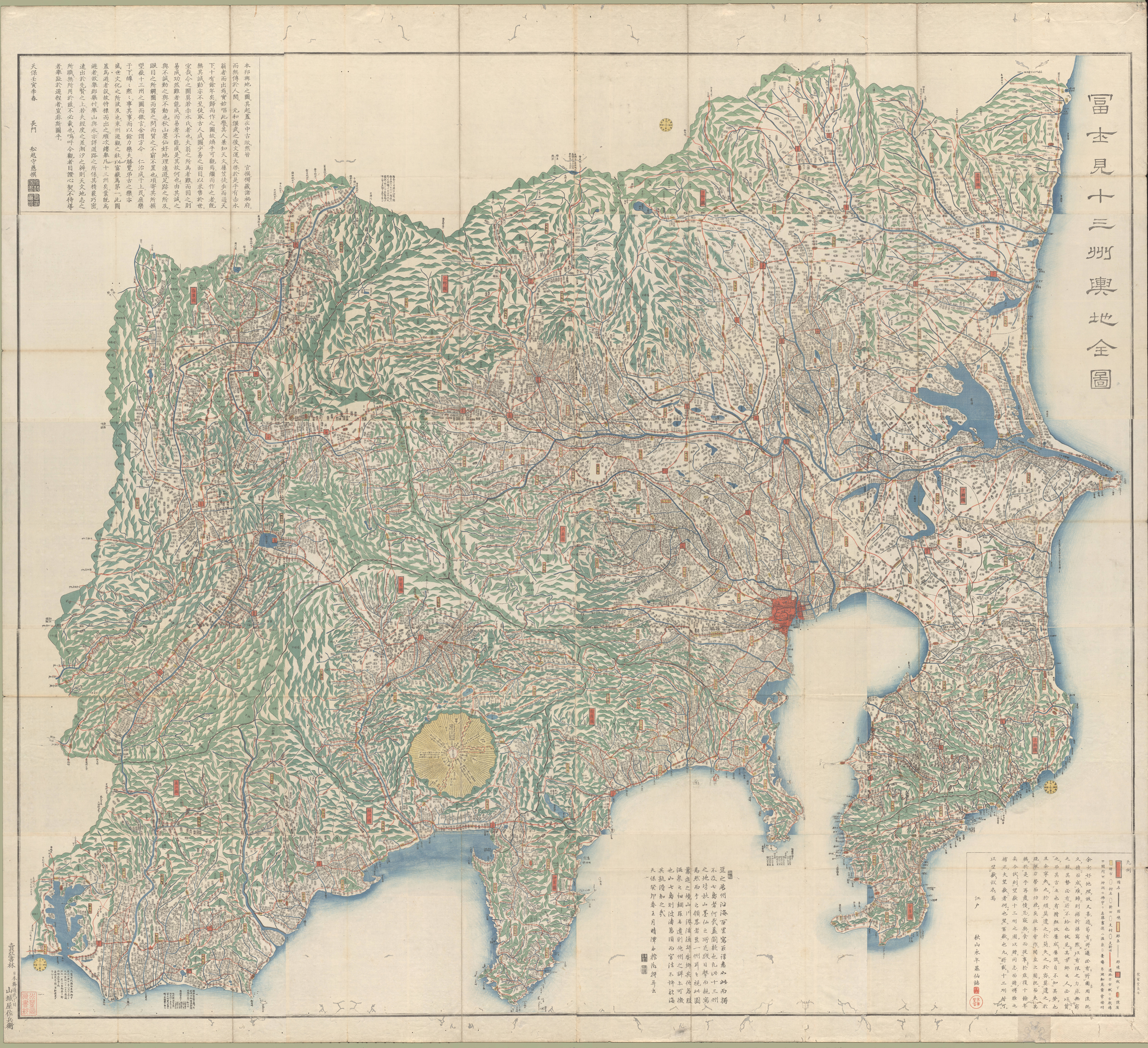
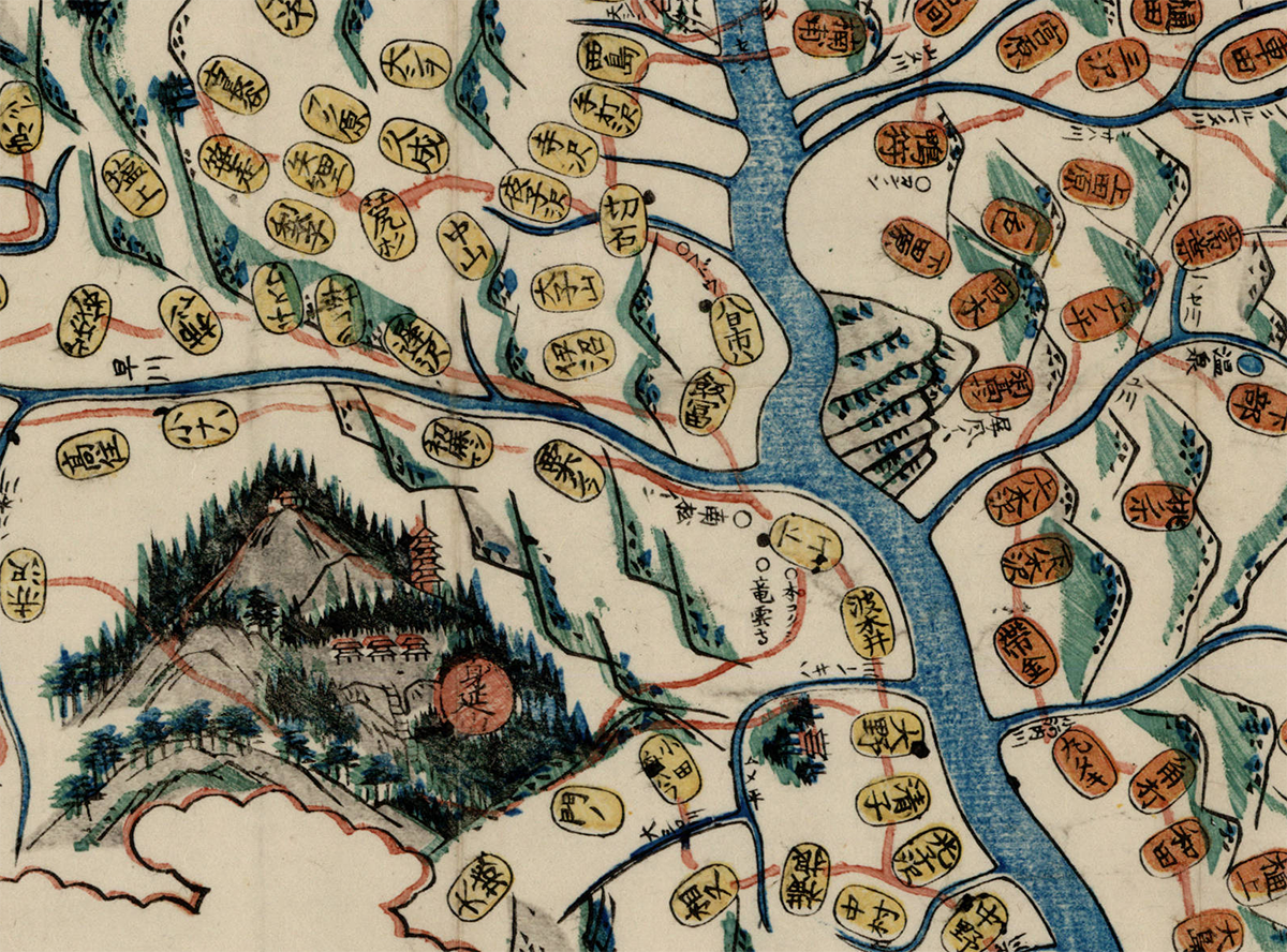
Fujimi jūsanshū yochi zenzu
(Map of the thirteen provinces from which Mt. Fuji is visible)
1843 | Edo : Yamashiroya Sahei
Source
••••••••••


Kaihō Kai no Kuni ezu
(Pocket map of Kai Province)
1842 | Kōfu, Kai Province : Murataya Kōtarō
Source
••••••••••
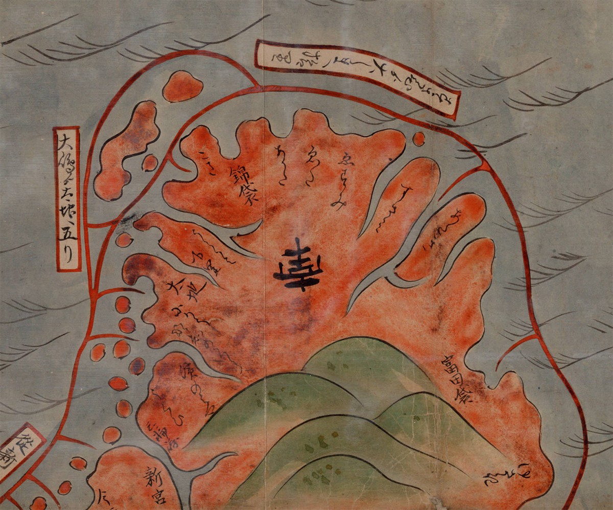


Ōsaka yori Tōkai ni itaru kairo no zu
(Tōkaidō and the sea route from Ōsaka to Edo)
1855 | Manuscript
Source
••••••••••
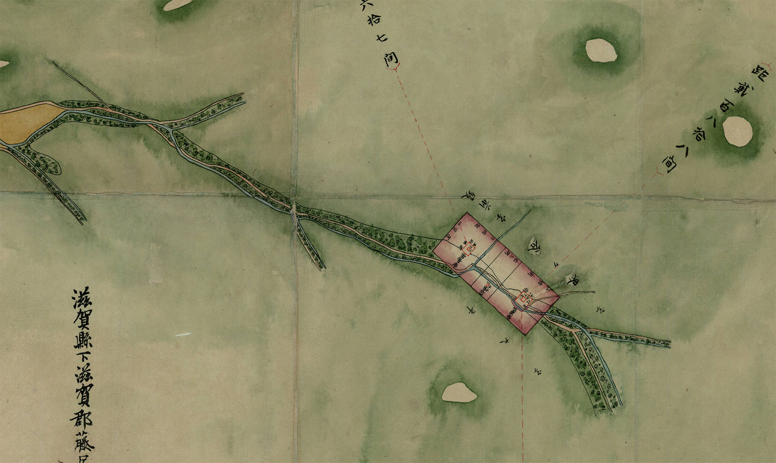

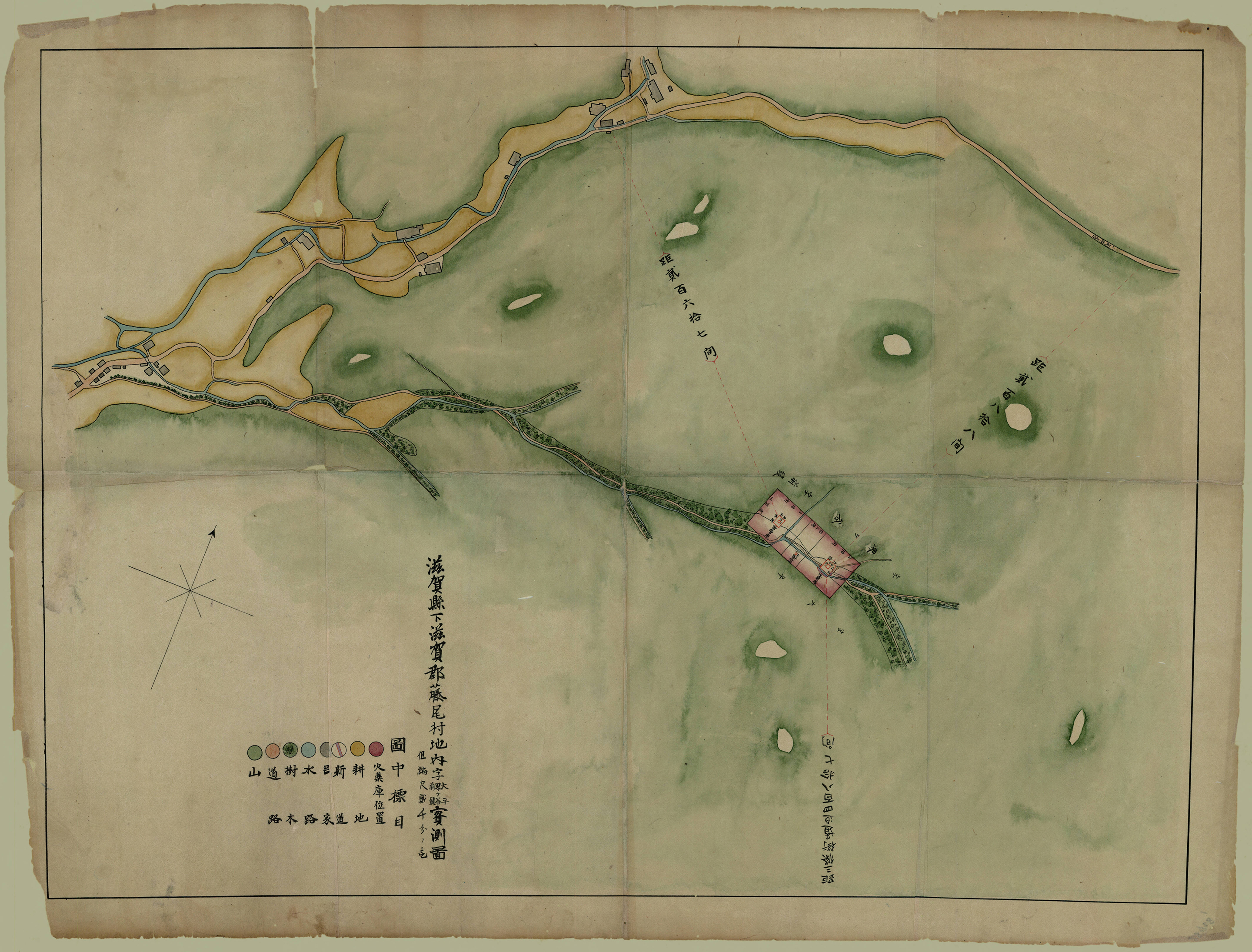
Shiga kenka Shiga-gun Fujio-mura chinai aza Ōhira Kaigaya Maegaki jissokuzu
(Measured map of Ōhira Kaigaya Maegaki, in Fujio Village, Shiga County, Shiga Prefecture – Gunpowder Safety Map)
1870 | Manuscript
Source
••••••••••
University of British Columbia
Collection: Japanese Maps of the Tokugawa Era
Source & Description
Map Posters | Spain | Germany | 1917-1936
Posted in 06 Map Layout, 07 Hierarchies, 09 Map Symbolization, 11 Color on Maps, Map History, tagged Map Design, Maps - History, Posters - Map, Spanish Revolution - Maps, World War 1 - Maps on June 9, 2013| Leave a Comment »
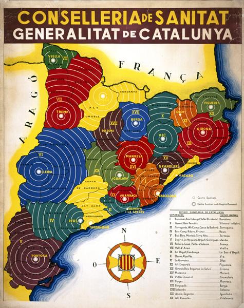
Catalonian Health Administration Areas (1936-39)
•••••
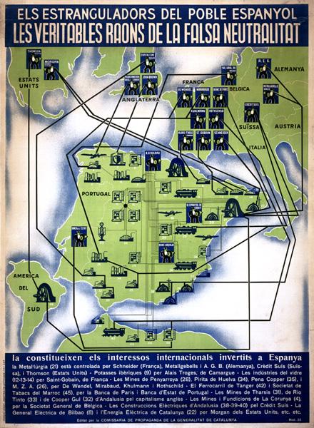
Foreign interests allied against the Spanish Republic (1937)
•••••
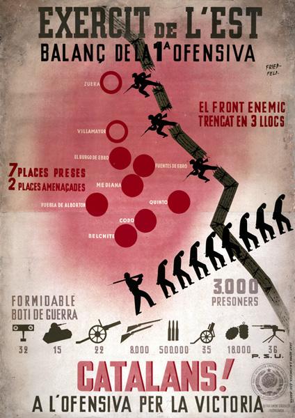
Aragon Front of the war: Republican gains shown as broken barbed wire, prisoners taken shown as silhouettes of men marching under guard, and captured armaments shown as images of specific weapons with numbers captured (1936).
•••••
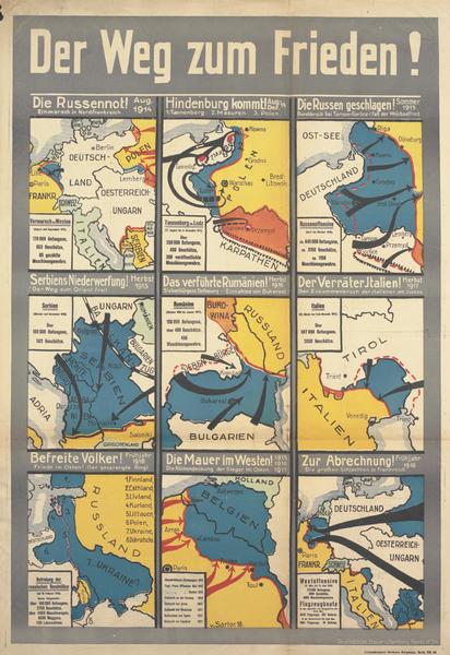
The Way to Peace! Nine maps of German campaigns from August 1914 to spring 1918.
•••••
•••••
Spanish Civil War Poster Collection
Posters of Conflict Collection
•••••
Thanks to A London Salmagundi for original link
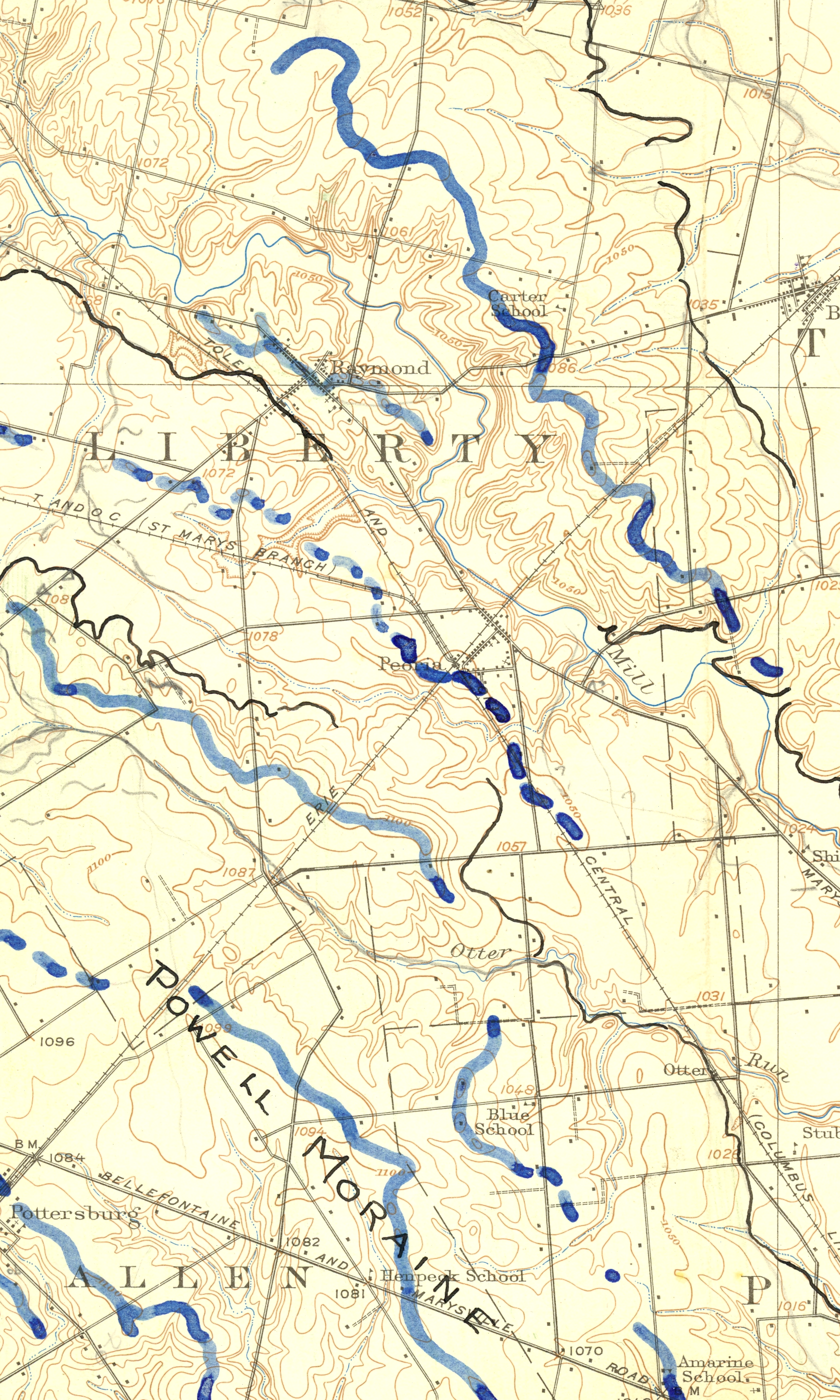
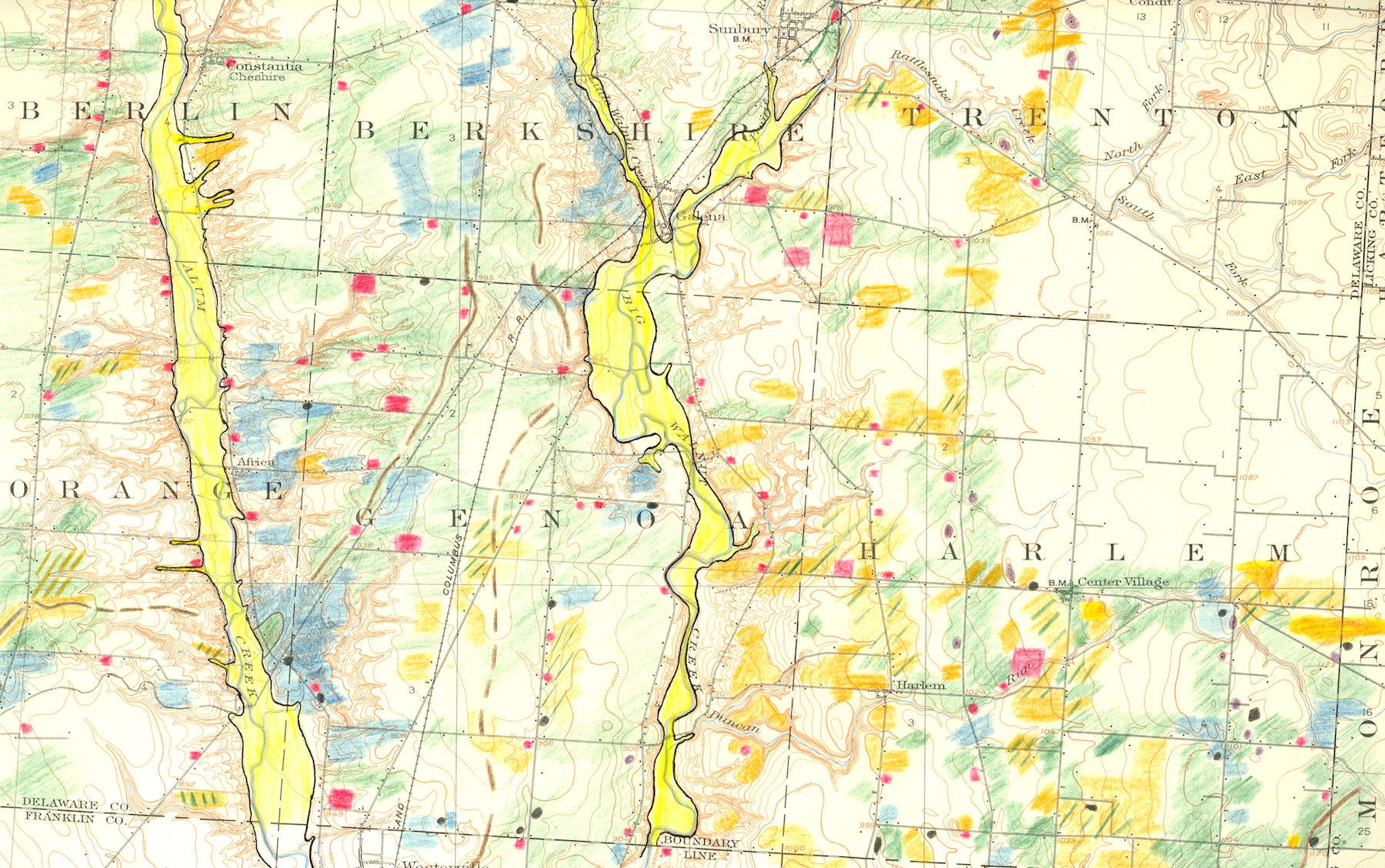
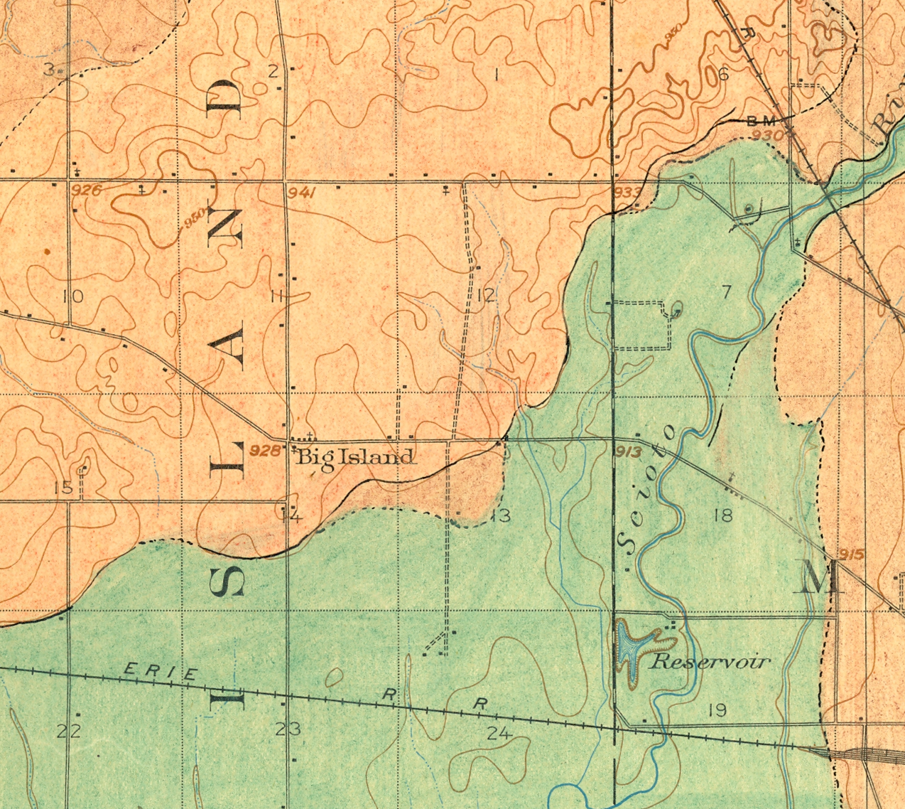
Hand-sketched Glacial Landform Maps IV
Posted in 04 Map-Making Tools, 09 Map Symbolization, 11 Color on Maps, tagged Maps - Annotated, Maps - Geomorphology on February 22, 2013| Leave a Comment »

Among the most expressive of map making tools are pencils, pens and other analog devices. The certainty of the topographic map contrasts with the precursory aesthetic of the hand drawn annotations.
This final posting in a series contains hand-sketched glacial geomorphology annotations on topographic maps by Dr. George Crowl (1910-87) who taught geology at Ohio Wesleyan University from 1947-1975. The topographic maps are from the USGS 15′ series, covering the area around Delaware, Ohio. Crowl was known for his field trips for students in Ohio and surrounding states. These manuscript maps, in the archives of the Geology & Geography Department at Ohio Wesleyan, were likely created for a generalized map of central Ohio glacial landforms for use on his field trips.
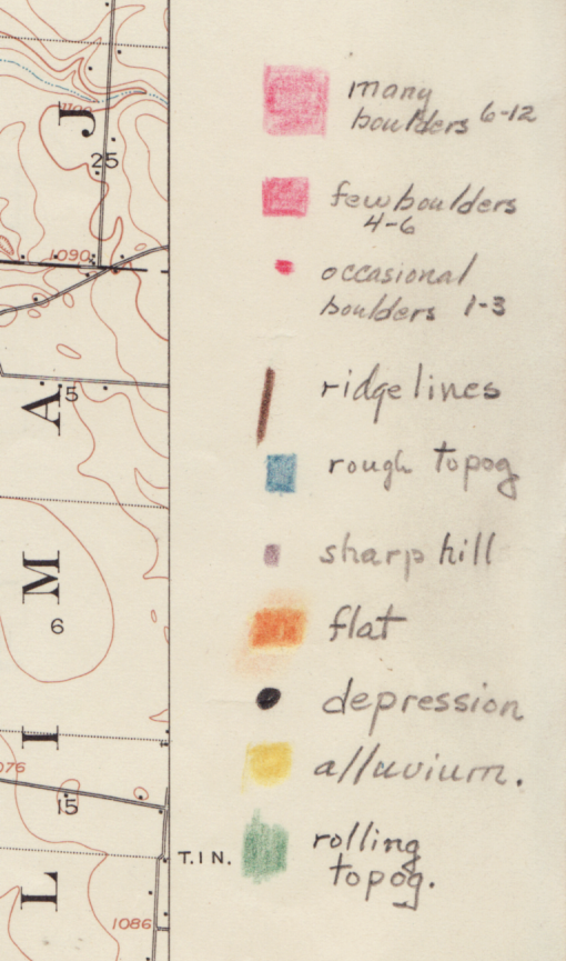
Excerpts from Westerville, OH USGS 15′ quadrangle
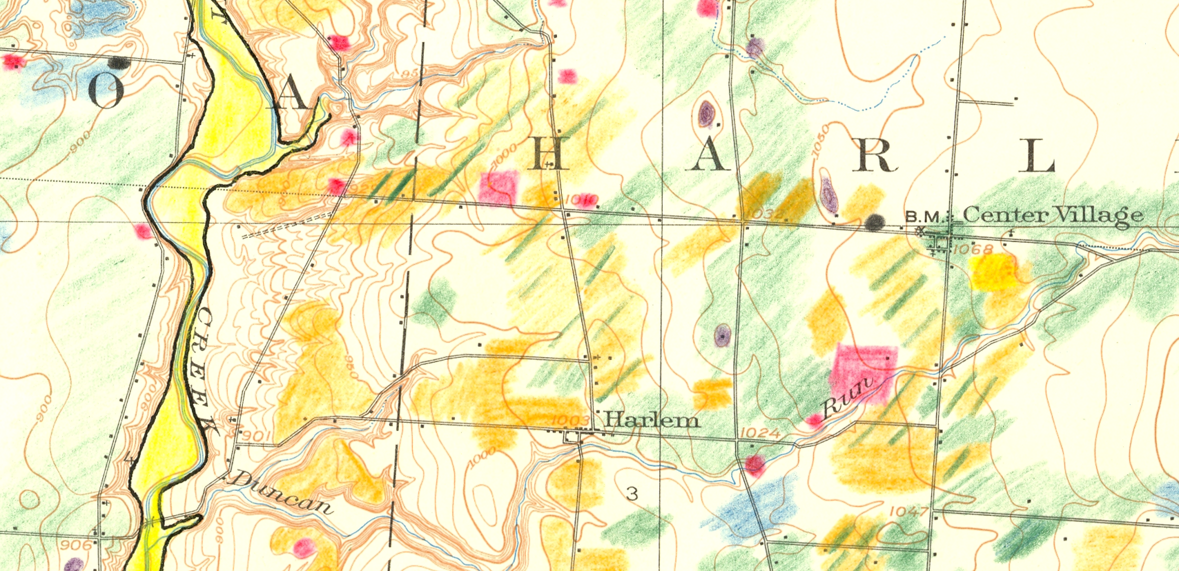
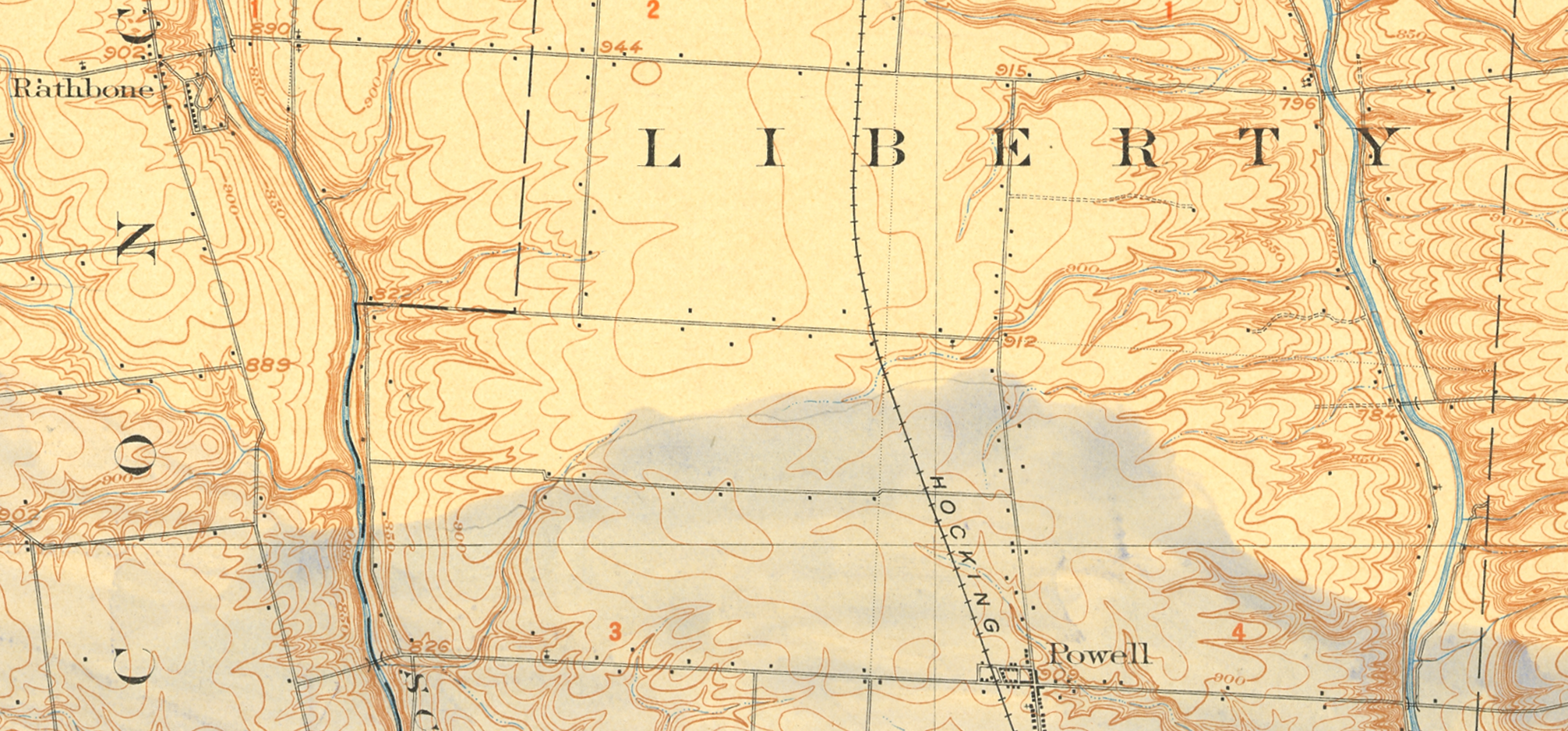
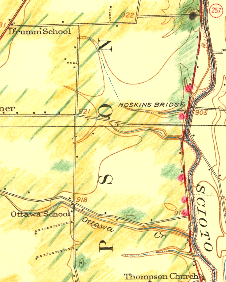
Hand-sketched Glacial Landform Maps I
Posted in 04 Map-Making Tools, 09 Map Symbolization, 11 Color on Maps, tagged Maps - Geomorphology; Maps - Annotated on February 19, 2013| Leave a Comment »

Among the most expressive of map making tools are pencils, pens and other analog devices. The certainty of the topographic map contrasts with the precursory aesthetic of the hand drawn annotations.
This and three subsequent postings contain a series of hand-sketched glacial geomorphology annotations on topographic maps by Dr. George Crowl (1910-87) who taught geology at Ohio Wesleyan University from 1947-1975. The topographic maps are from the USGS 15′ series, covering the area around Delaware, Ohio. Crowl was known for his field trips for students in Ohio and surrounding states. These manuscript maps, in the archives of the Geology & Geography Department at Ohio Wesleyan, were likely created for a generalized map of central Ohio glacial landforms for use on his field trips.
Excerpts from Delaware, OH USGS 15′ quadrangle


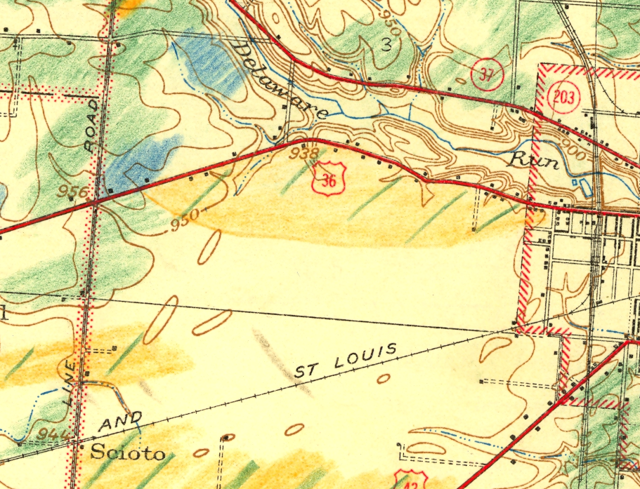
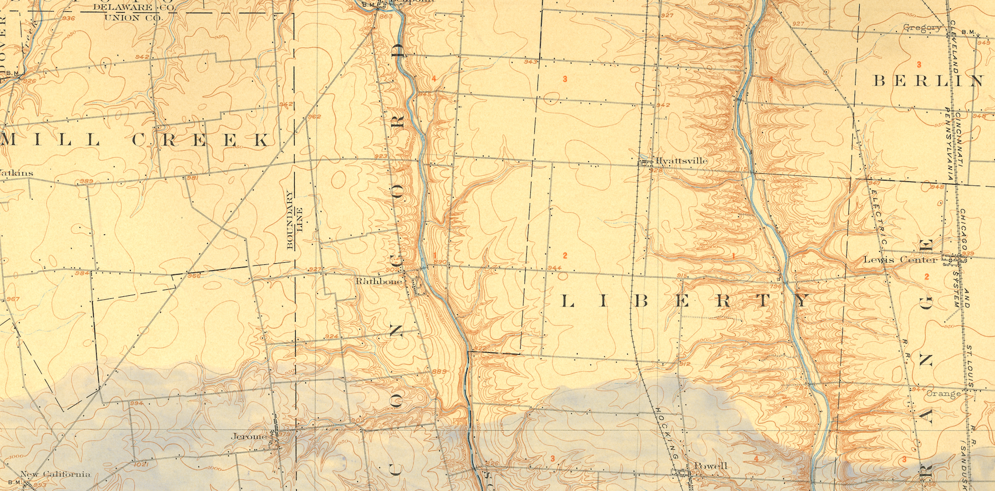
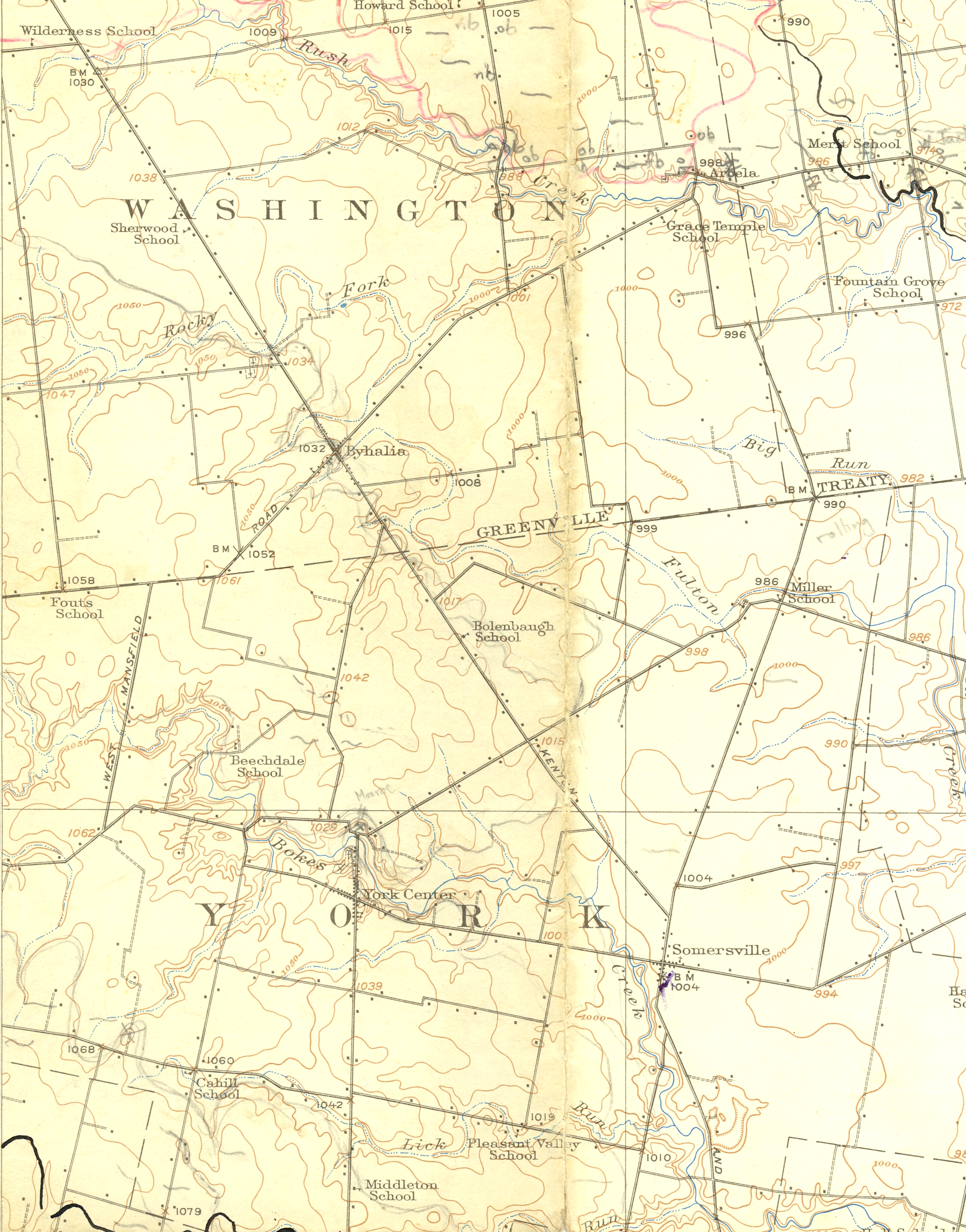
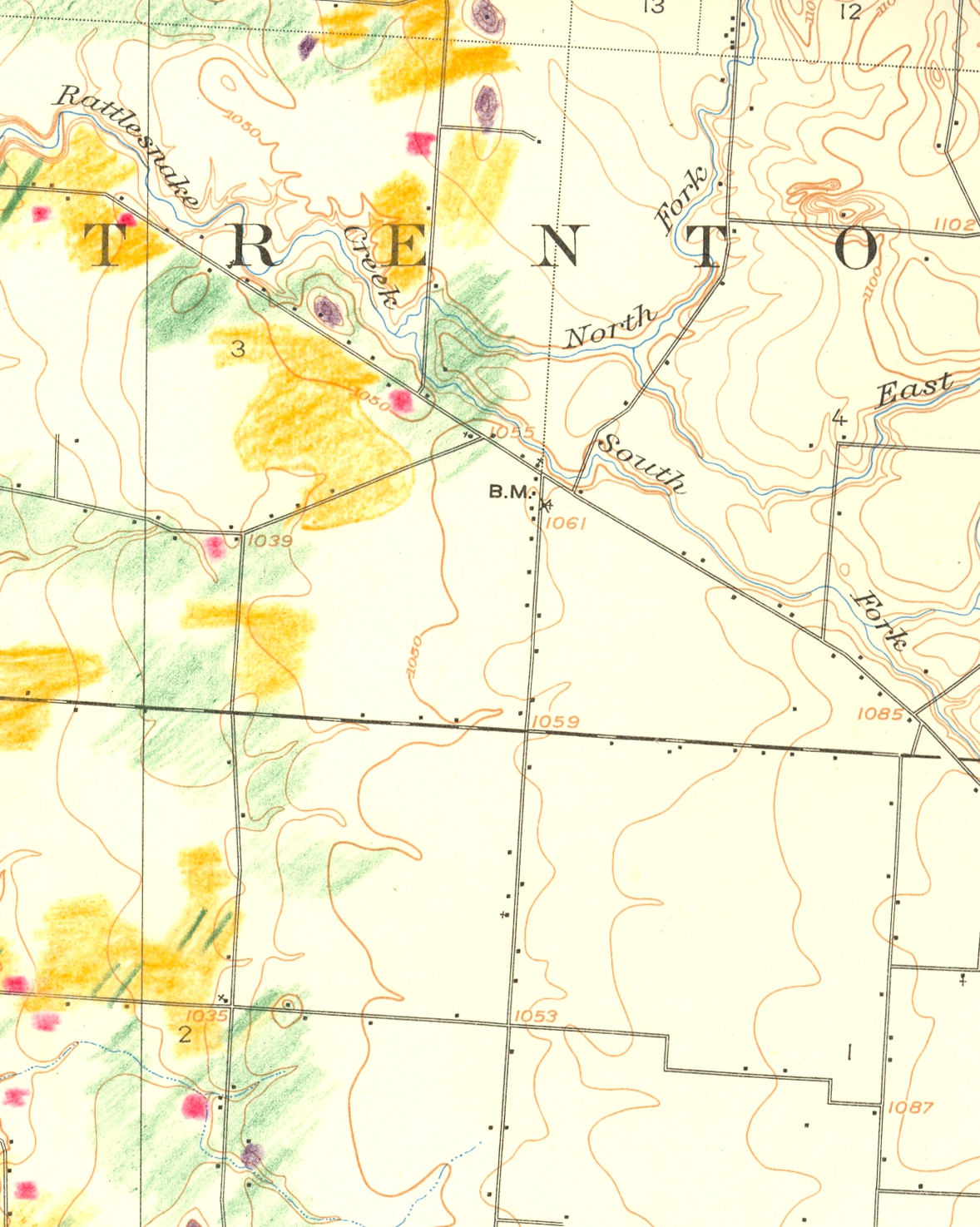
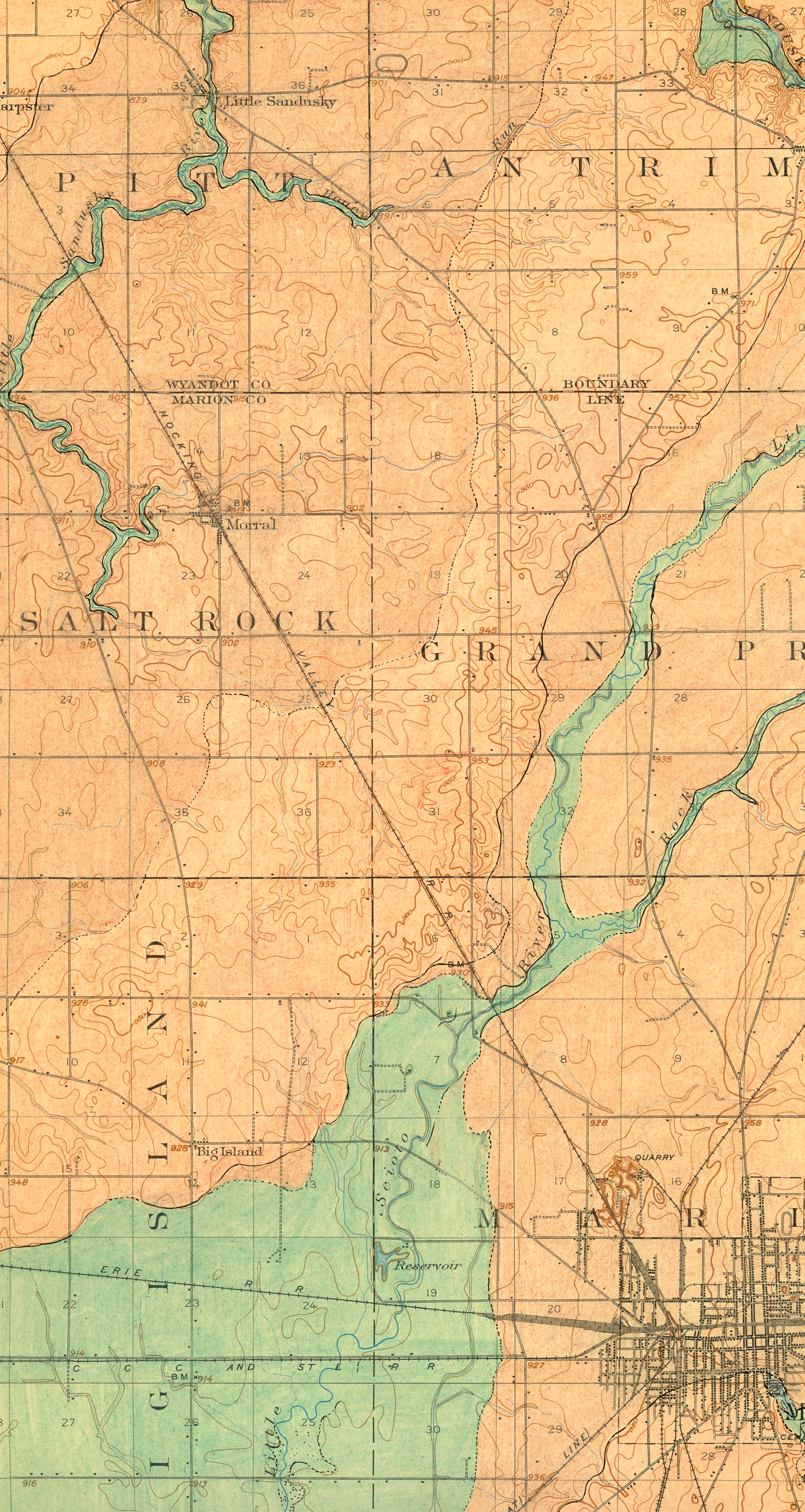
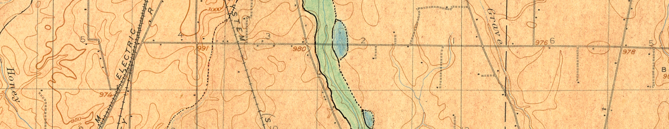
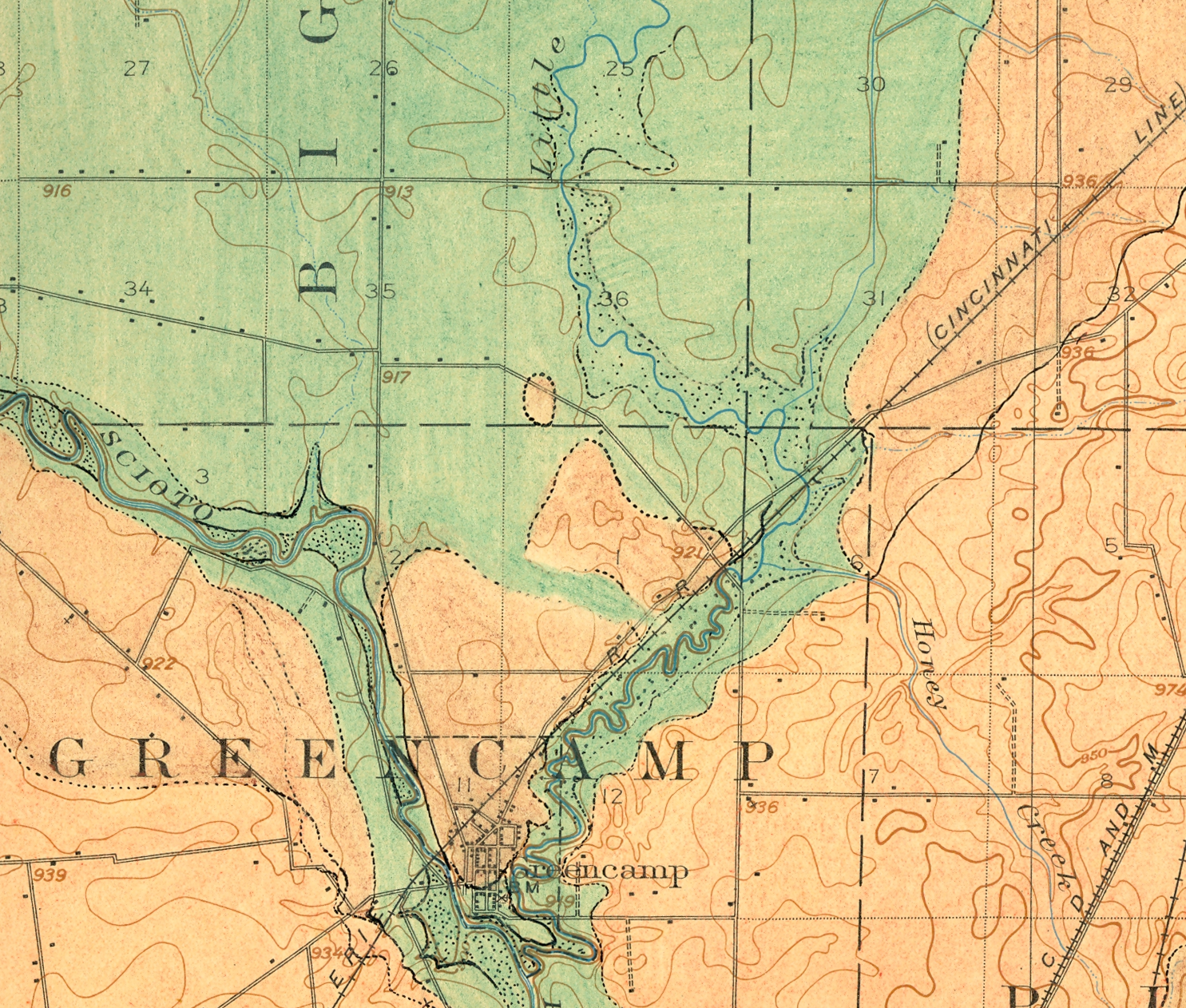
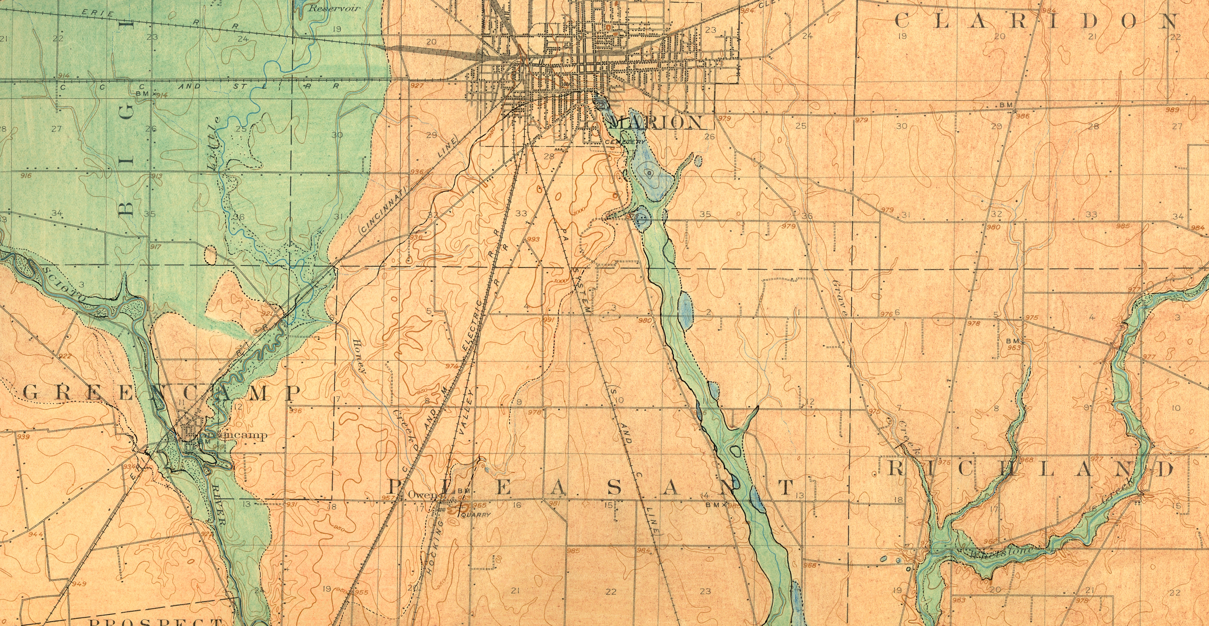
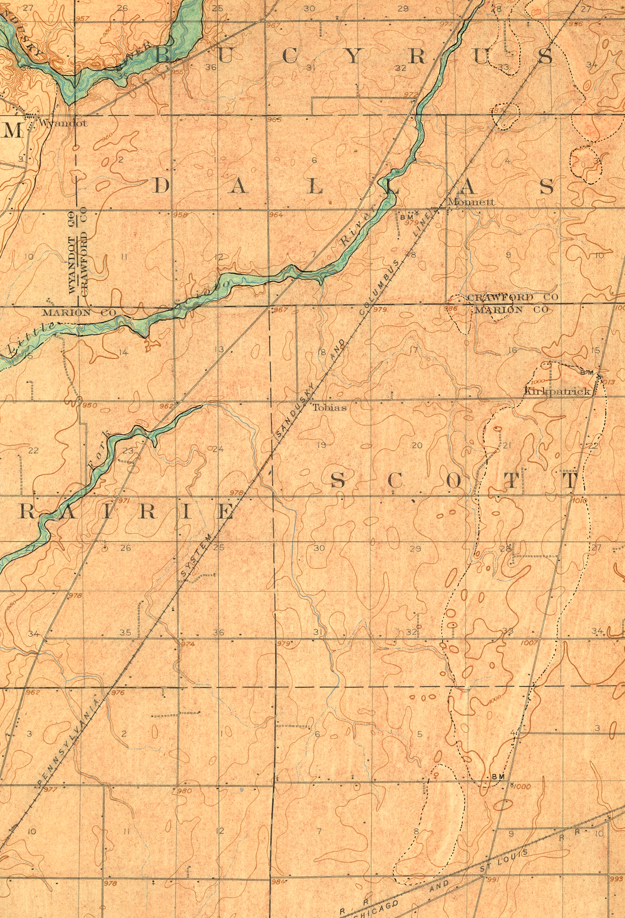
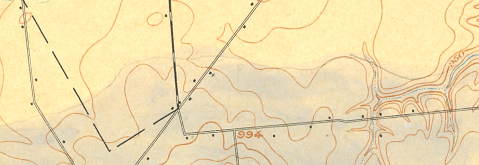
Hand-sketched Glacial Landform Maps III
Posted in 04 Map-Making Tools, 09 Map Symbolization, 11 Color on Maps, tagged Maps - Glacial Landforms; Maps - Annotated on February 19, 2013| Leave a Comment »
Among the most expressive of map making tools are pencils, pens and other analog devices. The certainty of the topographic map contrasts with the precursory aesthetic of the hand drawn annotations.
This posting contains a series of hand-sketched glacial geomorphology annotations on topographic maps by Dr. George Crowl (1910-87) who taught geology at Ohio Wesleyan University from 1947-1975. The topographic maps are from the USGS 15′ series, covering the area around Delaware, Ohio. Crowl was known for his field trips for students in Ohio and surrounding states. These manuscript maps, in the archives of the Geology & Geography Department at Ohio Wesleyan, were likely created for a generalized map of central Ohio glacial landforms for use on his field trips.
Excerpts from Marion, OH USGS 15′ quadrangle
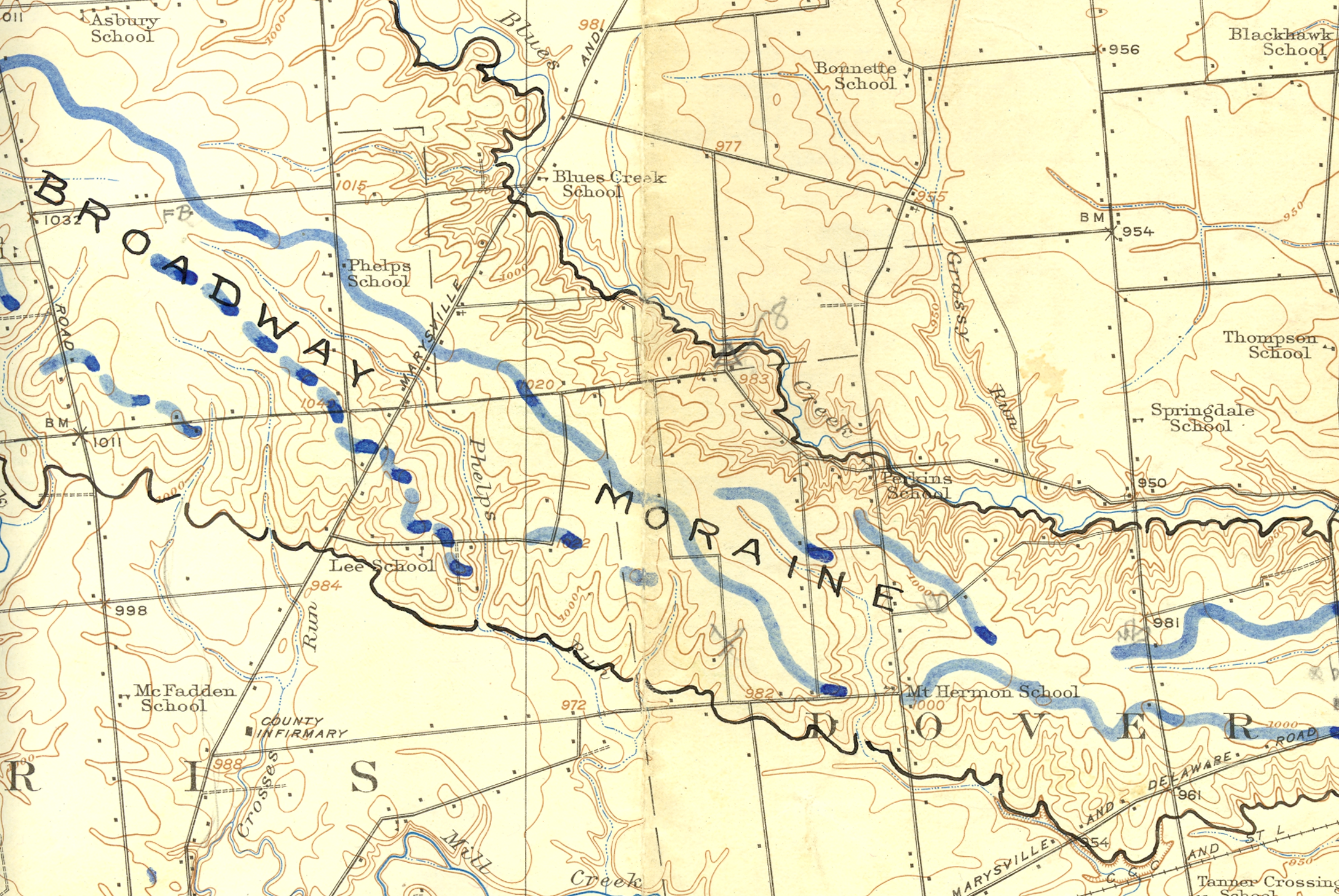
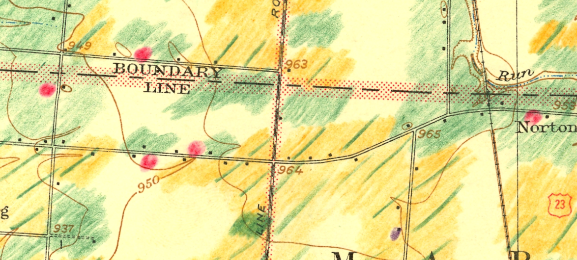
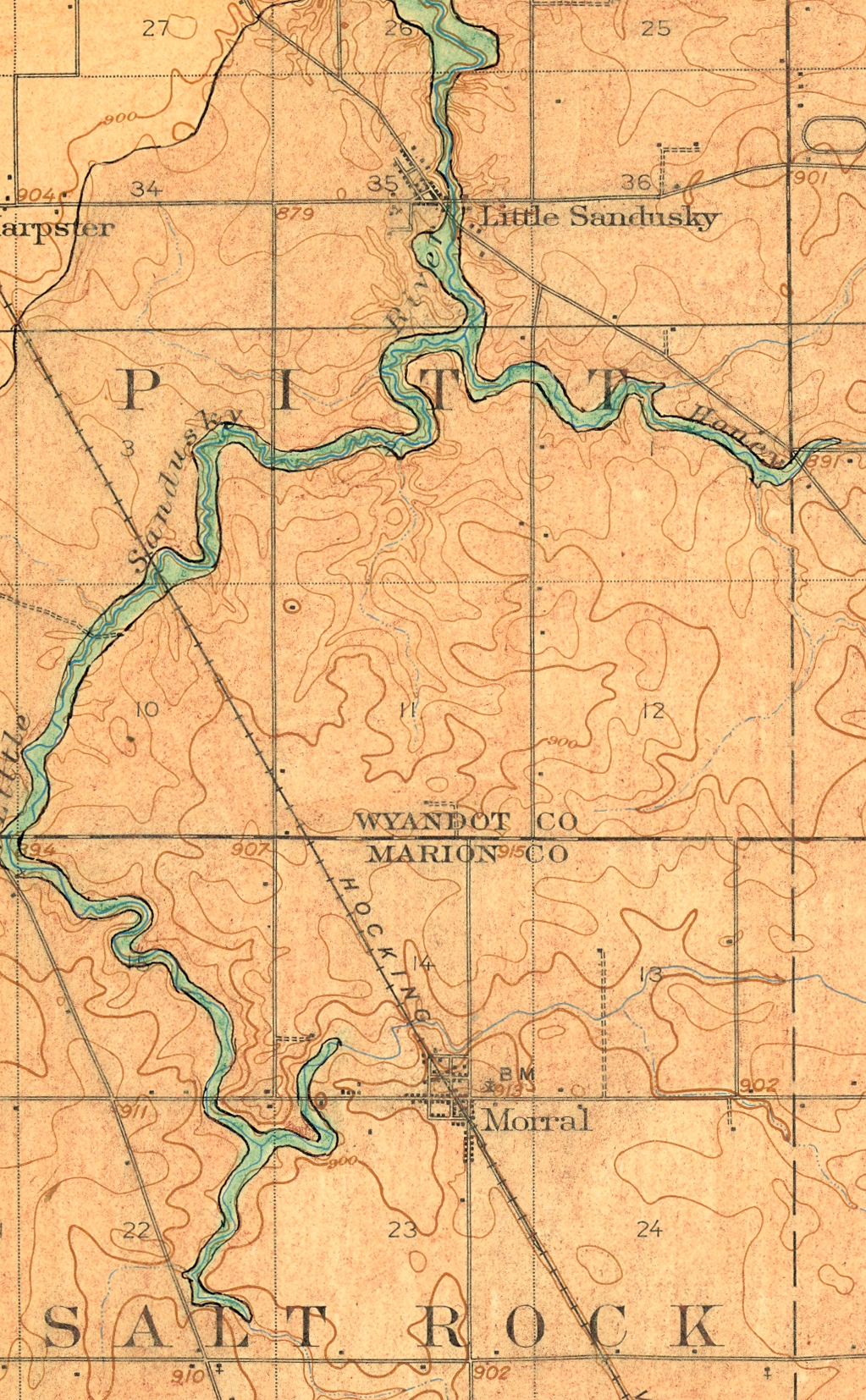
Hand-sketched Glacial Landform Maps II
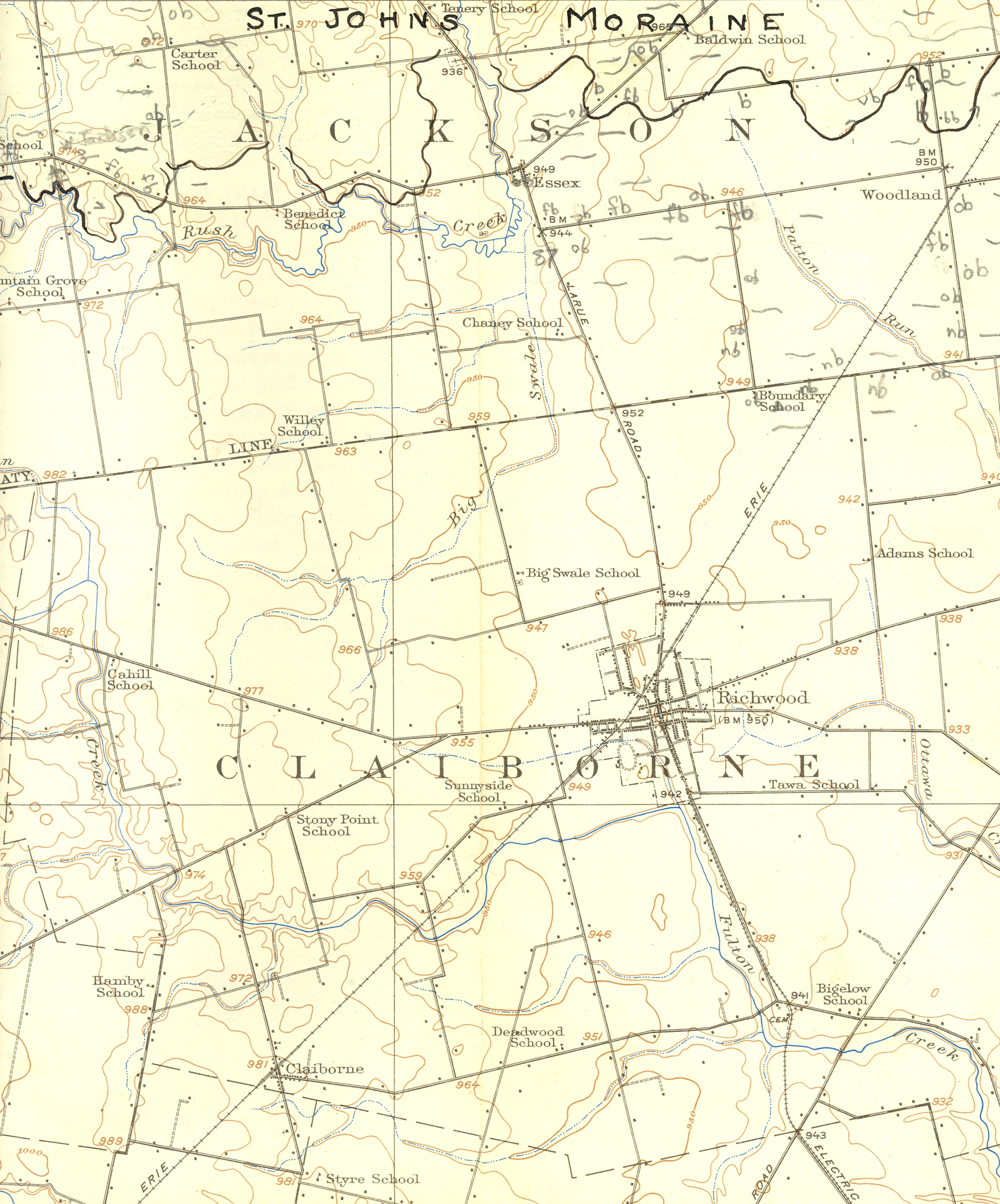
Posted in 04 Map-Making Tools, 09 Map Symbolization, 11 Color on Maps, tagged Maps - Annotated, Maps - Glacial on February 19, 2013| Leave a Comment »
Among the most expressive of map making tools are pencils, pens and other analog devices. The certainty of the topographic map contrasts with the precursory aesthetic of the hand drawn annotations.
This posting contains a series of hand-sketched glacial geomorphology annotations on topographic maps by Dr. George Crowl (1910-87) who taught geology at Ohio Wesleyan University from 1947-1975. The topographic maps are from the USGS 15′ series, covering the area around Delaware, Ohio. Crowl was known for his field trips for students in Ohio and surrounding states. These manuscript maps, in the archives of the Geology & Geography Department at Ohio Wesleyan, were likely created for a generalized map of central Ohio glacial landforms for use on his field trips.
Excerpts from Richwood, OH USGS 15′ quadrangle