Feeds:
Posts
Comments

Archive for the ‘Map Books’ Category

Pin maps have not much been much used in the past, chiefly because a map pin which would give satisfactory service has not been available for common use. Until recently the map markers obtainable have been little more than old-fashioned carpet tacks having chisel-shaped points which cut the surface of any map into which they were pushed. Tacks with rough steel shanks cannot be pushed far into a map if the tacks are to be pulled out again. Also, rough steel is likely to rust so as to cause the whole tack to deteriorate rapidly.

Thus begins a discourse on the map pin – and its brethren map beads, flags, and buttons – by Willard C. Brinton in his Graphic Methods for Presenting Facts (1919). In chapter 12 of that formidable volume, “Maps and Pins,” (2.5mb pdf) we are treated to 27 pages of considered commentary on the map pin: undoubtedly everything that could be said about map pins at the time. May I suggest cartopinography as the appropriate nomenclature for this deliciously narrow subset of the cartographic arts? Yes I may.

The shameful failings of mere tacks as map pins are amply demonstrated in the Brinton screed:

An alternative universe of map pins, beads, flags, and buttons are offered up, and, of course, delightfully illustrated: I repeat the opening image followed by an annotated list of map pin descriptors:

1. Long pin with small size glass head, available in many colors.
2. Long pin of brass wire for use with beads as shown in No.9.
3. Long pin with glass head used in conjunction with a piece of sheet celluloid cut into the shape of a flag.
4. A celluloid flag, with beads above the flag to represent quantity, or beads in different colors to denote various characteristics for the data portrayed. The grip of the sheet celluloid on the pin is sufficient to hold both the beads and the flag at the upper part of the pin.
5. Long pin with large size glass head, obtainable in different colors.
6. Pin like that shown in No.5 used with beads strung upon it.
7. A brass tack large enough to receive gummed labels which may be written upon with a pen.
8. Map pins having sharp points and small spherical glass heads in contact with the map. These pins are available in many different colors; the upper one in No. 8 is red and the lower one blue.
9. Beads in various colors of a size to correspond with the map pins in No. 8. Here the beads were red. White beads, used for every tenth position, show at a glance that there are 22 beads on the pin. Note that the color red photographs as black.
10. Map pins having sharp needle points and spherical glass heads in contact with the map. The pin is of the same general style as No. 8 but it has a head of larger diameter. This pin is obtainable in many colors.
11. Cloth-covered map tacks available in plain colors and in plaids.
12. Single bead used with an ordinary pin as a crude substitute for a regular map pin.
13. Beads in different colors corresponding in size with the map pin of No. 10.
14. Beads of two different sizes representing different things but at the same location.
15. Beads of two different sizes and three different colors. Since both sizes and colors may be varied, and almost any number of beads used on one pin, there are practically unlimited possibilities for the showing of complex data.
16. Beads on a pin which holds down on the map a sheet of colored celluloid cut to the exact shape of a small land area to which attention is directed.
17. A sheet-celluloid marker held by a map pin like that seen in No. 8.
18. Celluloid-covered tack, available in different colors.
19. Celluloid-covered tack with stripes of different colors.
20. Celluloid-covered tack with printed numbers from 1 to 99 inclusive.
21. Celluloid-covered tack having a rough surface so made that the surface may be written upon with pencil or pen, yet erased afterwards or rubbed off with a moist cloth. Lettering may be made permanent by means of a coat of varnish.
22. Large size celluloid-covered tack available in different colors.
23. Large size celluloid-covered tack with stripes of different colors.
24. Very large size celluloid-covered tack.

Included in the study are sundry illustrations of map pinnage at the zenith of development.

Below find a pin map showing the source of letters appealing for funds from Mary Harriman, the wife of railroad magnate E.H. Harriman. Mrs. Harriman’s fortune was somewhat reduced by the sheer number of map pins acquired for this exercise in cartopinography. Note the excessive pinning of New York City. So many pins are attempting to share the same geography that the map required an additional pin island (floating off the coast of New York city):

Harvard University, that hotbed of map pin innovation, confronted head-on the “too many pins in one place” problem that plagued the Harriman pin map. Why not, they suggested, create stacks of beads? Why not indeed!

The results, illustrated below, show the residence of 1907 Harvard graduates, six years after graduation. The map beads are stacked on a wire, every 10th bead is white. Why turn to a simple table when you could count beads on wires stuck in a map?

Further pin map considerations must be taken when attempting these protruding pin maps: such a bead map “should be mounted on several layers of corrugated straw-board to allow the long pins to sufficient depth in the mounting to hold fast.” One does not want teetering map pin beads!

The Harvard map sports six layers of straw-board, and a total thickness of 1 and 1/4 inches. Not only does such a sure base support the extensive beadage in the Boston area, but it is also “extremely light and very convenient to handle.”

Yes, I know what you are thinking: what kind of wire would one use for such a map? Would you believe piano wire? But some work is needed to transform piano wire into map bead wire. Brinton details the process: “The piano wire should be heated in a gas flame so as to remove some of the spring temper. After the wire has been heated it can be straightened and it will remain straight without continually springing back into coil form.” Once the heating and straightening has taken place, Brinton suggests a light coating of varnish to stabilize the wire used in longer columns, such as those for Boston and New York City on the map.

I suspect the Harvard map might suffer a bit of map bead flaccidity if hung upon a wall, given gravity and all. I also wonder about the hazards of such lengthy map beadings: a farsighted passer-by might, for example, receive a nasty map bead wire puncture-wound upon viewing the map too closely. No such injuries were reported in Brinton’s tome, however.

In our modern age of fancy maps-on-the-web the tangible map pin is certainly in decline. Yet a quick search leads to several suppliers of map pins, flags, and similar items, such as the Hudson Map company and The Map Shop.

Yet it is the ubiquitous Google Map that has saved the map pin from obscurity. Google’s default map pin marker can certainly be replaced by any kind of marker you want (see Custom Map Symbols in Google Maps) but who wants to futz around with that?

The Google Map map pin has taken its place as a literal pop-culture icon. Indeed, Google’s digital map pin has leaked back into earthly reality. Below find the work of map pin artist Adam Bartholl:

The map pin is dead! Long live the map pin!

Read Full Post »

•••••

That a cartographer  could set out on a mission that’s so emotional, so personal, so idiosyncratic, was news to me.    

—Ira Glass, host of This American Life


•••••

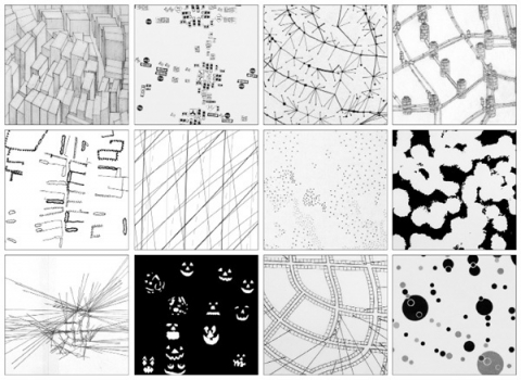
Everything Sings: Maps for a Narrative Atlas by Denis Wood with an introduction by Ira Glass. Pub date: Nov. 12.
$28  .  Paper  .  112 pages  .  85 black and white illustrations, including more than 50 maps  .  ISBN: 978-0-9799562-4-9

Preorder

•••••

These maps remind me of all the radio stories I love most. After all, most radio is a boring salaryman, waking up before you and me to announce the headlines or play the hits to some predetermined demographic. Yet some radio stories elbow their way into the world in defiance of that unrelentingly practical mission, with the same goal Denis Wood’s maps have: to take a form that’s not intended for feeling or mystery and make it breathe with human life. —Ira Glass, host of This American Life

•••••


From the Publisher:
Denis Wood has created an atlas unlike any other. Surveying Boylan Heights, his small neighborhood in North Carolina, he subverts the traditional notions of mapmaking to discover new ways of seeing both this place in particular and the nature of place itself. Each map attunes the eye to the invisible, the overlooked, and the seemingly insignificant. From radio waves permeating the air to the location of Halloween pumpkins on porches, Wood searches for the revelatory details in what has never been mapped or may not even be mappable. In his pursuit of a “poetics of cartography,” the experience of place is primary, useless knowledge is exalted, and representation strives toward resonance. Our perception of maps and how to read them changes as we regard their beauty, marvel at their poetry, and begin to see the neighborhoods we live in anew. Everything Sings weaves a multi-layered story about one neighborhood as well as about the endeavor of truly knowing the places which we call home.


See the Siglio Press Facebook page with seven of the Atlas maps.


The Press Release for Everything Sings.

See the previous post (on the Making Maps blog): Denis Wood: A Narrative Atlas of Boylan Heights


Read Full Post »

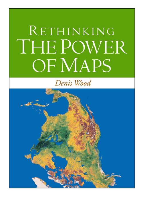
Denis Wood’s followup to his classic The Power of Maps (1992) is almost entirely new in content.  I have included the book’s table of contents below. A PDF copy of chapter 1 is included. This chapter argues, provocatively, “there were no maps before 1500” – a serious challenge to our assumptions about the map as a human and historical universal.

I. Mapping

1. Maps Blossom in the Springtime of the State (PDF)

2. Unleashing the Power of the Map

3. Signs in the Service of the State

4. Making Signs Talk to Each Other

II. Counter-Mapping

5. Counter-Mapping and the Death of Cartography

6. Talking Back to the Map

7. Map Art: Stripping the Mask from the Map

8. Mapmaking, Counter-Mapping, and Map Art in the Mapping of Palestine

Buy a copy of the book here…

From the publisher: “Denis Wood shows how maps are not impartial reference objects, but rather instruments of communication, persuasion, and power. By connecting us to a reality that could not exist in the absence of maps – a world of property lines and voting rights, taxation districts and enterprise zones – they embody and project the interests of their creators.”

Nicholas Chrisman, Department of Geomatic Sciences, Université Laval, says: “Rethinking the Power of Maps sharpens the argument of Wood’s earlier work and focuses its attention on the construction of power. Every student of cartography should take notice.”
Chris Perkins of the University of Manchester says: “In an age when mapping is sexy again Wood explains why it should matter to everyone, explores how maps came to be deployed by states, and how the authority of the image is now being used by many different voices. This is a carefully developed humanist argument for a critical approach to mapping, strongly academic, but reassuringly accessible. Denis Wood’s work always challenges – the passionate style and panache of his scholarship carries the reader along and persuades us to listen to his original ideas.”

Read Full Post »

rethinking_cover

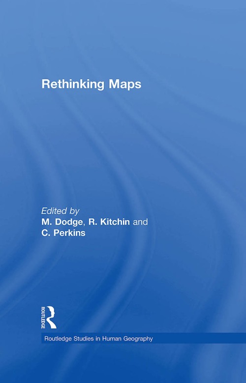
Lukewarm off the presses, a tome chock full of lofty thoughts on maps and mapping. The blurb about Rethinking Maps, edited by Martin Dodge, Rob Kitchin, and Chris Perkins (Routledge 2009), sez:

Maps are changing. They have become important and fashionable once more. Rethinking Maps brings together leading researchers to explore how maps are being rethought, made and used, and what these changes mean for working cartographers, applied mapping research, and cartographic scholarship. It offers a contemporary assessment of the diverse forms that mapping now takes and, drawing upon a number of theoretic perspectives and disciplines, provides an insightful commentary on new ontological and epistemological thinking with respect to cartography.

A useful overview of what typically gets called “critical cartography,” with a few other voices of reason mixed in.

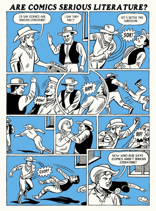
Denis Wood and I contributed a chapter, a comic with plentiful notes (for those who can’t figure out the pictures). I linked our chapter below, but it works much better as a printed comic.  I have about 10 paper copies, and can mail them to the first 10 people that email me (jbkrygier@owu.edu). Include a mailing address!

Debates rage, and tussles erupt, over the question…

kupperman2

Serious enough, I guess, to be included in a tome of high academic scribblings.

The editors have made the introductory and concluding chapters available as PDFs. Those too are linked below.

The book is expensive ($129.95!) and sales will mostly be to libraries. Check a copy out of your favorite library (or ask for it via inter-library loan) or email the author of a chapter you are interested in and ask if they are willing to share a copy.

Chapters in Rethinking Maps include:

1. Thinking about Maps (360k PDF) (Rob Kitchin, Chris Perkins and Martin Dodge)

2. Rethinking Maps and Identity: Choropleths, Clines and Biopolitics (Jeremy W. Crampton)

3. Rethinking Maps from a more-than-human Perspective: Nature-society, Mapping, and Conservation Territories (Leila Harris and Helen Hazen)

4. Web mapping 2.0 (Georg Gartner)

5. Modelling the Earth: A Short History (Michael F. Goodchild)

6. Theirwork: the Development of Sustainable Mapping (Dominica Williamson and Emmet Connolly)

7. Cartographic Representation and the Construction of Lived Worlds: Understanding Cartographic Practice as Embodied Knowledge (Amy Propen)

8. The 39 Steps and the Mental Map of Classical Cinema (Tom Conley)

9. The Emotional Life of Maps and Other Visual Geographies (Jim Craine and Stuart Aitken)

10. Playing with Maps (Chris Perkins)

11. Ce n’est pas le Monde [This is not the world] (2mb PDF) (John Krygier and Denis Wood)

Here is an easier to read PDF version of Ce N’est Pas le Monde.

12. Mapping Modes, Methods and Moments: A Manifesto for Map Studies (556k PDF) (Martin Dodge, Chris Perkins and Rob Kitchin)

Read Full Post »

bunge_runovermap.jpg

When Bill Bunge mapped out the locations of car/pedestrian collisions in Detroit (Detroit Geographical Expedition, 1968) he and the map were advocating a way of thinking about what was happening to the black community in Detroit – and advocating for change.

All maps advocate.

To advocate means to “to speak or write in favor of; support or urge by argument; recommend publicly.” The word derives from the Latin advocate: “to call to one’s aid.”

What map does not advocate, or argue for something? We are always calling maps to our aid.

Three free books on maps and advocacy have been made available for download recently, and are worth a look.

•••••

Two New PDF Books [added June 6 2009]:

Good Practices in Participatory Mapping (2mb PDF here, 2009). Published by International Fund for Agricultural Development.

A review of participatory mapping methods.

This report will review existing knowledge related to participatory mapping and recent developments. Specifically:

  • Section 1 will define the main features of participatory mapping;
  • Section 2 will discuss key applications of participatory mapping;
  • Section 3 will present specific tools used in participatory mapping, including their strengths and weaknesses;
  • Section 4 will identify good practices and explore the significance of process in participatory mapping initiatives.

participatorymapping

•••••

Toolbox & Manual: Mapping the Vulnerability of Communities (4.4mb PDF English version here, Portuguese version aqui, 2008). Published by Salzburg University Centre for Geoinformatics.

A overview of concepts and methods for community mapping, focused on vulnerability.

Within the research and project context it is aimed to provide the local communities with appropriate maps of their communities. The maps should enhance planning and decision making processes within the communities in regard to reduce local vulnerabilities and allow appropriate planning of disaster response measures. It is the first time in Mozambique that maps have been produced with such an accuracy (high resolution data) and for disaster risk management through the integration of participatory practices.

mappingvulnerability

•••••

•••••

Visualizing Information for Advocacy: an Introduction to Information Design (7mb PDF here, January 2008). Published by Tactical Technology Collective.

Succinct, well-designed, with many good examples of maps and information graphics for advocacy.

…a manual aimed at helping NGOs and advocates strengthen their campaigns and projects through communicating vital information with greater impact. This project aims to raise awareness, introduce concepts, and promote good practice in information design – a powerful tool for advocacy, outreach, research, organization and education.

vifa1

vifa2

•••••

Maps for Advocacy: An Introduction to Geographic Mapping Techniques (3mb PDF here, September 2008). Published by Tactical Technology Collective.

A great overview of maps and advocacy with many examples and resources.

The booklet is an effective guide to using maps in advocacy. The mapping process for advocacy is explained vividly through case studies, descriptions of procedures and methods, a review of data sources as well as a glossary of mapping terminology. Scattered through the booklet are links to websites which afford a glance at a few prolific mapping efforts.

mfa1

mfa2•••••

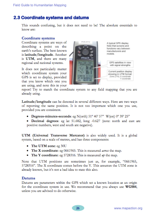
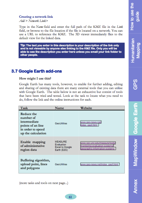
Field Guide for Humanitarian Mapping (3.2mb PDF here, March 2009). Published by MapAction.

A textbook for using maps and GIS in humanitarian work.  The Guide provides detailed information on data collection (GPS) and the use of Google Earth and MapWindow (free mapping software).

The guide was written to meet the need for practical, step-by-step advice for aid workers who wish to use free and open-source resources to produce maps both at field and headquarters levels. The first edition contains an introduction to the topic of GIS, followed by chapters focused on the use of two recommended free software tools: Google Earth, and MapWindow. However much of the guidance is also relevant for users of other software.

fghm1 fghm2

•••••

Some related resources:

Read Full Post »

picture-2


picture-3

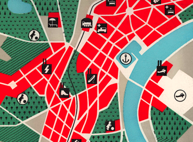
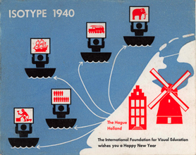
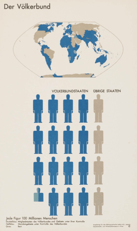
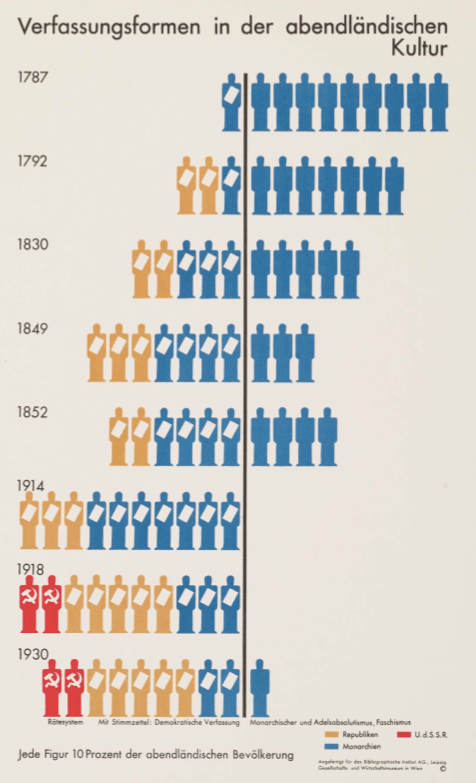
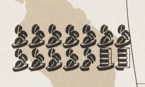
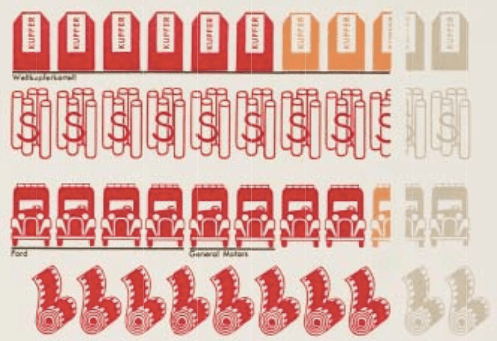
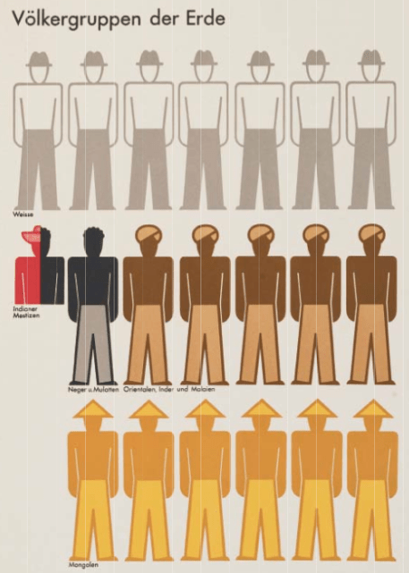
I was moving some piles of junk in a storage room and came across a 1934 U.S. Public Works Administration book on Mississippi Valley public works projects (Report of the Mississippi Valley Committee of the Public Works Administration, October 1, 1934). The book is full of maps and other information graphics influenced by Otto Neurath, Gerd Arntz, and Marie Reidemeister’s picture language, isotype.

I always thought isotype had a great look to it.  Its context, in Vienna Circle logical positivism, is a bit wonky, and the idea that symbols – if designed carefully enough – could be “universally communicable” across all cultural and social differences, is merely the dream of those born with a peculiar neurology.  Nevertheless, the isotype “look” is cool in a retro sort of way, and it has certainly influenced the current spare design ethos in cartography.

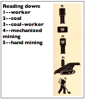
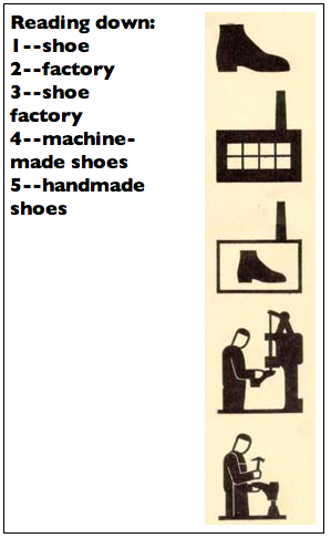
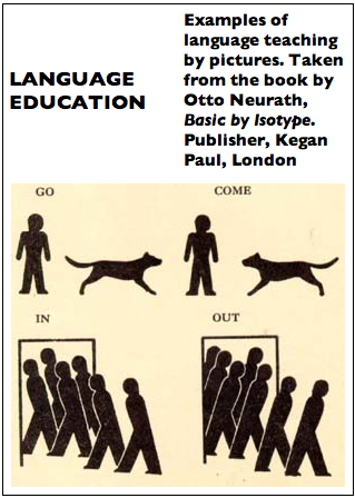
Some annotated examples of the isotype “language” from a 1937 article by Neurath:

isotype_lang1 sotype_lang2 sotype_lang3

The Gerd Arntz Web Archive is a spectacular collection of thousands of isotype symbols designed by Arntz. All seem to be free to use. (symbols are copyrighted by Pictoright – thanks to Jonathan Hunt for pointing this out). The site also has a breif biography of Arntz.

gmdh02_00158_0 gmdh02_00094_0gmdh02_00045

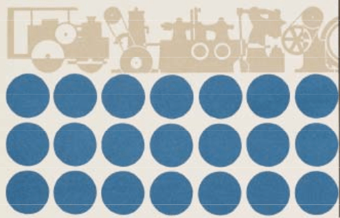
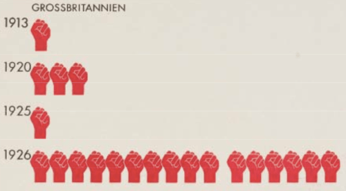
In casting about the internets, I was gladdened to find someone had scanned the isotype classic, Atlas of Gesellschaft und Wirtschaft (1930, 14+mb PDF).  As far as I know the atlas was printed (on sheets) in limited numbers and has never been easy to find.  Sybilla Nikolow discusses the atlas in her article “Society and Economy: An Atlas in Otto Neurath’s Pictorial Statistics from 1930.” (PDF)

A sampling of maps and graphs from the Atlas follows, and a few more useful isotype resources can be found way at the end.

isotype01

isotype02

isotype03

isotype04

isotype05

isotype06

isotype07

isotype08

isotype09

isotype10

isotype11

isotype12

isotype13

isotype14

isotype15

isotype16

isotype17

isotype18

isotype19

isotype20

isotype21

isotype22

isotype23

isotype24

isotype25

isotype26

•••••

A few interesting isotype resources:

The Isotype Institute documents the history of isotype and has much useful information.

A snazzy discussion of isotype done up by mixing isotype and text is Modern Hieroglyphics. (PDF)

Ellen Lupton reviews the history and significance of isotype in her article “Reading Isotype.” (PDF)

isotype

Neurath and the Vienna Method of Picture Statistics (PDF). A chapter out of an e-book called Speaking of Graphics An Essay on Graphicacy in Science, Technology and Business by Paul J. Lewi. Seems like a nice overview of the history of isotype and its characteristics.

The DADA Companion has much information on design and art related to isotype. Search for “isotype” or “Neurath.”

A new book to be published in April of 2009 is called The Transformer: Principles of Making Isotype Charts by Marie Neurath and Robin Kinross.

Austin Kleon’s blog on graphic design has a nice posting on isotype, comics, and information graphics design. Search the blog for other isotype references.

The web magazine Mute has a feature called The Dutch Are Weeping in Four Universal Pictorial Languages At Least that reviews a series of contemporary exhibits that focus on isotype and related ideas. One exhibit called After Neurath has a significant amount of information and links.

The New York Times summarized 2007 US and Coalition member deaths in Iraq in a isotype-esque chart (click for larger version):

iraq_2007_deaths

Stroom De Haag writes (in the online magazine Archined) about Neurath as the “grandfather of open source.”

Read Full Post »

wood_natures_maps1

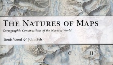
Denis Wood & John Fels’ new book The Natures of Maps is available now from the University of Chicago Press and many other sources. The lowest price I can find at this time is $29 (at Buy.com). Denis is, of course, co-author of the Making Maps book.

The book is big – almost a foot square – with color maps on almost every page.  The book had a harrowing path to publication.  Originally under contract to ESRI Press, the book was in final galleys (ready to print but for a handful of edits) when ESRI Press decided to cancel it and a dozen other books in process.  Given the expense of producing the book (and the cost of reproduction rights to the illustrations) this seemed to be a peculiar business decision.  The University of Chicago Press subsequently acquired the book, more or less ready to print.

Here’s an “editorial” blurb I wrote for the book:

If Wood & Fels’ The Power of Maps showed that maps were powerful, The Natures of Maps reveals the source of that power. The Natures of Maps is about a simple but profound idea: maps are propositions, maps are arguments. The book confronts nature on maps – nature as threatened, nature as threatening, nature as grandeur, cornucopia, possessable, as a system, mystery, and park – with intense slow readings of exemplary historical and contemporary maps, which populate this full color, beautifully illustrated and designed book.

The careful interrogation of maps reveals that far from passively reflecting nature, they instead make sustained, carefully crafted, and precise arguments about nature. The Natures of Maps shows how maps establish nature, and how we establish maps. The power of maps extends not only from their ability to express the complexities of the natural world in an efficient and engaging manner, but in their ability to mask that they are an argument, a proposal about what they show.

The implications of the arguments in The Natures of Maps are significant, empowering map users and makers. The Natures of Maps shows that neither map users or map creators are passive, merely accepting or purveying reality; they are, instead, actively engaged in a vital process of shaping our understanding of nature in all its complexity. Map users have a critical responsibility, the power to accept, reject, or counter-argue with the maps they encounter. Map creators have creative responsibility, the power to build and finesse their arguments, marshalling data and design for broader goals of understanding and communicating truths about the world. Rethinking how maps work in terms of propositional logic, with its 2000-year history and vast methodological and theoretical foundation, promises to be one of the most profound advances in cartographic theory in decades, and The Natures of Maps shows the way in a captivating manner.

Considering maps from the perspective of propositional logic provides a rigorous foundation for a theory of the map that transcends disciplinary boundaries. Scholars from the humanities, social sciences, and natural sciences will find Wood and Fels’ The Natures of Maps intellectually sound, methodologically useful, and deeply engaging. But the beauty of The Natures of Maps is that it is not merely an academic book. Wood and Fels’ The Natures of Maps is a powerful, beautifully illustrated and engaged argument about maps as arguments that will appeal to map lovers, map makers, map users, and map scholars.

Read Full Post »

voyager_snip.jpg

Edward Tufte’s The Visual Display of Quantitative Information (1998, 2nd edition 2001) is a classic book, arguably his best, and certainly a key text in the field of information graphics (which encompasses cartography). I know some cartography courses use the book as a text.

I recall being inspired by the book as a neophyte cartographer back in the late 1990s.

The book looked great: its design communicated the importance of design (when most other cartography and information graphics books were clunky and poorly designed). The tone was serious and high-minded: I was designing information graphics. And I think I absorbed Tufte’s minimalist design philosophy, although cartographic design, at least the way I learned it, was largely minimalist, with no allowance for flourish, fake 3D embellishment, or other chartjunk (or “map-crap” as I call it in the Making Maps book).

While I won’t impugn the importance of lofty inspiration, I did wonder what kind of practical guidelines I could derive from Tufte’s book. You know, specific stuff that would help me to design and make better maps. I sat down one day and made a list of Tufteisms from the book: that list is below.

(more…)

Read Full Post »

« Newer Posts