Feeds:
Posts
Comments

Archive for 2009

rethinking_cover

Lukewarm off the presses, a tome chock full of lofty thoughts on maps and mapping. The blurb about Rethinking Maps, edited by Martin Dodge, Rob Kitchin, and Chris Perkins (Routledge 2009), sez:

Maps are changing. They have become important and fashionable once more. Rethinking Maps brings together leading researchers to explore how maps are being rethought, made and used, and what these changes mean for working cartographers, applied mapping research, and cartographic scholarship. It offers a contemporary assessment of the diverse forms that mapping now takes and, drawing upon a number of theoretic perspectives and disciplines, provides an insightful commentary on new ontological and epistemological thinking with respect to cartography.

A useful overview of what typically gets called “critical cartography,” with a few other voices of reason mixed in.

Denis Wood and I contributed a chapter, a comic with plentiful notes (for those who can’t figure out the pictures). I linked our chapter below, but it works much better as a printed comic.  I have about 10 paper copies, and can mail them to the first 10 people that email me (jbkrygier@owu.edu). Include a mailing address!

Debates rage, and tussles erupt, over the question…

kupperman2

Serious enough, I guess, to be included in a tome of high academic scribblings.

The editors have made the introductory and concluding chapters available as PDFs. Those too are linked below.

The book is expensive ($129.95!) and sales will mostly be to libraries. Check a copy out of your favorite library (or ask for it via inter-library loan) or email the author of a chapter you are interested in and ask if they are willing to share a copy.

Chapters in Rethinking Maps include:

1. Thinking about Maps (360k PDF) (Rob Kitchin, Chris Perkins and Martin Dodge)

2. Rethinking Maps and Identity: Choropleths, Clines and Biopolitics (Jeremy W. Crampton)

3. Rethinking Maps from a more-than-human Perspective: Nature-society, Mapping, and Conservation Territories (Leila Harris and Helen Hazen)

4. Web mapping 2.0 (Georg Gartner)

5. Modelling the Earth: A Short History (Michael F. Goodchild)

6. Theirwork: the Development of Sustainable Mapping (Dominica Williamson and Emmet Connolly)

7. Cartographic Representation and the Construction of Lived Worlds: Understanding Cartographic Practice as Embodied Knowledge (Amy Propen)

8. The 39 Steps and the Mental Map of Classical Cinema (Tom Conley)

9. The Emotional Life of Maps and Other Visual Geographies (Jim Craine and Stuart Aitken)

10. Playing with Maps (Chris Perkins)

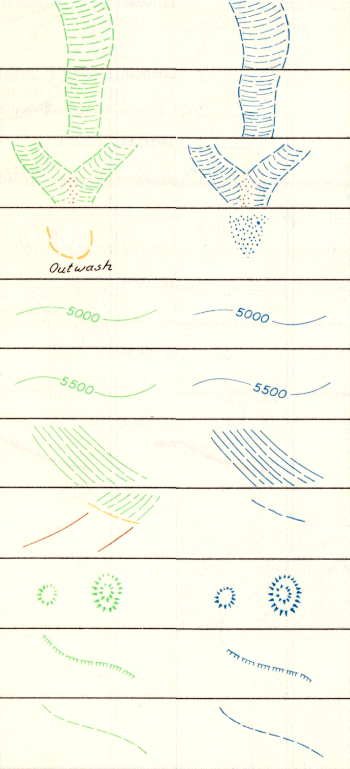
11. Ce n’est pas le Monde [This is not the world] (2mb PDF) (John Krygier and Denis Wood)

Here is an easier to read PDF version of Ce N’est Pas le Monde.

12. Mapping Modes, Methods and Moments: A Manifesto for Map Studies (556k PDF) (Martin Dodge, Chris Perkins and Rob Kitchin)

Read Full Post »

pop_proj_alone_150

Stop making cartograms! At least until permission is granted from the chap who holds the patent on them.

Karl Karsten’s “population projection” was published in his book Charts and Graphs (1923) and patented in 1925. As with the 1911 “Apportioinment Map” noted in an earlier post, the term “cartogram” was not used by Karsten to describe this creation.  He called it the “Population Projection.”

Curiously, it’s claimed that Karsten also invented the hedge fund.

But back to maps.

Karsten’s patent, (#1,556, 609, October 13, 1925) claimed rights to

…a map of a plurality of territories, having their boundary lines so distorted as to make their included areas represent graphically the relative importance of a given factor other than land area of one area with respect to another area, the boundaries being distorted without losing their familiar and significant features…

Karsten suggests using his “population projection” as a base upon which to map other data, such as truancy rates (below).  Thus it’s a bivariate cartogram (reproduced from p. 667 in Charts and Graphs):

truancy_popproj_150

The idea is good, but in practice it’s a bit wonky.  Several western US states are reduced to toothpick dimensions, and note the New York goiter (New York City). Also, Karsten seems to have some degree of difficulty maintaining the horizontal with the map and the legend. Could he have had an inner-ear infection?

But back to maps.

The illustration in Karsten’s patent reveals his methodology:

pop_proj_patentmap

Details of the methodology can be found in the text of the patent.

Karsten, in Charts and Graphs, explains the justification for using the “population projection” which is, more or less, the same line of argument used in current discussions of cartograms:

We do not sell our goods to the mountains, bill them to the rivers, or credit the forests with payment. Probably from at least a subconscious appreciation of this circumstance, many national distributors, advertisers, and sales-managers have discarded maps on which the rivers, forests or mountains are shown when they are studying the geographic distribution of their sales. The up-to-date sales manager lots his distributing points and records his sales in a great many ways upon maps which carry only faint State outlines or a the most show the location of larger cities. But why stop here? Your sales manager does not sell to square miles, acres, or other units of land-area measurement. He sells to human beings. Why should he use maps which show, not human beings, but square miles, that is, maps in which the areas indicate not the population but the land surface? Why indeed!

The result of this projection of the map of the United Statues upon a population basis rather than a land-area basis will be most surprising even to the most hardened travelers.

Needless to say, the picture of sales conditions which such a map exhibits, will be far more valuable and useful than the picture upon the usual land-area basis. In short, the corrected areas of the States serve to give an excellent background or evaluation of the importance of the statistics plotted upon the map.

The number of ways in which the map can be altered and projected for special purposes upon special bases is unlimited, but all are alike in one respect – that their areas no longer show physical land areas in square miles but show the actual values more important for the special purposes in view.

In 2005 a series of cartogram patents (here here here) failed to cite Karsten’s patent.

Read Full Post »

owjl-finalmap_low

Guide Psychogéographique de OWU (2009, med res jpg)

(larger version jpg)

•••••

During the week of June 15-19 (2009) five intrepid Ohio students and myself engaged in improvisational psychogeography, culminating in the map opening this post. A printable 11″ x 17″ (300dpi 1.4mb) PDF of the map is here.

•••

Picture 1

Map detail: The path taken through campus followed the outline of a wolfie hand-shadow cast on a campus map.

•••

Picture 2

Map detail: Stuff smelt, heard, and felt with its allure or disallure indicated with faces.

•••

The map was the product of a course – Mapping Weird Stuff – I offered at the OWjL (Ohio Wesleyan University Junior League of Columbus) summer camp for gifted and talented middle school students.

Based on the kid’s ideas and work collecting diverse data, I designed a layout and look for the map. The map itself was created in FreehandMX, now dead-tech thanks to Adobe (I still prefer Freehand even though I started with Illustrator back at version 1).

Making the map once again reminded me that it’s fun to make maps, if you have interesting stuff to map. The design and layout are certainly nothing one could generate with typical mapping software – thus the use of graphic illustration software. Diverse and interesting maps are not really the domain of web and pc-based map generation software. Maybe sometimes. Not usually.

•••

Picture 3

Map detail: An abstracted linear “map” sequencing smells, textures, and sounds from one end to the other of the path investigated.

•••

My vague intent was to do some kind of weird mapping project on campus – sensory mapping, psychogeography, etc. My search for resources for this age student (grades 6-8) resulted in a few finds, but not much. The materials I compiled on the course blog (here) served as the basis of our work, which developed as the students engaged the ideas. We met for 1.5 hours a day, for 5 days.

•••

kids

Special glasses indicate how serious we were about this project.
The
Hulk hand inspired confidence in our powers.

•••

The students, Django, Mallory, McKenna, Erica, and Ben, were great. They jumped into the project, came up with ideas that shaped our direction, and collected all of the data on the map. I had some ideas about what kind of psychogeography we would do, and what kind of map we would create, then it all transmogrified into something else which turned out great.

We did a dérive (“a technique of transient passage through varied ambiances”) to get a feel for the campus and its “resonances,” some blind-folded, ear-plugged tours through the campus (with me or one of the students leading the others along) collecting smells and sounds, as well as a few texture collection expeditions (inspired, in part, by Denis Wood’s Narrative Atlas of Boylan Heights project).

•••

Guiding much of our work was a single, inspiring Hulk hand.

•••

A bit of background on Psychogeography:

Psychogeography, according to its founder Guy Debord, is “the study of the precise laws and specific effects of the geographical environment, consciously organized or not, on the emotions and behavior of individuals.”

In practice, psychogeography inherently resists any narrow definitions. It encompasses diverse activities that raise awareness of the natural and cultural environment, is attentive to senses and emotions as they relate to place and environment, is often political and critical of the status quo, and must be both very serious and fun.

Psychogeography overlaps with Kevin Lynch’s work on mental maps, as nicely reviewed in Denis Wood’s article “Lynch Debord” as well as work on non-visual sensory-scapes (smellscape, soundscape, touchscape, tastescape, etc.).

The most famous psychogeography map is Debord’s Guide Pychogéographique de Paris:

debord-guide

Guy Debord, Guide Pychogéographique de Paris

•••

grassyfoot

•••

bomb

Read Full Post »

combined_header_2

The construction of symbols on maps requires the interaction of many elements.  How these elements come together – literally the intersection of bits of points, lines, and areas – is the subject of a series of illustrations entitled “The Drawing of Combined Symbols.”  The majority of these guidelines focus on peculiar details that when done well, the typical map user won’t even notice. They are among the fascinating hyper-minutiae of cartography.

Faces indicate the quality of the choices illustrated – good, ok, and poor.

Examples are illustrated by Prof. Kei Kanazawa (heading the Working Group of the Japan Cartographers Association) in a chapter entitled “Techniques of Map Drawing and Lettering” in the out-of-print book Basic Cartography, Vol. 1 (International Cartographic Association, 1984, p. 45). These guidelines were developed for the pen and ink era of cartography, yet most are applicable to contemporary digital mapping.

Illustrations are for educational purposes only. Click on an illustration for a larger version.

•••••

combined_3-2-1

Railway Symbols: Note arrangement of tics and black and white parts.

•••••

combined_3-2-2

Manner of connecting line symbols corresponding to broken lines.

•••••

combined_3-2-3

Several examples of crossing line symbols.

•••••

combined_3-2-4

Drawing of double broken line symbols.

•••••

combined_3-2-5

Drawing of double line road symbols in connection with other symbols.

•••••

combined_3-2-6

Position of individual point symbols: (1) Place of explanation symbol, (2) Point symbols corresponding to the exact place on the ground.

•••••

combined_3-2-7

Drawing of contours.

•••••

combined_3-2-8

Relation of contours and road symbols.

•••••

combined_3-2-9

Boundary along linear objects. Parts of a boundary along linear objects such as a river, road, and so on which are clearly recognized are usually omitted.

Read Full Post »

fat-tailed-map

from “Fat Tailed Sheep on Maps of Africa”
The Map Collector, 1 June 1979

Collectors are a peculiar lot.  They can frustrate somber scholars with their unconventional research methods and seeming interest in objects rather than context.  Yet the passion and obsessiveness of collectors often produces an endless source of interesting materials.

The Map Collector (1977-1996) was a magazine devoted to maps as collectible objects.  Within its pages could be found some rather interesting articles on all sorts of maps and cartographic ephemera.

Where else would one find an article about fat-tailed sheep illustrated on old maps of Africa?

fattai01

Yes they are real (source and here)

Kunstpedia, a “knowledge base on fine and decorative arts, popularly stated arts and antiques, with the exception of contemporary art” has acquired permission to publish Map Collector articles, full text with images, on their web pages.

Articles, which continue to be added to the site, include:

Hotchkiss

“One of America’s Foremost Cartographers: Jed Hotchkiss”
by Peter Roper

•••••

cigarette

“Maps on Cigarette Cards”
by Martin Murray

•••••

“Pocket Maps for Travellers”
by Katherine R. Goodwin

•••••

“Maps that made Cabmen Honest”
by Ralph Hyde

•••••

“The Indigenous Maps and Mapping of North American Indians”
by G. Malcolm Lewis

•••••

“The Great Lakes of Africa”
by R.V. Tooley

•••••

“History of Watermarks”
by Bob Akers

•••••

“Old Korean Hand Atlases”
by Shannon McCune

•••••

Also of interest:

Read Full Post »

bunge_runovermap.jpg

When Bill Bunge mapped out the locations of car/pedestrian collisions in Detroit (Detroit Geographical Expedition, 1968) he and the map were advocating a way of thinking about what was happening to the black community in Detroit – and advocating for change.

All maps advocate.

To advocate means to “to speak or write in favor of; support or urge by argument; recommend publicly.” The word derives from the Latin advocate: “to call to one’s aid.”

What map does not advocate, or argue for something? We are always calling maps to our aid.

Three free books on maps and advocacy have been made available for download recently, and are worth a look.

•••••

Two New PDF Books [added June 6 2009]:

Good Practices in Participatory Mapping (2mb PDF here, 2009). Published by International Fund for Agricultural Development.

A review of participatory mapping methods.

This report will review existing knowledge related to participatory mapping and recent developments. Specifically:

  • Section 1 will define the main features of participatory mapping;
  • Section 2 will discuss key applications of participatory mapping;
  • Section 3 will present specific tools used in participatory mapping, including their strengths and weaknesses;
  • Section 4 will identify good practices and explore the significance of process in participatory mapping initiatives.

participatorymapping

•••••

Toolbox & Manual: Mapping the Vulnerability of Communities (4.4mb PDF English version here, Portuguese version aqui, 2008). Published by Salzburg University Centre for Geoinformatics.

A overview of concepts and methods for community mapping, focused on vulnerability.

Within the research and project context it is aimed to provide the local communities with appropriate maps of their communities. The maps should enhance planning and decision making processes within the communities in regard to reduce local vulnerabilities and allow appropriate planning of disaster response measures. It is the first time in Mozambique that maps have been produced with such an accuracy (high resolution data) and for disaster risk management through the integration of participatory practices.

mappingvulnerability

•••••

•••••

Visualizing Information for Advocacy: an Introduction to Information Design (7mb PDF here, January 2008). Published by Tactical Technology Collective.

Succinct, well-designed, with many good examples of maps and information graphics for advocacy.

…a manual aimed at helping NGOs and advocates strengthen their campaigns and projects through communicating vital information with greater impact. This project aims to raise awareness, introduce concepts, and promote good practice in information design – a powerful tool for advocacy, outreach, research, organization and education.

vifa1

vifa2

•••••

Maps for Advocacy: An Introduction to Geographic Mapping Techniques (3mb PDF here, September 2008). Published by Tactical Technology Collective.

A great overview of maps and advocacy with many examples and resources.

The booklet is an effective guide to using maps in advocacy. The mapping process for advocacy is explained vividly through case studies, descriptions of procedures and methods, a review of data sources as well as a glossary of mapping terminology. Scattered through the booklet are links to websites which afford a glance at a few prolific mapping efforts.

mfa1

mfa2•••••

Field Guide for Humanitarian Mapping (3.2mb PDF here, March 2009). Published by MapAction.

A textbook for using maps and GIS in humanitarian work.  The Guide provides detailed information on data collection (GPS) and the use of Google Earth and MapWindow (free mapping software).

The guide was written to meet the need for practical, step-by-step advice for aid workers who wish to use free and open-source resources to produce maps both at field and headquarters levels. The first edition contains an introduction to the topic of GIS, followed by chapters focused on the use of two recommended free software tools: Google Earth, and MapWindow. However much of the guidance is also relevant for users of other software.

fghm1 fghm2

•••••

Some related resources:

Read Full Post »

flies-on-map

Don’t you think we’d better skidoo? They say this part of the map won’t be safe for big game this year.”

Life, February 4, 1909

Read Full Post »

snowice_header

This manual establishes the design, weights, and gauges of symbols, and the type styles and sizes to be used in compiling and drafting standard topographic maps prepared by the Army Map Service for publication at the scale of 1:1,000,000.

During the compilation stages, strict adherence to symbol specifications shall not be required.  Line weights and gauges may be varied twenty percent (20%), plus or minus, from prescribed specifications.

In using the symbols specified for drafting, strict adherence to the prescribed weights and gauges must be maintained.

The examples below are map symbols for permanent ice and snow features.

The 1953 Army Map Service guide Symbols for Small Scale Maps details map symbol specifications for compiled maps (left, below) and drafted maps (right, below). Compiled maps are the initial draft of a map, where diverse sources of information are drawn together.  Using the compiled map, a cartographic draftsman creates the final, drafted map, suitable for printing.

snowice_symbols1

The map symbol specifications include detailed symbol dimensions:

Specifications for glaciers:

snowice_glacier

Specifications for ice cliffs:

snowice_icecliff

Specifications for the limits of icefields or snowfields:

snowice_limits

The entire page 22 of the Army Map Service Symbols for Small Scale Maps, including specifications for permanent snow and ice features is linked below:

snowice_symbols_all

Read Full Post »

picture-2


picture-3

I was moving some piles of junk in a storage room and came across a 1934 U.S. Public Works Administration book on Mississippi Valley public works projects (Report of the Mississippi Valley Committee of the Public Works Administration, October 1, 1934). The book is full of maps and other information graphics influenced by Otto Neurath, Gerd Arntz, and Marie Reidemeister’s picture language, isotype.

I always thought isotype had a great look to it.  Its context, in Vienna Circle logical positivism, is a bit wonky, and the idea that symbols – if designed carefully enough – could be “universally communicable” across all cultural and social differences, is merely the dream of those born with a peculiar neurology.  Nevertheless, the isotype “look” is cool in a retro sort of way, and it has certainly influenced the current spare design ethos in cartography.

Some annotated examples of the isotype “language” from a 1937 article by Neurath:

isotype_lang1 sotype_lang2 sotype_lang3

The Gerd Arntz Web Archive is a spectacular collection of thousands of isotype symbols designed by Arntz. All seem to be free to use. (symbols are copyrighted by Pictoright – thanks to Jonathan Hunt for pointing this out). The site also has a breif biography of Arntz.

gmdh02_00158_0 gmdh02_00094_0gmdh02_00045

In casting about the internets, I was gladdened to find someone had scanned the isotype classic, Atlas of Gesellschaft und Wirtschaft (1930, 14+mb PDF).  As far as I know the atlas was printed (on sheets) in limited numbers and has never been easy to find.  Sybilla Nikolow discusses the atlas in her article “Society and Economy: An Atlas in Otto Neurath’s Pictorial Statistics from 1930.” (PDF)

A sampling of maps and graphs from the Atlas follows, and a few more useful isotype resources can be found way at the end.

isotype01

isotype02

isotype03

isotype04

isotype05

isotype06

isotype07

isotype08

isotype09

isotype10

isotype11

isotype12

isotype13

isotype14

isotype15

isotype16

isotype17

isotype18

isotype19

isotype20

isotype21

isotype22

isotype23

isotype24

isotype25

isotype26

•••••

A few interesting isotype resources:

The Isotype Institute documents the history of isotype and has much useful information.

A snazzy discussion of isotype done up by mixing isotype and text is Modern Hieroglyphics. (PDF)

Ellen Lupton reviews the history and significance of isotype in her article “Reading Isotype.” (PDF)

isotype

Neurath and the Vienna Method of Picture Statistics (PDF). A chapter out of an e-book called Speaking of Graphics An Essay on Graphicacy in Science, Technology and Business by Paul J. Lewi. Seems like a nice overview of the history of isotype and its characteristics.

The DADA Companion has much information on design and art related to isotype. Search for “isotype” or “Neurath.”

A new book to be published in April of 2009 is called The Transformer: Principles of Making Isotype Charts by Marie Neurath and Robin Kinross.

Austin Kleon’s blog on graphic design has a nice posting on isotype, comics, and information graphics design. Search the blog for other isotype references.

The web magazine Mute has a feature called The Dutch Are Weeping in Four Universal Pictorial Languages At Least that reviews a series of contemporary exhibits that focus on isotype and related ideas. One exhibit called After Neurath has a significant amount of information and links.

The New York Times summarized 2007 US and Coalition member deaths in Iraq in a isotype-esque chart (click for larger version):

iraq_2007_deaths

Stroom De Haag writes (in the online magazine Archined) about Neurath as the “grandfather of open source.”

Read Full Post »

alsace_archaeo

arch-detail

alsace_archaeo_leg4

alsace_archaeo_leg3alsace_archaeo_leg2

Prähistorische Karte von Südwestdeutschland und der Schweiz, 1879

(Protohistoric and Prehistoric Discoveries …)

Looking at working maps – manuscripts, field sketches, and provisional maps – reveals a diversity of symbolization and design which are lost in the monoculture of finished, standardized maps.

HistCarto brings together more than 4000 17th-19th century French manuscript maps.  All are working maps, and most are hand drawn.  Most contain signs of assessment:

These “signs of assessment” include textual commentaries or the addition of symbols, which provide some indication of the ways the maps were made or the uses to which they were put in an administrative or military capacity.

Map symbols and topics shown here include prehistoric sites, farm fields, trees and forests, rivers, hunting grounds, geology, terrain, and property parcels.

The site is in French.  Once at the site, click on the Acces a la base link on the right.  Then select Recherche (on the left) and Simple.  I tried to link each of the maps below to its page at the HistCarto site, but you must be logged into the site for the links to work.  Not optimal!  So I removed the links.  To find the maps, just search the site using the map’s title (below each map).

•••

Detail, farm fields near Neuhof forest (1787):

neuhof

Plan de la forêt du Neuhof

•••

Detail, farm fields near Poppenreuth (1795):

poppenreuth

Mappa Geographica Parochiae Poppenreutensis

•••

Detail, farm fields near Strasbourg (no date):

fields1

Carte des environs de Strasbourg

•••

Detail, farm fields near Herlisheim (1760):

gambsheim_1760_2

Projet d’une nouvelle route entre Gambsheim et Drusenheim

•••

Details, trees,  Château de Karlsruhe (no date):

karlsruhe

Plan du château de Karlsruhe

•••

Detail, forests near Molsheim (no date):

molsheim1

Plan de Molsheim

•••

Detail, forests near Mont Sainte Odile (1810):

odile

Les environs du Mont Sainte-Odile

•••

Detail, forests near Thann (1815):

thann1

Lever à Vue de la Ville de Thann et des Montagnes qui l’environnent

•••

Drachenkopf Forest, detail and full map (no date):

drachenkopf_1

drachenkopf_2

Forêt de Drachenkopf

•••

Detail, map of Strasburg (1765):

stras_water

Plan de Strasbourg en 1765

•••

Hunting grounds in the vicinity of Strasbourg, reserved for the king and officers (1739):

strasbourg_1

Terrains de chasse aux environs de Strasbourg

•••

Revision on Geologic Map, Barr Region (no date):

barr

Région de Barr: Carte Géologique

•••

Detail, hand-drawn map of Euphrates (no date):

euphrates

The river Euphrates with the Cilician Taurus and Northern Syria

•••

Detail, terrain near Munster (no date):

belfort

Carte des Vosges depuis Belfort jusqu’à Landau

•••

Detail, terrain on map of mining concessions near Thann and Dauendorf (1705):

thann

Concessions minières dans les environs de Thann et de Dauendorf

•••

Map showing two roads linking Wissembourg and Fischbach and a new road (in yellow) (no date):

wissembourg_2

wissembourg_1

Deux routes reliant Fischbach et Wissembourg

•••

Parcels in a portion of municipal Nordheim (1782):

nordheim_1781

Portion du communal de Nordheim

Read Full Post »

Older Posts »