Feeds:
Posts
Comments

Archive for the ‘03 Mappable Data’ Category

first_aid_explosives

First-Aid Station; Explosives Room

•••••

brattice

Concrete Brattice (with Manhole, Solid); Timber Door

•••••

along_the_line

Telephone; Power Line; Electric Light; Motor, Fan; Pump; Hoist; Gong

•••••

shaft_stations

Shaft Stations

•••••

Mine_Symbols_1919_3

Conventions Used on Mine Maps (entire plate)

•••••

mine_openings

Mine Openings: Shafts (Rectangular, Circular); Tunnels; Diamond Drill Hole; Churn Drill Prospect Hole; Water Well; Oil Well; Gas Well; Sulphur Well, Barren Well; Mines & Quarries; Prospects

•••••

Mine_Symbols_1919_2

Conventions Used on Topographic Maps (entire plate)

•••••

hypsography

Hypsography: Contours, Dumps, Dump and Car Track, Fills, Open Cuts, Cut, Stripping, Open Pits; Sand and Sand Dunes

•••••

Mine_Symbols_1919_1

Conventions Used on Topographic Maps (entire plate)

•••••

rock_types

Limestone, Sand, Conglomerate, Drift, Metamorphic Rock, Gneiss

•••••

Mine_Symbols_1919_4

Geologic Conventions (entire plate)

•••••

Source: Lester C. Uren (1919) “Conventional Symbols for Mine Maps.” Mining and Scientific Press (August 16, 1919 p. 231-235)

Read Full Post »

Chemical smoke puffs represent exploding shells…

smoking_map_pg_may_1927

Surveyed through field glasses that make it appear miles away, a novel war map at Princeton University makes artillery practice realistic to students of the Princeton unit of the Reserve Officers Training Corps.

…Each student takes his turn at directing the miniature “barrage.” The ingenious map is operated by the instructor, who follows the student’s data and commands to fire. A small adjoining map is criss-crossed with lines showing where shells with various ranges would strike. Over this key chart moves a lever which, placed at the spot where the student’s shot would fall, swings a glass nozzle to a corresponding position on the large map; at the student’s word “fire” a puff of artificial smoke is released.

Popular Mechanics, May 1927

Read Full Post »

Several signal officers flying alone or as passengers were able to make usable sketch maps of the country below them, as they flew two or three thousand feet in the air.

airmap

The practicability of making war maps from aeroplanes during aerial scouting expeditions into the enemy’s territory has recently been tested by the signal corps of the United States army and found entirely feasible. Several signal officers flying alone or as passengers were able to make usable sketch maps of the country below them, as they flew two or three thousand feet in the air. Two maps that were made during these tests are reproduced [above].

One of them is the rough sketch map drawn by Lieut. W.C. Sherman while riding as a passenger in an aeroplane with Lieut. Thomas DeWitt Milling on his record flight from Texas City to San Antonio. Tex., on March 28, 1913. It was drawn while they were traveling 56 miles an hour and, by means of the signal corps symbols, gives a clear picture of the country tover which they passed. Railroads, highways, streams. towns, woods. etc., are marked, and the figures on the lefthand margin indicate the aeroplane’s time. The original sketch is 12 ft. long and to scale, 6 1/2 inches equaling 10 minutes, and 1 in. equaling 1.44 mile. The other is a completed map drawn from a sketch of San Diego; Cal., and vicinity made by Lieut. J. D. Park while flying alone on May 3, 1913. a few days before his death in an aeroplane accident on May 9. The coast line and the topography of the country are indicated clearly enough to be of value to an attacking force, and at various points clear fields where airmen might make safe landings are marked out. Although the strip of country included in the map is 5 miles wide and 15 miles long, the entire sketch was made during a 35-minute flight from the aviation field at the south along the line of the railroad. At times the airman reached a height of over 3,000 ft. and from there was able to note the character of the country for 10 miles about.

Popular Mechanics Magazine, Volume 20, Number 4, October 1913.

Read Full Post »

I Don’t Want To But I Will: Title Page of Denis Wood’s Dissertation

Throughout graduate school I heard tales of the Denis Wood’s outrageous dissertation, curiously titled I Don’t Want To But I Will. Of particular interest are the scathing Acknowledgments, where Denis took his advisors to task. A worn copy of the Acknowledgments was passed among grad students as a bit of intellectual contraband.

But the content was what was most important. It’s a crazy dissertation. It’s about maps, mental maps, getting kicked off a bus, psychogeography, single element veridicality analysis, Europe, cartography, Kevin Lynch, passed-out subjects, Peter Gould, psychogeomorphology, the Shirelles, and the invention of “Environmental a” – a language for mapping. Among other things. It is driving the wrong way down the one-way-street of academia.

The dissertation was printed in a very limited number by the Clark University Cartographic Laboratory. Denis has recently made available a PDF of this never-really-in-print gem. I have reproduced Denis’ comments on the different chapters in the dissertation, along with links to the entire document and each chapter, from his web pages (here).

••••••••••

I DON’T WANT TO, BUT I WILL

By Denis Wood

1973

Download it by chapters (below) or as a single 685-page document.

The front matter, including the dedication (by the Shirelles), the notorious acknowledgements (my unhelpful faculty and the rare humans), credits (as in a movie), and Introduction (opening with Ed’s story, a night watchman on the edge of Castle Hill park, and going on to talk about psychogeography and various kinds of mental maps).

PART I: Psyching Up for the Trip (a sort of philosophy section).

Chapter 1: The Beginning of All This (“How would you like to go to Europe this summer?” Bob Beck asked me; and the design of the study).

Chapter 2: Some Relevant Ancestors (individual, consensual, and standard mental maps, Peter Gould, and Kevin Lynch; or, what passes in the trade for the “review of the literature”).

Chapter 3: The Study Tools (Bob and I invent Environmental a, a mapping language).

Chapter 4: The Study Starts Before the Trip (long-distance training in Environmental a and the “predictive morphologies” of London, Rome, and Paris).

PART II: The Trip or Denis’ Inferno (the novelesque part).

Chapter 5: What Others Have Thought of Travel (a bouquet of quotations about travel).

Chapter 6: A Terminal Wet Towel (Bob and I meet the Group L kids at Kennedy and what happens after that).

Chapter 7: A Day on a Tour (the first day: I will show you blood in a handful of data).

Chapter 8: Down and Out in London (the week in London).

Chapter 9: Parnassus in Innsbruck (and one of the kids ODs or, well, just passes out).

Chapter 10: When in Rome, Don’t Do as I Did (in which I get drunk and kicked off the bus).

Chapter 11: Kid’s Lib, or Aristocracy in Exile (in which the kids take control of the research and collect all the Paris data).

Chapter 12: Old Tours Never Die, They Just Fade Away (in which, months later, a bunch of us get together again for a weekend in New York).

PART III: After the Trip; or What’s in Klein’s Bottle (the “science” part of the dissertation).

Chapter 13: Tripping and Tracing through the Data (trace events; or the crumbs of the cookies left for Santa).

Chapter 14: The Content of the Tour (applying Lynchian content analysis to the traces left by the Group L kids).

Chapter 15: Travel Connections (or trying to wrap graph theory around the kids sketch maps).

Chapter 16: Hanging Out the Rivers to Dry (trying to read the maps through something I called single element veridicality analysis).

Chapter 17: Pagan Curves, Lincoln Variations, and Eber Aberrations (or the quest for the warped space of human experience and psychogeomorphology).

Chapter 18: Bigger is Better – Or Worse (you draw what you feel; or, the analysis of the areal and feelin overlays).

Chapter 19: You Are Where You Sit (the analysis of the bus seating charts and their relation to the maps; or, Fixers, Mixers, and Rangers).

Chapter 20: That’s the End of the Movie! ! ? ? ! ? ? (which is a whole long list of “conclusionettes” that concludes, “That the subject can have the first, last and most comprehensive word on the subject of the investigation itself, specifically that: I DIDN’T WANT TO, BUT I DID.”

BIBLIOGRAPHY

Read Full Post »

Eduardo Abaroa
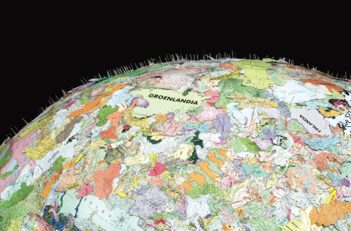
Proposal: We Just Need a Larger World, 2008 (detail)
Construction wire, papier maché, world map cutouts and steel pins, 130cm x 130cm x 130cm
Courtesy of the Artist and kurimanzutto gallery, Mexico City
From the Uneven Geographies Show at Nottingham Contemporary.

•••••••

Denis Wood’s 2010 book Rethinking the Power of Maps includes a discussion of exhibits devoted to maps created by artists prior to 2010. A significant number of exhibits have opened since the book was published, and Denis supplies an update below.

Map Art Exhibitions, 2010-11

Long before the emergence of critical cartography in the 1980s (at the hands of Fels and Wood, Harley, Rundstrom, Pickles, etc.), artists had been critiquing the map from every conceivable perspective. In 1929, for example, Paul Éluard edited the world map to better conform to notions of Surrealist desire; in 1943 Joaquín Torres-García turned it upside down to make it better accord with South American points of view; in 1960 Jasper Johns slathered oil paint all over the map’s pretensions to accuracy and precision; in 1966 Claes Oldenburg blew the map off the page by stuffing it with kapok; in 1969 John Baldessari literalized map type by photographing on the ground the letters C, A, L, I F, O, R, N, I, and A where they appeared on a state map; in 1971 Alighiero Boetti embroidered the map’s servitude to the state in national flags, again and again. Artists attacked the map, mocked it, contested it, made fun of it, turned it into a joke, emptied it of meaning, erased it, distorted it, reconstructed it, and in the process revealed it for what it was, a human artifact – like a magazine advertisement for Cadillac or a billboard for Luck Strikes – albeit one with legal pretensions in the domain of borders (from national borders all the way down to those of private property).

By the time the 1980s rolled around map art was a rapidly growing phenomenon. One index to this was the ever-growing numbers of group shows devoted to map art and what follows is a catalogue of the 2010-2011 map art shows that have come to our attention (thanks to the sharp eyes of Lize Mogel and kanarinka especially). We’re certain there were more and beg you to note them in the comments. We’ll make certain to update the list.

During the period Nato Thompson’s Experimental Geography exhibition continued to travel, as did Lize Mogel and Alexis Bhagat’s Atlas of Radical Cartography; and the intense activity finally drew the attention of Artnews which devoted two pages in its October, 2010 issue to map art. The piece not only covered Experimental Geography and the Atlas of Radical Cartography, but drew attention to Rebecca Solnit’s Infinite City: A San Francisco Atlas. Solnit and Denis Wood appeared together at the Los Angeles Times Festival of Books with her Infinite City and his Everything Sings: Maps for a Narrative Atlas (with an introduction by Ira Glass). A casual survey of the data suggests that Joyce Kozloff remains the most widely exhibited map artist but, especially with the continued travelling of Experimental Geography and the Atlas of Radical Cartography, Lize Mogel and Trevor Paglen are giving her a run for the money (artists whose work is more varied would be hard to imagine).

It’s worth noting that 2010 was a banner year for map art atlases too. The publication of Everything Sings was posted here at Makingmaps.net, but Rebecca Solnit’s celebrated Infitinte City: A San Francisco Atlas also needs to be mentioned, along with another, wholly different, San Francisco-map art atlas, Tracing the Portola: A San Francisco Neighborhood Atlas from, Kate Connell and Oscar Melara. Both Tracing the Portola and Infinite City were also released as broadside posters.

•••••••
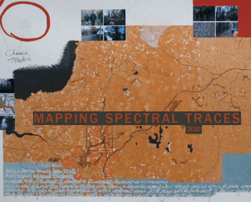
Mapping Spectral Spaces, Virginia Tech College of Architecture and Urban Studies, Blacksburg (VA), 2010. “How have residual marks [including maps] been created, left, and remembered? How might we conceptualize these afterlives and effects of experiences, perceptions, processes, and events?” Curated by Deb Sim, the exhibition displayed the work of Chris Baeumler, Iain Biggs, Laurie Beth Clark, Gülgün Kayim, Rebecca Krinke, Mary Modeen, Mona Smith, Judith Tucker and Dane Webster. Download the 40-page, full-color catalogue at the web site.

•••••••
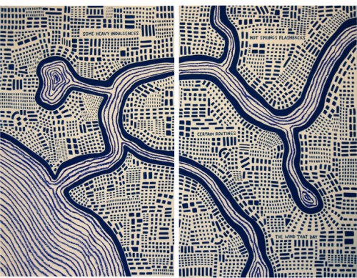
You Are Here: Mapping the Psychogeography of New York City, Pratt Manhattan Gallery, New York, 2010. This show, curated by You Are Here’s Katherine Harmon, wanted to “map the emotional terrain of the world’s most famous and influential urban center, New York City, and explore the effect of the city’s powerful moods on those who live and work here.” The show included Nicola Twilley’s Scratch ‘N Sniff NYC, Nina Katchadourian’s New York Soundtrack, Daniela Kostova and Olivia Robertson’s Anxiety Map, and Ingrid Burrington’s Loneliness Map, among others.

•••••••
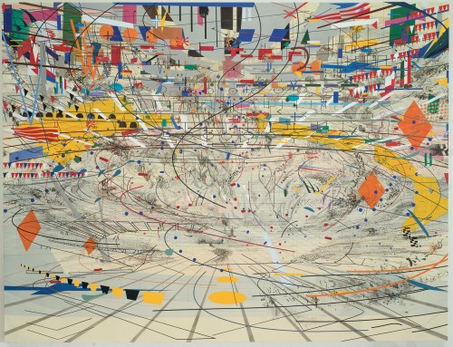
Julie Mehretu: Grey Area, Guggenheim Museum, New York, 2010. “Asking what it means to be an American artist in Germany during the Iraq and Afghanistan wars of the Bush years, Mehretu’s canvases meditate on the idea of the modern ruin,” in “maplike networks” of lines evoking trade routes and shapes drawn from architectural plans, city plans, and aerial imagery. The show is accompanied by a richly illustrated catalogue.

•••••••
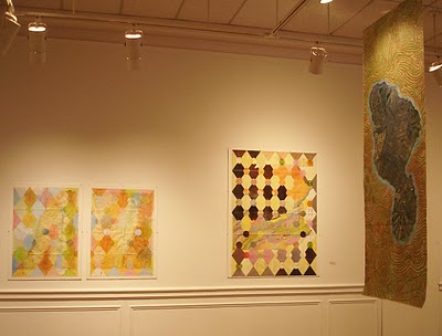
Mapping: Outside/Inside, Borowsky Gallery (Gershman Y), Philadelphia, 2010. “Four artists who use maps to bend our understanding of the outside world, including Leila Daw, Joyce Kozloff, Eve Andree Laramee, and Nikolas Schiller.” The show seems to have been curated by Schiller. No catalogue. MarieE posted shots of the show at the URL above.

•••••••
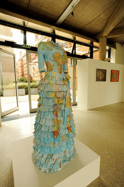
Creative Compass, Royal Geographical Society, London, 2010. Maps from the Society’s collection together with newly commissioned map art from Agnès Poitevin-Navarre and Susan Stockwell. It was accompanied by a 32-page illustrated color catalogue, with an essay by Dr Harriet Hawkins and artist interviews by Paul Goodwin. There’s a slide show at the URL above.

•••••••
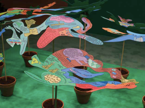
Uneven Geographies, Nottingham Contemporary, Nottingham, 2010. “Uneven Geographies considers ways contemporary art responds to the politics of globalization through the work of fourteen artists and artist-collectives from twelve countries and five continents.” The artists are: Éduardo Abaroa, Azzellini & Ressler, Yto Barrada, Ursula Biemann, Bureau d’Études, Öyvind Fahlström, Goldin + Senneby, Mark Lombardi, Steve McQueen, Cildo Meireles, George Osodi, Bruno Serralongue, Mladen Stilinović, and Yang Zhenzhong.
The 62-page catalogue is available as a download at the URL above.

•••••••
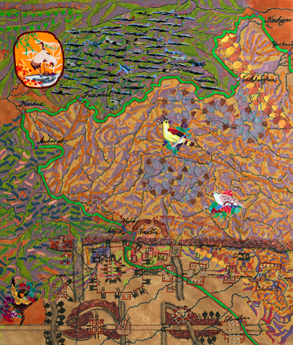
Joyce Kozloff: Navigational Triangles, DC Moore, New York, 2010. “Long before Google Maps or GPS, seafarers used navigational triangles to pinpoint their location and to chart their course in relation to celestial bodies and the earth’s poles. This exhibition comprises paintings and mixed media works that expand upon this concept and continue the artist’s longstanding engagement with cross-cultural issues.” The show also included pieces from Kozloff’s newest series, China Is Near (Charta, Milan, 2010, with an essay by Barbara Pollack).

•••••••
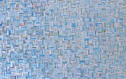
Mapworks: the Map as Art, Sebastopol Center for the Arts, Sebastopol (CA), 2010. Juried by Kim Anno the show included work from Michael Acker, Brian Andrews, Marla Brill, Stephanie Hamilton, Lee Millard, Michele Morehouse, Tofu S, Kathleen Yorba and others. No catalogue.

•••••••
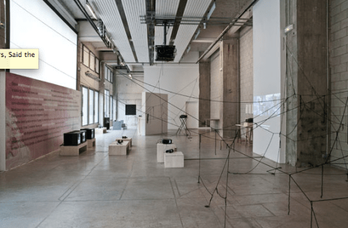
We Don’t Record Flowers, Said the Cartographer, Bétonsalon, Paris, 2010-2011. Put together by bo-ring (Virginie Bobin and Julia Kläring), the show “takes roots in the appropriation – under various forms and for various reasons – of the desert and its images in modern and postmodern political and cultural history,” that desert, which is “whiteness ‘without qualities’ – or so it is fantasized – and is best captured with maps or planar representations. It is thus an ideal space for projection, inscription, and the forward planning of political fantasies, architectural utopias, scientific expeditions, and some of fiction’s founding narratives.” It included the work of Lara Almarcegui, Louidgi Beltrame, Ursula Biemann, Julien Blanpied, Wang Bing, Tacita Dean, Ellie Ga, Michael Höpfner, Ruth Kaaserer, Yves Mettler, Trevor Paglen, Carson Salter, le Silo, Triple Canopy et José León Cerrillo, and was accompanied by a full slate of programs. There’s plenty more at the URL above,  where you can follow the links to a catalogue site where you can assemble your own catalogue of well over a hundred pages.

•••••••
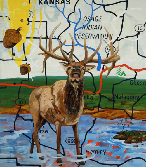
Mapping: Memory and Motion in Contemporary Art, Katonah Museum of Art, Katonah (NY), 2010-2011. “In an era of global culture, artists are increasingly exploring maps as both image and cipher. Mapping: Memory and Motion in Contemporary Art features paintings, works on paper, sculptures, videos, a sound installation, and a live web terminal to address such themes as borders and boundaries, identity and colonialism, journeys – both real and imagined, memory and nostalgia, and tourism and travel.” Curated by Sarah Yanguy, the show included the work of 38 artists and was accompanied by a lovely, 52-page, full-color catalogue. You can download a teacher’s pre-visit pack at the URL above.

•••••••
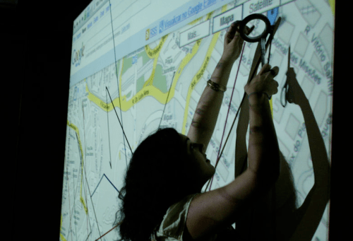
Apamar. Charts, metrics and politics of space, Centre d’Arts Contemporàbies, Barcelona, 2010-2011. “The projects intersect through proposing alternatives to the representation of space, its interpretation and how to live in it,” and “In this sense, Beirut: Mapping Security by Mona Fawaz, Ahmad Gharbieh and Mona Harb, depicts the numerous types of security measures that have been established in municipal Beirut as a result of the armed conflicts the country has witnessed since the 70s. Sara Nelson Wright’s visual mapping of six individuals’ travels in Brooklyn, Locations and Dislocation, is a reflection on the effects of gentrification and urban expansion. In LRPT (La región de los pantalones tranfronterizos), the Tijuana-based collective Torolab makes visible the transnational mobility of the inhabitants of the twin cities of Tijuana and San Diego. Isaki Lacuesta and Isa Campo visit Places that do not exist, and provide us with an account of the reality of these places that have disappeared from Google earth for being protected areas. Geografie dell’Oltrecittà and Agroculture nomadi of Stalker/Primavera Romana are common design projects that generate and share social knowledge and awareness on urban changes, while Guifi.net in Catalunya, Mapeo Colectivo from Iconoclasistas in Buenos Aires, and Mapping the Commons, Athens by Hackitectura.net all spur us into participation with the aim of creating common resources.” The extraordinary show was curated by Maral Mikirditsian, Ramon Parramon and Laia Sole. There’s more at the URL above.

•••••••

Raw: Geographies, Reed College Campus, Portland, 2011. “Seeking to transform our physical, social, and individual landscapes, RAW: GEOGRAPHIES explores and reconstructs our experience of space. Entering into the emerging discourse of experimental geographers, radical cartographers, old-school land artists, unruly activists, and stodgy theorists, it resides in the interdisciplinary space of psychogeography, spatial practice, environmentalism, and architecture. A heterogeneous mix of elements that shift pre-inscribed boundaries, RAW: GEOGRAPHIES will suspend the everyday in a space for potentiality and play.” The event showcased the work of Francis Alÿs, Lize Mogel, Melvin Edwards Nelson, Jacinda Russell & Nancy Douthey, Kathy Westwater, Gary Wiseman & Gabe Flores, and Ben Wolf.

•••••••
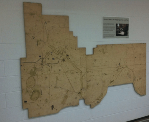
Mapping Joy and Pain, an ongoing project, mostly U.S. (Twin Cities, MN), 2010-2011. Rebecca Krinke’s public map art project consists of a large laser-cut map of Minneapolis and St. Paul (and elsewhere) on which people are encouraged to locate their personal places of joy and pain. Not quite the Atlas of Love and Hate Bill Bunge had in mind, it’s a serious step in that direction. The map or its analogues have been widely displayed (for example, see Mapping Spectral Spaces above), but the home office, with numerous videos, downloadable pdfs, and so on, is at the URL above.

•••••••
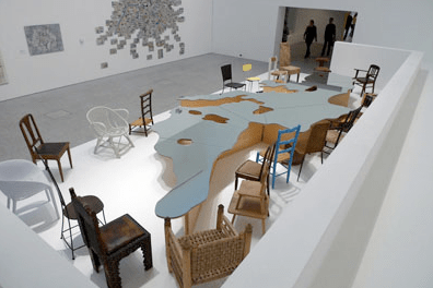
Mappamundi, an exhibition about maps and contemporary art, Berardo Museum-Foundation, Lisbon, 2011. Another extraordinary show! Curated by Guillaume Monsaingeon, the exhibition assembled an international group of artists who, over the past 40 years, have worked on maps and who have questioned cartographical representation. included the work of Noriko Ambe, Lars Arrhenius, Neal Beggs, Alighiero Boetti, Daniel Chust Peters, De Geuzen, Angela Detanico & Rafael Lain, Paola Di Beloo, Peter Fend, Jochen Gerner, Luigi Ghirri, Marco Godinho, Anawana Halba, Hong Hao, Nina Katchadourian, Chris Kenny, John Klima, Joseph Kosuth, Guillermo Kuitca, Nelson Leirner, Cristina Lucas, Mateo Mate, Satomi Matoba, Paco Mesa & Lola Marazuela, Matt Mullican, Rivane Neuenschwander, Miguel Palma, Michelangelo Pistoletto, Kathy Prendergast, Qin Ga, David Renaud, Rosana Ricalde, Susan Stockwell, Jeanne Terwen-de-Loos, Caterina Vaneetvelde, Adriana Varejao, Jessica Vaturi, Robert Walden, Jeremy Wood. See the slides at Jeremy Wood’s GPS Drawing website (above). The museum’s website is here.

•••••••

Mapping, Carroll Square Gallery, Washington, DC, 2011. The show featured the work of Carol Barton, Dahlia Elsayed, Joyce Kozloff, Siobhan Rigg, Juan Tejedor, and Renee van der Stelt.

•••••••
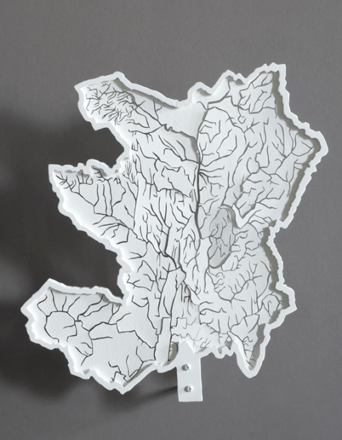
Lauren Rosenthal, Hand-Cut Paper, The Monmouth Museum (NJ), 2011. Rosenthal uses maps – here hand-cut paper maps of rivers and river basins – to reorient people’s thinking about rivers and our interconnectedness. Rosenthal’s river blog is here.

•••••••
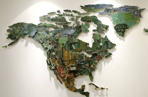
The Art of Mapping, TAG Fine Arts, London, 2011. The show “celebrates cartography’s potential as an art form, rather than a science,” and included the work of Neal Beggs, Claire Brewster, Christa Dichgans, Stanley Donwood, Peter Dykhuis, Dahlia Elsayed, Rob Good, Gonkar Gyatso, Emma Johnson, Jonathan Parsons, Simon Patterson, Nigel Peake, Grayson Perry, Rob Ryan, Paula Scher, Justine Smith, Susan Stockwell, Robert Walden, Stephen Walter, Heidi Whitman, Jeremy Wood, and Cai Yuan. A color catalogue accompanied the exhibition which can be downloaded here.

•••••••
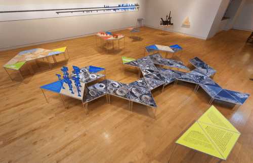
Global Cities, Model Worlds, Pittsburgh Biennial, Pittsburgh, 2011. Co-organized by the Carnegie Museum of Art, Miller Gallery at Carnegie Mellon University, Pittsburgh Filmmakers/Pittsburgh Center for the Arts (PF/PCA), and The Andy Warhol Museum; and organized by Astria Suparak; the exhibition featured the work of Justseeds, Lize Mogel, Sarah Ross & Ryan Griffis, subRose, Temporary Services, and Transformazium.

•••••••

Mind the Map! Barents Spektakel, Kirkenes, Norway, 2011. “The Arctic map is changing – creating new stories, opportunities and challenges. The Arctic map is being redrawn today. Who controls the Arctic seabed? More and more stakeholders ‘update’ their claims for the Arctic pie.” Involving commissioned music, writers, and others, the Speektakel’s Pikene på Broen invited three artists to comment on these issues: Morten Traavik (Norway), Olga Kisseleva (Russia), and Stefano Cagol (Italy).

•••••••
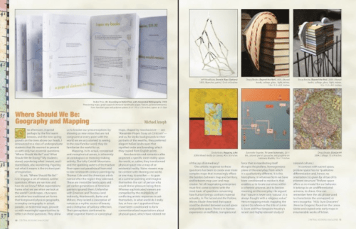
Mapping the Surface, Central Booking, New York, 2011-2012. “Cartographers can tell us more than just the routes from one point to another, they can map terrains of landscape or psychological space, that amorphous state that adds up to a sense of a place beyond mere cataloging. They can also reduce all to the basic, the pure essence of line and plane. These artists in the next exhibition at CENTRAL BOOKING take us along such a road and beyond”: Doug Beube, Jeff Woodbury, Christina Mitrentse, Heidi Neilson, Robin Price, Cindy Kane, Dannielle Tegeder, Haptic Lab, Paula Scher, Alastair Noble Lilla LoCurto & Bill Outcault, Sabra Booth, Public Laboratory, Smudge Studio (Jamie Kruse and Elizabeth Ellsworth), Robbin Ami Silverberg, Barbara Siegel, and Elena Costelian. A catalog of Mapping the Surface is available as part of the November issue of CENTRAL BOOKING Magazine, at the URL above.

Read Full Post »

Cartogram, 1930: “A Distorted Map of the United States Showing Population of Each State and of Cities of 50,000 or More in 1930” (Printers’ Ink Publishing Co., Inc., Chart by Walter P. Burns and Associates, Inc., New York City)

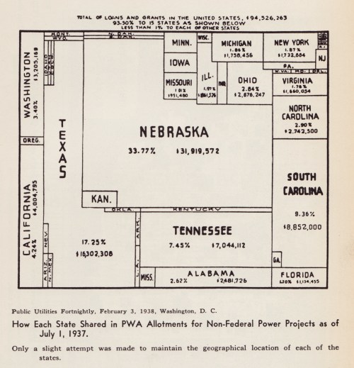
A cartogram scales geographic areas to some value other than geographic area. In two previous blog posts, 1911 Cartogram: “Apportionment Map” and 1923 Patented Cartogram, a few old-school cartograms were resurrected from musty old publications. Here find eight more cartograms published between 1921 and 1938.

This post opens with a peculiar item – the U.S. states as well as the areas of major cities are scaled to population, in essence two cartograms together. Symbols representing “people living on farms” are scattered about, each symbol equal to a number (undisclosed) of persons. Weird.

From the Literary Digest in 1921:

Cartogram, 1921: “Relative Size of Each of the United States if Based on Electrical Energy Sold for Light and Power in 1921” (Literary Digest, April 23, 1921)

•••••••••••••••

Cartogram, 1931: “The United States With the Area of the States Proportional to the Urban Population of 1930” (The Dartnell Corp., Chicago, Ill., 1931)

•••••••••••••••

Cartogram, 1933: “Horsepower Map of the United States in 1933 With the Area of Each State Drawn Proportional to the Amount of Horsepower Installed in the State” (Power Plant Engineering, New York City, 1933)

•••••••••••••••

I had an old slide of the following cartogram but did not know its source: turns out it is from an advertisement for The Mutual Broadcasting Network, showing that 80% of business in the U.S. is transacted in states east of the Mississippi – MBN’s broadcasting area:

Cartogram, date unknown (1930s): “Look to Your Sales Mileage” advertisement (The Mutual Broadcasting System).

•••••••••••••••

A very diagram-ish cartogram which places an un-cartogrammed map of the US in the background:

Cartogram, 1937: “The United States With the Areas of the States Proportional to Their Manufacturing Output in 1935” (Business Week, June 12, 1937, New York City)

•••••••••••••••

brinton_gp_cartograms_1938

Cartogram, 1938: “How Each State Shared in PWA Allotments for Non-Federal Power Projects as of July 1, 1937” (Public Utilities Fortnightly, February 3, 1938, Washington DC)

•••••••••••••••

Reproduced from Willard C. Brinton’s Graphic Presentation (1939).

Read Full Post »

Denis Wood’s Everything Sings: Maps for a Narrative Atlas

Now shipping from Siglio Press

Use discount code PUMPKIN for 20% off until November 12, 2010

Three maps from Everything Sings are below

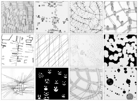
Sidewalk Graffiti | Wind Chimes | Radio Waves

•••••

Sidewalk Graffiti (detail)

Scratched, scrawled, or stamped into drying concrete—mostly from the 60s into the 80s—is a fragmentary and tragically conventional body of folklore.

Sidewalk Graffiti (click to enlarge)

•••••

Wind Chimes (detail)

When we did the house types survey, we also paid attention to the presence of wind chimes. They were all over—bamboo, glass, shell, metal tubes. Depending on where you stood, the force of the wind, and the time of day, you could hear several chiming, turning the neighborhood into a carillon.

Wind Chimes (click to enlarge)

•••••

Radio Waves (detail)

Unlike the wave fronts of wind chimes which—requiring a lot of energy to move the air molecules—never get very large, radio waves don’t propagate in air. They propagate in space and travel undisturbed through non-metallic objects like house walls and bodies. Depending on the location of the transmitter, their wave fronts can be enormous, yet they pass through the neighborhood silently, unfelt, and unnoticed, unless tuned into. In the mid-1980s, Boylan Heights listened mostly to a mix of Top 40, Oldies, Country, R&B, and talk radio on six radio stations: WDGC transmitting from Pittsboro, WFXC from Durham, WQDR from Apex, WRDU in Middlesex, WRAL and WPTF from Auburn. As the neighborhood has changed, so have the radio stations it listens to. Today, it’s mostly NPR broadcast by WUNC in Chapel Hill.


In the key, Boylan Heights is the point of tangency of these six fronts of radio waves. On the map, you can see which waves belong to which stations by their shape and direction. Because radio waves are concave to their point of origin, a wave concave to the lower right (southeast) is coming from Auburn, and one concave to the upper left (northwest) is from Durham. The degree of curvature depends on the size of the wave front and its distance from the source: the straighter the line, the farther away the transmitter. (Sensible curvature decreases with size which is why the earth seems flat.) These wave fronts, ever expanding, make different patterns in other places.

Radio waves also come from the stars. Their wave fronts are effectively flat and they come from every direction, silently, unfelt, and unnoticed.

Radio Waves (click to enlarge)

•••••

Read Full Post »

•••••

That a cartographer  could set out on a mission that’s so emotional, so personal, so idiosyncratic, was news to me.    

—Ira Glass, host of This American Life


•••••

Everything Sings: Maps for a Narrative Atlas by Denis Wood with an introduction by Ira Glass. Pub date: Nov. 12.
$28  .  Paper  .  112 pages  .  85 black and white illustrations, including more than 50 maps  .  ISBN: 978-0-9799562-4-9

Preorder

•••••

These maps remind me of all the radio stories I love most. After all, most radio is a boring salaryman, waking up before you and me to announce the headlines or play the hits to some predetermined demographic. Yet some radio stories elbow their way into the world in defiance of that unrelentingly practical mission, with the same goal Denis Wood’s maps have: to take a form that’s not intended for feeling or mystery and make it breathe with human life. —Ira Glass, host of This American Life

•••••


From the Publisher:
Denis Wood has created an atlas unlike any other. Surveying Boylan Heights, his small neighborhood in North Carolina, he subverts the traditional notions of mapmaking to discover new ways of seeing both this place in particular and the nature of place itself. Each map attunes the eye to the invisible, the overlooked, and the seemingly insignificant. From radio waves permeating the air to the location of Halloween pumpkins on porches, Wood searches for the revelatory details in what has never been mapped or may not even be mappable. In his pursuit of a “poetics of cartography,” the experience of place is primary, useless knowledge is exalted, and representation strives toward resonance. Our perception of maps and how to read them changes as we regard their beauty, marvel at their poetry, and begin to see the neighborhoods we live in anew. Everything Sings weaves a multi-layered story about one neighborhood as well as about the endeavor of truly knowing the places which we call home.


See the Siglio Press Facebook page with seven of the Atlas maps.


The Press Release for Everything Sings.

See the previous post (on the Making Maps blog): Denis Wood: A Narrative Atlas of Boylan Heights


Read Full Post »

pop_proj_alone_150

Stop making cartograms! At least until permission is granted from the chap who holds the patent on them.

Karl Karsten’s “population projection” was published in his book Charts and Graphs (1923) and patented in 1925. As with the 1911 “Apportioinment Map” noted in an earlier post, the term “cartogram” was not used by Karsten to describe this creation.  He called it the “Population Projection.”

Curiously, it’s claimed that Karsten also invented the hedge fund.

But back to maps.

Karsten’s patent, (#1,556, 609, October 13, 1925) claimed rights to

…a map of a plurality of territories, having their boundary lines so distorted as to make their included areas represent graphically the relative importance of a given factor other than land area of one area with respect to another area, the boundaries being distorted without losing their familiar and significant features…

Karsten suggests using his “population projection” as a base upon which to map other data, such as truancy rates (below).  Thus it’s a bivariate cartogram (reproduced from p. 667 in Charts and Graphs):

truancy_popproj_150

The idea is good, but in practice it’s a bit wonky.  Several western US states are reduced to toothpick dimensions, and note the New York goiter (New York City). Also, Karsten seems to have some degree of difficulty maintaining the horizontal with the map and the legend. Could he have had an inner-ear infection?

But back to maps.

The illustration in Karsten’s patent reveals his methodology:

pop_proj_patentmap

Details of the methodology can be found in the text of the patent.

Karsten, in Charts and Graphs, explains the justification for using the “population projection” which is, more or less, the same line of argument used in current discussions of cartograms:

We do not sell our goods to the mountains, bill them to the rivers, or credit the forests with payment. Probably from at least a subconscious appreciation of this circumstance, many national distributors, advertisers, and sales-managers have discarded maps on which the rivers, forests or mountains are shown when they are studying the geographic distribution of their sales. The up-to-date sales manager lots his distributing points and records his sales in a great many ways upon maps which carry only faint State outlines or a the most show the location of larger cities. But why stop here? Your sales manager does not sell to square miles, acres, or other units of land-area measurement. He sells to human beings. Why should he use maps which show, not human beings, but square miles, that is, maps in which the areas indicate not the population but the land surface? Why indeed!

The result of this projection of the map of the United Statues upon a population basis rather than a land-area basis will be most surprising even to the most hardened travelers.

Needless to say, the picture of sales conditions which such a map exhibits, will be far more valuable and useful than the picture upon the usual land-area basis. In short, the corrected areas of the States serve to give an excellent background or evaluation of the importance of the statistics plotted upon the map.

The number of ways in which the map can be altered and projected for special purposes upon special bases is unlimited, but all are alike in one respect – that their areas no longer show physical land areas in square miles but show the actual values more important for the special purposes in view.

In 2005 a series of cartogram patents (here here here) failed to cite Karsten’s patent.

Read Full Post »

owjl-finalmap_low

Guide Psychogéographique de OWU (2009, med res jpg)

(larger version jpg)

•••••

During the week of June 15-19 (2009) five intrepid Ohio students and myself engaged in improvisational psychogeography, culminating in the map opening this post. A printable 11″ x 17″ (300dpi 1.4mb) PDF of the map is here.

•••

Picture 1

Map detail: The path taken through campus followed the outline of a wolfie hand-shadow cast on a campus map.

•••

Picture 2

Map detail: Stuff smelt, heard, and felt with its allure or disallure indicated with faces.

•••

The map was the product of a course – Mapping Weird Stuff – I offered at the OWjL (Ohio Wesleyan University Junior League of Columbus) summer camp for gifted and talented middle school students.

Based on the kid’s ideas and work collecting diverse data, I designed a layout and look for the map. The map itself was created in FreehandMX, now dead-tech thanks to Adobe (I still prefer Freehand even though I started with Illustrator back at version 1).

Making the map once again reminded me that it’s fun to make maps, if you have interesting stuff to map. The design and layout are certainly nothing one could generate with typical mapping software – thus the use of graphic illustration software. Diverse and interesting maps are not really the domain of web and pc-based map generation software. Maybe sometimes. Not usually.

•••

Picture 3

Map detail: An abstracted linear “map” sequencing smells, textures, and sounds from one end to the other of the path investigated.

•••

My vague intent was to do some kind of weird mapping project on campus – sensory mapping, psychogeography, etc. My search for resources for this age student (grades 6-8) resulted in a few finds, but not much. The materials I compiled on the course blog (here) served as the basis of our work, which developed as the students engaged the ideas. We met for 1.5 hours a day, for 5 days.

•••

kids

Special glasses indicate how serious we were about this project.
The
Hulk hand inspired confidence in our powers.

•••

The students, Django, Mallory, McKenna, Erica, and Ben, were great. They jumped into the project, came up with ideas that shaped our direction, and collected all of the data on the map. I had some ideas about what kind of psychogeography we would do, and what kind of map we would create, then it all transmogrified into something else which turned out great.

We did a dérive (“a technique of transient passage through varied ambiances”) to get a feel for the campus and its “resonances,” some blind-folded, ear-plugged tours through the campus (with me or one of the students leading the others along) collecting smells and sounds, as well as a few texture collection expeditions (inspired, in part, by Denis Wood’s Narrative Atlas of Boylan Heights project).

•••

Guiding much of our work was a single, inspiring Hulk hand.

•••

A bit of background on Psychogeography:

Psychogeography, according to its founder Guy Debord, is “the study of the precise laws and specific effects of the geographical environment, consciously organized or not, on the emotions and behavior of individuals.”

In practice, psychogeography inherently resists any narrow definitions. It encompasses diverse activities that raise awareness of the natural and cultural environment, is attentive to senses and emotions as they relate to place and environment, is often political and critical of the status quo, and must be both very serious and fun.

Psychogeography overlaps with Kevin Lynch’s work on mental maps, as nicely reviewed in Denis Wood’s article “Lynch Debord” as well as work on non-visual sensory-scapes (smellscape, soundscape, touchscape, tastescape, etc.).

The most famous psychogeography map is Debord’s Guide Pychogéographique de Paris:

debord-guide

Guy Debord, Guide Pychogéographique de Paris

•••

grassyfoot

•••

bomb

Read Full Post »

« Newer Posts - Older Posts »