
A set of salt and pepper shakers, one each for the 48 contiguous U.S. states.

Photographs from the Jigsaw Puzzles Based on Maps page of PuzzleHistory.com.
Posted in 09 Map Symbolization, Map History, tagged Map Puzzles, Maps & Condiments, Salt & Pepper Shakers - Maps on January 6, 2009| 28 Comments »
A set of salt and pepper shakers, one each for the 48 contiguous U.S. states.
Photographs from the Jigsaw Puzzles Based on Maps page of PuzzleHistory.com.
Posted in 09 Map Symbolization, Map History, tagged Capital Punishment, Executions, Gallows symbos, Gibbet Symbols, Map Symbolization, map symbols on October 10, 2008| 3 Comments »

Official sites of execution – prisons, military bases, etc. – are found in parts of the semi-civilized world where capital punishment is still practiced (shown in red on the map below).

Alas, these sites where we kill people so people stop killing people (and other assorted reasons) are not typically symbolized on modern maps. I guess this is one of the ways we Lie With Maps.
A nice summary of capital punishment around the world can be found at Wikipedia. For those of you keeping score at home, Capital Punishment UK keeps a tidy list of the most recent executions around the world. For last month (September ’08), it looks like the US is in first place. Go USA!
There are many ways to execute people, including burning, boiling to death, breaking wheel, burial, crucifixion, crushing, decapitation, dehydration, devouring by animals, disembowelment, dismemberment, drawing and quartering, drowning, electrocution, explosives, flaying, garrote, gassing, guillotine, hanging, impalement, lethal injection, marooning, nitrogen asphyxiation, poisoning, pendulum blade, sawing, scaphism, shooting, slow slicing, snake pit, stabbing, starvation, stoning, thrown from a height, tearing apart by horses, and venomous stings.
There don’t seem to be map symbols for many of these methods, but there are a few historical examples hanging around out there, mostly for gibbets and gallows.
Francois de Dainville, in his Le Language des Geographes (1964, pp. 301-302) compiled map symbols from historical European maps (1550-1771) showing different ways to symbolize gibbets  and gallows
  and other curious structures
  for execution by hanging. The text below the symbols (in the graphic at the top of this post) indicates the historical maps the symbols were taken from.
The 1795 edition of a New Map of Hampshire by John Lodge includes a small gallows symbol:

John Rocque’s map of London, Westminster and Southwark (1746) includes a symbol for the Tyburn gallows and the location “Where Soldiers are Shot”:

Valerie Kivelson illustrated an execution map symbol in her book The Cartographies of Tsardom (2006).

In this case the map is Russian, from the 17th century, by the Russian cartographer Semen Remezov. The historical context is Russian Imperial expansion into Siberia in earlier centuries.
Kivelson writes
In his History Remezov approvingly describes how one of Ermak’s lieutenants pacified the natives of the Nazym District by attacking settlements, capturing their strongest men, hanging them from gallows by one leg, and then shooting them. The scene is illustrated in the History and captured Remezov’s imagination so much that he inscribed the tiny image of a man hanging by one leg in several of his maps, literally mapping the violence of imperial conquest onto the landscape.
Remezov illustrated the scene in his Kratkaia Sibirskaia Letopis:

Posted in 03 Mappable Data, 09 Map Symbolization, Map History, tagged Cartographic Design, Cartography, landform maps, Map Design, map symbols, maps, scenery on maps, terrain maps on April 3, 2008| 16 Comments »
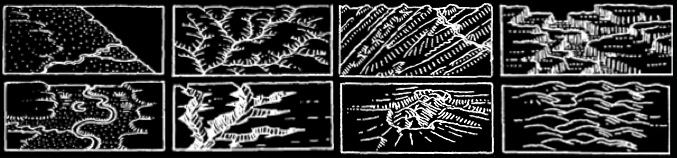
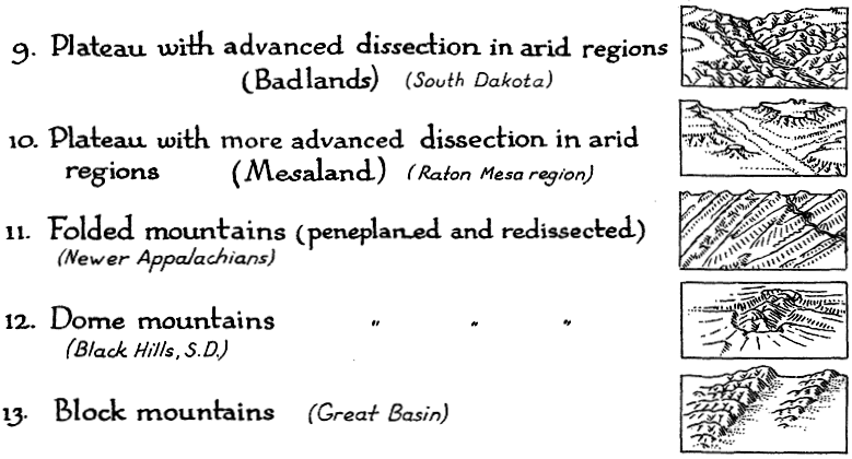
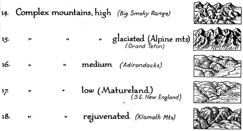
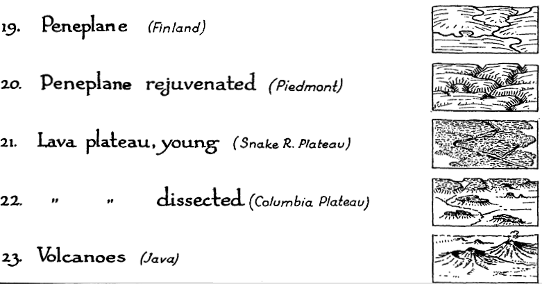
Erwin Raisz is among the most creative cartographers of the 20th century, known in particular for his maps of landforms.
In 1931 Raisz outlined and illustrated the methods behind his landform maps, in an article in the Geographical Review (Vol. 21, No. 2, April 1931). Excerpts from the text and graphics in the article are included below.
Raisz’s approach is to create complex pictorial map symbols for specific landform types. Each specific application, of course, would have to modify the symbols to fit the configuration of particular landforms.
One of the limitations of Raisz’s work is that it is so personal and idiosyncratic that it virtually defies automation or application in the realm of computer mapping. Thus digital cartography has, in some cases, limited the kind of maps we can produce.
Raisz writes:
There is one problem in cartography which has not yet been solved: the depiction of the scenery of large areas on small-scale maps.


Most of our school maps show contour lines with or without color tints. Excellent as this method is on detailed topographic sheets … it fails when it has to be generalized for a small-scale map of a large area. Nor does the other common method, hachuring, serve better.
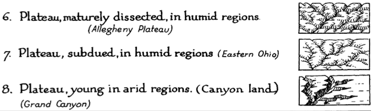
For the study of settlement, land utilization, or any other aspect of man’s occupation of the earth it is more important to have information about the ruggedness, trend, and character of mountains, ridges, plains, plateaus, canyons, and so on-in a word, the physiography of the region.
Our purpose here is to describe and define more closely a method already, in use, what we may call the physiographic method of showing scenery. This method is an outgrowth of the block diagram. [T]he method was fully developed by William Morris Davis. Professor Davis has used block diagrams more to illustrate physiographic principles than to represent actual scenery.
Professor A. K. Lobeck’s Physiographic Diagram of the United States and the one of Europe do away entirely with the block form, and the physiographic symbols are systematically applied to the vertical map. His book Block Diagrams is the most extended treatise on the subject.
It is probable that the mathematically-minded cartographer will abhor this method. It goes back to the primitive conceptions of the early maps, showing mountains obliquely on a map where everything should be seen vertically. We cannot measure off elevation or the angle of slope. Nevertheless, this method is based on as firm a scientific principle as a contour or hachure map: the underlying science is not mathematics but physiography.
If we regard the physiographic map as a systematic application of a set of symbols instead of a bird’s-eye view of a region, we do not violate cartographic principles even though the symbols are derived from oblique views instead of vertical views. It may be observed that our present swamp symbols are derived from a side view of water plants.
••••••
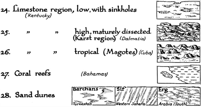
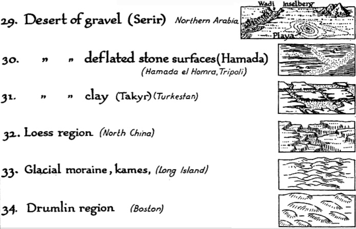
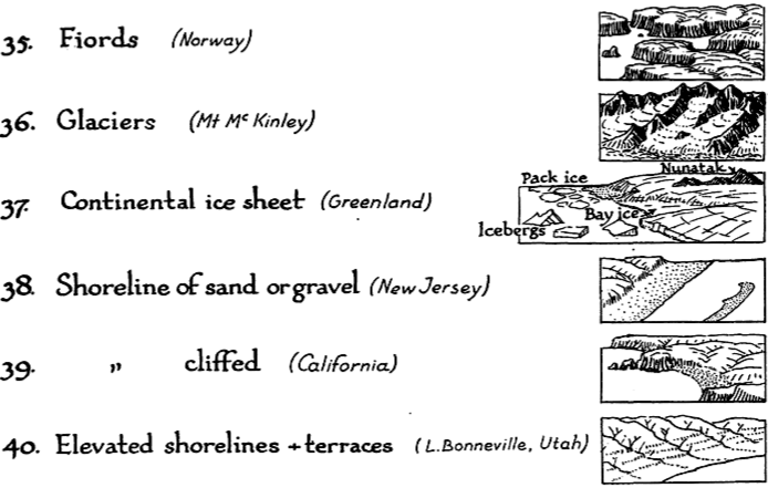
Landform map symbols include: plains (sand & gravel, semiarid, grassland, savannah, forest, needle forest, forest swamp, swamp, tidal marsh, cultivated land), coastal plain, flood plain, alluvial fans, conoplain, cuesta land, plateau (subdued, young, dissected), folded mountains, dome mountains, block mountains, complex mountains (high, glaciated, medium, low, rejuvenated), peneplane, lava plateau (young, dissected), volcanoes, limestone region (with sinkholes, dissected, karst, tropical, mogotes), coral reefs, sand dunes, desert of gravel (serir), deflated stone surfaces (hamada), clay (takyr), loess region, glacial moraine, kames, drumlin region, fjords, glaciers, shoreline (sand, gravel, cliffed), and elevated shorelines & terraces.
Posted in 03 Mappable Data, 09 Map Symbolization, 13 Multimedia Mapping, tagged Map Design, Map Symbolization, Mapping with Sound, Multimedia Mapping, Sonification, Sound Maps on March 25, 2008| 7 Comments »
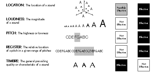
Quite a few years ago I wrote an overview article on the use of sound for representing geographic data, including a series of sound variables for mapping I developed. The article was titled “Sound and Geographic Visualization” and was published as a chapter in the now out-of-print book Visualization in Modern Cartography (MacEachren & Taylor eds., 1994).
Sound is used to convey information all the time, but less so in the realm of mapping where the visual dominates. The article explores the possibilities of making maps with sound, or using sound in tandem with a visual display to add additional layers of information.
Some work on tactile mapping had had occurred at the time the article was published, as well as a few dozen articles on sound for representing data in general (not geographic data). Subsequently, research on multi-sensory mapping has expanded but not as much as I expected. We still can’t hear data with Google Earth.
For an updated bibliography of related work, see the articles and books that cite “Sound and Geographic Visualization” at Google Scholar.
The article is below as originally published. It holds up ok, although technology has changed quite a bit.
••••••

Denis Elder emailed me (Feb 6, 2012) and asked about the “manuscript videotape” cited in the paper below. The video was made to accompany my 1993 Association of American Geographers (AAG) conference presentation on using sound with maps. Back then, showing the examples (which were created with the software Director on a Mac) live at the conference would not have been easy, so I made a video of the maps being used (and making sounds). This presentation was an early form of the work that would be published as “Sound and Geographic Visualization.”
I managed to find the video and had our media center create a digital version (in Quicktime / .mov format).
The video and the notes for the presentation (“Mapping with Sound”) are below. This is old stuff, so don’t laugh!
“Mapping with Sound.” (PDF) Presented at the 1993 Association of American Geographers Conference, Atlanta, Georgia.
“Mapping with Sound.” (Quicktime Movie, 9 minutes, 84mb) to accompany paper. Explanation of this video is in the above PDF of the paper presented at the conference. If sound does not work try the .m4v version (below).
“Mapping with Sound.” (.m4v Movie, 131.6mb). Same as above, different movie file format.
And, least and last, the 1991 seminar paper (For Mark Detweiler in Psychology 597a) that served as the basis of the Sound and Geographic Visualization book chapter: “An Elemental Approach to Animation and Sound in Information Graphics” (PDF, 1mb)
••••••
Sound and Geographic Visualization
“Who the hell wants to hear actors talk?”
Harry Warner on being confronted with the prospect of the sound movie.
Introduction
The issue of sound in the context of visualization may at first seem incongruous. There is, however, evidence to support the claim that sound is a viable means of representing and communicating information and can serve as a valuable addition to visual displays. Abstracted two-dimensional space and the visual variables – the traditional purview of cartography – may not always be adequate for meeting the visualization needs of geographers and other researchers interested in complex dynamic and multivariate phenomena. The current generation of computer hardware and software gives cartographers access to a broadened range of design options: three-dimensionality, time (animation), interactivity, and sound. Sound – used alone or in tandem with two-or three-dimensional abstract space, the visual variables, time, and interactivity – provides a means of expanding the representational repertoire of cartography and visualization.
This chapter discusses the use of realistic and abstract sound for geographic visualization applications. Examples of how and why sound may be useful are developed and discussed. Uses of sound in geographic visualization include sound as vocal narration, as a mimetic symbol, as a redundant variable, as a means of detecting anomalies, as a means of reducing visual distraction, as a cue to reordered data, as an alternative to visual patterns, as an alarm or monitor, as a means of adding non-visual data dimensions to interactive visual displays, and for representing locations in a sound space. The chapter concludes with research issues concerning sound and its use in geographic visualization.
Experiencing and Using Sound to Represent Data
Our sense of vision often seems much more dominant than our sense of hearing. Yet one only has to think about the everyday environment of sound surrounding us to realize that the sonic aspects of space have been undervalued in comparison to the visual (Ackerman 1990, Tuan 1993). Consider the experience of the visually impaired to appreciate the importance of sound and how it aids in understanding our environment. Also consider that human communication is primarily carried out via speech and that we commonly use audio cues in our day to day lives – from the honk of a car horn to the beep of a computer to the snarl of a angry dog as we approach it in the dark (Baecker and Buxton 1987).
There are several perspectives which can contribute to understanding the use of sound for representing data. Acoustic and psychological perspectives provide insights into the physiological and perceptual possibilities of hearing (Truax 1984, Handel 1989). An environmental or geographical perspective on sound can be used to examine our day to day experience with sound and to explore how such experiential sound can be applied to geographic visualization (Ohlson 1976, Schafer 1977, Schafer 1985, Porteous and Mastin 1985, Gaver 1988, Pocock 1989). Understanding how sound and music is used in non-western cultures may inform our understanding of communication with sound (Herzog 1945, Cowan 1948). Knowledge about music composition and perception provides a valuable perspective on the design and implementation of complicated, multivariate sound displays (Deutsch 1982). Many of these different perspectives have coalesced in the cross-disciplinary study of sound as a means of data representation, referred to as sonification, acoustic visualization, auditory display, and auditory data representation (Frysinger 1990). Within this context both realistic and abstract uses of sound are considered.
Posted in 09 Map Symbolization, Map History, tagged Cartographic Design, Cartographic symbols, Map Design, map symbols, springs, symbols, wells on March 6, 2008| Leave a Comment »
Wells
Springs
Successful, Unsuccessful
Nonmineral, Mineral
Nonmineral, Mineral, Artesian, Gravity, Artesian, Gravity
Rise, No Rise, Rise, No rise, Cold, Warm, Cold, Cold, Warm, Cold
Flowing, Nonflowing, Flowing, Nonflowing
Those are all the wells and springs…

In general there has been no attempt at uniformity of practice in the delineation on maps of underground water features or of wells or springs… …it now appears desirable that a concerted movement be made to develop a uniform system of symbols for use on maps.
The number of symbols devised should be sufficient for the representation of all features which it is desirable to show. If wholly arbitrary devices are used, confusion will result whenever a considerable number are used simultaneously, but this difficulty will be largely avoided if the system adopted is based on a few suggestive forms grouped according to easily remembered principles.
The principles to be considered in devising a system of well and spring symbols for underground water maps are (1) simplicity, (2) clearness, (3) ease of making, and (4) suggestiveness. Failure to answer these various requirements ruled out many of the arbitrary systems used in the past…
It is believed that a system of symbols can be most logically developed if a single arbitrary device is taken as a base. In common practice a circle is most often used for a well, while more or less closely allied devices are used for springs. Inasmuch as both wells and springs are ordinarily approximately circular, this device, which seems to have both the required simplicity and suggestiveness, is proposed.
Words of map symbolization wisdom from “Representation of Wells and Springs on Maps” by Myron Fuller in Water-Supply and Irrigation Paper No. 160, U.S. Geological Survey (1906).
Posted in 03 Mappable Data, 09 Map Symbolization, Map History, tagged cartograms, Cartographic Design, Map Design, map symbols, statistical maps, thematic maps on February 19, 2008| 10 Comments »
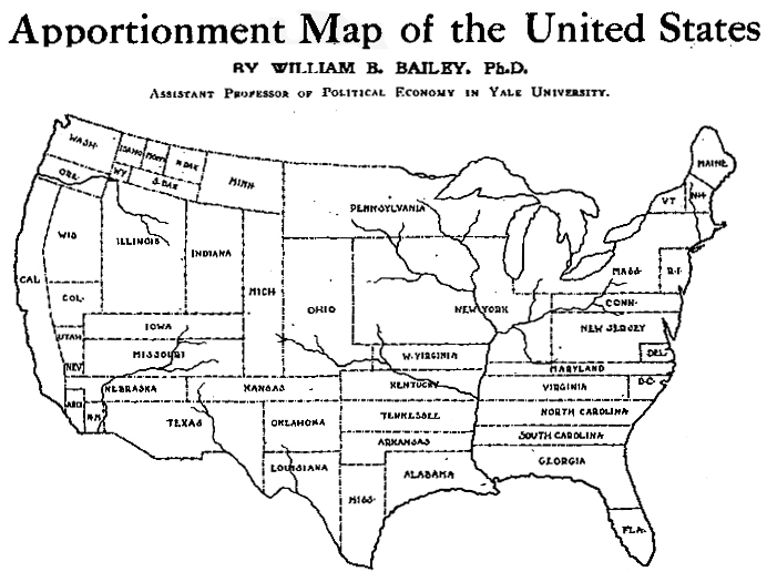
A cartogram varies the size of geographic areas based on the data values associated with each area. Typical cartograms scale geographic areas to population, GNP, electoral votes, etc.
This “apportionment map,” as creator William B. Bailey (Professor of Political Economy, Yale University) calls it, scales the size of U.S. states to the size of their population (in 1910). Note that New York has colonized much of the upper Midwest.
The map, published April 6, 1911 in The Independent is one of the earliest cartograms I have seen.
Apportionment means “allotment in proper shares.” Thus, each state size is allotted based on population, not actual geographical area. Is a curious term to use, possibly more meaningful than the somewhat vague term “cartogram” (a “map diagram”).
Bailey writes:
The map shown on this page is drawn on the principle that the population is evenly distributed thruout the whole United States, and that the area of the States varies directly with their population. With the map constructed on this principle some curious changes become apparent. On the ordinary map the four States, Montana, Wyoming, Colorado, and New Mexico, together with the seven States which lie to the west of them, comprise more than one-third of the territory of the United States, and the area of each one of them is considerably larger than that of New York State; yet the population of New York State alone is nearly one-fourth larger than the combined population of these eleven Western States. In fact, the entire territory to the west of the Mississippi River contains only about 5 per cent. more people than are to be found in the New England States, together with New York, New Jersey, and Pennsylvania. Yet the territory at present covered by these nine Eastern States is only about two-thirds as large as the State of Texas. If we should add to these nine Eastern States the population of Ohio, the total would be greater by about three millions than the entire population west of the Mississippi. The State of Rhode Island, hardly visible to the naked eye on the ordinary map, now becomes almost as large as the territory of Utah and Arizona combined.
Were Texas as densely populated as is the State of Rhode Island, it would contain a population of nearly eighty-five millions, leaving only six millions of our people to be scattered thruout the rest of the country. Were the population of the United Stats as a whole as dense of that of Rhode Island this country would have more than a billion inhabitants.
Posted in 03 Mappable Data, 09 Map Symbolization, Map History, tagged Cartographic Design, Cartography, Edward Tufte, ethnicity maps, Jacques Bertin, Map Design, map symbols, maps, multivariate, texture, visual variables on February 13, 2008| 18 Comments »
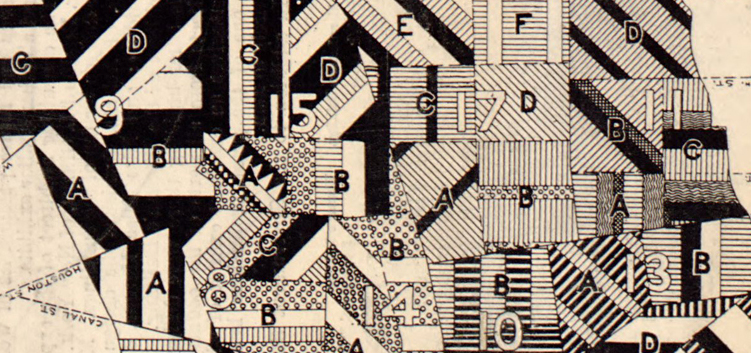
Map of New York City, Showing the Distribution of the Principal Nationalities by Sanitary Districts published in Harper’s Weekly (January 5, 1895, pp. 60–61) using 1890 U.S. Census data.
This map looks great, revealing a substantial amount of information with its intense, juxtaposed patterns.
The textures on the map show the relative amounts of different nationalities (qualitative data) in each of the areas (sanitary districts) on the map:

The map shows if a district has more or less diversity (more or fewer lines of different textures), the relative proportions of different nationalities, the nationalities themselves, and, at a broader scale, the districts that are similar or differ in their nationality constitution. Because of the careful rotation of the lines of textures, the different sanitary districts can also be distinguished from each other.
Posted in 02 Why Are You Making Your Map?, 06 Map Layout, 07 Hierarchies, 08 Generalization & Classification, 09 Map Symbolization, Deep Map Thoughts, tagged Cartographic Design, Cartography, Design, Design Principles, Hate Group Maps, Map Design, maps, Run Over Children Maps, Terror Maps on February 5, 2008| 17 Comments »

Making maps is rife with rules. But following rules does not necessarily produce a great (or even good) map. It may be the implementation of broader design principles that leads to a successful map.
Principles are an intellectual generalization of a broad field of knowledge: a kind of map, in the broadest sense of the word.
They are useful for guiding map makers and helping map users understand how maps work.
There are numerous sets of cartographic design principles. My previous post on Edward Tufte distilled six map design principles (or commandments as I called them) from Tufte’s first book, The Visual Display of Quantitative Information.
In 1999 the British Cartographic Society’s Design Group proposed “Five Principles of Cartographic Design.” When I first came across this set of principles I thought them interesting – even a bit passionate – a rare state of affairs in the often stoic world of cartography. I added a few maps and my own comments (in italics).
More on these map design principles below: Concept before Compilation, Hierarchy with Harmony, Simplicity from Sacrifice, Maximum Information at Minimum Cost, and Engage the Emotion to Engage the Mind.
Cool maps below include: Geo-Smiley Terror Spree Map, The Continents and Islands of Mankind, Hate Groups and Hate Crimes Map, and Where Commuters Run Over Black Children, Detroit 1968.
(more…)
Posted in 09 Map Symbolization, Map History, tagged coastlines, map symbols, nautical maps on January 17, 2008| 1 Comment »
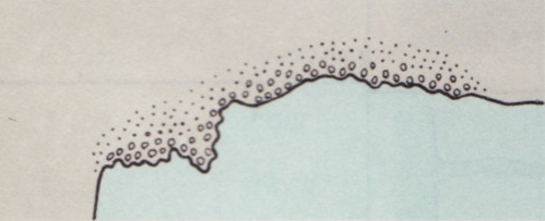
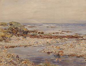
Ah, the shingly shore…
William McTaggart, A Shingly Shore, oil on canvas, 1904.
The nature of the coast: steep, flat, cliffy, rocky, sandhills, stony, shingly, sandy, mangrove, mud, gravel, coral, breakers, rubble, unsurveyed.
The nautical chart map symbol for a shingly shore is taken from section A of Chart #1, Nautical chart symbols and abbreviations used by U.S. Lake Survey, Corps of Engineers, U.S. Army, Dept. of Defense; U.S. Coast and Geodetic Survey, Dept. of Commerce; U.S. Navy Hydrographic Office, Dept. of Defense (Washington DC, 1957). The entire page A with the rest of the symbols is here (1.2 mb jpg). A contemporary version of these symbols, still Chart #1, is here.
Posted in 02 Why Are You Making Your Map?, 03 Mappable Data, 09 Map Symbolization, Maps Made, tagged maps, narrative, place, psychogeography on January 10, 2008| 31 Comments »
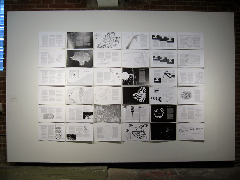
Denis Wood, co-author of Making Maps, has been working on an atlas of the Boylan Heights neighborhood in Raleigh, North Carolina since the mid 1970s. The atlas, which has never been published in its entirety, is called Dancing and Singing: A Narrative Atlas of Boylan Heights.
Inspired by Bill Bunge’s radical cartography in the 1960s and 1970s, the atlas contains diverse examples of creative, place-inspired maps, including maps of night, crime, fences, graffiti, textures, autumn leaves, routes, the underground, lines overhead, stars, and jack-o-lanterns. The atlas is of particular interest to those engaged in planning, urban history, urban geography, landscape architecture, participatory mapping and GIS, subversive cartography, counter-mapping, and psychogeography. Or anyone who enjoys creative mapping.
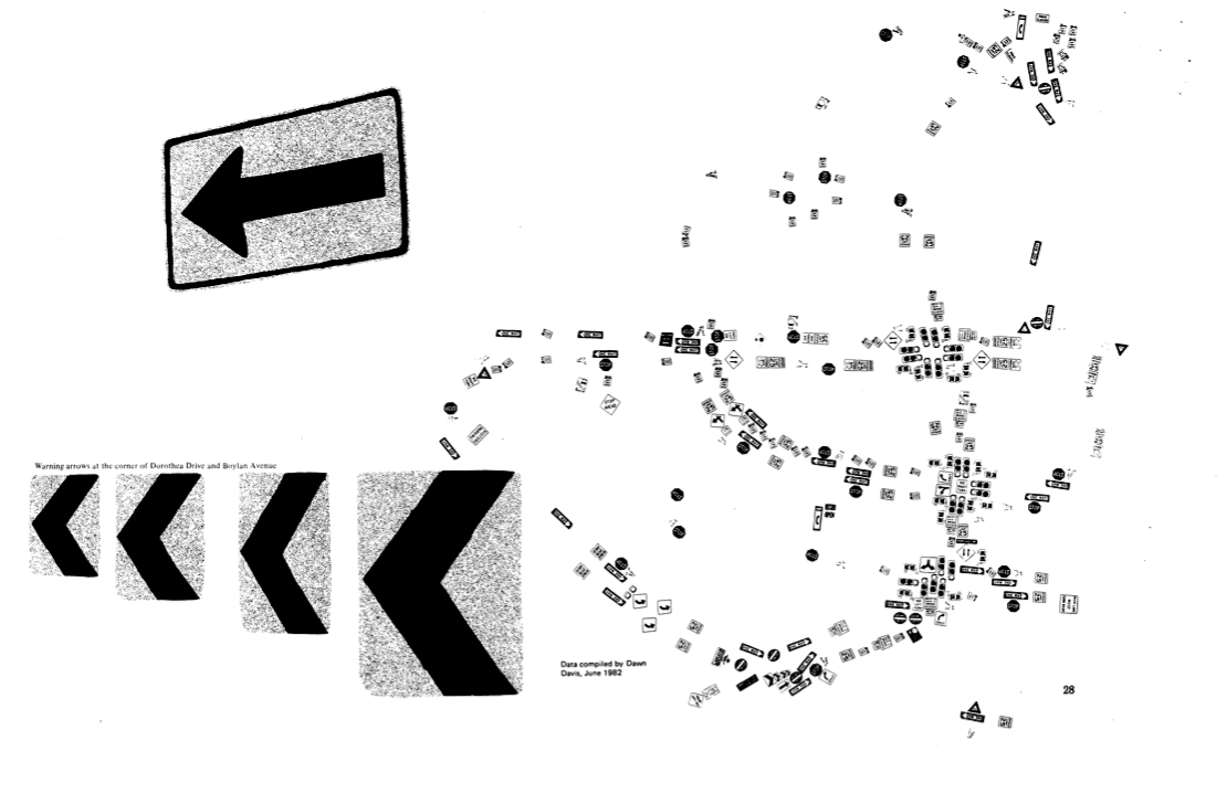
Sign Map (736kb PDF here)
The Atlas has been featured on NPR’s This American Life and in Katharine Harmon’s book You Are Here. All or or parts of the atlas have been shown at The Brattleboro Museum and Art Center, Brattleboro, Vermont (1989), the Tang Teaching Museum at Skidmore College in Saratoga Springs, New York (2001), at SCI-Arc in Los Angeles (2002), at Colby-Sawyer College in New London, New Hampshire (2002), at designbox in Raleigh, North Carolina (2004), and Publico Galleries in Cincinnatti, Ohio (2007). The image which opens this entry was taken at the Publico Gallery.
A description of the atlas by Denis and more of it’s maps follow.
